
Hour 16 Using Behaviors
What You’ll Learn in This Hour:
 How to apply behaviors to elements in your site
How to edit existing behaviors
How to change the events that trigger behaviors
What the different behaviors in Expression Web 2 are and how they work
Introduction
HTML (Hypertext Markup Language) and CSS (Cascading Style Sheets) are powerful tools that can take you a long way to making a great website. But for all the virtues of those tools, many tasks are impossible or far too cumbersome to do using them alone. To help simplify some of these tasks, Expression Web 2 comes complete with a set of behaviors to insert into your pages. Behaviors are small pieces of JavaScript that, when inserted, perform actions within the page and give the visitor a more powerful interactive experience.
Behaviors: An Introduction
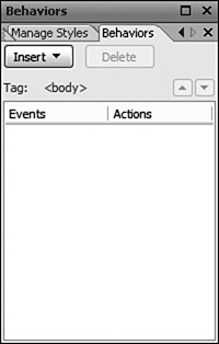
The behaviors in Expression Web 2 can be accessed from the Behaviors task pane which, when selected from the Task Panes menu on the toolbar, opens in the lower-right corner of the workspace next to the Apply and Manage Styles task panes (see Figure 16.1).
When you insert a behavior into your page, you are actually adding a block of JavaScript code to it. JavaScript is a basic script language that lets you perform many tasks that are not available or are otherwise hard to achieve using HTML and CSS alone.
Boiled down to its basic components, a behavior consists of two elements: an event and an action. An event is an action, usually performed by the user, which tells the browser that something happened and asks it to respond by running a script. Events are standardized code segments that in most cases describe themselves pretty well. Here are some examples:
Figure 16.1 The Behaviors task pane.
onclick—When the object is clicked
ondblclick—When the object is double-clicked
onload—When the object is loaded by the browser
onmousedown—When the mouse button is pressed
onmouseover—When the mouse pointer is over the object
When triggered, an event sends a set of predefined arguments to the browser that it passes on to the action. In short, the event describes what needs to happen for the action to trigger.
An action is a JavaScript function (tiny program) that executes when the corresponding event occurs. The action receives the arguments from the event and the script performs the programmed task with these arguments.
Try it Yourself
Create a Swap-Image Behavior
The easiest way to understand how a behavior works is to see it in action. So, before you immerse yourself in all the different behaviors available, you are going to apply a simple behavior to an image:
1. Create and open a new HTML page called behaviors.html in Design view.
2. From the buttonGraphics folder, drag and drop the blueButtonUp.gif file into the page. Give it the alternative text Behavior button.
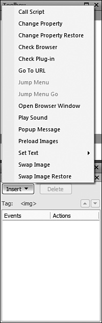
3. Click the image to select it and click the Insert button in the Behaviors task pane to open the Behaviors menu (see Figure 16.2).
Figure 16.2 Clicking the Insert button in the Behaviors task pane opens a menu with all the available behaviors.
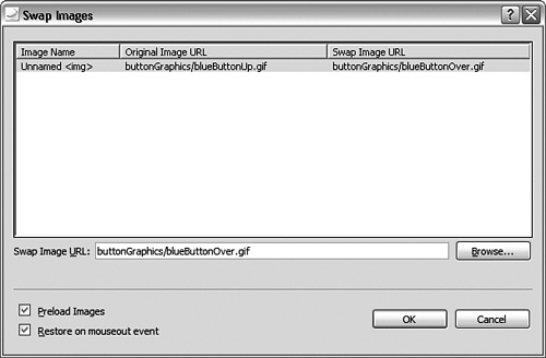
4. Select the Swap Image behavior from the menu. This opens the Swap Images dialog.
5. In the Swap Images dialog, click the Browse button and select the blueButtonOver.gif image. Click OK and the image location now appears in the Swap Image URL column. Leave Preload Images checked and check Restore on Mouseout Event as well. Click OK to apply the new behavior (see Figure 16.3).
Figure 16.3 The Swap Image URL is set and the Preload Images and Restore on Mouseout Event options are checked.
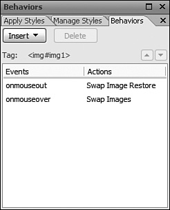
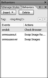
After clicking OK, you see that there are now two behaviors visible in the Behaviors task pane. The first one has the event onmouseout and the action Swap Image Restore, whereas the other has the event onmouseover and the action Swap Images (see Figure 16.4).
Figure 16.4 After you add a behavior to an object on the page, it appears in the Behaviors task pane when you select the object.
If you click anywhere else in the page, you see that a different behavior shows up with the event onload and the action Preload Images. To see what the combination of these three behaviors does, save and preload the page in your browser. When you hover your mouse over the image (the onmouseover event), it is swapped for the other image you defined (the Swap Images action). When you move your mouse away from the image (the onmouseout event), the original image is restored (the Swap Image Restore action). The third behavior is triggered when the page loads (the onload event) and preloads the second image into the browser memory so that it is readily available when it is needed (the Preload Images action).
Modifying Behaviors
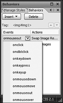
Each of the three behaviors you inserted into the page has three components: the event, the action, and the variable. To change the event, hover over the event name in the Behaviors task pane and click the drop-down arrow. This opens a full menu of all available events that you can choose from (see Figure 16.5).
To change the variable(s) of a behavior, double-click the behavior in the Behaviors task pane and the dialog for that behavior opens.
The only thing you can’t do to a behavior is change its action. To do that, you have to add a new behavior to the object and delete the old one, if necessary.
Experienced designers and people familiar with JavaScript can make modifications of the different behaviors in Code view. Although this book does not cover the modification of JavaScript in Code view, it is worth your time to look under the hood to understand how exactly behaviors work.
Figure 16.5 After applying a behavior, you can change the event by opening the Event sub-menu from the drop-down arrow.
If you click the image you inserted into the page and switch to Split view, you see that the image code is much longer than what you have seen before:
<img id=″img1″ alt=″BehaviorButton″ height=″44″ onmouseout=″FP_swapImgRestore()″
onmouseover=″FP_swapImg(1,1,/*id*/’img1’,/*url*/
’buttonGraphics/blueButtonOver.gif’)″
src=″buttonGraphics/blueButtonUp.gif″ width=″92″ />
In addition to familiar components such as id, alt, src, height, and width, the image now has a series of new code elements attached. Those new code elements are the behavior events. Let’s take a closer look at the onmouseover event:
onmouseover=″FP_swapImg(1,1,/*id*/’img1’,/*url*/
’buttonGraphics/blueButtonOver.gif’)″
The first part of this code is the event itself. The next part, FP_swapImg, is the name of the action or function the event is triggering. Every JavaScript function has a name and a set of arguments contained within parentheses and separated by commas. In this case the variables are 1, 1, ’img1’, ’buttonGraphics/blueButtonOver.gif’, and they tell the script what image to swap out (img1) and what image to put in its place (buttonGraphics/blueButtonOver.gif).
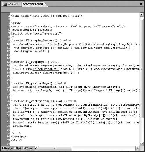
The actual action or function is in the head of the page (see Figure 16.6):
function FP_swapImg() {//v1.0
var doc=document,args=arguments,elm,n; doc.$imgSwaps=new Array();
for(n=2; n<args.length;n+=2) { elm=FP_getObjectByID(args[n]); if(elm) {
doc.$imgSwaps[doc.$imgSwaps.length]=elm;
elm.$src=elm.src; elm.src=args[n+1]; } }
}
This is highly technical JavaScript code and you do not need to understand what it means and how it works. What you can do, however, is examine the sequence of events: When the page loads in the browser, the image on the page loads as normal and the browser loads a second image into memory as per the onload event. When the visitor moves the mouse over the image, the onmouseover event triggers the FP_swapImg action and sends it the arguments img and buttonGraphics/blueButtonOver.gif. The action runs the tiny program with these arguments and replaces the image. When the visitor moves the mouse off the image, the onmouseout event triggers the FP_swapImageRestore action. This action has no arguments because it just restores the old image.
Figure 16.6 When you attach behaviors to objects in the page, you’re also adding small programs called functions into the head of the page.
To put this example into context, the interactive button you created in Hour 15, “Buttons, Buttons, Buttons,” used the same events and actions along with some additional ones to achieve its hover and click effects.
The Many Behaviors of Expression Web 2
The preceding example introduced you to the Preload Images, Swap Image, and Swap Image Restore behaviors. Those are just three of a series of behaviors you can use to increase interactivity for your visitors. To get the full use out of the program, you should know each behavior and what it does.
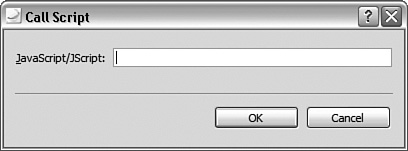
Call Script
The Call Script behavior calls a script that is not featured in the prepackaged behaviors in Expression Web 2. To put it simply, Call Script is a behavior where you define the action. When you apply Call Script to an object, a dialog opens asking you for the JavaScript/JScript code (see Figure 16.7). This behavior is for advanced users with previous knowledge of JavaScript.
Figure 16.7 The Call Script dialog.
Change Property
The Change Property behavior lets you change the styling properties of the object to which it is applied. These properties include Font, Position, Borders and Shading, and Visibility.
1. Below the image you inserted earlier, write a couple of lines of text in a new paragraph. With the cursor inside the text, apply the Change Property behavior by clicking the Insert button in the Behaviors task pane and selecting Change Property. This opens the Change Property dialog (see Figure 16.8).
Figure 16.8 The Change Property dialog.
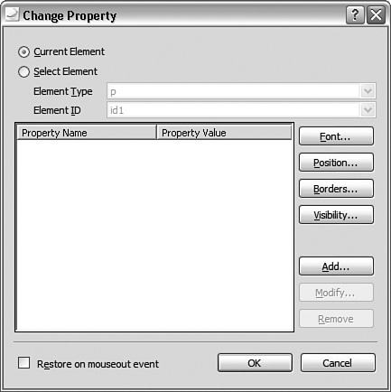
2. In the Change Property dialog, you can choose whether you want to change the properties of the current element or selected element. The Selected Element option lets you pick any of the defined elements within the page. Leave Current Element checked.
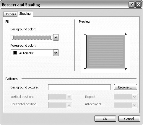
3. For this exercise you want to create a box with a gray background around the paragraph when the visitor hovers over it. Click Borders to open the Borders and Shading dialog. From here you can pick the border style and shading (background color). Under the Borders tab, set the Setting to Box and leave everything else as it is (see Figure 16.9). Under the Shading tab, set the Background Color to Silver (see Figure 16.10). Click OK.
Figure 16.9 The Borders tab lets you set the border style and color.
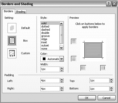
Figure 16.10 The Shading tab lets you set the background color or a background image.
The Borders and Shading options under the Change Property dialog can be confusing because the names and functionality differ greatly from the Add and Modify Style dialogs. (In fact they look more like the Borders and Shading dialogs from Microsoft Word.) Despite this apparent difference, the functions within the two dialogs are the same as the ones in the Add and Modify Style dialogs, and the output is the same as if you were to style the element with CSS.
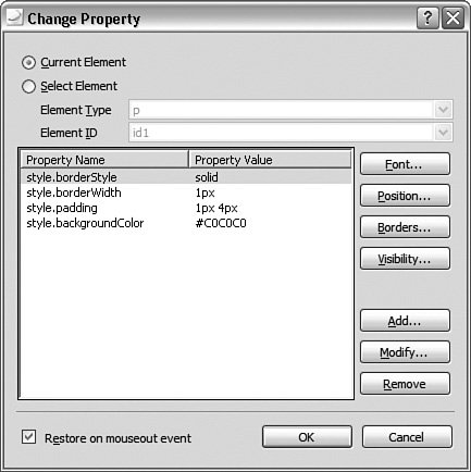
4. The dialog now lists the style changes you made, as you can see from Figure 16.11, they are CSS code. Make further changes if you like using the other functions. When you are done, check the Restore on Onmouseout Event box and click OK to apply the behavior.
Figure 16.11 The Change Property dialog lists the styling changes as CSS code.
When you save and test the page in your browser you see that when you hover over the paragraph, a black border and silver background appear behind it just as if you created a :hover pseudostyle in CSS.
Should I Use CSS or Behaviors?
The preceding examples beg the question: If I can apply both CSS and behaviors to achieve the same result, which one do I use and why? Although CSS and behaviors can perform many of the same tasks, there are different reasons to use (or not use) them. For instance, CSS is a great tool for layout, especially if you have a certain style you are going to use many times throughout your site. But one particular element requires a certain style or behavior, using behaviors can be the better choice because they leave the arguments attached to the element rather than in the style code. For instance if you are creating a series of image-based buttons that all require different images, creating separate styles for every button is cumbersome and creates a lot of style code. One way to circumvent this is by creating an overall style for the buttons and inline styles for each of the backgrounds but that still requires a lot of specialized styling. In contrast, applying behaviors to achieve the same result requires only one function per behavior in the head of the page and the arguments will be attached to each element.
A caveat: Although JavaScript is prevalent throughout the Web, not everyone supports it. In particular, some people and companies block JavaScript in their browsers to prevent malicious scripts from attacking their computers. For those users, and on computers that do not have Java installed, behaviors will not work.
Change Property Restore
As its name suggests, the Change Property Restore behavior restores the property changed by the Change Property behavior to what it was before the behavior was applied. When you apply the Change Property behavior, you have the option to also apply automatically the Change Property Restore behavior from within the dialog, as you saw in the earlier example.
Check Browser
The Check Browser behavior checks what browser the visitor is using and redirects the visitor to a specific page based on this information. This behavior is useful if you have certain scripts or styles within your page that you know will not show up correctly in a particular browser. Applying this behavior, you can redirect users with this browser to an alternative page that doesn’t contain this script.
The Check Browser behavior can detect multiple versions of the following browsers:
Microsoft Internet Explorer
Netscape Navigator
Opera
AOL
WebTV
AOLTV
HotJava
Despite the popularity of the Mozilla Firefox browser and the discontinuation of Netscape Navigator, the browser selection lists the latter. Firefox and Navigator are always grouped together due to similar signatures, so if you want to target Firefox, you have to select Netscape Navigator.
In this example, you add the Check Browser behavior to the button you inserted earlier:
1. Select the button you inserted earlier and click Insert in the Behaviors task pane to open the Behaviors menu. Select Check Browser from the menu. This opens the Check Browser dialog (see Figure 16.12).
Figure 16.12 The Check Browser dialog.
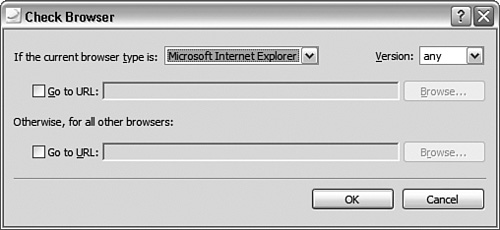
2. In the If the Current Browser Type Is drop-down menu, select Microsoft Internet Explorer. Leave the Version option set to Any. Check the Go to URL box and set the target page to http://www.getfirefox.com. Check the box under Otherwise, for all other browsers, Go to url and set the target page to http://www.microsoft.com/expression (see Figure 16.13).
Figure 16.13 The Check Browser dialog lets you specify a particular browser and set a different target page for that browser.
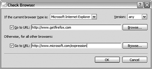
3. Click OK to apply the new behavior. The Check Browser behavior now shows up in the list in the Behaviors task pane above the two you created earlier. Save the page and test it in your browser. If you click the button while in Internet Explorer, you will be taken to the Mozilla Firefox download page. If you do the same in any other browser, you will be taken to the Microsoft Expression website.
The tricky part about using this behavior is that because it is JavaScript-based, it loads a bit slower than the rest of the page. This means that, depending on the visitor’s computer and connection speed, parts of the page could already be loaded before the behavior redirects the browser. To avoid this problem, designers often build a separate front page that contains only this behavior so that the visitor doesn’t get a flash of a broken page before the browser loads the modified one.
Check Plug-In
The Check Plug-In behavior works in much the same way as the Check Browser behavior, except that it checks for installed plug-ins instead of browsers. This behavior is extremely useful if your page features content that requires a particular plug-in to function properly. You have probably encountered this behavior in the past because designers frequently use it to test whether a browser has either the Flash or the Shockwave plug-in.
The Check Plug-in behavior can check whether your browser has the following plug-ins installed:
Flash
QuickTime
RealPlayer
Shockwave
Windows Media Player
Bizarrely, it does not give you the option of checking whether the browser has the Microsoft Silverlight plug-in installed.
As with the Check Browser behavior, you can select to redirect the browser based on whether it has a particular plug-in installed. In this example, you make a button that points to the popular video-sharing website YouTube. If a user’s browser does not have the Flash plug-in installed, she cannot view videos on YouTube, so redirect her to the Flash plug-in download site instead.
1. Select the button you inserted earlier and press Ctrl+C on your keyboard to copy it. Create a new paragraph on the page and press Ctrl+V to paste the button in the new location.
2. With the new button selected, click the Check Browser behavior in the Behaviors task pane to highlight it and delete it by clicking the Delete button (see Figure 16.14). Doing so deletes the behavior from only the selected element and not the other button.
Figure 16.14 When you select a behavior in the Behaviors task pane, you can delete it from the element by clicking the Delete button. Doing so affects only the current element.
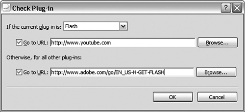
3. With the new button still selected, click Insert and select Check Plug-In to open the Check Plug-in dialog.
4. In the If the Current Plug-In Is menu, choose Flash. The wording is somewhat strange, but it means if the current plug-in is installed. Check the box below and set the target page to http://www.youtube.com. Check the Otherwise, for All Other Plug-Ins box and set the target page to http://www.adobe.com/go/EN_USH-GET-FLASH (see Figure 16.15).
Figure 16.15 The Check Plug-In dialog lets you pick a particular plug-in and set the target of the browser to different pages depending on whether the user’s browser has the plug-in installed.
Go to URL
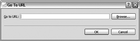
The Go to URL behavior does exactly what it says: If the behavior is applied, the browser goes to the specified URL. In other words, it is a JavaScript method of creating hyperlinks. You can use this behavior in conjunction with other behaviors if you want to make buttons and so forth. When you apply the Go to URL behavior to an element, the Go to URL dialog opens, as shown in Figure 16.16, and you insert the target address.
The Go to URL behavior gives you the ability to make hyperlinks that trigger by events other than the regular clicking of a button. For instance, you can set the event to onmouseover so that the browser navigates to the new address when an element is touched. Or you can set the event to onload to force the browser to navigate to the new address when the element or the page loads.
Figure 16.16 The Go to URL dialog has only one field where you insert the target address.
Jump Menu
The Jump Menu behavior adds a drop-down menu with a Jump Menu behavior to the page wherever you place the cursor. This behavior is actually a two-birds-with-one-stone approach to making a drop-down menu with some functionality. Technically the jump menu part of the behavior is just the onchange event and Jump Menu action. Separately the Jump Menu behavior inserts a drop-down box to which you attach the behavior. The result is a drop-down menu with a set of choices that link to different pages just like the menu that appears when you hover over the events in the Behaviors task pane.
1. To create a new jump menu, place the cursor where you want the jump menu to appear, click Insert in the Behaviors task pane, and select Jump Menu from the menu. This opens the Jump Menu dialog.
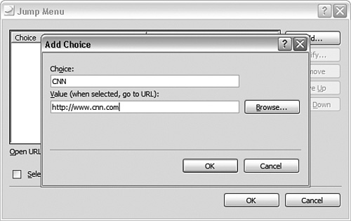
2. The Jump Menu dialog is where you define the different menu options. To add a menu option, click the Add button. This opens the Add Choice dialog. The Choice is the text that appears as an option within the jump menu. The Value is the target URL navigated to when the user selects the choice. This menu lists a series of news sources, so start with CNN as the Choice setting and http://www.cnn.com as the Value setting. Click OK to add the item to the jump menu (see Figure 16.17).
Figure 16.17 The Add Choice dialog appears when you click Add in the Jump Menu dialog, and lets you insert new menu items and their corresponding links.
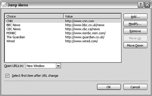
3. Add a series of new links to other news sources to create a list. When the list has several items, you can modify each item, remove them, or move them up and down in the list with the buttons on the side.
4. When you are satisfied with your list, you can decide whether the new pages should open in the current window or a new window using the Open URLs In drop-down menu (see Figure 16.18). Set this option to New Window. You can also check the Select First Item After URL Change option. Doing so resets the jump menu to the first item on the list after a URL change. Otherwise the last selected item appears in the jump menu. Click OK to insert the jump menu.
Figure 16.18 The Jump Menu dialog as it appears with multiple menu items inserted.
If you save and preview the page in your browser, you can test the new jump menu. Because you set the URL to open in a new window, a new window opens every time you make a selection from the menu. If you had unchecked the Select First Item After URL Change box, the last selection you made would appear in the jump menu when it is not activated.
To change the properties of the menu items, double-click the jump menu in Design view and the Drop-Down Box Properties dialog opens. From here you can add, remove, modify, and reorganize the different list alternatives and even change options such as tab order (for visitors using the Tab key on their keyboard) and whether the visitor can make multiple selections. This is because you are now editing the menu as a drop-down box, not a jump menu. Note that you don’t have the Open URLs In and Select First Item After URL Change options in this dialog.
Jump Menu Go
The default setting of the Jump Menu event is onchange. That means whenever the user selects a menu item, the action triggers. But sometimes you want the user to make a selection first and then press a separate button to trigger the action. You can do so with the Jump Menu Go behavior by removing the event and action from the menu itself and giving it to a separate element.
To make this scenario work properly, you have to create a new button with the Jump Menu Go event attached and then change the event of the jump menu.
1. You need to attach the Jump Menu Go behavior to a different element than the jump menu itself. Copy one of the buttons on the page and paste it next to the menu. With the new button selected, delete the onclick event by selecting it and clicking the Delete button in the Behaviors task pane. Click the Insert button and select Jump Menu Go from the menu. This opens the Jump Menu Go dialog (see Figure 16.19).
Figure 16.19 The Jump Menu Go dialog lists the available jump menus you can control with the new behavior.
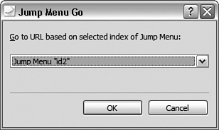
2. Because there is only one jump menu on the page, you have only one option. Had there been several jump menus, you could choose which one the Jump Menu Go behavior would affect. Click OK to apply the new behavior.
3. The jump menu still has the Jump Menu behavior attached. To get the new button to work properly, you have to remove this behavior. Select the jump menu and delete the Jump Menu behavior from the Behaviors task pane by selecting it and clicking the Delete button. This might seem counterintuitive but, as you just learned, the Jump Menu behavior and the drop-down box are two separate entities. Now the button you created in step 1 controls the menu. Save and preview in your browser to test the new behavior.
Open Browser Window
In Hour 5, “Get Connected—Building Hyperlinks for Navigation and Further Exploration,” you learned how to make hyperlinks open in a new window. The Open Browser Window behavior takes this to a whole new level by letting you create hyperlinks that open in new windows where you set the parameters for how the window should look and behave. This gives the designer much more control of the experience the visitor has after clicking the link. This behavior is especially useful when you want to open a separate window that displays an image and you want it to be the same size as the image.
1. Drag and drop a new button image into the page and give it the alternative text Image Pop-Up.
2. With the new button selected, click the Insert button and select Open Browser Window from the menu. This opens the Open Browser Menu dialog.
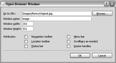
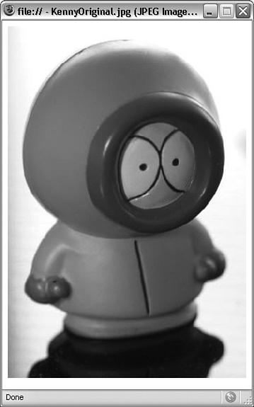
3. In the Open Browser Window dialog, set the target URL for the hyperlink. This can be a page within your site or any page or file on the World Wide Web. Use the Browse button to browse to the kennyOriginal.jpg image.
4. In the Window Name box, define a unique name for your window. This name will not be visible, but the browser uses it to identify the window so that you can target it with other behaviors or functions. The window name can contain only numbers and letters, no spaces or symbols. Name the window image.
5. The Window Width and Window Height setting define the physical width and height of the new window. The default value is 200px by 200px, which is very small. The kennyOriginal.jpg image is 353px wide and 521px high, so match these values in your window.
6. The window’s attributes make up the final set of options in the Open Browser Window dialog. By checking and unchecking these boxes, you turn various features of the window on and off. Leaving all of them unchecked means you get a stripped window with no navigation or other features (see Figure 16.20). Click OK to apply the new behavior.
Figure 16.20 The Open Browser Window dialog with all the new settings completed.
After saving and previewing the page in your browser, click the New button and a new window opens to the size specified (see Figure 16.21). Note that because you didn’t check any attributes, the window has no navigation, scrollbars, or any other features. Furthermore, you can’t resize the window.
Figure 16.21 The new window’s size is according to specifications and stripped of all the extra features a browser window normally has.
Play Sound
The Play Sound behavior plays back a sound file when the desired event triggers. The supported sound file types are
AIFF sound files (files ending with .aif, .aifc, and .aiff)
AU sound files (files ending with .au and .snd)
MIDI sequencer files (files ending with .mid)
RealAudio files (files ending with .ram and .ra)
Wave files (files ending with .wav)
When you apply the Play Sound behavior to an element, the Play Sound dialog opens to allow you to insert the location of the sound file (see Figure 16.22). Keep in mind that just like image files, this file has to be available on the World Wide Web either from your own site or an external site. If you insert a link to a file on your local hard drive, only visitors using your computer will be able to hear it.
Figure 16.22 The Play Sound dialog lets you browse to the sound you want to play when the event triggers.

Popup Message
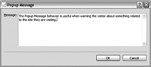
When an element with the Popup Message behavior applied triggers, a warning box with the warning of your choice appears on the screen. Designers often use this behavior to warn visitors about the content about to display, that they are leaving the site, or that they are submitting information to the site. Because you are in complete control of the warning message, you can have it say whatever you want.
To create a popup message, simply add the behavior to an element and the Popup Message dialog opens (see Figure 16.23). There you type out your message and click OK to insert it into the page.
Figure 16.23 The Popup Message dialog lets you insert the text you want to display in the warning box.
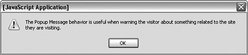
When triggered, the Popup Message behavior creates a warning box with the text you inserted and the visitor has to manually close it to move on (see Figure 16.24).
Figure 16.24 The popup message as it appears when triggered in the browser.
Preload Images
The Preload Images behavior loads images that are not actually present on the page into the browser memory for future retrieval. This is a useful function if your page contains images that appear when the user performs an action (such as hovering the mouse over a button), and you don’t want there to be a lag between the action and the image switching out. You saw the Preload Images behavior both when you created the interactive buttons in Hour 15 and when you used the Swap Image behavior in this hour.
The Preload Images behavior is usually applied to the page as a whole (under the <body> tag) with an onload event so that it loads with the rest of the page.
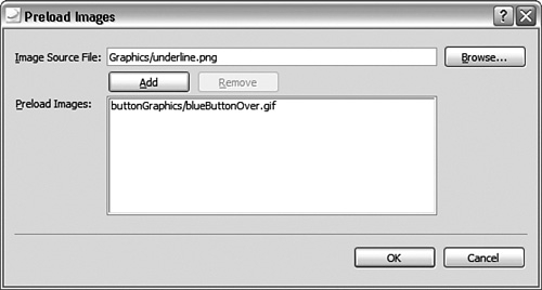
1. There is already a Preload Images behavior present in your page (you inserted it along with the Swap Image behavior). But if you want to insert one, you simply click anywhere within the page and select the <body> tag from the Quick Tag Selector before inserting the behavior from the Behaviors task pane. Because you already inserted a Preload Images behavior, simply select the <body> tag and double-click the behavior from the Behaviors task pane. This opens the Preload Images dialog.
2. When the Preload Images dialog opens, it has one image listed and only the Remove button is active. To add a new image, you first have to use the Browse button to find it. Select any image in your site and click OK. The new image location appears in the Image Source File area and the Add button becomes clickable. Click the Add button to add the new image to the list (see Figure 16.25).
Figure 16.25 To add a new image to the Pre-load Images list, you first have to browse to the image source file location and then click the Add button.
Set Text
Set Text is the only behavior with a submenu. This behavior changes the text or HTML content of various fields within the page. To fully understand how this behavior works, you first need an introduction to frames, layers, and text fields. Therefore the Set Text behavior will be covered in Hour 17, “Frames and Layers.”
Behavior Pitfalls and Expression Web 2 Idiosyncrasies
Like CSS styles, a behavior always applies to the closest tag. That means if you highlight a portion of text and use the Behaviors task pane to apply a new behavior to it, you attach the behavior to all the content within the same tag as the text, not just the highlighted selection. If you want to attach a behavior to a selection of text, you must first wrap it inside a set of <span> tags in Code view and give it a unique ID. However, for some reason, Expression Web 2 treats <span> tags differently from all other tags. So, when you apply a behavior to a <span> tag, Expression Web 2 inserts it without an event! To make the behavior work properly and show up in the Behaviors task pane, you have to manually insert the event ahead of the action in Code view.
Summary
Behaviors are small programs you can attach to elements within your page to create a more interactive experience for your visitors. They can produce many of the same effects you already created using CSS and some that you can’t produce using CSS. Therefore behaviors are an important and valuable tool for designers.
In this hour, you learned how to apply behaviors to different elements within a page and how to edit them. More importantly you got a complete walkthrough of all the available behaviors and learned how each one works. Knowing the behaviors in Expression Web 2 is your first step on the path to understanding JavaScript. Looking at JavaScript in more detail is beyond the scope of this book but if you are interested in learning about Java, look at Sams Teach Yourself JavaScript in 24 Hours.
In the coming hours, you will be applying what you learned about behaviors to some of the content in the MyKipple site to create a more interactive experience for the visitor.
Q&A
Q. When I click the last button with both an Open Browser Window and a Popup Message action, the new browser window opens behind the main window while the popup message appears on top. Why is that?
A. JavaScript is handled in sequence from top to bottom. That means if an object has several actions attached, they will be triggered in the order they appear in the Behaviors task pane. If the Open Browser Window action appears above the Popup Message action, the button will tell the browser to create a popup window on top, then return to the main window and perform the other action. To change the order of the two actions simply click on the Open Browser Window action and click the down button (with an arrow pointing down) in the Behaviors Task Pane. This moves the behavior down in the order. Now when you preview the page in your browser the popup message shows up first and only after you click OK does the new window with the image appear. As you can see, this organization of a popup message and a new window can be used to warn visitors that a new window is about to be opened.
Workshop
The Workshop has quiz questions to help you put to use what you just learned. If you get stuck, the answers to the quiz questions are in the next section. But try to answer the questions first. Otherwise you’ll only be cheating yourself.
Quiz
1. What two components are behaviors comprised of?
Answers
1. A behavior consists of an event and an action. The event defines the trigger that causes the action to engage. The action contains the small JavaScript program that makes the behavior what it is.
Exercise
Later on in this book you will learn how to use Behaviors to create an interactive menu. Here is a preview:
Create a table with 1 row and 4 colums and place a new button in each of them. Use the different behaviors you learned about in this hour to make the buttons do different things such as changing the properties of a block of text, creating a new window pointing to your favorite web site or simply changing color when you click on it.