Hour 13. Working with Fullscreen, Filled, Snapped, and Portrait Views
What You’ll Learn This Hour:
• Using the simulator to test the portrait state
• Detecting the view state and reacting using JavaScript
• Using CSS media queries to handle different view state
• Making apps look great in every view state
A Windows Store app needs to both look great and function great in many different layouts. Our apps need to be able to handle being snapped to a 320-pixel-wide space (the same width as most mobile devices) and also handle fullscreen and filled modes. Apps are not required to work in the portrait view state to pass certification, but effort should be made to make them work so the user isn’t forced to change preferred orientation.
Windows 8 is a reimaging of the PC from the chip to the interface. It scales from a variety of screen sizes and pixel densities, from a table, laptop, or convertible all the way up to a desktop. More screens mean more content and more productivity within the same app. A great snapped view invites users to keep the app open longer—possibly all day! A great portrait mode can result in a much higher rating for the app.
Learning About the Different View States in Windows 8
Windows 8 enables users to view their apps in four different view states. The default view state, and the one we have been using for the last 12 hours, is the fullscreen state. This is landscape mode. We briefly saw each view state during Hour 5, “Understanding Microsoft Design Style Principles,” in the section “Simulating the Different Views Using Blend.” In this hour, we dig into each of these view states and describe how to modify style sheets to accommodate each mode.
The second view state that Windows supports is snapped view state. When an app is snapped, it uses only 320 pixels across. When an app is taking up the remaining space, the app is considered to be in the filled view state. Our apps must support all three of these view states to pass certification.
The final view state is portrait. Portrait view state occurs when the user rotates the device from landscape mode into portrait mode. Apps in portrait mode cannot be snapped; the device must be rotated back to landscape orientation to change the app from fullscreen back into snapped view state.
Figures 5.10–5.13 displayed how each of these view states looks when using Blend for Visual Studio. We show how to use CSS and CSS-Grid and the WinJS ViewBox control to handle free-flowing content as well as fixed content across each view state. By default, all of the project templates we have seen so far, except Blank App, handle snapped, portrait, and filled view states automatically.
Using the Simulator
We have seen the simulator in action a couple times already, but we want to see how the simulator helps us as we make our apps look correct in all view states and resolutions. During Hour 5, we looked at how Windows handles different screen sizes and resolutions in the section “Understanding Device Dimensions, Resolutions, and DPI.” It may be good to reread that section because this hour uses that information.
When the simulator runs, it does so as an instance of our own machine: It creates a remote desktop connection with our machine. If we are running on hardware that supports only a resolution of 1,280×800, then our device will not allow snapping. The minimum resolution in which Windows 8 runs is 1,024×768. The minimum resolution in which Windows 8 allows an app to be snapped is 1,366×768. The simulator can help us make sure our app will look good when it is snapped even if we don’t have hardware that supports snapped view. The same thing is true regarding portrait mode. If we don’t have a device that lets us rotate to portrait mode for testing, we can use the simulator. In fact, testing might be easier with the simulator than rotating our device while developing the app.
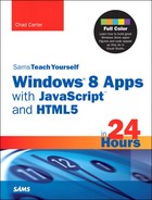
Figure 13.1 shows the right side of the simulator. We can simulate basic touch, pinch and zoom, and rotation when the device we are working on doesn’t support touch. We can use the Rotate Clockwise and Rotate Counterclockwise buttons to rotate the simulator a full 360 degrees 90 degrees at a time, to test how the app works upside down and in portrait mode. Another button enables us to change resolutions; the menu in Figure 13.1 shows all available resolutions and DPIs. The simulator enables us to snap apps by dragging them into place. The hotkey to toggle snapped view is Windows+period (.).
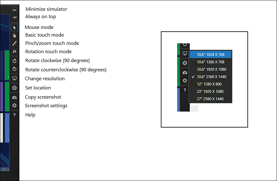
Figure 13.1. The simulator contains buttons that enable us to manipulate the simulator itself, as well as simulate actions within the environment.
Using ViewBox for Fixed Layouts
The WinJS ViewBox control handles all of the different view states for us. If a game or an app works best in fixed layout mode, we can wrap it in a ViewBox and let it do all the hard work for us. ViewBox scales the child element it contains but keeps the aspect ratio intact. This means that it expects a single element. The Fixed App project template we created in Hour 2, “Trying out File | New | Project,” uses ViewBox, but for the single element, it uses a div that is styled with a CSS -ms-flexbox. A flexbox can have many elements. It then stacks them either vertically or horizontally, based on the -ms-flex-direction property. This “stack panel” can have nested flexbox elements. The FlexBoxExample in Hour13FlexBoxExample shows how elements can be nested with different directions to not only have the stack panel go horizontally, but also give each element multiple nested elements that flow vertically. In the example, the elements are flowing vertically and subelements are flowing horizontally.
Activity 3 in Hour 8, “Working with Multitouch and Other Input,” requests the InkExample to be converted to a Fixed Layout project so the canvas is always centered regardless of the resolution of the app. We now complete that activity to get the InkExample that we modified in Hour 11, “Storing Data Locally,” to work in every resolution and view mode.
Try It Yourself: Fixing the InkExample to Work in All Resolutions and View States
1. Create a new Fixed Layout App project and call it InkExampleFixed.
2. Start a second instance of Visual Studio and open the InkExample from Hour 11 (not Hour 8). We want the version that contains the results textbox and Save button.
3. Copy the contents from InkExamplejsdefault.js over top of InkExampleFixedjsdefault.js.
4. Copy the content of the body element from InkExampledefault.html over top of the p element inside the fixedlayout div.
5. Change the height from 760 to 718. Change 1280 to 1366. Instead of targeting 1,280×800 as we did the first time around, we target 1,366×768. We want some room at the bottom, so instead of setting the height to 768, we subtract 50 pixels from it, to make it 718.
6. Open default.css in the InkExampleFixed project to see what the Fixed Layout App project provided. It has created a 1×1 grid that is 1,024×768. The grid is inside -ms-flexbox (the CSS rule for the body element), which is aligning it to the center.
7. Change the grid width to 1366px. At this point, we are consistently stating that the area we are working in will match upcoming devices. For many tablet devices that currently have a resolution of 1,280×768, we simply letterbox them.
8. Open default.css in the InkExample project from Hour 8. Copy the #canvas, #results, and #btnSave CSS rules, and paste them inside the default.css file in the InkExamplecssdefault.css file:
#canvas { -ms-touch-action: none; }
#results { width: 1000px; }
#btnSave { width: 250px; margin-left: 10px; }
9. We could change the width of the results text box to another fixed value. Instead, let’s use the CSS calc function. Let’s change the results width to calc(100% - 290px).
10. Because we have placed these controls inside a fixed layout grid, we need to utilize absolute positioning. This is typically not desired, but because we are making everything look right at this one resolution (1,366×768) and will let Windows handle the scaling, we can get by with it. Let’s add the following properties to the #results rule:
position: absolute; top: 718px; left: 0;
11. Similarly, we can replace the #btnSave rule with the following:
#btnSave {
position: absolute;
top: 722px;
left: calc(100% - 250px);
width: 250px;
}
12. We left the width in place, but we removed the margin and set the absolute positioning to set it up against the right side by subtracting only the width of the button itself.
13. Inside Visual Studio, change the target from Local Machine to Simulator, as in Figure 13.2.
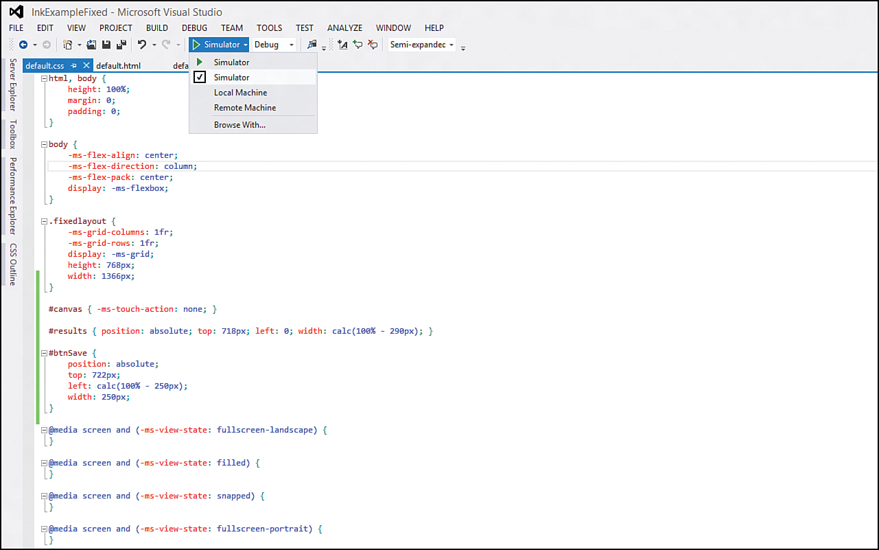
Figure 13.2. Visual Studio enables us to run our apps inside the simulator.
14. Inside the simulator, change the resolution to each one available. Notice how the canvas, textbox, and button are all being centered and scaled appropriately.
15. Rotate the simulator until it is in portrait mode and it is scaled to fit. Now, it can be argued that this isn’t a great experience for users. They can use the app in portrait mode, but they aren’t able to use the majority of the screen space. However, if they have started writing, we can’t just reset the canvas.
16. If the device has a resolution of 1,366 pixels wide or higher, it can be snapped. If not, it can still be snapped in the simulator, which has the higher resolution. When the app is snapped, we see that the canvas is shrunk to fit. We can even write and save the contents while it is snapped. Snapped view also suffers from a lot of unused space, as with portrait view state. For some apps, this is the best that can be done because it really prefers landscape mode.
17. To have our writing app prefer only landscape mode, we can check the landscape and landscape-flipped check boxes inside the app package under the supported rotations section of the Application UI (see Figure 13.3).
Figure 13.3. We can set the apps to support only landscape (or portrait) mode inside the app package manifest configuration file.
The simulator’s rotate buttons still force the app into portrait mode, but real devices do not send the notification to the app to be reoriented.
Using CSS Media Queries to Style Content Based on the Current View State
To see how to use CSS media queries to style content based on the view state, we work with the last ListViewExample (which included the semantic zoom control) from Hour 10, “Binding Data to Our Apps,” and get it to work nicely in each view state.
Try It Yourself: Fixing the ListViewExample to Work in All Resolutions and View States
1. Copy or open the latest ListViewExample project from Hour 10. (The project should include the semantic zoom functionality.)
2. Copy the grid helper images from Hour05UIDesignExampleUIDesignExampleimages. This includes 2560x1440-MicrosoftDesignStyle-Grid-subunit.png and 2560x1440-MicrosoftDesignStyle-Grid-unit.png. Paste the images into the images folder of ListViewExample.
3. Copy the debug-subunit.css and debug-unit.css files from Hour05UIDesignExampleUIDesignExamplecss and paste them into the css folder of the ListViewExample.
4. Open the project in Visual Studio and click the Show All Files toolbar button in the Solution Explorer (see Figure 13.4). Right-click the newly added CSS and image files, and select Include in Project from the context menu.
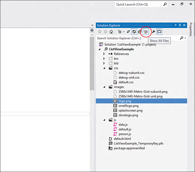
Figure 13.4. Visual Studio allows files that exist on disk in the solution folders to be included in the project.
5. To see the grid displayed, we need to include one of the debug CSS files into our default.html page. Let’s add debug-subunit.css in our default.html immediately following the reference to the default.css:
<link href="/css/debug-subunit.css" rel="stylesheet" />
6. The debug grid image works best with the dark style, so let’s change the style of our app to use ui-dark.css.
Now we can run the app in the simulator and see the grid in place. If we snap it or look at it in portrait view state, we see that the app is not functioning the way we want it to. Portrait mode is close, but as we saw in Hour 5, in Table 5.1, content in portrait mode should be 5 units, or 100 pixels from the left. Ours is set to 6 units, or 120 pixels, identical to the default fullscreen view state.
Fortunately, we can utilize CSS media queries. The very last rule in the default.css file is a media query:
@media screen and (-ms-view-state: fullscreen-portrait) {
}
As we add rules to this media query, it will be applied only when the view state is portrait. Depending on the content of an app, all media queries might need to be populated with CSS rules. Typically, the snapped and fullscreen-portrait media queries need some extra rules. The exception is when a fixed layout is involved, as we saw with the InkExample project. In that case, no special work might need to be done with the media queries.
Rules that we want to affect everything, regardless of the view state, should come before any media query. Then each media query can have specific rules to override the defaults. Using the default for the snapped and portrait view states might be easier, and then fullscreen-landscape and filled can override the default rules.
Adding CSS rules after the media queries might cause them to be used instead of what is inside the media query. CSS rules inside a media query do not override any rules set after them. They work like regular CSS rules, and the last one set wins unless a more specific selector is used. Thus, it is a best practice to not place any CSS rules after the media queries. Blend for Visual Studio can easily add rules after the media queries. If that happens, the rules should be reordered through the tool or manually so that no surprises arise when it comes time to render the content with the rules.
To get the header in the right position in portrait mode, we just need to add the following rule to the fullscreen-portrait CSS media query:
header[role=banner] {
-ms-grid-columns: 100px 1fr;
}
header[role=banner] .win-backbutton {
margin-left: 29px;
}
This app doesn’t have any detail page, but we are styling the button as the default Grid App styles it. Instead of using the 120-pixel margin, our header uses only a 100-pixel margin when the view state is fullscreen-portrait.
Next, let’s make sure the actual grid portion of the site is styled correctly in the portrait view state. We can add the following rule inside the fullscreen-portrait media query:
#simpleListView .win-horizontal.win-viewport .win-surface {
margin-left: 25px;
}
By setting the margin to only 25 pixels from the left, the content starts displaying at position 100 on the x-axis. Finally, let’s zoom out to see how that view looks in portrait mode. As expected, it is positioned at 120 pixels in. We can add the following rule in the media query to correct it:
#zoomedOutView .win-horizontal.win-viewport .win-surface {
margin-left: 100px;
margin-bottom: 0;
}
It is a best practice to start with the Grid App template or the Split App template instead of starting with the Blank App template to place items from scratch. Sometimes this can’t be avoided, but many times it can. We are styling the project that originated as a Blank App to show each piece, but for real apps, the other templates should be the starting point.
We can run the app and see how it works in portrait mode (using the simulator, if needed). The zoomed-out view and the regular view are both being positioned correctly. Now we can tackle the snapped view mode. Figure 13.5 shows our app in portrait mode.
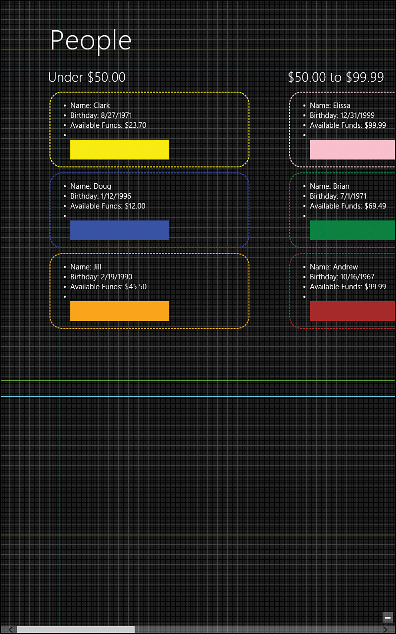
Figure 13.5. Just a little CSS styling inside the appropriate media query makes the app look great in portrait mode.
Snapped view is a little more complicated, but we can style the header much as we did when we were in portrait mode. We need to replace the empty snapped media query with the following:
@media screen and (-ms-view-state: snapped) {
header[role=banner] {
-ms-grid-columns: 20px 1fr;
}
header[role=banner] .win-backbutton {
margin: 0;
margin-right: 10px;
margin-top: 76px;
}
}
This sets the left margin to 20 pixels (by setting the first column to that amount) because 20 is the position where the header and content should start on the x-axis when in snapped mode. Our content grid of “people” information is just too large to fit in snapped mode.
If we temporarily modify the JavaScript code to change
listView.layout = new WinJS.UI.GridLayout();
to
listView.layout = new WinJS.UI.ListLayout();
and we run the code, we will see that, as expected, the ListView control now displays the content vertically; the layout is the ListLayout instead of horizontally, where it was the GridLayout. We also see that, if we snap it, boxes are clipped off the edge of the screen. Our data can actually fit in a much smaller space, so let’s add the following CSS rule to the snapped media query to shorten the width of our people tiles if we are in snapped view state:
.templateItem {
width: 280px;
}
The templateItem class originally had the width set to 400 when we first styled the tiles. That remains intact, but now we are changing it to 280 so that it will fit in snapped view.
We know that we can get the desired look we want in snapped view, but changing the layout view to ListLayout lost the main functionality of the app. Let’s change the layout property back to GridLayout:
listView.layout = new WinJS.UI.GridLayout();
Next, we look at how to be notified when the view state changes so that we can handle switching the layout view in our JavaScript code.
Using the Resize Event to Determine the View State
The DOM has a built-in event that occurs when the window is resized. We can handle the event and then check some properties to determine the view state of our app. We must change our layout based on the view state, so let’s refactor our code a bit. We need to extract out the code inside the WinJS.xhr promise after we define the STYWin.Data namespace into a new function call initLayout. The refactor code follows:
WinJS.xhr({ url: "/js/data.js" }).then(function (peeps) {
var list = new WinJS.Binding.List(JSON.parse(peeps.responseText));
var groupOfPeople = list.createGrouped(
groupKeySelector, groupDataSelector, compareGroups
);
WinJS.Namespace.define("STYWin.Data", {
people: groupOfPeople
});
initLayout();
});
function initLayout() {
var zoomedOutView = document.getElementById("zoomedOutView").winControl;
zoomedOutView.itemDataSource = STYWin.Data.people.groups.dataSource;
zoomedOutView.itemTemplate = document.getElementById("zoomedOutDiv");
var gridLayoutOptions = {
maxRows: 1
};
zoomedOutView.layout = new WinJS.UI.GridLayout(gridLayoutOptions);
var listView = document.getElementById("simpleListView").winControl;
listView.itemDataSource = STYWin.Data.people.dataSource;
listView.itemTemplate = document.getElementById("templateDiv");
listView.groupDataSource = STYWin.Data.people.groups.dataSource;
listView.groupHeaderTemplate = document.getElementById("headerDiv");
listView.layout = new WinJS.UI.GridLayout();
}
With that little bit of refactoring out of the way, let’s add the following code inside the WinJS.xhr promise, right after the call to initLayout:
window.addEventListener("resize", updateLayout);
We write the updateLayout function shortly. For now, we need to modify the initLayout function we just refactored out. We need to add the following three variable declarations and assignments to the beginning of initLayout:
var currViewState = Windows.UI.ViewManagement.ApplicationView.value;
var viewStates = Windows.UI.ViewManagement.ApplicationViewState;
var semanticZoom = document.getElementById("semantic").winControl;
When our application first launches, inside the ready event, we load data using WinJS.xhr. When that is completed and we have our data, we call the initLayout function. This initLayout function does the actual data binding and assigns the dataSource, as we saw during Hour 10. Now we have added code that enables us to determine the current view state (currViewState), as well as the enumeration of view states that Windows supports (viewStates). Finally, we grabbed a handle to the semantic zoom control that wraps the zoomed-in and zoomed-out list views.
The Windows.UI.ViewManagement.ApplicationViewState enumeration has the following values:
fullScreenLandscapefilledsnappedfullScreenPortrait
Let’s remove the following two layout assignments inside the initLayout function:
var gridLayoutOptions = {
maxRows: 1
};
zoomedOutView.layout = new WinJS.UI.GridLayout(gridLayoutOptions);
and
listView.layout = new WinJS.UI.GridLayout();
Now, at the end of the initLayout function, let’s add them back in—but this time we want to take into account the view state we are in. We saw in the last section that we should change the list view to be in ListLayout instead of GridLayout when in snapped view state. Let’s make that happen by adding the following code to the end of the initLayout function:
if (currViewState !== viewStates.snapped) {
zoomedOutView.layout = new WinJS.UI.GridLayout({ maxRows: 1 });
listView.layout = new WinJS.UI.GridLayout();
semanticZoom.locked = false;
} else {
zoomedOutView.layout = new WinJS.UI.ListLayout();
listView.layout = new WinJS.UI.ListLayout();
semanticZoom.locked = true;
}
We simply check the currViewState that was set during the page ready event against the snapped enumeration. If we are not in snapped mode, we have the same code we did before (although we have condensed the grid layout a little). Inside that same condition, we also set the overall semantic zoom control to not be locked. This means that we can zoom out while looking at our site in every mode except snapped.
If we are in snapped mode, then set zoomedOutView and listView (zoomed-in view) to both use ListLayout. However, we set the semantic zoom control’s locked property to true so that we never see the zoomed-out view while in snapped mode.
Now it is time to actually implement the updateLayout function. We registered for the resize event on the window, so anytime a window is resized (by snapping, rotating, moving our app to a different size monitor, and so on), this function is called.
For this demo project, we started with the Blank App project template. Starting with the Grid App project is better, though, because the page controls already have the initializeLayout and updateLayout functions inside the page definition. Look at the groupedItems.js page definition to see how those two functions are set up. We do it manually here because we aren’t using a page control and didn’t utilize the goodness of the Grid App project. For explaining topics in this book in a step-by-step manner, this approach is fine (and hopefully beneficial), but it doesn’t make sense to reinvent the wheel for real apps.
The code for updateLayout follows:
function updateLayout() {
var currViewState = Windows.UI.ViewManagement.ApplicationView.value;
var viewStates = Windows.UI.ViewManagement.ApplicationViewState;
var semanticZoom = document.getElementById("semantic").winControl;
var listView = document.getElementById("simpleListView").winControl;
listView.itemDataSource = STYWin.Data.people.dataSource;
listView.itemTemplate = document.getElementById("templateDiv");
listView.groupDataSource = STYWin.Data.people.groups.dataSource;
listView.groupHeaderTemplate = document.getElementById("headerDiv");
if (currViewState !== viewStates.snapped) {
listView.layout = new WinJS.UI.GridLayout();
semanticZoom.locked = false;
} else {
listView.layout = new WinJS.UI.ListLayout();
listView.groupDataSource = null;
semanticZoom.zoomedOut = false;
semanticZoom.locked = true;
}
}
updateLayout is similar to initLayout. The main difference is that we are forcing the semantic zoom control to not be zoomed out when we are in snapped mode. The assumption is that we will never have more data than we do, and we want the user to be able to scroll through the actual person list. If this were a real app, we would want to start with the Grid App project and have the actual person detail show up in the detail page. Then in snapped mode, it would show the group information (the group headers, in this case); when the user clicked one, it would display the list of people. When the user then tapped a person tile, the app would bring up detailed information about the person.
Again, the updateLayout is checking the current view state value (Windows.UI.ViewManagement.ApplicationView.value), which is accurately set only after the resize event fires, against the enumeration to determine whether the view state is in snapped mode. This is the key for using JavaScript and the DOM resize event to create a different experience when our app is placed in a different view state.
If we run our app, we can see that we can snap now and that our data is in list layout mode instead of grid layout mode. But our data isn’t sorted—it really was never sorted. It was grouped, but the data within the groups weren’t sorted. So now when we don’t have groups, the people are just sorted in the default way the data was obtained. Activity 4 of Hour 10 included a task of actually sorting data; if that was completed, the data is currently in order.
To sort the data, let’s change the following code in the WinJS.xhr promise from
var list = new WinJS.Binding.List(JSON.parse(peeps.responseText));
to
var ppl = JSON.parse(peeps.responseText);
ppl.sort(function (a, b) { return a.funds - b.funds; });
var list = new WinJS.Binding.List(ppl);
We are placing the data we parse from the JSON text into the variable ppl. We then call the JavaScript sort on the variable, passing in a custom sort function. The sort function subtracts the funds to get a positive number, a negative number, or 0. We did the same thing during Hour 10 when we sorted groups in the section “Displaying Data in Groups,” and we can see this in the compareGroups function in the code. Figure 13.6 shows the app in snapped view state.
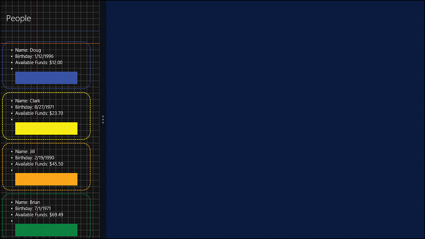
Figure 13.6. Hooking into the DOM’s resize event makes it possible to modify the contents to be displayed in snapped view state.
Using CSS msMatchMedia to Detect View State Changes
Windows 8 also provides the msMatchMedia function. The function is passed a media query string identical to what is used in CSS. For example, the following code can be used to determine snapped mode by checking for a max width of 320 pixels:
window.addEventListener("resize", updateLayout, false);
var w, h;
function updateLayout(evt) {
w = evt.view.outerWidth;
h = evt.view.outerHeight;
var body = document.querySelector("body");
body.style.backgroundColor = "red";
var isSnapped = window.msMatchMedia("(max-width: 320px)").matches;
if (isSnapped) {
body.style.backgroundColor = "blue";
}
}
Inside the resize event handler, the isSnapped variable is set to match the Boolean of what the msMatchMedia returns when passed in a media query string. isSnapped thus is true if the max-width is 320 pixels. The code defaults the background color to red. If it is snapped, the code sets it to blue.
We could have also used the following line of code as well:
var isSnapped = window.msMatchMedia("(-ms-viewstate: snapped)").matches;
Something else to notice is that we have access to the actual width and height of the view in our resize event handler:
var w, h;
function updateLayout(evt) {
w = evt.view.outerWidth;
h = evt.view.outerHeight;
...
}
We can also register for an event using the msMatchMedia function:
var mq = window.msMatchMedia(
"(-ms-view-state:fullscreen-landscape) and (min-width: 2560px)");
mq.addListener(handleHighResolution);
handleHighResolution(mq);
function handleHighResolution(mql) {
//this will get overridden by handleResize on screen layout changes
//because the resize is called after this is called
if (mql.matches) {
var body = document.querySelector("body");
body.style.backgroundColor = "green";
}
}
In this example, we check to see if the view state is fullscreen-landscape and the minimum resolution is 2,560 pixels. The previous two code segments were placed into the example at Hour13ResizeEventsExample. If we load the project and run it in the simulator, the screen defaults to red if we are running in the full 2,560 resolution on the 27-inch screen. If we are running on a smaller screen, Windows treats it as a smaller resolution and increases the number of pixels taken up by the color. This scaling was discussed during Hour 5, in the section “Understanding Device Dimensions, Resolutions, and DPI.”
If we run the app, the first time the simulator is set to the large screen with the 2,560×1,440 resolution, we will see the green background. After that, any resize event causes the msMatchMedia event to fire first; then it causes the resize window event to fire. So even though the background might be set to green, it will be overwritten by red in the resize event. If we snap the app, the background color is set to blue because the isSnapped variable is assigned true from the matches flag.
Further Exploration
The @-ms-viewport rule was not discussed but can be beneficial to apps. This device adaptation technique is part of the CSS Device Adaptation W3C Working Draft. Information on how to use this CSS rule can be found at http://msdn.microsoft.com/en-us/library/windows/apps/hh868813.
Many other media queries exist than those listed in this chapter. A good resource is the documentation at http://msdn.microsoft.com/en-us/library/windows/apps/hh453556.
More information on the CSS Flexbox can be found at http://msdn.microsoft.com/en-us/library/windows/apps/hh772069.
The following Quickstart is a good resource for more practice with styling an app for all the different view states: http://msdn.microsoft.com/en-us/library/windows/apps/jj150600.
A great blog post article discussing view states is http://blogs.msdn.com/b/windowsappdev/archive/2012/04/19/getting-the-most-out-of-your-pixels-adapting-to-view-state-changes.aspx.
As stated earlier, it might be good to refer back to Hour 5 and look at the section “Simulating the Different Views Using Blend” to see how Blend can help style the different view states.
The Windows SDK samples of interest for this hour are:
• Adaptive layout with CSS sample
• CSS media queries sample
• Display orientation sample
• Scaling according to DPI sample
• Snap sample
Summary
During this hour, we saw in detail the different view states an app can be in. We looked at how to utilize CSS media queries to style an app when it is in the different view states. We looked at how to handle a fixed layout by utilizing the ViewBox and the CSS flexbox. We looked at CSS media queries and saw how to target any of the view states our app can be in. We then saw how we can hook into the resize event and then check the Windows.UI.ViewManagement.ApplicationView.value against the Windows.UI.ViewManagement.ApplicationViewState enumeration to see which view state the app is in. We even saw how to utilize the msMatchMedia function to check for explicit resolutions.
Q&A
Q. Should I use CSS media queries, the window resize event, or msMatchMedia?
A. When possible, CSS media queries should be used to style the content for the different view states. Sometimes media queries aren’t enough, though. In those cases, the resize event on the window object should be used—possibly in combination with the CSS media queries. msMatchMedia can be used when trying to do something based on a specific resolution, but that is pretty rare.
Q. Does my app have to support the snapped view state?
A. Yes! Apps that do not support snapped mode correctly will not pass certification. An app might not function when in snapped mode, though. In such a situation, providing a message to the user stating the fact is appropriate. Some games just have a pause menu when the app is snapped.
Q. Does my app have to support the portrait view state?
A. No, but apps that support portrait mode get higher ratings than those that do not. Not every app can support a portrait, but many can. Those that can should, but it is not required to pass certification.
Workshop
Quiz
1. The WinJS ViewBox control accepts multiple elements and scales them to fit the entire area of the screen. True or false?
2. When starting a new project, it is best to start with the Grid App or Split App project and avoid the Blank App project. True or false?
3. Besides an app being moved to or from snapped mode and being rotated into portrait mode, what other events can cause the resize event to fire?
4. How far from the left should the content start in the portrait view state?
Answers
1. False. The ViewBox takes a single element. It also scales that single element but keeps the aspect ratio. It might fill the screen, or it might not.
2. True. Although this book has utilized the Blank App project extensively, it has been for demonstration purposes. It intends to keep the code base uncluttered and contain only pieces that are vital to understanding the concept at hand. For-real world apps, Grid App and Split App are much better starting points.
3. Besides the different view states an app can be place into, when an app is moved between monitors of different resolutions, the resize event is fired.
4. The content should start at 100 pixels, or 5 units, from the left side of the screen when the content is being rendered in portrait view state.
Activities
1. In the InkExample, change the background color when the app is in portrait view state.
2. In the InkExampleFixed app, create an isDirty flag to determine whether anything has been written yet. If not, and if the user changes the orientation of the device, automatically change the canvas to that orientation. If the user has, just have it resize.
3. In the ListViewExample, make the group titles use the user’s currency instead of hardcoding USD. (Hint: Make a function to pass the numbers to, and have the existing formatCurrency converter function use it.)
4. Open the UIDesignExample from Hour 5 and look in detail at the page controls that make up the app. Run it in the simulator and see how it responds. Make a copy of the project and implement Semantic Zoom in the new project.