
FOUR
Color

Color makes the world truly come alive. No other fundamental component can evoke feelings of happiness, passion, jealousy, and serenity so effectively. While it's certainly possible to take an amazing black-and-white photograph being aware of how we perceive color mentally and emotionally will give you a powerful tool in your photographic utility belt.
Color plays a huge role in our lives. The entire spectrum of visible light is very narrow, as we discussed in detail in Chapter Two, yet we are finely tuned to see it. For example, there’s roughly a one percent change in wavelength from a green-yellow color to yellow, but we see it clearly. We typically don’t even notice if we gain or lose one percent of our body mass!
Color can also affect our brains and physiology. Red or black placebo pills are perceived as stronger medicine than white ones. When we see red, scientists have observed that our brain’s electrical activity picks up, as does our heart rate. Blue has been proven to bring down blood pressure and lower our heart rate. There’s even an entire type of alternative medicine called color therapy that tries to treat various ailments by having people look at different colors.
In an article titled “Emotion & Design: Attractive things work better,” Don Norman, a famous user interface guru, noted that the first time he used a color monitor, it didn’t add any “discernible value for everyday work.” Color was mainly used to highlight text or add other screen decorations. However, he didn’t want to give up his color monitor because of some un-articulate-able emotional need that color fulfilled for him.
Over hundreds of years, artists and scientists have studied color and how we relate to it. Many great books, such as Harald Mante’s Color Design and Michael Freeman’s Color, go into much more detail than we will cover in this chapter. However, we will give you the important foundational information and cover how color affects your image’s visual intensity. If after you’ve read this chapter you find yourself in love with the intricacies of color theory, we suggest you check out the books mentioned here.
Where Does Color Come from?
Color comes from many different places. In nature, you see it in pigments, and even in bioluminescence such as with fireflies. It can come from a side effect of light traveling through a medium, such as the colors on a soap bubble that also give an indication of how thick the bubble is, or appear as a rainbow, when light is affected by water in the air.
Leaves appear green because of chlorophyll, and in the fall when the chlorophyll breaks down, the yellow and red pigments masked by the chlorophyll the rest of the year start to appear, creating a beautiful display of color.
Color can also serve many purposes in the world. Sometimes it’s a warning of danger. Black, yellow, and red often warn that a particular insect will make a dangerous snack rather than a tasty one. Sometimes color lets animals and insects blend in and camouflage themselves in their surroundings. Other times color can even be a defense, such as a squid squirting ink.
Even though you might have learned in grade school that grass is green and the sky is blue, color and our perception of it is actually a lot more complex than that. First, objects appear to have specific colors because of the light that they absorb and reflect. For example, an apple appears red because it reflects red light and absorbs green and blue light. The color we see for an object also depends on what colors the light source is giving off. If you look at an apple under a light that’s not giving off any red light, the apple wouldn’t look red, it’d look dark, because it would be absorbing the light falling onto it and there’s no red in that light source to reflect. Lastly, as we discussed in Chapter Two, our perception of light also depends on the cones in our eyes and the processing system in our brains converting the light falling onto the retinas into a form that our brain can understand.
Properties of Color
In grade school, you might have learned that you can use a prism to separate white light into a rainbow, and that rainbow has all the colors we can see. That’s not quite right. It doesn’t contain every shade possible, as you can see for yourself by looking around and thinking about which shades are and are not in a rainbow. Instead, the rainbow contains pure hues for most colors (Figure 2).
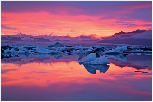
FIGURE 1 The world around us is full of color, and that color comes from many sources, such as a sunset, and serves many different purposes.
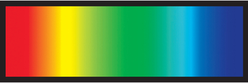
FIGURE 2 A simple rainbow model of color .
Hue is the first property of color. Usually when people talk about color, what they’re actually talking about its hue, as the hue is most closely tied to the light’s wavelength. There are higher-level structures in the brain (“globs”) beyond the cones in our eyes that are sensitive to various hues. If you’re talking about pure colors, such as “green” or “red” without any modifiers such as “light” or “dark,” then you’re talking about a color’s hue.
Saturation is the next property, and this refers to a color’s purity. Low saturation means that the color looks fairly dull or grayish, whereas high saturation means that the color looks very pure. As you might expect, saturated colors contribute more energy to an image than unsaturated ones (Figure 3).
Brightness is the last property we’ll discuss, and this is a measure of our perception of how light or dark a color is. Often lighter colors are called tints, whereas darker colors are called shades. All highly saturated, pure colors have a medium brightness value. Sometimes changing a color’s brightness will

FIGURE 3 Different saturations with the same hue and brightness values.

FIGURE 4 Different brightnesses with the same hue and saturation values.
cause it to have a very different perceived color, such as an orange that changes to a pale, almost skin tone when it has a brighter value to a deep brown when it has a darker value (Figure 4).
The Color Whee
A rainbow is also a poor representation of color because it doesn’t help us describe relationships between hues, and it also doesn’t capture purple, which is between red and blue (purple is technically different from violet because purple contains a mix of red and blue whereas violet doesn’t contain red—we’ll discuss this more in depth shortly). Instead, we’re going to connect the two ends of the rainbow to form a color wheel. By arranging colors in this manner, we’ll be able to clearly see various properties of colors that artists have taken advantage of for centuries.
In the late 1800s and early 1900s, Ewald Hering started advocating the idea that, rather than seeing colors as a mix of red, green, and blue, colors are made up of a mix of four perceptually pure hues: red, green, yellow, and blue. Furthermore, Hering came to the conclusion that red and green, and yellow and blue, are perceptual opposites because they can’t be combined to form another color, and you never describe an object as greenish-red or yellowish-blue. Knowing that these
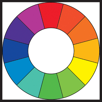
FIGURE 5 A color wheel, with purple in between red and blue.
are opposites, we can put them across from each other on a color wheel, and we now know how to space the wheel out so that we can see the various combinations of hues that our eyes can perceive. You might recognize these combinations from Chapter Two. It turns out that not only was Hering right, but we have structures in our eyes and brain that process color using this opponent method.
It’s also sometimes helpful to think of color perception in terms of the two axes defined by red/green and yellow/blue. If you know a color is purple, then it’ll be towards the blue side on the yellow/blue axis and the red side on the red/green axis. This helps to give a more precise definition of a color and is how the LAB color space works, separating out luminance from color data (L stores luminance, A stores red-green opponent information, and B stores blue-yellow opponent data). If you look closely at the white balance controls in your favorite RAW converter, you might note that these are roughly
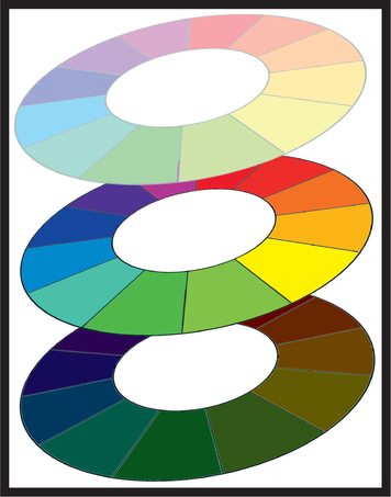
FIGURE 6 We can create a three-dimensional color wheel by adding a vertical axis for luminosity.
the two axes provided to let you manually adjust your white balance as well. By making our color wheel three-dimensional, adding a vertical axis for luminosity as you see in Figure 6, we can also express muted and darker tones of each hue.
Colors and Their Impact
Whether you consciously realize it or not, we associate emotions with colors. For example, have you ever felt green with jealousy or so mad that you turned red? The following table summarizes the common emotions that people in Western cultures associate with colors, as well as the visual intensity associated with each.
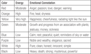
As you might expect, many of these colors have their emotional connotation because we see them in nature, such as with a yellow sun, orange/red fire, and blue sky or water. When we see the color, we think of the natural object and the meaning we associate with that object.
Sometimes colors have meaning because of historical context. White became a popular wedding color after an image of Queen Victoria’s wedding dress was publicized in the mid-1800s. Before then, other colors, including black, were popular wedding dress colors.
Purple is also considered a royal color for historical reasons. Tyrian purple, also known as royal purple, was made from sea snails, and the dye became more intense over time instead of fading. The dye was very expensive and it became a status symbol, making it so that only wealthy people and important religious figures had royal purple clothing.
In addition, purple is special because while it is commonly made from a mix of red and blue, there are some rare instance, such as the purple you see in a butterfly’s wings, that actually emit spectral violet light where the object reflects light at a shorter wavelength than blue, which is truly violet light and not a mix of red and blue. When you visit an art store, note how some purple paints that visually appear similar to other purples are ten times more expensive. The more expensive purple paints are not a mix of red and blue.
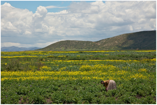
FIGURE 7 The greens of the plants in this shot create a feeling of growth and nature (as does the setting) and the yellow flowers add a sense of happiness. Together, these help bias the viewer to feel that the woman working in the field is happy to be there.
Cultural connotations also play a role. For example, in Thailand, purple is a color of mourning (worn when someone close to you dies). In the United States and other Western cultures, black is a color of mourning, but in China and South Africa, white and red, respectively, are colors of mourning.
Religions also have meaningful colors. In Hinduism, a number of gods have blue skin. Judaism is often represented by blue and white, and green is a holy color of Islam. Many religions use white to represent peace.
Pastel colors, such as pink and pastel green, which are less saturated, are often seen as more youthful and sometimes feminine than fully saturated colors.

FIGURE 8 Pastel variants of colors, which feel more youthful than the fully saturated versions.
The particular shade variant (how light or dark a color is) can also affect how we perceive a color. For example, we often associate dark blue with restful and mature feelings whereas light blue is youthful and masculine. Light green reminds us of nature and growth whereas a vivid green reminds us of nausea and sickness.
Whew, there are a lot of meanings here, aren’t there! Fortunately, you have a very powerful tool to help you: your instinct. You know what you think of when you see certain colors. Unless you have a very specific, personal connotation for a color (e.g., you were wearing a magenta shirt when you first met your significant other), there’s a good chance most people in your culture will react the same way you do to a color. That’s how you can determine the emotional meaning that a color adds to your image.
Unfortunately we just have to accept that not all cultures view each color the same way, and a viewer from another culture might miss some meaning in your photo if the color is critical. On the other hand, since the energy that each color contributes to a photo is related to how our brains perceive color, which is culture neutral, someone from another culture will perceive a similar energy level in your image.
Matching Colors
Just as visual intensity is about finding the right balance of energy from the components in an image, matching colors is about finding the right combination of colors that fit together and the right amount of each. Learning how to pick colors that go together well will help your photography, your fashion, and even your interior decorating, and it turns out that it’s pretty easy to learn. Later in this chapter, we’ll discuss what happens with our perception of an image when colors aren’t balanced.
Complementary colors are the easiest to understand. Complementary colors are located across from each other on the color wheel, and these colors look good together. The specific pairs are red and green, reddish-orange and bluish-green, yellow and purple, yellowish-green and reddish-violet, orangish-yellow and bluish-purple, and orange and blue. These pairs are said to be balanced when neither color appears more prominent than the other.
Fortunately for us, Johann Wolfgang von Goethe (yes, this is the Goethe who wrote Faust) came up with an easy way to balance colors in his Theory of Colors, and this work is the basis of a lot of modern color theory in art. In fact, it was Goethe who first proposed expressing color using a wheel instead of in a straight line like a rainbow.
What Goethe proposed is that each color has a specific number associated with it, as seen in this table.
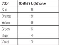
When you take complementary pairs, such as yellow and violet, you get a ratio, in this case 9:3. To make this color combination feel balanced, there must be three times more of the image that’s violet than yellow, as three times three is nine. Red and green is the only complementary combination where you want equal amounts of each to feel balanced.
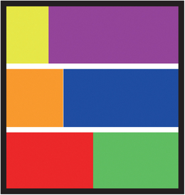
FIGURE 9 Complementary pairs in balanced mixtures.

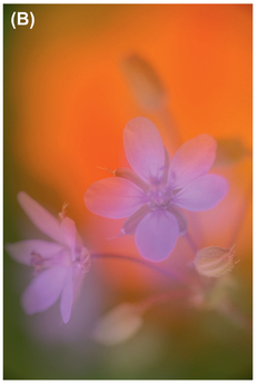
FIGURE 10 Split complementary pairs on a wheel (A) and a sample image with those colors (B).
What’s interesting about these numbers is that they match the energy level that the colors contribute to the overall image. An image with a lot of yellow is far more energetic than a similar image with the same amount of violet.
Three-Color Mixtures
It’s actually quite easy to figure which combinations of three colors work well together by using a color wheel, too. There are two ways to do so, producing different sets of results. The first way is by selecting split complementary colors.
We just discussed how complementary colors, such as yellow and purple, are located across from each other on the color wheel. Select one of those colors, say yellow. Now, select the colors to either side of purple. For this group of three colors, we’ll use yellow, bluish-purple, and reddish-purple. Similarly, if we’d decided to select purple as our initial color, then we would pick the colors to either side of yellow on the color wheel, giving us purple, yellowish-green, and orangish-yellow (Figure 10).
The other way to select combinations of three colors is to draw an equilateral triangle (where all sides are the same length) on the color wheel and rotate it around. The points of the triangle will pick colors that go well together. The main combinations you’ll find this way are red/yellow/blue, orange/purple/green, yellow-orange/blue-green/red-purple, and red-orange/blue-purple/yellow-green.
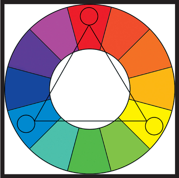
FIGURE 11 Using an equilateral triangle on the color wheel to pick color combinations.
The Color Triangle
Goethe came up with another way to represent colors that helps us pick four or five colors that work well together. That’s the color triangle (sometimes called Goethe’s triangle). As seen in Figure 12, this triangle is formed by putting smaller triangles of the primary colors at the vertices of the large triangle, putting triangles with the additive mixture of those colors between each primary (such as purple between red and blue), and then filling the rest of the space with three further additive combinations (purple and orange give a reddish-brown, green and purple give olive, etc.).
Once you have a color triangle, either pick four colors that make up a smaller equilateral triangle, such as purple, indigo, green, and blue (Figure 13A) or the four triangles that make up
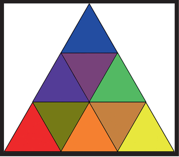
FIGURE 12 Goethe’s color triangle.
one side of the color triangle (Figure 13B), and you’ll have a mixture of four colors that look good together.
To add a fifth color to your palette, pick the color opposite your selection in the color triangle, as seen in Figure 14. This color will stand out against the other hues.
Also keep in mind that, as you add more color combinations to an image, you’re adding to its overall visual intensity. An image with five colors has more energy than one with two colors.
Cool and Warm Colors
Periodically, you’ll hear colors described as cool or warm. If you draw a line right down the middle of the color wheel, as seen in Figure 15, you’ll bisect the wheel into warm and cool colors. Cool colors tend to have a calming effect, although they can sometimes make an image feel
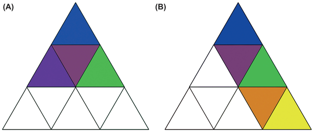
FIGURE 13 Two ways to select four colors that match from the color triangle, either from a smaller triangle (A) or from a side of the larger triangle (B).
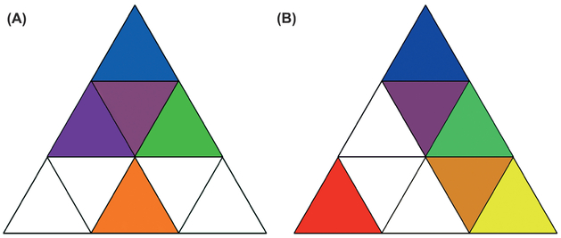
FIGURE 14 Adding a fifth color to your palette using a color triangle.
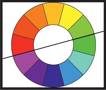
FIGURE 15 Cooler colors are below the line and warmer colors are above it.
impersonal. Warm colors convey stronger excitement, optimism, and even anger. Sometimes, warm colors are called “active” colors and cool colors are called “passive.” Ironically, the actual color temperature of the cool colors— that is the temperature of a black-body source radiating light at a similar hue—is higher than the color temperature of the warm colors.
Interestingly, marketing studies have found that stores painted red or blue are perceived as the most active, and people have a more positive reaction to blue stores than to red. Green and blue colors are usually the most preferred colors, too. Maybe that’s why some people prefer Walmart to Target!
Warm and cool colors also have an interesting effect on our depth perception. Warm colors placed against a cool-colored background appear to come forward. Cool colors appear to recede when placed against warm colors.
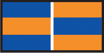
FIGURE 16 The warm orange against blue appears to come forward whereas the cool blue against orange appears to recede.
Visual Effects of Your Color Palette
We’ve discussed how to make colors balanced and find ones that match. However, an unbalanced color or a contrasting color will stand out and add more visual intensity to the image (the amount will vary depending on how extreme the contrast is). For example, a tiny amount of red in a green image is very un bal anced and makes the red part energetic. You’ll almost always want the red item to be your subject, as your eye will go straight to it because of its contrast. The same would be true if you had a tiny amount of green in a red image: you’ll want the green object to be your subject because your attention will go to it.
With a balanced mix of colors, such as red, yellow, and blue, if you add something into that image of a different color, such as something green, it’ll stand out and draw your attention.
If your image has only cool or only warm images, it’ll have a strong overall cool or warm tone. There will still be some contrast between the different tones, but it’ll be much less noticeable than if you add one of the other types of colors, for example adding a warm tone into a cool image. You can pick these hues using the techniques we described previously for finding matching hues, as long as they’re from the other side
FIGURE 17 By not balancing the colors in this image, we make it more visually intense.
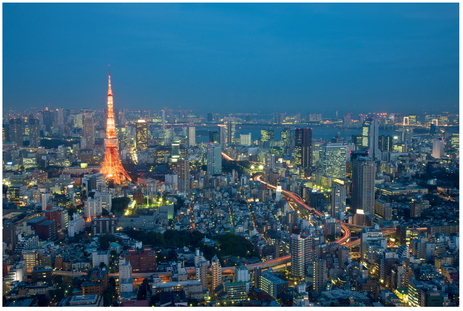
FIGURE 18 Warm hue on a cold image at dusk.
of the warm/cool line. Dusk is actually a very appealing time for city shots because you get warm lights against a cool sky. This is sometimes called “blue hour.”
There are other factors that affect our perception of colors, such as the light we’re viewing it under. For example, a red rose appears bright against the plant’s dark green under
daylight. At dusk, the red appears far darker than the leaves. This is also related to white balance and color constancy, which we discussed in Chapter Two.
Simultaneous Contrast
It turns out that two colors side by side change our perception of the colors. For instance, colors against a black background look more brilliant, as you can see in Figure 19 (colored objects against a black background also appear slightly larger than against a white background). This is another reason that dusk and night-time shots with artificial light are appealing—the subject’s colors appear more brilliant.
Similarly, take a look at the inner squares in Figure 20. The two on the left and the two on the right have the same color, but the surrounding squares affect our perception. The square on the dark background looks lighter than the one on the light background.
What’s going on here is that the inner squares are taking on some of the complementary color of the surrounding hue. As Michel Eugène Chevreul, a French chemist whose research led to the idea of simultaneous contrast, put it, if two colors are placed side by side, each color shifts as if mixed with the visual complement of the contrasting color. A gray square surrounded by red will look slightly more green (the complementary color for red) than if the red weren’t there. In Chapter Two, we discussed why this effect happens in terms of center/surround.
This can be a tricky effect to actually see because your eye tends to make deep reds and blues appear lighter than they are as well as making some yellows and greens seem darker than they are, but in Figure 21, the inner square on the right should appear slightly bluer (the complement of orange).
The effects of simultaneous contrast are most visible when you have a mid-valued, unsaturated color surrounded by a very saturated color.
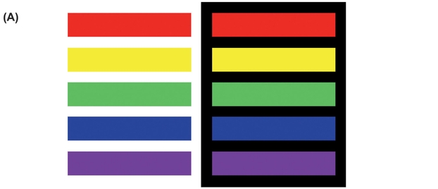
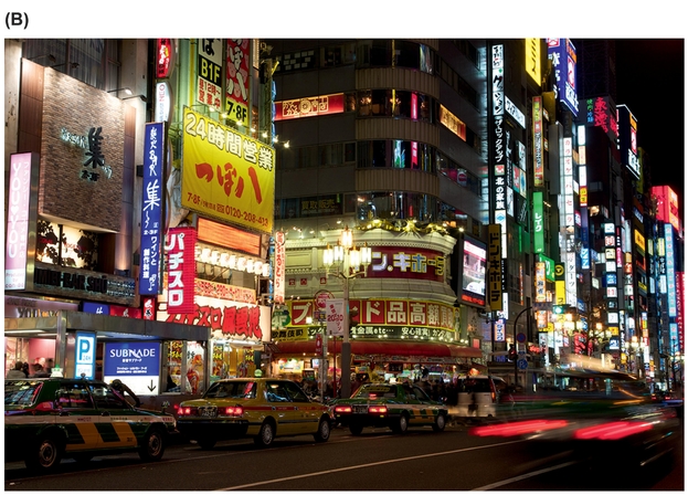
FIGURE 19 Colors against white and black appear to have different sizes and brilliances (A). This is a big reason why night shots are more appealing (B).

FIGURE 20 The inner squares are the same color, but the surrounding color influences our perception.
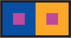
FIGURE 21 The magenta square against orange appears slightly bluer (the complement of orange).
Color Blending
Once in a while, rather than taking on properties of the complementary color, colors appear to blend together. Current scientific thinking is that we have a high-resolution, color-blind form system that determines what something is and a lower-resolution color system that colors in the form (this is similar to the “where” and “what” systems we discussed in Chapter Two). If our brain decides that the colors are part of the same overall form, they’ll blend together.
As you can see in Figure 22, adapted from an example in Margaret Livingstone’s Vision and Art, the colored lines bleed into the background, forming a circle, when the color is close to equiluminant with the background. It seems likely that in this case the “where” or form systems associate the lines with the background more than the other diagonal lines, and the

FIGURE 22 If our brain decides that the colors are part of the same overall form, they’ll blend together such as the lines bleeding to form colored discs.
gestalt-oriented groupings we discussed in Chapter Three cause us to see discs.
Robert Silvers’ Photomosaics® take advantage of this. A photomosaic is a large image (often a portrait) made up of smaller images that, when viewed from a distance, looks like the desired, large image.
By identifying strong illusory borders in the large image and placing small images that create these borders in the mosaic, Silvers takes advantage of our form system so that the colored images within these borders bleed together. As you get closer to the image and the details in the small images become clearer, the form system shifts between identifying the overall form and letting the colors bleed to identifying the individual images. This adds to the visual intensity in the image and helps keep it engaging.
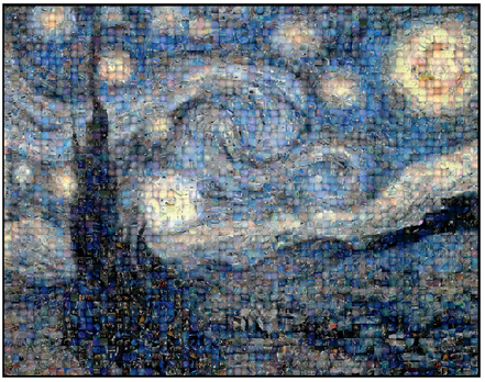
FIGURE 23 A Photomosaic® of aerial- and space-related images by Robert Silvers, www.photomosaic.com.
Black-And-White Versus Color Photography
If color is so great, then why is black-and-white photography so popular? One simple reason is that it removes color as a component completely, removing any visual intensity and extraneous subtext that the color contributed to the image.
If your image is a little too intense, removing the color might put its visual intensity back into the right range. Sometimes after you remove the color you’ll find that you need to increase the intensity in other components, which you often see in black-and-white landscape photos with dramatic skies.
Also, by removing color, any emotional context associated with the colors or interactions between the colors goes away. Earlier, we discussed how color accents draw your attention. If there’s a color accent in the photo, and the accented object isn’t the subject, then switching to black and white can help keep the viewer’s attention away from that object and let you focus it onto the subject through other components.
Color contributes a broader effect to an image, too, as it helps us judge time. Autumn leaves are yellow and red, as opposed to green in the summer. Early morning and late evening light is more golden than midday light. Removing color de-emphasizes time, which is useful if time doesn’t matter to your vision for the photo.
Mark Changizi, in The Vision Revolution, puts forward another interesting idea about why black-and-white photos are
FIGURE 24 The same photo in black and white (A) and color (B). In this case, the color wasn’t contributing anything useful to the image, and in fact the muted colors on this rainy day were lowering the overall energy. Converting to black and white and increasing the contrast helped raise the energy.
appealing. He points out that the way we process color is very simple, and because of that we see similar shades of color in multiple objects; this expands on his idea that we see the colors we do because those are the colors that our blood creates in our skin (as covered in Chapter Two). For example, the red in a ruby gemstone can look like the red of your face when you blush. Therefore, black and white can be said to be a truer representation of an object because any animal, even one without color vision, would perceive the image the same way. Removing the color removes the biases that our color vision system adds to how we perceive the image.
Ignoring the technical details as to why, sometimes black and white just makes an image more appealing, especially when the color’s not contributing anything. Fortunately, with our digital toolkit it’s very easy to experiment with converting an image to black and white. We’d recommend trying it when you have a very intense image and need to lose some intensity, when you have an image with very muted colors that’s almost black and white anyway (such as on a snowy day), or when you want to draw the viewer’s attention more to the lines, shapes, and lighting in the image.
