
THREE
Lines, Shapes, and Textures
Lines and shapes make up the world around us. At its core, every photograph is a juxtaposition of shapes, and those shapes contribute to an image’s visual intensity. Surprisingly, shapes, their placement, and the relation among them also have inherent meanings! By learning about the intensity and meaning that lines and shapes create, we can unlock the door to a new level for composing and critiquing photographs.

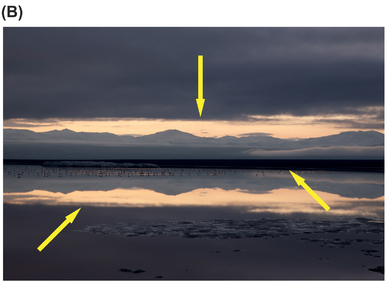
FIGURE 1 Some random lines that we drew, which are really rectangles with a very thin width (A). Arrows pointing at the lines we perceive in an image, at the boundary of two different things (B).
Lines
When you think about a line, you most likely imagine a single stroke across a page. But if you look at a photo, you never actually see a line like that. The reason is that the line you imagine is really a rectangle with a very small width, whereas lines in images are often formed from contrast, where two different things meet. As mentioned in earlier chapters, this is also where our brains are tuned to look in an image, making lines very important to composition.
Lines are also a great first component of visual intensity to look at because they’re simple. Let’s think about a straight line. You can have three types of straight lines, as seen in Figure 2. They can be horizontal, vertical, or oblique.

FIGURE 2 Horizontal, vertical, and oblique lines (graphically, not photo-graphically).
Horizontal lines have the least visual intensity because they appear to be at rest. If you think about when you go to bed or relax, you’re often lying down flat. There’s no real potential energy in these lines. Vertical lines have more intensity than horizontal lines. They’re standing up straight, and we all know that it takes more energy to stand all day than it does to lay in bed all day!
FIGURE 3 A photo made up of horizontal and vertical lines (A) and an image with primarily oblique lines (B).
Vertical lines have the potential to fall down, but because they’re stable they don’t have as much energy as oblique lines. Oblique lines have the most visual intensity because they’re unstable; they look like they could fall over any minute and thus add a sense of action to an image. Zig-zag lines have the most energy, because they’re unstable but also change throughout their length.
In addition to contributing to an image’s visual intensity, different types of lines also have their own emotional meaning, which affects the story we’re telling with an image (more on storytelling in Chapter Seven). Did you ever hear the fashion guideline about how horizontal lines make you look fatter whereas vertical lines make you look taller? The more horizontal a line is, the more it emphasizes something’s width. The more vertical a line is, the more it emphasizes height. You can use this to affect someone’s perception of your image: if you want to make your subject feel very wide, look for horizontal lines!
Straight lines (we’re including zig-zagging lines here) often have a direct quality to them, making them more intense than a curved line traveling in the same direction (compare, for example, a curved horizontal line to a straight horizontal line). Furthermore, because we rarely see perfectly straight lines in nature, straight lines feel more manufactured and artificial than curved lines, which feel more natural and soft. And within curved lines, the greater the curvature the more intense it is. Imagine a small tree in the wind. If it’s only a little windy, the tree will bend a little, creating a slightly curved line. Yet if it’s really windy, the tree will be bent over a lot, and this extra bend creates more visual intensity.
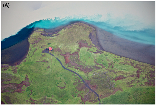
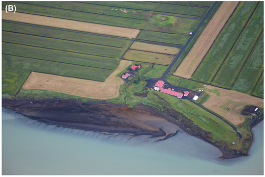
FIGURE 4 In these two similar aerial shots, compare the softer and more natural feeling of the winding road in A to the more manufactured feeling created by the straight boundaries around the fields in B.

As we’ll discuss more in Chapter Five, lines can be used to separate ideas in an image by placing them on opposite sides of the line, or they can be used to connect two ideas by touching both things with the line, creating a visual connection. As a simple example of how a line divides space, think about the ultimate line, the horizon. This line is formed at the boundary of ground and sky and separates the two (Figure 6). Later, you’ll learn that when this imaginary line is in a frame it can affect overall visual intensity as well as helping to determine what’s supposed to be the subject and the background.
Implied Lines
In addition to lines created when two different objects are next to each other, images contain implied lines,
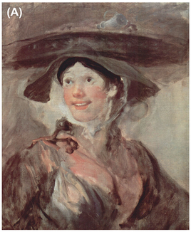

FIGURE 5 Hogarth’s The Shrimp Girl (A) with the line of beauty highlighted (B). William Hogarth, The Shrimp Girl, oils, 1740–1745, National Gallery, London.
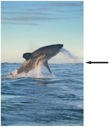
FIGURE 6 The horizon line, indicated with an arrow, divides an image between heaven and earth.
that is, lines that our brains discern when we look at a photo. For example, in Chapter One, we discussed how our brain looks at certain points in a photo, such as faces. When the eyes move between different faces in a photo, an implied line is created, and all of the visual intensity guidelines we just mentioned for lines apply to this line as well. If you’re taking a shot of two people and both are at exactly the same height, this image will be less energetic than one in which the people are shown at different heights. Your brain creates a horizontal line when your eyes travel between faces at the same height, compared to an oblique line when your eyes move between faces at different heights.
What’s arguably the most important implied line in an image is an eye line. We’re really good at figuring out where someone’s eyes are in an image, how the subject’s head is angled, and where their eyes are looking. Eye lines guide our brains to where they should look next (where the subject’s looking) because there’s probably some information there we should know (e.g., “All those people are looking at something, what is it? Oh, it’s a lion sleeping in the grass! We don’t want to disturb it when we’re out hunting for dinner”).
You see this in movies all the time to help make cuts between shots—which are inherently unnatural and jarring—more acceptable. If a character’s looking down and to the left in the first shot, then the subject in the next shot will almost always show up in the lower left part of the frame.
The implied line from the subject’s eyes to where he’s looking contributes to a shot’s visual intensity as well. For example, an eye line that’s flat and to one side is less energetic than one that’s diagonally up and to one side (Figure 7). As a quick preview of a topic in Chapter Five, when an eye line is directed to the side and parallel to your sensor, you’re creating flat space, which has less visual intensity than when the subject’s looking out of the picture toward the camera; in the latter case, you’re creating depth and dimensionality with an eye line (Figure 7).
If you have a moving object in your frame, or something that has a natural direction of travel associated with it, such as a parked car, there’s also an implied line of motion. How’s the object going to move next? As you might have guessed, it’ll have more energy if it’s going to move at a diagonal than if it were to move straight across the frame. Similarly, if it’s going to move towards the camera, it’ll have more energy than if it’s going to move parallel to the camera (Figure 8).
Conflicting eye lines and directions of implied motion can create dynamic tension in a shot, adding energy to it. In Figure 9, the kiteboarder’s passing directly overhead, and the water droplets imply that she’s traveling from right to left. But her eye line is looking down and to the right, the opposite of the direction she’s traveling. That conflict adds intensity to the image.
Shapes
When lines start to bend and connect with each other, they form shapes. Shapes are two-dimensional regions with well-defined boundaries. There are three primary shapes we’re going to address: rectangles, circles, and triangles.
Rectangles have the least visual intensity. They’re very stable, rigid, and well-balanced. Their emotional meaning is rigid and boring as well. Calling someone a “square” means that the person isn’t particularly interesting, and that he likes to stick to the rules and is somewhat formal. However, the stability of rectangles can be comforting. To make a rectangle have more energy, you can tilt it, causing its horizontal and
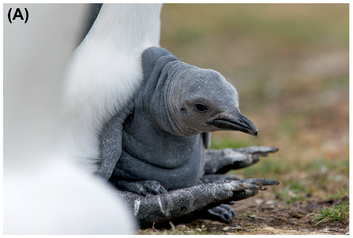
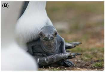
FIGURE 7 An eye line to the side, parallel to your camera’s sensor (A), is less energetic than one going out of the frame toward the camera, creating depth (B).
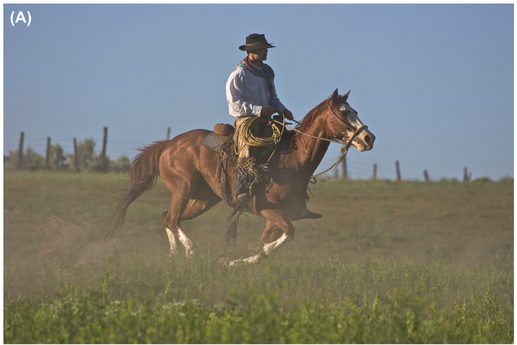
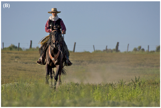
FIGURE 8 In each of these shots, there’s an implied direction of motion. Since (A) has an implied line parallel to the film plane, it’s less energetic than the implied motion toward the camera in (B).
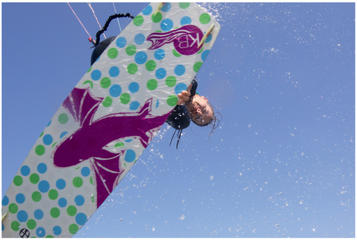
FIGURE 9 A kiteboarder with conflicting implied motion (to the left) and eye line (to the right).
vertical lines to all become oblique. Rectangles also tend to be manufactured and lead to a constructed rather than natural feel in images (Figure 10).
Circles have more energy than rectangles. Whereas a rectangle, like a building, is not going to move, a circle has the potential to move. They also have a very positive emotional appeal. We often tend to draw smiley faces as circles, and we think of rounder people, like Santa Claus, as jollier. We also associate babyish qualities with rounder faces and see rounder people as needing more protection.
Circles are also interesting because they have no beginning or end, and their curves often make them feel more feminine and graceful. We also see circles as safe and providing a sense of grouping and protection from everything outside their boundaries.
In a photograph, you can easily create circles by using a fisheye lens, which makes the whole image circular (Figure 11). In addition, even if your subject isn’t circular, you can imply circles through the curves in bodies and forms in the image.
Triangles have the most visual intensity. One big reason is that triangles typically point in a particular direction, which implies movement. Equilateral triangles, in which all three angles are the same, are the least energetic triangle because they don’t point in a specific direction. Isosceles
FIGURE 10 A primarily rectangular shot with fairly low intensity .
triangles, which have two equal sides and two equal angles, are the most energetic because they strongly imply a direction. Furthermore, triangles can move between being stable and strong (if they’re resting on a base or on a point) and unstable, which creates a dynamic tension. They are often used to express ideas such as growth and progress, as well as conflict, and they’re often seen as a more masculine shape.
Triangles are arguably the most useful shape for photographers because they’re easy to create or imply. For example, if you walk up to a building’s corner, tilt your camera up, and take a picture, bingo, you’ll have a triangle because of how the perspective lines converge. They’re also easy to imply because any three points of interest, as long as they’re not in a straight line, will form a triangle (Figure 12).
You might be reading this and thinking, “Okay, I stuck with you for Chapter One, and Chapter Two did have some neat things about the brain and the eyes. But really? Shapes and emotions? I’m not sure I buy this.” Amazingly, scientific studies, such as one by Irena Pavlova, Arseny Sokolov, and Alexander Sokolov in 2005, have shown that we consistently assign emotions to static shapes. This helps explain why abstract art is appealing. What might at first look like arbitrary shapes can in fact be carefully constructed to evoke emotions. Similarly, in 1988, Aronoff and others discovered that triangles and diagonal lines are far more prevalent in threatening drawings.
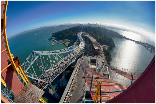
FIGURE 11 A primarily circular shot taken using a fisheye lens. The strong, vertical lines placed near the edge of the frame have been distorted by the fisheye lens into dominant lines that create a circle. The rounded horizon, also due to the fisheye lens, helps emphasize the circular shape.
As another example, part of the reason we associate happy emotions with circles and angry ones with triangles is most likely due to how our faces move when we express emotions. In 1978, a scientist, Bassili, put glowing dots on people’s faces in a dark room. When they put on happy faces the dots expanded outwards, making a more circular shape, and when they made angry faces the dots formed a V-shape.
As crazy as this might seem, there is a lot of scientific research showing that lines and shapes have associated energy and emotion, and even better for photographers, those emotions are consistent across cultures. Viewers around the world will have the same reaction to components in an image.
Joy, Anger, and Stable Shapes
In addition to inherent emotional properties, Pavlova and her colleagues discovered a few other significant correlations between shapes and emotions. First, take a look at the shapes in Figure 13. Which appear to be more fearful or timid?
Pavlova and her colleagues discovered a number of things about emotion and shapes. First, the more unstable a figure, the more likely that we will associate a negative emotion (fear or discomfort) with it. The reverse is not true, though—we’re not likely to say that a stable shape is automatically joyful. And if we see a smiling face in an unstable position, the smiling

FIGURE 12 An image with a strong triangular shape, formed by the bike, that gives it a pleasing overall intensity.
face (compared to no face or a frowning face) won’t make us perceive the shape as more stable.
Furthermore, there are relationships between shapes’ vertical orientation and their associated emotions. For triangles, ovals, and lines, the more vertical the shape is, the more joyful it appears to be. But if we’ve decided that the shape expresses anger, then the less vertical it is, the angrier the shape.
If you think about your body, all of these relationships make sense. If we’re happy or surprised, we jump upright. If we’re fearful, we fall over or need to sit down. And if we’re really angry and shouting at someone, we tend to lean forward a lot, becoming less vertical.
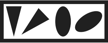
FIGURE 13 A stable and unstable triangle and oval.
A really simple way to think about this, if you have a dominant shape in an image, is to imagine that the shape is a human body—perhaps a ballet dancer who is trying to express something via dance and the shapes her body can create. What emotions would that dancer be conveying? There’s a good chance that another viewer will perceive those emotions in the shape, something that scientists believe is partially due to the mirror neurons we covered in Chapter Two.
Groups and Gestalt
Thus far in this chapter, we’ve primarily been focusing on lines and shapes in isolation. When we put multiple lines and shapes together, our perception of the overall intensity and emotional quality changes. We might also see new shapes— even though the world doesn’t always have clear shapes, our brains sometimes create them.
We’ve already touched on how oblique lines relate to one another, where we start attributing aggressive and passive qualities to each line. It turns out that the emotions we attribute to lines in an image are very similar to the emotions we associate with body language, which makes sense, given that a simple way of representing a person is a stick figure. To step out even further, we need to look at a part of psychology called gestalt psychology.
“Gestalt” is a German word that roughly means “configuration,” and “the whole is greater than the sum of the parts” is often mentioned when discussing gestalt psychology. Essentially, gestalt says that you can’t just look at something as a collection of lines and curves in isolation, but rather you need to look at the entire collection of lines and shapes because the way the pieces are arranged has meaning. In fact emergence, the idea that complex patterns come from simple elements, is a key element in gestalt systems.
Furthermore, our brains have a natural tendency to group things, and the gestalt “laws” help categorize how we group them (the original gestalt theory even stated that forms in our brain mimic various parts of the theory, although since then that part has been found to be mistaken). Gestalt matters for composition because those natural groups will affect the perceived intensity of an image. For example, we might group the objects together into a shape such as a triangle, which is more visually intense than if we grouped them into a rectangle.
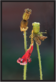
FIGURE 14 What emotions do you attribute to these flower stems if you imagine them as human bodies?
Also, when everything in an image coalesces into an ordered group, the image will lose some of its intensity. For example, take a look at the row of doors in Figure 15. The people breaking up the group of doors add energy to the shot, making it more interesting and providing a point to look at (and more often than not the element that breaks up a pattern will become your subject). Now put your fingers over the people sitting in the doorway. It’s not a bad shot technically, but the overall intensity is too low if we just see a group of doors with nothing breaking it up.
Proximity
The first gestalt law of perceptual organization we’ll discuss is proximity. Simply put, when things are near each other physically, we tend to group them together perceptually, too. For example, in Figure 16, we perceive different overall visual

FIGURE 15 The people breaking up the ordered group of doors makes this image more interesting than if they hadn’t been in the shot.
balances in the image just by moving the circles around. The image with five circles close together and one apart appears to have more energy than the balanced image with two groups of three circles.
To give a more concrete example, take a look at the photograph in Figure 17 of two groups of penguins. Because the penguins on the left are close together and the penguin on the right is away from the group, we see this image as having two distinct groups of penguins and begin associating emotions to each group. You might see the penguin standing by himself as a loner and perhaps as braver than the other penguins.
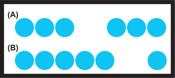
FIGURE 16 Two groups of three circles (A) and a group of five and a group of one (B).
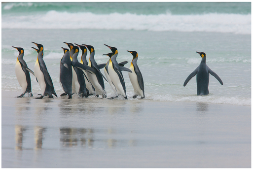
FIGURE 17 We mentally divide these penguins into two groups, the group on the left and the individual penguin on the right.
Similarity
Grouping by similarity means that when we see similar things we tend to group them together. For example, this text is part of a group whereas this text is another group, and your brain created those groups because of the differing typefaces. This is a very common way that our brains group items, as you can see in Figure 18. Even though the entire shot is of sunflowers, we see the larger ones in the foreground as one group and the smaller ones in the background as another.
What’s also interesting is that, even if we see the same item at the same size and color in an image yet slightly different in a minor way, for example how it’s rotated, our brain will see different groups. For example, in Figure 19, we’re looking at two sides of a frond with sand covering each side. The only difference is the angle of each side, but we clearly see two groups, one on the left and one on the right (the stem in the middle further emphasizes this division).
Common Fate
Although “common fate” might sound like something more fit for a crime show or religious text (or maybe some combination of the two), the idea’s simple. If we see things moving in the same direction (or if there’s implied motion in that direction), we group them together. Furthermore, if the moving objects are different (e.g., bird A and bird B) and there’s a similar stationary object in the shot (e.g., another bird A), we’ll group the moving objects together before we group the similar
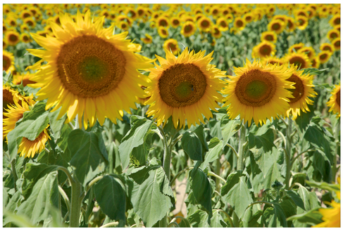
FIGURE 18 The larger sunflowers in the foreground form one group and the smaller ones in the rest of the image create another.

FIGURE 19 We mentally group the parts of this frond together by angle.
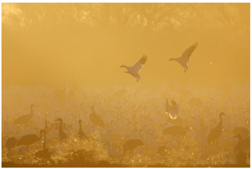
FIGURE 20 Backlit birds in corn dust. We group the two flying to the left together, and see the one flying to the right as a group of one and the stationary birds as another group, even though there are different types of birds within the stationary group.
objects (see Figure 20, for example). Part of the reason for this could be that your brain is performing threat assessment—are the flying birds going to attack me?
Continuation
The gestalt law of continuation relies on our ability to predict trajectories. If we see an object moving in a certain way in a particular direction, we expect it to continue along that course. Our eyes will naturally follow a line or a curve, and we’ll group objects following that trajectory together as a single object, rather than seeing each one as separate.
For example, in Figure 21, rather than seeing two half-circles, we see a continuous sine curve with a line running through it. Similarly, in Figure 22, rather than perceiving multiple parts of the plane’s float and wing meeting in the middle, we perceive a wing and a float.
Closure
Closure is closely related to continuation. Gestalt theory says that we’ll perceive elements that don’t actually exist to create a more regular, closed figure. If we see a shape that’s almost a rectangle or almost a circle but is missing just a few parts of a line, our brains will naturally continue the existing lines and close the shape. This is helpful because it lets us suggest shapes, and the emotion and intensity of those particular shapes will add to a composition, even if those shapes don’t actually exist. In Figure 23, the rainbow and its reflection

FIGURE 21 We perceive this shape (A) as a sine curve interrupted by a line rather than two half-circles (B).
appear to be one curve, even though there’s a mountain in between. Furthermore, even though we only see the right half of the circle formed by the rainbow and its reflection, our brains can mentally compute where the rest of the circle would be. And although the mountain on the right and its reflection is bisected by some greenery, we perceive the connection between the two and create a triangle.
Closure is also interesting because you only need to imply a shape, and our brains will complete it (this is also called amodal perception, when we perceive an entire object even if only part of it exists). A famous example of this is the Kanizsa triangle, seen in Figure 24. We perceive a white triangle on top of three black discs and an outlined triangle, even though the image is actually three discs with wedges cut out of them and three angled lines. This also plays with the idea of negative space (which we’ll discuss more in Chapter Five): the space around a subject can also influence our perception of an image.
Prägnanz
One of the more controversial parts of gestalt theory is prägnanz, which boils down to saying that we prefer solid and “good” forms. This is controversial because it’s tough to define what a “good” shape actually is. We feel a better way to interpret prägnanz is to assume that the simplest explanation or grouping in an image is what your viewer’s going to see. For example, going back to Figure 21, logically it’s simpler that there are two objects overlapping each other, rather than four objects (two straight lines and two semicircles) meeting at the middle. In Figure 25 A, we show a simple, graphic figure, and then 25B, 25C, and 25D all provide possible explanations for what the shapes that make up 25A actually are. Since 25B is the simplest possibility, it’s the one our brain is most likely to infer.

The important take-away here is that, visually, the brain groups parts of images together and creates shapes, such as the circle in Figure 23, even if those groupings and shapes don’t actually exist. Being aware of them lets us perceive larger parts of the image—the results of those groups and shapes—so that we can look at the overall energy in an image.
It’s also important to be aware that conflicting groupings can create dynamic tension in an image, adding intensity to a shot. In Figure 26, there are two penguins on the right, facing right, two on the left facing left, and one in the middle whose body is facing right but whose head is facing left. Since he’s standing a little more to the right, we might initially group him on the right. But since his head is facing left, we might also group him with the two on the left. This tension makes a simple shot of five penguins in a row more intense.
Visual Rhythm
Rhythm is a repeating pattern through time (in music) or in space (more useful for our purposes). Whether you have a repeating individual element, such as the lines in the sand in the Figure 27A, or repeating groups such as the rows of magnets in Figure 27B (and remember, our brains will create groups using gestalt principles, even if we didn’t intend them to be there), it’s important to think about the energy that this repetition adds to an image. Rhythm can be used to add peace and regularity to an image, and it can also be used to help a subject that interrupts the rhythm stand out.
If the rhythm is very spaced out, then it’s a very slow rhythm and has a low energy. If it’s a frequently repeating rhythm, then it has a faster tempo and more energy. But even if you have a rhythm with a fast tempo and a lot of repetition, if it’s completely even

FIGURE 22 A float plane. We perceive the float as a whole, even though it’s interrupted by part of the wing. Similarly, we perceive the wing as a whole, even though only parts of it appear in shot.
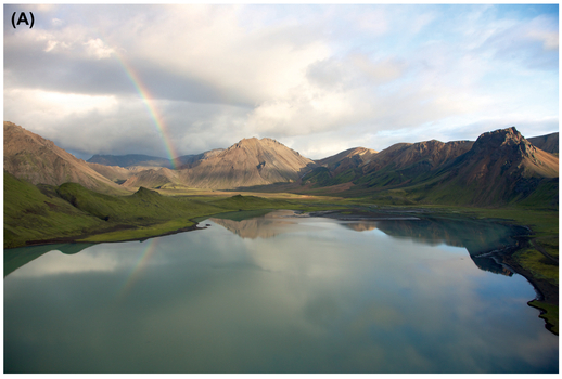
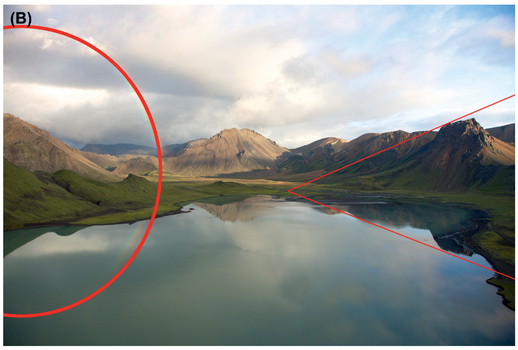
FIGURE 23 Rainbow, mountain, and reflections (A) with the shapes highlighted (B).
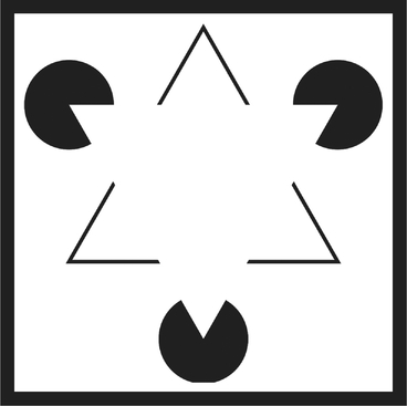
FIGURE 24 The Kanizsa triangle illusion.

FIGURE 25 A sample shape (A) and three possible explanations (B through D) for the shapes we’ve combined to make it.
and regular, it’ll still be lower energy than a shot with an irregular rhythm. For example, imagine a metronome ticking off a constant beat compared to one that skips one out of every four or five notes. The skipping metronome will grab your attention more than the regular one.
However, just having an irregular rhythm doesn’t necessarily create a shot with enough energy to be interesting. Our brains are good at recognizing rhythm, regular or irregular, and what really stands out is something that completely breaks a rhythm. Look at Figure 28 as an example. Here, there’s nothing technically wrong with the image, and we have a regular pattern of coffee cups and filters. They’re also on a diagonal to add more energy to the image. But it’s not a particularly energetic image because the rhythm is so regular. There are three strong beats, and that’s it. This regular rhythm often causes our brains to perceive this type of image as low intensity and not interesting.
Compare this to Figure 29, where we’ve extended the visual rhythm by showing more coffee cups in a row, again along a strong diagonal, but we’ve also interrupted the rhythm with a stream of water pouring into a cup. This interruption adds intensity to the image by creating contrast—we’re breaking up a rhythm—and it gives us a clear subject—the pouring water.
Visual rhythm can also make an image more dynamic by not showing the beginning and ending of the repeating beats. For example, in the shot of an inside of a subway train in Figure 30, because we only see where the handles start but not where they end, and they have a strong and fast visual rhythm, we can infer that they keep going for a long time and that the train car is a lot longer than it actually is. If the visual rhythm suddenly dropped off, and there were very few handles on the right, then it would imply that the end of the train car is just outside the frame. To further enhance this feeling of repetition and endlessness, one or two handles partially visible on the right side of frame would have implied that there were far more handles to the right than we see in the photo.
Texture
When a pattern repeats a lot in an image, the pattern tends to read as a texture, or part of an image that is detailed but comprised of very similar details. Sometimes, this pattern comes from the surface properties of what you’re photographing, such as the rough bark on a tree.
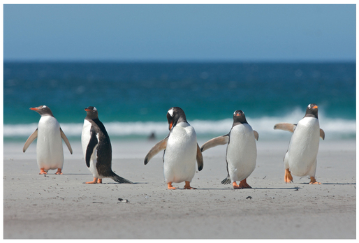
FIGURE 26 Five penguins in a row, with the middle one potentially belonging to either group.
FIGURE 27 Regular lines in the sand create a visual rhythm (A) and regular groups also create a visual rhythm (B).

FIGURE 28 Three strong beats of coffee cups create a regular rhythm.
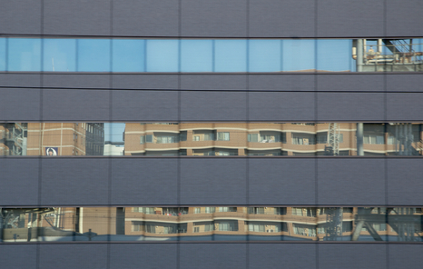
Often when people talk about texture, they only think about an object’s surface. Texture also comes from other high-frequency repetitions when you’re at the right scale. Imagine that you took a wide-angle shot of a very urban city. The buildings and windows would read as texture in the image. Be careful of this effect when you’re photographing a group of repeating elements—if you show too many, the group will read as a texture, and your eyes will skip over a lot of it (e.g., Figure 31). If you get closer and focus on the details making up this pattern, the texture will disappear.
An overall texture will have less visual intensity than if you got closer and saw a small portion of the detail making up the texture. That’s because our brain groups all of this small detail together (“small” depends on the scale of the photo) and treats it as the same thing. But textures can still have high or low intensities, depending on what pieces make up the texture. A texture made up of alternating bright and dark areas will have more intensity than one made up of neutral gray and slightly-darker-than-neutral gray areas. The details of a texture don’t have to be perfectly the same either. As long as the individual pieces are close or related, our brains will group the whole thing into a texture (Figure 32).
Typically, photos of just textures are too low energy and not appealing (although they do make for decent background

FIGURE 29 Pouring water interrupts the visual rhythm of the coffee cups, creating a more intense image.
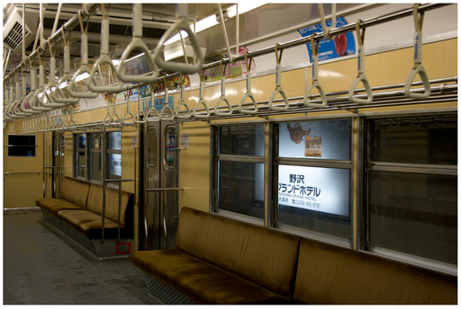
FIGURE 30 Inside a subway car in Japan. The visual rhythm implies that the handles go on for a while, making the car seem bigger.
images on your computer because they’re not very distracting). You’ll usually want something to break up that texture and add intensity to the photo as your subject (Figure 33).
Interestingly, texture and our implicit desire for gestalt-style groupings can also create depth in an image. We sometimes perceive two separate textures overlapping each other rather than a single overall texture, as in Figure 34.
In future chapters, we’ll discuss gestalt theory in more detail. For now, you should have a good understanding of the energy and emotions that lines and shapes contribute to an image, as well as how we perceive their interactions.

FIGURE 31 Your eye skips over a lot of this city detail, reading it as a texture.
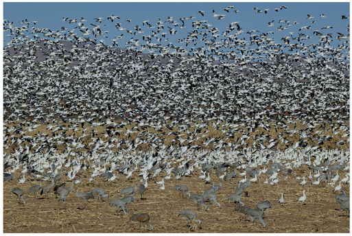
FIGURE 32 There are many birds flying in different ways in here, but we still read them all as one texture.

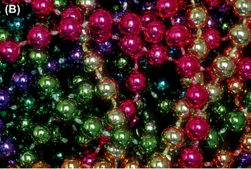
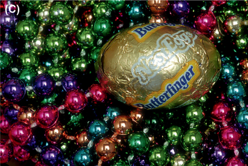
FIGURE 33 With both regular (A) and irregular rhythms (B), these beads just read as a texture. We need something to break the texture up and become the subject (C).
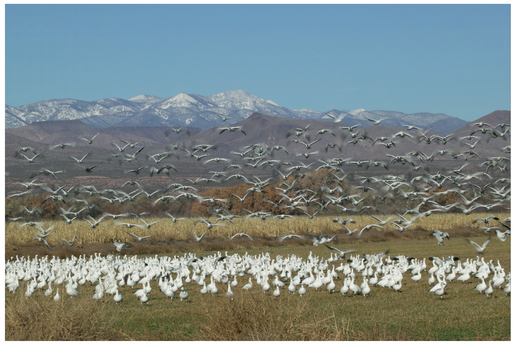
FIGURE 34 We perceive multiple different textures in this image (white geese in front, geese in the sky, corn in the distance, trees in the distance), and the overlap of different textures adds depth to the image (the flying geese are in front of the corn).
