23
Son e(s)t Lumière
A word that is often used when discussing music is ‘intangible’. As we are not able to see or touch sound in the same way we can with the visual or plastic arts, there is a tendency to regard music as being a distinct, even separate, art form. However, there are of course many means available to manifest sound and thereby reduce this inherent intangibility. Oscilloscopes, VU meters, wave editors and spectrum analysers all provide unique ways to peer ‘under the hood’ of sound and understand better its inner intricacies and nature. For composers, especially those utilising recorded or electronic sounds, such means are an invaluable aid to the creative process, enabling us to shape and sculpt materials in great detail.
The act of visualising the ‘intangible’ in this way is not only an aid to creativity but is also an act of creation in and of itself. Visual artists, particularly in the last couple of centuries, have often been inspired by musical works. Henri Fantin-Latour created a series of lithographs in the 1870s in tribute to the music of Hector Berlioz. Marc Chagall’s ceiling at the Paris Opera contains elements inspired by no fewer than fourteen operas, including Mozart’s The Magic Flute, Mussorgsky’s Boris Godunov, Ravel’s Daphnis and Chloe, Tchaikovsky’s Swan Lake and Wagner’s Tristan and Isolde. Tom Walker’s The Mystic Image is an ambitious sequence of paintings inspired by Charles Tournemire’s fifteen-hour cycle of organ music L’Orgue Mystique. German architect and designer David Mrugala, whose work is largely rooted in generative art, has created pieces that visualise examples of pop and electronic music – through, for example, a real-time analysis of their dynamic or pitch content – as well as more abstract forms such as the rising frequencies of a sine tone sweep and astronomical data recorded by NASA.1 Creative visualisations of this kind are not limited to sonic sources. Data scientist Martin Krzywinski is well known for the striking, attractive visualisations he has made of, among other things, irrational numbers – most famously, π – created with the primary aim of transforming data into something beautiful.2
It is generally less common for such methods as these to be practiced the other way round, utilising visual sources as the means to musical ends. Conceptual artist James Whitehead (who works under the name JLIAT) took inspiration from the imagery in film footage of US nuclear tests in the Pacific to create his four Bikini tests. Part of Whitehead’s ongoing exploration of the definition, nature and interpretation of noise, these works artificially recreate the sonic experience of the nuclear tests, Whitehead imagining “the scene, beach, waves, slight breeze, then the aircraft… followed by the explosion”.3 To the uninformed listener, one could plausibly believe these pieces to be authentic field recordings, and whether or not they are viewed in conjunction with the film, the Bikini tests constitute what we might call a ‘creative sonification’ of the film footage.
Clarence Barlow’s fascination with links between sound and image has led to many compositions where visual sources are sonified. The two movements of his 1998 piano work Kuri Suti Bekar are each derived from what Barlow describes as ‘sonic translations’ of images related to the work’s dedicatee, Kristi Becker: her name written in Japanese Katakana script and a scanned photograph of her face. More ambitiously, in his Le loup en pierre (2002), composed for the two organs in St. Peter’s Church in Leiden, the opening of the work is derived from a sketch of the church that Barlow mapped to the keys of the organs in order to sonify the image (Figure 23.1).
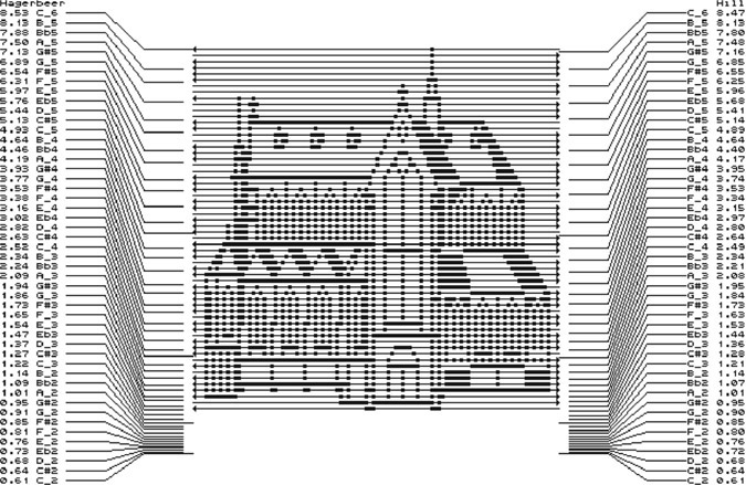
Figure 23.1
Clarence Barlow – Le loup en pierre: overview of pitch-mapping from the image to the two organs.
Yet more intangible, sound artist Christina Kubisch’s music uses otherwise invisible electromagnetic waves as the basis for sonification. In works such as La Ville Magnétique (2008) and Seven Magnetic Places (2017) part or all of the musical material is derived from recordings made from converting these signals into sound. Throughout her career she has extended this process to real-time acts of composition in which listeners wear magnetic induction headphones to make the electromagnetic waves audible. Her numerous ‘Electrical Walks’ involve the following of a pre-planned route around various town and city centres, and her most recent work Weaving (2019) is a gallery installation piece picking up waves from nearby sources in downtown Oslo (Cummings 2019b).
In more conventional audiovisual works the hierarchical relationship between its visual and musical aspects is often one of, at best – from the perspective of the music – equal significance. Jaroslaw Kapuscinski describes his work as “sculpting audiovisually” to the end of creating “structurally integrated intermedia works, in which sounds and images are given equal importance and are developed either simultaneously or in constant awareness of each other” (Kapuscinski 2008: 11’15”). However, even when the relationship is nominally equal, it is not uncommon for the visual to take precedence. Ryoji Ikeda’s formula and datamatics [ver. 2.0] are two cases in point: presented cinematically, the large screen unavoidably places increased emphasis on the visual.4 While the majority of Ikeda’s output is not audiovisual, almost all of his albums sonically imply a fundamental connection to, or even a derivation from, complex datasets that could be similarly visualised. Likewise, Christian Ludwig’s pioneering ‘oscilloscope music’ can only be appreciated fully when viewed – as the name implies – through an oscilloscope, revealing the visual component created by the sound. Indeed, it could be argued that in this context the music, though highly engaging on its own terms, is ultimately at the mercy of the visual, being carefully composed in order to create interesting visual patterns and images. Further still, composer Nell Shaw Cohen has written of her suspicion of creating sounds “with an abstract or imperceptible connection to their source material”. She has therefore instead sought to subju-gate the role of music, conceiving it “expressly for the purpose of illuminating, commenting upon, and conversing with visual art” (Cohen 2015). As such, it is vital to the concept of Cohen’s pieces that the associated visual art is clearly displayed to the audience.
Instances of works in which this hierarchy is reversed – where the sound is of greater importance than any associated visual source – are very much less prevalent. They tend to be presented more as scientific rather than artistic creations, with reduced emphasis on their status as music than on being the product of a process. The clear implication in such instances is that they should be regarded as being more creatively passive: sound as the product of research rather than sound as a creative work of musical art.
This is well exemplified by works originating in datasets. Carsten Nicolai’s 2008 album Unitxt concludes with a collection of miniature tracks created by converting the content of data files, from familiar programs such as Microsoft Word, Excel and PowerPoint, into short-lived streams of rapidly shifting noise. Though fascinating in their own right, the very short durations of these pieces lends them the distinct impression of being tiny ‘novelties’ tacked onto the end of the album. Astronomical data sent back by the Voyager I and II probes has been regularly sonified since the late 1970s. Originally developed by Frederick L. Scarf as a means to make science more tangible to the public (Fisk 1989), these recordings have been collected and released on various occasions. The most extensive of these is the Voyager Space Sounds album series by Jeffrey Thompson which, quite apart from under-emphasising its musical qualities, even downplays the recordings’ scientific aspects, instead marketing them as a New Age holistic ‘remedy’.5
Music that employs sonification with more demonstrable creative intent has tended to inhabit the periphery of compositional practice. Prominent examples, such as the Oramics system by Daphne Oram and Iannis Xenakis’ UPIC – both techniques turning pre-drawn designs into sound data – have failed to acquire significant followings and are largely regarded as individual oddities. In the digital age, software developments in this area have produced modern equivalents of the Oramics and UPIC models (IanniX6 and HighC7 are both designed as direct descendants of the latter), rendering image data into sonic parameters. These programs have been similarly marginal, and in many cases are essentially the product of a single individual, including Rasmus Ekman’s Coagula,8 Kenji Kojima’s RGB MusicLab,9 Michael Rouzic’s Photosounder,10 Nicolas Fournel’s Audiopaint11 and Olivia Jack’s browser-based PIXELSYNTH.12
All of the aforementioned musical examples use abstract sources as the basis for their sonification. Use of specific, identifiable images to create sound material is relatively rare. One particularly well-known example is by British musician Richard D. James (better known as Aphex Twin), whose 1999 EP Windowlicker features two such sonified images. The title track includes a brief spiral at its end, acting as a transition into the following track, the title of which is generally referred to as ‘formula’.13 One of James’s most avant-garde creations, ‘formula’ culminates with an episode created from an image of his own grinning face (Figure 23.2). The sonic effect is deliberately unexpected and jarring; hitherto, ‘formula’ has been heavily beat-based and regular, but during this concluding episode becomes suddenly and unsettlingly abstract and amorphous.
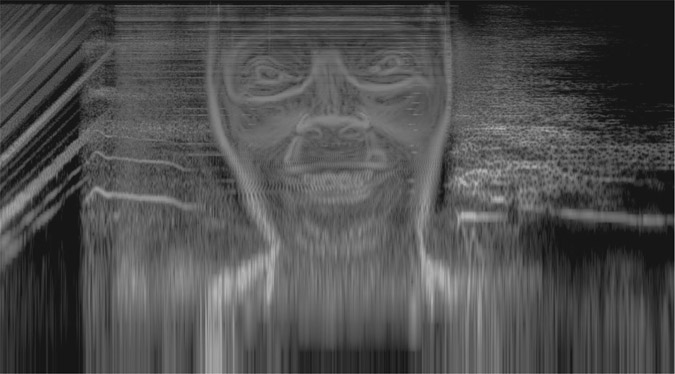
Figure 23.2 Spectrogram of the conclusion of Aphex Twin’s ‘formula’.
Comparable in approach is Venetian Snares’s ‘Look’, created from photographs of cats owned by its composer, Aaron Funk (Figure 23.3). The final track on Funk’s 2001 album Songs About My Cats, the soundworld created by this sonification is once again completely distinct from the mixture of drum and bass and synthetic instrumental music that precedes it.
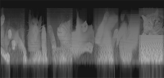
Figure 23.3
Spectrogram of Venetian Snares’s ‘Look’.
Similar but less striking instances can also be found in isolated tracks by Plaid, who used a sequence of interconnected number threes in ‘3 Recurring’ (1999), and Nine Inch Nails, who inserted the appearance of an ominous hand (referred to as “the Presence”) in their 2007 song ‘The Warning’.
A more substantial example can be found in the soundtrack to the 2012 video game FEZ by Rich Vreeland, who composes under the name Disasterpeace. The game includes a number of secret elements, and Vreeland mirrored this by embedding various shapes and images – including the photograph of Neil Armstrong’s footprint on the moon, a human eye, the portrait by Greta Kempton of US president Harry S. Truman, Salvador Dali’s painting Crucifixion (Corpus Hypercubus), a smiley face and a QR code containing a sequence of numbers – within the opening or closing moments of many parts of the soundtrack (Figure 23.4).
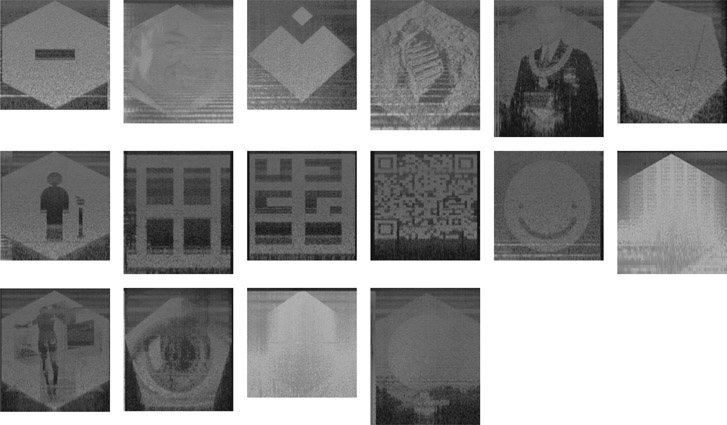
Figure 23.4 Spectrograms of the sonified images found within the audio of Disasterpeace’s FEZ soundtrack.
In contrast to the previously discussed examples, where the use of sonification was contextually highly distinct and conspicuous, Vreeland keeps these images secret from the listener by rendering them at an almost inaudible level. They can therefore only be clearly discerned by viewing spectrograms of the audio.14
This is indicative of the broader fact that, in all of these examples, sonification is arguably employed principally as a playful gimmick that seeks less to create material with significant compositional potential than to present the listener with a strange sonic novelty. This is reinforced by the fact that the use of these sonified images is restricted to a very brief, either highly contrasting or virtually undetectable, appearance within a single composition. Furthermore, the technique is not explored anywhere else in their respective artists’ output. While Vreeland’s FEZ soundtrack uses it more extensively, as discussed its results are not intended to be clearly audible. As such, sonification is utilised as a form of mischievous sonic steganography, akin to the practice of backmasking on vinyl records by numerous bands from the 1960s onward,15 or otherwise hidden messages such as the Morse code contained within Mike Oldfield’s Amarok.16 The relatively trivial creative attitude towards sonification in these examples is echoed by Madeline Mechem’s journalistic response to them; the conclusion of her otherwise ostensibly enthusiastic and encouraging overview of the technique advises potential listeners, “Don’t listen to the sound files – unless you just enjoy weird, dial-tone-like static sounds” (Mechem 2015).
Attempts to obviate the unconventional nature of such sonified images have tended to be articulated by a simplified retreat to the conventions of historical tonality, restricting the output to traditional pitches, scales and modes. In their research into image-based composition, Wu and Li were guided by how “pleasant” or “smooth” the results sounded, eschewing chromaticism in favour of the “stability and popularity” arising from ‘melodic anchoring’ within the tonal hierarchical confines of major scales (Wu and Li 2008: 1346–1347). Maria Mannone’s so-called Tridimensional Music takes a similarly simplified approach, heavily quantising both its pitched and rhythmic elements in her transformations of images into sound (Mannone 2014). Such basic approaches to sonification have attained minor popular interest and appeal, culminating in the naïve, optimistically named ‘Glorious Midi Unicorn’ by YouTuber Andrew Huang (Mufson 2017).
My own work with sonification, while methodologically related to some of these aforementioned examples, is ultimately distinct from them. My primary interest in this area is to create self-contained musical compositions that are fundamentally informed, and both macro- and microstructurally determined, by an intermedia relationship with existing visual stimuli, articulated – at least, initially – via sonification.
Sonification is a natural development and extension of my existing approach to composition, which in the early stages involves a great deal of previsualisation. A major aspect of my compositional research is the use of discretely defined musical behaviours (Cummings 2017), and these are invariably designed via sketches in which their small- and large-scale activity is visualised. These sketches illustrate an overview of the nature of the behaviour in relation to an implied x/y-axial arrangement, where the x-axis acts as a timeline above which the behaviour’s details are shown. Figure 23.5 shows three such visualisations used in the composition process of my large orchestral work Cloud Triptych (2016).
Figure 23.5
Visualisation sketches of musical behaviours used in Cloud Triptych.
Sonification was first utilised in my work in Triptych, May/July 2009 (2009).17 Inspired in part by the triptychs of Francis Bacon, the piece was composed as a homage to my late father, and as such I had wanted to ‘embed’ him into the firmament of the music in some tangible way. To that end, I experimented with designing the time-pitch structure of the work’s three movements using modified versions of a digitised photograph of his face (Figure 23.6). One version focused on sparseness, intended to create a vague and elusive soundworld for the outer movements ‘Figment’ and ‘Vestige’, the other on saturation, designed to generate a complex noise environment which forms the basis for the work’s central panel, ‘Icon’.

Figure 23.6 The original photograph of my father together with the two modified versions used to create Triptych, May/July 2009.
The immediacy of creating an equivalence between light distribution across an image and sound distribution over time establishes the image as a kind of ‘graphic score’. Daphne Oram saw her own work using the Oramics system as comparable to this. Furthermore, Oram regarded having such a complete sonic overview of a composition as this as highly beneficial, noting that it “gives an easily comprehended, permanent, visual account of the music” (Oram 1972: 102). In his work with what he calls ‘phonographics’ (a 16-synth microtonally tuned MIDI system), French composer Vincent Lesbros has echoed this sentiment, particularly with regard to the capacity such image-sound equivalences afford the composer to devise and organise both large- and small-scale musical details: “Graphical representations of sound offer a global view, and thus help organise a composition’s temporal structure. One advantage of such a representation is that a simple zoom on the score image becomes a bridge between the macrostructure and the microstructure of the composition” (Lesbros 1996: 59).
Since 2014, I have been exploring further the creative possibilities of sonification in an ongoing series of electronic Studies. While these build on my previous work with both sketched behavioural visualisations and sonified images, they were especially inspired by examples of Op art and pattern-based generative art, in particular the work of Bridget Riley and David Mrugala.
Study No. 1 (2014)18 was the product of experimenting with Riley’s 1964 work Blaze (Figure 23.7). In order to clarify the work’s dense zig-zag arrangement, these were alternately separated to the left and right channels. Interestingly, the resulting network of concentrically spiralling sliding bands produced a curious aural effect akin to the optical illusion in the original artwork, with pitches shimmering or juddering against each other either within a single channel or apparently moving between channels. This uncanny effect – an example of what might be termed ‘Op music’ – was unexpected and, even when subsequently scrutinised, is hard to explain.

Figure 23.7 Bridget Riley’s Blaze and the sonogram of Study No. 1.
Encouraged by the results of this piece, several subsequent studies also utilised radial designs, based on pieces by David Mrugala (Figure 23.8). These were approached in a similar way to Study No. 1, exploring how concentric layers clarify, obfuscate and otherwise impinge on each other (No. 3 [2015] and No. 4 [2014]) or directing shafts of tapering pitch towards and away from a central point, in the process accreting varying quantities of noise (No. 5 [2014] and No. 6 [2017]).19
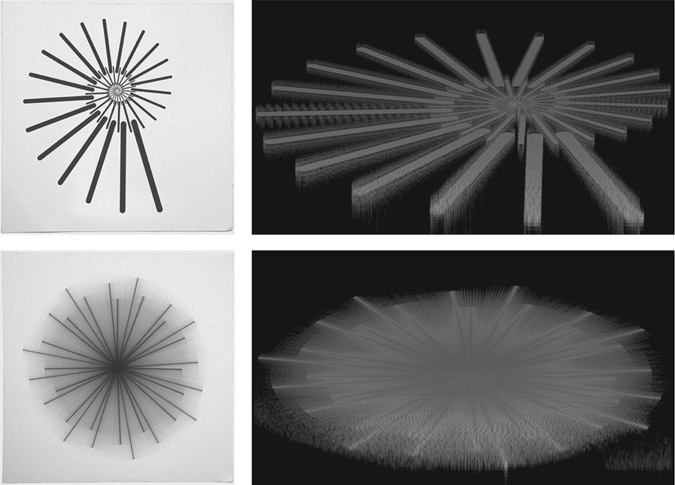
Figure 23.8 Generative images by David Mrugala and the sonograms of Studies No.4 (top) and No. 6 (bottom).
One of the key musical aspects that these early studies clarified was the importance of positioning within the stereo field. The sonifications were created using the program Coagula, which assigns a stereo position to each pixel according to its RGB light value, on a continuum from red (left) through yellow (centre) to green (right). Therefore, to create the material for these pieces, the images were first edited such that their values were either purely red and green (as in Study No. 1) to create a hard, polarised stereo, or including yellow in order to introduce a third, central, channel to the stereo field.20
This discrete positioning has been harnessed as an integral element in the structure of many of the studies. No. 9 (2015),21 another radial design based on an image by David Mrugula, features a gradual progression from mono (centre) to stereo (left/right) as its frequency range expands and contracts, engineered through a colour gradient from yellow to red/green. No. 10 (2016)22 sets up a polarised left/right environment within which a separate, abstract idea occupies the centre channel. No. 24 (2017)23 does the opposite, using the faintest parts of Jeffrey Earp’s circuit diagram-like image ‘Downtown Dreaming’ as the basis for an austere centre-channel backdrop. Left/right stereo chords, created from the more vibrant parts of the image, extrude outward from this. Experiments have also been made with a few of the Studies in four- and eight-channel arrangements, or using a wider variety of RGB colour combinations to enable more fine positioning within the stereo field. At the opposite extreme, several of the Studies are monaural pieces, exploring the extreme intimacy arising from the use of just a single channel.
That these Studies exhibit engaging compositional structures and unifying behaviour has been aided in part by the use of images that possess an overall quasi-symmetric design with consistent elements. However, images that are more abstract and unpredictable in character have also been explored. No. 2 (2014)24 is based on David Lemm’s ‘One’, which was specifically chosen for its diverse combination of straight and curved lines, large amorphous forms and scattered minutiae. When sonified, these elements become extended drones, bursts of noise and sporadic pitch chatter (Figure 23.9).

Figure 23.9 David Lemm’s ‘One’ and the sonogram of Study No. 2.
No. 8 (2015)25 is a composite study in which two images, one geometric and one abstract, are superimposed. The abstract image, by Justin Lincoln, becomes akin to a series of fireworks being set off within the hollowed-out centre of a fierce wall of noise, based on another of David Mrugala’s geometric generative images. The juxta-position in No. 1026 is more combative, the abstract element – sonified from a painting by Zachariah Rieke – being designed to aggressively complicate and confuse an already disintegrating pattern of rhythmic and behavioural order, created from a geometric image by Refik Anadol (Figure 23.10).
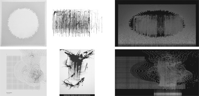
Figure 23.10 Source images and the sonograms of composite Studies No. 8 (top) and No. 10 (bottom).
More recent Studies have explored the potential of larger-scale, ambient-influenced structures. No. 16 (2016)27 uses an untitled painting by A. J. Fusco as the basis for a 13-minute journey through semi-fixed drones. At different rates these drones gradually expand and contract, in the process obfuscating their pitch content and merging to form complex, noisy but resonant epicentres. No. 19 (2016)28 undergoes a conceptually similar but altogether less-defined process, using an image by Victoria Burge to navigate an abstract procession through large-scale shifts in registral emphasis and timbral quality. A woodcut by Lee Ufan was used as the starting point for No. 22 (2016),29 emerging from a dense wall of noise into a spacious world where extruded pitches float freely beside each other. In this environment, the music establishes a ‘steady state’ (Cummings 2019a), producing a continual slow shift in the nature of its harmony. Though all three of these studies contain or attain high points of intensity, they are fundamentally restful, even peaceful works, in which the beauty of their slowly evolving materials is allowed to linger and dominate the composition. With a dramatic interplay of pitch and noise these pieces exhibit the unique combination of quasi-stasis and gradual flux that typifies ambient music (Figure 23.11).
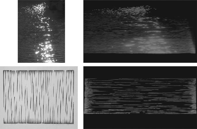
Figure 23.11
Source images and the sonograms of Studies No. 19 (top) and No. 22 (bottom).
When composing Study No. 1, the urge to impose my compositional ‘voice’ onto the raw output created from the sonified Bridget Riley image was strong. Ultimately in that case and some others, the urge was resisted. This was in part an acknowledgement of the fact that the process had already involved considerable creativity, in terms of choosing a potentially suitable image and then editing it in preparation for sonification. This was done in conjunction with often extensive trial-and-error experiments to understand better the sonic implications and ‘language’ of the image, in order to discover the most compositionally appealing combination of duration, frequency range and stereo positioning.30 In many of the later Studies, the sonifications have been merely the first step in a longer composition process, providing material to be subsequently worked on further. But in all cases they have highlighted the fundamental importance of personal creative thinking to the musical success of this practice.
However, research in sonification has often sought to introduce notions of objectivity. This has primarily focused on establishing associations or even parallels between visual elements and musical parameters. Alan Wells has suggested a correlation between colour and harmony (Wells 1980), José Luis Caivano between luminosity and loudness (Caivano 1994), while Woon Seung Yeo and Jonathan Berger’s work with sonification has led them to propose a parallel between human image perception and the method by which an image is sonified (Yeo and Berger 2005).
Away from the field of research, from the perspective of music composition, correlations of this kind are inherently problematic. The term ‘sonification’ aptly describes one particular aspect of this creative process, but other terms – some musical, some not – are equally relevant. The act of creating a musical rendition of a non-sonic original is a clear form of transcription, while the appropriation and repurposing of extant material is suggestive of arrangement. Furthermore the transformation of an image into sound data can be likened to conversion, and the inter-media movement from one discrete art form to another is an example of translation.
Regardless of which terms are used, their accompanying processes can certainly be automated, though the mechanisms and criteria for those processes must by necessity be subjective, the product of imagination, interpretation and creativity. In a musical context, therefore, efforts to obviate creative input and make sonification ‘objective’ seem entirely incongruous. Kapuscinski and Sanchez’s work developing the Counterlines intermedia setup led to the same realisation. They concluded that, while “there are many parameters in music that can be represented in numbers”, their algorithmic mapping method was “maybe logical but not very expressive. Such techniques can reveal interesting, musically relevant, and at times highly sophisticated information but it is always reductionist and serves better the purpose of analysis than creation” (Kapuscinski and Sanchez 2009: 225). Bob L. Sturm’s work sonifying ocean buoy data reached a similar verdict. Drawn by the “inherent beauty and characteristic qualities of the sonifications” to explore composing with them, Sturm found that “expressive large-scale structures do not come from within the datasets. The responsibilities of the sonification artist are much different than those of the composer. It takes a creative hand to fix the material into effective musical forms. The sound material provides only a palette of colours and sensations with which to paint” (Sturm 2005: 148). Martin Krzywinski, similarly considering how data can be made beautiful, states that, “I think that comes down to the individual artist. There are objective aspects of what people find attractive, but then there’s also the personal expression. This is what I like to see, and this is what I create, and this is how I express myself. And you may like it or you may not, like any other artist. […] My approach is to keep working at it until I no longer think it’s ugly. I don’t quite know how to make it beautiful, but I know when it’s still ugly to me, and I just keep plugging away at it until that sense stops” (Krzywinski 2014: 11’45”).
In conclusion, it is worth briefly considering the implications of image appropriation on originality. To what extent is a composition that has been substantially created through sonification an original work of art? Due to the considerable subjectivity of the overall process and the complex crossover of implications arising from its multifaceted identity as a work involving elements of transcription, arrangement, conversion and translation, together with the plethora of creative decisions that are unavoidably required at every stage, it is easy to argue that compositions of this kind are highly original. This is consolidated by the fact that the connection between the music and the image from which it sprang is broken, or at least rendered moot. It is by no means obvious that such compositions began life in the form of a visual image.
With the image absent – not only not visible but, potentially, its existence not even implied – such sound materials therefore no longer exist merely as sonifications but transcend their origin. They are thus perceived via what Pierre Schaeffer described as ‘reduced listening’ (Chion 2009: 30), and thereby become conventionally acousmatic. As such, the sonifications can be regarded as something of a parallel to the Schaefferian objet sonore, being “perceived as a whole, a coherent entity, […] which targets it for itself, independently of its origin or its meaning. […] It is a sound unit perceived in its material, its particular texture, its own qualities and perceptual dimensions” (Chion 2009: 32). Heard in their own right in this way, sonified images act as not so much a sound object as a sound structure. These structures help visualise, make tangible and articulate a composer’s large- and small-scale creative intentions, thereby becoming the basis for original, personal and powerful works of sonic art.
Bibliography
- Arblaster, S. (2016) The Noise of Art: Pixelsynth Can Turn Your Images into Music for Free. Music Radar. Available online: www.musicradar.com/news/tech/the-noise-of-art-pixelsynth-can-turn-your-images-into-music-for-free-638423 [Last Accessed 25/06/19].
- Barlow, C. (2008) Musica Visualis: On the Sonification of the Visual and the Visualisation of Sound. Proceedings of the Systems Research in the Arts and Humanities Symposium. pp. 38–42.
- Ben-Tal, O.; Berger, J. (2004) Creative Aspects of Sonification. Leonardo. 37. pp. 229–233.
- Caivano, J. (1994) Color and Sound: Physical and Psychophysical Relations. Color Research & Application. 19(2). pp. 126–133.
- Chion, M. (2009) Guide to Sound Objects: Pierre Schaeffer and Musical Research (trans. J. Dack; C. North). Available online: www.ears.dmu.ac.uk.
- Cohen, N.S. (2015) Music Inspired by Visual Art. New Music Box. Available online: https://nmbx.newmusicusa.org/music-inspired-by-visual-art/ [Last Accessed 24/06/19].
- Cox, C. (2011) Beyond Representation and Signification: Toward a Sonic Materialism. Journal of Visual Culture. 10(2). pp. 145–161.
- Cummings, S. (2017) Cloud Triptych: An Exploration of Stochastic Movement between Discrete Musical Behaviours. PhD Thesis, Birmingham City University/Birmingham Conservatoire.
- Cummings, S. (2019a) The Steady State Theory: Recalibrating the Quiddity of Ambient Music. In: M. Adkins; S. Cummings (eds.) Music Beyond Airports: Appraising Ambient Music. University of Huddersfield Press.
- Cummings, S. (2019b) Ultima 2019 (Part 2). 5:4. Available online: http://5against4.com/2019/09/20/ultima-2019-part-2/ [Last Accessed 07/11/19].
- Dachis, A. (2011) How to Hide Secret Messages and Codes in Audio Files. Lifehacker. Available online: https://lifehacker.com/5807289/how-to-hide-secret-messages-and-codes-in-audio-files [Last Accessed 07/11/19].
- Fisk, L. (1989) Obituaries: Frederick L. Scarf. Physics Today. 42(9). pp. 116–118.
- Huang, A. (2017) Glorious Midi Unicorn. Available online: www.youtube.com/watch?v=i3tiuGVDDkk [Last Accessed 07/11/19].
- Ikeda, R. (2002) Formula. NTT Publishing.
- Kahney, L. (2002) Hey, Who’s That Face in My Song? Wired. Available online: www.wired.com/2002/05/hey-whos-that-face-in-my-song/ [Last Accessed 24/06/19].
- Kapuscinski, J. (2008) Composing with Sounds and Images. Available online: www.youtube.com/watch?v=uyWYAcvwPOg [Last Accessed 25/06/19].
- Kapuscinski, J.; Sanchez, J. (2009) Interfacing Graphic and Musical Elements in Counterlines. ICMC 2009. pp. 222–225.
- Killham, E. (2012) The Fez Soundtrack’s Hidden Images and How They Got There. VentureBeat. Available online: https://venturebeat.com/2012/04/23/fez-hidden-images/ [Last Accessed 24/06/19].
- Krzywinski, M. (2014) The Art of Data Visualization, Design & Information Mapping. Available online: www.youtube.com/watch?v=mS8Q5_sZYH8 [Last Accessed 07/11/19].
- Lesbros, V. (1996) From Images to Sounds, a Dual Representation. Computer Music Journal. 20(3). pp. 59–69.
- Licht, A. (2009) Sound Art: Origins, Development and Ambiguities. Organised Sound. 14(1). pp. 3–10.
- Mechem, M. (2015) How Musicians Put Hidden Images in Their Songs. Mental Floss. Available online: http://mentalfloss.com/article/61815/how-musicians-put-hidden-images-their-songs [Last Accessed 24/06/19].
- Mannone, M. (2014) Tridimensional Music. Available online: www.youtube.com/watch?v=Kle1AzsljiE [Last Accessed 07/11/19].
- Mufson, B. (2017) The Internet Is Freaking Out over This Song Made from a Unicorn Drawing. Vice. Available online: www.vice.com/en_us/article/nz9e98/andrew-huang-unicorn-drawing-song-incredible [Last Accessed 07/11/19].
- Niinisalo, J. (2002) The Aphex Face. Available online: https://web.archive.org/web/20020604013443/www.tp.spt.fi/~cleth/projects/aphexface/index.htm [Last Accessed 24/06/19].
- Oram, D. (1972) An Individual Note of Music, Sound and Electronics. Galliard Paperbacks.
- Sturm, B.L. (2005) Pulse of an Ocean: Sonification of Ocean Buoy Data. Leonardo. 38(2). The MIT Press. pp. 143–149.
- Walker, T. (1989) The Mystic Image: A Cycle of Visual Meditations Inspired by the 51 Offices of L’Orgue Mystique of Charles Tournemire. Self-Published.
- Wells, A. (1980) Music and Visual Colour: A Proposed Correlation. Leonardo. 13(2). The MIT Press. pp. 101–107.
- Wu, X.; Li, Z. (2008) A Study of Image-Based Music Composition. IEEE International Conference on Multimedia and Expo. pp. 1345–1348.
- Yeo, W.; Berger, J. (2005) A Framework for Designing Image Sonification Methods. Proceedings of ICAD 05: Eleventh Meeting of the International Conference on Auditory Display, Limerick, Ireland, July 6–9. pp. 1–5.
- Yeo, W.; Berger, J. (2005) Application of Image Sonification Methods to Music. ICMC.
Music
- Aphex Twin, Windowlicker (Warp, 1999).
- Alva Noto, Unitxt (Raster-Noton, 2008).
- Simon Cummings, Studies Vols. 1–6 (Interrobang, 2016–18).
- Simon Cummings, Triptych, May/July 2009 (Interrobang, 2009).
- Disasterpeace, FEZ OST (II, 2012).
- Jerobeam Fenderson, Oscilloscope Music (Self-Released, 2016).
- JLIAT, Bikini Tests (Self-Released, 2002).
- Christina Kubisch, Five Electrical Walks (Important Records, 2007).
- Christina Kubisch, La Ville Magnétique/The Magnetic City (Ville De Poitiers, 2008).
- Nine Inch Nails, Year Zero (Interscope, 2007).
- Mike Oldfield, Amarok (Virgin Records, 1990).
- Plaid, Rest Proof Clockwork (Warp, 1999).
- Venetian Snares, Songs About My Cats (Planet Mu, 2001).