
4 Choosing Brand Elements to Build Brand Equity
Learning Objectives
After reading this chapter, you should be able to
-
Identify the different types of brand elements.
-
List the general criteria for choosing brand elements.
-
Describe key tactics in choosing different brand elements.
-
Explain the rationale for “mixing and matching” brand elements.
-
Highlight some of the legal issues surrounding brand elements.

A brand symbol like the Energizer Bunny can reinforce key brand associations and be used in a variety of different communication applications.
Source: Paul Martinka/Polaris/Newscom
Preview
Brand elements, sometimes called brand identities, are those trademarkable devices that serve to identify and differentiate the brand. The main ones are brand names, URLs, logos, symbols, characters, spokespeople, slogans, jingles, packages, and signage. The customer-based brand equity model suggests that marketers should choose brand elements to enhance brand awareness; facilitate the formation of strong, favorable, and unique brand associations; or elicit positive brand judgments and feelings. The test of the brand-building ability of a brand element is what consumers would think or feel about the product if they knew only that particular brand element and not anything else about the product and how else it would be branded or marketed. A brand element that provides a positive contribution to brand equity conveys or implies certain valued associations or responses.
This chapter considers how marketers choose brand elements to build brand equity. After describing the general criteria for choosing brand elements, we consider specific tactical issues for each of the different types of brand elements and finish by discussing how to choose the best brand elements to build brand equity. Brand Focus 4.0 at the end of the chapter highlights some legal issues for branding.
Criteria for Choosing Brand Elements
In general, there are six criteria for brand elements (with more specific subchoices for each, as shown in Figure 4-1):
-
Memorable
-
Meaningful
-
Likable
-
Transferable
-
Adaptable
-
Protectable
Memorable
Easily recognized
Easily recalled
Meaningful
Descriptive
Persuasive
Likable
Fun and interesting
Rich visual and verbal imagery
Aesthetically pleasing
Transferable
Within and across product categories
Across geographic boundaries and cultures
Adaptable
Flexible
Updatable
Protectable
Legally
Competitively
Figure 4-1 Criteria for Choosing Brand Elements
The first three criteria—memorability, meaningfulness, and likability—are the marketer’s offensive strategy and build brand equity. The latter three, however, play a defensive role for leveraging and maintaining brand equity in the face of different opportunities and constraints. Let’s consider each of these general criteria.
Memorability
A necessary condition for building brand equity is achieving a high level of brand awareness. Brand elements that promote that goal are inherently memorable and attention-getting and therefore facilitate recall or recognition in purchase or consumption settings. For example, a brand of propane gas cylinders named Blue Rhino featuring a powder-blue animal mascot with a distinctive yellow flame is likely to stick in the minds of consumers.
Meaningfulness
Brand elements may take on all kinds of meaning, with either descriptive or persuasive content. We saw in Chapter 1 that brand names can be based on people, places, animals or birds, or other things or objects. Two particularly important criteria are how well the brand element conveys the following:
-
General information about the function of the product or service: Does the brand element have descriptive meaning and suggest something about the product category, the needs satisfied or benefits supplied? How likely is it that a consumer could correctly identify the product category for the brand based on any one brand element? Does the brand element seem credible in the product category?
-
Specific information about particular attributes and benefits of the brand: Does the brand element have persuasive meaning and suggest something about the particular kind of product, or its key points-of-difference attributes or benefits? Does it suggest something about some aspect of the product performance or the type of person who might use the brand?
The first dimension is an important determinant of brand awareness and salience; the second, of brand image and positioning.
Likability
Independent of its memorability and meaningfulness, do customers find the brand element aesthetically appealing?1 Is it likable visually, verbally, and in other ways? Brand elements can be rich in imagery and inherently fun and interesting, even if not always directly related to the product.
A memorable, meaningful, and likable set of brand elements offers many advantages because consumers often do not examine much information in making product decisions. Descriptive and persuasive elements reduce the burden on marketing communications to build awareness and link brand associations and equity, especially when few other product-related associations exist. Often, the less concrete the possible product benefits are, the more important is the creative potential of the brand name and other brand elements to capture intangible characteristics of a brand.
M&M’S® Brand Chocolate Candies
A classic example of developing a powerful set of brand elements is Hershey’s candy-colored chocolate, M&M’S®. One the most famous slogans of all time—“Melts in Your Mouth, Not in Your Hand”—reveals the key product benefit. Mars introduced its first “spokes-character,” Red, in 1954, 13 years after the candy-coated chocolates debuted, followed by Yellow, a nut-filled mascot, when the company launched M&M’S® Peanut Candies later that year. Over the last 50-plus years, M&M’S® has introduced three more spokes-candies to represent new flavors, colors, and themes, each with a distinct personality. Green, introduced in 1997, is the company’s first female spokes-candy. Recognizing that MM means 2000 in Roman numerals, in early 1998, the M&M’S® characters proclaimed themselves the “Official Spokescandies of the New Millennium.” In late 1997, Mars opened “M&M’S® World”—the brand’s own colorful retail store on the Las Vegas strip, featuring one-of-a-kind branded merchandise ranging from T-shirts and designer jackets to designer dresses, jewelry, and furniture.2

The hugely popular M&M® “spokes-characters” have given the brand valuable personality and imagery.
Source: M&M’S® and the M&M’S® Characters are registered trademarks of Mars, Incorporated and its affiliates. This trademarks are used with permission. Mars, Incorporated is not associated with Pearson Education, Inc. The M&M’S® advertisement is printed with permission of Mars, Incorporated.
Transferability
Transferability measures the extent to which the brand element adds to the brand equity for new products or in new markets for the brand. There are several aspects to this criterion.
First, how useful is the brand element for line or category extensions? In general, the less specific the name, the more easily it can be transferred across categories. For example, Amazon connotes a massive South American river and therefore as a brand can be appropriate for a variety of different types of products. Books “R” Us obviously would not have afforded the same flexibility if Amazon had chosen that name to describe its original line of business.
Second, to what extent does the brand element add to brand equity across geographic boundaries and market segments? To a large extent this depends on the cultural content and linguistic qualities of the brand element. One of the main advantages of nonmeaningful, synthetic names like Exxon is that they transfer well into other languages.
The difficulties or mistakes that even top marketers have encountered in translating their brand names, slogans, and packages into other languages and cultures over the years have become legendary. As an example, Microsoft was challenged when launching its Vista operating system in Latvia, because the name means “chicken” or “frumpy woman” in the local language.3 Figure 4-2 includes some of the more notorious mishaps.4 To avoid such complications, companies must review all their brand elements for cultural meaning before introducing the brand into a new market.
Adaptability
The fifth consideration for brand elements is their adaptability over time. Because of changes in consumer values and opinions, or simply because of a need to remain contemporary, most brand elements must be updated. The more adaptable and flexible the brand element, the easier it is to update it. For example, logos and characters can be given a new look or a new design to make them appear more modern and relevant.
Although it can be difficult to judge the accuracy of some reports of past marketing failures, here are some of the more widely cited global branding failures reported over the years.
When Braniff translated a slogan touting its upholstery, “Fly in leather,” it came out in Spanish as “Fly naked."
Coors put its slogan, “Turn it loose,” into Spanish, where it was read as “Suffer from diarrhea."
Chicken magnate Frank Perdue’s line, “It takes a tough man to make a tender chicken,” sounds much more interesting in Spanish: “It takes a sexually stimulated man to make a chicken affectionate."
When Pepsi started marketing its products in China, it translated the slogan “Pepsi Brings You Back to Life” pretty literally. In Chinese it really meant, “Pepsi Brings Your Ancestors Back from the Grave."
Clairol introduced the “Mist Stick,” a curling iron, into Germany only to find out that mist is slang for manure in German.
Japan’s Mitsubishi Motors had to rename its Pajero model in Spanish-speaking countries because the term related to masturbation.
Toyota Motor’s MR2 model dropped the number in France because the combination sounded like a French swearword.
Figure 4-2 Global Branding Mishaps
Michelin Man
Michelin recently launched a newer, slimmer version of its famous tubby Michelin Man (whose real name is Bibendum) to mark his 100th year. A company press release notes, “Thinner and smiling, Bibendum will look like the leader he is, with an open and reassuring manner.” Michelin has used the character to promote its brand values of research, safety, and environmentalism through the years. In 2000, Bibendum was voted the “greatest logo in history” in a competition sponsored by the Financial Times. In a 2009 global campaign that featured the character as a hero, the Michelin Man—which has been the exclusive focus of Michelin advertising since 2001—moved from a “more passive endorser to a more active problem solver.” Reinforced by the slogan “The Right Tire Changes Everything,” the new ad campaign emphasized the role tires play people’s everyday lives.5
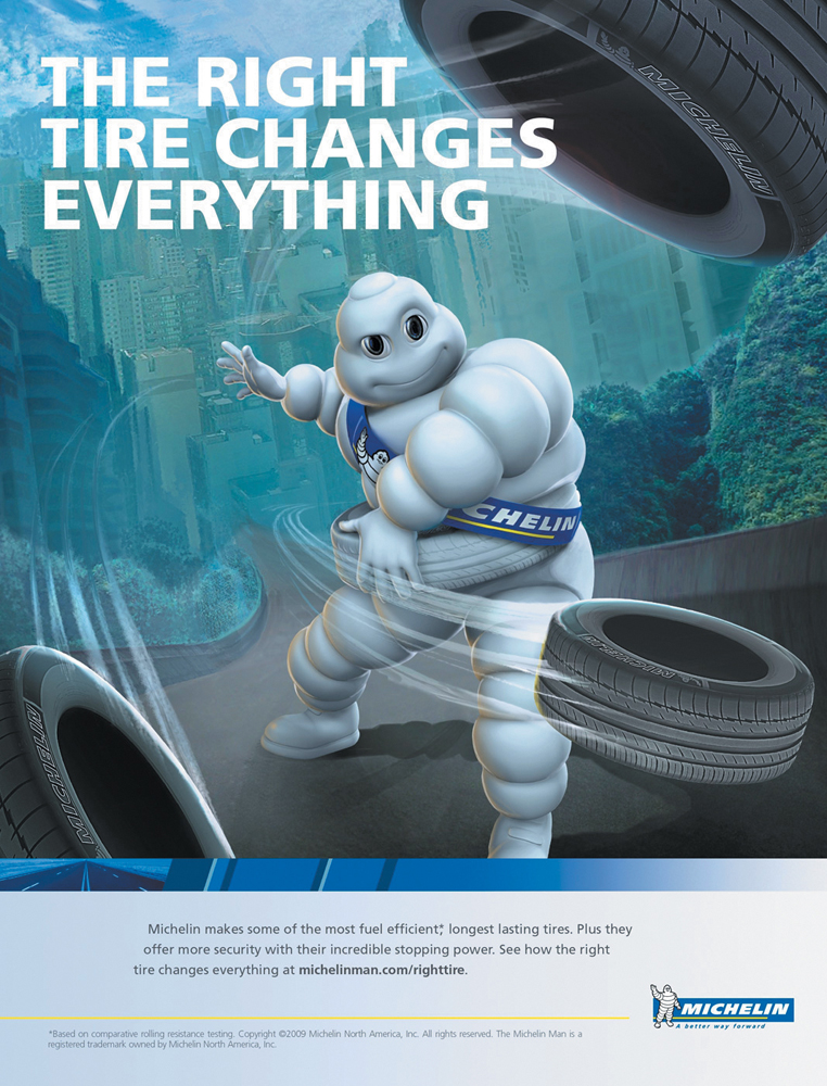
The Michelin Man—whose actual name is Bibendum—has served as the centerpiece of the tire brand’s advertising for years.
Source: Michelin, North America
Protectability
The sixth and final general consideration is the extent to which the brand element is protectable— both in a legal and a competitive sense. Marketers should (1) choose brand elements that can be legally protected internationally, (2) formally register them with the appropriate legal bodies, and (3) vigorously defend trademarks from unauthorized competitive infringement. The necessity of legally protecting the brand is dramatized by the billions of dollars in losses in the United States alone from unauthorized use of patents, trademarks, and copyrights, as described in The Science of Branding 4-1.
Another consideration is whether the brand is competitively protectable. If a name, package, or other attribute is too easily copied, much of the uniqueness of the brand may disappear. For example, consider the once red-hot ice-beer category. Although Molson Ice was one of the early entries in the category, it quickly lost its pioneering advantage when Miller Ice and what later became Bud Ice were introduced. Marketers need to reduce the likelihood that competitors can create a derivative based on the product’s own elements.
Options and Tactics for Brand Elements
Consider the advantages of “Apple” as the name of a personal computer. Apple was a simple but well-known word that was distinctive in the product category—which helped develop brand awareness. The meaning of the name also gave the company a “friendly shine” and warm brand personality. It could also be reinforced visually with a logo that would transfer easily across geographic and cultural boundaries. Finally, the name could serve as a platform for sub-brands like the Macintosh, aiding the introduction of brand extensions. As Apple illustrates, a well-chosen brand name can make an appreciable contribution to the creation of brand equity.
What would an ideal brand element be like? Consider brand names—perhaps the most central of all brand elements. Ideally, a brand name would be easily remembered, highly suggestive of both the product class and the particular benefits that served as the basis of its positioning, inherently fun or interesting, rich with creative potential, transferable to a wide variety of product and geographic settings, enduring in meaning and relevant over time, and strongly protectable both legally and competitively.
Unfortunately, it is difficult to choose a brand name—or any brand element, for that matter—that satisfies all these criteria. The more meaningful the brand name, for example, the more difficult it may be to transfer it to new product categories or translate it to other cultures. This is one reason why it’s preferable to have multiple brand elements. Let’s look at the major considerations for each type of brand element.
Brand Names
The brand name is a fundamentally important choice because it often captures the central theme or key associations of a product in a very compact and economical fashion. Brand names can be an extremely effective shorthand means of communication.6 Whereas an advertisement lasts half a minute and a sales call could run to hours, customers can notice the brand name and register its meaning or activate it in memory in just a few seconds.
Because it is so closely tied to the product in the minds of consumers, however, the brand name is also the most difficult element for marketers to change. So they systematically research them before making a choice. The days when Henry Ford II could name his new automobile the “Edsel” after the name of a family member seem to be long gone.
Is it difficult to come up with a brand name? Ira Bachrach, a well-known branding consultant, has noted that although there are 140,000 words in the English vocabulary, the average U.S. adult recognizes only 20,000; Bachrach’s consulting company, NameLab, sticks to the 7,000 words that make up the vocabulary of most TV programs and commercials.
Although that may seem to allow a lot of choices, each year tens of thousands of new brands are registered as legal trademarks. In fact, arriving at a satisfactory brand name for a new product can be a painfully difficult and prolonged process. After realizing that most of the desirable brand names are already legally registered, many a frustrated executive has lamented that “all the good ones are taken.”
In some ways, this difficulty should not be surprising. Any parent can probably sympathize with how hard it can be to choose a name for a child, as evidenced by the thousands of babies born without names each year because their parents have not decided on—or perhaps not agreed upon—a name yet. It is rare that naming a product can be as easy as it was for Ford when it introduced the Taurus automobile.
“Taurus” was the code name given to the car during its design stage because the chief engineer’s and product manager’s wives were both born under that astrological sign. As luck would have it, upon closer examination, the name turned out to have a number of desirable characteristics. When it was chosen as the actual name for the car, Ford saved thousands and thousands of dollars in additional research and consulting expenses.
Naming Guidelines
Selecting a brand name for a new product is certainly an art and a science. Figure 4-3 displays the different types of possible brand names according to brand identity experts Lippincott. Like any brand element, brand names must be chosen with the six general criteria of memorability, meaningfulness, likability, transferability, adaptability, and protectability in mind.
Brand Awareness
Brand names that are simple and easy to pronounce or spell, familiar and meaningful, and different, distinctive, and unusual can obviously improve brand awareness.7
Simplicity and Ease of Pronunciation and Spelling
Simplicity reduces the effort consumers have to make to comprehend and process the brand name. Short names often facilitate recall because they are easy to encode and store in memory—consider Aim toothpaste, Raid pest spray, Bold laundry detergent, Suave shampoo, Off insect repellent, Jif peanut butter, Ban deodorant, and Bic pens. Marketers can shorten longer names to make them easier to recall. For example, over the years Chevrolet cars have also become known as “Chevy,” Budweiser beer has become “Bud,” and Coca-Cola is also “Coke.”8
Surname
Dell, Siemens, Gillette
Descriptive
American Online, Pizza Hut, General Motors
Invented
Häagen-Dazs, Kodak, Xerox
Connotative
Duracell, Humana, Infiniti
Bridge
Westin, DaimlerChrysler, ExxonMobil
Arbitrary
Apple, Yahoo!, Infiniti
Figure 4-3 Lippincott Brand Name Taxonomy
Source: http:/
To encourage word-of-mouth exposure that helps build strong memory links, marketers should also make brand names easy to pronounce. Also keep in mind that rather than risk the embarrassment of mispronouncing a difficult name like Hyundai automobiles, Shiseido cosmetics, or Façonnable clothing, consumers may just avoid pronouncing it altogether.
Brands with difficult-to-pronounce names have an uphill battle because the firm has to devote so much of its initial marketing effort to teaching consumers how to pronounce the name. Polish vodka Wyborowa (pronounced VEE-ba-ro-va) was supported by a print ad to help consumers pronounce the brand name—a key factor for success in the distilled spirits category, where little self-service exists and consumers usually need to ask for the brand in the store.9
Ideally, the brand name should have a clear, understandable, and unambiguous pronunciation and meaning. However, the way a brand is pronounced can affect its meaning, so consumers may take away different perceptions if ambiguous pronunciation results in different meanings. One research study showed that certain hypothetical products with brand names that were acceptable in both English and French, such as Vaner, Randal, and Massin, were perceived as more “hedonic” (providing pleasure) and were better liked when pronounced in French than in English.10
Pronunciation problems may arise from not conforming to linguistic rules. Although Honda chose the name “Acura” because it was associated with words connoting precision in several languages, it initially had some trouble with consumer pronunciation of the name (AK-yur-a) in the U.S. market, perhaps in part because the company chose not to use the phonetically simpler English spelling of Accura (with a double c).
To improve pronounceability and recallability, many marketers seek a desirable cadence and pleasant sound in their brand names.11 For example, brand names may use alliteration (repetition of consonants, such as in Coleco), assonance (repetition of vowel sounds, such as in Ramada Inn), consonance (repetition of consonants with intervening vowel change, such as in Hamburger Helper), or rhythm (repetition of pattern of syllable stress, such as in Better Business Bureau). Some words employ onomatopoeia—words composed of syllables that when pronounced generate a sound strongly suggestive of the word’s meaning, like Sizzler restaurants, Cap’n Crunch cereal, Ping golf clubs, and Schweppes carbonated beverages.
Familiarity and Meaningfulness
The brand name should be familiar and meaningful so it can tap into existing knowledge structures. It can be concrete or abstract in meaning. Because the names of people, objects, birds, animals, and inanimate objects already exist in memory, consumers have to do less learning to understand their meanings as brand names.12 Links form more easily, increasing memorability.13 Thus, when a consumer sees an ad for the first time for a car called “Fiesta,” the fact that the consumer already has the word stored in memory should make it easier to encode the product name and thus improve its recallability.
To help create strong brand-category links and aid brand recall, the brand name may also suggest the product or service category, as do JuicyJuice 100 percent fruit juices, Ticketron ticket selling service, and Newsweek weekly news magazine. Brand elements that are highly descriptive of the product category or its attribute and benefits can be quite restrictive, however.14 For example, it may be difficult to introduce a soft drink extension for a brand called JuicyJuice!
Differentiated, Distinctive, and Unique
Although choosing a simple, easy-to-pronounce, familiar, and meaningful brand name can improve recallability, to improve brand recognition, on the other hand, brand names should be different, distinctive, and unusual. As Chapter 2 noted, recognition depends on consumers’ ability to discriminate between brands, and more complex brand names are more easily distinguished. Distinctive brand names can also make it easier for consumers to learn intrinsic product information.15
A brand name can be distinctive because it is inherently unique, or because it is unique in the context of other brands in the category.16 Distinctive words may be seldom-used or atypical words for the product category, like Apple computers; unusual combinations of real words, like Toys“R”Us; or completely made-up words, like Cognos or Luxottica. Even made-up brand names, however, have to satisfy prevailing linguistic rules and conventions—for example, try to pronounce names without vowels such as Blfft, Xgpr, or Msdy!
ColorStay lipsticks
Head & Shoulders shampoo
Close-Up toothpaste
SnackWell reduced fat snacks
DieHard auto batteries
Mop & Glo floor wax
Lean Cuisine low-calorie frozen entrees
Shake’n Bake chicken seasoning
Sub-Zero refrigerators and freezers
Cling-Free static buildup remover
Figure 4-4 Sample Suggestive Brand Names
Here too there are trade-offs. Even if a distinctive brand name is advantageous for brand recognition, it also has to be credible and desirable in the product category. A notable exception is Smuckers jelly, which has tried to turn the handicap of its distinctive—but potentially dislikable—name into a positive through its slogan, “With a Name Like Smucker’s, It Has to Be Good!”
Brand Associations
Because the brand name is a compact form of communication, the explicit and implicit meanings consumers extract from it are important. In naming a new peer-to-peer communication technology, the founders landed on the descriptive “Sky peer-to-peer” which they decided to shorten to Skyper. When the corresponding Web address Skyper.com was not available, they shortened it again to the much more user-friendly Skype.17
The brand name can be chosen to reinforce an important attribute or benefit association that makes up its product positioning (see Figure 4-4). Besides performance-related considerations, brand names can also communicate more abstract considerations as do names like Joy dishwashing liquid, Caress soap, and Obsession perfume. Consider the reasoning behind the name of Colgate’s new mini toothbrush.
Colgate Wisp
Famed brand-identity firm Lexicon has developed some wildly successful brand names, such as BlackBerry, Dasani, Febreze, OnStar, Pentium, Scion, and Swiffer. To develop a name for a new disposable mini toothbrush from Colgate, the firm went through a careful development process. The center of the disposable toothbrush held a dab of special toothpaste that made rinsing unnecessary and brushing on the go possible. Deciding to focus on the lightness, softness, and gentleness of the product, Lexicon’s global network of 70 linguists in 50 countries brainstormed metaphors and sounds that conveyed lightness. One name—Wisp—jumped out at company founder David Placek. Subsequent consumer research validated its positive connotations, and a new name was born.18

Colgate decided to call its new disposable mini-toothbrush Wisp because the name had positive connotations of lightness.
Source: Colgate-Palmolive Company
A descriptive brand name should make it easier to link the reinforced attribute or benefit.19 Consumers will find it easier to believe that a laundry detergent “adds fresh scent” to clothes if it has a name like “Blossom” than if it’s called something neutral like “Circle.”20 However, brand names that reinforce the initial positioning of a brand may make it harder to link new associations to the brand if it later has to be repositioned.21 For example, if a laundry detergent named Blossom is positioned as “adding fresh scent,” it may be more difficult to later reposition the product, if necessary, and add a new brand association that it “fights tough stains.” Consumers may find it more difficult to accept or just too easy to forget the new positioning when the brand name continues to remind them of other product considerations.
With sufficient time and the proper marketing programs, however, this difficulty can sometimes be overcome. Southwest Airlines no longer stands for airline service just in Texas and the southwestern United States; and RadioShack doesn’t just provide equipment for ham radio operators and now sells a wide variety of consumer electronics. Such marketing maneuvers can be a long and expensive process, however. Imagine the difficulty of repositioning brands such as “I Can’t Believe It’s Not Butter!” or “Gee, Your Hair Smells Terrific!” Thus, it is important when choosing a meaningful name to consider the possibility of later repositioning and the necessity of linking other associations.
Meaningful names are not restricted to real words. Consumers can extract meaning, if they so desire, even from made-up or fanciful brand names. For example, one study of computer-generated brand names containing random combinations of syllables found that “whumies” and “quax” reminded consumers of a breakfast cereal and that “dehax” reminded them of a laundry detergent.22 Thus, consumers were able to extract at least some product meaning from these essentially arbitrary names when instructed to do so. Nevertheless, consumers are likely to extract meaning from highly abstract names only when they are sufficiently motivated.
Marketers generally devise made-up brand names systematically, basing words on combinations of morphemes. A morpheme is the smallest linguistic unit having meaning. There are 7,000 morphemes in the English language, including real words like “man” and prefixes, suffixes, or roots. For example, Nissan’s Sentra automobile is a combination of two morphemes suggesting “central” and “sentry.”23 By combining carefully chosen morphemes, marketers can construct brand names that actually have some relatively easily inferred or implicit meaning.
Brand names raise a number of interesting linguistic issues.24 Figure 4-5 contains an overview of different categories of linguistic characteristics, with definitions and examples. Even individual letters can contain meaning that may be useful in developing a new brand name. The letter X became popular (e.g., ESPN’s X Games and Nissan’s Xterra SUV) because X represents “extreme,” “on the edge,” and “youth.”25 Research has shown that in some instances, consumers prefer products with brand names bearing some of the letters from their own name (Jonathan may exhibit a greater-than-expected preference for a product named Jonoki).26
The sounds of letters can take on meaning as well.27 For example, some words begin with phonemic elements called plosives, like the letters b, c, d, g, k, p, and t, whereas others use sibilants, which are sounds like s and soft c. Plosives escape from the mouth more quickly than sibilants and are harsher and more direct. Consequently, they are thought to make names more specific and less abstract, and to be more easily recognized and recalled.28 On the other hand, because sibilants have a softer sound, they tend to conjure up romantic, serene images and are often found in the names of products such as perfumes—think of Chanel, Ciara (by Revlon), and Shalimar and Samsara (Guerlin).29
One study found a relationship between certain characteristics of the letters of brand names and product features: As consonant hardness and vowel pitch increased in hypothetical brand names for toilet paper and household cleansers, consumer perception of the harshness of the product also increased.30 The actual font or logotype used to express the brand name may also change consumer impressions.31
Brands are not restricted to letters alone.32 Alphanumeric names may include a mixture of letters and digits (WD-40), a mixture of words and digits (Formula 409), or mixtures of letters or words and numbers in written form (Saks Fifth Avenue). They can also designate generations or relationships in a product line like BMW’s 3, 5, and 7 series.
Characteristics |
Definitions and/or Examples |
|---|---|
Phonetic Devices |
|
Alliteration |
Consonant repetition (Coca-Cola) |
Assonance |
Vowel repetition (Kal Kan) |
Consonance |
Consonant repetition with intervening vowel changes (Weight Watchers) |
Masculine rhyme |
Rhyme with end-of-syllable stress (Max Pax) |
Feminine rhyme |
Unaccented syllable followed by accented syllable (American Airlines) |
Weak/imperfect/slant rhyme |
Vowels differ or consonants similar, not identical (Black & Decker) |
Onomatopoeia |
Use of syllable phonetics to resemble the object itself (Wisk) |
Clipping |
Product names attenuated (Chevy) |
Blending |
Morphemic combination, usually with elision (Aspergum, Duracell) |
Initial plosives |
/b/, /c-hard/, /d/, /g-hard/, /k/, /p/, /q/, /t/ (Bic) |
Orthographic Devices |
|
Unusual or incorrect spellings |
Kool-Aid |
Abbreviations |
7 UP for Seven Up |
Acronyms |
Amoco |
Morphologic Devices |
|
Affixation |
Jell-O |
Compounding |
Janitor-in-a-Drum |
Semantic Devices |
|
Metaphor |
Representing something as if it were something else (Arrid); simile is included with metaphor when a name describes a likeness and not an equality (AquaFresh) |
Metonymy |
Application of one object or quality for another (Midas) |
Synecdoche |
Substitution of a part for the whole (Red Lobster) |
Personification/pathetic fallacy |
Humanizing the nonhuman, or ascription of human emotions to the inanimate (Betty Crocker) |
Oxymoron |
Conjunction of opposites (Easy-Off) |
Paranomasia |
Pun and word plays (Hawaiian Punch) |
Semantic appositeness |
Fit of name with object (Bufferin) |
Figure 4-5 Brand Name Linguistic Characteristics
Naming Procedures
A number of different procedures or systems have been suggested for naming new products. Most adopt a procedure something along the following lines. Figure 4-6 displays some common naming mistakes according to leading marketing and branding consultancy Lippincott.33
-
Define objectives. First, define the branding objectives in terms of the six general criteria we noted earlier, and in particular define the ideal meaning the brand should convey. Recognize the role of the brand within the corporate branding hierarchy and how it should relate to other brands and products (we’ll discuss this in Chapter 11). In many cases, existing brand names may serve, at least in part. Finally, understand the role of the brand within the entire marketing program and the target market.
1
Using cliched words such as “Innovation” or “Solution” in a name.
In most industry situations these kinds of words are so overused, they no longer have meaning.
2
Insisting on a name that can be found in an English dictionary.
Not only are such names scarce, they also may cause translation or other linguistic problems.
3
Taking the easy way out and settling on initials.
Initials may be easier to trademark, but an enormous budget is typically required to give them meaning.
4
Using terms like “Extra,” “Plus,” or “New” to communicate next generation products or improved line extensions.
Three more examples of words that have lost their meaning through overuse.
5
Adopting license-plate shorthand.
A name that customers have to work too hard to figure out is a turnoff—and a wasted opportunity.
6
Seeing how many names can be combined to make a confusing brand
Most that initially started in this direction have truncated to simpler shorter alternatives.
7
Asking for suggestions from friends and other uninformed sources.
The results that come from this approach seldom relate to or express a company’s business startegy.
Figure 4-6 Seven Crucial Naming Mistakes
Source: http:/
/ www. lippincott.com/ -
Generate names. With the branding strategy in place, next generate as many names and concepts as possible. Any potential sources of names are valid: company management and employees; existing or potential customers (including retailers or suppliers if relevant); ad agencies, professional name consultants, and specialized computer-based naming companies. Tens, hundreds, or even thousands of names may result from this step.
-
Screen initial candidates. Screen all the names against the branding objectives and marketing considerations identified in step 1 and apply the test of common sense to produce a more manageable list. For example, General Mills starts by eliminating the following:
-
Names that have unintentional double meaning
-
Names that are unpronounceable, already in use, or too close to an existing name
-
Names that have obvious legal complications
-
Names that represent an obvious contradiction of the positioning
Next General Mills runs in-depth evaluation sessions with management personnel and marketing partners to narrow the list to a handful of names, often conducting a quick-and-dirty legal search to help screen out possible problems.
-
-
Study candidate names. Collect more extensive information about each of the final 5–10 names. Before spending large amounts of money on consumer research, it is usually advisable to do an extensive international legal search. Because this step is expensive, marketers often search on a sequential basis, testing in each country only those names that survived the legal screening from the previous country.
-
Research the final candidates. Next, conduct consumer research to confirm management expectations about the memorability and meaningfulness of the remaining names. Consumer testing can take all forms. Many firms attempt to simulate the actual marketing program and consumers’ likely purchase experiences as much as possible.34 Thus, they may show consumers the product and its packaging, price, or promotion so that they understand the rationale for the brand name and how it will be used. Other aids in this kind of research are realistic three-dimensional packages and concept boards or low-cost animatic advertising using digital techniques. Marketers may survey many consumers to capture differences in regional or ethnic appeal. They should also factor in the effects of repeated exposure to the brand name and what happens when the name is spoken versus written.
-
Select the final name. Based on all the information collected from the previous step, management should choose the name that maximizes the firm’s branding and marketing objectives and then formally register it.
Some segment of consumers or another will always have at least some potentially negative associations with a new brand name. In most cases, however, assuming they are not severe, these associations will disappear after the initial marketing launch. Some consumers will dislike a new brand name because it’s unfamiliar or represents a deviation from the norm. Marketers should remember to separate these temporal considerations from more enduring effects. Here is how a new airline arrived at its name.35
Jetblue
Traditionally, airlines use descriptive names that evoke specific geographic origins, like American, or broad geographic reach, like United. In launching a new airline with a fresh concept—stylish travel for the budget-minded flier—JetBlue decided it needed an evocative name, but not one that sounded like an airline. Working with its ad agency, Merkley & Partners, and brand consultant, Landor, the company generated a list of candidate names—Fresh Air, Taxi, Egg, and It. The name Blue, suggesting peaceful clear skies, quickly became a favorite, but trademark lawyers noted that it would be impossible to protect the name without a distinctive qualifier. The first candidate, TrueBlue, went by the wayside when it was found to also be the name of a car rental agency. JetBlue emerged as the best substitute and the brand was born. JetBlue has also leveraged the “jet” portion of its brand name with its optimistic “jetting” campaign, which occurred during the economic downturn and was a response to difficult times in the airline industry. The ads served to distinguish JetBlue and its “maverick” approach to service. Its “TrueBlue” loyalty program cleverly leverages the second half of its name.36

Jet Blue has used evocative brand imagery and a strong customer focus to build its brand.
Source: JetBlue Airways
URLs
URLs (uniform resource locators) specify locations of pages on the Web and are also commonly referred to as domain names . Anyone wishing to own a specific URL must register and pay for the name. As companies clamored for space on the Web, the number of registered URLs increased dramatically. Every three-letter combination and virtually all words in a typical English dictionary have been registered. The sheer volume of registered URLs often makes it necessary for companies to use coined words for new brands if they wish to have a Web site for the brand. For example, when Andersen Consulting selected its new name, it chose the coined word “Accenture” in part because the URL www.accenture.com had not been registered.
Another issue facing companies with regard to URLs is protecting their brands from unauthorized use in other domain names.37 A company can sue the current owner of the URL for copyright infringement, buy the name from the current owner, or register all conceivable variations of its brand as domain names ahead of time.
In 2010, cybersquatting cases reached record levels. Cybersquatting or domain squatting, as defined by government law, is registering, trafficking in, or using a domain name with bad-faith intent to profit from the goodwill of a trademark belonging to someone else. The cybersquatter then offers to sell the domain to the person or company who owns a trademark contained within the name at an inflated price. Under such cases, trademark holders sue for infringement of their domain names through the WIPO (an agency of the UN).38
The top five areas of legal activity initiated by companies are in the retail, banking and finance, biotechnology and pharmaceuticals, Internet and IT, and fashion industries. In 2009, Citibank successfully filed suit against Shui of China under the Anticybersquatting and Consumer Protection Act by showing that (1) Shui had a bad-faith intent to profit from using the domain name citybank.org; and (2) that the name was confusingly similar to, or dilutive of, Citibank’s distinctive or famous mark. Shui was forced to pay Citibank $100,000 and its legal fees.39
Many sources list the current total of registered domain names at or close to the 200 million mark. As the domain name market has exploded, ICANN—a nonprofit that governs the industry—announced it would begin accepting applications to register customized and unlimited URLs. This decision could have a significant impact for companies, which can now register brand URLs. Canon and Hitachi were among the first brands to apply to register their brand names under the new top-level domain policy.
Brand recall is critical for URLs because it increases the likelihood that consumers easily remember the URL to get to the site. At the peak of the Internet boom, investors paid $7.5 million for Business.com, $2.2 million for Autos.com, and $1.1 million for Bingo.com. Many of these “common noun” sites failed, however, and were criticized, among other things, for having names that were too generic. Many firms adopted names that started with a lowercase e or i and ended in “net,” “systems,” or, especially, “com.” Most of these names became liabilities after the Internet bubble burst, forcing firms such as Internet.com to revert to a more conventional name, INTMedia Group.
Yahoo!, however, was able to create a memorable brand and URL. Jerry Yang and David Filo named their Internet portal (created as a Stanford University thesis project) “Yahoo!” after thumbing through the dictionary for words that began with “ya,” the universal computing acronym for “yet another.” Filo stumbled upon yahoo, which brought back fond childhood memories of his father calling him “little yahoo.” Liking the name, they created a more complete acronym: “Yet another hierarchical officious oracle.”40
Typically, for an existing brand, the main URL is a straightforward and maybe even literal translation of the brand name, like www.shell.com, although there are some exceptions and variations, such as www.purplepill.com for the Nexium acid-reflux medication Web site.
Logos and Symbols
Although the brand name typically is the central element of the brand, visual elements also play a critical role in building brand equity and especially brand awareness. Logos have a long history as a means to indicate origin, ownership, or association. For example, families and countries have used logos for centuries to visually represent their names (think of the Hapsburg eagle of the Austro-Hungarian Empire).
Logos range from corporate names or trademarks (word marks with text only) written in a distinctive form, to entirely abstract designs that may be completely unrelated to the word mark, corporate name, or corporate activities.41 Examples of brands with strong word marks and no accompanying logo separate from the name include Coca-Cola, Dunhill, and Kit Kat. Examples of abstract logos include the Mercedes star, Rolex crown, CBS eye, Nike swoosh, and Olympic rings. These non–word mark logos are also often called symbols.
Many logos fall between these two extremes. Some are literal representations of the brand name, enhancing brand meaning and awareness, such as the Arm and Hammer, American Red Cross, and Apple logos. Logos can be quite concrete or pictorial in nature like the American Express centurion, the Land o’ Lakes Native American, the Morton salt girl with umbrella, and Ralph Lauren’s polo player. Certain physical elements of the product or company can become a symbol, as did the Goodyear blimp, McDonald’s golden arches, and the Playboy bunny ears.
Like names, abstract logos can be quite distinctive and thus recognizable. Nevertheless, because abstract logos may lack the inherent meaning present with a more concrete logo, one danger is that consumers may not understand what the logo is intended to represent without a significant marketing initiative to explain its meaning. Consumers can evaluate even fairly abstract logos differently depending on the shape.
Benefits
Logos and symbols are often easily recognized and can be a valuable way to identify products, although consumers may recognize them but be unable to link them to any specific product or brand. Many insurance firms use symbols of strength (the Rock of Gibraltar for Prudential and the stag for Hartford) or security (the “good hands” of Allstate, the hard hat of Fireman’s Fund, and the red umbrella of Travelers).
Another branding advantage of logos is their versatility: Because they are often nonverbal, logos transfer well across cultures and over a range of product categories. For example, corporate brands often develop logos in order to confer their identity on a wide range of products and to endorse different sub-brands. Marketers must think carefully, however, as to how prominent the brand name and logo should be on any product, especially more luxury ones.42
Abstract logos offer advantages when the full brand name is difficult to use for any reason. In the United Kingdom, for example, National Westminster Bank created a triangular device as a logo because the name itself was long and cumbersome and the logo could more easily appear as an identification device on checkbooks, literature, signage, and promotional material. The logo also uses the shortened version of the company name, NatWest.43
Finally, unlike brand names, logos can be easily adapted over time to achieve a more contemporary look. For example, in 2000, John Deere revamped its deer trademark for the first time in 32 years, making the animal appear to be leaping up rather than landing. The change was intended to “convey a message of strength and agility with a technology edge.”44
In updating, however, marketers should make gradual changes and not lose sight of the inherent advantages of the logo. In the 1980s, the trend for many firms was to create more abstract, stylized versions of their logos. In the process, some of the meaning residing in these logos, and thus some equity, was lost. Recognizing the logo’s potential contribution to brand equity, some firms in the 1990s reverted to a more traditional look for their symbols.
Prudential’s Rock of Gibraltar logo was changed back from black-and-white slanted lines introduced in 1984 to a more faithful rendition. To harken back to its historic past and reflect its engineering and design prowess, Chrysler used a winged badge to replace the Pentastar five-pointed star design as a symbol of the brand. The wings, intended to symbolize freedom and flying, were found on the first Chrysler manufactured in 1924.
Regardless of the reason for doing it, changing a logo is not cheap. According to branding experts, engaging a firm for four to six months to create a symbol or remaking an old one for a big brand “usually costs $1 million.”45
Characters
Characters represent a special type of brand symbol—one that takes on human or real-life characteristics. Brand characters typically are introduced through advertising and can play a central role in ad campaigns and package designs. Some are animated characters like the Pillsbury Doughboy, Peter Pan peanut butter, and numerous cereal characters such as Tony the Tiger and Snap, Crackle & Pop. Others are live-action figures like Juan Valdez (Colombian coffee) and Ronald McDonald. One character has been both in its lifetime.
Green Giant
One of the most powerful brand characters ever introduced is General Mills’s Jolly Green Giant. His origin can be traced back to the 1920s, when the Minnesota Valley Canning Company placed a green giant on the label of a new variety of sweet, large English peas as a means to circumvent trademark laws that prevented the firm from naming the product “Green Giant.” Ad Agency Leo Burnett used the Jolly Green Giant character in print ads beginning in 1930 and in TV ads beginning in the early 1960s. At first, TV ads featured an actor wearing green body makeup and a suit of leaves. Later, the ads moved to full animation. Creatively, the ads have been very consistent. The Green Giant is always in the background, with his features obscure, and he says only “Ho Ho Ho!” He moves very little, doesn’t walk, and never leaves the valley. The Green Giant has been introduced into international markets, following the same basic set of rules. The Little Sprout character was introduced in 1973 to bring a new look to the brand and allow for more flexibility. Unlike the Green Giant, the Little Sprout is a chatterbox, often imparting valuable product information. The Green Giant brand has enormous equity to General Mills, and using the name and character on a new product has been an effective signal to consumers that the product is “wholesome” and “healthy.” Not surprisingly, the company has tied many of their recent green initiatives on sustainability to the Green Giant.46

One of the most enduring—and most powerful—brand characters ever devised is the Jolly Green Giant.
Source: General Mills, Inc.
Benefits
Because they are often colorful and rich in imagery, brand characters tend to be attention getting and quite useful for creating brand awareness. Brand characters can help brands break through marketplace clutter as well as help communicate a key product benefit. For example, Maytag’s Lonely Repairman has helped reinforce the company’s key “reliability” product association.
The human element of brand characters can enhance likeability and help create perceptions of the brand as fun and interesting.47 A consumer may more easily form a relationship with a brand when the brand literally has a human or other character presence. Characters avoid many of the problems that plague human spokespeople—they don’t grow old, demand pay raises, or cheat on their wives. An interesting exception occurred, however, when Aflac fired the human voice to its famed duck character, comedian Gilbert Gottfried, after he posted some controversial remarks on Twitter that made light of the fallout from the earthquake and tsunami in Japan.48
Finally, because brand characters do not typically have direct product meaning, they may also be transferred relatively easily across product categories. For example, Aaker notes that “the Keebler’s elf identity (which combines a sense of home-style baking with a touch of magic and fun) gives the brand latitude to extend into other baked goods—and perhaps even into other types of food where homemade magic and fun might be perceived as a benefit.”49 Popular characters also often become valuable licensing properties, providing direct revenue and additional brand exposure.
Cautions
There are some cautions and drawbacks to using brand characters. Brand characters can be so attention getting and well liked that they dominate other brand elements and actually dampen brand awareness.
Eveready
When Ralston Purina introduced its drumming pink bunny that “kept going . . . and going . . . and going” in ads for the Eveready Energizer battery, many consumers were so captivated by the character that they paid little attention to the name of the advertised brand. As a result, they often mistakenly believed that the ad was for Eveready’s chief competitor, Duracell. Eveready had to add the pink bunny to its packages, promotions, and other marketing communications to create stronger brand links. Through its concerted marketing efforts through the years, however, the Energizer Bunny has now achieved iconic status. Many marketing experts view the character as the “ultimate product demo” because of how effectively it showcases the product’s unique selling proposition—long-lived batteries—in an inventive, fresh way. As the company’s CEO noted, “The message of the Energizer Bunny has remained consistent over the last two decades; he speaks to longevity, determination and perseverance.” The bunny celebrated its 20th anniversary in 2009, having achieved several milestones, including 95 percent awareness among consumers and an entry in the Oxford English Dictionary. Perhaps the greatest compliment, however, is how often everyone from politicians to sport stars have used the Energizer Bunny to describe their own staying power.50
Characters often must be updated over time so that their image and personality remain relevant to the target market. Japan’s famous Hello Kitty character, which became a multibillion dollar product and license powerhouse, found its sales shrinking over the last decade, a victim in part of overexposure and a failure to make the character modern and appealing across multiple media.51
In general, the more realistic the brand character, the more important it is to keep it up-to-date. One advantage of fictitious or animated characters is that their appeal can be more enduring and timeless than that of real people. Branding Brief 4-1 describes the efforts by General Mills to evolve the Betty Crocker character over time. Finally, some characters are so culturally specific that they do not travel well to other countries. The Science of Branding 4-2 describes some guidelines from a leading consultant.
Slogans
Slogans are short phrases that communicate descriptive or persuasive information about the brand. They often appear in advertising but can play an important role on packaging and in other aspects of the marketing program. When Snickers advertised, “Hungry? Grab a Snickers,” the slogan also appeared on the candy bar wrapper itself.
Slogans are powerful branding devices because, like brand names, they are an extremely efficient, shorthand means to build brand equity. They can function as useful “hooks” or “handles” to help consumers grasp the meaning of a brand—what it is and what makes it special.52 They are an indispensable means of summarizing and translating the intent of a marketing program in a few short words or phrases. For example, State Farm Insurance’s “Like a Good Neighbor, State Farm Is There” has been used for decades to represent the brand’s dependability and aura of friendship.
Benefits
Some slogans help build brand awareness by playing off the brand name in some way, as in “The Citi Never Sleeps.” Others build brand awareness even more explicitly by making strong links between the brand and the corresponding product category, like when Lifetime would advertise that it was “Television for Women.” Most important, slogans can help reinforce the brand positioning as in “Staples. That Was Easy.” For HBO, a slogan was critical to conveying its unique positioning.
HBO
As a pay TV channel, HBO has always needed to convince viewers it was worth paying extra money for. More than just a pay movie channel, HBO had a tradition of broadcasting original, edgy programming such as Sex and the City, The Sopranos, and Entourage that would not be found on free channels. To highlight its most compelling point-of-difference and brand essence, HBO developed a clever slogan in 1996: “It’s Not TV, It’s HBO.” Externally, the slogan gave viewers a point of reference to understand and categorize the brand. Internally, the slogan gave employees a clear vision and goal to keep in mind: No matter what they did, it should never look like ordinary TV.53

The clever slogan “It’s Not TV, It’s HBO” reinforces how the cable network with shows like Entourage is different from other networks.
Source: AF archive/Alamy
Slogans often become closely tied to advertising campaigns and serve as tag lines to summarize the descriptive or persuasive information conveyed in the ads. DeBeers’s “A Diamond Is Forever” tag line communicates that diamonds bring eternal love and romance and never lose value. Slogans can be more expansive and more enduring than just ad tag lines, though campaign-specific tag lines may help reinforce the message of a particular campaign instead of the brand slogan for a certain period of time.
For example, through the years, Nike has used tag lines specific to ad campaigns for events or sports such as “Prepare for Battle” and “Quick Can’t Be Caught” (basketball); “Write the Future,” (World Cup); “My Better Is Better” (multisport); and “Here I Am” (women) instead of the well-known brand slogan, “Just Do It.” Such substitutions can emphasize that the ad campaign represents a departure of some kind from the message conveyed by the brand slogan, or just a means to give the brand slogan a rest so that it remains fresh.
Designing Slogans
Some of the most powerful slogans contribute to brand equity in multiple ways.54 They can play off the brand name to build both awareness and image, such as “Be Certain with Certs” for Certs breath mints; “Maybe She’s Born with It, Maybe It’s Maybelline” for Maybelline cosmetics; or “The Big Q Stands for Quality” for Quaker State motor oil.
Slogans also can contain product-related messages and other meanings. Consider the historical Champion sportswear slogan, “It Takes a Little More to Make a Champion.” The slogan could be interpreted in terms of product performance, meaning that Champion sportswear is made with a little extra care or with extra-special materials, but it could mean that Champion sportswear is associated with top athletes. This combination of superior product performance and aspirational user imagery is a powerful platform on which to build brand image and equity.
Benetton has had an equally strong slogan on which to build brand equity (“United Colors of Benetton”), but as Branding Brief 4-2 describes, the company has not always taken full advantage of it.
Updating Slogans
Some slogans become so strongly linked to the brand that it becomes difficult to introduce new ones (take the famous slogan quiz in Figure 4-7 and check the accompanying footnote to see how many slogans you can correctly identify). Marketers of 7UP tried a number of different successors to the popular “Uncola” slogan—including “Freedom of Choice,” “Crisp and Clean and No Caffeine,” “Don’t You Feel Good About 7UP,” and “Feels So Good Coming Down,” and for over five years the somewhat edgy “Make 7UP Yours.” A new ad in 2011 featuring hip-hop singer–songwriter Cee Lo Green beatboxing used yet another tag line, “Be Yourself. Be Refreshing. Be 7UP.”
_______________________ Reach Out and Touch Someone
_______________________ Have It Your Way
_______________________ Just Do It
_______________________ When It Absolutely, Positively Has to Be There Overnight
_______________________ Drivers Wanted
_______________________ Don’t Leave Home Without It
_______________________ Like a Rock
_______________________ Because I’m Worth It
_______________________ The Ultimate Driving Machine
_______________________ When You Care Enough to Send the Very Best
_______________________ Capitalist Tool
_______________________ The Wonder Drug That Works Wonders
_______________________ No More Tears
_______________________ Melts in Your Mouth, Not in Your Hands
_______________________ We Try Harder
_______________________ The Antidote for Civilization
_______________________ Where Do You Want to Go Today?
_______________________ Let Your Fingers Do the Walking
_______________________ Breakfast of Champions
_______________________ Fly the Friendly Skies
Answers: (1) Bell Telephone; (2) Burger King; (3) Nike; (4) Federal Express; (5) Volkswagen; (6) American Express; (7) Chevrolet; (8) $$Oreal; (9) BMW; (10) Hallmark; (11) Forbes magazine; (12) Bayer aspirin; (13) Johnson’s Baby Shampoo; (14) M&M’s (15) Avis; (16) Club Med; (17) Microsoft; (18) Yellow Pages; (19) Wheaties; and (20) United Airlines.
Figure 4-7 Famous Slogans Quiz
A slogan that becomes so strongly identified with a brand can box it in. Or successful slogans can take on lives of their own and become public catch phrases (like Wendy’s “Where’s the Beef?” in the 1980s, MasterCard’s “Priceless” in the 1990s, and the “Got Milk?” spoofs in the 2000s), but there can also be a down side to this kind of success: the slogan can quickly become overexposed and lose specific brand or product meaning.
Once a slogan achieves such a high level of recognition and acceptance, it may still contribute to brand equity, but probably as more of a reminder of the brand. Consumers are unlikely to consider what the slogan means in a thoughtful way after seeing or hearing it too many times. At the same time, a potential difficulty arises if the slogan continues to convey some product meaning that the brand no longer needs to reinforce. In this case, by not facilitating the linkage of new, desired brand associations, the slogan can become restrictive and fail to allow the brand to be updated as much as desired or necessary.
Because slogans are perhaps the easiest brand element to change over time, marketers have more flexibility in managing them. In changing slogans, however, they must do the following:
-
Recognize how the slogan is contributing to brand equity, if at all, through enhanced awareness or image.
-
Decide how much of this equity enhancement, if any, is still needed.
-
Retain the needed or desired equities still residing in the slogan as much as possible while providing whatever new twists of meaning are necessary to contribute to equity in other ways.
Sometimes modifying an existing slogan is more fruitful than introducing a new slogan with a completely new set of meanings. For example, Dockers switched its slogan from the well-received “Nice Pants” to “One Leg at a Time” in the late 1990s before reverting to the previous slogan when recognizing it had given up too much built-up equity.
Jingles
Jingles are musical messages written around the brand. Typically composed by professional songwriters, they often have enough catchy hooks and choruses to become almost permanently registered in the minds of listeners—sometimes whether they want them to or not! During the first half of the twentieth century, when broadcast advertising was confined primarily to radio, jingles were important branding devices.
We can think of jingles as extended musical slogans, and in that sense classify them as a brand element. Because of their musical nature, however, jingles are not nearly as transferable as other brand elements. They can communicate brand benefits, but they often convey product meaning in a nondirect and fairly abstract fashion. Thus the potential associations they might create for the brand are most likely to relate to feelings and personality and other intangibles.
Jingles are perhaps most valuable in enhancing brand awareness. Often, they repeat the brand name in clever and amusing ways that allow consumers multiple encoding opportunities. Consumers are also likely to mentally rehearse or repeat catchy jingles after the ad is over, providing even more encoding opportunities and increasing memorability.
A well-known jingle can serve as an advertising foundation for years. The familiar “Give Me a Break” jingle for Kit Kat candy bars has been sung in ads since 1988 and has helped make the brand the sixth best-selling chocolate candy bar in the United States.55 There was an uproar when, after two decades, the U.S. Army switched from its familiar “Be All That You Can Be” to “Army of One.” Finally, the distinctive four-note signature to Intel’s ads echoes the company’s slogan “In-tel In-side.” Although the jingle seems simple, the first note alone is a mix of 16 sounds, including a tambourine and a hammer striking a brass pipe.56
Packaging
Packaging is the activities of designing and producing containers or wrappers for a product. Like other brand elements, packages have a long history. Early humans used leaves and animal skin to cover and carry food and water. Glass containers first appeared in Egypt as early as 2000 b.c. Later, the French emperor Napoleon awarded 12,000 francs to the winner of a contest to find a better way to preserve food, leading to the first crude method of vacuum packing.57
From the perspective of both the firm and consumers, packaging must achieve a number of objectives:58
-
Identify the brand.
-
Convey descriptive and persuasive information.
-
Facilitate product transportation and protection.
-
Assist in at-home storage.
-
Aid product consumption.
Marketers must choose the aesthetic and functional components of packaging correctly to achieve marketing objectives and meet consumers’ needs. Aesthetic considerations govern a package’s size and shape, material, color, text, and graphics. Innovations in printing processes now permit eye-catching and appealing graphics that convey elaborate and colorful messages on the package at the “moment of truth”—the point of purchase.59
Functionally, structural design is crucial. For example, innovations over the years have resulted in food packages that are resealable, tamperproof, and more convenient to use—easy to hold, easy to open, or squeezable. Consider these recent General Mills packaging innovations: Yoplait Go-Gurt’s yogurt in a tube packaging concept was a huge hit with kids and their parents; packaging for Betty Crocker Warm Delights showcased a microwavable (two minutes), convenient, single-serve dessert treat; and Green Giant Valley Fresh Steamers uses materials that withstand microwave cooking temperatures to offer steamable vegetables with sauce.60
Benefits
Often, one of the strongest associations consumers have with a brand is inspired by the look of its packaging. For example, if you ask the average consumer what comes to mind when he or she thinks of Heineken beer, a common response is a “green bottle.” The package can become an important means of brand recognition and convey or imply information to build or reinforce valuable brand associations. Molson’s beer sales increased by 40 percent in the United States after the company modified the bottle’s back labels to include cheeky “ice-breakers” for bar patrons such as “On the Rebound,” “Sure, You Can Have My Number,” and “Fairly Intimidated by Your Beauty.” Buoyed by that success, they later introduced “Answer Honestly” bottle back labels that gave drinkers challenging choices to mull over.61
Structural packaging innovations can create a point-of-difference that permits a higher margin. New packages can also expand a market and capture new market segments. Packaging changes can have immediate impact on customer shopping behavior and sales: a redesign of Häagen-Dazs packaging increased flavor shoppability by 21 percent; General Mills saw an increase in sales of 80 percent after redesigning Bisquick Shake n’ Pour package to improve its ergonomics and by creating a “smooth, curvy form that reinforces the brand equity”; and a redesign on the packaging for Jimmy Dean’s Biscuit Sandwiches lead to an increase of 13 percent in household penetration.62
One of the major packaging trends of recent years is to make both bigger and smaller packaged versions of products (as well as portions) to appeal to new market segments.63 Jumbo sizes have been successfully introduced for hot dogs, pizzas, English muffins, frozen dinners, and beer. Pillsbury’s Grands! biscuits—40 percent larger than existing offerings—were the most successful new product in the company’s 126-year history when introduced. But sometimes smaller has proven to be successful too.
100-Calorie Packs
By 2007, a few years after their introduction by Kraft, 100-calorie snack packs of crackers, chips, cookies, and candy had passed the $200-million mark. Truly a consumer-driven packaging innovation, they had an appeal that was plain and simple—portion control made easy. The products were identical to those in larger packages but conveniently placed in handy 100-calorie packs for which calorie-conscious consumers were willing to pay a premium. With sales of the packs growing at almost 30 percent a year by 2007, most top food manufacturers—including Kraft’s Nabisco, Hershey, PepsiCo’s Frito-Lay and Quaker Oats, and Campbell’s Pepperidge Farm—introduced their own versions. In the years that followed, however, the 100-calorie snack pack market began to slow down. A number of factors contributed to the cooling off, such as market saturation (190 products were introduced in 2008 and at least 68 in 2009) and customer concerns about their actual effectiveness in controlling caloric intake, their relatively high price, and the amount of wasteful packaging.64

Though they were a very successful packaging innovation, 100-calorie snack packs did find it hard to sustain their sales growth over time.
Source: Keri Miksza
Packaging at the Point of Purchase
The right packaging can create strong appeal on the store shelf and help products stand out from the clutter, critical when you realize that the average supermarket shopper can be exposed to 20,000 or more products in a shopping visit that may last less than 30 minutes and include many unplanned purchases. Many consumers may first encounter a new brand on the supermarket shelf or in the store. Because few product differences exist in some categories, packaging innovations can provide at least a temporary edge on competition.
For these reasons, packaging is a particularly cost-effective way to build brand equity.65 It is sometimes called the “last five seconds of marketing” as well as “permanent media” or “the last salesman.” Walmart looks at packaging critically and tests whether consumers understand the brand promise behind the package within three seconds and up to 15 feet from the shelf. Note that consumer exposure to packaging is not restricted to the point of purchase and moments of consumption, because brand packages often can play a starring role in advertising.
Packaging Innovations
Packaging innovations can both lower costs and/or improve demand. One important supply-side goal for many firms is to redesign packages and employ more recyclable materials to lower the use of paper and plastic. Toward that goal, U.S. food, beverage, and consumer product manufacturers reported that they had eliminated 1.5 billion pounds of packaging between 2005 and 2011 with another 2.5 billion pounds expected to be avoided by 2020, representing an overall reduction of 19 percent in total average U.S. packaging weight.66
On the demand side, in mature markets especially, package innovations can provide a short-term sales boost. The beverage industry in general has been characterized by a number of packaging innovations. For example, following the lead of Snapple’s wide-mouth glass bottle, Arizona iced teas and fruit drinks in oversize (24-ounce), pastel-colored cans with a southwestern motif became a $300 million brand in a few years with no marketing support beyond point-of-purchase and rudimentary outdoor ads, designed in-house.67
Package Design
An integral part of product development and launch, package design has become a more sophisticated process. In the past, it was often an afterthought, and colors, materials, and so forth were often chosen fairly arbitrarily. For example, legend has it that Campbell’s famous soup is red and white because one executive at the company liked the uniforms of Cornell University’s football team!
These days, specialized package designers bring artistic techniques and scientific skills to package design in an attempt to meet the marketing objectives for a brand. These consultants conduct detailed analyses to break down the package into a number of different elements.68 They decide on the optimal look and content of each element and choose which elements should be dominant in any one package—whether the brand name, illustration, or some other graphical element—and how the elements should relate to each other. Designers can also decide which elements should be shared across packages and which should differ (and how).
Designers often refer to the “shelf impact” of a package—the visual effect the package has at the point of the purchase when consumers see it in the context of other packages in the category. For example, “bigger and brighter” packages are not always better when competitors’ packages are also factored in.69 Given enough shelf space, however, manufacturers can create billboard effects with their brand to raise their prominence and impact. General Mill deliberately “tiled” graphical elements of their packaging so that some of their mega-brands with multiple varieties such as Cheerios, Nature Valley Granola Bars, and Progresso Soup would stand out.70
Although packaging is subject to some legal requirements, such as nutrition information on food products, there is plenty of scope for improving brand awareness and forming brand associations. Perhaps one of the most important visual design elements for a package is its color.71 Some package designers believe that consumers have a “color vocabulary” when it comes to products and expect certain types of products to have a particular look.
For example, it would be difficult to sell milk in anything but a white carton, club soda in anything but a blue package, and so forth. At the same time, certain brands are thought to have “color ownership” such that it would be difficult for other brands to use a similar look. Here is how some experts see the brand color palette:72
-
Red: Ritz crackers, Folgers coffee, Colgate toothpaste, Target retailer, and Coca-Cola soft drinks
-
Orange: Tide laundry detergent, Wheaties cereal, Home Depot retailer, and Stouffer’s frozen dinners
-
Yellow: Kodak film, Juicy Fruit chewing gum, McDonald’s restaurants, IKEA retailers, Cheerios cereal, Lipton tea, and Bisquick biscuit mix
-
Green: Del Monte canned vegetables, Green Giant frozen vegetables, Walmart retailers, Starbucks coffee, BP retail gasoline, and 7UP lemon-lime soft drink
-
Blue: IBM technology and services, Ford automobiles, Windex cleaner, Downy fabric softener, and Pepsi-Cola soft drinks
Packaging color can affect consumers’ perceptions of the product itself.73 For example, the darker the orange shade of a can or bottle, the sweeter consumers believe the drink inside to be. Color is thus a critical element of packaging. Like other packaging design elements, color should be consistent with information conveyed by other aspects of the marketing program.
Packaging Changes
Although packaging changes can be expensive, they can be cost-effective compared with other marketing communication costs. Firms change their packaging for a number of reasons:74
-
To signal a higher price, or to more effectively sell products through new or shifting distribution channels. For instance, Kendall Oil redid its package to make it more appealing to do-it-yourselfers when it found more of its sales coming from supermarkets and hardware stores rather than service stations.
-
When a significant product line expansion would benefit from a common look, as with Planter’s nuts, Weight Watchers foods, and Stouffer’s frozen foods.
-
To accompany a new product innovation to signal changes to consumers. To emphasize the brand’s “green” heritage, Stevia redesigned the packaging on its SweetLeaf product, changing the look and the size and promoting the 100 percent recycled materials used in its manufacture.75
-
When the old package just looks outdated. Kraft updated its Macaroni & Cheese packaging in 2010—the first time in more than 10 years—to better underscore the brand’s core equities (happiness, smiles, and joy) through a “noodle smile” symbol as well as to unify its three sub-brands.76
Packaging changes have accelerated in recent years as marketers have sought to gain an advantage wherever possible. As one Coca-Cola ad executive noted, “There’s no question the crowded marketplace has inspired companies to change their boxes more often, and there’s greater use of promotional packages to give the appearance that things are changing.”
In making a packaging change, marketers need to recognize its effect on the original or current customer franchise for the brand.77 Under these circumstances, marketers must not lose the key package equities that have been built up. Branding Brief 4-3 describes some setbacks marketers have faced updating packaging and other brand elements in recent years.
To identify or confirm key package equities, consumer research is usually helpful (see Branding Brief 4-3). If packaging recognition is a critical consumer success factor for the brand, however, marketers must be especially careful. It would be a mistake to change the packaging so significantly that consumers don’t recognize it in the store. Retailers’ opinions can also be important too.
Some marketing observers consider packaging important enough to be the “fifth P” of the marketing mix. Packaging can play an important role in building brand equity directly, through points-of-difference created by functional or aesthetic elements of the packaging, or indirectly through the reinforcement of brand awareness and image. The Science of Branding 4-3 reviews some insightful academic research.78
Putting it All Together
Each brand element can play a different role in building brand equity, so marketers “mix and match” to maximize brand equity.79 For example, meaningful brand names that are visually represented through logos are easier to remember with than without such reinforcement.80
The entire set of brand elements makes up the brand identity, the contribution of all brand elements to awareness and image. The cohesiveness of the brand identity depends on the extent to which the brand elements are consistent. Ideally, marketers choose each element to support the others, and all can be easily incorporated into other aspects of the brand and the marketing program.
Some strong brands have a number of valuable brand elements that directly reinforce each other. For example, consider Charmin toilet tissue. Phonetically, the name itself conveys softness. The brand character, Mr. Whipple, and the brand slogan, “Please Don’t Squeeze the Charmin,” also help reinforce the key point-of-difference for the brand of “softness.”
Brand names characterized by rich, concrete visual imagery often can yield powerful logos or symbols. Wells Fargo, a large California-based bank, has a brand name rich in Western heritage that can be exploited throughout its marketing program. Wells Fargo has adopted
a stagecoach as a symbol and has named individual services to be thematically consistent, for example, creating investment funds under the Stagecoach Funds brand umbrella.
Although the actual product or service itself is critical in building a strong brand, the right brand elements can be invaluable in developing brand equity. Method Products is a prime example of the payoffs from getting both correct.
Method
Celebrating its tenth anniversary in 2011 and still one of the fastest-growing companies in the United States, Method Products is the brainchild of former high school buddies Eric Ryan and Adam Lowry. The company took a big supermarket category—cleaning and household products—and literally and figuratively turned things upside down by taking a completely fresh approach. Ryan and Lowry designed a sleek, uncluttered dish soap container that also had a functional advantage—the bottle, shaped like a chess piece, was built to let soap flow out the bottom, so users would never have to turn it upside down. This signature product, with its pleasant fragrance, was designed by award-winning industrial designer Karim Rashid. By creating a line of nontoxic, biodegradable household cleaning products with bright colors and sleek designs totally unique to the category, Method has surpassed $100 million in annual revenues. Although it is available in such desirable retail outlets as Target and Lowe’s, the company believes its marketing must work harder to express the brand positioning given its limited advertising budget. In addition to its attractive packaging, the company is capitalizing on growing interest in green products by emphasizing its nontoxic, nonpolluting ingredients. It is also developing a strong brand personality as hip, modern, and somewhat irreverent as reflected by its slogan, “People Against Dirty.”81

Method built a highly successful line of cleaning products by paying attention to what was inside the bottle as well as outside.
Source: Christopher Schall/Impact Photo
Review
Brand elements are those trademarkable devices that identify and differentiate the brand. The main ones are brand names, URLs, logos, symbols, characters, slogans, jingles, and packages. Brand elements can both enhance brand awareness and facilitate the formation of strong, favorable, and unique brand associations.
Six criteria are particularly important. First, brand elements should be inherently memorable, easy to recognize, and easy to recall. Second, they should be inherently meaningful to convey information about the nature of the product category, the particular attributes and benefits of a brand, or both. The brand element may even reflect brand personality, user or usage imagery, or feelings for the brand. Third, the information conveyed by brand elements does not necessarily have to relate to the product alone and may simply be inherently appealing or likable. Fourth, brand elements can be transferable within and across product categories to support line and brand extensions, and across geographic and cultural boundaries and market segments. Fifth, brand elements should be adaptable and flexible over time. Finally, they should be legally protectable and, as much as possible, competitively defensible. Brand Focus 4.0 outlines some of the key legal considerations in protecting the brand.
Brand Element |
|||||
|---|---|---|---|---|---|
Criterion |
Brand Names and URLs |
Logos and Symbols |
Characters |
Slogans and Jingles |
Packaging and Signage |
Memorability |
Can be chosen to enhance brand recall and recognition |
Generally more useful for brand recognition |
Generally more useful for brand recognition |
Can be chosen to enhance brand recall and recognition |
Generally more useful for brand recognition |
Meaningfulness |
Can reinforce almost any type of association, although sometimes only indirectly |
Can reinforce almost any type of association, although sometimes only indirectly |
Generally more useful for non-product-related imagery and brand personality |
Can convey almost any type of association explicitly |
Can convey almost any type of association explicitly |
Likability |
Can evoke much verbal imagery |
Can provoke visual appeal |
Can generate human qualities |
Can evoke much verbal imagery |
Can combine visual and verbal appeal |
Transferability |
Can be somewhat limited |
Excellent |
Can be somewhat limited |
Can be somewhat limited |
Good |
Adaptability |
Difficult |
Can typically be redesigned |
Can sometimes be redesigned |
Can be modified |
Can typically be redesigned |
Protectability |
Generally good, but with limits |
Excellent |
Excellent |
Excellent |
Can be closely copied |
Figure 4-8 Critique of Brand Element Options
Because different brand elements have different strengths and weaknesses, marketers “mix and match” to maximize their collective contribution to brand equity. Figure 4-8 offers a critique of different brand elements according to the six key criteria.
Discussion Questions
-
Pick a brand. Identify all its brand elements and assess their ability to contribute to brand equity according to the choice criteria identified in this chapter.
-
What are your favorite brand characters? Do you think they contribute to brand equity in any way? How? Can you relate their effects to the customer-based brand equity model?
-
What are some other examples of slogans not listed in the chapter that make strong contributions to brand equity? Why? Can you think of any “bad” slogans? Why do you consider them to be so?
-
Choose a package of any supermarket product. Assess its contribution to brand equity. Justify your decisions.
-
Can you think of some general guidelines to help marketers mix and match brand elements? Can you ever have “too many” brand elements? Which brand do you think does the best job of mixing and matching brand elements?
Notes
1 Bernd H. Schmitt and Alex Simonson, Marketing Aesthetics: The Strategic Management of Brands, Identity, and Image (New York: Free Press, 1997).
2 “In Pictures: America’s Best-Loved Spokescreatures,” www.forbes.com, 18 March 2010; www.m-ms.com/
us/ ; Bernadette Casey, “A New Message from Your Mars,” License Global, October 2009.about/ characters 3 Nick Farrell, “Latvians Laugh at Vista,” The Inquirer, 8 September 2006.
4 For some provocative discussion, see Matt Haig, Brand Failures (London: Kogan Page, 2003) and www.snopes.com
5 Eleftheria Parpis, “Michelin Gets Pumped Up,” Brandweek, 6 October 2009; Roger Parloff, “Michelin Man: The Inside Story,” Fortune, 19 September 2005; Brent Marcus, “Brand Icons Get an Online Facelift,” www.imediaconnection.com, 30 May 2007.
6 For a stimulating treatment of brand naming, see Alex Frankel, Word Craft (New York: Crown, 2004).
7 An excellent overview of the topic, some of which this section draws on, can be found in Kim R. Robertson, “Strategically Desirable Brand Name Characteristics,” Journal of Consumer Marketing 6, no. 4 (1989): 61–71.
8 Interestingly, GM sent a memo to its headquarter Chevrolet employees in June 2010 telling them, for the sake of brand consistency, to stop using the Chevy nickname, a move many branding experts criticized for not reflecting consumer desires. Richard S. Chang, “GM Wants to Kick Popular Nickname ‘Chevy’ to the Curb,” New York Times, 10 June 2010.
9 Later, after meeting with some success in the UK, Wyborowa launched an ad campaign based again on its name. Themed “There is No V in Wodka,” it was based on the fact that in Poland, where vodka originated, the spirit is called wodka! “Wyborowa Campaigns for No V in Wodka,” Harpers Wine & Spirits Trades Review, 6 June 2008.
10 Frances Leclerc, Bernd H. Schmitt, and Laurette Dube, “Foreign Branding and Its Effects on Product Perceptions and Attitudes,” Journal of Marketing Research 31 (May 1994): 263–270. See also M. V. Thakor and B. G. Pacheco, “Foreign Branding and Its Effect on Product Perceptions and Attitudes: A Replication and Extension in a Multicultural Setting,” Journal of Marketing Theory and Practice (Winter 1997): 15–30.
11 Eric Yorkston and Geeta Menon, “A Sound Idea: Phonetic Effects of Brand Names on Consumer Judgments,” Journal of Consumer Research 31 (June 2004): 43–51; Richard R. Klink, “Creating Brand Names with Meaning: The Use of Sound Symbolism,” Marketing Letters 11, no. 1 (2000): 5–20.
12 Kim R. Robertson, “Recall and Recognition Effects of Brand Name Imagery,” Psychology and Marketing 4 (1987): 3–15.
13 Robert N. Kanungo, “Effects of Fittingness, Meaningfulness, and Product Utility,” Journal of Applied Psychology 52 (1968): 290–295.
14 Kevin Lane Keller, Susan Heckler, and Michael J. Houston, “The Effects of Brand Name Suggestiveness on Advertising Recall,” Journal of Marketing 62 (January 1998): 48–57.
15 Luk Warlop, S. Ratneshwar, and Stijn M. J. van Osselaer, “Distinctive Brand Cues and Memory for Product Consumption Experiences,” International Journal of Research in Marketing 22 (2005): 27–44.
16 Daniel J. Howard, Roger A. Kerin, and Charles Gengler, “The Effects of Brand Name Similarity on Brand Source Confusion: Implications for Trademark Infringement,” Journal of Public Policy & Marketing 19 (Fall 2000): 250–264.
17 Rob Lammle, “How Etsy, eBay, Reddit Got Their Names,” www.cnn.com, 22 April 2001.
18 Dan Heath and Chip Heath, “The Quest for the Perfect Name,” Fast Company, December 2010/January 2011, 72–73; www.lexiconbranding.com; www.ciulla-assoc. com; “Colgate’s Portable Wisp Targets Young, On-the-Go Consumers,” www.launchpr.com, 21 April 2009.
19 William L. Moore and Donald R. Lehmann, “Effects of Usage and Name on Perceptions of New Products,” Marketing Science 1, no. 4 (1982): 351–370.
20 Yih Hwai Lee and Kim Soon Ang, “Brand Name Suggestiveness: A Chinese Language Perspective,” International Journal of Research in Marketing, 20 (December 2003): 323–335.
21 Keller, Heckler, and Houston, “Effects of Brand Name Suggestiveness on Advertising Recall.”
22 Robert A. Peterson and Ivan Ross, “How to Name New Brands,” Journal of Advertising Research 12, no. 6 (December 1972): 29–34.
23 Robert A. Mamis, “Name Calling,” Inc., July 1984.
24 Tina M. Lowrey, L. J. Shrum, and Tony M. Dubitsky, “The Relationship Between Brand-Name Linguistic Characteristics and Brand-Name Memory,” Journal of Advertising 32, no. 3 (2003): 7–17; Tina M. Lowrey and L. J. Shrum, “Phonetic Symbolism and Brand Name Preference,” Journal of Consumer Research 34 (October 2007): 406–414.
25 Michael McCarthy, “Xterra Discovers Extra Success,” USA Today, 26 February 2001, 4B.
26 C. Miguel Brendl, Amitava Chattopadyhay, Brett W. Pelham, and Mauricio Carvallo, “Name Letter Branding: Valence Transfers When Product Specific Needs Are Active,” Journal of Consumer Research 32 (December 2005): 405–415.
27 Jennifer J. Argo, Monica Popa, and Malcolm C. Smith, “The Sound of Brands,” Journal of Marketing 74 (July 2010): 97–109.
28 Bruce G. Vanden Bergh, Janay Collins, Myrna Schultz, and Keith Adler, “Sound Advice on Brand Names,” Journalism Quarterly 61, no. 4 (1984): 835–840; Bruce G. Vanden Bergh, Keith E. Adler, and Lauren Oliver, “Use of Linguistic Characteristics with Various Brand-Name Styles,” Journalism Quarterly 65 (1987): 464–468.
29 Daniel L. Doeden, “How to Select a Brand Name,” Marketing Communications (November 1981): 58–61.
30 Timothy B. Heath, Subimal Chatterjee, and Karen Russo, “Using the Phonemes of Brand Names to Symbolize Brand Attributes,” in The AMA Educator’s Proceedings: Enhancing Knowledge Development in Marketing, eds. William Bearden and A. Parasuraman (Chicago: American Marketing Association, August 1990).
31 John R. Doyle and Paul A. Bottomley, “Dressed for the Occasion: Font-Product Congruity in the Perception of Logotype,” Journal of Consumer Psychology 16, no. 2, 2006: 112–123. See also Pamela W. Henderson, Joan L. Giese, and Joseph A. Cote, “Impression Management Using Typeface Design,” Journal of Marketing 68 (October 2004): 60–72; Terry L. Childers and Jeffrey Jass, “All Dressed Up with Something to Say: Effects of Typeface Semantic Associations on Brand Perceptions and Consumer Memory,” Journal of Consumer Psychology 12, no. 2 (2002): 93–106.
32 Much of this passage is based on Teresa M. Paiva and Janeen Arnold Costa, “The Winning Number: Consumer Perceptions of Alpha-Numeric Brand Names,” Journal of Marketing 57 (July 1993): 85–98. See also, Kunter Gunasti and William T. Ross Jr., “How and When Alphanumeric Brand Names Affect Consumer Preferences,” Journal of Marketing Research 48 (December 2010): 1177–1192.
33 Beth Snyder Bulik, “Tech Sector Ponders: What’s in a Name?” Advertising Age, 9 May 2005, 24.
34 John Murphy, Brand Strategy (Upper Saddle River, NJ: Prentice Hall, 1990), 79.
35 Alex Frankel, “The New Science of Naming,” Business 2.0, December 2004, 53–55; Chuck Slater, “Project Runway,” Fast Company, October 2010, 170–174.
36 Brett Snyder, “How JetBlue Tends to Its Brand, www. bnet.com, 14 July 2010; Cliff Medney, “Flying Sucks. They Know,” Brandweek, 16 June 2008; Rupal Parekh, “How JetBlue Became One of the Hottest Brands in America, Advertising Age, 6 July 2010; www.jetblue.com.
37 Matt Hicks, “Order Out of Chaos,” eWeek, 1 July 2001.
38 Anticybersquatting Consumer Protection Act (ACPA), November 29, 1999; “Cybersquatting Hits Record Level, WIPO Center Rolls Out New Services,” www. wpio.int, 31 March 2011; Evan Brown and Brian Beckham, “Internet Law in the Courts,” Journal of Internet Law (May 2009): 24–26.
39 ACPA; “Cybersquatting Hits Record Level”; Brown and Beckham, Journal of Internet Law.
40 Rachel Konrad, “Companies Resurrect Abandoned Names, Ditch ‘.com,’” www.CNETNews.com, 13 November 2000.
41 Murphy, Brand Strategy.
42 Young Jee Han, Joseph C. Nunes, and Xavier Drèze, “Signaling Status with Luxury Goods: The Role of Brand Prominence,” Journal of Marketing 74 (July 2010): 15–30.
43 Murphy, Brand Strategy.
44 Michael McCarthy, “More Firms Flash New Badge,” USA Today, 4 October 2000, B3.
45 McCarthy, “More Firms Flash New Badge”; Natalie Zmuda, “What Went into the Updated Pepsi Logo,” Advertising Age, October 27, 2008.
46 www.generalmills.com; Cyndee Miller, “The Green Giant: An Enduring Figure Lives Happily Ever After,” Marketing News, 15 April 1991, 2; “The Jolly Green Giant Is Back!,” Business Wire, 10 November 2005.
47 Dorothy Pomerantz and Lacey Rose, “America’s Most Loved Spokescreatures,” www.forbes.com, 18 March 2010.
48 Andrew Ross Sorkin, “The Aflac Duck Will Quack Again,” New York Times, 22 March 2011.
49 David A. Aaker, Building Strong Brands (New York: Free Press, 1996), 203.
50 “Still Going and Going: Energizer Bunny Enters His 20th Year,” Associated Press, 29 November 2008; www.energizer.com; “The Energizer Bunny,” Ad Age Advertising Century: Icons, www.adage.com, 1999.
51 Hiroko Tabuchi, “In Search of Adorable, as Hello Kitty Gets Closer to Goodbye,” New York Times, 14 May 2010, B1.
52 Claudiu V. Dimotfe, “Consumer Response to Polysemous Brand Slogans,” Journal of Consumer Research 33 (March 2007): 515–522.
53 Allen Adamson, BrandSimple (New York: Palgrave Macmillan, 2007); Melissa Grego, “It’s Not Just Any Network Executive,” Broadcasting & Cable, February 2010.
54 Claudiu V. Dimofte and Richard F. Yalch, “Consumer Response to Polysemous Brand Slogans,” Journal of Consumer Research, 33 (March 2007): 515–522.
55 The classic lyrics are:
Gimme a break,
Gimme a break,
Break me off a piece o’ that
Kit Kat bar
That chocolatey taste is gonna make your day,
Everywhere you go you hear the people say
Gimme a break,
Gimme a break,
Break me off a piece o’ that
Kit Kat bar
56 Dirk Smillie, “Now Hear This,” Forbes, 25 December 2000, 234.
57 Nancy Croft, “Wrapping Up Sales,” Nation’s Business (October 1985): 41–42.
58 Susan B. Bassin, “Value-Added Packaging Cuts Through Store Clutter,” Marketing News, 26 September 1988, 21.
59 Raymond Serafin, “Packaging Becomes an Art,” Advertising Age, 12 August 1985, 66.
60 Pan Demetrakakes, “Packaging Innovator of the Decade,” Food and Beverage Packaging, 1 April 2009.
61 Nate Nickerson, “How About This Beer Label: ‘I’m in Advertising!,’” Fast Company, March 2004, 43; “Coors Brewing Company Reveals 2008 Advertising,” Business Wire, 8 April 2008.
62 Stephanie Hildebrandt, “A Taste-full Redesign,” Brand Packaging, July/August 2010; Pan Demetrakakes, “Packaging Innovator of the Decade,” Food and Beverage Packaging, 1 April 2009; Elaine Wong, “IRI Summit: How Sara Lee Beefed Up Jimmy Dean Brand,” Brandweek, 23 March 2010.
63 Eben Shapiro, “Portions and Packages Grow Bigger and Bigger,” Wall Street Journal, 12 October 1993, B1.
64 Melanie Warner, “Goodies in Small Packages Prove to Be a Big Hit,” New York Times, 30 May 2005; Jeremy W. Peters, “In Small Packages, Fewer Calories and More Profit,” New York Times, 7 July 2007; Elaine Wong, “100-Calorie Packs Pack It In,” Brandweek, 26 May 2009.
65 Alecia Swasy, “Sales Lost Their Vim? Try Repackaging,” Wall Street Journal, 11 October 1989, B1.
66 “CPGs Cutting 4 Billion Pounds of Packaging,” Supermarket News, 17 March 2011.
67 Gerry Khermouch, “John Ferolito, Don Vultaggio,” Brandweek, 14 November 1995, 57.
68 For some academic perspectives on package design, see Ulrich R. Orth and Keven Malkewitz, “Holistic Package Design and Consumer Brand Impressions,” Journal of Marketing 72 (May 2008): 64–81.
69 For interesting discussion, see Margaret C. Campbell and Ronald C. Goodstein, “The Moderating Effect of Perceived Risk on Consumers’ Evaluations of Product Incongruity: Preference for the Norm,” Journal of Consumer Research 28 (December 2001): 439–449.
70 Pan Demetrakakes, “Packaging Innovator of the Decade,” Food and Beverage Packaging, 1 April 2009.
71 For an interesting application of color to brand names, see Elizabeth G. Miller and Barbara E. Kahn, “Shades of Meaning: The Effect of Color and Flavor Names on Consumer Choice,” Journal of Consumer Research 32 (June 2005): 86–92.
72 Michael Purvis, president of Sidjakov, Berman, and Gomez, as quoted in Carla Marinucci, “Advertising on the Store Shelves,” San Francisco Examiner, 20 October 1986, C1–C2; Angela Bright, “Why Color Matters,” Beneath the Brand, 13 December 2010.
73 Lawrence L. Garber Jr., Raymond R. Burke, and J. Morgan Jones, “The Role of Package Color in Consumer Purchase Consideration and Choice,” MSI Report 00–104 (Cambridge, MA: Marketing Science Institute, 2000); Ronald Alsop, “Color Grows More Important in Catching Consumers’ Eyes,” Wall Street Journal, 29 November 1984, 37.
74 Bill Abrams and David P. Garino, “Package Design Gains Stature as Visual Competition Grows,” Wall Street Journal, 14 March 1979, 48.
75 Ann Marie Mohan, “Established Stevia Brand Refreshes Packaging for Greater Green Mileage,” Packaging World, October 2010.
76 Jim George, “Kraft Says ‘Smile’ With Updated Macaroni & Cheese,” Shelf Impact!, 17 February 2011.
77 Garber, Burke, and Jones, “Role of Package Color.”
78 See also Peter H. Bloch, “Seeking the Ideal Form—Product Design and Consumer Response,” Journal of Marketing 59, no. 3 (1995): 16–29; Peter H. Bloch, Frederick F. Brunel, and T. J. Arnold, “Individual Differences in the Centrality of Visual Product Aesthetics: Concept and Measurement,” Journal of Consumer Research 29, no. 4 (2003): 551–565; Priya Raghubir and Aradna Krishna, “Vital Dimensions in Volume Perception: Can the Eye Fool the Stomach?” Journal of Marketing Research 36 (August 1999): 313–326; Valerie Folkes, Ingrid Martin, and Kamal Gupta, “When to Say When: Effects of Supply on Usage,” Journal of Consumer Research 20 (December 1993): 467–477; Valerie Folkes and Shashi Matta, “The Effects of Package Shape on Consumers’ Judgment of Product Volume: Attention as Mental Containment,” Journal of Consumer Research 31 (September 2004): 390–401.
79 Alina Wheeler, Designing Brand Identity: An Essential Guide for the Whole Branding Team, 3rd ed. (Hoboken, NJ: John Wiley & Sons, 2009).
80 Terry L. Childers and Michael J. Houston, “Conditions for a Picture Superiority Effect on Consumer Memory,” Journal of Consumer Research 11 (September 1984): 551–563; Kathy A. Lutz and Richard J. Lutz, “Effects of Interactive Imagery on Learning: Application to Advertising,” Journal of Applied Psychology 62, no. 4 (1977): 493–498.
81 Jessica Shambora, “David vs. Goliath: Method vs. Clorox,” Fortune, 15 November 2010; Stuart Elliott, “A Clean Break with Staid Detergent Ads,” New York Times, 3 February 2010; Ilana DeBare, “Cleaning Up without Dot-Coms,” San Francisco Chronicle, 8 October 2006; “Marketers of the Next Generation,” Brandweek, 17 April 2006, 30.
82 Dorothy Cohen, “Trademark Strategy,” Journal of Marketing 50 (January 1986): 61–74; Dorothy Cohen, “Trademark Strategy Revisited,” Journal of Marketing 55 (July 1991): 46–59.
83 For example, see Judy Zaichkowsky, Defending Your Brand Against Imitation (Westpoint, CO: Quorom Books, 1995); Judy Zaichkowsky, The Psychology Behind Trademark Infringement and Counterfeiting (Mahwah, NJ: Lawrence Erlbaum Associates, 2006); Jerre B. Swann, Sr., David Aaker, and Matt Reback, “Trademarks and Marketing,” The Trademark Reporter 91 (July–August 2001): 787; and a series of articles by Ross D. Petty in the Journal of Brand Management, e.g., “Naming Names: Part Three—Safeguarding Brand Equity in the United States by Developing a Family of Trademarks,” Journal of Brand Management 17 (2010): 561–567.
84 David Stipp, “Farewell, My Logo,” Fortune, 27 May 1996, 128–140.
85 Paul F. Kilmer, “Tips for Protecting Brand from Private Label Lawyer,” Advertising Age, 5 December 1994, 29.
86 Greg Erickson, “Seeing Double,” Brandweek, 17 October 1994, 31–35.
87 Itamar Simonson, “Trademark Infringement from the Buyer Perspective: Conceptual Analysis and Measurement Implications,” Journal of Public Policy & Marketing 13, no. 2 (Fall 1994): 181–199.
88 Alex Simonson and Morris Holbrook, “Evaluating the Impact of Brand-Name Replications on Product Evaluations,” working paper, Marketing Department, Seton Hall University, 1994.
89 Jerre B. Swann, “Dilution Redefined for the Year 2000,” Houston Law Review 37 (2000): 729.
90 For a detailed discussion of dilution, see Jerre B. Swann, “Dilution Redefined for the Year 2002,” The Trademark Reporter 92 (May/June 2002): 585–613. See also Maureen Morrin and Jacob Jacoby, “Trademark Dilution: Empirical Measures for an Elusive Concept,” Journal of Public Policy & Marketing 19, no. 2 (Fall 2000): 265–276; Maureen Morrin, Jonathan Lee, and Greg M. Allenby, “Determinants of Trademark Dilution,” Journal of Consumer Research 33 (September 2006): 248–257; and Chris Pullig, Carolyn J. Simmons, and Richard G. Netemeyer, “Brand Dilution: When Do New Brands Hurt Existing Brands?” Journal of Marketing 70 (April 2006): 52–66.
91 J. Thomas McCarthy, McCarthy on Trademarks and Unfair Competition, 4th ed. (Deerfield, IL: Clark Boardman Callaghan, 1996).
92 Alex Frankel, “Name-o-rama,” Wired, June 1997, 94.
93 Constance E. Bagley, Managers and the Legal Environment: Strategies for the 21st Century, 2nd ed. (Minneapolis, MN: West, 1995).
94 Garry Schuman, “Trademark Protection of Container and Package Configurations—A Primer,” Chicago Kent Law Review 59 (1982): 779–815.
95 Junda Woo, “Product’s Color Alone Can’t Get Trademark Protection,” Wall Street Journal, 5 January 1994, B8.