Fundamentals of Statistics— Part I
Abstract
Statistical Quality Control the predecessor of Total Quality Management still continues to exert its influence in the quality management of corporations. It is essential to have the basic knowledge of statistics to understand practice the statistical quality control. This chapter explains the basics techniques of statistics.
Keywords
Science of averages; Interviewing; Questionnaires; Population; Sample; Attributes; Variables discrete and continuous; Graph construction; Percentage component bar chart; Pictogram; Innovative graph; Frequency graphs; Frequency distribution; Ogive; “Z” chart; Lorenz curve; Measure of central tendency; Arithmetic mean; Geometric mean; Harmonic mean; Quadratic mean; Mode; Median; Mode; Range; Mean deviation; Standard deviation; Variance; Root mean square; ANOVA; Kurtosis; Skewness; Dispersion; Range
16.1 Definition of Statistics
Originally the word “STATISTICS” was derived from the word “STATUS” or “STATE” ie, a science of dealing with the affairs of administration of a state. Today, statistics refers to the scientific approach to the collection, presentation, analysis, and interpretation of numerical data or information by presenting it in a way to understand the information.
Different individuals react differently under the same set of circumstances. But the ability to predict with reliable confidence how the entire group is likely to react under the given circumstances is very important. Hence, it is necessary to evaluate a certain statistical parameter, which would represent the characteristics of the entire group. This is called an average. The method of statistics actually deals with the evaluation of such characteristics and hence it is also defined as the “Science of Averages.”
16.2 Role of Statistics in Analysis
Today statistics is indispensable for a clear appreciation of any problem affecting human welfare, whether it is industry, transport, business, medicine, and more significantly, in quality control analysis.
Statistics is an aid to the economic measure. It is a technique of analyzing the data obtained to conclude on the economic progress and forecast the future trend.
Statistics is an aid to the manager particularly in these days of impersonal relationships between the employer and employee. With this, he can estimate the demand more accurately then by guesswork. Statistics help in recording the past knowledge and experience, drawing out standards whose results can be compared from time to time. And also the expected changes, the reasons for these changes, and the effects of these changes on the nation’s economy can be estimated.
We can summarize the role of statistics as follows:
1. Helps in simplifying complexity.
2. Keeps a control on the disturbing factors affecting the data and helps in detecting and eliminating them.
3. Studies the relationship between connected facts and in measuring their degree or level of significance.
4. Helps in forecasting the future happening of events based on the present situation.
16.3 Limitation of Statistics
1. It is restricted only to the study of quantitative phenomena.
2. It is cognizant of individual items.
3. It does not reveal the entire problem.
4. Its laws are true only on an average.
5. It is liable to be mishandled and misused.
16.4 Elements of Statistical Techniques
In general, the elements of statistical techniques include:
2. Assembling of data.
3. Classification and summarization of data.
4. Presentation of data.
● in tabular form
● in graphic form
5. Analysis of data.
16.5 Methods of Collecting Data
The first step in statistical analysis is to collect data, which can be in any of the following methods:
A. By direct observation like counting the number of buses passing a particular junction during peak hours, or taking the time study of an operation.
Advantages: It reduces the chance of incorrect data or guess works being recorded.
Disadvantages: Many times this method is costly, or not possible, such as observing the various activities done by a housewife during the course of a month.
B. Interviewing asking concerned people personally for the required information, such as the market research people going around to the customers’ houses to collect information for the census data.
Advantages: Easy and more accurate replies.
Disadvantages:
(a) Sometimes deliberately wrong data may be given due to shyness or forgetfulness.
(b) Wrong understanding of the questions or wrong interpretation of the answer.
C. Referring to published records: They can be of two types:
(a) The primary data, consisting of raw and unprocessed data collected at the point of generation; and
(b) The secondary data, consisting of processed summarized primary data as found in reports and publications, either government or private.
D. Questionnaires: Sending questionnaires by post and asking people to complete it and send it back.
Advantages: Reduces wrong interpretation and giving all unnecessary information.
Disadvantages: Poor response. Just out of laziness, namely a maximum number of 15% respond. Also by the time you get back the answers, it might be too late.
Factors for the Design of a Questionnaire:
(a) Questions should be simple.
(b) Questions should not be vague or ambiguous.
(c) The questionnaire should be as short as possible.
(d) The questions should not be irrelevant or pursuant.
(e) Leading questions should not be asked. For example “Don’t you think all the sensible people use XYZ Soap”?
(f) Questions in a questionnaire should fall into a logical sequence.
(g) The best kinds of questions are those which allow preprinted multiple choice answers, so that the respondent has just to tick his answer.
16.6 Data Classification
To make the data comprehensive, it is necessary to classify it into homogeneous groups, subgroups, etc., as per their respective characteristics, into useful and logical categories.
The main objects of classification are:
1. To simplify the understanding of such huge data.
2. To enable specifying the main objective of collecting such figures.
3. To trace out certain characteristics in the order of their importance.
4. To facilitate comparison.
16.7 Data Presentation
The next step after data classification is to arrange them in an orderly manner, so that they can be readily understood. In general, the following are the different methods of data presentations.
2. Tabular presentations.
3. Single dimensional diagrams, such as bar charts.
4. Two-dimensional presentations.
● Graphs.
● Binominal curves.
● “Z” charts.
● Lorenz curves.
5. Pictorial presentations.
● Pie charts.
● Statistical maps.
6. 3-Dimensional presentations.
16.8 Population Versus Sample
Before understanding the elements of statistical techniques, the first step in statistical analysis is to understand the basic data groups like population, sample, attributes, variables, etc.
16.8.1 Population
Population is the entire body of items about which we want to obtain information. That is when all the items, values, or attributes are taken into consideration for any statistical enquiry, and will be called a population or universe. There are many types of populations.
1. If we take the values of variables, then, the set of all these values will be a population of values.
2. If we take all the forms of a certain attribute, then we get a population of attributes.
3. A population which consists of an infinite number of items is called an infinite population.
4. A population of finite members is called a finite population.
5. A population defined under certain law is called hypothetical population. For example, if we assume that heights of individuals follow a normal law, then heights will form a population which will be a hypothetical population.
6. A population which exists in reality and which can be observed, is called a real population.
16.8.2 Sample
Any subset formed by certain members of a given population will be called a sample.
1. A sample may be finite or infinite. But usually samples of finite sizes from a given population are taken.
2. The number of members in a finite sample will be called as the size of the sample.
3. The sample may be derived from a finite or infinite population.
4. From a given population, we can derive several samples.
16.9 Attributes and Variables
Attribute: If the measurement is made qualitatively, then it is called an attribute. eg, color, sex, etc.
Variable: If the measurement is made quantitatively, then it is called a Variable. eg, height, weight, etc.
Discrete variable: If a variable can take only a specified number of values, then it is called a discrete variable.
Continuous variable: If a variable can take all the possible values between two real numbers, then it is called continuous variable.
16.10 Graphs
Graphs are visual presentation of the data which give an immediate visual concept of the trend or comparison.
A graph is a representation of data by a continuous curve on squared paper, while a diagram is any other two-dimensional form of visual representation. Note that a line on a graph is always referred to as a curve—even though it may be straight.
16.10.1 Principles of Graph Construction
Graph construction, like table construction, is in many ways an art. However, like tables again, there are a number of basic principles to be observed if the graph is to be a good one. These are given below:
1. The correct impression must be given.
2. The graph must have a clear and comprehensive title.
3. The independent variable should always be placed on the horizontal axis.
4. The vertical scale should always start at zero.
5. A double vertical scale should be used where appropriate.
6. Axes should be clearly labeled.
7. Curve must be distinct.
8. The graph must not be overcrowded with curves.
9. The source of the actual figures must be given.
16.10.2 Class Interval
The width of a class or a symbol that defines a class is called a class interval (eg, 0–10, 10–20, etc.).
16.10.3 Class Limits
The end values which are included in each class are called the class limits eg, 0–4 then the possible members of this class are 0,1,2,3, and 4. Then the lowest value 0 is called the lower limit of the class interval, and the highest value 4 is called the upper limit of the class interval.
16.10.4 Class Mark
The class mark is the midpoint of the class interval and is obtained by adding the lower and upper class limits and dividing the total by 2.
16.11 Single Dimensional Diagrams—Bar Charts
16.11.1 Simple Bar Charts
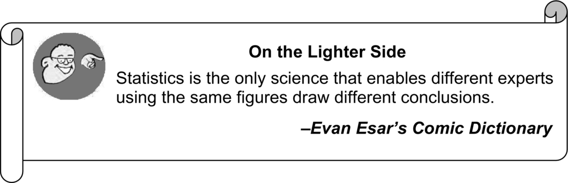
In simple bar charts, data are represented by a series of bars: the height (or length) of each bar indicating the size of the figure represented (Fig. 16.1).
Since bar charts are similar to graphs, virtually the same principles of construction apply though, it should be noted that there should never be a “break to zero” in bar charts.
16.11.2 Component Bar Charts
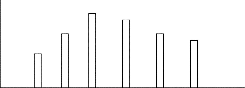
These are like ordinary bar charts, except that the bars are subdivided into component parts. This is constructed when each total figure is built up from two or more components (Fig. 16.2).
16.11.3 Percentage Component Bar Chart
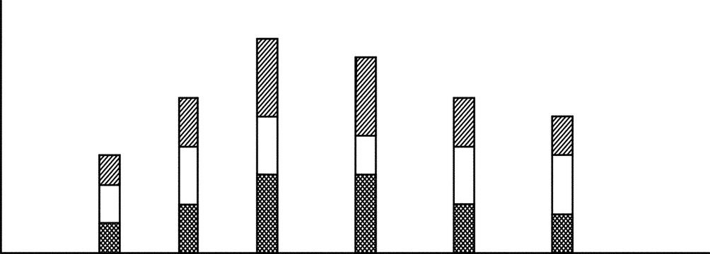
Here the individual component lengths represent the percentage each component forms of the overall total. Note that a series of such bars will all be of the same total height ie, 100% (Fig. 16.3).
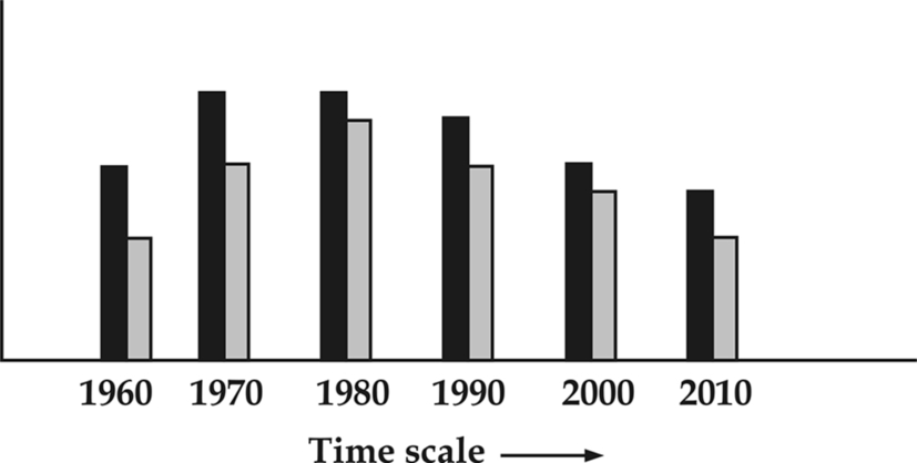
16.11.4 Multiple Bar Charts
In this type of chart, the component figures are shown as separate bars adjoining each other. The height of each bar represents the actual value of the component as shown in Fig. 16.4.
16.11.5 Dimensional Diagrams
Here the variations are represented by X and Y axes shown in Fig. 16.5
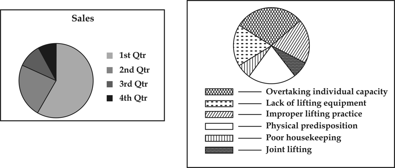
16.11.6 Pie Diagrams
Circular and pie diagrams eg, circles whose areas are made proportional to given quantities and are of service to show the makeup of the total, its segments representing the ratios of the components parts to the whole as shown in Fig. 16.6.
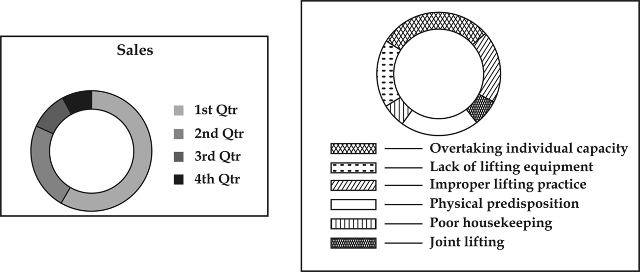
16.11.7 Doughnut Diagrams
These are similar to pie diagrams, except the data is indicated between to concentric circles, rather than in a full circle shown in Fig. 16.7.
16.11.8 Pictograms
This form of presentation involves the use of pictures to represent data. There are two kinds of pictogram:
(a) Those in which the same picture always the same size, is shown repeatedly, the value of a figure represented being indicated by the number of pictures shown (see Fig. 16.8a).
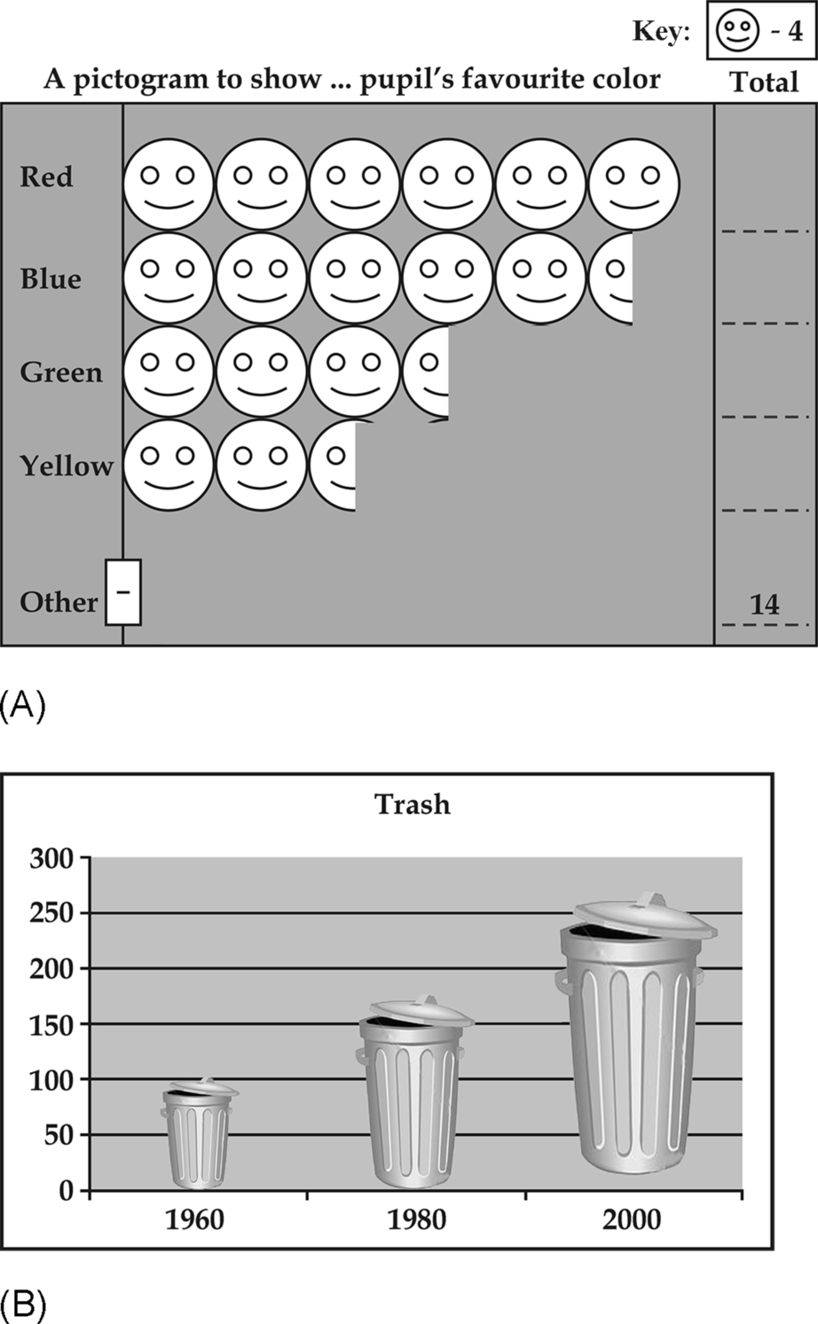
(b) Those in which the pictures change in size, the value of a figure represented being indicated by the size of the picture shown (see Fig. 16.8b).
16.12 Innovative Graphs
These days, you find in newspapers statistics data represented in innovative types of graphs, a recent one noticed in the Times of India on the urban planning statistics of various cities/towns of India can be illustrated as in Fig. 16.9.

16.13 Frequency Graphs
These frequency graphs can be drawn in several forms.
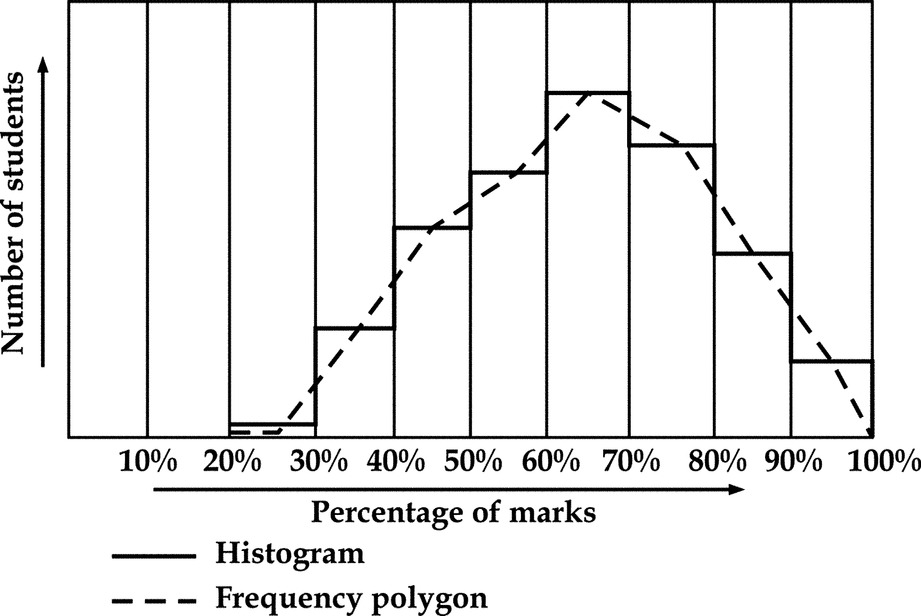
16.13.1 Histograms
It is a diagram consisting of a set of rectangles having:
(i) Bases on the X axis with centers at the class marks and lengths equal to the class interval sizes.
(ii) Areas proportional to class frequencies.
This gives the frequency per unit length of class interval and is known as the frequency density over that class-interval. In view of the importance given to the histograms as a traditional tool of TQM, this is dealt more in detail in Section 20.3.
16.13.2 Frequency Polygon
This is obtained by joining the midpoints of the top line of each bar in the previously mentioned histograms.
16.13.3 Frequency Curve
This is obtained by smoothing the frequency polygon to obtain a curve shown in Fig. 16.10.
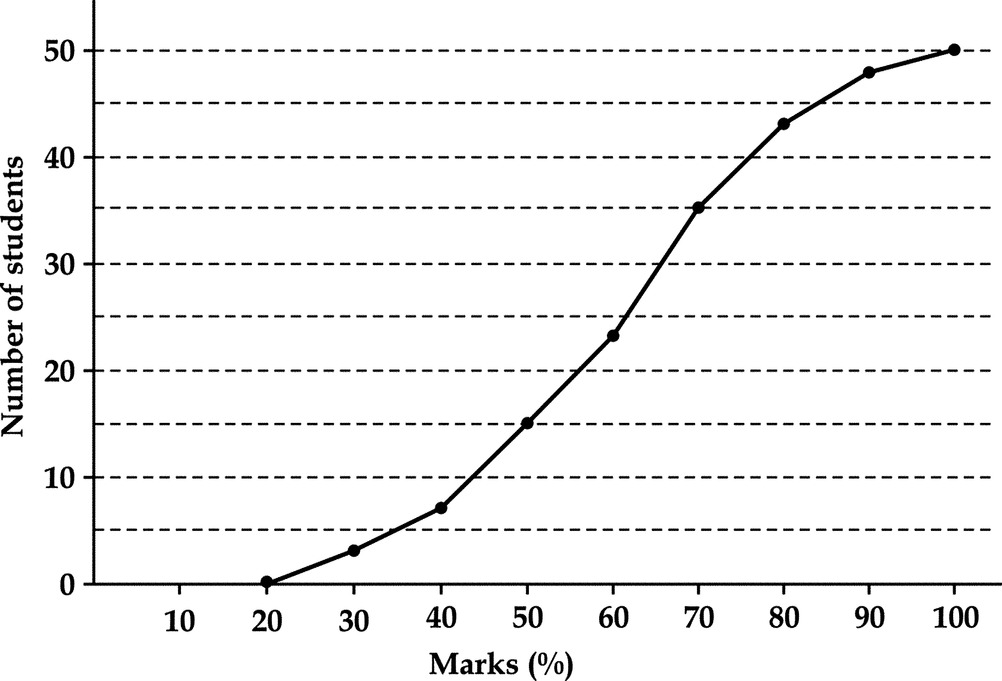
16.14 Ogive
It is the frequency polygon of the cumulative frequencies. Thus, an ogive is obtained by plotting the cumulative frequencies corresponding to values of the variate, to which they belong. Cumulative frequency polygon when smoothed out will be referred to as an ogive curve is shown in Fig. 16.11.
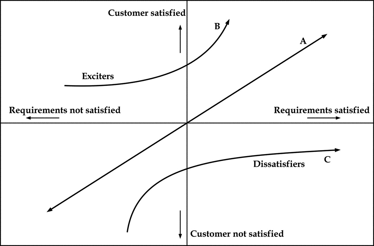
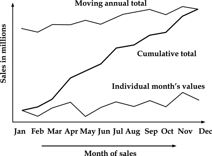
16.15 “Z” Chart
A “Z” chart (Fig. 16.13) is a combination of three graphs drawn for data over a period of one year incorporating:
(a) Individual monthly figures.
(b) Monthly cumulative figures for the year.
(c) A moving annual total.
Construction of Z-charts:
1. The basic curve representing the values of a variable over each of the 12 months of a particular year is drawn in a time scale (curve A).
2. The cumulative values for each month is computed and represented by curve B.
3. The total value of the variable for the 12 months, including that month plus the preceding 11 months, viz February of the previous year to January of this year is computed and indicated against January month. Similarly, the total of the variable from March of the previous year to February of this year is indicated against February. In this manner, the total of the 12 months’ values for the particular month plus the preceding 11 months is indicated against each of the months. A line joining these points is called the moving annual total curve (curve C) and since these three lines together look like Z of the English alphabet, it is called z-chart as illustrated in Fig. 16.12.
16.16 Lorenz Curves
It is a well-known fact that in practically every country, a small proportion of the population owns a large proportion of the total wealth. Industrialists know, too, that a small proportion of all the factories employ a large proportion of the factory workers. This disparity of proportions, which is similar to ABC analysis and Pareto principle, is a common economic phenomenon. American economist Max Lorenz illustrated this in 1905 by a graph called the Lorenz curve, showing the reality of wealth distribution. A straight diagonal line representing perfect equality of wealth distribution is drawn above it for providing contrast. The difference between the straight line and the curved line is the amount of inequality of wealth distribution, a figure also called the Gini coefficient. Lorenz curve is shown in Fig. 16.13.
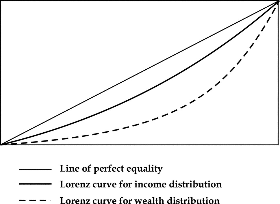
16.16.1 Application of Lorenz Curves
Lorenz curves are applicable in the following situations:
(a) Incomes in the population.
(b) Tax payments of individuals in the population.
(c) Industrial efficiencies.
(d) Industrial outputs.
(e) Examination marks.
(f) Customers and sales.
(g) Production planning.
16.17 Frequency Distribution
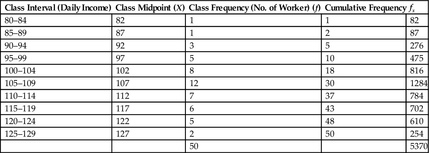
In earlier paragraphs, we have studied a variety of graphic methods of presentation of data. One of the frequent problems related to statistics is to represent grouped data graphically. Consider the following example (Table 16.1), indicating the daily income distribution among 50 workers, classified into 10 groups between Rs. 80 and Rs. 129.
Table 16.1
Frequency Distribution of Daily Income
| Class Interval (Daily Income) | Class Midpoint (X) | Class Frequency (No. of Worker) (f) | Cumulative Frequency | fx |
| 80–84 | 82 | 1 | 1 | 82 |
| 85–89 | 87 | 1 | 2 | 87 |
| 90–94 | 92 | 3 | 5 | 276 |
| 95–99 | 97 | 5 | 10 | 475 |
| 100–104 | 102 | 8 | 18 | 816 |
| 105–109 | 107 | 12 | 30 | 1284 |
| 110–114 | 112 | 7 | 37 | 784 |
| 115–119 | 117 | 6 | 43 | 702 |
| 120–124 | 122 | 5 | 48 | 610 |
| 125–129 | 127 | 2 | 50 | 254 |
| 50 | 5370 |
16.18 Central Tendency
This frequency distribution table is the basic data representation for further computations and statistical analysis. The following few paragraphs explain the subsequent steps in analyzing the central tendency of the figures.
As a second step, this distribution can be represented as frequency polygon illustrated in Fig. 16.14. Where we join the top values of each income group, we get what is called the frequency distribution curve. This is also illustrated in Fig. 16.14, which indicates other parameters of central tendency.
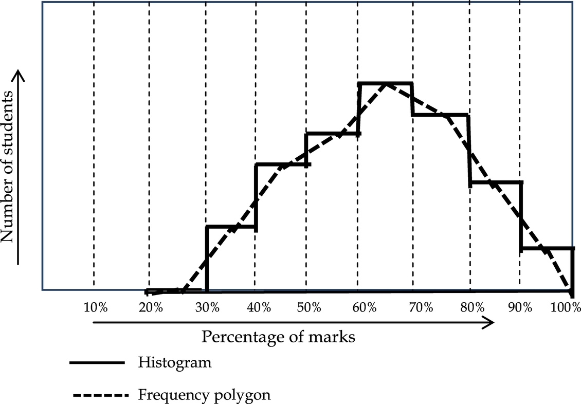
You can see from the histogram of Fig. 16.14 that while the income group value (or x value) increases, the frequency (or y value) slowly increases from a low value and attains a high value at somewhere about the center of the value and again decreases towards the end of value. This is called the Central tendency, and is common in most statistical distribution.
16.19 Measures of Central Tendency
The following are some of the measures for the frequency distribution.
2. Median
3. Mode
Also the other measures for the dispersion of the data (ie, how the individual values are spread out) are
2. Mean deviation
3. Standard deviation or variance
4. Kurtosis
5. Skewness
The three measures mean, median, and mode all sound similar, but the frequency curve as illustrated in Fig. 16.15, which has a deviation from the normal curve, explains their differences better.
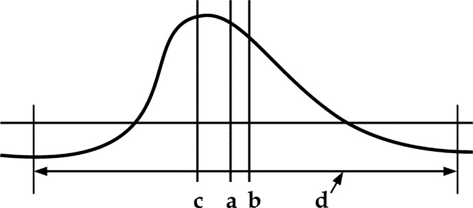
Range, represented by d is the difference between the minimum and maximum values in a series.
Mean, represented by a, is the average point on either side of which the frequencies are equally distributed, that is around which the areas on either side are equal.
Median, represented by b, is the mid-point of the range, that is the point midway between the smallest and largest value of the frequency. The median is the value of the middle item when the items are arranged according to size.
Mode, represented by c, is the point corresponding to the largest value in the array, that is the peak of the frequency distribution.
16.20 Mean or an Average
Mean or an average is a typical value which is intended to sum up or describe the mass of data. It also serves as a basis for measuring or evaluating extreme or unusual values. The average is a measure of the location of the point of central tendency. Mean can be in four types as below:
(b) Geometric mean
(c) Harmonic mean
(d) Quadratic mean
16.21 Arithmetic Mean
Due to ease of computation and long usage, the arithmetic mean is the best known and most commonly used of all the averages. When the word “mean” is used without qualification, the reference is to the arithmetic mean.
Calculation of arithmetic mean: The arithmetic mean of a small group of individual values may be obtained by dividing the sum of the values by the number of items used.
The computation of the arithmetic mean is expressed in formula form as:
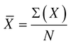
where
∑ = symbol meaning “sum of.”
X = data expressed as individual values.
N = number of items.
16.21.1 Characteristics of Arithmetic Mean
1. The value of the arithmetic mean is determined by every item in the distribution. It is a calculated average.
2. It is greatly affected by extreme values.
3. The sum of the deviations about the arithmetic mean is zero.
4. The sum of the squares of the deviations from the arithmetic mean is less than those computed about any other point.
5. Its standard error is less than that of the median.
6. In every case, it has a determinate value.
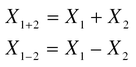
7. The sum of the means in case of multiple distributions equals the mean of the sums, whereas the difference between the means equals the mean difference.
16.21.2 Advantages of Arithmetic Mean
1. The arithmetic mean is the most commonly used.
2. Its computation is relatively simple.
3. Only total values and the number of items are necessary for its computation.
4. It may be treated algebraically. For example, where averages for subgroups are available, they in turn may be averaged in order to obtain an average for the whole group.
16.21.3 Disadvantages of Arithmetic Mean
1. The arithmetic mean may be greatly distorted by extreme values, and therefore it may not be a typical value.
2. The arithmetic mean cannot be computed from a distribution containing “Open ended” class intervals, that is, when the items are grouped in “and under” or “and over” class intervals.
16.22 Geometric Mean, Quadratic Mean, and Harmonic Mean
The three other means viz., the Geometric mean, Quadratic mean, and Harmonic mean are rarely used in statistics and hence, not covered here. However, for academic interest, the formulae are given below:
If X1, X2, X3 … etc., are the X values, then
Geometric Mean = ![]() .
.
Quadratic Mean = ![]() .
.
Harmonic Mean is given by ![]() .
.
16.23 Median
16.23.1 Definition
The median is the value of the middle item when the items are arranged according to size. If there is an even number of items, the median is taken as the arithmetic mean of the values of the two central items.
The median is an average of position while the arithmetic mean is a calculated average of values.
16.23.2 Calculation from Ungrouped Data
The median is computed from ungrouped data as follows:
1. Arrange the items according to magnitude (this arrangement is called an array).
2. Record the size of the middle value. If there is an even number of items in the array, there will be two central values and the arithmetic mean of these two values is taken as the median.
16.23.3 Calculation from Grouped Data
The median is computed from grouped data as follows:
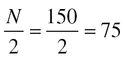
1. Determine the number of the desired middle item by using the Eq. (16.1) where N is the number of items in the distribution. For example, if there are 150 items in an array, the median item is the seventy-fifth item.
2. Find the class interval in which the seventy-fifth item appears by cumulative addition of the frequencies. The value of this class interval is the median.
16.23.4 Characteristics of Median
1. The median is an average of position.
2. The median is affected by the number of items, not by the size of extreme values.
3. The sum of the deviations about the median, signs ignored, will be less than the sum of the deviation about any other point.
4. The median is most typical when used to describe distributions where central values are closely grouped.
5. A value selection at random is just as likely to be located above the median as below. At times, therefore, the median is called the “Probable” value.
16.23.5 Advantages of Median
1. The median is easily calculated.
2. It is not distorted in value by unusual items.
3. It is sometimes more typical of the series than are other averages because of its independence of unusual values.
4. The median may be calculated even when the class intervals of the distribution are “open ended.”
16.23.6 Disadvantages of Median
1. The median is not as familiar as the arithmetic mean.
2. The items must be arranged according to size before the median can be computed.
3. It has a larger standard error than the arithmetic mean.
4. The median cannot be manipulated algebraically. The average of the medians of subgroups, for eg, is not the median of the group.
16.24 Mode
16.24.1 Definition
The mode is the most frequent or most common value which occurs in a set of data, provided a large number of observations are available.
The value of the mode will correspond to the value of the maximum point (ordinate) of a frequent distribution, if it is an “ideal,” or smooth distribution.
16.24.2 Characteristics of Mode
1. By definition, the mode is the most usual or typical value. Under certain circumstances, it may be considered as the “normal” value.
2. The value of the mode is entirely independent of extreme items.
3. The mode is an average of position.
16.24.3 Advantages of Mode
1. It is in the most typical value, and therefore, the most descriptive average.
2. It is simple to approximate by observation when there are a small number of cases.
3. If there are only a few items, it is not necessary to arrange them in order to determine the mode.
16.24.4 Disadvantages of Mode
1. The mode can be approximated only when a limited amount of data is available.
2. Its significance is limited when a large number of values are not available.
3. If none of the values are repeated, the mode does not exist.
16.25 Dispersion
The average or typical value has little use unless the degree of variation which occurs about it is given. For if the scatter about the measure of central tendency is very large, the average is not a typical value. It is therefore necessary to develop a quantitative measure of the dispersion (or variation, or scatter) of values about the average.
16.26 Range
The range, the simplest of the measure of dispersion, and as defined earlier, is the difference between the minimum and maximum values in a series. It is sometimes given in the form of a statement of the minimum and maximum values themselves.
The difference between the two extreme values indicative of the spread of the series, but quite frequently is misleading, because it gives no information about how the items are dispersed.
16.26.1 Characteristics of Range
1. The range is simple and readily understood.
2. It is easily calculated.
3. Its value is dependent on two items only, the highest and lowest values.
4. It is not necessary to know the distribution of the items between the two extremes in order to obtain the range.
5. Because the range is dependent only upon the two extremes, it is greatly affected by unusual maximum and minimum values.
16.27 Mean Deviation
The range is dependent for its value entirely upon the two extreme values. Obviously, when these end-values are far removed from the remainder of the data, a satisfactory measure of dispersion must be dependent upon the position of every value in the series.
A simple method for determining the scatter of a series of values about a given point is to take the average distance of the items from the given point. The smaller the average distance about this point, the smaller the scatter or dispersion of the values.
In a frequency distribution, the average distances of the items from the measure of control tendency, such as the arithmetic mean, may be used for this purpose. However, since the sum of the deviations about the arithmetic mean is zero, it is necessary to ignore signs in order to obtain the average distance of items from that measure.
16.27.1 Characteristics of Mean Deviation
1. The value of the mean deviation is dependent upon the value of every item in the series.
2. It may be computed about any measure of central tendency.
3. The mean deviation about the median is less than calculated about any other point.
16.27.2 Computation of Mean Deviation
The mean deviation can be computed by the following formula.
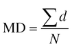
where
Σd = sum of the deviations of each value from the arithmetic mean.
N = total number of items.
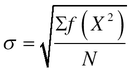
16.28 Standard Deviation
The standard deviation represented by the Greek letter sigma, σ, is the most useful value in statistics and in total quality management to understand the deviation of the values from the mean in a distribution. It is computed by taking the quadratic mean of the deviations from the arithmetic mean of those values. A standard deviation close to 0 indicates that all values are close to the mean with a steep curve of high kurtosis. The lower the σ, the wider the variation. While the standard deviation is thus called the root-mean-square, the analysis of the deviation is called analysis of variation or ANOVA in short.

where,
X = deviation of individual item from arithmetic mean = ![]() .
.
N = total number of items.
16.28.1 Computation of σ from Ungrouped Data
1. Get the difference between each actual value and the arithmetic mean.
2. Square the values thus obtained. Obtain the average of the squares.
3. Take the square root of the result.
16.28.2 Computation of σ from Grouped Data
Where there are a considerable number of items in the series the calculation of the standard deviation can be more readily performed if the data is first grouped into the form of a frequency distribution.
1. The deviation of the midpoint of each group from the arithmetic mean is used as a measure of the average deviation from the mean of all items in the group.
2. The average deviation of each group is squared to obtain the necessary deviation squared.
3. The average deviation squared is multiplied by the frequency indicated for the group in order to obtain the total of the squared deviations for that group.
4. The totals are then added for the entire distribution.
5. The square root of the sum obtained after dividing by N is the standard deviation.
16.28.3 Characteristics of Standard Deviation
1. The standard deviation is affected by the value of every item.
2. Greater emphasis is placed on extremes than in the mean deviation; this is because all the values are squared in the computation.
3. In a normal or bell-shaped distribution, the standard deviation shows the following relationship with individual values.
(a) If a distance equal to one standard deviation is measured off on the X axis on both sides of the arithmetic mean in a normal distribution, 68.26% of the values will be included within the limit indicated.
(b) If two standard deviations are measured off, 95.46% of the values will be included.
(c) If three standard deviations are measured off, 99.75% of the values will be included.
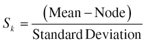
16.29 Skewness
Referring to Fig. 16.15, skewness is a term for the degree of distortion from symmetry exhibited by a frequency distribution.
When a distribution is perfectly symmetrical with one mode, the values of the mean, median, and mode coincide. In an asymmetrical (skewed) distribution, their values will be different and it will be farthest from the mode. The mode is not affected at all by unusual values; therefore the greater the degree of skewness the greater the distance between the mean and the mode.
Measure for skewness:
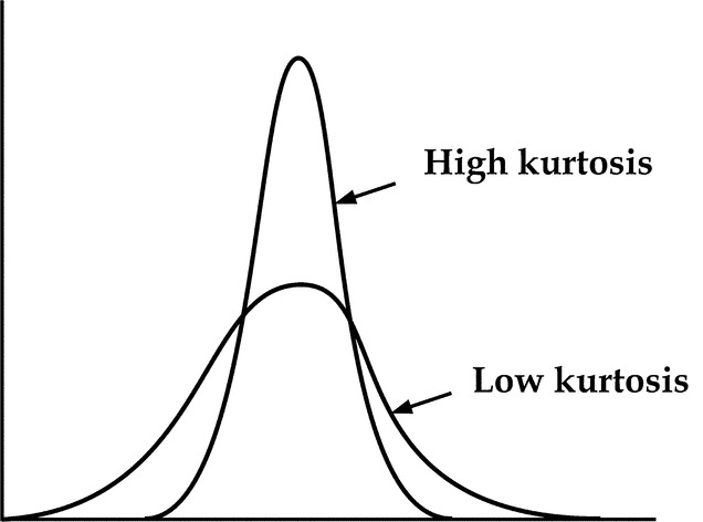
16.30 Kurtosis
This is a measure of the peakness of the distribution as is clear from Fig. 16.16.
16.31 Conclusion
It can be seen that the understanding of basic statistics and the related terminology is a must for practicing statistical quality control, without which total quality management has no place.