Seven Traditional Tools of TQM
Abstract
The Japanese folklore says that the Samurai or the warrior always went to a battle armed with seven tools. After Kaoru Ishikawa’s fishbone diagram more such TQM tools have been developed to aid analysis of the problems associated with quality. The Japanese thought it fit to have seven tools in this list, to suit the theme of the above folklore and aptly called them as the seven traditional tools of TQM. These seven traditional tools related to TQM are explained in this chapter with illustrations. In fact these methodologies have been practiced by industrial engineers and statisticians over centuries developed, especially during World War II. This process charts used in industrial engineering field, which are slightly different with reference to their application is also explained in an annexure for the information of the reader.
Keywords
Seven Traditional TQM tools; Ishikawa diagram; Seven Modern TQM tools; Check sheet; Tally sheets; Check list; Stratification; Class interval; Subject evaluation by students; Histogram; Bar graph; Symmetrical; Skewed right; Skewed left; Flat; Bimodal or Peaked histograms; Scatter diagram; Correlation; Control chart; Upper control limit; Lower control limit; Pareto principle; 80–20 rule; Law of the vital few; Principle of factor sparsity; ABC analysis; 6 Ms of manufacturing industry; 7 Ps of marketing industry; 4 Ps of service industry; Cause and Effect diagram; Fish bone diagram; Flowchart; Operation process chart; Flow diagram; Process flow diagram or chart; System flow diagram; Symbols used in flow charts; Frank Gilbreth flow chart of a nuclear power plant; Outline process charts; Man type; Material type and equipment type flow process charts; Two handed process charts; B.S. 3138
20.1 Introduction
Kaoru Ishikawa, the father of cause and effect or Fishbone diagram, and other TQM exponents proposed seven methods of analyzing TQM problems graphically, in line with the Japanese folklore which says that the Samurai or the warrior always went to a battle armed with seven tools. These have come to be known as the seven tools of Total Quality Management. Because subsequently seven more tools for TQM have been propounded as indicated in the next chapter, Ishikawa’s tools have come to be known as the Seven Traditional Tools while the latter are known as the Seven Modern TQM tools, which are discussed in a later chapter. The Seven Traditional Tools are:
1. Cause and Effect, Fishbone, or Ishikawa diagram
2. Pareto principle
3. Scatter diagram
4. Control chart
5. Flow chart
6. Histogram or bar graph and
7. Check sheet
We can group these into:
1. Check sheet, also called stratification by some authors
2. Histogram
3. Scatter diagram
4. Control chart
B. Analytical Tools
6. Flow chart
7. Cause and Effect analysis
It can be seen that the statistical tools are very much interrelated and form the sequence to be followed for any statistical analysis. An illustration is the Teacher Assessment Form used in engineering colleges, as explained in the later paragraphs. On the other hand, the tools listed above as analytical tools can be independently used for any analysis.
20.2 Check Sheets and Checklists
A Check Sheet or a Tally Sheet is a data recording form that has been designed to readily interpret results from the form itself. It needs to be designed for the specific data it is to gather. Being adaptable to different data gathering situations, it is easy and quick to use and requires only minimal interpretation of results. It is free from various forms of bias—exclusion, interaction, perception, operational, non-response, estimation.
This check sheet may not be confused with a checklist which contains items that are important or relevant to a specific issue or situation. Checklists are used under operational conditions to ensure that all important steps or actions have been taken. Their primary purpose is for guiding operations, not for collecting data.
As one of Ishikawa’s basic quality tools, check sheets are an effective means of gathering data in a helpful, meaningful way. They are easy to use and allow the user to collect data in a systematic and organized manner. Many types of check sheets are available. The most common are the defective item, defective location, defective cause, and checkup confirmation check sheets.
Sheets, apart from several types as illustrated below.
When the recording of a particular parameter is done in several sheets, the tally sheet helps in summarizing all the parameters from all the pages into a single sheet without missing a single parameter.
Objectives of check sheets
● Clearly identify of what is being observed.
● Keep the data collection process as easy as possible.
● Group the data. Collected data should be grouped in a way that makes the data valuable and reliable. Similar problems must be in similar groups.
● Create a format that will give the most information with the least amount of effort.
Types of check sheets
1. Distribution check sheets, used to collect data in order to determine how a variable is dispersed within an area of possible occurrences.
2. Location check sheets, used to highlight the physical location of a problem/defect in order to improve quality.
3. Cause check sheets, used to keep track of how often a problem happens or records the cause of a certain problem.
4. Classification check sheets, Used to keep track of the frequency of major classifications involving the delivery of products or services.
Basic steps to construct a check sheet
1. Clearly define the objective of the data collection.
2. Determine other information about the source of the data that should be recorded, such as shift, date, or working point.
3. Determine and define all categories of data to be collected.
4. Determine the time period for data collection and who will collect the data.
5. Determine how instructions will be given to those involved in data collection.
6. Design a check sheet by listing categories to be counted.
7. Pilot the check sheet to determine ease of use and reliability of results.
8. Modify the check sheet based on results of the pilot.
Illustration No. 1
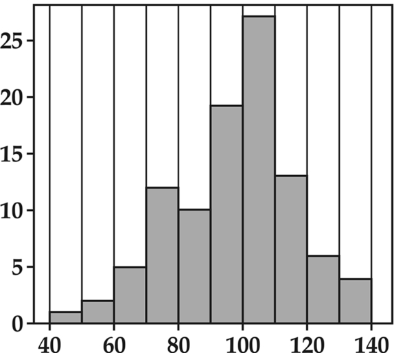
Step 1: Let us consider the marks obtained by each of the 60 students in a class in the order of their roll number are:
57, 56, 54, 73, 83, 48, 60, 50, 67, 62, 74, 56, 84, 78, 60, 67, 79, 53, 50, 76, 66, 65, 65, 72, 52, 87, 42, 75, 66, 68, 68, 69, 70, 51,61, 72, 64, 63, 54, 74, 66, 58, 57, 68, 81, 74, 67, 68, 64, 47, 64, 63, 63, 65, 67, 62, 67, 55, 58 and 59.
Step 2: Arrange a tally sheet with 10 class intervals, each containing 5 marks like 40 to 44, 45 to 49… up to 85 to 90, as per Fig. 20.1.
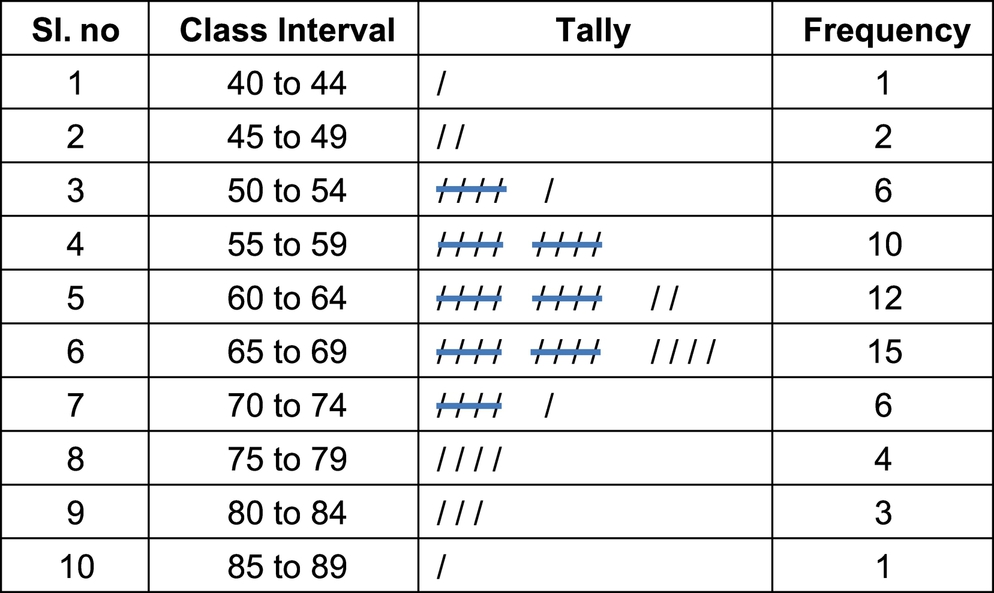
This is an illustration of simple tally sheet for a single variable. This is further explained in Section 20.3 on how the histogram can be drawn based on this tally sheet.
Illustration No. 2
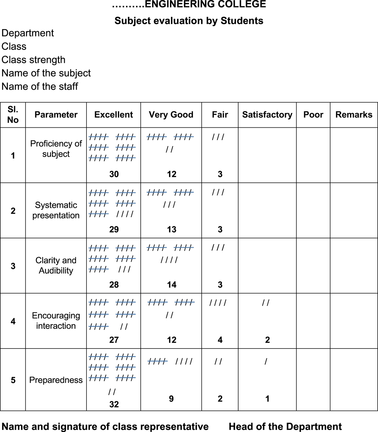
Another typical illustration for the tally sheet is the “Subject Evaluation by Students” exercise being done at engineering colleges, as illustrated below.
The principle of the check sheet or tally sheet is illustrated by Figs. 20.2 and 20.3 of the Teacher Assessment Form used in engineering colleges as per the following procedure.
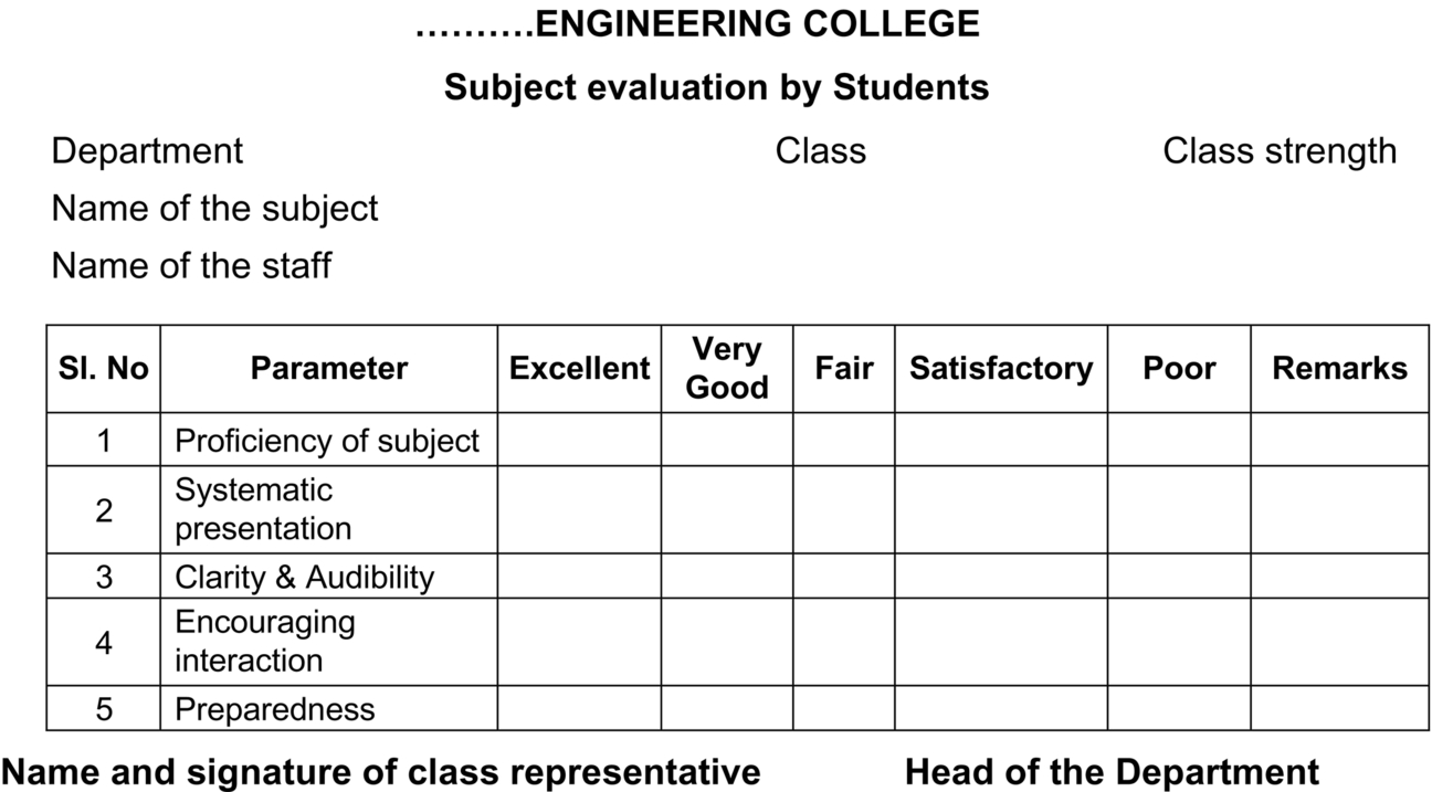
1. In a class of 60, each student assesses the capacity of the teacher by giving 5 gradings of Excellent, Very good, Fair, Poor, and Very Poor for 4 or 5 parameters, each student filling up one sheet. Here we have considered only 5 parameters, whereas there can be as many as 15 parameters that can be assessed. Fig. 20.2 illustrates a blank format in which the student records his assessment.
2. The class representative then prepares the tally sheet as per Fig. 20.3, transferring the data from the 60 sheets into a single sheet, each grading/parameter entered by a tick.
3. He then counts the number of ticks in each box and enters it in a corresponding box per Fig. 20.3, which will give the frequency of that grade.
4. By assigning a value for each grade and a weight for each parameter, the total points scored by the teacher can be calculated and recorded.
1. The format is as shown in Fig. 20.2.
2. The tally sheet is done on the same format with larger sized boxes for clear tallying, as illustrated in Fig. 20.3.
20.3 Histogram or Bar Graph
Histogram, derived from the Greek word histos meaning anything set upright, was first introduced by Karl Pearson in 1891. It is a graphical representation of the distribution of data in a set of rectangles having:
(i) The X axis with centers at the class marks and lengths equal to the consecutive, non-overlapping intervals of a variable class.
(ii) The height of a rectangle is also equal to the frequency density of the interval.
This gives the frequency per unit length of class interval and is known as the frequency density over that class-interval.
Histograms are used to plot the density or frequency of occurrence of a particular event or parameter, estimating the probability density function of the underlying variable or parameter.
Histograms are the basic diagrams, the smoothing of which give us normal curves, the most significant curve in statistics. Smoothing is done by joining the midpoints of the peaks of each of the bar by a smooth curve. Thus, just like normal curves, the histograms, too, can be smoothened (Figs. 20.4 and 20.5):

2. Skewed right or
3. Skewed left or
4. Flat or
5. Peaked or
6. Bimodal.
How to build a histogram
1. Arrange all the values or readings in the order they appear.
2. Determine the range which is the difference between the highest and the lowest value.
3. Distribute this range into a reasonable number of groups, say 10. These are also called the arrays and the magnitude of each group is called the class interval.
4. Tabulate the frequency of each value by placing it alongside of the class interval in tally form.
5. Total the tallies of each class and indicate this against each class as frequency.
6. Construct the graph with the class intervals in the X-axis and the frequency value in the Y-axis., erecting bars for each class interval, the height of each bar being equal to the frequency.
Principles of histogram construction
1. The correct impression must be given by giving a clear and comprehensive title.
2. A reasonable number of class intervals should be chosen to provide a meaningful, diagram that is not overcrowded.
3. The histogram must have clearly labeled axes.
4. The independent variable should always be placed on the horizontal axis.
5. The vertical scale should always start at zero.
6. A double vertical scale should be used where appropriate.
7. The bars should of the same width, meaning the class interval should be same.
8. The source of the actual figures must be given.
20.4 Scatter Diagram
As scatter diagram, scatter lot, or scatter graph is a type of statistical diagram using Cartesian coordinates to display values for two variables for a set of data and shows how much one variable is affected by another. It is effectively a line graph with no line—ie, the point intersections between the two data sets are plotted, but no attempt is made to physically draw a line. It is used when a variable exists at random which is beyond our control. The Y-axis is conventionally used for the characteristic whose behavior we would like to predict. A scatter plot (Fig. 20.6) can suggest various kinds of correlations between two variables’ weight and height with a certain confidence level. It is the basic tool to explain the correlation between two variables as explained in more detail in Section 17.1.4, of Chapter 17.
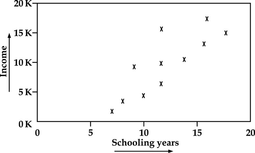
This relationship may be correlated, uncorrelated, positively related (rising), or negatively related (falling). If the points are close to making a straight line in the scatter plot, the two variables have a high correlation, but if they are equally distributed in the scatter plot, the correlation is low, or zero. Several types of scatter graphs shown in Fig. 17.2 of Chapter 17 indicate how a certain variable represented by the Y-axis changes with respect another variable represented by the X-axis. More noticeable is Fig. 17.2(iv) which indicates absolute no correlation while 17.2(i) and 17.2(vii) indicate perfect positive and negative correlation.
20.5 Control Chart
Walter Shewhart (pronounced as shoe-heart), in his book, Statistical Method from the Viewpoint of Quality Control (1939), put a question, “What can statistical practice, and science in general, learn from the experience of industrial quality control?” This question and his explanation formed a major turning point in the concept of quality control. Walter Shewhart visited India in 1947–48 under the sponsorship of P. C. Mahalanobis of the Indian Statistical Institute. Shewhart toured the country, held conferences, and stimulated interest in statistical quality control among Indian industrialists.
Shewhart framed the problem in terms of assignable cause and chance-cause variation and introduced the control chart as a tool for distinguishing between the two. Shewhart stressed that bringing a production process into a state of statistical control, where there is only chance-cause variation, and keeping it in control, is necessary to predict future output and to manage a process economically. He concluded that while every process displays variation, some processes display controlled variation that is natural to the process, while others display uncontrolled variation that is not present in the process causal system at all times. That is how the control charts came to be treated as the most significant tool of quality control analyses. A typical control chart is illustrated in Fig. 20.7.
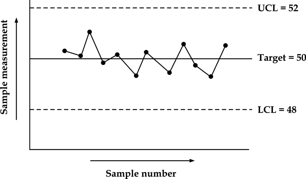
A control chart consists of:
● Points representing values of a quality characteristic, such as mean, range, proportion, in samples taken from the process at different times.
● The mean of this parameter for all the samples is calculated.
● On the graph, a Center line is drawn at the value of the mean of the statistic. All other points representing the respective values are plotted on the graph.
● Upper and lower control limits, sometimes called natural process limits, beyond which the values are not expected to go, or the threshold at which the process output is considered acceptable, are calculated.
● The upper value and the lower value are designated as upper control limit and lower control limit.
● The space between the control limits is divided into zones depending upon the requirement.
● As long as the values of the points are within these limits, the process is assumed as going as expected, but if the points are seen beyond these limits, there we can suspect that either the value measurement is wrong or that there is something wrong in the process that needs our attention.
20.6 Pareto Principle
The Pareto principle (also known as (i) the 80–20 rule, (ii) the law of the vital few, and (iii) the principle of factor sparsity states that, for many events, roughly 80% of the effect comes from 20% of the causes (machines, raw materials, operators, etc.). In other words, in any population, 20% of the people contribute to 80% of a parameter, say the GDP. This is similar to the Principle of ABC analysis which states that in an engineering industry, 10% of the production items contribute to 70% of the total annual consumption. The origin of Pareto Diagram is indicated in Section 3.1 (Fig. 20.8).
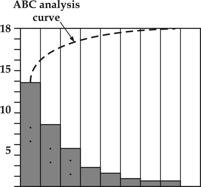
When applied to the TQM situation, we can say that as per Pareto principle, 20% of the effects cause 80% of the total machine downtime. Effort aimed at the right 20% can solve 80% of the problems.
This principle would help in identifying which of the products or processes that fail more often, so as to prioritize and concentrate our efforts more. Effort aimed at the problematic 20% can solve 80% of the problems, just as we concentrate our inventory control effort on the 10% items to control 70% of the annual value. A typical Pareto chart indicating the significance of the shrink effect in casting defects is illustrated in a figure from Wikipedia. Double (back to back) Pareto charts can be used to compare “before and after” situations.
20.7 Cause and Effect Diagram
When you have a serious problem, it’s important to explore holistically all of the things that could cause it, before you start to think about a solution, rather than just addressing part of it and having the problem run over and again. Ishikawa diagrams were proposed in the 1960s, by Kaoru Ishikawa, one of the founding fathers of modern management, who pioneered quality management processes in the Kawasaki shipyards. This forms one of the seven basic tools of TQM along with the histogram, Pareto chart, check sheet, control chart, flowchart, and scatter diagram.
Because of its principle of showing the causes of a certain event for further analysis, it is called the Cause and Effect diagram and also Ishikawa diagram, after its pioneer. Since the diagram looks like a fish skeleton with its bones spreading out from the vertebral bone (Fig. 20.9), it has become more popular as the fishbone diagram.

This method can be used on any type of problem, and can be tailored by the user to fit the circumstances. Use of this tool has several benefits to process improvement teams:
● Straightforward and easy to learn visual tool.
● Involves the workforce in problem resolution—preparation of the fishbone diagram provides an education to the whole team.
● Organizes discussion to stay focused on the current issues.
● Promotes “System Thinking” through visual linkages.
● Prioritizes further analysis and corrective actions.
20.7.1 Categories of Cause and Effect Diagrams
A. The 6 Ms (used in manufacturing industry)
Toyota Production System had originally used 6 Ms to which two more Ms, viz Management (money power) and maintenance have later been added to make it 8 Ms, as stated which, of course, is not globally recognized.
● Method (process)
● Material (includes raw material, consumables, and information.)
● Manpower (physical work)/mind power (brain work): Kaizens, Suggestions
● Measurement (inspection)
● Milieu/mother nature (environment)
The other 2 Ms added later on as above are:
● Maintenance
B. The 7 Ps (used in the marketing industry)
● Price
● Place
● Promotion
● People/personnel
● Positioning
● Packaging
C. The 4 Ps (used in service industry)
● Procedures
● Process technology
● People
20.7.2 Basic Illustrations of Cause and Effect Diagrams
The six parameters of every event called 6 Ms, as stated above, are analyzed in manufacturing industries. These are Machines, Methods, Materials, Measurements, Manpower, and Mother Nature (Environment) (Fig. 20.9).
In service industries there can be four parameters called 4 Ps as stated above. These are the company policies, the procedures adapted, the person working on it, and the Process Technology adapted where the event has taken place. Fig. 20.10 illustrates this situation.

20.8 Flow Charts
A flowchart is a type of diagrammatic representation to illustrate a solution to a given problem. Basically, it is a line diagram representing the flow of a particular product along different operation sequences without reference to the geographical location of these work stations. This will give a bird’s eye view of the several operations that the product would undergo. It indicates the steps involved in a process in the form of boxes of different kinds, and their order by connecting them with arrows. The boxes show the process operations, the various steps and actions, while the arrows show the order of the steps. Fig. 20.11 illustrates some of the boxes used in flow charts.

There are basically 3 categories of these charts:
● Process Flow Charts, as explained above
● Operation process charts, as explained in the next paragraph
● Flow diagrams
20.8.1 Symbols Used in Flow Charts
The flow process chart was originally introduced by Frank Gilbreth in 1921 as a structured method for documenting process flow, in his presentation “Process Charts, First Steps in Finding the One Best Way to Do Work.” Gilbreth’s tools quickly found their way into industrial engineering curricula (Wikipedia). With the advancement of information technology, the flow charts have been applied extensively using most of the symbols as illustrated.
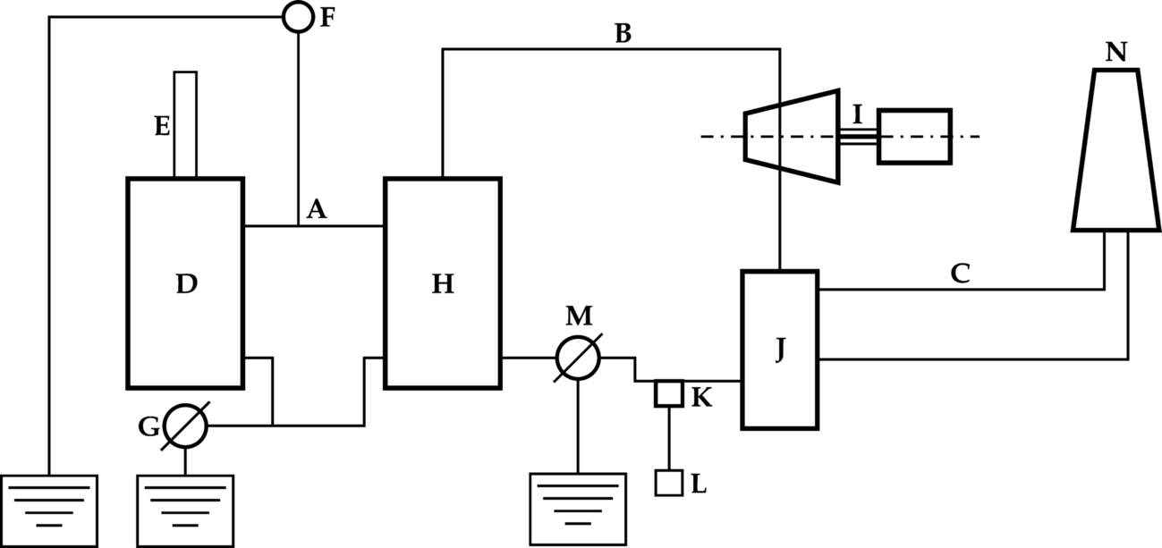
Flow chart is also known as process flow diagram or chart, or system flow diagram or simply flow chart, a term used by industrial engineers, depending upon the application basically a manufacturing system. It is used primarily in process engineering and the chemical industry where the complex relationship between major components and how the material flows through various stages and components is depicted to provide an easy comprehension of the user. This generally is a combination of outline process chart and the flow diagram, where each operation is represented by the appropriate shape of the equipment as illustrated in Fig. 20.11. This gives a visual picture of the equipment, as well as the operation sequence. Sometimes the equipment is represented by functional blocks. Even in computer programming, flow charts are used to represent a series of decisions and the corresponding actions taken. A typical such flow diagram for a nuclear power plant is illustrated in Fig. 20.12.
It may be noted that in industrial engineering and work study, nomenclatures like flow diagrams, operation flow charts, etc. are used with slightly different applications. These charts are explained in the appendix so that we can distinguish clearly between the nomenclature used in TQM books and those used in Industrial Engineering books.
20.8.2 The Benefits for Process Flowchart
The process flow chart provides a visual representation of the steps in a process. Constructing a flow chart is often one of the first activities of a process improvement effort, because of the following benefits:
● Helps in making process flow charts
● Gives everyone a clear understanding of the process
● Helps to identify non-value-added operations
● Facilitates teamwork and communication
● Keeps all information on the same page.
It may be noted that the terms Flow chart or flow diagram are used to represent the flow of material along the several equipment especially in a process industry. In TQM, several books use the words charts and diagrams interchangeably almost as synonyms. However, in industrial engineering where these tools have been extensively used since the days of W. Taylor, charts signify the operations, movements, inspection, and delays that occur during the flow of materials from the first operation to the final operation in a group of operations performed on the material between work stations. On the other hand, the diagrams are geographic representations which may or may not be to a scale depicting the positioning of the equipment and the flow of material. It is hence felt to be appropriate to detail the various charts and diagrams used in industrial engineering projects to have a clear appreciation of the terminology used in TQM, as explained in the annexure at the end of this chapter.
20.8.3 Operation Process Chart
It is a simplified form using only the five parameters of operations, movements, inspections, delays, and storage. These charts are used for method study analysis in industrial engineering applications to identify and eliminate the wasted elements and operations, while the original form of a flow process chart or the flow charts are more used in analyzing quality control issues. Since method study is very significant in an industrial engineer’s day-to-day performance, the operation process chart and flow diagram are explained more in detail in the annexure at the end of this chapter.
20.8.4 Flow Diagram
It is a plan, substantially to scale, of the factory or shop with the location of the machine, workplace, etc., indicated. On this, the movement of each product or component can be graphically represented, as illustrated in Fig. A5.
20.9 Conclusion
Undoubtedly a proper diagrammatic representation of the flow of materials and the operations performed on them gives us a better understanding of the physical flow, more than the narrative. It is essential that these diagrams and charts should be drawn to an international standard so that they convey the same concept to everyone. The appendix below illustrates, in addition to those specified in the 7 traditional tools, some other charts and diagrams normally used by engineers, so that the confusion in the terminology is avoided.

Apart from the flow Process chart that has been cited as one of the 7 traditional tools of TQM, industrial engineers have been using different types of process charts from the days of W. Taylor. These are illustrated and explained in this annexure.
Process Chart
This has been used by Industrial engineers from the days of W. Taylor. Basically a flow chart is a line diagram representing the flow of a particular product along different operation sequences without reference to the geographical location of these work stations. This will give an idea of the several operations that the product would undergo. On the other hand, a flow diagram depicts the geographical position of the various workstations and may or may not be to scale. This would give a bird’s eye view of the general location of the activities carried out as well as the route followed by the product, the operators, the materials and the equipment. There can be several types of flow charts or diagrams as follows.
2. Flow process charts
● Material type
● Equipment type
3. Two-handed process charts
4. Flow charts
5. Process charts
Outline Process Chart
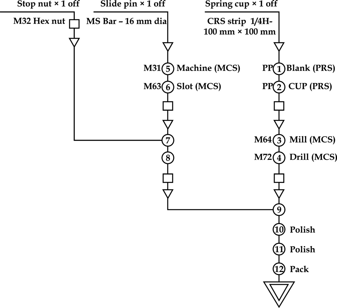
The outline process chart (also referred as operation process chart) is a chart that gives a bird’s eye view of the various operations, inspections, and storage done in sequence for all the components that go into a particular product or assembly.
B.S. 3138.
It may be noted here that most European authors, including ILO, refer to this chart as outline process chart where as American authors including HB Maynard, in his Industrial Engineering Handbook, refer to this as operations process chart. Both names are valid and can be treated as synonyms as illustrated in Fig. A1. As mentioned earlier, this is a simplified form of the Flow chart and the symbols used are as per Fig. A2.

Flow Process Chart
Flow process can be defined as follows:
Flow process chart sets out the sequence of the flow of a product or an equipment or a man, by recording all the events under review using appropriate process symbols. These flow process charts can either be material type or equipment type or man type, depending whether the subject being charted is the material, equipment or man.
As the definition indicates, the flow process charts can be of three types.
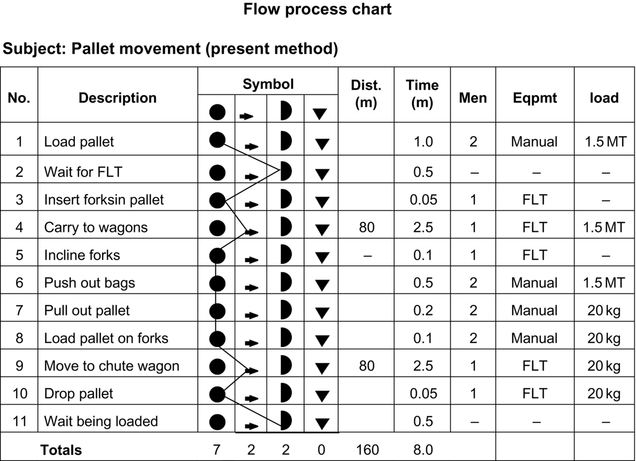
(a) Material types, wherein the flow of the materials, the products, or the components are charted as illustrated in Figs. A3 and A4. A majority of the flow process charts are of this type.

(b) Equipment type, wherein the movement of certain equipment like welding equipment, portable drills, cranes, fork lift trucks, and air compressors, that are taken from workplace to workspace on a regular basis. This chart would be useful if these equipment cause bottlenecks or excessive waiting time for the work place that needs it.
(c) Man type, wherein the activities of a single worker or a gang moves from place to place as a part of their work, like the maintenance gang or the road laying gang, this type of chart would be used.
Fig. A3 and A4 illustrate the material type flow process chart for pallet handling in a port.
Flow process charts are specifically useful the following 3 situations
● The work sequence or elements are not exactly identical, but vary from cycle to cycle. This variation may be due to the operator’s practices, such as cleaning equipment or may be due to the inherent nature of the work, like the maintenance operations or like the powdering of the hardened fertilizer in bulk storage.
● The work is not cyclic, but unique like the port workforce handling different types and sizes of the packages in clearing a general cargo storage area.
● The work is cyclic, but includes several subcycles performed with different frequencies. A typical example is in packing operations, where small automobile components are packed in individual cartons, then 10 of them are packed in a larger carton and 4 or 6 of the larger cartons packed in wooden boxes, all these forming one cycle. In this case, it is essential that to indicate the frequency of each element and the subcycle.
Flow Diagram
A flow diagram is a plan, substantially to scale, of the factory or shop with the location of the machine, workplace, etc., indicated. On this, the movement of each product or component can be graphically represented.
As the definition implies, the flow diagram is a supplement to the flow process chart as illustrated in Fig. A5. This can also be used for the movement of men and tools. The general steps involved in drawing a flow diagram are:
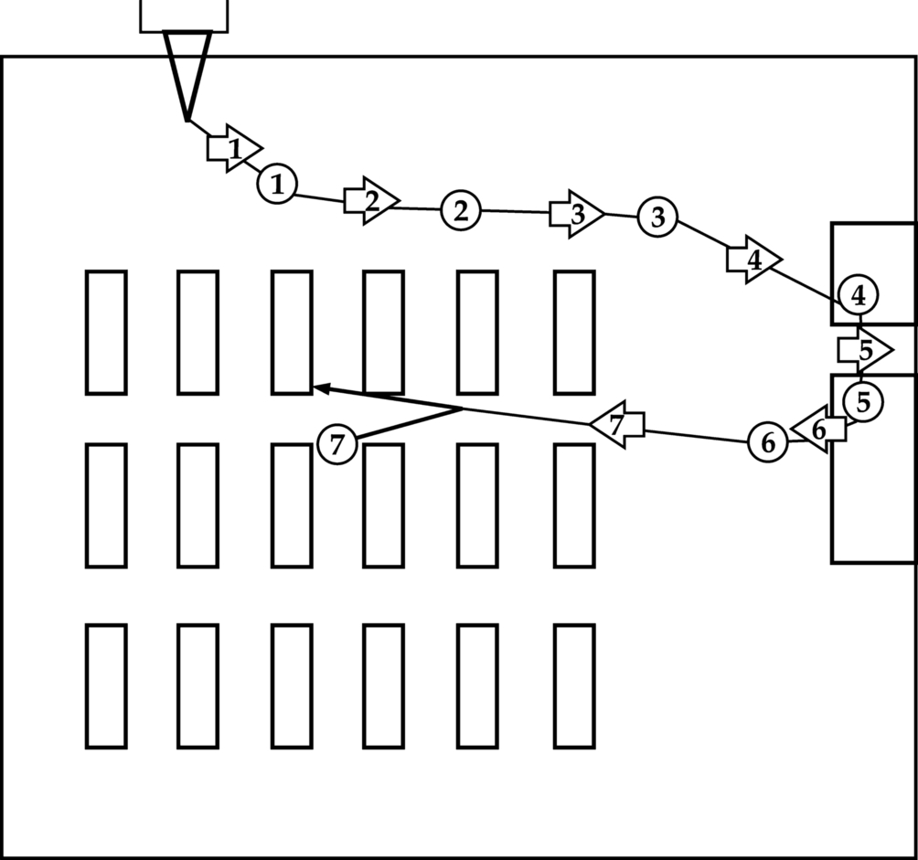
(a) Draw to scale the plan of the work area,
(b) Mark the relative positions of the machines and all equipment like benches, booths, racks, etc.
(c) From the different observations and recordings made, draw the path and direction of the movement of the material or men on the diagram. The paths of different components can be marked in different colors.