This chapter demonstrates how you can use vRealize Operations and vRealize Log Insight to monitor performance. To some extent, it will help in performance troubleshooting too. This chapter deliberately separates capacity from performance in order to further drive the point that they are different.
We group the dashboards into use cases and will cover the following use cases:
- How is the overall IaaS performance? Is any VM not getting the resources promised as per the performance SLA?
- Is virtualization causing the problem? This dashboard lets the help desk team quickly determine where a performance problem lies when a VM owner complains.
- Is vMotion impacting VM performance?
- Is any VM abusing the shared IaaS?
Let's recap from Chapter 4, Performance Monitoring, the main question asked by the CIO about your IaaS platform:
"How do you prove that not a single VM in the past month has suffered an unacceptable performance hit because of non-performing IaaS?"
Chapter 4, Performance Monitoring, then went on to explain that you implement service tiering to help you defend your IaaS. Chapter 5, Capacity Monitoring, supported the idea by incorporating performance into capacity management.
For each service tier, we need to cover the four components of infrastructure, which are:
- CPU
- RAM
- Disk
- Network
You need to ensure that not a single VM experiences a contention that exceeds the agreed-upon SLA on that service tier. Naturally, there is different SLA for each tier. This means you need to plot one chart for each service tier.
Based on the performance SLA defined in Chapter 4, Performance Monitoring, these are the required line charts:
- A line chart showing the maximum CPU contention experienced by any VM in the cluster
- A line chart showing the maximum RAM contention experienced by any VM in the cluster
- A line chart showing the maximum storage latency experienced by any VM in the cluster
Can you guess why we use clusters and not ESXi hosts?
You are right: due to HA and DRS, a vSphere cluster is the smallest logical building block. With technology like VSAN, it further emphasizes that a cluster should be seen as one unit.
You will need a minimum of four super metrics, which are:
- Maximum VM CPU contention in the cluster
- Maximum VM RAM contention in the cluster
- Maximum VM disk latency in the cluster
- Maximum VM dropped packets in the data center
We're not tracking the network at the cluster level as it's something you can do at higher levels. You should not expect any dropped packets within your data center.
Can you guess why we only display the maximum value and not the average?
There is no need to display the average value. Our focus here is performance, not capacity. Remember, performance is something you check daily, while capacity is something you check quarterly.
While this dashboard is for day-to-day monitoring, it is a good starting point for any performance troubleshooting. You need to know the overall situation before diving into a particular problem. There is no point troubleshooting a particular VM's performance if the whole cluster has a performance issue.
This dashboard is not for the overall health. Health is more than performance. It takes into account anomalies and availability. Health is also affected when the capacity is near full as it takes into account the vSphere HA setting.
With that, let's proceed.
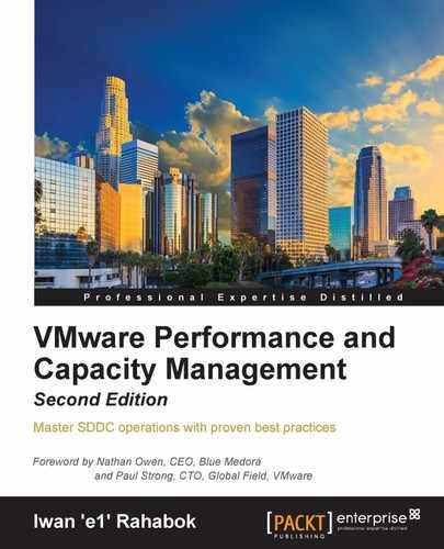
The following screenshot shows the super metric formula to get the maximum CPU contention experienced among all VMs in the cluster. I have enlarged the original dialog box so that the text is large enough to read on a tablet and printed copy.
Maximum VM CPU contention in a cluster
Note
If you are not sure how to create a super metric, follow the instructions at http://virtual-red-dot.info/how-to-create-a-super-metric-in-vrealize-operations-6/.
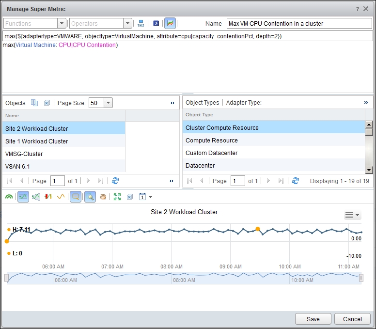
The following screenshot shows the Super Metric formula to get the maximum memory contention of all the VMs in the cluster. It's similar to CPU contention, but just using a different metric.
Average VM memory contention in a cluster
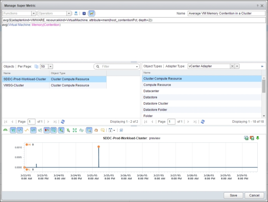
For storage, we have a few counters to choose from as VMs have multiple storage counters. We've chosen a counter at the Virtual Disk level, so it does not matter whether it is VMFS, NFS, or VSAN. It also works on RDM, although you should avoid using RDM in the first place.
The following screenshot shows the Super Metric formula to get the maximum disk latency of all the VMs in the cluster:
Maximum VM disk latency in a cluster
For network, we need a line chart showing the maximum network dropped packets at the physical data center level. We use a physical data center and not a vSphere cluster, as both share the same core switches.
It's also easier to manage the network per physical data center. Unless your network is stretched, problems do not span across. If you are planning to span your network across multiple sites, review the article by Ivan Pepelnjak at http://blog.ipspace.net/2012/10/if-something-can-fail-it-will.html.
The problem is how to choose ESXi from the same physical data center. It is possible for a physical data center to have multiple vCenter servers. On the other hand, it is also possible for a vRealize Operations world object, or even a single vCenter, to span multiple physical data centers.
Based on your environment, determine the right vRealize Operations object so that you get all the ESXi hosts in that physical data center. For example, if you have one vRealize Operations instance managing two physical data centers, you definitely cannot use the World object. It will span across both data centers.
In this example, the environment has one virtual data center mapped to one physical data center. None of the clusters span across physical data centers. In this case, we can choose a vCenter virtual data center.
The following screenshot shows the super metric formula to get the maximum network dropped packets in a vCenter data center object. Notice the formula has depth=3, as the data center object is three levels above the VM object:
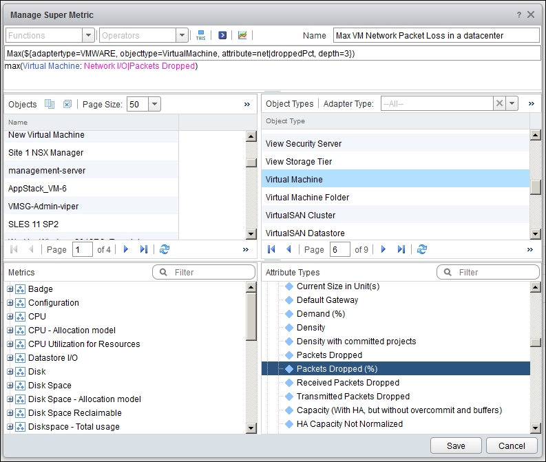
Maximum VM network dropped packets in a vCenter data center
Once you create the super metrics, you need to apply them to the objects. If you are not sure how to apply super metrics to objects, follow the instructions at http://virtual-red-dot.info/vrealize-operations-how-to-add-supermetric/.
By the way, if you prefer to copy and paste the Super Metrics, here are the actual formulas:
max(${adaptertype=VMWARE, objecttype=VirtualMachine, attribute=cpu|capacity_contentionPct, depth=2})
max(${adaptertype=VMWARE, objecttype=VirtualMachine, attribute=mem|host_contentionPct, depth=2})
Max(${adaptertype=VMWARE, objecttype=VirtualMachine, attribute=virtualDisk|totalLatency, depth=2})
Max(${adaptertype=VMWARE, objecttype=VirtualMachine, attribute=net|droppedPct, depth=3})There are many resources on the Internet showing you how to create dashboards, so I hope you agree that there is no need to kill trees when the information is readily available using Google. The actual steps also differ slightly for each vRealize Operations edition.
The dashboard we use here leverages the View widget.
View is a new feature in version 6.0. In version 5.x, you needed to create a custom XML file to display specific metrics in a widget. In version 6, you just need to create a view for a specific metric. There is no need to manually edit and upload an XML file. The catch is that you get one chart per view, which cannot be split. If you want multiple charts, you need to have multiple views, and hence, multiple widgets.
Always prefix the View objects that you create. vRealize Operations has over 200 out-of-the-box views, so it can be difficult to find yours if you do not tag them somehow. In the following example, we have prefixed our view with E1. A good prefix for you will be the short name of your company (for example, MSFT or AWS).
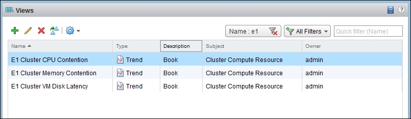
vRealize Operations—Views list with filters
You need to create three View objects. Each of them is a line chart. As part of the creation, you need to do the following:
- Click on the Presentation tab in the wizard's dialog box and choose Trend. This stands for line chart.
- In the Subjects dialog box, choose Cluster. You want to get the Super Metric you created earlier.
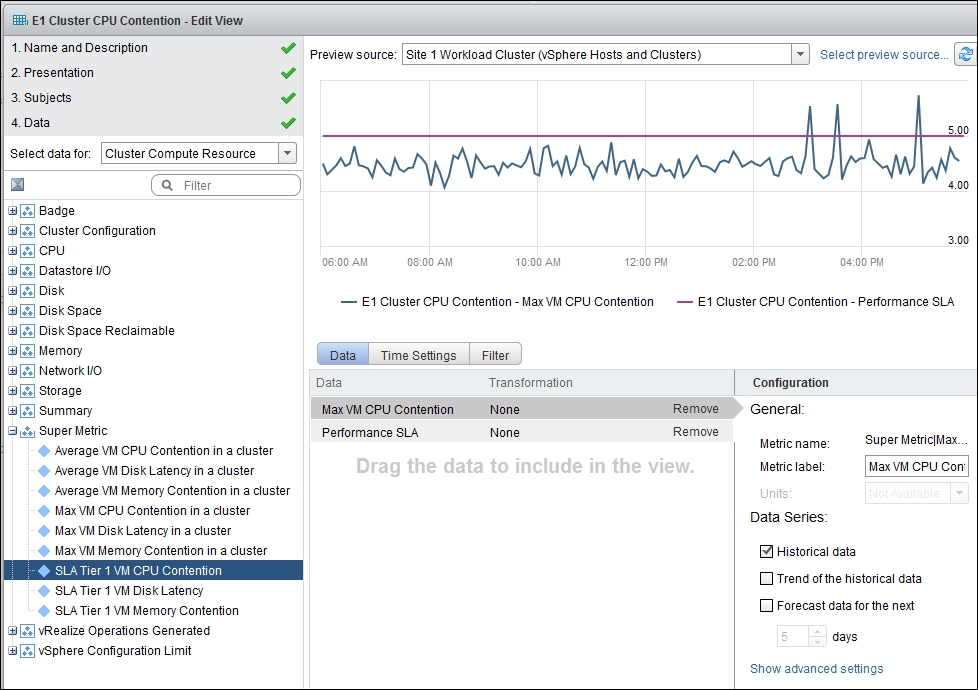
- In the Data tab, choose the relevant Super Metric. For CPU, choose CPU contention.
- In the Configuration area, deselect Trend under historical data and forecast data. You only need the actual historical data. A trend line will complicate the chart.
- Now, in the Time Settings tab, choose the time duration that suits your need. I recommend 12 hours as the default. This means you should check the environment twice a day, which is a good practice.
When you are done, it will look like the following screenshot. This example is for CPU:
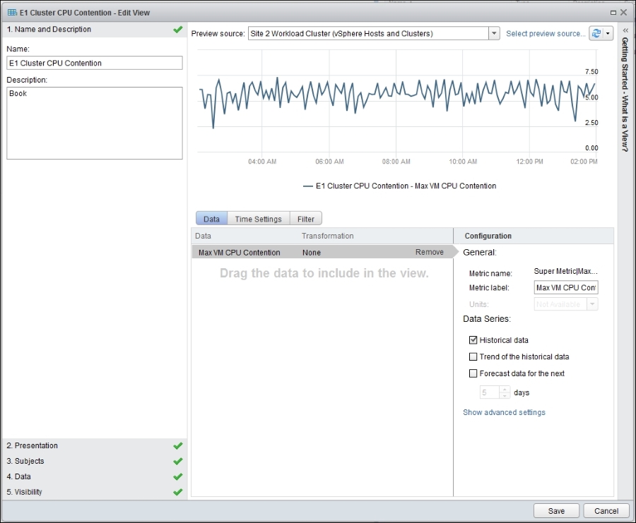
vRealize Operations—the View wizard dialog box
Once all the View widgets are created, it is a matter of adding them to a dashboard. Here are the steps you need to carry out:
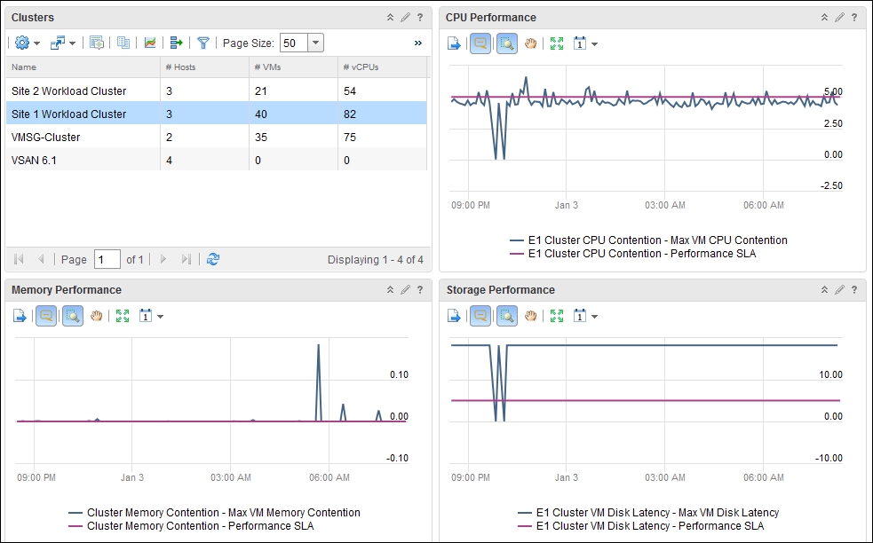
- Create a new dashboard. Name it IaaS Overall Performance, or something that makes sense to you.
- From the Widget List submenu, choose an Object List. Customize it to show the cluster objects.
- Add three View widgets. Associate each with the views you created earlier (CPU, RAM, storage, and so on).
- Make your dashboard a two-column dashboard.
- Define an interaction between the widgets, as shown in the following screenshot:
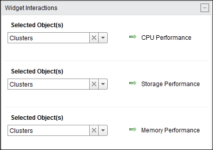
- Save the dashboard.
That's it!
Here is what it should look like. The screenshot shows we have created a two-column dashboard. It has a list of clusters. Choosing a cluster from the list will automatically show the relevant performance line charts in the three View widgets:
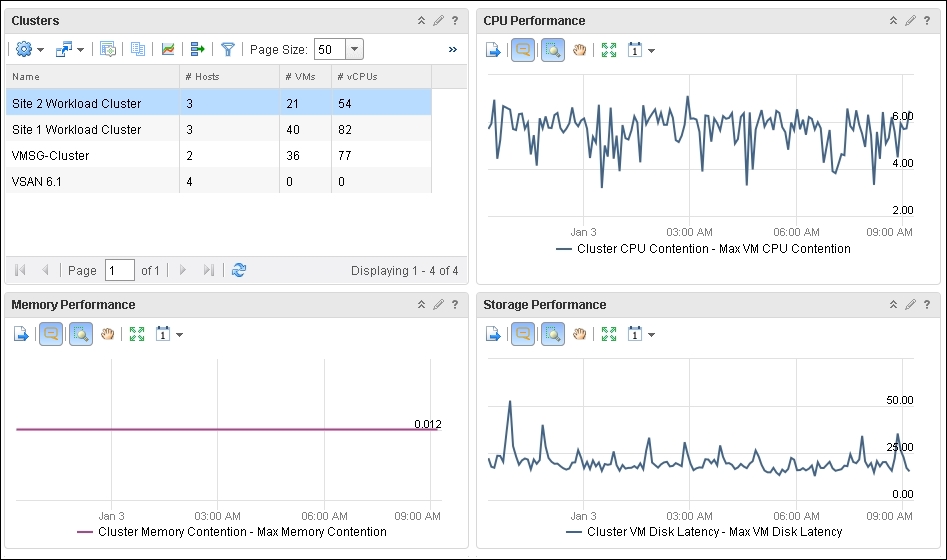
The performance monitoring dashboard
The preceding dashboard is good and simple. In a very large environment, where there are many people using the dashboard, it will be useful to add the SLA threshold. This helps everyone visually tell whether the threshold is breached or not.
This means we enhance the dashboard by adding:
- VM CPU performance SLA for that tier
- VM RAM performance SLA for that tier
- VM Disk performance SLA for that tier
We also can add an alert. The alert should tell us the VM name and which SLA was hit (CPU, disk, RAM, network, and so on).
Can you think of the complexity required to realize this? The following questions come to mind:
- How does vRealize Operations know which cluster is on which tier, since even vSphere does not know?
- How do we associate the SLA with each object?
- How do we associate the SLA with a new VM? It has to inherit from the cluster it belongs to.
There are a few ways to implement this, as we have two tools (vSphere and vRealize). In this example, we will not touch vCenter and do all the implementation in vRealize Operations. This is simpler as organizations typically have multiple vCenter servers but one vRealize Operations server.
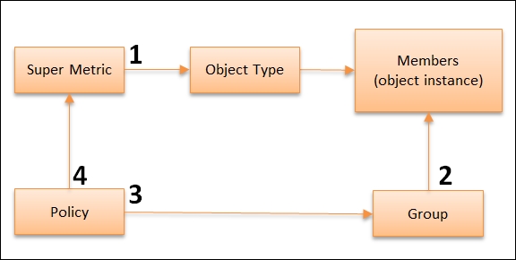
vRealize Operations does not allow you to apply a Super Metric to a group, so there is some workaround required. You might feel that we are performing a lot of steps, so a diagram will help. The numbers in the following diagram correspond to the steps we will perform:
We cannot create a property in vRealize Operations and attach a value to it. What we can do is create a metric and attach a constant value. Brandon Gordon shared this idea when we met during VMworld.
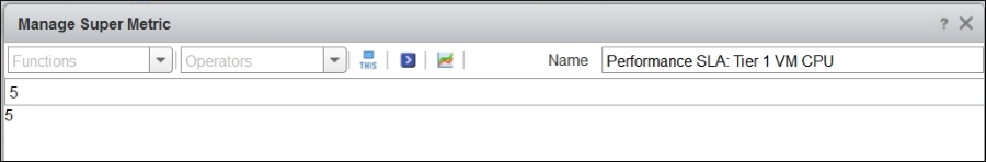
The following example shows how to set the VM CPU SLA to 5 percent. There is no need to specify percentage or other units.
vRealize Operations | Super Metric | edit dialog box
You may be surprised that all you need to do is specify the value. Here is what it looks like after it's created:
vRealize Operations | Super Metric | main screen
Now, we need to attach the right SLA to the right cluster. This means we need to map each cluster to the right tier. One way to do this is to create a group for each tier and add all the associated clusters as members.
In the following example, we have created three groups, one for each tier:
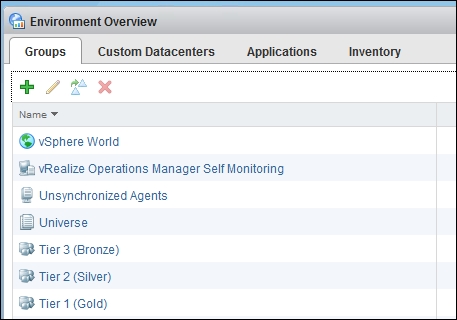
vRealize Operations | Group | main screen
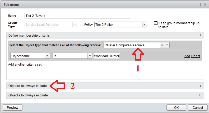
The group members are the associated clusters. There are two ways you can do this, as shown in the following diagram. You can use either a dynamic (1) or static membership (2):
vRealize Operations | Group | edit dialog box
The first option works when you have a clear naming convention for each tier. You can include all clusters whose names or properties match a pattern.
The second option works if you do not have a clear naming convention. In this situation, you simply include the object manually, as shown in the following screenshot:
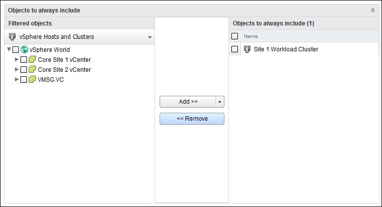
vRealize Operations | Group | edit dialog box | static membership
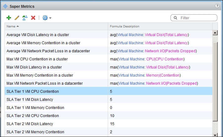
The group we created only has members. It does not have its own SLA yet. In other words, it does not have a policy, since an SLA is a form of policy. By default, vRealize Operations only has one active policy. So, we need to create three more policies. We have created two in the following example, as the environment does not need more than that:
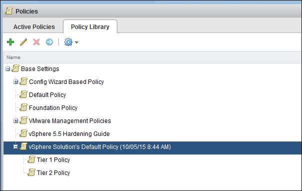
vRealize Operations | Policy | Policy Library tab
Now that we have multiple policies, we need to associate each one to the group we created earlier. Here is how you do it:
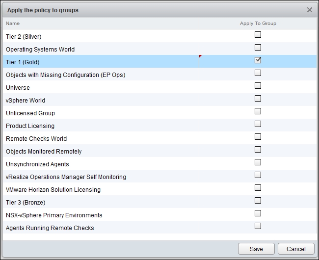
vRealize Operations | Policy | Applying to groups
When you are done, the result will look like the following. Notice it shows the number of objects for each group.
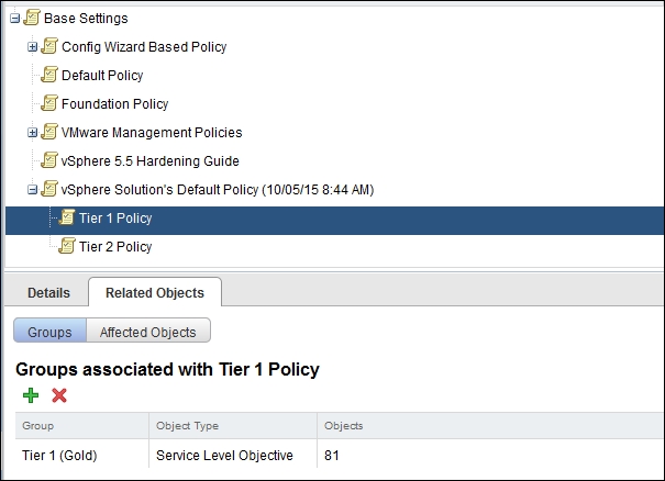
vRealize Operations | Policy | Groups mapped to the selected policy
We have the group and we have the Super Metric. The next step is to associate them. Association between metrics and objects is done using policies, which is why we created the policies in the previous step. This screenshot shows you how to map them:
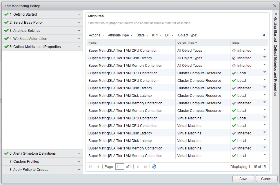
vRealize Operations | Policy | mapping super metrics
Once you do the mapping, you will see the effect on the Super Metrics screen. Click on the Policies tab, and you will see the policy tied to the super metric. This means that this Super Metric will not be tied to objects that do not belong to this policy.
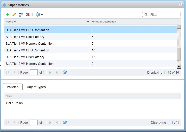
vRealize Operations | Super Metric | Policies mapped to the selected super metric
Finally, we are ready to add the SLA line to each of the View widgets. To do this, you need to copy each widget for each tier because they have different SLAs.
For each tier, add the Super Metric. We have added the tier one CPU SLA Super Metric to the tier one CPU widget, as shown in the following screenshot:
vRealize Operations | View | wizard dialog box
The next possible enhancement is to have an alert. An alert is triggered when a symptom occurs, so let's define the symptom. An example symptom is VM CPU contention exceeding the tier 1 CPU SLA. Another example is VM disk latency exceeding the tier 3 disk SLA.
To create a symptom, go the Symptom Definitions UI and create a new one based on metrics. It will show you the following window:
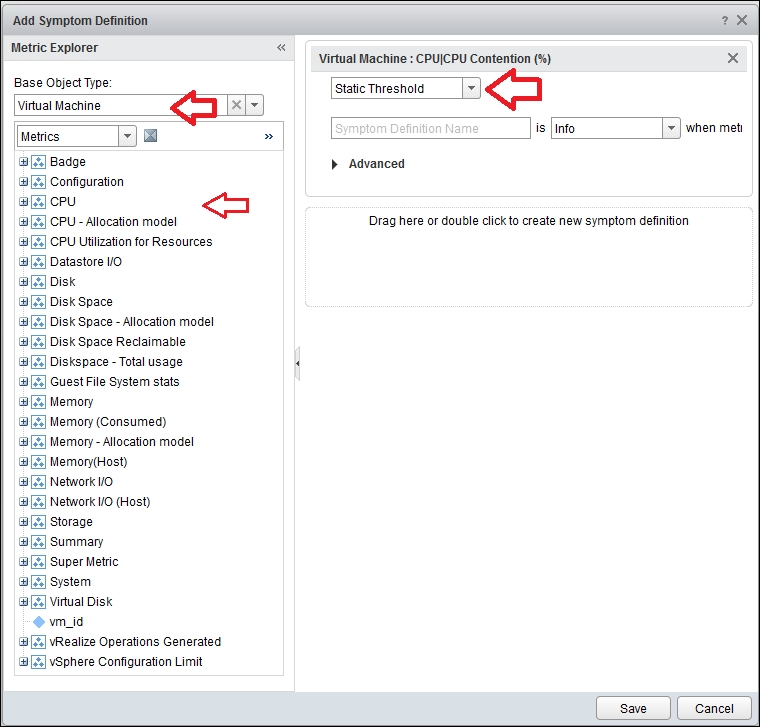
vRealize Operations | Create a new symptom definition
In the previous screenshot, choose Virtual Machine as the object.
Next, find CPU Contention and drag it to the right. We did this in the previous example.
Change Static Threshold to Compare. You will get the following screen, which enables you to compare values instead of hardcoding a static threshold:
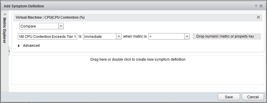
vRealize Operations | Create a new symptom definition
Once you have that, simply drag the Super Metric counter.
At the end, you will have a symptom for each tier and SLA.
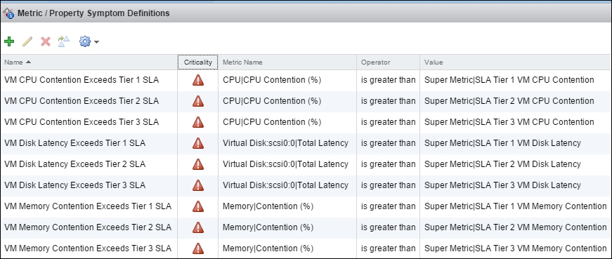
vRealize Operations | the symptom definition main screen
Once you have the symptom, you can create an alert. An alert can be triggered by a complex set of logic involving many symptoms. In our case, we will keep things simple and have just one symptom, as shown in the following screenshot:
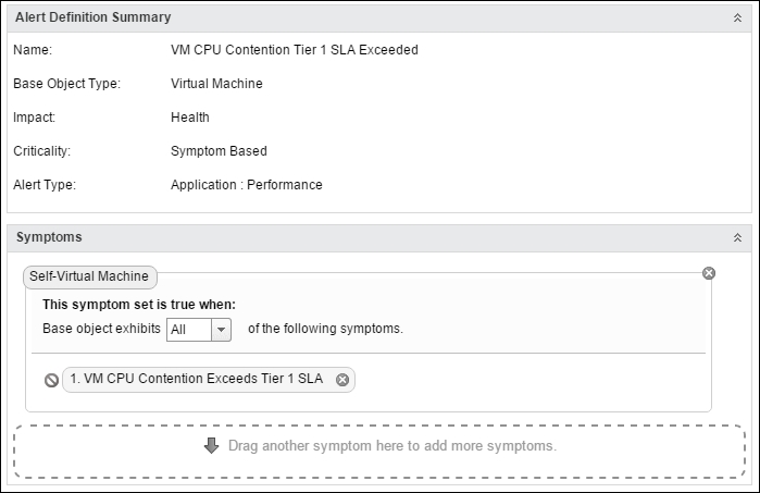
vRealize Operations | Alert | the Create new alert dialog box
Repeat the steps for each alert, mapping it to each symptom. At the end, you will get a list of alerts, as shown in the following screenshot:
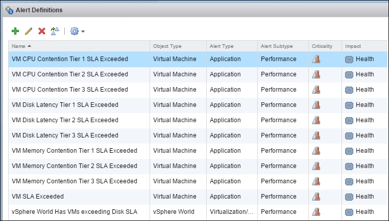
vRealize Operations | Alert Definitions | Main screen
You do not need to activate the alerts. They are active by default.
If indeed your environment is unable to meet the SLA, you will start getting alerts.
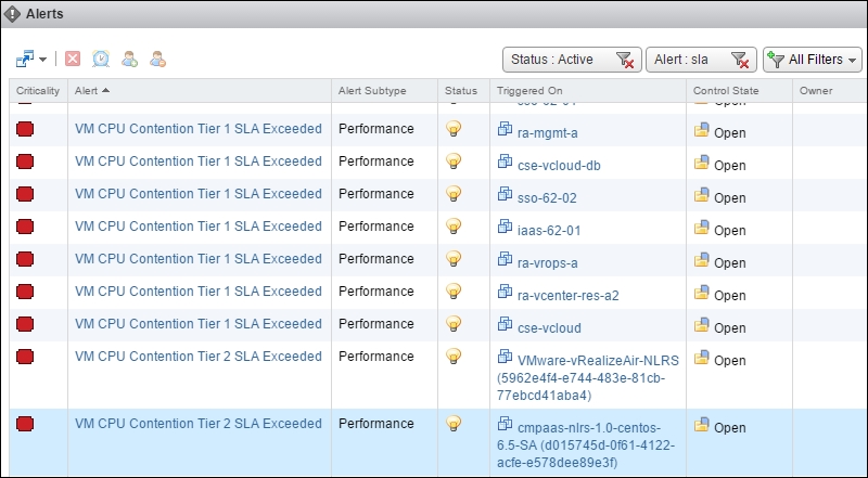
vRealize Operations | Alerts | list of active alerts
You can click on each of them to assign them to a different person. The Owner column is blank by default. The date it was triggered was cropped from the previous screenshot to fit the book.
When you click on an alert, you get more details, including the actual chart for when it was breached.
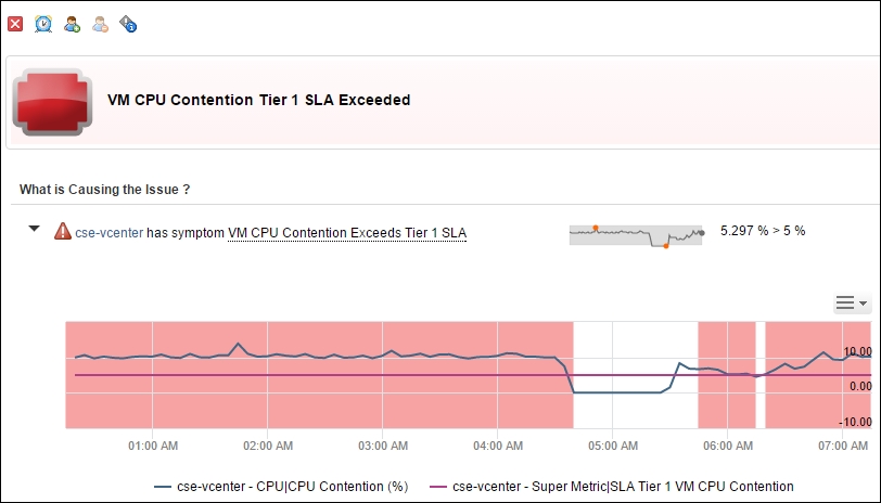
vRealize Operations | Example of an alert being triggered
Alerts are good when they are triggered. It is a form of reactive management. Sometimes, you want to see the overall picture and see how many VMs are near the alerts, not just the ones that hit the alert.
This is where the Top-N widget comes in. It is a simple widget that lists objects based on your chosen time and metric value.
Let's create a simple dashboard with four independent Top-N widgets. It will look like this:
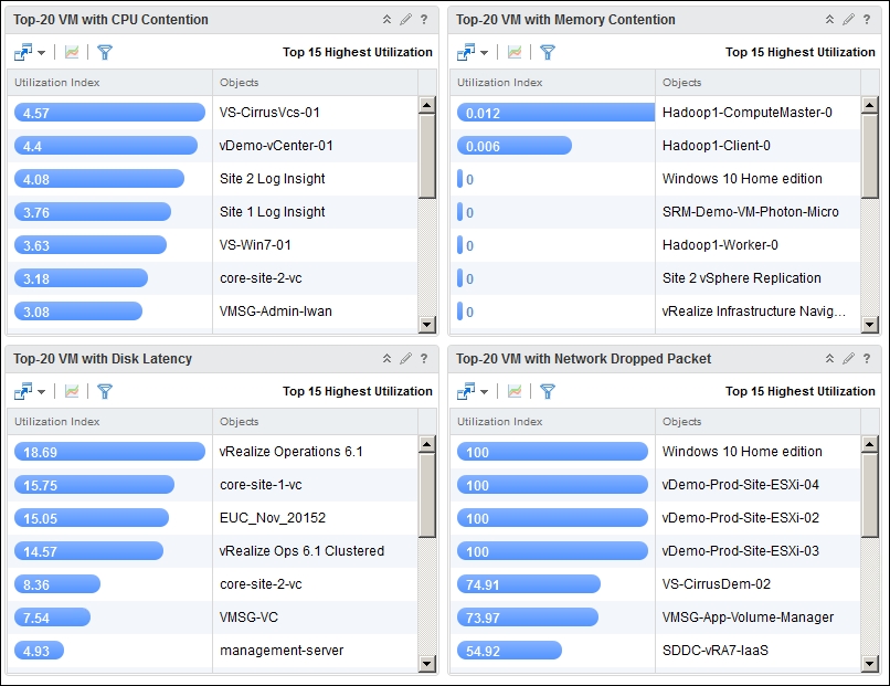
List of affected VMs
These four widgets are driven from the cluster that we created in the first dashboard. To enable that interaction, perform these steps:
- Edit the first dashboard.
- Click on Dashboard Navigation, as shown in the next screenshot.
- From the dropdown, choose the Top-N dashboard you created earlier.
- Click on all its Top-N widgets. You want to drive all the widgets.
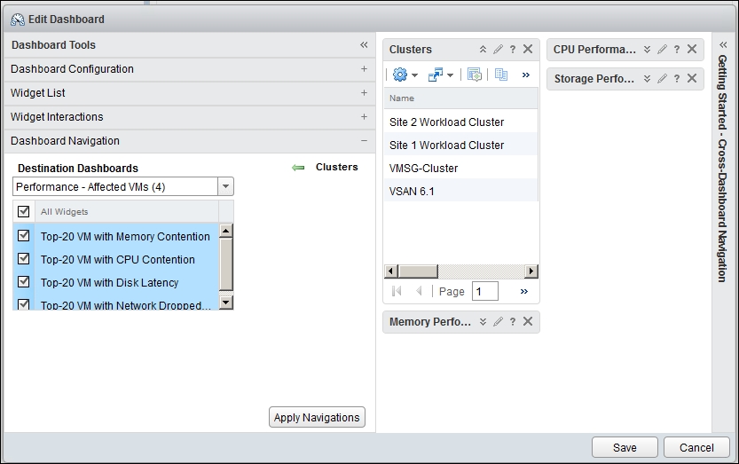
vRealize Operations | Dashboard | edit dialog box
- Click on Save, and you are done. This dashboard will now drive the other dashboard.
How do you actually use it, as in navigate from one dashboard to another? The following screenshot shows this. From the Clusters list, click on Navigate, and then choose the dashboard you want to go to. You can link more than one dashboard. We have linked three dashboards to be driven from this dashboard.
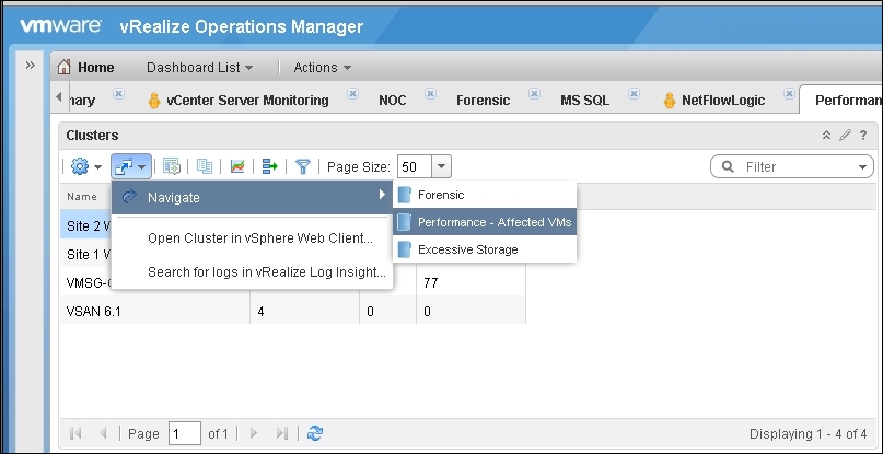
vRealize Operations | transitioning from one dashboard to another
We've covered an environment where a vSphere cluster is dedicated to a service tier. What if your environment is much smaller? Due to cost reasons, you have to mix multiple service tiers in a cluster. As a result, you need to manually create groups. Create one group for each tier, and place the VMs in their respective tiers.
What about the other extreme? You have way too many clusters, and it's hard to monitor them one by one. You want to monitor at the Tier level first before drilling into a specific cluster.
You need to create a group for each tier. Add the clusters to their groups. This is a one-time setup that you need to do for each cluster. In an environment where you have many physical data centers, these groups can contain clusters from different vCenter Servers and physical data centers. A tier 1 VM is a tier 1 VM, regardless of where it physically resides. You should have consistent SLAs throughout your organization.
When you create the group, the group will naturally be an object that is one level higher, as it has to encompass all the members of the group. Remember to increase your super metric depth value by 1.