
XAML FEATURES
XAML is a form of XML that defines certain allowed combinations of XML elements. For example, a XAML file should have a single root element that represents a Window. That object can have a single child element that is normally a container. The container can hold several children with specifically defined properties such as Width and Height.
XAML is a very complicated language, and many of its features are available only in certain places within the file. For example, inside a Button element you can place attributes such as Background, BorderThickness, Margin, Width, Height, and Content. The XAML text editor provides IntelliSense that makes figuring out what is allowed in different places easier, but building a XAML file can still be quite challenging.
The following sections describe some of the basic building blocks of a XAML application. They explain how to build objects; how to use resources, styles, and templates to make objects consistent and easier to modify; and how to use transformations and animations to make objects interactive. The section “Procedural WPF” later in this chapter explains how to do these things in Visual Basic code instead of XAML.
Objects
WPF objects are represented by XML elements in the XAML file. Their properties are represented either by attributes within the base elements or as separate elements within the main element.
For example, the following XAML code shows a Window containing a Grid object. The Grid element contains a Background attribute that makes the object’s background red.
<Window x:Class="MainWindow"
 xmlns="http://schemas.microsoft.com/winfx/2006/xaml/presentation"
 xmlns:x="http://schemas.microsoft.com/winfx/2006/xaml"
 Title="MainWindow" Height="235" Width="300">
   <Grid Background="Red">

   </Grid>
</Window>
More complicated properties must be set in their own sub-elements. The following code shows a similar Grid that has a linear gradient background:
<Window x:Class="MainWindow"
 xmlns="http://schemas.microsoft.com/winfx/2006/xaml/presentation"
 xmlns:x="http://schemas.microsoft.com/winfx/2006/xaml"
 Title="MainWindow" Height="235" Width="300">
   <Grid>
     <Grid.Background>
       <LinearGradientBrush StartPoint="0,0" EndPoint="1,1">
       <GradientStop Color="Red" Offset="0.0" />
       <GradientStop Color="White" Offset="0.5" />
       <GradientStop Color="Blue" Offset="1.0" />
     </LinearGradientBrush>
   </Grid.Background>
  </Grid>
</Window>
Instead of using a Background attribute, the Grid element contains a Grid.Background element. That, in turn, contains a LinearGradientBrush element that defines the background. The StartPoint and EndPoint attributes indicate that the gradient should start at the upper-left corner of the grid (0, 0) and end at the lower right (1, 1). The GradientStop elements inside the brush’s definition set the colors that the brush should display at different fractions of the way through the gradient. In this example, the gradient starts red, changes to white halfway through, and changes to blue at the end.
Object elements often contain other elements that further define the object. The following code defines a grid that has two rows and three columns. (From now on I’m leaving out the Window element to save space.) The rows each occupy 50 percent of the grid’s height. The first column is 50 pixels wide and the other two columns each take up 50 percent of the remaining width.
<Grid>
   <Grid.RowDefinitions>
     <RowDefinition Height="50*" />
     <RowDefinition Height="50*" />
    </Grid.RowDefinitions>
    <Grid.ColumnDefinitions>
     <ColumnDefinition Width="50" />
     <ColumnDefinition Width="50*" />
     <ColumnDefinition Width="50*" />
   </Grid.ColumnDefinitions>
</Grid>
When you use a * in measurements, the control divides its height or width proportionally among items that contain a *. For example, if a grid has two rows with height 50*, they each get half of the control’s height. If the two rows have heights 10* and 20*, the first is half as tall as the second.
If the control also contains items without a *, their space is taken out first. For example, suppose a grid defines rows with heights 10, 20*, and 30*. In that case the first row has height 10, the second row gets 20/50 of the remaining height, and the third row gets the rest.
An object element’s body can also contain content for the object. In some cases, the content is simple text. The following example defines a Button object that has the caption Click Me:
<Button Margin="2,2,2,2" Name="btnClickMe">Click Me</Button>An object’s content may also contain other objects. The following code defines a grid with three rows and three columns holding nine buttons:
<Grid>
  <Grid.RowDefinitions>
    <RowDefinition Height="33*" />
    <RowDefinition Height="33*" />
    <RowDefinition Height="33*" />
   </Grid.RowDefinitions>
   <Grid.ColumnDefinitions>
    <ColumnDefinition Width="33*" />
    <ColumnDefinition Width="33*" />
    <ColumnDefinition Width="33*" />
  </Grid.ColumnDefinitions>
  <Button Grid.Row="0" Grid.Column="0" Margin="5">0, 0</Button>
  <Button Grid.Row="0" Grid.Column="1" Margin="5">0, 1</Button>
  <Button Grid.Row="0" Grid.Column="2" Margin="5">0, 2</Button>
  <Button Grid.Row="1" Grid.Column="0" Margin="5">1, 0</Button>
  <Button Grid.Row="1" Grid.Column="1" Margin="5">1, 1</Button>
  <Button Grid.Row="1" Grid.Column="2" Margin="5">1, 2</Button>
  <Button Grid.Row="2" Grid.Column="0" Margin="5">2, 0</Button>
  <Button Grid.Row="2" Grid.Column="1" Margin="5">2, 1</Button>
  <Button Grid.Row="2" Grid.Column="2" Margin="5">2, 2</Button>
</Grid>
Usually, it is easiest to start building a Window by using the graphical XAML editor, but you may eventually want to look at the XAML code to see what the editor has done. It often produces almost but not quite what you want. For example, if you size and position a control by using click and drag, the editor may set its Margin property to 10,10,11,9 when you really want 10,10,10,10 (or just 10).
It can also sometimes be hard to place controls exactly where you want them. You can fix some of these values in the Properties window, but sometimes it’s just easier to edit the XAML code directly.
Resources
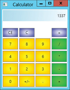
Example program Calculator, which is available for download on the book’s website, is shown in Figure 11-3. This program contains three groups of buttons that use radial gradient backgrounds with similar colors. The number buttons, +/-, and the decimal point have yellow backgrounds drawn with RadialGradientBrush objects. The CE, C, and = buttons have blue backgrounds, and the operator buttons have green backgrounds.
FIGURE 11-3: This program uses resources to simplify maintenance.
You could build each button separately, including the appropriate RadialGradientBrush objects to give each button the correct background. Suppose, however, you decide to change the color of all of the number buttons from yellow to red. You would have to edit each of their 12 RadialGradientBrush objects to give them their new colors. In addition to being a lot of work, those changes would give you plenty of chances to make mistakes. The changes would be even harder if you decide to change the numbers of colors used by the brushes (perhaps having the brush shade from yellow to red to orange), or if you want to use a completely different brush for the buttons such as a LinearGradientBrush.
One of the ways XAML makes maintaining projects such as this one easier is by letting you define resources. You can then use the resources when defining objects. In this example, you can define resources to represent button backgrounds and then use those resources to set each button’s Background property. If you later need to change the backgrounds, you only need to update the resources.
The following code shows how the Calculator application shown in Figure 11-3 creates a LinearGradientBrush resource called brResult, which the program uses to draw the result text box at the top. Ellipses show where code has been omitted to make it easier to read.
<Window x:Class="Window1"
 xmlns="http://schemas.microsoft.com/winfx/2006/xaml/presentation"
 xmlns:x="http://schemas.microsoft.com/winfx/2006/xaml" Title="XamlCalculator"
 Height="292" Width="227" Focusable="True">
  <Window.Resources>
   ...
  <LinearGradientBrush x:Key="brResult" StartPoint="0,0" EndPoint="1,1">
   <GradientStop Color="LightBlue" Offset="0.0" />
   <GradientStop Color="AliceBlue" Offset="1.0" />
  </LinearGradientBrush>
   ...
  </Window.Resources>
  ...
</Window>
The Window element contains a Window.Resources tag that contains the resource definitions. The LinearGradientBrush element defines the brush. One of this element’s more important attributes is x:Key, which identifies the brush for later use.
The following code shows how the Calculator program defines the Label that displays calculation results. The Background attribute refers to the resource brResult.
<Label Name="lblResult"
  Background="{StaticResource brResult}"
  Grid.ColumnSpan="4"
  Margin="2,2,2,2"
  HorizontalContentAlignment="Right"
  VerticalContentAlignment="Center">0</Label>
Later if you decide to change the background color for the result label, you only need to change the definition of the brResult resource. This example uses that resource for only one label so you don’t save a huge amount of work by defining a resource. The program’s buttons, however, reuse the same resources many times. Instead of reusing the background resources directly, however, the buttons use styles as described in the next section.
Styles
Resources make it easy to create many controls that share an attribute such as a background. Styles take attributes a step further by allowing you to bundle multiple attributes into one package. For example, you could define a style that includes background, width, height, and font properties. Then you could use the style to help define controls.
You can also use styles to define other styles. For example, you can make a base style to be applied to every button in an application. Then you can derive other styles for different kinds of buttons from the base style.
The following example defines a style named styAllButtons. It contains Setter elements that set control properties. This style sets a control’s Focusable property to False and its Margin property to 2,2,2,2.
<Style x:Key="styAllButtons">
  <Setter Property="Control.Focusable" Value="false" />
  <Setter Property="Control.Margin" Value="2,2,2,2" />
</Style>
The following code defines a style named styClear for the calculator’s C, CE, and = buttons:
<Style x:Key="styClear" BasedOn="{StaticResource styAllButtons}">
  <Setter Property="Control.Background" Value="{StaticResource brClear}" />
  <Setter Property="Grid.Row" Value="1" />
  <Setter Property="Control.Margin" Value="2,20,2,2" />
</Style>
The BasedOn attribute makes the new style start with the properties defined by styAllButtons. The new style then uses two Setter elements to add new values for the Background (set to the brush resource brClear) and Grid.Row properties (these buttons are all in row 1 in the calculator). It then overrides the styAllButtons style’s value for the Margin property to increase the margin above these buttons.
The following code shows how the program defines its C button. By setting the button’s style to styClear, the code sets most of the button’s properties with a single statement. It then sets the button’s Grid.Column property and its content (those values are different for the C, CE, and = buttons).
<Button Name="btnC"
  Style="{StaticResource styClear}"
  Grid.Column="1">C</Button>
Styles let the program keep all of the common properties for a set of controls in a single location. Now if you decided to change the color of the C, CE, and = buttons, you would need to change only the definition of the brClear brush. If you wanted to change the brushes’ margins, you would need to change only the styClear style.
As the previous code shows, styles also keep the controls’ definitions very simple.
Styles also let you easily change the controls’ properties later. For example, if you later decide to specify the font family and font size for the calculator’s C, CE, and = buttons, you only need to add the appropriate Setter elements to styClear instead of adding a new property to every button. If you want to set the font for every button in the program, you simply add the appropriate Setter elements to styAllButtons, and the other styles automatically pick up the changes.
Templates
Templates determine how controls are drawn and how they behave by default. For example, the default button template makes buttons turn light blue when the mouse hovers over them. When you press a button down, it grows slightly darker and shows a thin shadow along its upper and left edges. By using Template elements, you can override these default behaviors.
The following code contained in the Window.Resources section defines a button template:
<Style TargetType="Button">
  <Setter Property="Margin" Value="2,2,2,2" />
  <Setter Property="Template">
   <Setter.Value>
     <ControlTemplate TargetType="{x:Type Button}">
     <Grid>
       <Polygon x:Name="pgnBorder"
         Stroke="Purple"
         StrokeThickness="5"
         Points="0.2,0 0.8,0 1,0.2 1,0.8 0.8,1 0.2,1 0,0.8 0,0.2"
         Stretch="Fill"
         Fill="{StaticResource brOctagonUp}">
       </Polygon>
       <ContentPresenter HorizontalAlignment="Center"
         VerticalAlignment="Center" />
     </Grid>

      <!-- Triggers -->
      <ControlTemplate.Triggers>
        <Trigger Property="IsMouseOver" Value="true">
          <Setter TargetName="pgnBorder" Property="Stroke" Value="Black" />
          <Setter TargetName="pgnBorder" Property="Fill"
            Value="{StaticResource brOctagonOver}" />
        </Trigger>
      </ControlTemplate.Triggers>
    </ControlTemplate>
  </Setter.Value>
 </Setter>
</Style>
The code begins with a Style element that contains two Setter elements. The first Setter sets a button’s Margin property to 2,2,2,2. The second Setter sets a Template property. The Setter’s value is a ControlTemplate element targeted at Buttons.
The ControlTemplate contains a Grid that it uses to hold other elements. In this example, the Grid holds a Polygon element named pgnBorder. The Points attribute lists the points used to draw the polygon. Because the polygon’s Fill attribute is set to Stretch, the polygon is stretched to fill its parent area, and Points coordinates are on a 0.0 to 1.0 scale within this area. The polygon’s Fill attribute is set to the brOctagonUp brush defined elsewhere in the Window.Resources section and not shown here. This is a RadialGradientBrush that shades from white in the center to red at the edges.
The ControlTemplate element also contains a Triggers section. The single Trigger element in this section executes when the button’s IsMouseOver condition is true. When that happens, a Setter changes the pgnBorder polygon’s Stroke property to Black. A second Setter sets the polygon’s Fill property to another brush named brOctagonOver. This brush (which also isn’t shown here) shades from red in the center to white at the edges.
Because this style does not have an x:Key attribute, it applies to any button in the Window that doesn’t have a Style set explicitly.
Example program ButtonTemplate uses the following code to create its controls:
<Grid>
  <Grid.ColumnDefinitions>
    <ColumnDefinition Width="0.25*" />
    <ColumnDefinition Width="0.25*" />
    <ColumnDefinition Width="0.25*" />
    <ColumnDefinition Width="0.25*" />
  </Grid.ColumnDefinitions>
  <Grid.RowDefinitions>
    <RowDefinition Height="0.50*" />
    <RowDefinition Height="0.50*" />
  </Grid.RowDefinitions>
  <Button Name="btnOne" Content="One" Grid.Row="1" Grid.Column="0" />
  <Button Name="btnTwo" Content="Two" Grid.Row="1" Grid.Column="1" />
  <Button Name="btnThree" Content="Three" Grid.Row="1" Grid.Column="2" />
  <Button Name="btnFour" Content="Four" Grid.Row="1" Grid.Column="3" />

  <Button Name="btnClickMe" Content="Click Me"
   Style="{StaticResource styYellowButton}" />
  <Button Name="btnYellow" Content="I'm Yellow"
   Style="{StaticResource styYellowButton}" Grid.Column="2" Grid.Row="0" />
</Grid>
The Window contains a Grid that holds six buttons. The first four buttons do not explicitly set their Style, so they use the previously defined octagonal style.
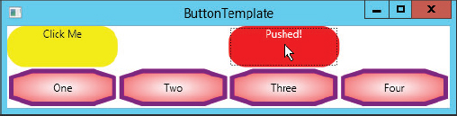
The final buttons set their Style attributes to styYellowButton (also defined in the Windows.Resources section, but not shown here) so they display a yellow background. That style also positions the button’s text in the upper center. When you hover the mouse over these buttons, they switch to an orange background. If you press the mouse down on these buttons, they change to a red background with white text that says “Pushed!” Download the ButtonTemplate example program to see how the triggers work.
Figure 11-4 shows the result. The mouse is pressed on the upper-right button so it has turned red and is displaying the text “Pushed!”
FIGURE 11-4: Templates let you change the appearance and behavior of objects such as buttons.
Transformations
Standard graphical properties such as Foreground and FontFamily determine a control’s basic appearance, but you can further modify that appearance by using a RenderTransform element. The following code creates a button that has been rotated 270 degrees. The Button.RenderTransform element contains a RotateTransform element that represents the rotation.
<Button Name="btnSideways"
Content="Sideways"
Background="{StaticResource brButton}"
Margin="-6,-6.5,0,0"
Height="43"
HorizontalAlignment="Left"
VerticalAlignment="Top"
Width="94">
<Button.RenderTransform>
<RotateTransform Angle="270" CenterX="75" CenterY="50" />
</Button.RenderTransform>
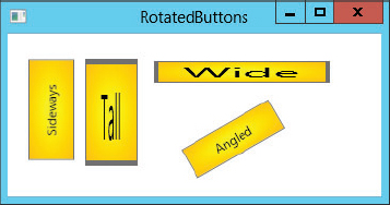
</Button>XAML also provides TranslateTransform and ScaleTransform elements that let you translate and scale an object. Example program RotatedButtons, which is available for download on the book’s website and shown in Figure 11-5, uses transformations to draw several buttons that have been rotated and scaled vertically and horizontally.
FIGURE 11-5: Buttons can be rotated and scaled vertically and horizontally by using RotateTransform and ScaleTransform.
XAML also defines a TransformGroup element that you can use to perform a series of transformations on an object. For example, a TransformGroup would let you translate, scale, rotate, and then translate an object again.
Animations
The section “Templates” earlier in this chapter shows how to use Triggers to make an object change its appearance in response to events. For example, it shows how to make a button change its background and border color when the mouse moves over it.
XAML also provides methods for scripting more complicated actions that take place over a defined period of time. For example, you can make a button spin slowly for two seconds when the user clicks it.
You use a trigger to start the animation and a Storyboard object to control it. A Storyboard contains information about the state the animation should have at various times during the animation.
The SpinButton example program, which is available for download on the book’s website, uses the following code to make a button rotate around its center when it is clicked:
<Button Name="btnSpinMe" Content="Spin Me"
  Width="150" Height="100">
  <Button.Background>
    <RadialGradientBrush
      Center="0.5,0.5"
      RadiusX="1.0" RadiusY="1.0">
      <GradientStop Color="Yellow" Offset="0.0" />
      <GradientStop Color="Orange" Offset="1.0" />
    </RadialGradientBrush>
  </Button.Background>
  <Button.RenderTransform>
    <RotateTransform x:Name="rotButton" Angle="0" CenterX="75" CenterY="50" />
  </Button.RenderTransform>
  <Button.Triggers>
    <EventTrigger RoutedEvent="Button.Click">
     <EventTrigger.Actions>
      <BeginStoryboard>
       <Storyboard
         Storyboard.TargetName="rotButton"
         Storyboard.TargetProperty="(RotateTransform.Angle)">
         <DoubleAnimationUsingKeyFrames>
         <SplineDoubleKeyFrame KeyTime="0:0:00.0" Value="0.0" />
         <SplineDoubleKeyFrame KeyTime="0:0:00.2" Value="30.0" />
         <SplineDoubleKeyFrame KeyTime="0:0:00.8" Value="330.0" />
         <SplineDoubleKeyFrame KeyTime="0:0:01.0" Value="360.0" />
         </DoubleAnimationUsingKeyFrames>
       </Storyboard>
      </BeginStoryboard>
     </EventTrigger.Actions>
    </EventTrigger>
  </Button.Triggers>
</Button>
Much of this code should seem familiar by now. The Button element’s attributes set its name, contents, and size. A Background element fills the button with a RadialGradientBrush.
The Button element contains a RenderTransform element similar to the ones described in the previous section. In this case, the transform is a RotateTransform with angle of rotation initially set to 0 so that the button appears in its normal orientation. Its center is set to the middle of the button. The transform is named rotButton so that other code can refer to it later.
After the transform element, the code contains a Triggers section. This section holds an EventTrigger element that responds to the Button.Click routed event.
A routed event is a new kind of event developed for WPF. Routed events travel up and down through a WPF application’s hierarchy of controls so interested controls can catch and process the events. For simple purposes, however, a routed event behaves much like a Windows Forms event does and you can catch it with a normal Visual Basic event handler. When the user clicks the button, the Button.Click event fires and this trigger springs into action.
The trigger’s Actions element contains the tasks that the trigger should perform when it runs. In this example, the trigger performs the BeginStoryboard action. Inside the BeginStoryboard element is a Storyboard element that represents the things that the storyboard should do.
The Storyboard element’s TargetName attribute gives the target object on which the storyboard should act, in this case the RotateTransform object named rotButton. The TargetProperty attribute tells what property of the target button the storyboard should manipulate, in this example the object’s RotateTransform.Angle property.
The Storyboard element contains a DoubleAnimationUsingKeyFrames element. A key frame is a specific point in an animation sequence with known values. The program automatically calculates values between the key frame values to make the animation smooth.
This DoubleAnimationUsingKeyFrames element holds a collection of SplineDoubleKeyFrame elements that define the animation’s key values. Each key frame gives its time within the animation in hours, minutes, and seconds, and the value that the controlled property should have at that point in the animation. In this example, the rotation transformation’s angle should have a value of 0 when the storyboard starts, a value of 30 when the animation is 20 percent complete, a value of 330 when the storyboard is 80 percent complete, and a value of 360 when the storyboard finishes. The result is that the button rotates slowly for the first 0.2 seconds, spins relatively quickly for the next 0.6 seconds, and then finishes rotating at a more leisurely pace.
Example program SpinButton animates a single property, the button’s angle of rotation, but you can animate more than one property at the same time if you like. The SpinAndGrowButton example program, which is available for download on the book’s website, simultaneously animates a button’s angle of rotation and size. This example has two key differences from program SpinButton.
First, the new button’s RenderTransform element contains a TransformGroup that contains two transformations, one that determines the button’s angle of rotation and one that determines its scaling:
<Button.RenderTransform>
   <TransformGroup>
     <RotateTransform x:Name="rotButton" Angle="0" CenterX="50" CenterY="25" />
     <ScaleTransform x:Name="scaButton" ScaleX="1" ScaleY="1"
      CenterX="50" CenterY="25" />
   </TransformGroup>
</Button.RenderTransform>
The second difference is in the new button’s Storyboard. The following code omits the animation’s TargetName and TargetProperty from the Storyboard element’s attributes. It includes three DoubleAnimationUsingKeyFrame elements inside the Storyboard, and it is there that it sets the TargetName and TargetProperty. The three animations update the button’s angle of rotation, horizontal scale, and vertical scale.
<Storyboard>
  <!-- Rotate -->
  <DoubleAnimationUsingKeyFrames
    Storyboard.TargetName="rotButton"
    Storyboard.TargetProperty="(RotateTransform.Angle)">
    <SplineDoubleKeyFrame KeyTime="0:0:00.0" Value="0.0" />
    <SplineDoubleKeyFrame KeyTime="0:0:01.0" Value="360.0" />
  </DoubleAnimationUsingKeyFrames>

  <!-- ScaleX -->
  <DoubleAnimationUsingKeyFrames
    Storyboard.TargetName="scaButton"
    Storyboard.TargetProperty="(ScaleTransform.ScaleX)">
    <SplineDoubleKeyFrame KeyTime="0:0:00.0" Value="1.0" />
    <SplineDoubleKeyFrame KeyTime="0:0:00.5" Value="2.0" />
    <SplineDoubleKeyFrame KeyTime="0:0:01.0" Value="1.0" />
  </DoubleAnimationUsingKeyFrames>

  <!-- ScaleY -->
  <DoubleAnimationUsingKeyFrames
   Storyboard.TargetName="scaButton"
   Storyboard.TargetProperty="(ScaleTransform.ScaleY)">
   <SplineDoubleKeyFrame KeyTime="0:0:00.0" Value="1.0" />
   <SplineDoubleKeyFrame KeyTime="0:0:00.5" Value="2.0" />
   <SplineDoubleKeyFrame KeyTime="0:0:01.0" Value="1.0" />
  </DoubleAnimationUsingKeyFrames>
</Storyboard>
By using XAML Storyboards, you can build complex animations that run when certain events occur. As with templates, however, you should use some restraint when building storyboard animations. A few small animations can make an application more interesting, but too many large animations can distract and annoy the user.
Drawing Objects
WPF provides several objects for drawing two-dimensional shapes, the most useful of which are Line, Ellipse, Rectangle, Polygon, Polyline, and Path.
Most of these are relatively straightforward and you can learn more about them by searching the online help. They all provide Stroke and StrokeThickness properties to determine the appearance and thickness of their borders and a Fill property to determine how a shape is filled (although Line ignores the Fill property because it doesn’t draw a closed curve).
The Path object is the most confusing of these so it deserves some special attention. Instead of drawing a single simple shape, the Path object draws a series of shapes such as lines, arcs, and curves. A Path object can be incredibly complex, and can include any of the other drawing objects plus a few others that draw smooth curves.
You can define a Path object in two ways. First, you can make the Path element contain other elements (Line, Ellipse, and so forth) that define objects drawn by the path.
The second (and more concise) method is to use the Path element’s Data attribute. This is a text attribute that contains a series of coded commands for drawing shapes. For example, the following code makes the Path move to the point (20, 20), and then draw to connect the following points (80, 20), (50, 60), (90, 100), and (50, 120):
<Path Stroke="Gray" StrokeThickness="5" Grid.Column="1" Grid.Row="1"
 Data="M 20,20 L 80,20 50,60 90,100 50,120" />
You can use spaces or commas to separate point coordinates. To make it easier to read the code, I use commas between a point’s X and Y coordinates and spaces between points, as in the previous example.
Some commands allow both uppercase and lowercase command letters. For those commands, the lowercase version means that the following points’ coordinates are relative to the previous points’ coordinates. For example, the following data makes the object move to the point (10, 20) and then draws to the absolute coordinates (30, 40):
Data="M 10,20 L 30,40"In contrast, the following data moves to the point (10, 20) as before, but then moves distance (30, 40) relative to the current position. The result is that the line ends at point (10 + 30, 20 + 40) = (40, 60).
Data="M 10,20 l 30,40"There isn’t enough room for a complete discussion of the Path object, but the following table summarizes the commands that you can include in the Data attribute.
| COMMAND | RESULT | EXAMPLE |
| F0 | Sets the fill rule to the odd/even rule. | F0 |
| F1 | Sets the fill rule to the non-zero rule. | F1 |
| M or m | Moves to the following point without drawing. | M 10,10 |
| L or l | Draws a line to the following point(s). | L 10,10 20,20 30,10 |
| H or h | Draws a horizontal line from the current point to the given X coordinate. | h 50 |
| V or v | Draws a vertical line from the current point to the given Y coordinate. | v 30 |
| C or c | Draws a cubic Bezier curve. This command takes three points as parameters: two control points and an endpoint. The curve starts at the current point moving toward the first control point. It ends at the endpoint, coming from the direction of the second control point. | C 20,20 60,0 50,50 |
| S or s | Draws a smooth cubic Bezier curve. This command takes two points as parameters: a control point and an endpoint. The curve defines an initial control point by reflecting the second control point used by the previous S command, and then uses it plus its two points to draw a cubic Bezier curve. This makes a series of Bezier curves join smoothly. | S 60,0 50,50 S 80,60 50,70 |
| Q or q | Draws a quadratic Bezier curve. This command takes two points as parameters: a control point and an endpoint. The curve starts at the current point moving toward the control point. It ends at the endpoint, coming from the direction of the control point. | Q 80,20 50,60 |
| T or t | Draws a smooth quadratic Bezier curve. This command takes one point as a parameter: an endpoint. The curve defines a control point by reflecting the control point used by the previous T command, and then uses it to draw a quadratic Bezier curve. The result is a smooth curve that passes through each of the points given as parameters to successive T commands. | T 80,20 T 50,60 T 90,100 |
| A or a | Draws an elliptical arc. This command takes five parameters: size—The X and Y radii of the arc rotation_angle—The ellipse’s angle of rotation large_angle—0 if the arc should span less than 180; 1 if the arc should span 180 degrees or more sweep_direction—0 if the arc should sweep counter-clockwise; 1 if it should sweep clockwise end_point—The point where the arc should end |
A 50,20 0 1 0 60,80 |
| Z or z | Closes the figure by drawing a line from the current point to the Path’s starting point. | Z |
Example program Shapes, which is shown in Figure 11-6 and which is available for download on the book’s website, demonstrates several different Path objects.
FIGURE 11-6: Example program Shapes demonstrates the Polygon, Polyline, Ellipse, Line, and Path objects.

Example program BezierCurves, which is shown in Figure 11-7 and is also available for download on the book’s website, shows examples of the four different kinds of Bezier curves. This program also draws a gray polyline behind each to show the curves’ parameters.
FIGURE 11-7: The Path object can draw Bezier curves.
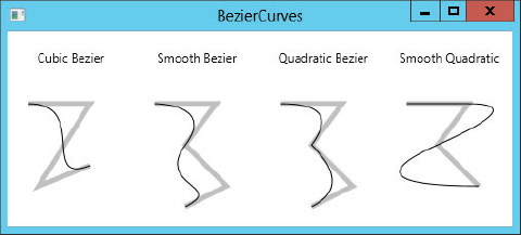
The cubic Bezier curve on the left connects the two endpoints using the two middle points to determine the curve’s direction at the endpoints.
The smooth cubic Bezier curve shown next passes through the first, third, and fifth points. The second point determines the curve’s direction as it leaves the first point and as it enters the third point. The curve automatically defines a control point to determine the direction leaving the third point, so the curve passes through the point smoothly. Finally, the fourth point determines the curve’s direction as it ends at the fifth point.
The next curve shows two quadratic Bezier curves. The first curve connects the first and third points, with the second point determining the curve’s direction at both points. The second curve connects the third and fifth points, using the fourth to determine its direction.
The final curve in Figure 11-7 uses an M command to move to the point (20, 20). It then uses three smooth quadratic Bezier curves to connect the following three points. The curve automatically defines the control points it needs to connect the points smoothly.
With all of these drawing objects at your disposal, particularly the powerful Path object, you can draw just about anything you need. The graphical XAML editor does not provide interactive tools for drawing shapes, but you can draw them by using the XAML text editor. It may help to sketch out what you want to draw on graph paper first.