WPF CONCEPTS
WPF applications are similar in concept to Windows Forms applications in many respects. Both display a form or window that contains controls. Controls in both systems provide properties, methods, and events that determine the control’s appearance and behavior.
Windows Forms applications use a set of controls provided by the System.Windows.Forms namespace. WPF applications use a different set of controls in the System.Windows.Controls namespace. Many of these controls serve similar functions to those used by Windows Forms applications, but they provide a different set of capabilities. For example, both namespaces have buttons, labels, combo boxes, and check boxes, but their appearances and abilities are different.
WPF uses these similar, but different, controls for two main reasons:
- To take better advantage of the graphics capabilities of modern computer hardware and software. The new controls can more easily provide graphical effects such as transparent or translucent backgrounds, gradient shading, rotation, two- and three-dimensional appearance, multimedia, and other effects.
- To provide a greater separation between the user interface and the code behind it. The following sections describe this idea and some of the other key WPF concepts in greater detail.
Separation of User Interface and Code
The idea of separating the user interface from the code isn’t new. Visual Basic developers have been building thin user interface applications for years. Here, the user interface contains as little code as possible, and calls routines written in libraries to do most of the work.
Unfortunately, the code that calls those libraries sits inside the same file that defines the user interface, at least in Windows Forms applications. That means you cannot completely separate the code from the user interface. For example, if one developer wants to modify the user interface, another developer cannot simultaneously modify the code behind it.
WPF separates the user interface from the code more completely. The program stores the user interface definition in a XAML file.
Associated with a XAML file is a code file containing Visual Basic code. It contains any code you write to respond to events and manipulate the controls much as Windows Forms code can. Unlike the case with Windows Forms, WPF keeps the user interface definition and the code behind it in two separate files so, in theory at least, different developers can work on the user interface and the code at the same time. For example, a graphics designer can use the Expression Blend design tool to build the user interface, defining the forms’ labels, menus, buttons, and other controls. Then a Visual Basic developer can attach code to handle the controls’ events.
Because the user interface definition is separate from the code behind it, the graphic designer can later edit the XAML to rearrange controls, change their appearance, and otherwise modify the user interface while the code behind it should still work unchanged.
WPF Control Hierarchies
In a WPF application, the Window class plays a role similar to the one played by a Form in a Windows Forms application. However, a Form can contain any number of controls while a Window can contain only one. If you want a WPF form to display more than one control, you must first give it some kind of container control, and then place other controls inside that one.
For example, when you create a WPF application, its Window initially contains a Grid control that can hold any number of other controls, optionally arranged in rows and columns. Other container controls include Canvas, DockPanel, DocumentViewer, Frame, StackPanel, and TabControl.
The result is a tree-like control hierarchy with a single Window object serving as the root element. This matches the hierarchical nature of XAML. Because XAML is a form of XML, and XML files must have a single root element, XAML files must also have a single root element. When you look at XAML files later in this chapter, you will find that they begin with a Window element that contains all other elements.
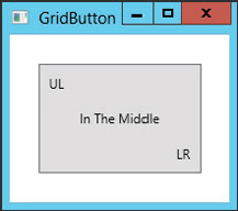
Many non-container controls can hold only a single element, and that element is determined by the control’s Content property. For example, you can set a Button control’s Content property to the text that you want to display.
A control’s Content property can have only a single value, but that value does not need to be something simple such as text. For example, Figure 11-1 shows a Button containing a Grid control that holds three labels.
FIGURE 11-1: This Button contains a Grid that holds three labels.