
4. Applying Character Formatting
Character formatting is formatting that you can apply to individual characters of text. There are other types of formatting too, which I address in other chapters. Paragraph formatting is formatting that applies to entire paragraphs (for example, line spacing), and page formatting is formatting that applies to entire pages (for example, page margins and paper size).
Each character has a certain font (typeface) and size applied to it that govern how the letter appears. You can change the font or the size for a single character or any size block of text, often dramatically changing the look of the document. In this chapter, you learn about applying various types of character formatting to text.
Understanding How Fonts Are Applied
When you type text in Word, how does Word know what font to use for it? And how can you change that font choice? The answers to those questions are surprisingly complex.
You can assign a font to text in three ways:
![]() You can apply the font manually to the text. You select the text and then choose a font from the Home tab or the Font dialog box. Manual font choices override styles and themes.
You can apply the font manually to the text. You select the text and then choose a font from the Home tab or the Font dialog box. Manual font choices override styles and themes.
![]() You can modify the font definition in the style applied to the text. Each paragraph has a paragraph style assigned to it; the default paragraph style is called Normal. The style’s definition can include a font, such that any paragraphs with that style applied appear in the specified font unless manual formatting has been applied to override it.
You can modify the font definition in the style applied to the text. Each paragraph has a paragraph style assigned to it; the default paragraph style is called Normal. The style’s definition can include a font, such that any paragraphs with that style applied appear in the specified font unless manual formatting has been applied to override it.
![]() Instead of assigning a specific font to a style, you can assign a Body or Heading placeholder. Then you can specify an overall theme or font theme on the Design tab that changes what font those placeholders represent, or you can choose a Style Set from the Design tab.
Instead of assigning a specific font to a style, you can assign a Body or Heading placeholder. Then you can specify an overall theme or font theme on the Design tab that changes what font those placeholders represent, or you can choose a Style Set from the Design tab.
![]() To learn how to change the font assigned to a style, see “Modifying a Style Definition,” p. 238.
To learn how to change the font assigned to a style, see “Modifying a Style Definition,” p. 238.
![]() To change to a different set of fonts by changing the document’s theme, see “Working with Themes,” p. 245.
To change to a different set of fonts by changing the document’s theme, see “Working with Themes,” p. 245.
![]() To change to a different set of fonts by applying a Style Set, see “Changing the Style Set,” p. 219.
To change to a different set of fonts by applying a Style Set, see “Changing the Style Set,” p. 219.
In the default Normal.dotm template in Word, the default paragraph font is defined using the Body placeholder. The default theme applied is called Office, and it defines the Body placeholder as Calibri 11-point text. As a result, Calibri 11-point is the default font and size in new documents. You can change this by switching to a different font theme, by redefining the Normal style to use a different font, by selecting a different style set or document theme, or by selecting the desired text and manually applying a font.
![]() Note
Note
In Microsoft Office and Windows, the term font is synonymous with typeface; it refers to a style of lettering, such as Arial or Times New Roman. (Windows also uses this definition; if you add or remove fonts, you are actually adding or removing typefaces.) This usage is not universal, however. Some programs refer to a typeface as a font family, and a typeface at a certain size with certain attributes (such as bold) as a font. Modifiers such as bold and italic are called font styles.
In most cases, it is best to change the font at the style or theme level and let the change trickle down to the individual instances. This helps ensure consistency throughout a document. However, sometimes you just want one block of text to change, independently of the rest of the document. For that type of formatting, you must select the text and make the change manually.
If you select a block of text and then change the font, Word places invisible beginning and ending codes around that block of text.
For example, suppose you type ACME Industries and then select it and apply Arial font. Codes are inserted at the beginning and end of the selection to indicate what font to use, like this:
[begin font Arial]ACME Industries[end font Arial]
That’s just a conceptual example; the actual codes are hidden deep within the file’s coding and are not available to end users except by manually deconstructing the XML coding.
![]() To learn more about the Reveal Formatting feature, see “Revealing and Comparing Formatting,” p. 166.
To learn more about the Reveal Formatting feature, see “Revealing and Comparing Formatting,” p. 166.
Changing the Text Font and Size
As mentioned earlier, the default font assigned to the Normal style in the Normal.dotm template is Calibri. It is a clean and easy-to-read font, suitable for a variety of document types, but you are free to change any or all text to another font at any point in the document-creation process.
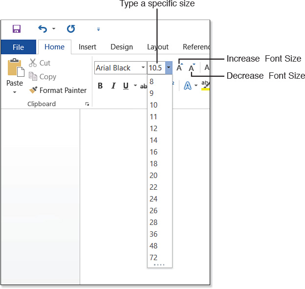
To manually change the font, position the insertion point or select the block of text to affect, and then choose from the Font drop-down list on the Home tab (see Figure 4.1). You can also right-click or point to the selection to display the Mini Toolbar and then select a font from there instead.

Notice that each font appears in its actual lettering style on the menu (where possible), making it easy to browse the available choices. For some fonts, it is not possible to view the names in the actual fonts because the fonts contain no letters; Wingdings is a symbols-only font, for example.
The Font drop-down list displays fonts in three areas:
![]() Theme Fonts—When you choose Body or Headings as the font choice rather than selecting a specific font, you allow the chosen theme (selected from the Design tab) to control the font choices. Selecting one of the fonts in this section of the list sets the text to draw its font choice from those placeholders; changing the theme (on the Design tab) changes the font.
Theme Fonts—When you choose Body or Headings as the font choice rather than selecting a specific font, you allow the chosen theme (selected from the Design tab) to control the font choices. Selecting one of the fonts in this section of the list sets the text to draw its font choice from those placeholders; changing the theme (on the Design tab) changes the font.
![]() To apply and modify themes, see “Working with Themes,” p. 245.
To apply and modify themes, see “Working with Themes,” p. 245.
![]() Recently Used Fonts—Fonts that you have recently applied appear here, for easy reselection. This section does not appear if you have not selected any fonts.
Recently Used Fonts—Fonts that you have recently applied appear here, for easy reselection. This section does not appear if you have not selected any fonts.
![]() All Fonts—A complete list of the available fonts appears here.
All Fonts—A complete list of the available fonts appears here.
The fonts appear in alphabetic order in the All Fonts part of the list. To quickly jump to a certain area of the list, start typing the first few letters of the font’s name.
Font sizes are measured in points. A point is 1/72 of an inch on the printed page. (Because zoom settings and monitor sizes vary, the font size has no fixed relationship to the size of the text onscreen.)
To change the font size, select from the Font Size drop-down list. You are not limited to the sizes that appear on this list, though; you can type any size (including decimal numbers, such as 10.5) into the text box at the top of the list area (see Figure 4.2). You can enter a font size of up to 1638 points here. In addition, the Home tab has Increase Font Size and Decrease Font Size buttons that increase and decrease, to the next larger or smaller size on the Font Size list. (Depending on the font and the current size, this could be 1 point or it could be more. Notice, for example, that there are big jumps between the larger sizes, such as 48 and 72.)
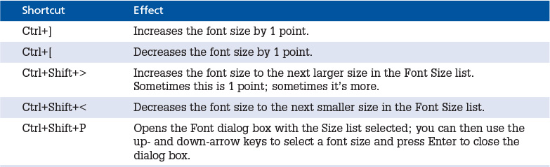
There are also shortcut keys for changing the font size (see Table 4.1).
You can also access font and size controls by right-clicking or pointing at a text selection. When you do so, the Mini Toolbar appears, containing a Font drop-down list, a Font Size drop-down list, and the Increase Font Size and Decrease Font Size buttons (see Figure 4.3).

Figure 4.3 Use the Mini Toolbar for quick access to the Font and Font Size lists and to the buttons for increasing and decreasing font size.
There is one more method: You can use the Font dialog box to change both the font and the font size. To display the Font dialog box shown in Figure 4.4, do any of the following:
![]() Press Ctrl+D.
Press Ctrl+D.
![]() Click the dialog box launcher in the bottom-right corner of the Font group on the Home tab.
Click the dialog box launcher in the bottom-right corner of the Font group on the Home tab.
![]() Right-click the selected text and choose Font from the shortcut menu that appears.
Right-click the selected text and choose Font from the shortcut menu that appears.
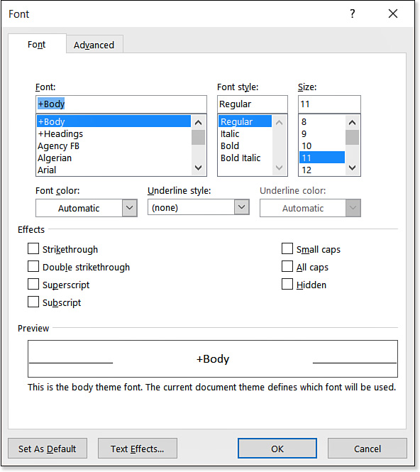
Figure 4.4 The Font dialog box offers a variety of character-formatting options, including font and size choices.
The Font dialog box is useful as a one-stop shop for all types of character formatting—not only fonts and sizes, but attributes such as bold, italic, underline, strikethrough, and so on, as well as character spacing. You find out more about all these things as this chapter progresses. For font and size selection, however, the Font dialog box offers little benefit over the tab method, and in fact it has several drawbacks. Fonts appear on the dialog box’s list in plain text, rather than as the actual fonts, so you must look to the Preview area to see an example of the font you have chosen. The Font list in the dialog box also does not pull out theme fonts or recently used fonts separately, making them more difficult to find.
 The Font Onscreen Is Not the Font That Prints
Setting the Default Font
If you don’t like the default font of Calibri, you can easily change it. You make this change to the Normal.dotm template so that all new documents are affected.
You can set a default font in two ways. If you always want a certain font, you can set the default definition of the Normal style to a fixed choice. If you prefer to maintain the flexibility of working with the Body and Heading placeholders, so that you can use themes to format the fonts later if desired, you can define a set of theme fonts and then set them as the default.
Specifying a Fixed Default Font
Notice in the Font dialog box (refer to Figure 4.4) that a Set As Default button appears in the bottom-left corner. Select the desired default font and size, and then click the Set As Default button. In the resulting confirmation box, you can choose between making the change to this document only or to all documents based on the Normal.dotm template. Choose an option and then click OK. Your choice of font and size becomes the default. This setting applies to all future new blank documents as well as the current document.
Here’s another way of doing the same thing: Apply the desired font to some text, and select that text. Then on the Design tab, click Set as Default.
Setting Different Default Theme Fonts
You learn about themes in Chapter 6, “Creating and Applying Styles and Themes,” but here’s a quick walkthrough of how to change the default definition for Body and Heading by creating a new theme font set and then setting it to be the default:
1. On the Design tab, click Fonts, and click Customize Fonts.
2. In the Create New Theme Fonts dialog box, specify a Heading Font and Body Font.
3. Type a name for the new font theme in the Name box.
4. Click Save.
5. On the Design tab, click Set as Default.
6. Click Yes to confirm.
![]() For more information about theme font sets, see “Working with Themes,” p. 245.
For more information about theme font sets, see “Working with Themes,” p. 245.
I Accidentally Modified Normal.dotm, and Now All New Documents Are Messed Up
More About Font Types
The majority of the fonts used in Windows are scalable OpenType or TrueType fonts. These are outline fonts, which means they consist of unfilled mathematically created outlines of each character. When you assign a size, you are sizing the outline; then the outline is filled in with black (or whatever color you choose) to form each character. Such fonts look good at any size.
TrueType fonts, which Microsoft and Apple jointly developed, have been around since the late 1980s; they’re good basic scalable fonts that you can use on any printer. OpenType was created as a joint venture between Microsoft and Adobe (the makers of PostScript), so OpenType fonts have many of the characteristics and benefits of both TrueType fonts and Adobe Type 1 fonts, including the capability of storing more than 65,000 characters in a single font file. For example, OpenType fonts typically store ligatures, alternative characters, typeset-style ordinals, and built fraction sets, as well as characters for different written languages.
Not all fonts are created equal, however. The simple fact of a font being OpenType does not necessarily make it better than a TrueType font, because both amateurs and experts create both types. In the end, the quality and versatility of a font depend in large part upon who created it. The best commercial OpenType fonts, such as those that Adobe has produced, have several alternative character sets in them, plus alternative characters for superscript and subscript numbers, fractions, ligatures, and so on. (See the Advanced tab of the Font dialog box to control the available options.) And although Word cannot access this feature, most commercial OpenType fonts have several weights of lettering, such as light, normal, semibold, bold, and extra bold. A free amateur-created font might have only the basic keyboard letters, numbers, and symbols.
Word’s Font list shows icons to the left of the fonts that indicate their type. An O indicates an OpenType font, and a TT indicates TrueType. The vast majority of the fonts available will be OpenType, but you might have a few TrueType fonts on your system as well.
Depending on the default printer, you might also have some printer-resident fonts available. The printer driver tells Windows (and Word) about their existence, and the fonts become available on Word’s list. (They do not appear in the Fonts folder in the Windows Control Panel, as other fonts do.) For example, most PostScript-compatible printers have 35 or more printer-resident fonts. In Word, printer-resident fonts appear with a printer icon to their left. The available printer-resident fonts on the Fonts list change when you set a different printer to be the default in Windows. Don’t use these fonts in documents that you plan on printing on a different printer than the default one currently connected to your computer, because the other printer might not have them available.
![]() For more information about theme font sets, see “Working with Themes,” p. 245.
For more information about theme font sets, see “Working with Themes,” p. 245.
Printer Fonts Don’t Appear
Adding More Fonts to Your System
Fonts, like printers, are installed Windows-wide. Different word processing and desktop publishing applications come with different fonts, so your font choices depend on what other programs you have installed besides Word.
Office 2016 comes with a large selection of fonts, but you can also buy more (or freely acquire them online in many cases). After acquiring one or more new fonts, install them in Windows to gain access to them in all applications (including Word).
To install new fonts in Windows, follow these steps:
1. In Windows 7, open the Start menu and click Control Panel.
or
In Windows 8.1 and Windows 10, right-click the Start button and click Control Panel.
2. Click Appearance and Personalization.
3. Click Fonts.
4. While leaving the Control Panel window open, open Windows Explorer (Windows 7) or File Explorer (Windows 8.1 and Windows 10), and navigate to the folder containing the font files to install.
5. Drag and drop the font files into the Fonts window. Then close both windows.
Embedding and Substituting Fonts
One potential problem when sharing documents with other people is that not everyone has the same fonts installed on their PCs. When a document is opened on a PC that does not have the correct font, the name of the font appears in the Font box on the Home tab, but the actual font does not appear; instead the text appears in whatever Word considers to be a close match for the font. (Often it is not a close match at all, but a generic-looking font such as Courier.) The text remains marked as using the missing font, so if the document is later opened on a different PC with the correct font installed, it appears as originally intended.
To get around this problem, in some cases you can embed the font in the document so that the font travels with it. This trick works only if there is no prohibition against embedding built in to that font. (Some font designers disallow embedding to keep the font from being distributed without their permission.)
To embed fonts in a document, follow these steps:
1. Choose File, Save As, click the location to save to (probably This PC or OneDrive), and then click Browse. The Save As dialog box opens.
2. Click Tools at the bottom of the dialog box, and choose Save Options. The Word Options dialog box opens.
3. Mark the Embed Fonts in the File check box.
4. Select either or both of the options provided:
![]() Embed Only the Characters Used in the Document—This embeds only the letters in use. Do not select this if the document will be edited later.
Embed Only the Characters Used in the Document—This embeds only the letters in use. Do not select this if the document will be edited later.
![]() Do Not Embed Common System Fonts—This prevents fonts that come with Windows, such as Times New Roman and Arial, from being embedded.
Do Not Embed Common System Fonts—This prevents fonts that come with Windows, such as Times New Roman and Arial, from being embedded.
5. Click OK.
6. Continue saving normally.
If the person who created the document did not have the foresight to embed the needed fonts, you aren’t completely stuck; you can change the font substitution table so that the missing fonts are at least displayed in a font of your choice. To modify the font substitution table for the document, follow these steps:
1. Choose File, Options. The Word Options dialog box opens.
2. Click Advanced.
3. Scroll down to the Show Document Content section and click Font Substitution.
If no fonts need to be substituted, a message appears to that effect and you’re done. Otherwise, the Font Substitution dialog box opens, listing the missing and substituted fonts.
4. Click a font on the list, and then select a different font from the Substituted Font drop-down list. Repeat for each font.
![]() Caution
Caution
If you are sharing the document with others, be wary of converting fonts permanently. You might be the only one who is missing the chosen font, and the original font choice might be important to maintain (for example, to match the company’s official document-formatting standards).
5. (Optional) To permanently convert all instances of the missing font to the chosen substitution, click Convert Permanently and then click OK to confirm.
6. Click OK to close the Font Substitution dialog box, and then click OK to close the Word Options dialog box.
Changing Font Color and Style
Now let’s have a look at some ways to work with that basic choice of font. You can change the color, add styles like bold and italic, and apply special effects like strikethrough, shadow, and small caps.
Changing Font Color
The default setting for font color in Word is Automatic (not black, as many people assume). Automatic makes the text appear either black or white, depending on which would most sharply contrast with the background on which it is placed. By default, the background is white, so text appears black. However, if you change the background to a dark color (or to black), the text changes to white. You can change the font color to any color you like—including fixed black or fixed white.
To understand the font color choices in Word, you must know something about themes. A theme is like a style that applies to the entire document. Themes include colors, fonts, and object effects (for formatting drawn lines and shapes). There are 12 color placeholders in a theme. By changing the theme, you can change what colors are populated into those placeholders.
![]() To change themes, see “Applying a Theme,” p. 246.
To change themes, see “Applying a Theme,” p. 246.
![]() To learn more about object effects, see “Changing the Theme Effects for the Entire Document,” p. 535.
To learn more about object effects, see “Changing the Theme Effects for the Entire Document,” p. 535.
When specifying the color for text (or for an object), you can either choose a fixed color or a theme color. A fixed color does not change, regardless of the theme applied. A theme color does not actually apply a color to the selection, but rather a link to one of the theme’s color placeholders. Then whatever color happens to be assigned to that placeholder trickles down to the selection. That way, you can have elements in your document that change color automatically when you switch themes.
You do not necessarily have to apply a theme color at full strength; you can instead apply a tint or shade of it. A tint is a scaled-back version of a color, derived by blending the color with white. Tints are described in percentages, such as a 40% tint, an 80% tint, and so on. Shades are darkened versions, derived by blending the color with black. Shades are also described in percentages, such as a 50% shade.
Color formatting works like font formatting, in that if you select the text first, it applies only to the selected block. If you do not select anything, the formatting applies to the insertion point’s current position.
To change the font color, follow these steps:
1. If you want, select text to affect. Otherwise, the change applies to new text typed at the insertion point’s current location.
2. On the Home tab, open the Font Color button’s drop-down list (see Figure 4.5).
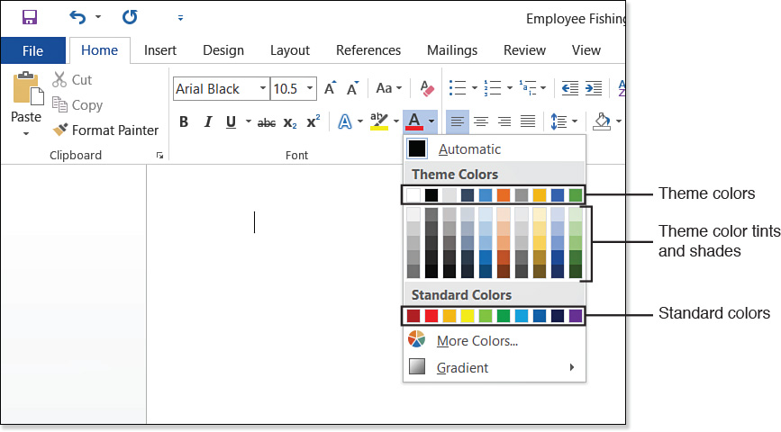
3. Do one of the following:
![]() Click Automatic.
Click Automatic.
![]() Click a theme color (top row).
Click a theme color (top row).
![]() Click a tint or shade of a theme color.
Click a tint or shade of a theme color.
![]() Click a standard (fixed) color.
Click a standard (fixed) color.
![]() Note
Note
This same Font Color list is also available in the Font dialog box. You can also point to or right-click the selected text and use the Font Color button on the Mini Toolbar.
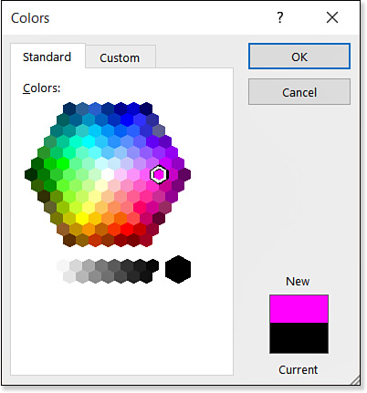
If none of the color choices please you, choose More Colors from the Font Color drop-down list and select a color from the Colors dialog box. This dialog box has two tabs: Standard and Custom.
On the Standard tab, you can click any of the colored hexagons, as shown in Figure 4.6.
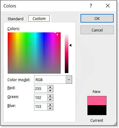
On the Custom tab, you can define a color precisely using its numeric value from either the RGB or the HSL color model. These numeric color models can be useful when you are trying to match a color exactly; for example, many corporations have official colors to be used in all company correspondence and publications.
RGB stands for Red/Green/Blue; colors are defined with values ranging from 0 to 255 for each of those three colors. Equal amounts of each color result in varying shades of black-gray-white.
HSL stands for Hue/Saturation/Luminosity. These are also values from 0 to 255, but H is for all hues (0 and 255 are both red; the numbers in between are the other colors of the rainbow), S is for saturation (the intensity of the color, as opposed to neutral gray), and L is for luminosity, the lightness/darkness (white to black). As you can see in Figure 4.7, you can click any spot on the color grid to select that color, or you can drag the vertical slider up or down.
Bold and Italic: Applying Font Styles
Font styles are modifiers that affect the shape or thickness of the characters. In Word, a font’s style can be set to Regular, Italic, Bold, or Bold Italic. The way font styles are applied depends on the particular font. Some fonts that appear as single entries in Word’s Font list are actually four separate font files behind the scenes—one for each style. This is the ideal, because the shapes of the letters can be subtly different for each style. Other fonts have only one font definition, and Word must simulate “bold” by fattening up the characters or “italic” by skewing them to the right slightly. In some programs, this skewing is called false italic.
Word makes no distinction between true italic and false italic, or between true bold and simulated bold, but you can see the difference for yourself by experimenting with the various fonts on your system. For example, in Figure 4.8, the Broadway and Times New Roman fonts are shown in both regular and italic. Notice that the Broadway font’s letters are simply tilted to the right, but the Times New Roman letters are actually different in shape and thickness.
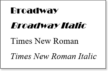
Figure 4.8 Some fonts are merely tilted for italic; others have completely different character shapes.
You can also tell which fonts have separate files for the various styles by opening the Fonts folder from the Control Panel. In the Fonts folder, click the View button to open its menu and click Details. Then look in the Font Style column; fonts with separate files for the styles have multiple entries in this column.
![]() Caution
Caution
Do not confuse font styles with character styles. A character style is a Word-defined style that applies to individual characters; character styles are covered in Chapter 6.
Some professional-quality fonts might even have more styles than just the standard four; they might have separate sets for light, regular, semibold, bold, and so on. Word recognizes and uses only one level of bold, however.
As with other formatting, you can select the text first and then apply bold or italic, or you can apply the font style to the insertion point position.
To quickly apply bold or italic to text, use one of these methods:
![]() Click the Bold or Italic button on the Home tab, as shown in Figure 4.9.
Click the Bold or Italic button on the Home tab, as shown in Figure 4.9.

![]() Right-click the selected text and click the Bold or Italic button on the Mini Toolbar.
Right-click the selected text and click the Bold or Italic button on the Mini Toolbar.
![]() Use shortcut keys: Use Ctrl+B for bold or Ctrl+I for italic.
Use shortcut keys: Use Ctrl+B for bold or Ctrl+I for italic.
All these methods are on/off toggles. To remove bold or italic, click the button again or use the shortcut key again. (You can also strip off all formatting from text, including bold and italic, by selecting the text and pressing Ctrl+Spacebar.)
![]() To learn about clearing text formatting, see “Clearing Formatting,” p. 165.
To learn about clearing text formatting, see “Clearing Formatting,” p. 165.
You can also apply bold or italic from the Font dialog box:
1. On the Home tab, click the dialog box launcher in the lower-right corner of the Font group, or press Ctrl+D. The Font dialog box opens.
2. On the Font Style list, click your preference: Regular, Italic, Bold, or Bold Italic.
3. Click OK.
Underlining Text
Word enables you to apply a variety of underline styles and colors to text. Unlike bold and italic, underlining does not modify the basic shape or weight of the text; it’s an additive element.
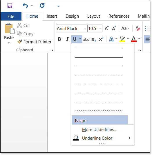
To apply the default underline style (a plain, solid single line, Automatic color), click the Underline button on the Home tab. The Underline button on the Home tab also has a drop-down menu associated with it for choosing alternative underline styles, as shown in Figure 4.10. To pick an underline color from the menu, point to Underline Color for a fly-out menu of color choices.
![]() Note
Note
There are shortcut keys for some of the most popular underline styles:
![]() Single plain underline—Ctrl+U
Single plain underline—Ctrl+U
![]() Words Only underline—Ctrl+Shift+W
Words Only underline—Ctrl+Shift+W
![]() Double underline—Ctrl+Shift+D
Double underline—Ctrl+Shift+D
For even more underline options, choose More Underlines from the menu to display the Font dialog box (see Figure 4.11). From here, open the Underline Style drop-down list and select a style. A variety of line styles are available, including solid, dotted, dashed, single, double, and wavy. While you’re here, open the Underline Color list and select a color. (The choices for underline colors are the same as for font colors.)

Applying Font Effects and Text Effects
Font effects are additives or modifiers applied to the text, such as strikethrough, small caps, or superscript. Some of these are available from the Home tab; others must be applied via the Font dialog box (refer to Figure 4.11). Table 4.2 summarizes the effects and shows the Home tab buttons or the shortcut keys where applicable.

As the name implies, the Hidden effect hides the text. Marking text as hidden is useful when you don’t want it in the current draft but you might eventually want it again. For example, in a boilerplate contract, you could hide text that doesn’t apply to a certain client. Hidden text does not print under any circumstances, but you can choose whether it should appear onscreen. The easiest way to do this is to click the Show/Hide (±) button on the Home tab; this turns on the display of all hidden text and characters. If you don’t want all the other hidden characters, but just hidden text, customize the viewing options as follows: Choose File, Options, and on the Display tab, mark the Hidden Text check box if you want hidden text to show onscreen.
Font effects can be combined, but there are a few exceptions. The following are mutually exclusive:
![]() Strikethrough and double strikethrough
Strikethrough and double strikethrough
![]() Superscript and subscript
Superscript and subscript
![]() Small caps and all caps
Small caps and all caps
Text effects are an extra type of character formatting that you can apply when working in Word 2007 and later documents. (They are not available in Word 97-2003 Compatibility Mode.) Click the Text Effects button in the Font dialog box to open the Format Text Effects dialog box. (You can also access these controls from the Text Effects and Typography button on the Home tab.) Choose one of the icons across the top: Text Fill & Outline or Text Effects. Then click one of the headings to expand that category of options. For example, in Figure 4.12, the Text Fill & Outline icon has been chosen and the Text Fill category has been expanded.
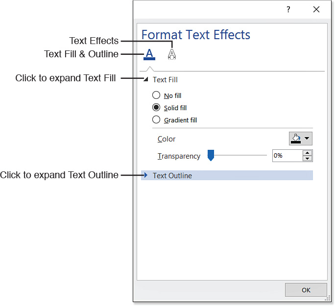
Text Effects under Text Fill & Outline include the following:
![]() Text Fill—You can apply a solid or gradient fill color to the text that replaces its regular font color.
Text Fill—You can apply a solid or gradient fill color to the text that replaces its regular font color.
![]() Text Outline—You can outline the letters in a different color than the fill. (This is useful mainly with extremely large and thick letters.)
Text Outline—You can outline the letters in a different color than the fill. (This is useful mainly with extremely large and thick letters.)
Text effects available when you choose the Text Effects icon include the following:
![]() Shadow—You can apply a graphics-style shadow to the text.
Shadow—You can apply a graphics-style shadow to the text.
![]() Reflection—You can make the text appear to have a reflection, as if it were on a shiny surface.
Reflection—You can make the text appear to have a reflection, as if it were on a shiny surface.
![]() Glow—You can apply a fuzzy halo effect (a glow) around the text.
Glow—You can apply a fuzzy halo effect (a glow) around the text.
![]() Soft Edges—You can blend the edges of the text to various degrees of softness.
Soft Edges—You can blend the edges of the text to various degrees of softness.
![]() 3-D Format—You can tilt and rotate the text to make it appear 3-D.
3-D Format—You can tilt and rotate the text to make it appear 3-D.
You discover more about these effects in Chapter 11, “Working with Drawings and WordArt.” All these effects also apply to drawings and are covered in detail there. You can experiment with these effects on your own in the meantime if you like; each has fairly self-explanatory controls.
Changing Text Case
In the ASCII character set, which is the basic set of characters used in English-language writing (as well as many other languages), upper- and lowercase versions of the same letter are considered two completely separate characters. For example, a capital A has no inherent relationship to a lowercase a. Therefore, generally speaking, if you accidentally type A instead of a, you must retype it.
There are cases in which you don’t have to retype text to change its case, however. As you learned in Chapter 3, “Correcting and Printing Documents,” Word’s AutoCorrect feature turns off the Caps Lock feature and corrects any text that you have accidentally typed with it on. AutoCorrect also fixes instances of two capital letters at the beginning of an otherwise-lowercased word.
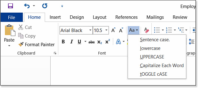
Alternatively, you can use Word’s Change Case feature to change the case of some text. Here are the choices:
![]() Sentence case—Text is capitalized as in an English-language sentence (first letter of the first word only).
Sentence case—Text is capitalized as in an English-language sentence (first letter of the first word only).
![]() Lowercase—All letters of all words are lowercase.
Lowercase—All letters of all words are lowercase.
![]() Uppercase—All letters of all words are capitalized.
Uppercase—All letters of all words are capitalized.
![]() Capitalize Each Word—The first letter of each word is capitalized.
Capitalize Each Word—The first letter of each word is capitalized.
![]() Toggle Case—The current case of each letter is reversed.
Toggle Case—The current case of each letter is reversed.
To change the text case of some text, select the text and then click the Change Case button on the Home tab. Select the desired case from the menu, as shown in Figure 4.13. Alternatively, you can toggle through uppercase, lowercase, and sentence case by pressing Shift+F3.
The All Caps font effect covered in the preceding section does make the text appear to be in all caps, but this is just an illusion. The letters have not changed; they have just had a mask placed over them that makes them appear as their uppercase cousins. That’s not the same thing as actually changing the text’s case. It’s useful, for example, if you want to make a heading all caps for a certain appearance effect, but you want to retain the flexibility of going back to the original capitalization later without retyping.
![]() Caution
Caution
The Capitalize Each Word option is not “smart” or contextual. It simply capitalizes the first letter in every word. Modern English usage dictates that certain words such as of and in should not be capitalized in titles, so you need to edit what Word has done to conform to that standard usage. However, the grammar checker can also fix such problems, so running a grammar check immediately after changing text to Capitalize Each Word should do the trick.
Highlighting Text
Students have long known that a highlighter marker can be of great help in marking important passages of a textbook. Word’s highlighting feature lets you do the same thing to Word documents. You can use highlighting to call attention to text or to color-code various passages (for example, to mark text that’s the responsibility of a certain writer or reviewer).
![]() Note
Note
Highlighting is the one type of character formatting that is not removed by the Clear All Formatting command (Ctrl+Spacebar or the Clear All Formatting button on the Home tab). You can remove highlighting only with the Text Highlight Color button.
You can highlight text in two ways:
![]() Select the text, and then select a highlight color from the Text Highlight Color button’s drop-down list on the Home tab (see Figure 4.14).
Select the text, and then select a highlight color from the Text Highlight Color button’s drop-down list on the Home tab (see Figure 4.14).
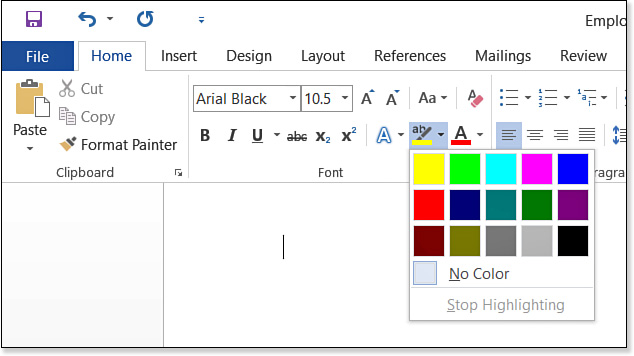
![]() Select a highlight color, and then drag across text to be highlighted with that color. Press Esc to turn off the highlight when finished.
Select a highlight color, and then drag across text to be highlighted with that color. Press Esc to turn off the highlight when finished.
To remove a highlight, select the text and then open the Text Highlight Color button’s list and choose No Color.
Adjusting Character Spacing and Typography
Have you ever wondered why ordinary word processing documents don’t look as polished and professional as book or magazine pages? It’s the spacing. A professional designer knows how to subtly manipulate spacing and typography settings to create more readable and attractive pages.
Word enables you to adjust text spacing to achieve the same professional-looking effects enjoyed by professionals who use expensive page layout programs. Although Word’s controls are perhaps not as exhaustive in function, they are adequate for most projects.
To change character spacing and typography settings, use the Font dialog box. Follow these steps:
1. Select the text to affect, or position the insertion point where you will type new text that will have this formatting.
2. On the Home tab, click the Font dialog box launcher to open the Font dialog box.
![]() Tip
Tip
To redefine the defaults in Normal.dotm, click the Set As Default button in the Font dialog box.
3. Click the Advanced tab.
4. Adjust any of the character spacing settings, as described following these steps and as shown in Figure 4.15.

5. Click OK.
Here are some details about the options on the Advanced tab:
![]() Scale—This is the size of the text in relation to its baseline size (as specified via the Font Size setting). Scale can be used to subtly adjust the size of certain characters—for example, to make an @ sign or punctuation mark slightly larger or smaller than the surrounding text. A drop-down list of common percentages is provided, but you can manually enter any value from 1% to 600%.
Scale—This is the size of the text in relation to its baseline size (as specified via the Font Size setting). Scale can be used to subtly adjust the size of certain characters—for example, to make an @ sign or punctuation mark slightly larger or smaller than the surrounding text. A drop-down list of common percentages is provided, but you can manually enter any value from 1% to 600%.
![]() Tip
Tip
Setting scaling for a character is preferable to setting its font size because its size shifts proportionally if you later change the font size definition for the style on which it is based. For example, suppose that the Body style is defined as 12 point, and you choose to make a particular character 120% of that size. That character ends up 14.4 point in size. If you redefine the Body style to be 10 point, the character changes to 12 point (120% of 10 point).
![]() Spacing—This is an increase or decrease of the space between letters compared to a baseline size of Normal. This setting does not change the letters themselves, but only the space between the letters. In some programs, this is called tracking. You choose either Expanded or Condensed and then specify a number of points. (One point is 1/72 of an inch.) The increment arrows move the value up one point at a time, but you can manually type values in as fine a detail as 1/20 of a point (for example, 1.05 points).
Spacing—This is an increase or decrease of the space between letters compared to a baseline size of Normal. This setting does not change the letters themselves, but only the space between the letters. In some programs, this is called tracking. You choose either Expanded or Condensed and then specify a number of points. (One point is 1/72 of an inch.) The increment arrows move the value up one point at a time, but you can manually type values in as fine a detail as 1/20 of a point (for example, 1.05 points).
![]() Position—This is a raising or lowering of the characters compared to the baseline of Normal. This setting is called baseline shift in some desktop publishing programs. You choose either Raised or Lowered and then specify a number of points. As with spacing, you can use the increment arrows to go up or down one point at a time or manually enter values in as fine a detail as 1/20 of a point. You can use this to make a manual adjustment to the height of a superscript or subscript character, for example.
Position—This is a raising or lowering of the characters compared to the baseline of Normal. This setting is called baseline shift in some desktop publishing programs. You choose either Raised or Lowered and then specify a number of points. As with spacing, you can use the increment arrows to go up or down one point at a time or manually enter values in as fine a detail as 1/20 of a point. You can use this to make a manual adjustment to the height of a superscript or subscript character, for example.
![]() Kerning—This is a spacing adjustment between certain pairs of letters based on their shapes. For example, when the letters A and V appear adjacent to one another, they can afford to be closer together because their shapes fit into one another: AV. You can turn kerning on or off, and you can specify a minimum font size at which kerning should occur.
Kerning—This is a spacing adjustment between certain pairs of letters based on their shapes. For example, when the letters A and V appear adjacent to one another, they can afford to be closer together because their shapes fit into one another: AV. You can turn kerning on or off, and you can specify a minimum font size at which kerning should occur.
Kerning is more useful at larger sizes; with small text, however, kerning can actually backfire and make letters look as if they are too close together. Kerning also slows down the computer’s performance somewhat, especially noticeable on a PC that is slow to begin with. If you notice a difference in performance with kerning turned on for body text sizes (say, 10 point and up), but you want to kern text that size, consider doing all the editing on the document with kerning turned off and then turning it back on right before you print.
![]() Caution
Caution
Kerning may cause spacing to shift, and in some cases it might cause text to float from one page to another.
Many OpenType and TrueType fonts have kerning tables built in to them that determine how much space should be left between letters when kerning is turned on for maximum readability and attractiveness. This table can contain as many as 500 kerning pairs (pairs of letters with rules established for kerning them when they appear together). If the font has such a table, Word uses it; otherwise, Word tries to kern based on the letter shapes.
![]() Tip
Tip
High-end desktop publishing programs enable you to manually adjust the kerning values between specific letter pairs. Word does not offer this feature, but you can simulate such an adjustment by changing the spacing between two letters with the Spacing setting. For example, if you think a particular A and V are too close to each other, select the V and change its spacing to Expanded by a certain value (perhaps 0.5 point to start with), and then adjust up or down as needed.
If the selected text uses an OpenType font, you can adjust additional options on the Advanced tab. This enables Word to use some of the powerful extra features of some OpenType fonts, in the same way that professional-quality desktop publishing programs such as Adobe InDesign do. For example, you can control ligatures (which are letters that run together typographically), number spacing, number forms, and stylistic sets. Refer to Figure 4.15.
Creating a Drop Cap
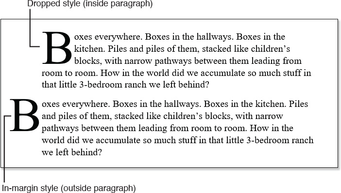
A drop cap is an enlarged capital letter at the beginning of a paragraph, “dropped” down into the paragraph. Drop caps are used to call attention to the beginning of a chapter, section, or article; they say to the reader “begin here.”
There are two basic styles of drop cap: Dropped and In-Margin. The Dropped style places the letter in the paragraph, so that the lines move over to accommodate its presence. An In-Margin drop cap places the letter to the left of the paragraph and does not interfere with line positions (see Figure 4.16).
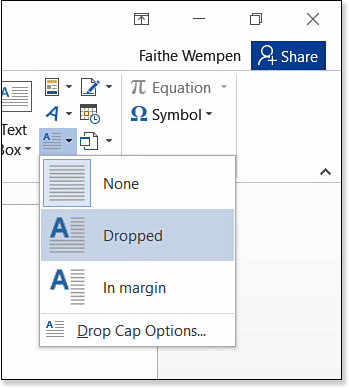
To create a drop cap for a paragraph, click in the paragraph. Then on the Insert tab, click the Drop Cap button and choose the type of drop cap you want: Dropped or In Margin (see Figure 4.17). To remove a drop cap from a paragraph, choose None.
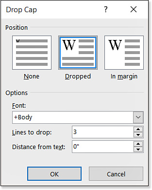
For a drop cap with custom settings, choose Drop Cap Options. The Drop Cap dialog box opens (see Figure 4.18). From here, you can select the following options:
![]() Font—By default, whatever font was previously applied to that letter is used. Sometimes a different font can make for a more interesting drop cap, though; for example, an Old English or handwriting style font can be attractive.
Font—By default, whatever font was previously applied to that letter is used. Sometimes a different font can make for a more interesting drop cap, though; for example, an Old English or handwriting style font can be attractive.
![]() Lines to Drop—The default is three lines. The larger the value here, the larger the drop cap will be and the further down into the paragraph it will drop.
Lines to Drop—The default is three lines. The larger the value here, the larger the drop cap will be and the further down into the paragraph it will drop.
![]() Distance from Text—The default is 0 inches. Increase this value to increase the spacing around the drop cap.
Distance from Text—The default is 0 inches. Increase this value to increase the spacing around the drop cap.
![]() To learn about adjusting paragraph indentation, see “Indenting Paragraphs,” p. 181.
To learn about adjusting paragraph indentation, see “Indenting Paragraphs,” p. 181.
Clearing Formatting
Sometimes it’s easier to format text by starting from scratch rather than wondering what formatting has been applied to it. To quickly strip off all the character formatting from some text (except for highlighting), select the text and press Ctrl+Spacebar, or click the Clear All Formatting button on the Home tab.
Ctrl+Spacebar is an old trick that Word has offered for many versions now, but few people knew about it because there was no menu command for it. The Clear All Formatting button just makes the feature more obvious.
Copying Formatting with Format Painter
You can copy formatting from one block of text to another, which can save a tremendous amount of time if text has multiple formatting actions applied to it. For example, instead of individually making multiple blocks of text 16 point and bold and italic and red, you can format one block of text that way and use Format Painter to copy all that formatting to other blocks.
To copy the formatting from one block of text to another, follow these steps:
1. Select the text that is already formatted correctly. You can select as little as a single character. If you do not select any text, Format Painter copies the text settings that are in effect at the insertion point’s current location.
2. Click the Format Painter button on the Home tab (see Figure 4.19), click the Format Painter button on the Mini Toolbar. The mouse pointer changes to show a paintbrush.
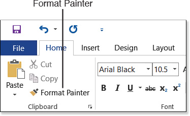
3. Drag across the text to receive the formatting.
Format Painter turns itself off automatically when you release the mouse button. If you want Format Painter to stay on so you can copy the same formatting to additional selections, double-click instead of single-clicking the button in step 2. Then click the button again (or press Esc) to turn off Format Painter when you’re done.
![]() Note
Note
You can also use Format Painter with keyboard shortcuts. To copy formatting from the selected text, press Ctrl+Shift+C. To paste the formatting, press Ctrl+Shift+V. When you use this method, you don’t see the mouse pointer change to a paintbrush.
Revealing and Comparing Formatting
The Reveal Formatting task pane is Word’s partial response to requests from WordPerfect users who missed that program’s Reveal Codes feature after moving to Word. To display the Reveal Formatting pane, press Shift+F1. The pane describes the formatting applied to the currently selected text or to the insertion point’s current location (see Figure 4.20).

Notice the underlined headings in the Reveal Formatting task pane, in sections such as Font, Language, Alignment, and Indentation. Each of those headings is a hyperlink to the dialog box in which that setting can be changed.
The Reveal Formatting task pane also has two check box options:
![]() Distinguish Style Source—When this is marked, information appears about where the formatting comes from. For example, if the font choice comes from the paragraph style applied to it, that source is noted. It’s good to know that a particular formatting attribute is part of the style (or not) so you know whether to change the style’s definition or apply manual formatting over it.
Distinguish Style Source—When this is marked, information appears about where the formatting comes from. For example, if the font choice comes from the paragraph style applied to it, that source is noted. It’s good to know that a particular formatting attribute is part of the style (or not) so you know whether to change the style’s definition or apply manual formatting over it.
![]() Show All Formatting Marks—When this is marked, nonprinting characters such as end-of-paragraph markers appear. This can be helpful in sorting out where one paragraph ends and the other begins, and where manual line breaks (Shift+Enter) have been inserted.
Show All Formatting Marks—When this is marked, nonprinting characters such as end-of-paragraph markers appear. This can be helpful in sorting out where one paragraph ends and the other begins, and where manual line breaks (Shift+Enter) have been inserted.
You can also use the Reveal Formatting pane to compare the formatting between two blocks of text. Here’s how to do this:
1. With the Reveal Formatting task pane open, select the first block of text to compare.
2. Mark the Compare to Another Selection check box.
3. Select the second block of text to compare. The differences appear on the Formatting Differences list in the task pane, as shown in Figure 4.21.
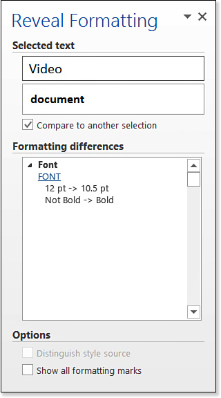
The differences are indicated with -> arrows. For example, under Font, it indicates that the first text uses 12 pt, whereas the second text uses 10.5 pt.
If you want to select different text for the initial selection, clear the Compare to Another Selection check box and then start the steps over again.
Using AutoFormat
There are actually two different features called AutoFormat in Word:
![]() AutoFormat as You Type—Automatically makes formatting changes for you, such as changing two minus signs in a row to a dash and converting straight quotes to curly ones (smart quotes). These options work behind the scenes in every document. You can turn individual options on or off.
AutoFormat as You Type—Automatically makes formatting changes for you, such as changing two minus signs in a row to a dash and converting straight quotes to curly ones (smart quotes). These options work behind the scenes in every document. You can turn individual options on or off.
![]() AutoFormat—Sets up headings and lists and applies some styles automatically. AutoFormat can be done all at once (in a single pass) or interactively (you confirm or decline each change).
AutoFormat—Sets up headings and lists and applies some styles automatically. AutoFormat can be done all at once (in a single pass) or interactively (you confirm or decline each change).
The latter AutoFormat has been deemphasized in Word 2007 and later, to the point where there is not even a button for it on any of the tabs. You have to know the shortcut key combo for it (Ctrl+Alt+K) or add a button for it to the Quick Access toolbar. It’s still around, however, and still useful.
Setting AutoFormat As You Type Options
Most AutoFormat As You Type options are enabled by default in Word, so setting options consists mostly of turning off the ones you don’t want. To access these options and make your selections, follow these steps:
1. Choose File, Options. The Word Options dialog box opens.
2. Click the Proofing tab, and then click AutoCorrect Options.
3. Click the AutoFormat As You Type tab (see Figure 4.22).
4. Mark or clear check boxes to make your selections.
5. Click OK to close the AutoCorrect dialog box, and then click OK to close the Word Options dialog box.
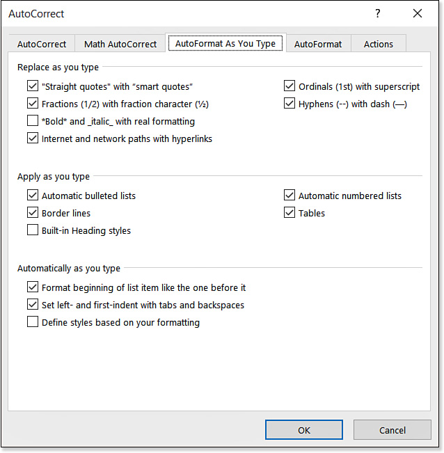
As shown in Figure 4.22, the options are broken down into three major categories:
![]() Replace as You Type—A set of options for inserting typographical symbols to substitute for plain typing. These provide shortcuts for items such as ordinals, fractions, quotation marks, and dashes.
Replace as You Type—A set of options for inserting typographical symbols to substitute for plain typing. These provide shortcuts for items such as ordinals, fractions, quotation marks, and dashes.
![]() Apply as You Type—A set of options for applying automatic formatting at the paragraph level, including bulleted and numbered lists, borders, headings, and tables.
Apply as You Type—A set of options for applying automatic formatting at the paragraph level, including bulleted and numbered lists, borders, headings, and tables.
![]() Automatically as You Type—A set of options for tidying up text as you type, including formatting list items in a parallel fashion and defining styles based on formatting.
Automatically as You Type—A set of options for tidying up text as you type, including formatting list items in a parallel fashion and defining styles based on formatting.
As in many other dialog boxes in Word, you can click the Help button in the top-right corner to get detailed information about its options, so I won’t belabor each of the options here. However, I do want to point out a couple of things that are especially useful.
![]() Tip
Tip
You might want to experiment with Define Styles Based on Your Formatting. (This is one of the few settings that is turned off by default.) It generates new styles based on the manual formatting you apply as you work. Some people find that it results in too many unwanted styles being created, but try it for yourself and see what you think.
With the Tables option under Apply As You Type, you can create a table by typing plus and minus signs. Type a row that begins with a plus sign, and use minus signs for spaces and plus signs where column breaks should occur. When you press Enter at the end of the line, Word creates a table with the columns in the spots you indicated.
Another item of interest is Format Beginning of List Item Like the One Before It. When this option is on, Word pays attention to special formatting you apply at the beginning of a list item, such as a bold word or phrase preceding the rest of the text in a bullet point. When you press Enter to start a new bulleted paragraph, Word automatically formats the first words of the paragraph to match whatever formatting you applied in the previous item.
Formatting a Document with AutoFormat
All those AutoFormat As You Type options apply only to new text that you type. If you import existing text, such as from a plain text version of a document, AutoFormat As You Type won’t help you. Instead, you must rely on the regular AutoFormat command.
You can run two types of AutoFormat: an automated type (by pressing Ctrl+Alt+K) and an interactive type. We look at each of these in more detail shortly, but first you need to know how to access them.
Making AutoFormat Available on the Quick Access Toolbar
As mentioned earlier, Word 2016 still includes AutoFormat, but it has been deemphasized. There’s no way to launch either the automated or interactive AutoFormat command from any of the tabs.
The automated AutoFormat still retains its shortcut key combo, Ctrl+Alt+K. However, there is no keyboard shortcut for the interactive AutoFormat. Fortunately, you can customize the Quick Access toolbar to add buttons for either or both.
To add the buttons to the Quick Access toolbar, follow these steps:
1. Choose File, Options. The Word Options dialog box opens.
2. Click the Quick Access Toolbar tab.
3. Open the Choose Commands From list and choose All Commands.
4. Scroll through the list and locate AutoFormat. There are four AutoFormat entries on the list:
![]() AutoFormat...—The interactive (dialog box-based) AutoFormat
AutoFormat...—The interactive (dialog box-based) AutoFormat
![]() AutoFormat as You Type...—The AutoFormat As You Type options from the AutoCorrect dialog box
AutoFormat as You Type...—The AutoFormat As You Type options from the AutoCorrect dialog box
![]() Caution
Caution
If you add both AutoFormat and AutoFormat Now to the Quick Access toolbar, they arrive there with identical icons. The same is true for AutoFormat As You Type and AutoFormat options. However, you can hover the mouse over them to see ScreenTips that differentiate between them.
![]() AutoFormat Now—The Ctrl+Alt+K automatic version of AutoFormat
AutoFormat Now—The Ctrl+Alt+K automatic version of AutoFormat
![]() AutoFormat Options...—The AutoFormat options from the AutoCorrect dialog box
AutoFormat Options...—The AutoFormat options from the AutoCorrect dialog box
Click the one you want (probably the first one, AutoFormat), and then click Add to add it to the Quick Access toolbar.
5. Repeat step 4 for another button if desired.
6. Click OK.
Setting AutoFormat Options
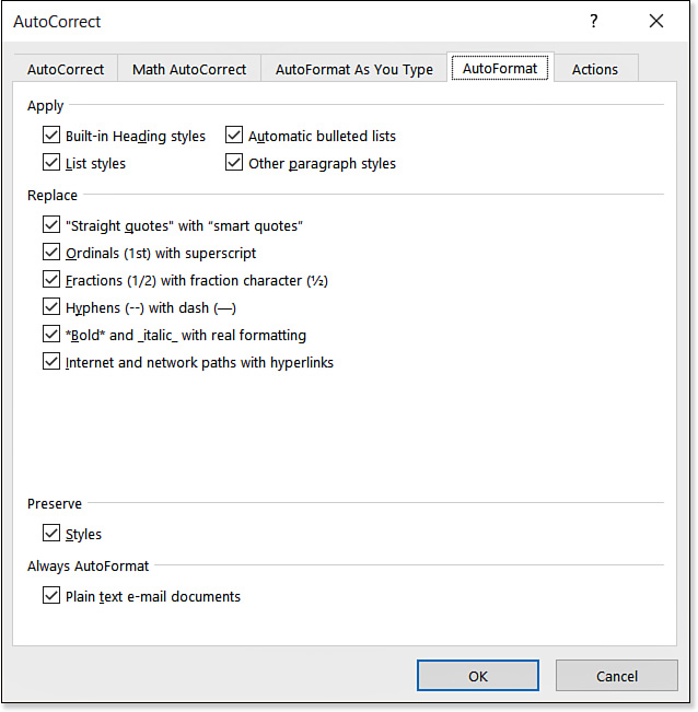
The AutoFormat options are similar to the AutoFormat As You Type options (refer to Figure 4.22). They are all turned on by default, so setting options consists mainly of disabling any you don’t want.
To access the AutoFormat options, follow these steps:
1. Choose File, Options. The Word Options dialog box opens.
2. On the Proofing tab, click AutoCorrect Options.
3. Click the AutoFormat tab.
4. Mark or clear check boxes to make your selections. As shown in Figure 4.23, the options are broken down into four categories:
![]() Apply—Various types of styles that can be automatically applied, such as headings, lists, and bullets.
Apply—Various types of styles that can be automatically applied, such as headings, lists, and bullets.
![]() Replace—Typographical symbols, formatting, and hyperlinks that can replace plain text.
Replace—Typographical symbols, formatting, and hyperlinks that can replace plain text.
![]() Preserve—Only one option here, Styles. Leave this marked to leave any styles that are already applied to the text.
Preserve—Only one option here, Styles. Leave this marked to leave any styles that are already applied to the text.
![]() Always AutoFormat—Only one option here, Plain Text E-Mail Documents. Leave this marked to let AutoFormatting occur when using Word as an email editor.
Always AutoFormat—Only one option here, Plain Text E-Mail Documents. Leave this marked to let AutoFormatting occur when using Word as an email editor.
5. Click OK twice to close both dialog boxes.
Applying AutoFormat (Automated Mode)
In automated mode, AutoFormat applies all the selected options (from the preceding section) to the entire document as best it can. There is no prompt. To AutoFormat a document, press Ctrl+Alt+K, or if you placed a button on the Quick Access toolbar for the command, click that button.
If AutoFormat does anything that you don’t like, undo the operation (press Ctrl+Z or click the Undo button on the Quick Access toolbar). Then open up the AutoFormat options again, deselect any options you want to omit, and then try the AutoFormat again.
Applying AutoFormat (Interactive Mode)
In Interactive mode, you can review each AutoFormat change. As mentioned earlier, you must add the AutoFormat command to the Quick Access toolbar to get access to this feature in Word 2016.
Follow these steps to AutoFormat interactively:
1. If you have not yet added the AutoFormat button to the Quick Access toolbar, do so now. See “Making AutoFormat Available on the Quick Access Toolbar” earlier in this chapter.
2. Click the AutoFormat button on the Quick Access toolbar. The AutoFormat dialog box appears (see Figure 4.24).
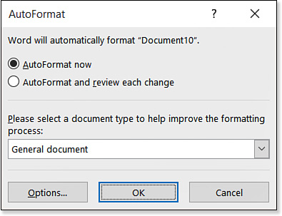
3. Click AutoFormat and Review Each Change.
4. The default document type is General Document. If you are composing a letter or email, open the drop-down list and select one of those types instead.
5. Click OK. A message appears that the formatting is completed.
6. Click Review Changes. A markup of the document appears. Additions appear red and underlined; deletions appear red and strikethrough.
7. Click one of the Find buttons. A change appears and is described in the Review AutoFormat Changes dialog box (see Figure 4.25).
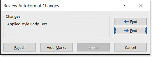
8. To accept the change, click a Find button to move past it. To reject the change, click the Reject button. Continue through the document until you have reviewed all changes.
9. When a message appears that you have reached the end of the document, click Yes to continue searching from the beginning or click No to stop.
10. Click Cancel to close all open dialog boxes as needed.