
12. Working with Charts
A chart is a graphical representation of numeric data. Charts can summarize data and help people make sense out of it. (Some people call them graphs, and in fact, so did Microsoft up until the 2007 version of Word; the program that was used to create charts was called Microsoft Graph.) In this chapter, you find out how to create, format, modify, and position charts in your documents.
Understanding the Parts of a Chart
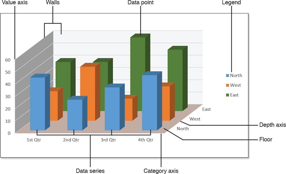
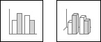
To work with charts in Word, you should have a general grasp of Word’s charting vocabulary. Here are some of the key terms to know, most of which are pointed out in Figures 12.1 and 12.2:
![]() Data point—An individual numeric value, represented by a bar, point, column, or pie slice.
Data point—An individual numeric value, represented by a bar, point, column, or pie slice.
![]() Data series—A group of related data points. For example, in Figure 12.1, all the bars of a certain color are a data series.
Data series—A group of related data points. For example, in Figure 12.1, all the bars of a certain color are a data series.
![]() Category axis (X axis)—The horizontal axis of a two-dimensional or three-dimensional chart.
Category axis (X axis)—The horizontal axis of a two-dimensional or three-dimensional chart.
![]() Value axis (Y axis)—The vertical axis of a two-dimensional or three-dimensional chart.
Value axis (Y axis)—The vertical axis of a two-dimensional or three-dimensional chart.
![]() Depth axis (Z axis)—The front-to-back axis of a three-dimensional chart.
Depth axis (Z axis)—The front-to-back axis of a three-dimensional chart.
![]() Legend—A key that explains which data series each color or pattern represents.
Legend—A key that explains which data series each color or pattern represents.
![]() Floor—The bottom of a three-dimensional chart.
Floor—The bottom of a three-dimensional chart.
![]() Walls—The background of a chart. Three-dimensional charts have a back wall and a side wall, which you can format separately.
Walls—The background of a chart. Three-dimensional charts have a back wall and a side wall, which you can format separately.
![]() Data labels—Numeric labels on each data point. A data label can represent the actual value or a percentage.
Data labels—Numeric labels on each data point. A data label can represent the actual value or a percentage.
![]() Axis titles—Explanatory text labels associated with the axes.
Axis titles—Explanatory text labels associated with the axes.
![]() Data table—A table containing the values on which the chart is based.
Data table—A table containing the values on which the chart is based.
![]() Chart title—A label explaining the overall purpose of the chart.
Chart title—A label explaining the overall purpose of the chart.

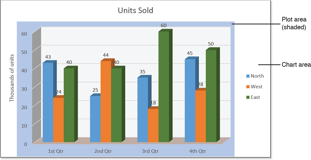
It is also important to understand the various areas of a chart. Each chart’s complete package, including all its auxiliary pieces such as legends and titles, is the chart area. Within the chart area is the plot area, which contains only the chart and its data table (if present). Sometimes the chart title is overlaid on top of the plot area, but the chart title is not part of the plot area. Figure 12.3 shows the chart area and plot area.
Creating a New Chart
If you create a chart in a native-format Word document, you have full access to the same powerful charting features as you do in Excel and PowerPoint. There is no need to create a chart in Excel and then import it to Word, because the capabilities are the same. Charts created in legacy Word documents (that is, Word 97-2003 format) use Microsoft Graph, an older charting tool.
![]() For more information about Microsoft Graph, see “Creating a Legacy Chart,” p. 475.
For more information about Microsoft Graph, see “Creating a Legacy Chart,” p. 475.
Creating a Chart in a Word Document
For maximum power and flexibility, create charts in Word documents that are in Word’s native file format (.docx or .docm), rather than in the older Word 97-2003 document format (.doc). This way you can take advantage of the powerful charting features that modern versions of Word offer.
Follow these steps to create a new chart:
1. On the Insert tab, click Chart. The Insert Chart dialog box opens.
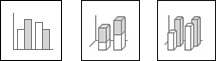
2. In the left pane, click the desired chart type (such as Column or Pie). Then at the top of the right pane, click the icon for the desired chart subtype (see Figure 12.4).
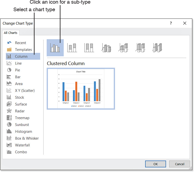
![]() For detailed descriptions of the chart types and subtypes, see “Changing the Chart Type,” p. 482.
For detailed descriptions of the chart types and subtypes, see “Changing the Chart Type,” p. 482.
3. Click OK. A Chart in Microsoft Word spreadsheet window opens, displaying dummy data for the chart. (Word remains open in its own window behind it.)
4. Change the data in the spreadsheet as needed. Edit both the numbers and the labels.
You can add or delete rows and columns as needed; the chart automatically reflects them.
![]() For more information about changing the data range, see “Modifying Chart Data,” p. 478.
For more information about changing the data range, see “Modifying Chart Data,” p. 478.
5. Switch to the Word window to view the chart. (Close the spreadsheet window if desired, or leave it open for later editing.)
![]() Caution
Caution
Don’t copy the raw data from Excel to Word using the Clipboard; that’s awkward, and the Word charting feature doesn’t accept that very gracefully. Instead, make the chart in Excel using Excel’s charting tools, and then copy and paste the chart from Excel into Word. The charting tools are nearly identical between Word and Excel, so you should have no difficulty with them.
Obviously, there’s a lot more to charting than the simple creation process. You’ll probably want to change chart types, format charts, add optional elements such as labels, and so on. You discover how to do all these things in the rest of this chapter.
Creating a Legacy Chart
Microsoft Graph is the charting tool found in Word 97 through 2003. The interface has been slightly updated, but the options and features are the same. If you are working with a legacy document (that is, a document in Word 97-2003 format), and you insert a chart, Microsoft Graph opens to help you create the chart.
In a Word 97-2003 document, follow these steps in Word 2016 to create a new chart:
1. On the Insert tab, click Chart. A sample chart appears, with a floating datasheet. The toolbars and menus for Microsoft Graph appear in a separate Microsoft Graph window (see Figure 12.5).

2. Change the data in the datasheet as needed. Edit both the numbers and the labels. You can also add or delete rows and columns. (To delete a row or column, right-click the row or column heading and choose Delete.)
3. When you have finished, choose File, Exit & Return to filename to return to Word.
If you prefer the charting tools offered by Microsoft Graph, you are free to continue using them in Word 2016 documents. Here’s how:
1. On the Insert tab, click Object. The Object dialog box opens.
![]() Tip
Tip
In Microsoft Graph, to import data from an Excel worksheet for use in your chart, choose Edit, Import File and browse for an Excel file.
2. On the Create New tab, select Microsoft Graph Chart.
3. Click OK.
Working with Chart Templates
Each of the chart types and subtypes that you can select from the Insert Chart dialog box (refer to Figure 12.4) represents a chart template. These templates are built in and cannot be modified.
However, you can create your own chart templates and start new charts based on them. This feature is not available in Microsoft Graph.
Creating a Chart Template
To create a chart template, set the chart type, layout, and formatting as desired (as explained in the remainder of this chapter), and then follow these steps:
1. Right-click the chart and click Save as Template. The Save Chart Template dialog box opens.
2. Type a name for the template in the File Name box.
3. Click Save.
![]() Note
Note
The default location for storing user-created chart templates is C:UsersusernameAppDataRoamingMicrosoftTemplatesCharts. Chart templates have a .crtx extension.
Starting a New Chart Based on a User Template
You can use any of your saved templates as the basis for a new chart, rather than starting with one of the built-in templates.
To start a new chart based on one of your saved templates, follow these steps:
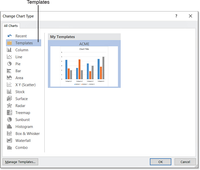
1. On the Insert tab, click Chart. The Insert Chart dialog box opens (refer to Figure 12.4).
2. Click Templates. The My Templates list appears showing thumbnail images of your saved user templates. See Figure 12.6.
3. Click the desired template.
![]() Tip
Tip
To see a template’s name and a larger preview of the chart, hover the mouse pointer over it.
4. Click OK to start a new chart based on the chosen template.
Managing Stored Chart Templates
You can modify or delete user-created chart templates at any time. To work with them, from the Insert tab, click Chart. Then from the Insert Chart dialog box, click Manage Templates.
A File Explorer window opens showing the folder containing the user-created chart templates. From here, you can do the following:
![]() Rename a template—Right-click it and choose Rename. Then type the new name and press Enter.
Rename a template—Right-click it and choose Rename. Then type the new name and press Enter.
![]() Delete a template—Click it and press Delete, or right-click it and choose Delete.
Delete a template—Click it and press Delete, or right-click it and choose Delete.
![]() Back up your user templates—Drag and drop the templates to another location or disk. To ensure that you are copying rather than moving, hold down Ctrl as you drag.
Back up your user templates—Drag and drop the templates to another location or disk. To ensure that you are copying rather than moving, hold down Ctrl as you drag.
Modifying Chart Data
The whole point of a chart is to present data, so obviously the most important thing to get right in a chart is to show the correct numeric values. If your numbers aren’t right, all the formatting in the world can’t save you.
Editing the Data
When you create a chart, a spreadsheet window opens in which you can enter the data. It’s an embedded datasheet in your Word document, and it’s known as the data source.
To change the numbers or labels in the chart, select the chart, and then on the Chart Tools Design tab, click Edit Data. The datasheet opens in a spreadsheet window (see Figure 12.7). If you want a better view of the data, click the Edit Data in Microsoft Excel button on the Quick Access toolbar on the spreadsheet window; the data opens in Excel.

To make a change, click a cell and then type a replacement value and press Tab or Enter, just like you would in any spreadsheet.
You can also add and delete rows and columns from the sheet:
![]() To add a row at the bottom of the list or a column at the right, click in the first blank row or column and type new entries. The data range expands automatically.
To add a row at the bottom of the list or a column at the right, click in the first blank row or column and type new entries. The data range expands automatically.
![]() To add a row or column between existing rows or columns, right-click the row where the new row should appear or the column where the new column should appear, and then click Insert.
To add a row or column between existing rows or columns, right-click the row where the new row should appear or the column where the new column should appear, and then click Insert.
![]() To delete a row or column, select it by clicking its letter or number, and then right-click the row or column header and choose Delete.
To delete a row or column, select it by clicking its letter or number, and then right-click the row or column header and choose Delete.
![]() To hide a row or column, select it, and then right-click it and choose Hide. To unhide, select the rows and columns on either side of the hidden one and then right-click and choose Unhide.
To hide a row or column, select it, and then right-click it and choose Hide. To unhide, select the rows and columns on either side of the hidden one and then right-click and choose Unhide.
In the next section, you learn how to use the Hidden and Empty Cell Settings dialog box to control what happens to a hidden row or column. It can be made to be included in the chart or not, as you prefer. Hiding a row or column is a good alternative to deleting it entirely if you think you might want to display it in the chart later. Another way to keep data in a datasheet but exclude it from the chart is to change the data range, as described in the next section.
Changing the Charted Data Range
A blue box surrounds the data range, and a blue square appears in the bottom-right corner of the last cell in the range. You can drag that square to expand or contract the range to be included, as long as the range is a contiguous block on the spreadsheet.
Sometimes, however, you might want to change a chart so that it does not show all the data you have entered in the datasheet. Suppose, for example, that you want to exclude a certain series from the chart temporarily, print a copy, and then include that series again. You don’t want to delete the data altogether because you’ll need it again later. In cases like this, you adjust the data range, telling Word to pull a subset of the entered data for the chart.
If you just want to redefine a smaller contiguous range, drag the blue square so that the range excludes some of the rows at the bottom or some of the columns at the right.
If you need more sophisticated range editing, follow these steps:
1. Click the chart to select it.
2. Display the Chart Tools Design tab, and click Select Data. The spreadsheet window appears, along with the Select Data Source dialog box (see Figure 12.8).
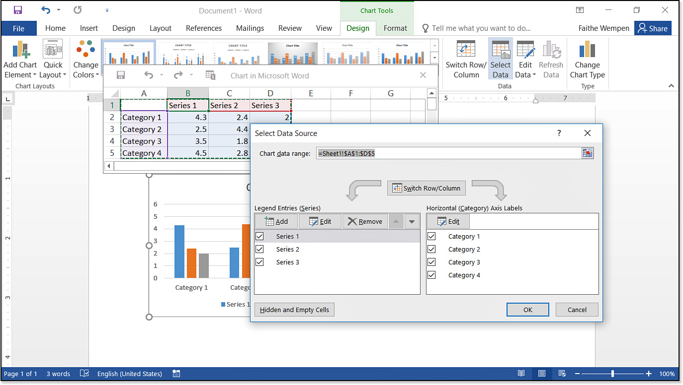
3. Adjust the series (columns) as needed:
![]() To redefine the overall range for the chart (provided that the desired range is in one contiguous block in the sheet), click in the Chart Data Range box, and then drag across the range and press Enter.
To redefine the overall range for the chart (provided that the desired range is in one contiguous block in the sheet), click in the Chart Data Range box, and then drag across the range and press Enter.
![]() To remove a certain series from the chart, click its name in the Legend Entries (Series) box and click Remove. Or, to temporarily hide it, deselect its check box.
To remove a certain series from the chart, click its name in the Legend Entries (Series) box and click Remove. Or, to temporarily hide it, deselect its check box.
![]() To re-add a series that you’ve temporarily hidden, mark its check box again. Or, if you removed it completely from the list, click the Add button in the dialog box. Then click on the column heading in the worksheet and press Enter.
To re-add a series that you’ve temporarily hidden, mark its check box again. Or, if you removed it completely from the list, click the Add button in the dialog box. Then click on the column heading in the worksheet and press Enter.
![]() To reorder the series, click a series name in the dialog box and then click the Up or Down arrow button.
To reorder the series, click a series name in the dialog box and then click the Up or Down arrow button.
4. If needed, change the range from which the category labels are being pulled by doing the following:
a. In the Horizontal (Category) Axis Labels section, click Edit. The Axis Labels dialog box opens.
b. On the worksheet, drag across the range containing the labels.
c. Click OK in the dialog box, or press Enter.
5. Specify how to deal with hidden and empty cells by doing the following:
a. Click the Hidden and Empty Cells button. The Hidden and Empty Cell Settings dialog box opens.
b. Choose how to show empty cells: as gaps, as zero, or spanned with a line.
c. Mark or clear the Show Data in Hidden Rows and Columns check box.
d. Click OK.
6. Click OK. The datasheet becomes available for manual edits. Make any additional changes to it as desired, and then close it and return to the chart in Word.
Switching Between Rows and Columns
By default, a chart displays datasheet columns as series and datasheet rows as categories. You can flip this rather easily, though, by clicking the Switch Row/Column button on the Chart Tools Design tab. If the Switch Row/Column button is not available, display the data sheet by clicking Edit Data on the Chart Tools Design tab.
Controlling How the Chart and Document Interact
A chart is an object, in the same way that a photo or diagram is an object. Therefore, you can make it interact with the document text in all the standard ways, such as setting its positioning and text wrap. These settings were covered in detail in Chapter 10, “Working with Pictures and Videos,” but the basics are briefly repeated here for convenience.
Setting Text Wrapping
Text wrapping controls how the document text interacts with the chart. Text wrapping for a chart is identical to that for a picture:
1. Select the chart.
2. On the Chart Tools Format tab, click Wrap Text. A menu of text-wrap choices appears.
3. Click the desired text-wrap setting.
![]() For detailed descriptions of text-wrapping choices and their effects on the surrounding text, see “Setting Text Wrap,” p. 395.
For detailed descriptions of text-wrapping choices and their effects on the surrounding text, see “Setting Text Wrap,” p. 395.
Positioning a Chart
Position presets are available for charts, the same as for other graphics objects. These presets set the chart frame to precise relative or absolute positioning within the document page.
To apply a position preset to a chart, follow these steps:
1. Select the chart.
2. On the Chart Tools Format tab, click the Position button, and click one of the position presets.
![]() Note
Note
If no options are available on the Position tab, set the text wrapping to something other than In Line with Text.
To set an exact position for the chart, follow these steps:
1. Select the chart.
2. On the Chart Tools Format tab, click the Position button and then click any position option except In Line with Text.
3. On the Chart Tools Format tab, click the Position button again and then click More Layout Options. The Layout dialog box opens.
4. On the Position tab of the dialog box, set the desired layout in the Horizontal section. You can choose layout by Alignment, by Book Layout, by Absolute Position, or by Relative Position. Then do the same in the Vertical section. Your choices for vertical layout are Alignment, Absolute Position, or Relative Position.
5. Set any options desired, such as Move Object with Text or Lock Anchor (see Figure 12.9).
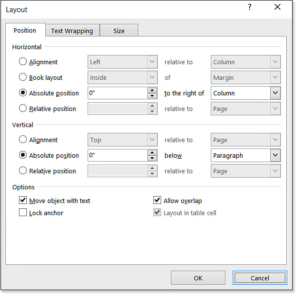
6. Click OK to accept the new position setting.
![]() For more detailed descriptions of the position choices, see “Setting Picture Position,” p. 399.
For more detailed descriptions of the position choices, see “Setting Picture Position,” p. 399.
Changing the Chart Type
The chart’s type is the single most important design setting you can apply to it. The same data can convey different messages when presented using different chart types. For example, if you want to show how each person’s work contributes to the whole, a pie chart is ideal. If you would rather concentrate on the numeric value of each contribution, you might prefer a bar or column chart.
![]() Caution
Caution
Each chart type and subtype is designed to serve a specific purpose. Choosing an inappropriate chart type can prevent your message from getting across to your audience, and in some cases it can actually make the data misleading or incomprehensible. For example, if you change a multiseries bar chart to a pie chart, you lose all the data except the first series because pie charts are single-series charts by definition.
To change the chart type, follow these steps:
1. Select the chart.
2. On the Chart Tools Design tab, click Change Chart Type. The Change Chart Type dialog box opens. It is just like the Insert Chart dialog box shown in Figure 12.4, except for the name.
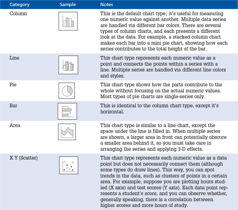
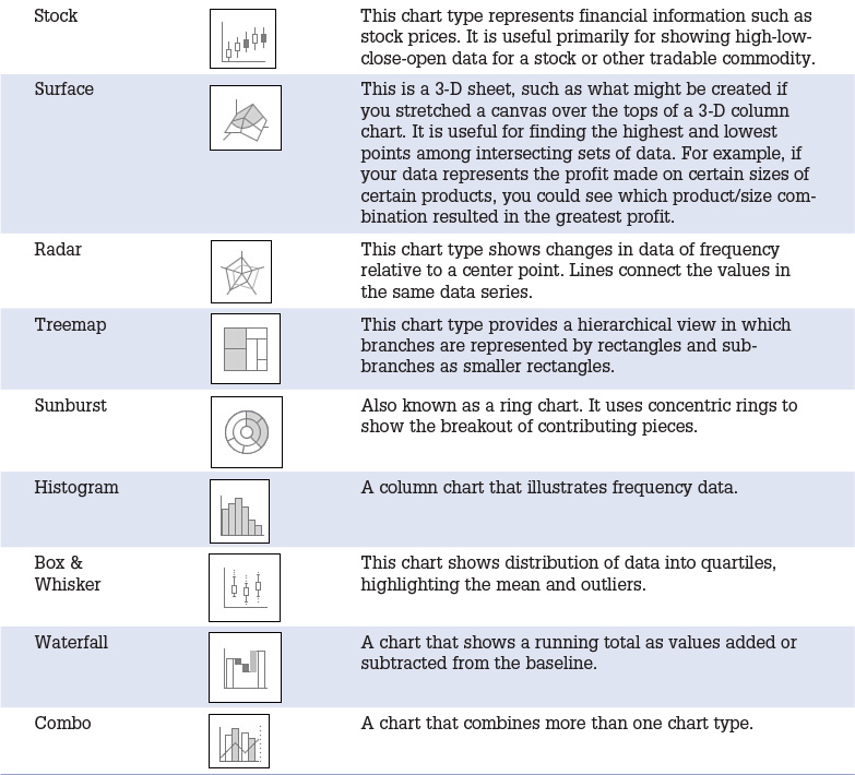
3. Select the desired category in the left pane. You’ll find more details in Table 12.1.
4. Select the desired chart subtype icon at the top of the right pane.
5. Click OK to change to the new chart type.
Word 2016 offers 14 chart categories (plus Combo, which is cross-category), and several types within each category. The categories are listed in Table 12.1.
![]() Note
Note
In Word 2010 and earlier, there were two additional categories: Doughnut and Bubble. They still exist but have been rolled into other categories. Look for Doughnut under Pie, and look for Bubble under X Y (Scatter).
Chart types have from one to seven subtypes to choose from. Don’t let them overwhelm you, though; even though there are many subtypes, they fall into predictable categories.
Here are some of the major ways in which the chart subtypes can be differentiated:
![]() 2-D versus 3-D style—Some types show the shapes as flat 2-D objects; others show them as 3-D with sides and tops. The chart categories with available 3-D types are column, line, pie, bar, area, scatter, and surface.
2-D versus 3-D style—Some types show the shapes as flat 2-D objects; others show them as 3-D with sides and tops. The chart categories with available 3-D types are column, line, pie, bar, area, scatter, and surface.
![]() Clustered, stacked, or 3-D—When there are multiple series in a bar, column, or area chart, some types cluster the series, some stack them on a single bar (or other shape), and some add a third axis to the chart (front-to-back) and place each series on a separate axis.
Clustered, stacked, or 3-D—When there are multiple series in a bar, column, or area chart, some types cluster the series, some stack them on a single bar (or other shape), and some add a third axis to the chart (front-to-back) and place each series on a separate axis.
![]() Regular or 100 percent—For bar and column charts, a stacked bar can be regular (that is, the bar height represents the sum of the values), or each bar can be the same height (100 percent). A 100 percent bar is essentially a rectangular pie chart; it does not represent actual values, but rather the contribution of each series toward the whole.
Regular or 100 percent—For bar and column charts, a stacked bar can be regular (that is, the bar height represents the sum of the values), or each bar can be the same height (100 percent). A 100 percent bar is essentially a rectangular pie chart; it does not represent actual values, but rather the contribution of each series toward the whole.
![]() Regular or exploded—Pie and doughnut charts can optionally have one or more pieces broken out with more detail.
Regular or exploded—Pie and doughnut charts can optionally have one or more pieces broken out with more detail.
![]() Points, lines, or both—A scatter chart can show data points without lines, lines without data points, or both.
Points, lines, or both—A scatter chart can show data points without lines, lines without data points, or both.

![]() Curved or straight lines—When a scatter chart has lines, the line segments can be either curved or straight.
Curved or straight lines—When a scatter chart has lines, the line segments can be either curved or straight.
![]() Uniform or multisized points—A scatter chart can show each point the same, or can use multiple sizes of bubbles to represent a point. For example, if there are several data points of the same value, a larger bubble can indicate that.
Uniform or multisized points—A scatter chart can show each point the same, or can use multiple sizes of bubbles to represent a point. For example, if there are several data points of the same value, a larger bubble can indicate that.

![]() Wireframe or filled—Radar and surface charts can appear with each series as a different color fill, or they can appear in wireframe view (with transparency set for each series).
Wireframe or filled—Radar and surface charts can appear with each series as a different color fill, or they can appear in wireframe view (with transparency set for each series).

Creating a Combination Chart
A combination chart is one that contains data plotted using multiple chart types. For example, you could have a line overlaying a column chart, or columns overlaying a stacked area chart. For example, in Figure 12.10, notice that two different types of data are being presented: revenue in dollars and units sold. The right axis shows dollar amounts from $0 to $100,000, and this axis applies to the revenue (the area portion of the chart). On the left, a secondary axis shows plain numbers from 0 to 70, and this axis applies to the units sold (the columns portion of the chart). Figure 12.11 shows the datasheet for this chart.
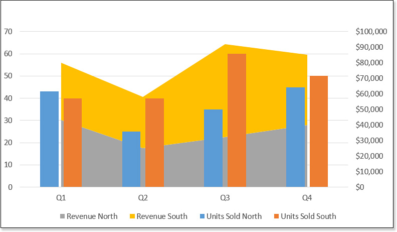
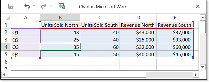
Figure 12.11 This data was used to create Figure 12.10.
To set up a combination chart, choose one of the Combo charts from the Insert Chart dialog box (refer to Figure 12.6), or if the chart has already been created, from the Change Chart Type dialog box.
The trick to creating an effective combination chart is identifying which data series should be plotted on the secondary axis (if any). A secondary axis is useful only if one or more series represent something that is not an apples-to-apples comparison with the others numerically. In Figure 12.11, for example, obviously units sold and revenue are two different things and must be plotted separately. If you simply want to pull out a certain series for emphasis, such as plotting the revenue of a competitor as a line overlaying bars that show your own revenue, you do not need a secondary axis.
Because configuring a combination chart can be a little tricky, let’s walk through an example. Follow these steps:
1. In a blank document, choose Insert, Chart. The Insert Chart dialog box opens.
2. Click Combo, and click the first icon (Clustered Column – Line).
3. In the options beneath the selected chart, choose which series should be associated with which chart type. You can add more data series later, so don’t worry that you get only three right now.
4. For Series 3, mark the Secondary Axis check box.
5. Click OK. A datasheet appears.
6. Change the data on the datasheet to match Figure 12.11 and then close the datasheet.
7. On the Chart Tools Design tab, click Change Chart Type. The Change Chart Type dialog box opens. Notice that the Custom Combination icon is selected at the top.
8. At the bottom of the dialog box, for both of the Revenue series, open the Chart Type drop-down list and choose Stacked Area. Figure 12.12 shows the dialog box at this point.

9. Click OK to apply the new chart type. If you did it correctly, it should look like Figure 12.10.
Working with Chart Elements
After you choose an appropriate chart type, the next task is to decide which additional elements to include in the chart. In other words, besides the data points, what do you want your chart to include? Possibilities include legends, walls, floors, gridlines, titles, data labels, and so on. Each of these can be displayed/hidden, positioned, and formatted.
There’s an easy way to turn each of the optional chart elements on and off. When the chart is selected, click the Chart Elements icon (the plus sign) that appears to the chart’s right. On the menu that appears, you can mark or clear the check box for individual chart elements, as shown in Figure 12.13. Some of the chart elements have options available. When you point at one of the chart elements, if a right-pointing arrow appears, you can click the arrow to see a submenu of additional options. I don’t cover this method in the following individual sections, but keep it in mind as an option as you go.

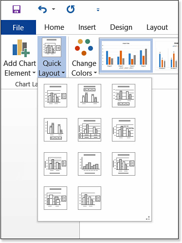
Applying a Quick Layout
Quick layouts are preset combinations of chart elements that serve as shortcuts to adding and formatting these elements. For example, one of the chart layouts places the legend across the top; uses data labels; does not include walls, floors, or gridlines; and includes a chart title.
To apply a chart layout, select the chart and then click the Quick Layout button on the Chart Tools Design tab (see Figure 12.14) and choose one of the layouts in the gallery.
Adding a Chart Title
A chart title is a text box that floats above the chart and describes its purpose. You can place the chart title in either of two locations: Centered Overlay (which places the title within the chart’s plot area) or Above Chart (which places the title above the plot area). Figure 12.15 shows the difference.

To create or modify a chart title, first place the box and then edit the placeholder text within it:
1. Select the chart.
2. On the Chart Tools Design tab, click Add Chart Element and then point to Chart Title. A menu appears.
3. Click Centered Overlay or Above Chart. The title appears in the chosen location.
4. Click in the chart title’s text box, delete the placeholder text, and type your own text.
5. To format the chart title’s frame, choose Chart Tools Design, Add Chart Element, Chart Title, More Title Options and use the Format Chart Title task pane to apply your selections. You can apply all the same types of formatting to it as you can any text box or chart elements, including Fill, Border, and Effects. Close the task pane when you finish.
![]() Note
Note
You cannot change the chart title box’s size, but if you increase or decrease the font size, the box grows or shrinks automatically.
6. To format the text in the chart title, select the text and then use the Home tab’s controls in the Font group.
![]() For detailed descriptions of the options in the Format Chart Title task pane, see “Formatting Individual Chart Elements,” p. 509.
For detailed descriptions of the options in the Format Chart Title task pane, see “Formatting Individual Chart Elements,” p. 509.
![]() For more information about text formatting with the Home tab, see “Applying Character Formatting,” p. 139.
For more information about text formatting with the Home tab, see “Applying Character Formatting,” p. 139.
Working with Legends
The legend is the key that explains what each of the colors or patterns represents in a multiseries chart. It’s critical to understanding the chart unless some other means of explanation is provided (as in a data table, or in individual labels for each pie slice or bar).
You can place the legend either outside or inside of the chart’s plot area, and you can place it on any of the four sides or in the top-right corner. The Legend menu offers some presets, but you can also choose to display the Format Legend task pane for additional options.
To turn off the legend or select one of the presets, follow these steps:
1. Select the chart.
2. On the Chart Tools Design tab, click Add Chart Element and then point to Legend. A menu appears.
3. Select one of the presets on the menu, or select None.
Not all of the possible combinations of legend position are represented by the presets. To specify the desired position and choose whether it should overlap the chart, follow these steps:
1. Select the chart.
2. On the Chart Tools Design tab, click Add Chart Element, point to Legend, and click More Legend Options. The Format Legend task pane opens (see Figure 12.16).

3. Select a legend position.
4. If you want the legend outside the plot area, mark the Show the Legend Without Overlapping the Chart check box. Otherwise, clear the check box to make the legend overlap the chart.
5. To format the legend box’s frame, use the Fill & Line and Effects sections of the Format Legend task pane to apply your selections for fill, line, shadow, and so on.
![]() For detailed descriptions of the options in the Format Legend task pane, see “Formatting Individual Chart Elements,” p. 509.
For detailed descriptions of the options in the Format Legend task pane, see “Formatting Individual Chart Elements,” p. 509.
6. Close the task pane.
7. To format the text in the legend, select the text and then use the Home tab’s controls in the Font group.
![]() For more information about text formatting with the Home tab, see “Applying Character Formatting,” p. 139.
For more information about text formatting with the Home tab, see “Applying Character Formatting,” p. 139.
Using Data Labels
You can make data labels appear on (or near) each data point. A data label can contain any combination of these:
![]() Values from cells that you specify
Values from cells that you specify
![]() The series name (duplicated from the legend, if present)
The series name (duplicated from the legend, if present)
![]() The category name (duplicated from the category axis labels, if present)
The category name (duplicated from the category axis labels, if present)
![]() The numeric value represented by the data point
The numeric value represented by the data point
![]() The percentage of the whole that the data point represents (only on pies, doughnuts, and 100 percent bars)
The percentage of the whole that the data point represents (only on pies, doughnuts, and 100 percent bars)
Data labels can be applied to any chart type, but they’re especially useful on pies, and in fact they are often used as an alternative to a legend, as in Figure 12.17. Labels work especially well when presenting charts in black and white because then the audience does not have to match up the colors or patterns of the slices to the legend key. They make the meaning of each slice or point more obvious.

To apply data labels, you can apply a quick layout that includes data labels, choose from one of the data label presets, or define your own labels.
The preset data labels use the data point values only and place them in your choice of locations. To use one of the presets, do this:
1. Select the chart. (Optional: To affect only a certain data series or data point, select it.)
![]() To learn how to select only a certain data series or data point, see “Selecting Chart Elements,” p. 509.
To learn how to select only a certain data series or data point, see “Selecting Chart Elements,” p. 509.
2. On the Chart Tools Design tab, click Add Chart Element and then point to Data Labels.
3. Select one of the presets from the menu. (The menu varies somewhat depending on the chart type.)
To use other data in the labels, such as the series name, category name, or percentage, you must use the Format Data Labels task pane. Follow these steps:
1. Select the chart. (Optional: To affect only a certain data series or data point, select it.)
2. On the Chart Tools Design tab, click Add Chart Element, point to Data Labels, and click More Data Label Options. The Format Data Labels task pane opens.
3. If needed, click the Label Options icon and then expand the Label Options heading (see Figure 12.18).
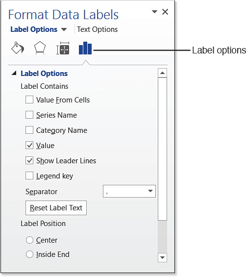
4. In the Label Contains section, mark or clear check boxes for the types of information to appear.
5. (Optional) Mark the Legend Key check box, and then choose a separator character for it in the Separator box. The legend key indicates which series a value belongs to. For example, if the series is named Sales and the value is 10, using a Legend Key with a colon as a separator would make the label appear like this: Sales:10.
6. In the Label Position section, select a position for the label.
7. (Optional) Click the Number heading at the bottom of the task pane to expand that set of options and set a number format for the values. For example, you could choose Currency and then set the number options for currency format, as shown in Figure 12.19.
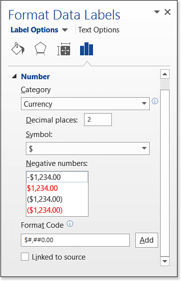
![]() In the Format Code box, you can enter your own custom numeric format. For details about how to write codes, see “Constructing a Custom Numeric Format,” p. 642.
In the Format Code box, you can enter your own custom numeric format. For details about how to write codes, see “Constructing a Custom Numeric Format,” p. 642.
8. Close the task pane when you finish.
Applying Axis Titles
Axis titles are text labels that appear on the axes to indicate what they represent. For example, a chart might have a value axis of 0 to 100, but what does that represent? Dollars? Millions of dollars? Units sold? Errors recorded? An axis title can help clarify what’s being measured. Figure 12.20 shows a 3-D chart with three axes, all with titles.

Each of the three dimensions of a chart (or two dimensions, depending on the chart) has its own separate setting for axis titles. On the Chart Tools Design tab, click Add Chart Element and then point to Axis Titles to open a menu, and then select the desired axis to toggle it on or off. Or, for more options, click More Axis Title Options at the bottom of the menu to open the Format Axis Title task pane.
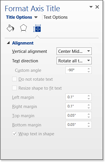
In the task pane, under Title Options, click the Layout & Properties icon, and then use the Alignment controls to set a text direction, as shown in Figure 12.21. In Figure 12.20, notice that the axis titles for the primary vertical axis and the depth axis are both set to Rotate All Text 270°.
Modifying Axis Properties
Several types of modifications are available for the various axes in a chart. For example, you can change the numeric scale that appears on an axis, or you can make the axis scale run in a different direction (for example, right to left instead of the default left to right on a horizontal axis). For numeric axes, you can also add automatic “thousands” or “millions” labels.
Turning an Axis’s Text On or Off
The most basic thing you can control about an axis is whether or not it appears—that is, whether its text appears. If you remove the text from an axis, the reader has no way to determine what each data point or category represents that’s plotted on that axis, but if you have already made that information apparent in some other way, such as with a data label, the axis text may not be necessary.
To turn an axis’s text on or off, on the Chart Tools Design tab, click Add Chart Element, point to Axes, and click the axis for which to toggle the text on or off.
Adjusting the Axis Scale
One of the most dramatic ways you can change an audience’s interpretation of a chart is by adjusting the axis scale. For example, in Figure 12.22, both the charts use the same data but different vertical axis scales. In the top chart, the difference between bars appears minimal, but in the bottom chart, it’s dramatic.
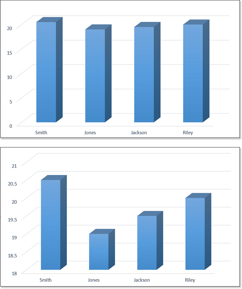
Word is actually pretty smart about adjusting the axis scale automatically; the chart at the bottom in Figure 12.22 shows the default for this data in Word. The top chart shown in Figure 12.22 was manually rigged to use a larger scale so that you could see the difference. When Word does not correctly deduce what you want, however, you can make manual changes. For example, you might want to increase the axis scale as in the top image in Figure 12.22 to minimize the differences between the values.
To adjust the axis scale, follow these steps:
1. Select the numeric axis that you want to modify.
2. On the Chart Tools Design tab, click Add Chart Element, point to Axes, and click More Axis Options. (Alternatively, you can right-click the axis and choose Format Axis.) The Format Axis task pane opens.
3. If you do not want the automatic value for one of the measurements, enter a different number in its text box under Bounds. For example, in Figure 12.23, the minimum value on the axis is set to 18 and the maximum to 22. If you change your mind and want to go back to the automatic setting, click Reset next to the text box.
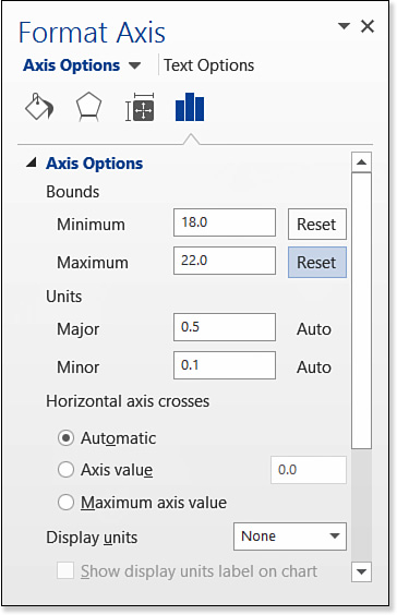
4. If you want the units on the axis to display differently, change the values in their text boxes under Units. If you change your mind and want to go back to the automatic settings for these, click Reset next to the text box.
The Major unit setting determines what numbers appear; for example, if you set Major to 5, the axis will show 5, 10, 15, and so on. The Minor unit setting determines the interval of the smaller tick marks or gridlines (if used) between the major ones. Most charts look better without minor units showing, because they can make a chart look cluttered. In most cases, you should leave Minor set to Auto.
5. (Optional) To change the unit of display on the axis, open the Display Units list and choose a unit (for example, Thousands or Millions).
![]() Note
Note
Specifying a display unit is somewhat like adding an axis label, except that in addition to adding the label for the unit, it converts the numbers on the scale. For example, if your scale is currently 0, 1000, 2000, 3000, and so on, and you set the Display Units to Thousands, the scale changes to 0, 1, 2, 3.
6. (Optional) To reverse the scale, mark the Values in Reverse Order check box.
7. (Optional) To use a logarithmic scale, mark the Logarithmic Scale check box and then enter a Base setting.
8. (Optional) If it’s a 3-D chart, in the Floor Crosses At section, choose Axis Value and then specify where the vertical and horizontal axes will meet. This setting makes it possible to have a chart that has data on both sides of the horizontal axis, as in Figure 12.24. If it’s a 2-D chart, this setting is in the Horizontal Axis Crosses section.
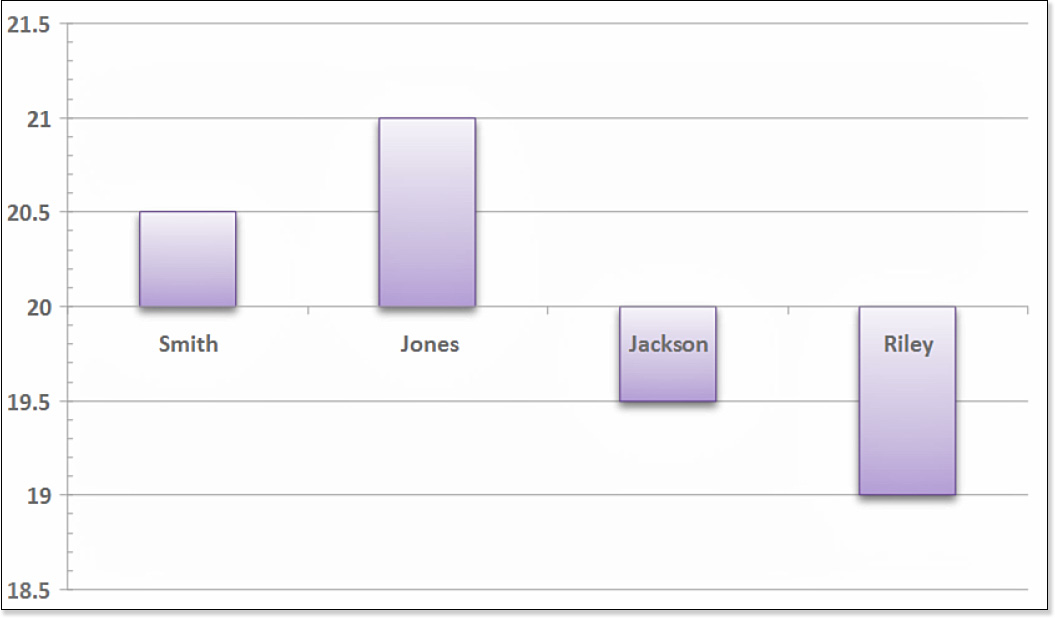
Figure 12.24 To create a 3-D chart that has data on both sides of the axis, change the Floor Crosses At setting.
9. (Optional) Click the Tick Marks heading to expand those options, and use the Major Type and Minor Type settings to change the way tick marks appear on the chart for the major and minor units. This does not affect the gridlines, only the small marks that appear on the axis line.
10. Close the task pane when you finish.
Changing the Axis Number Type
On axes that contain numeric values, you can indicate what type of number formatting to use. For example, the numbers can appear as currency (with dollar signs), as percentages, or as any of several other number types.
To set the number type, follow these steps:
1. Select the axis.
2. On the Chart Tools Format tab, in the Current Selection group, click Format Selection. (Alternatively, right-click the axis and choose Format Axis.) The Format Axis task pane opens.
If you have selected the wrong chart area, you can select the correct area from the drop-down list in the Current Selection group.
3. Click the Axis Options heading to collapse it if the axis options are displayed. Then click the Number heading to expand its options. The Number options appear.
4. On the Category list, select the type of number formatting you want.
5. Adjust the settings that appear for the chosen category. For example, for currency you can set the number of decimal places and the currency symbol. This is the same as you learned earlier in the chapter for the data labels; refer to Figure 12.19.
![]() In the Format Code box you can enter your own custom numeric format. For details about how to write codes, see “Constructing a Custom Numeric Format,” p. 642.
In the Format Code box you can enter your own custom numeric format. For details about how to write codes, see “Constructing a Custom Numeric Format,” p. 642.
6. Close the task pane.
Using Gridlines
Gridlines are horizontal or vertical lines that appear on the chart’s walls to help the reader’s eyes track across from the values on the axes to the data points.
Word uses major horizontal gridlines by default in most chart types. The positioning of these gridlines is determined by the Major Units measurement set in “Adjusting the Axis Scale,” earlier in this chapter. You can turn the gridlines on/off, and you can optionally turn on/off minor horizontal gridlines or vertical gridlines.
You can toggle gridlines on or off in several ways. You can click the Chart Elements button to the right of the chart and then mark or clear the Gridlines check box from its menu. You can also click Add Chart Element on the Chart Tools Design tab, point to Gridlines, and then click one of the presets from the submenu, as shown in Figure 12.25. From that menu, you can also choose More Gridline Options to open the Format Major Gridlines task pane and work from there. From the task pane, you can apply Line and Effects formatting the same as with any other object. (You can’t apply Fill effects to gridlines because they are just lines, not shapes.)

![]() Tip
Tip
There are other ways to format gridlines, which you learn about in the “Formatting Individual Chart Elements” section, later in this chapter. On the Chart Tools Format tab, you can use the Shape Styles group to apply shape outlines and effects that change the gridline color, thickness, shadow, and more.
Adding Trendlines
A trendline is a line superimposed over a two-dimensional chart (usually a scatter chart) that helps express the relationship between a pair of values. Trendlines are often used in statistics and scientific research to show overall trends of relationship between cause and effect.
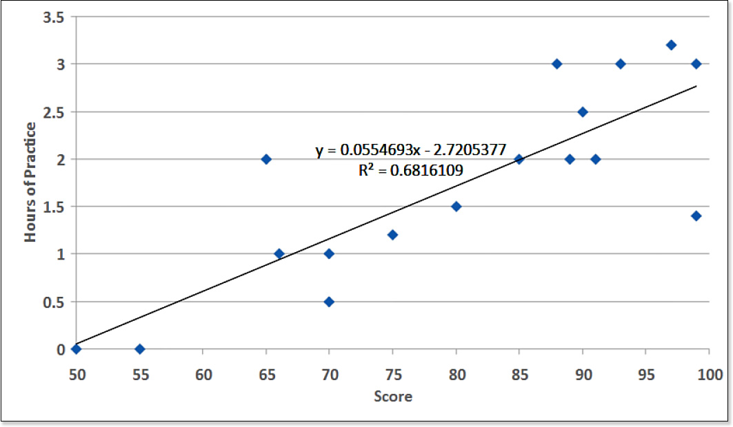
To understand the value of a trendline, let’s look at an example. Suppose that a coach asked his basketball players to practice shooting free throws as many hours a day as they could for a one-week period. Different students approached this assignment with varying degrees of dedication; some players did not practice at all, whereas others practiced as much as 3.5 hours per day. At the end of the week, each player made 100 free-throw attempts and recorded his or her number of successes.
To prove a positive relationship between practicing and success, the coach plotted this data in a Word chart. The relationship is not mathematically perfect because we’re dealing with humans, not machines. However, an overall trend is apparent (see Figure 12.26).

To quantify this trend, add a trendline to the chart. The simplest and most straightforward type of trendline is a linear one (a straight line). In Figure 12.27, a linear trendline has been applied. The trendline helps the data analysis in two ways. First, the line itself shows where the expected score will be for any number of hours of practice (or fractions thereof). Second, it shows a statistical equation that represents the relationship. In the formula shown in Figure 12.27, for example, you could plug in a number of practice hours for y and then solve for x to determine the expected score.
To add a trendline, follow these steps:
1. Select the data series for which you want to add a trendline. It must be a 2-D chart; you cannot add trendlines to 3-D charts.
2. On the Chart Tools Design tab, click Add Chart Element, point to Trendline, and select the desired trendline type. (If you are not sure what type you want, choose Linear.)
![]() Tip
Tip
To quickly add a linear trendline, you can right-click the data series and choose Add Trendline.
If you do not select the data series in step 1, and if it is a multiseries chart, a dialog box prompts you to select the series to receive the trendline. Make your selection and click OK. For more trendline options, choose More Trendline Options in step 2, and select the series to which they apply if prompted. Then in the Format Trendline task pane, shown in Figure 12.28, change any of these options. If you don’t see all these options in the task pane, scroll down.
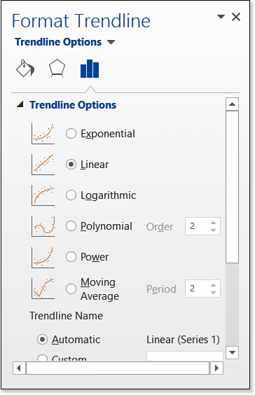
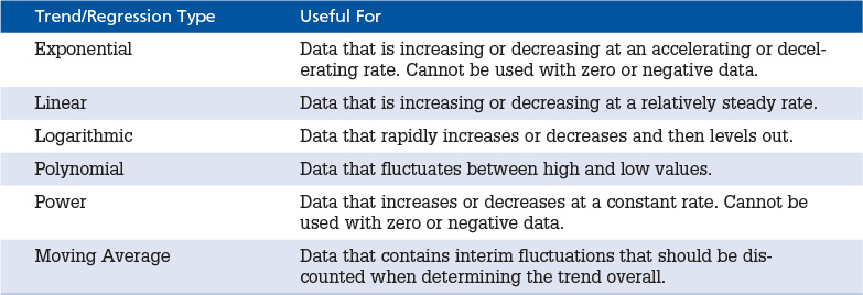
![]() Trendline Type—Click one of the option buttons to select a type, such as Exponential or Linear. More types are available in this box than were on the Trendline menu. Table 12.2 lists the trendline types.
Trendline Type—Click one of the option buttons to select a type, such as Exponential or Linear. More types are available in this box than were on the Trendline menu. Table 12.2 lists the trendline types.
![]() Trendline Name—This is useful when you have more than one trendline per chart. Automatic makes the trendline name the same as the data series name; Custom lets you enter a new name of your choosing.
Trendline Name—This is useful when you have more than one trendline per chart. Automatic makes the trendline name the same as the data series name; Custom lets you enter a new name of your choosing.
![]() Forecast—This lets you extend the trendline forward or backward to predict values that are outside the data range.
Forecast—This lets you extend the trendline forward or backward to predict values that are outside the data range.
![]() Set Intercept—This changes the tilt of the trendline so that its left end points to a different number on the vertical axis.
Set Intercept—This changes the tilt of the trendline so that its left end points to a different number on the vertical axis.
![]() Display Equation on Chart—This toggles the equation on/off.
Display Equation on Chart—This toggles the equation on/off.
![]() Display R-Squared Value on Chart—The R-squared value is a measurement of the reliability of the equation in predicting the outcome. Statisticians appreciate it, but most people don’t know what it is. Toggle it on/off here.
Display R-Squared Value on Chart—The R-squared value is a measurement of the reliability of the equation in predicting the outcome. Statisticians appreciate it, but most people don’t know what it is. Toggle it on/off here.
Adding Error Bars
When sampling a population for research purposes, how can you be certain that you didn’t get unusual data? For example, what about the basketball player who is naturally so good at free throws that he can shoot 90% without practice? With a small sample, you can’t be sure that your data isn’t being skewed by unusual cases, but as the sample size grows, so does your confidence in your results.
Even though the formula from the trendline in the preceding section can provide a prediction of a value, in reality that value may be off. The actual value might turn out to be higher or lower than that. For example, what if someone practices free throws for 1.5 hours? The chart in Figure 12.27 indicates that the expected score would be somewhere around 77, but that’s just a guess. The amount by which a guess could be off—in either direction—is its margin of error. That margin of error is shown on a chart by using error bars.
![]() Note
Note
You can use error bars on area, bar, column, line, and scatter charts.
For example, in Figure 12.29, the margin of error for each data point appears to be about 3 points horizontally and 1 hour vertically. In other words, given a player’s number of hours practicing, his score could have been 3 points higher or lower, and given a player’s score, his practice time could have been 1 hour more or less.

The amount of certainty in the results is described as the amount of error. In other words, how confident are we that, given a player’s practice time, we can predict his score within a certain margin of error? Are we 90% confident? 95%? As the desired confidence level goes up, so does the margin of error required to achieve it, and the point spread grows.
Amount of error can be measured in several ways: by standard error, standard deviation, or a specific percentage. We won’t get into the differences between these calculation methods here—that’s something for a college-level statistics course to delve into—but let’s assume you know which method you want to use. If you don’t, go with a fixed percentage, because that’s the easiest to understand.
![]() Caution
Caution
Don’t confuse margin of error with amount of error; they’re two different things. The margin of error is the point spread. The amount of error is the confidence level that the point spread is accurate.
To apply error bars to a chart, do this:
1. Select the data series for which you want to add an error bar.
2. On the Chart Tools Design tab, click Add Chart Element, point to Error Bars, and select the calculation type for amount of error:
![]() Standard Error
Standard Error
![]() Percentage (by default 5% error, or 95% confidence)
Percentage (by default 5% error, or 95% confidence)
![]() Standard Deviation (by default 1 standard deviation)
Standard Deviation (by default 1 standard deviation)
To fine-tune the error bars, click Add Chart Element and point to Error Bars again and choose More Error Bars Options. Select the data series if prompted. Then in the Format Error Bars task pane (Figure 12.30), set the error amount desired. You can enter a certain percentage, fixed value, or number of standard deviations.
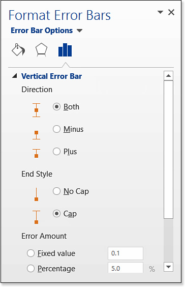
Figure 12.30 Fine-tune the amount of error to be expressed in the error bars and the method by which it will be calculated.
Adding Up/Down Bars
Up/down bars are specific to stock charts. They are filled rectangles that run between the open and close value, as in Figure 12.31. When the open value is higher, the bar is dark; when the close value is higher, the bar is light. Up/down bars let you see at a glance the overall change in the stock that day, disregarding the fluctuations that occurred throughout the trading day. For example, you can see in Figure 12.31 that on 1/8/2015, the stock’s price fluctuated a great deal (by nearly $5), but the net loss was only about 50 cents from opening to closing.

Figure 12.31 Up/down bars make the fluctuation between the high and the close values more obvious in stock charts.
To turn up/down bars on or off, from the Chart Tools Design tab, click Add Chart Element and choose Up/Down Bars from the menu that appears.
Adding and Formatting a Data Table
A chart does a nice job of summarizing data, but sometimes it’s useful to see the original data in addition to the chart. You can copy and paste the data from the Excel sheet into the document as a table below the chart, but it’s much easier to simply turn on the display of a data table. A data table repeats the data on which the chart is based, as in Figure 12.32.

Optionally, you can set a data table to show legend keys, as in Figure 12.32, or simply show the data. The legend keys are the colored squares next to the series names in the data table. If you display the legend keys, the legend itself becomes superfluous and can be removed if desired.
To turn on/off the data table, follow these steps:
1. Select the chart.
2. On the Chart Tools Design tab, click Add Chart Element, point to Data Table, and choose one of the following options:
![]() None
None
![]() With Legend Keys
With Legend Keys
![]() No Legend Keys
No Legend Keys
If you choose More Data Table Options, the Format Data Table task pane opens. From here, you can choose which borders should be visible in the data table. Clear the check boxes for the borders to hide: Horizontal, Vertical, or Outline.
Applying Chart Styles and Colors
The Chart Styles gallery on the Chart Tools Design tab applies colors from the current color theme to the chart in various combinations and with various effects (see Figure 12.33).
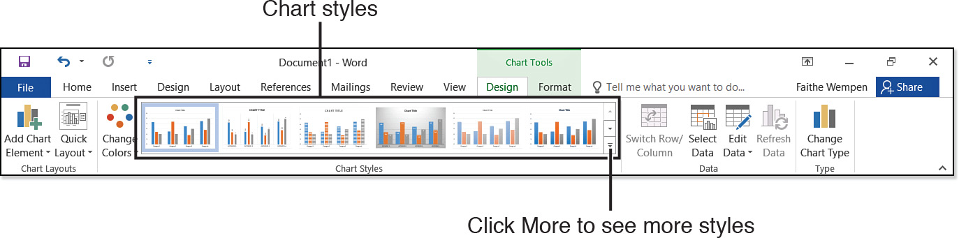
Chart styles do not change the color set (color theme). The colors for the entire document are set on the Design tab, as you learned in Chapter 6, “Creating and Applying Styles and Themes.” Chart styles simply combine the color placeholders defined by the theme in different ways. For example, some chart styles use the same theme color for all the bars, lines, or slices in a chart, but in different tints, whereas others use different colors from the theme for each item.
If you want to use different color combinations within the chart but you don’t want to change colors for the entire presentation, you can click the Change Colors button on the Chart Tools Design tab and select a different color set (see Figure 12.34). These colors are related to the document’s theme colors, but they use different tints and shades of them in different combinations.

Figure 12.34 Apply the theme’s colors to the chart in different ways with the Change Colors command.
![]() To change the theme colors, see “Working with Themes,” p. 245.
To change the theme colors, see “Working with Themes,” p. 245.
Formatting Individual Chart Elements
Now let’s look at the formatting options available for individual pieces of the chart—data series, data points, legends, titles, and so on. Each of these has its own Format task pane. Some of the options in this task pane do not change no matter what type of element is selected; others are unique to a particular element.
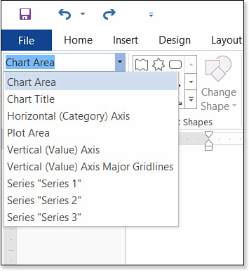
Selecting Chart Elements
Each chart element can be separately formatted, and many of them have special options you can set depending on the element type. Some of these are covered throughout the remainder of this chapter. However, before you can format a chart element, you must select it.
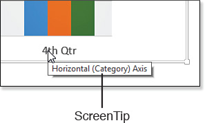
Clicking on an element is one way to select it. Hover the mouse pointer over an element, and wait for a ScreenTip to appear to make sure you are in the right spot (see Figure 12.35). Then click to select the element.
Some elements can be selected either individually or as part of a group. For example, you can select a group of bars in the same series in a bar chart either together or separately. When you click once on such items, the entire group becomes selected; click again on the same item to select only that one object. You can tell when an element is selected because a rectangular box appears around it. When a data series is selected, a separate rectangular box appears around each bar (or other shape).
It can be difficult to tell what you are clicking when several elements are adjacent or overlapping, so Word provides an alternative method of selection. On the Chart Tools Format tab, in the Current Selection group, a Chart Elements drop-down list is available. Choose the desired element from that list to select it (see Figure 12.36).
Clearing Manually Applied Formatting
Word’s task panes are nonmodal, which means they can stay open indefinitely; their changes are applied immediately, and you don’t have to close the task pane to continue working on the document. Although this is handy, it’s all too easy to make an unintended formatting change.
To clear the formatting applied to a chart element, select it and then, on the Chart Tools Format tab, click Reset to Match Style. This strips off the manually applied formatting from that element, returning it to whatever appearance is specified by the chart style that has been applied.
Applying a Shape Style
Shape styles are presets that you can apply to individual elements of the chart, such as data series, data points, legends, the plot area, the chart area, and so on. A shape style applies a combination of fill color, outline color, and effects (such as bevels, shadows, or reflection).
To apply a shape style, follow these steps
1. Select an element of the chart, as you learned in a preceding section.
2. Open the drop-down list in the Shape Styles group of the Chart Tools Format tab and click the desired style (see Figure 12.37).

![]() Note
Note
Like the overall Chart Styles on the Chart Tools Design tab, the Shape Styles use the theme colors in various combinations. If you need to change the theme colors, do so from the Design tab, as described in “Working with Themes” in Chapter 6.
Applying Shape Outlines and Fills
The Shape Styles group on the Chart Tools Format tab contains Shape Fill and Shape Outline drop-down lists, from which you can apply manual formatting to the selected chart element. These work the same as drawn lines and shapes, which Chapter 11, “Working with Drawings and WordArt,” covered in detail.
![]() To learn about applying fill and outline formatting, see “Formatting Drawn Objects,” p. 446.
To learn about applying fill and outline formatting, see “Formatting Drawn Objects,” p. 446.
Applying Shape Effects
The Shape Effects menu (Chart Tools Format tab, Shape Styles group) enables you to apply various special effects to a chart’s elements that make them look shiny, 3-D, textured, metallic, and so on. As shown in Figure 12.38, a number of presets are available for 3-D effects that make the element look as if it is raised, indented, shiny, rounded, and so on.

You can also create your own effects by combining the individual effects on the Shape Effects menu. The available submenus and effects depend on the element selected; for data series and points, there are fewer options than for the chart area as a whole, for example.
Each effect on the Shape Effects menu also has an Options command that opens the Format task pane for the selected element. The following sections look at these effects in more detail.
Applying Shadow Effects
Shadow effect presets are available from the Shape Effects, Shadow submenu. Choose outer or inner shadows or choose shadows with perspective (see Figure 12.39).

For additional shadow fine-tuning, choose Shadow Options from the menu to open the Shadow settings in the Format task pane. (The exact name of the task pane depends on the chart element chosen.) From here, you can change the shadow color and adjust its transparency, size, blur, angle, and distance (see Figure 12.40).

![]() To review the shadow settings available, see “Applying a Shadow Effect,” p. 414.
To review the shadow settings available, see “Applying a Shadow Effect,” p. 414.
Applying Reflection Effects
Reflection is unavailable on the Shape Effects menu when you’re working with chart elements. Reflection is not totally off-limits for charts, though; you can make text reflected via the Text Effects list in the WordArt Styles group, as you will see later in this chapter.
Applying Glow Effects
A glow effect places a fuzzy “halo” of a specified color around the object. The samples on the Glow submenu show each of the theme colors in a variety of glow sizes. To change these colors, change to a different color theme for the entire document (on the Design tab).
You can also specify a fixed color; from the Glow submenu, point to More Glow Colors and then pick a standard color, a theme color, or a custom color, as you would with any other object. Choose Glow Options for settings that will further fine-tune the glow effect.
![]() To review the Glow settings available, see “Applying Glow,” p. 415.
To review the Glow settings available, see “Applying Glow,” p. 415.
Applying Soft Edge Effects
Soft edges is just what it sounds like. It makes the edges of the selected element fuzzy. You can choose a variety of degrees of softness from the Soft Edges submenu: 1 pt, 2.5 pt, 5 pt, 10 pt, 25 pt, and 50 pt.
![]() To review the Soft Edges settings available, see “Applying Soft Edges,” p. 416.
To review the Soft Edges settings available, see “Applying Soft Edges,” p. 416.
Applying Bevel Effects
Beveling changes the shapes of the edges of the object. Beveling can make the object appear to have rounded corners, for example. Another name for beveling is 3-D Format.
Apply one of the preset bevel effects from the Bevel submenu, or select 3-D Options to open the 3-D Format options in the task pane, as shown in Figure 12.41. From here, you can change the height and width of the effect at the top and bottom of the object; change the color of the depth and contours; and change the surface material, lighting, and lighting angle.
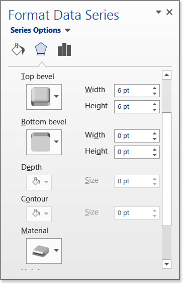
![]() To review the Bevel settings, see “Applying a Beveled Edge and Other 3-D Formatting,” p. 416.
To review the Bevel settings, see “Applying a Beveled Edge and Other 3-D Formatting,” p. 416.
Changing the Shape of a Series
You can change the shape used for the bars or columns in a chart. Rather than plain rectangles, you can have pyramids, cylinders, or cones. The cones and pyramids can either be full or partial. A full cone or pyramid is the same shape regardless of the data value; a partial one appears “sawed off” so that its top marks the data point position (see Figure 12.42).
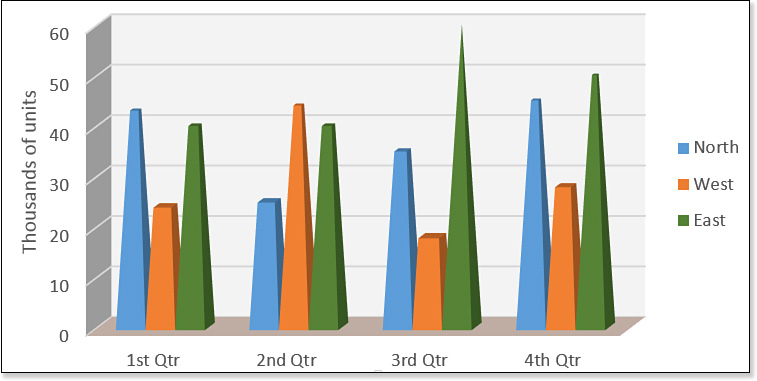
Figure 12.42 The partial pyramid setting makes all pyramids the same size and then cuts off the tops of lower values.
![]() Note
Note
Earlier versions of Word included pyramid, cone, and cylinder variants as chart types, but in Word 2016 you must apply these nonstandard shapes series by series.
You can change the shapes of an individual series by doing the following:
1. Select a data series in a 3-D bar or column chart.
2. Right-click any bar in the data series and choose Format Data Series to open the Format Data Series task pane.
3. Under Column Shape, select one of the shape options (see Figure 12.43). The change is applied to only the selected series.

4. Click a different series on the chart to select it, and then repeat step 3. Do this until all the series have been changed as needed, and then close the task pane.
Adjusting Data Spacing
When working with chart types that involve multiple series of data in a bar, column, or similar style of chart, you can adjust the amount of blank space between the series. To do this, change the data spacing for any series, and all the others will fall into line:
1. Select any data series, and then right-click any data point within it and choose Format Data Series.
2. In the Format Data Series task pane (refer to Figure 12.43), under Series Options, drag the slider to adjust the Gap Depth setting. This is the amount of white space between bars from front to back in a 3-D chart. Figure 12.44 shows this setting at its minimum.

3. Drag the slider to adjust the Gap Width setting. This is the amount of white space from side to side between bars or series. Figure 12.44 shows this setting at its maximum.
4. Close the task pane.
Formatting Chart Text
Text in a chart is an odd hybrid of regular text and WordArt, and its formatting options reflect that. There are two ways to format text in a chart: use regular formatting techniques from the Home tab, or apply a WordArt style to the entire chart (preset or custom).
Changing the Font, Size, and Text Attributes
Most of the text formatting that applies to regular text also applies to chart text. On the Home tab, you can choose a different font, size, and color, just like with any other text.
You can also format the text in the selected element using a special version of the Font dialog box, enabling you to specify less-common font formatting such as character spacing. To do this, follow these steps
1. Select the desired chart element.
2. On the Home tab, click the dialog box launcher in the Font group. The Font dialog box opens. It’s a different version than for regular text, as shown in Figure 12.45.

3. Choose the font, font style, size, font color, and effects desired from the Font tab.
In addition to the regular font-formatting options, an Equalize Character Height option is available. When enabled, this option forces all the characters to the same height.
![]() Note
Note
The Font Color button on the Home tab’s Font group is the same as the Text Fill button on the Chart Tools Format tab’s WordArt Styles group. You can set the font color in either place; making a change to one also makes the change to the other.
4. (Optional) Adjust the character spacing on the Character Spacing tab if desired. Normal spacing is the default, but you can set it to Expanded or Condensed and specify a number of points by which to adjust. You can also indicate that you want kerning for text at or above a certain size.
5. Click OK.
![]() To review font formatting and character spacing, see “Changing the Text Font and Size,” p. 141, and “Adjusting Character Spacing and Typography,” p. 161.
To review font formatting and character spacing, see “Changing the Text Font and Size,” p. 141, and “Adjusting Character Spacing and Typography,” p. 161.
Applying a WordArt Style
WordArt styles enable you to change the fill and outline for chart text and to apply special effects to it such as Glow and Reflection.
You can affect all the text in the entire chart at once by selecting the Chart Area before applying a WordArt style, or you can affect only certain text by selecting that element first.
From the Chart Tools Format tab, click the Quick Styles button to see the available presets, as in Figure 12.46; point at a preset to see a preview of its application in the chart. If you have a wider window than that shown in Figure 12.46, you might instead see a WordArt Styles gallery in the WordArt Styles group.

If none of the presets meet your needs, use the Text Fill, Text Outline, and Text Effects lists to create your own custom WordArt effect:
![]() Text Fill—Works just like Shape Fill. You can apply any color (theme or fixed) or any type of fill effect, such as gradient or picture.
Text Fill—Works just like Shape Fill. You can apply any color (theme or fixed) or any type of fill effect, such as gradient or picture.
![]() Text Outline—Works just like Shape Outline. If you do not want an outline around your text, choose No Outline.
Text Outline—Works just like Shape Outline. If you do not want an outline around your text, choose No Outline.
![]() Text Effects—Similar to Shape Effects. You can apply a Shadow, Reflection, or Glow effect to the text in the chart.
Text Effects—Similar to Shape Effects. You can apply a Shadow, Reflection, or Glow effect to the text in the chart.
![]() To review the Shape Fill and Shape Outline settings, see “Formatting Drawn Objects,” p. 446.
To review the Shape Fill and Shape Outline settings, see “Formatting Drawn Objects,” p. 446.