
11. Graphing Data
In This Chapter
• Creating a chart from spreadsheet data
• Formatting a chart for clarity
• Printing a chart
• Making changes to a chart
I know it sounds tired, but a picture really is worth a thousand words, especially if your “words” are really numbers you’re trying to explain. Suppose that you have a year’s worth of sales figures for three different products your company produces, and you want to compare the sales of the products over the year. If you try to make the comparison using raw data, you’ll probably get a headache. But, if you chart those same numbers, you can easily understand what’s happening.
In this chapter, I’ll show you how to use the data in a Quattro Pro spreadsheet to quickly and easily create a variety of charts. Then, we’ll spruce up those charts to make them truly meaningful and easy to read, and I’ll show you how to print charts. Last, we’ll explore what you need to do when you need to change an existing chart.
Understanding Chart Types
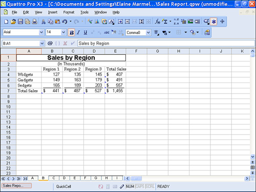
The type of chart you create affects the reader’s understanding of the information you want to present. For example, consider the data in Figure 11.1.
Figure 11.1. Using this data, you can produce several different types of charts, each with a different meaning to the reader.
I can best compare sales by region for each product if I produce a bar chart like the one shown in Figure 11.2.
Figure 11.2. A bar chart helps compare two or more values for the same set of data; in this figure, the chart compares sales for three regions and three products.
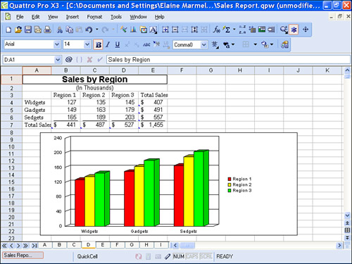
Selecting the correct data to appear in the chart goes hand in hand with selecting an appropriate chart type. Selecting the wrong data can produce a very strange chart. For example, in Figure 11.2, I charted A3.D6. Quattro Pro uses the text information in the selection to automatically label data on the chart.
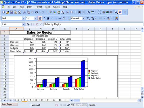
If, instead, I include the total row (row 7) and the total column (column E), I get the odd-looking chart shown in Figure 11.3, which doesn’t really make much sense, if you think about it.
Figure 11.3. If you include totals when creating the chart, it appears as if you’re trying to compare a fourth product.
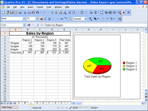
If I change the goal of my chart, I also need to change the type of chart I produce and, possibly, the data to chart. For example, a pie chart is more appropriate when you want to compare portions of anything to the whole enchilada.

I added labels and a legend to the pie chart after I created it, using techniques described later in this chapter in the section, “Formatting a Chart.”
Using the same data shown in Figure 11.3, I can produce a pie chart that shows each region’s portion of total sales, or I can produce a pie chart that shows each product’s portion of total sales. The pie chart I produce will depend on the data I select.
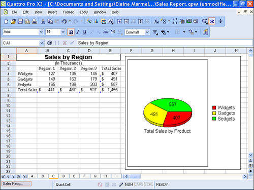
In Figure 11.4, I created a pie chart that shows sales by region. To create the chart, I selected B7.D7—the cells that contain total sales for each region.
Figure 11.4. To create this pie chart, I selected the totals for each region.
In Figure 11.5, I created a pie chart that shows the sales by product. To create the chart, I selected E4.E6—the cells that contain the total sales for each product.
Figure 11.5. To create this pie chart, I selected the totals for each product.
Quattro Pro contains a wide variety of chart types from which you can select; make sure that you select a chart type that is appropriate for the information you want to convey.
Creating a Chart
You can create a chart in one of two ways in Quattro Pro:
• You can use the Chart Expert, a wizard that walks you through the process.
• You can draw the chart and then modify it as needed.
Creating a Chart Using the Chart Expert
Creating a chart using the Chart Expert wizard is easy; follow these steps to create a chart and place it in a separate chart window:
- Select any cell in the range of data you want to chart.
Tip

I include the cells containing labels in the selection so that Quattro Pro automatically labels information in the chart.
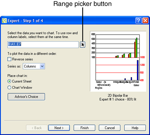
- Open the Insert menu and click Chart to start the Chart Expert wizard. Quattro Pro displays the first step of the Chart Expert (see Figure 11.6).
Figure 11.6. In the Chart Expert, you start by selecting the data that you want to chart.
- Click the Range Picker button to collapse the Chart Expert to just a title bar.
- Select the data that Quattro Pro should chart (see Figure 11.7). Remember, select data appropriate for the type of chart you want to create. In this example, I want to create a bar chart that compares sales by region for all three products, so I select cells A3.D6.
Figure 11.7. Select the cells containing the data you want to chart.
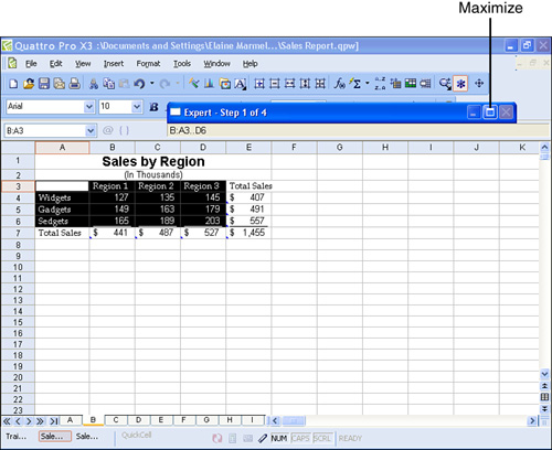
- Click the Maximize button to redisplay the first step of the Chart Expert.
- Click the Chart Window option to tell Quattro Pro to display the chart in its own window.
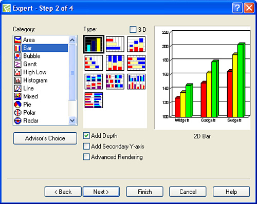
- Click Next to select a chart type (see Figure 11.9). For this chart, I clicked the first available chart type. I also clicked the Add Depth box to make the visual appearance of the bars two-dimensional and more interesting.
Tip
If you compare Figure 11.8 with Figure 11.6, you’ll notice that the sample chart in the Expert dialog box makes more sense after you select the correct data than it did when the Chart Expert first opened.
Figure 11.8. After you select the correct range, the sample in the Expert dialog box makes more sense.
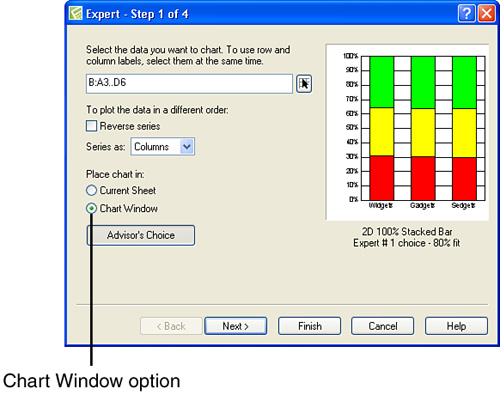
Figure 11.9. Select a chart type.
All the charts displayed in this chapter up to this point have appeared on the spreadsheet with the data.
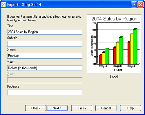
- Click Next to set up explanatory text for the chart (see Figure 11.10). Although you don’t need to fill out all the boxes, some are rather valuable. For example, the Title tells your readers what they’re viewing. The X-Axis label appears along the bottom of a bar chart; in this example, I used the label “Product,” because product names appear along the bottom of the chart. The Y-Axis label appears along the left edge of the chart and, in a bar chart, describes the units being displayed—in this example, dollars.
Figure 11.10. Use these boxes to describe the information on the chart.
Tip
If you’re unsure of the type of chart to produce, click the Advisor’s Choice button, and Quattro Pro will suggest a chart type. Remember, though, that it may not be appropriate for what you want to show.
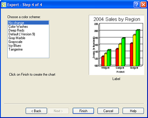
- Click Next to select a color scheme for the chart (see Figure 11.11). A color scheme is most useful if you can print in color or if you intend to create color slides of the chart.
Figure 11.11. You can select a color scheme for a chart.
Click the chart window’s close button to redisplay the spreadsheet.
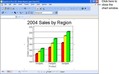
- Click Finish, and Quattro Pro displays the chart in a separate window from the data (see Figure 11.12).
Figure 11.12. A chart in a separate chart window.
Drawing a Chart
If you opt to place a chart in the current sheet in step 6 above, Quattro Pro lets you draw the boundaries of the chart in the spreadsheet. You also can insert a chart without using the Chart Expert by drawing the chart. When you draw a chart, Quattro Pro makes its best guess for the chart type, and you then use formatting options described later in this chapter to add other information to the chart.
To draw a chart, follow these steps:
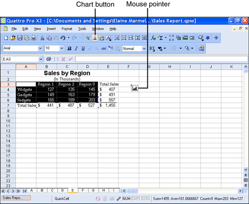
- Select the data you want to chart.
- Click the Chart button on the Notebook toolbar. The mouse pointer changes to look like a chart (see Figure 11.13).
Figure 11.13. Select the data that you want to chart.
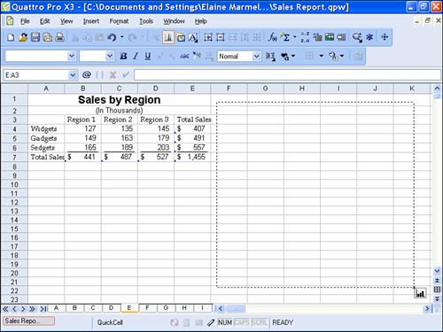
- Drag from the upper-left corner to the lower-right corner of the location where you want the chart to appear (see Figure 11.14).
Figure 11.14. Drag to insert a chart in a spreadsheet.
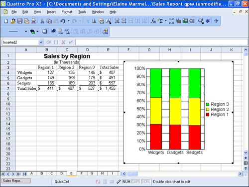
- When you release the mouse button, Quattro Pro inserts the chart (see Figure 11.15).
Figure 11.15. Quattro Pro inserts a chart like this one when you draw a chart.
Formatting a Chart
Suppose that you want to change the chart type for an existing chart. No problem; follow these steps:
- Click in a blank area of the chart to select the chart—you’ll see either small black handles surrounding the chart as appeared in Figure 11.15, or you’ll see a hatched border surrounding the chart, as shown in Figure 11.16.
Figure 11.16. Right-click a blank area of a chart to display a menu.
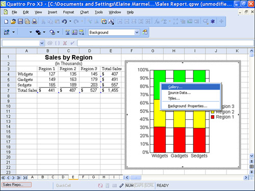
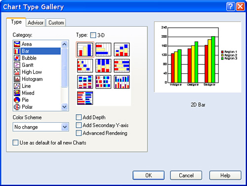
- Right-click a blank area of the chart.
- Select Gallery from the menu that appears. Quattro Pro displays the Chart Type Gallery dialog box, which closely resembles the first dialog box that appears when you use the Chart Expert to insert a chart (see Figure 11.17).
Figure 11.17. Use the Chart Type Gallery to change the chart type after creating a chart.
Tip
If Quattro Pro displays placeholders for a title and subtitle, you can double-click the placeholder, remove the placeholder word—”Title” or “Subtitle,” and so on—type the text you want, and press Enter on the keyboard.
- Select a new chart type and click OK. Quattro Pro changes the chart type to match your selection.
If you want to add titles to a chart, follow steps 1–4 above, selecting Titles instead of Gallery from the menu in step 3. If you want to add a legend to a chart, follow the steps 1–4, selecting Source Data instead of Gallery from the menu in step 3.
Printing a Chart
If you place a chart in a spreadsheet, you print the chart when you print the spreadsheet, using the same techniques described in Chapter 6, “Printing.” If you place a chart in its own window, you must print that window. To find a chart that you placed in its own window, click the Objects Sheet button at the bottom of the Quattro Pro window (see Figure 11.18). Quattro Pro displays a sheet that contains all the charts you created in a notebook.
Figure 11.18. The Objects sheet displays icons that represent all the charts you created in a notebook.
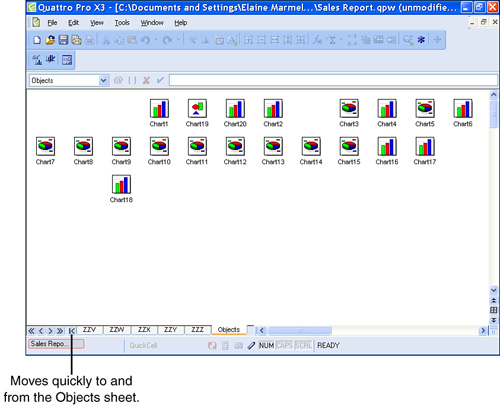
Double-click the icon that represents the chart you want to view. Quattro Pro displays the chart represented by the icon you selected.
Tip
If you double-click the wrong icon, just redisplay the Objects sheet and try again.
When you find a chart created in its own window, click the Print button to print it. When you finish with the chart, click the chart window’s Close button—that’s the bottom X in the upper-right corner; if you click the top X, you’ll close Quattro Pro. When you close the chart window, Quattro Pro redisplays the Objects sheet. To return to the spreadsheet at the front of the notebook quickly, click the Objects sheet button at the bottom of the Quattro Pro window again.
Modifying Chart Information
Suppose that the data in your chart changes; you know, some department missed some sales and adjusted the numbers after you create your chart. You don’t need to re-create the chart. Instead, just change the numbers in the data area of the spreadsheet. Quattro Pro automatically updates the chart to reflect the change.