8. Using Color to Enhance Artwork
Lesson overview
In this lesson, you’ll learn how to do the following:
Understand color modes and the main color controls.
Create, edit, and apply colors using a variety of methods.
Name and save colors.
Copy and paste appearance attributes from one object to another.
Work with color groups.
Be inspired creatively with the Color Guide panel.
Explore the Recolor Artwork command.
Work with Live Paint groups.

This lesson will take about 75 minutes to complete. To get the lesson files used in this chapter, download them from the web page for this book at adobepress.com/IllustratorCIB2022. For more information, see “Accessing the lesson files and Web Edition” in the Getting Started section at the beginning of this book.
Spice up your illustrations with color by taking advantage of color controls in Adobe Illustrator. In this information-packed lesson, you’ll discover how to create and apply fills and strokes, use the Color Guide panel for inspiration, work with color groups, recolor artwork, and more.
Starting the lesson
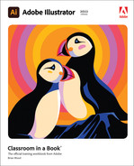
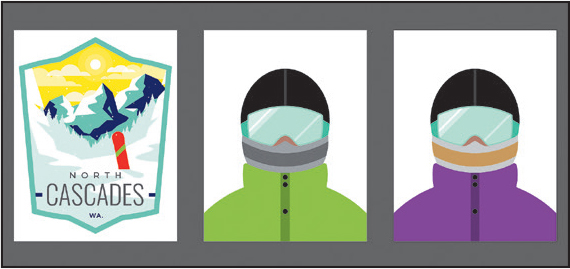
In this lesson, you’ll learn about the fundamentals of color by using the Swatches panel and more to create and edit the colors for artwork for a ski area.
To ensure that the tools function and the defaults are set exactly as described in this lesson, delete or deactivate (by renaming) the Adobe Illustrator preferences file. See “Restoring default preferences” in the “Getting Started” section at the beginning of the book.
 Note
NoteIf you have not already downloaded the project files for this lesson to your computer from your Account page, make sure to do so now. See the “Getting Started” section at the beginning of the book.
Start Adobe Illustrator.
Choose File > Open, and open the L8_end1.ai file in the Lessons > Lesson08 folder to view a final version of the artwork.
Choose View > Fit All In Window. You can leave the file open for reference or choose File > Close to close it.
Choose File > Open. In the Open dialog box, navigate to the Lessons > Lesson08 folder, and select the L8_start1.ai file on your hard disk. Click Open to open the file. This file has all the pieces already in it; they just need to be painted.
In the Missing Fonts dialog box, ensure that the checkboxes to the right of the names of the missing fonts are selected, and click Activate Fonts. After some time, the font(s) should be activated, and you should see a success message in the Missing Fonts dialog box. Click Close.
NoteFor more information on activating fonts, visit helpx.adobe.com/creative-cloud/help/add-fonts.html.
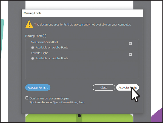
If you see a dialog box about font auto-activation, click Skip.
Choose View > Fit All In Window.
Choose File > Save As. If the Cloud Document dialog box opens, click Save On Your Computer.
In the Save As dialog box, navigate to the Lesson08 folder, and name the file Snowboarder.ai. Leave Adobe Illustrator (ai) chosen from the Format menu (macOS) or Adobe Illustrator (*.AI) chosen from the Save As Type menu (Windows), and click Save.
In the Illustrator Options dialog box, leave the options at their default settings and then click OK.
NoteIf you don’t see Reset Essentials in the menu, choose Window > Workspace > Essentials before choosing Window > Workspace > Reset Essentials.
Choose Window > Workspace > Reset Essentials.
Exploring color modes
There are many ways to experiment with and apply color to your artwork in Adobe Illustrator. As you work with color, it’s important to consider the medium in which the artwork will be published, such as print or the web. The colors you create need to be suitable for the medium. This usually requires that you use the correct color mode and color definitions for your colors.
Before starting a new document, you should decide which color mode the artwork should use, CMYK or RGB.
CMYK—Cyan, magenta, yellow, and black are the colors of ink used in four-color process printing. These four colors are combined and overlapped in a pattern of dots to create a multitude of other colors.
RGB—Red, green, and blue light are added together in various ways to create an array of colors. Select this mode if you are using images for onscreen presentations, the internet, or mobile apps, or maybe printing to desktop inkjet printers.
![]() Note
Note
You may see a series of templates in the New Document dialog box that are different than those you see in the figure.
When you create a new document by choosing File > New, each new document preset, like Print or Web, has a specific color mode. For instance, the presets in the Print category use the CMYK color mode by default. You can easily change the color mode by choosing a different option from the Color Mode menu after clicking Advanced Options in the New Document dialog box.
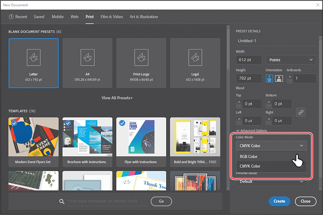
Once a color mode is chosen, solid colors in the document are displayed in and created from that color mode. Once a document is created, you can change the color mode of a document by choosing File > Document Color Mode and then switching to either CMYK Color or RGB Color in the menu.
Working with color
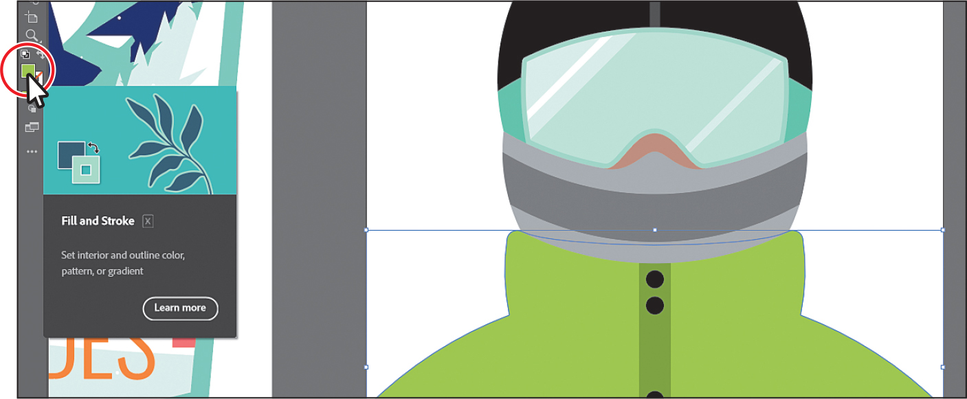
In this lesson, you’ll learn about the traditional methods of coloring objects in Illustrator using a combination of panels and tools, such as the Properties panel, Swatches panel, Color Guide panel, Color Picker, and paint options in the toolbar.
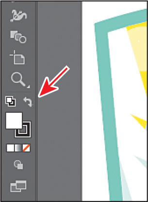
In previous lessons, you learned that objects in Illustrator can have a fill, a stroke, or both. At the bottom of the toolbar, notice the Fill and Stroke boxes. The Fill box is white (in this case), and the Stroke box is black. If you click those boxes one at a time, you’ll see that whichever is clicked is brought in front of the other (it’s selected). When a color is chosen, it is applied to the fill or stroke, whichever is selected. As you explore more of Illustrator, you’ll see these fill and stroke boxes in lots of other places, like the Properties panel, Swatches panel, and more.
![]() Note
Note
The toolbar you see may be a double column, depending on the resolution of your screen.
As you will see in this section, Illustrator provides many ways to arrive at the color you need. You’ll start by applying an existing color to a shape and then work your way through the most widely used methods for creating and applying color.
Applying an existing color
Every new document in Illustrator has a series of default colors available for you to use in your artwork in the form of swatches in the Swatches panel. The first color method you’ll explore is applying an existing color to a shape.
![]() Note
Note
Throughout this lesson, you’ll be working on a document with a color mode that was set to CMYK when the document was created. That means that colors you create will, by default, be composed of cyan, magenta, yellow, and black.
![]() Note
Note
As you move the pointer over the swatches, tool tips appear revealing each swatch’s name. By default, swatches are named according to their color values. If you change the name, that name will appear in the tool tip.
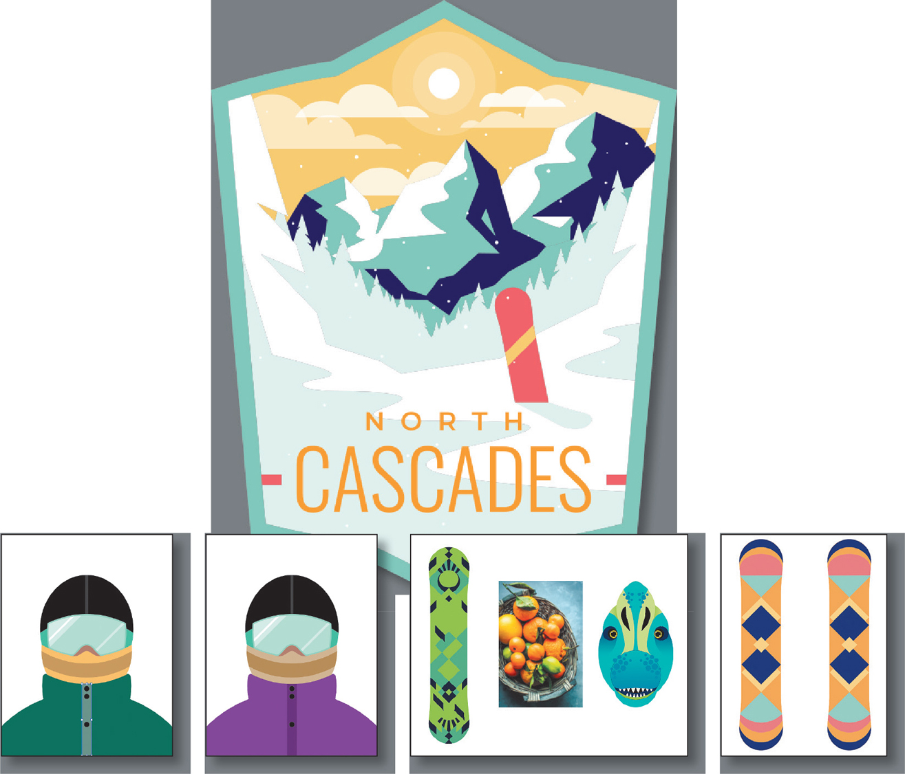
With the Snowboarder.ai document showing, choose 1 Badge from the Artboard Navigation menu in the lower-left corner of the Document window (if it’s not chosen already) and then choose View > Fit Artboard In Window.
With the Selection tool (
 ), click the red snowboard shape to select it.
Click the Fill box (
 ) in the Properties panel on the right to reveal a panel. Click the Swatches button (
 ) toward the top of the panel, if it isn’t already selected, to show the default swatches (colors). Click to apply the pink swatch to change the color of the fill for the selected shape.
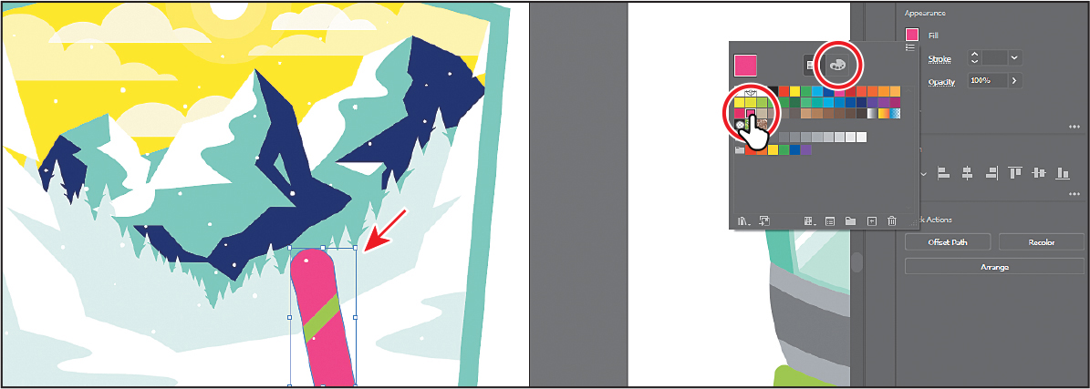
Press the Escape key to hide the panel of colors.
Creating a custom color
There are lots of ways to create your custom colors in Illustrator. Using the Color panel (Window > Color) or Color Mixer, you can apply custom colors you make to an object’s fill and stroke and also edit and mix colors using different color models (CMYK, for example).
The Color panel and Color Mixer display the current fill and stroke of the selected content. You can either visually select a color from the color spectrum bar at the bottom of the panel or mix your colors in various ways. Next, you’ll create a custom color using the Color Mixer.
With the Selection tool (
), select the green stripe on the snowboard.Click the Fill box (
 ) in the Properties panel on the right to reveal the panel. Click the Color Mixer button (
 ) at the top of that panel (circled in the first part of the following figure).
 Tip
TipTo see a larger color spectrum, you can open the Color panel (Window > Color) and drag the bottom of the panel down.
At the bottom of the panel, click in the yellow-orange part of the color spectrum to sample a yellow-orange color, and apply it to the fill (see the following figure).
Since the spectrum bar is so small, you most likely won’t achieve the same color as you see in the book. That’s okay, because you’ll edit it to match next.
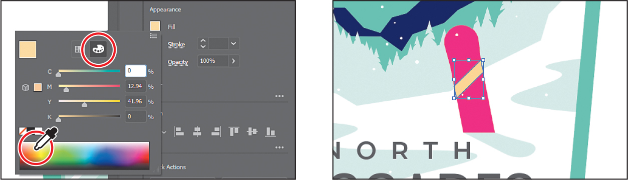
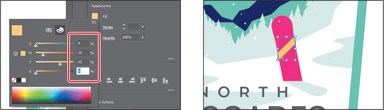
In the Color Mixer panel, which should still be showing, type the following values in the CMYK fields: C=0, M=20, Y=65, K=0. Press Return or Enter after the last value entered to make a light orange color and close the panel. This ensures that we are all using the same color. Leave the shape selected.
Colors created in the Color Mixer panel are not saved anywhere except in the fill or stroke of the selected artwork. If you want to easily reuse the color you just created elsewhere in this document, you can save it as a swatch in the Swatches panel, which is what you’ll do next.
Saving a color as a swatch
You can name and save different types of colors, gradients, and patterns in the document as swatches so that you can apply and edit them later. Swatches are listed in the Swatches panel in the order in which they were created, but you can reorder or organize the swatches into groups to suit your needs. All documents start with a default number of swatches, as mentioned earlier. Any colors you save or edit in the Swatches panel are available only to the current document, by default, since each document has its own defined swatches.
Next, you’ll save the color you just created as a swatch so you can reuse it later.
With the light orange shape still selected, click the Fill box (
 ) in the Properties panel to show the panel again.
Click the Swatches button (
) at the top of the panel to see the swatches. Click the New Swatch button ( ) at the bottom of the panel to create a swatch from the fill color of the selected artwork.
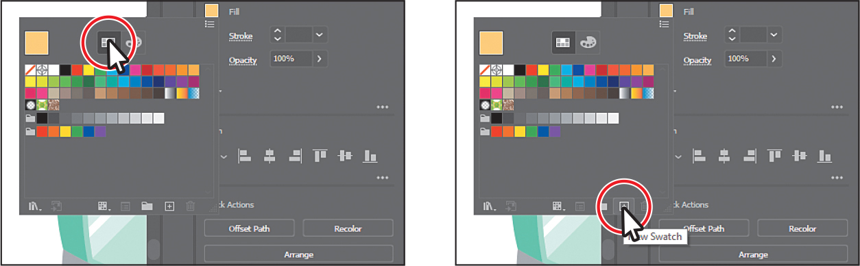
 Tip
TipNaming colors can be an art form. You can name them according to their values (C=45, ...), appearance (light orange), or description (like “text header”), among other attributes.
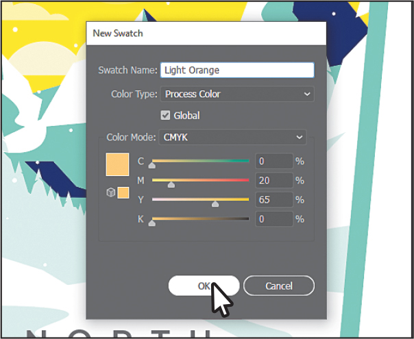
In the New Swatch dialog box that appears, change the swatch name to Light Orange.
Notice the Global option that is selected by default? New swatches you create are global by default. A global swatch is a swatch that is updated everywhere it’s applied anytime the color is changed, regardless of whether or not the artwork is selected. Also, the Color Mode menu lets you change the color mode of a specific color to RGB, CMYK, Grayscale, or another mode.
Click OK to save the swatch.
Notice that the new Light Orange swatch is highlighted in the Swatches panel (it has a white border around it). That’s because it’s applied to the selected shape automatically. Also, notice the little white triangle in the lower-right corner of the swatch, which indicates that it’s a global swatch.
Leave the light orange shape selected and the panel showing for the next section.
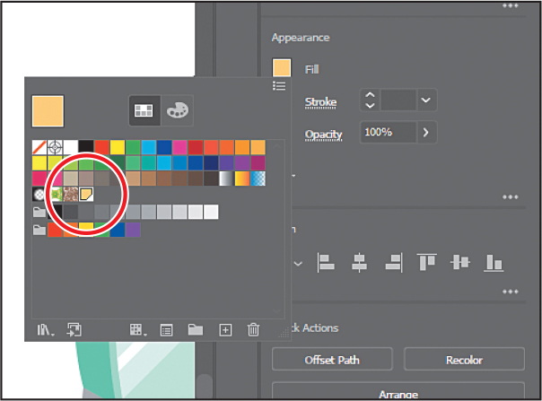
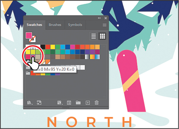
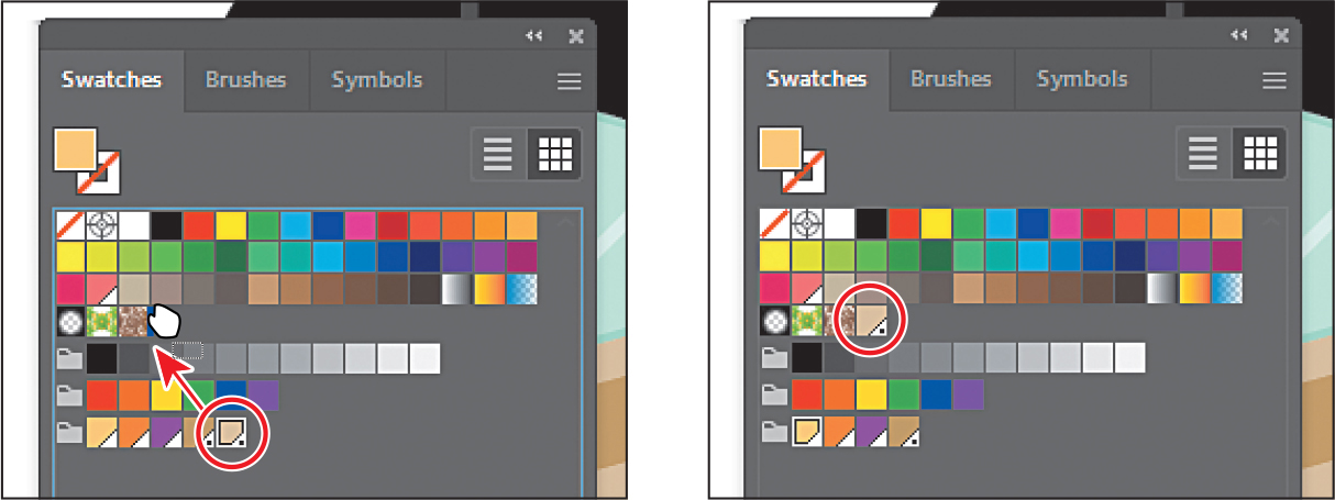
Creating a copy of a swatch
One of the easiest ways to create and save a color as a swatch is to make a copy of an existing swatch and edit the color of the copy. Next, you’ll create another swatch by copying and editing the swatch named “Light Orange.”
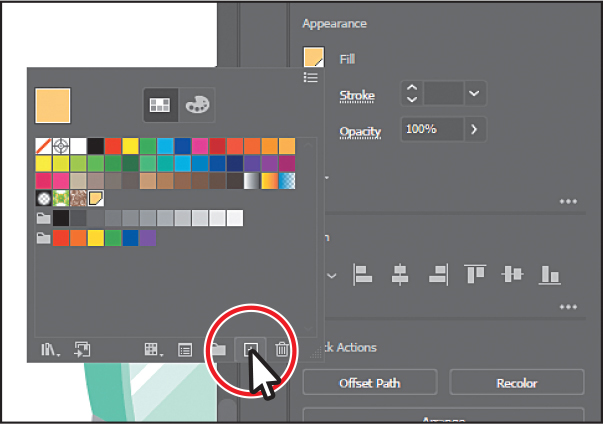
With the shape in the snowboard still selected and the Swatches panel still showing, click the New Swatch button (
 ) at the bottom of the panel. Tip
You can also choose Duplicate Swatch from the panel menu (
 ) to create a copy of a selected swatch.
This creates a copy of the selected Light Orange swatch and opens the New Swatch dialog box.
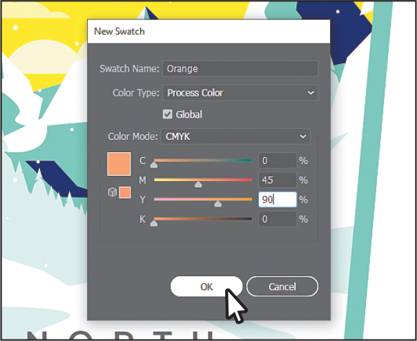
In the New Swatch dialog box, change the name to Orange and change the CMYK color values to C=0, M=45, Y=90, K=0 to make a slightly darker orange. Click OK.
In the Swatches panel, click to apply the Light Orange swatch to the selected shape.
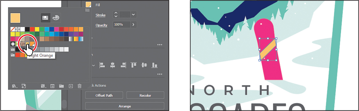
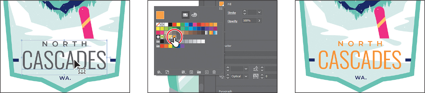
With the Selection tool (
), click the word “NORTH,” and then Shift-click the word “CASCADES.”Click the Fill box (
 ) in the Properties panel, and click the Orange swatch to apply it to the selected text.
Press the Escape key to hide the Swatches panel.
Choose Select > Deselect.
Editing a global swatch
Next you’ll edit a global color. When you edit a global color, all artwork with that swatch applied is updated, regardless of which artwork is and isn’t selected.
With the Selection tool (
), click the yellow shape in the sky, behind the clouds.You’ll apply the Light Orange swatch to the shape and then change the color.
Click the Fill box (
 ) in the Properties panel, and click to apply the swatch named “Light Orange.” Leave the panel of swatches showing.
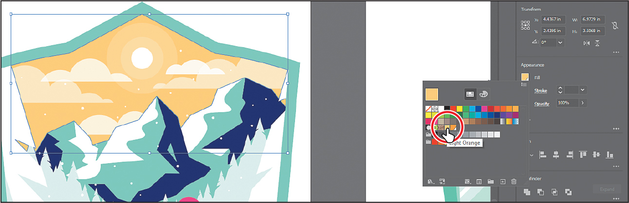
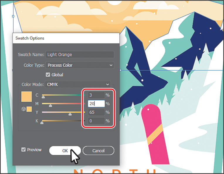
Double-click the Light Orange swatch in the panel to edit it. In the Swatch Options dialog box:
Select Preview to see the change.
Change the C (Cyan) value to 80 and click in another field in the dialog box to see the change happen.

You may need to drag the dialog box by the top title bar to see the snowboard and sky shapes. All of the shapes with the global swatch applied are updated—even the shape on the snowboard that wasn’t selected.
NoteThe cursor is in the Magenta field in the figure because I have a habit of entering a number and pressing the tab key to go to the next field, so the value is accepted.
Change the C (Cyan) value to 3 and click OK.
Editing a non-global swatch
The default color swatches that come with each Illustrator document are non-global swatches by default. As a result, when you edit one of those color swatches, the artwork that uses the color will update only if that artwork is selected. Next, you’ll edit the non-global pink swatch you applied to the fill of the snowboard.
With the Selection tool (
) selected, click to select the pink snowboard you first changed the color for.Click the Fill box (
 ) in the Properties panel, and you’ll see that the pink swatch is applied to the fill. This was the first color you applied at the beginning of this lesson.
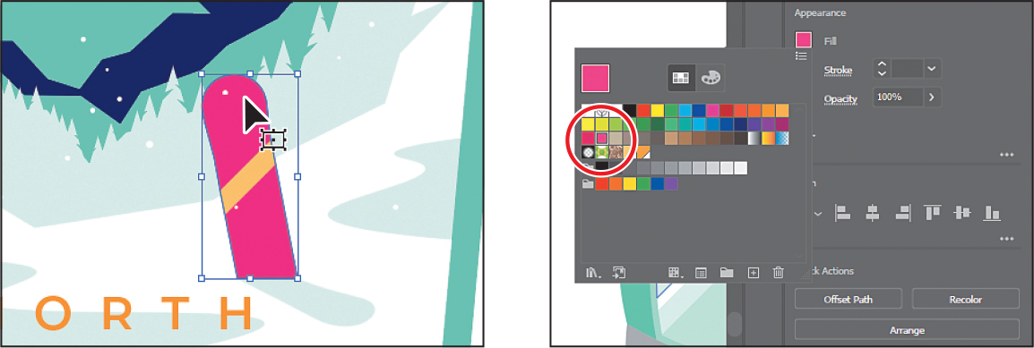
You can tell that the pink swatch you applied is not a global swatch because it doesn’t have the small white triangle in the lower-right corner of the swatch in the Swatches panel.
Press the Escape key to hide the Swatches panel.
Click either the small blue shape on the left or to the right of the “CASCADES” text to select both since they are grouped together.
Click the Fill box (
 ) in the Properties panel, and click the same pink swatch to change the fill of both shapes.
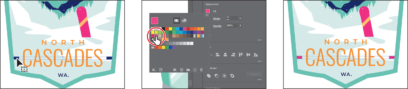
Choose Select > Deselect.
Choose Window > Swatches to open the Swatches panel as a separate panel.
Double-click the same pink swatch to edit it.
Most of the formatting options you find in the Properties panel can also be found in separate panels. Opening the Swatches panel, for instance, can be a useful way to work with color without having to select artwork.
NoteYou can change an existing swatch into a global swatch, but it requires a bit more effort. You need to either select all the shapes that swatch was applied to before you edit the swatch and make it global or edit the swatch to make it global and then reapply the swatch to your content.
In the Swatch Options dialog box, change the name to Snowboard pink and the values to C=0, M=76, Y=49, K=0, select Global to ensure that it’s a global swatch, and select Preview.
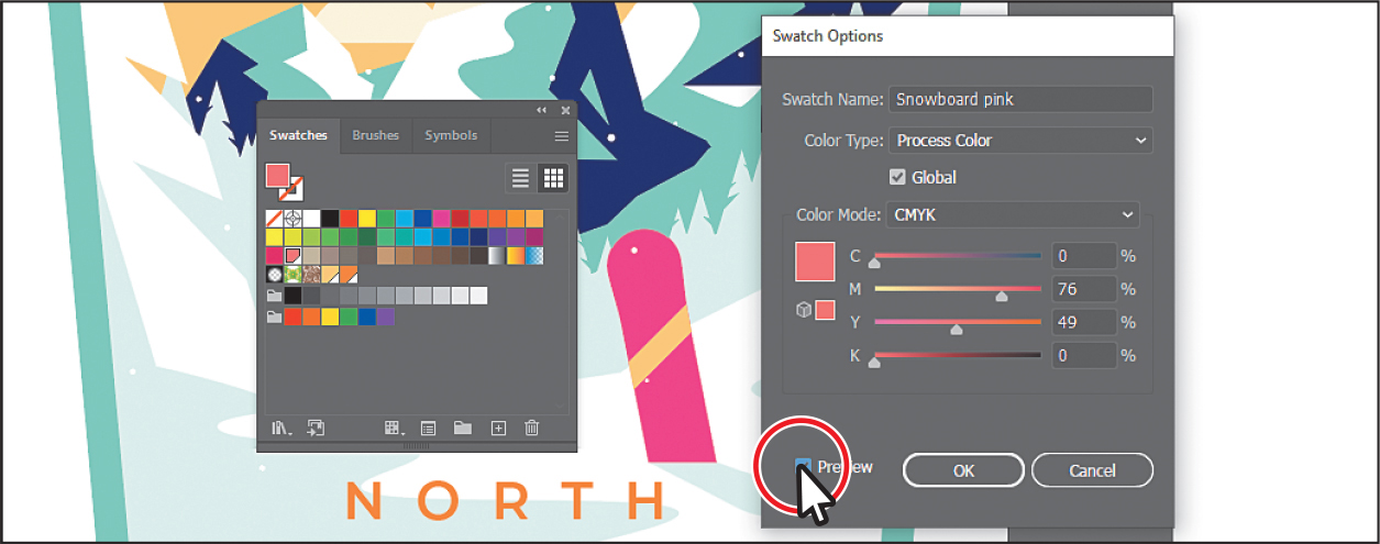
Notice that the color of the snowboard or small shapes on either side of the text didn’t change. That’s because Global wasn’t selected in the Swatch Options dialog box when the color was applied to them. After changing a non-global swatch, you need to reapply it to artwork that wasn’t selected when you made the edit.
Click OK.
Click the X at the top of the Swatches panel group to close it.
Click to select the pink snowboard again. Shift-click one of the two shapes with the same pink applied to select them as well.
Click the Fill box (
 ) in the Properties panel, and notice that what was the pink color swatch is no longer applied.
Click the Snowboard pink swatch you just edited to apply it.
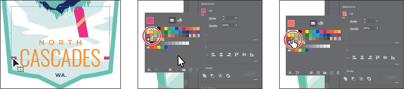
Choose Select > Deselect and then choose File > Save.
Using the Color Picker to create color
Another method for creating color is to use the Color Picker. The Color Picker lets you select a color in a color field or a spectrum, either by defining colors numerically or by clicking a swatch. The Color Picker is also found in Adobe applications like InDesign and Photoshop. Next, you’ll create a color using the Color Picker and then save that color as a swatch in the Swatches panel.
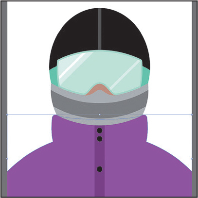
Choose 2 Snowboarder from the Artboard Navigation menu in the lower-left corner of the Document window.
With the Selection tool (
), click in the green jacket shape. NoteYou can’t double-click the Fill box in the Properties panel to open the Color Picker.
Double-click the green Fill box at the bottom of the toolbar, to the left of the document, to open the Color Picker.
In the Color Picker dialog box, the larger color field shows saturation (horizontally) and brightness (vertically). The color spectrum bar to the right of the color field shows the hue.
In the Color Picker dialog box, drag up and down in the color spectrum bar to change the color range. Make sure that you wind up with the triangles in a purple color—it doesn’t have to match the figure exactly.
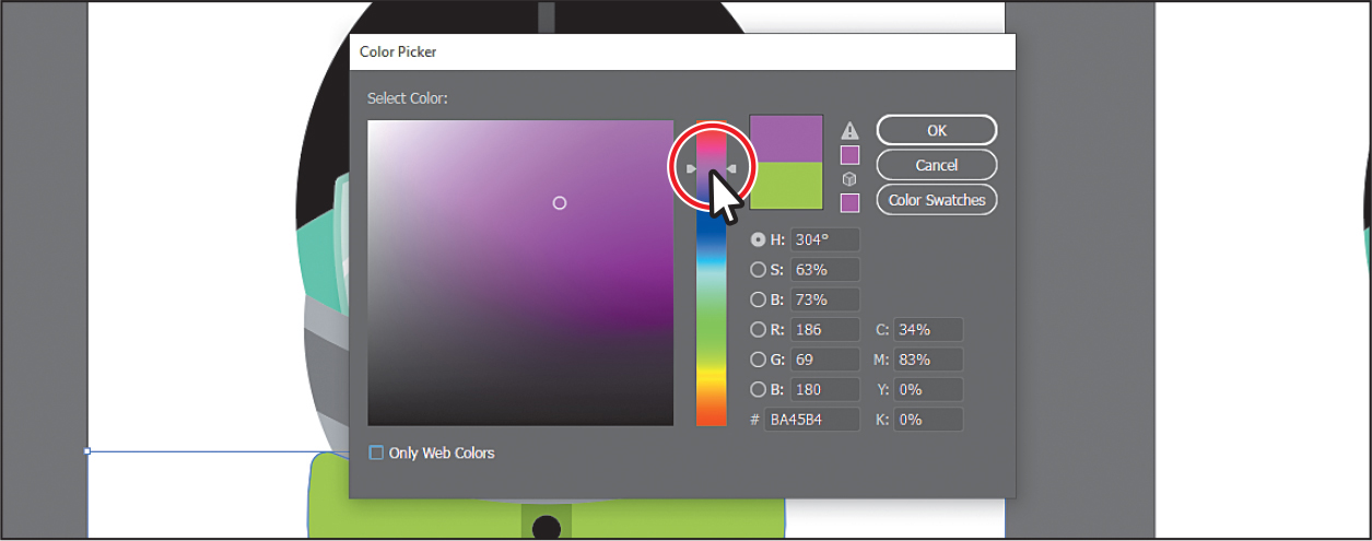
Drag in the color field (where you see the circle in the following figure). As you drag right and left, you adjust the saturation, and as you drag up and down, you adjust the brightness. The color you create when you click OK (don’t click yet) appears in the New Color rectangle (an arrow is pointing to it in the figure).
Don’t worry about matching the color in the figure yet.
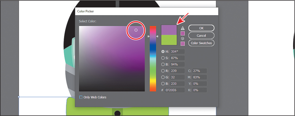
NoteThe Color Swatches button in the Color Picker shows you the swatches in the Swatches panel and the default color books (the sets of swatches that come with Illustrator). It also lets you select a color from one. You can return to the color spectrum by clicking the Color Models button and then editing the swatch color values, if necessary.
In the CMYK fields, change the values to C=50, M=90, Y=5, and K=0.
Click OK, and you should see that the purple color is applied to the fill of the jacket.
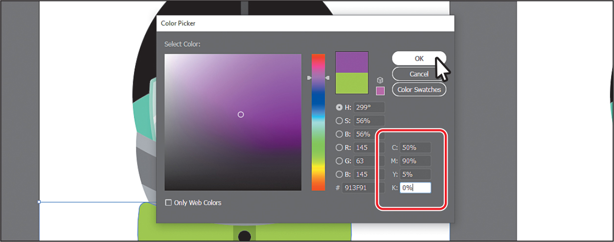
To save the color as a swatch so you can reuse it, click the Fill box (
 ) in the Properties panel to show the swatches. Click the New Swatch button (
 ) at the bottom of the panel, and change the following options in the New Swatch dialog box:
Swatch Name: Purple
Global: Selected (the default setting)
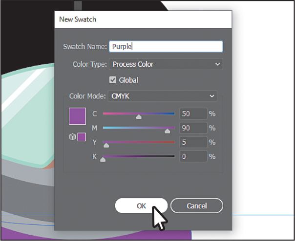
Click OK to see the color appear as a swatch in the Swatches panel.
Choose Select > Deselect.
Choose File > Save.
Using Illustrator swatch libraries
Swatch libraries are collections of preset colors, such as Pantone and TOYO, and thematic libraries, such as Earthtone and Ice Cream. Illustrator has default swatch libraries that appear as separate panels and can’t be edited when you open them. When you apply color from a library to artwork, the color becomes a swatch that is saved only in that document and appears in the Swatches panel. Swatch libraries are a great starting point for creating colors.
![]() Note
Note
Sometimes it’s practical to use process (typically CMYK) and spot (PANTONE, for instance) inks in the same job. For example, you might use one spot ink to print the exact color of a company logo on the same pages of an annual report where photographs are reproduced using process color. You can also use a spot-color printing plate to apply a varnish over areas of a process color job. In both cases, your print job would use a total of five inks—four process inks and one spot ink or varnish.
Next, you’ll create a spot color using a Pantone Plus library. Those colors print using spot ink. A spot ink is a premixed color (not created by printing tiny dots of CMYK inks). After creating it, you’ll apply it to artwork. When color is defined in Illustrator and later printed, the appearance of the color may vary, which is why most printers and designers rely on a color-matching system, like the PANTONE system, to help maintain color consistency and, in some cases, to access a wider range of colors.
Adding a spot color
In this section, you’ll see how to open a color library, such as the PANTONE color system, and add a PANTONE Matching System (PMS) color to the Swatches panel and apply it to the snowboarder artwork.
Choose Window > Swatch Libraries > Color Books > PANTONE+ Solid Coated.
The Swatch Libraries option is toward the bottom of the Window menu.
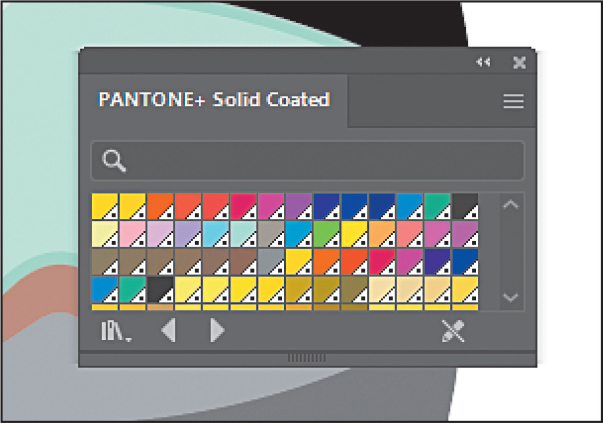
In the PANTONE+ Solid Coated library panel, type 7562 in the Find field.
As you type, the list is filtered, showing a smaller and smaller range of swatches.
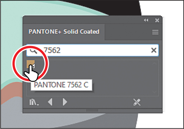
Click the swatch PANTONE 7562 C to add it to the Swatches panel for this document.
Click the X to the right of the search field to stop the filtering.
NoteIf you exit Illustrator with the PANTONE library panel still open and then relaunch Illustrator, the panel does not reopen. To automatically open the panel whenever Illustrator opens, choose Persistent from the PANTONE+ Solid Coated panel menu (
 ).
).Close the PANTONE+ Solid Coated panel.
With the Selection tool (
), click the darker gray shape covering the mouth of the snowboarder.Click the Fill box (
 ) in the Properties panel to show the swatches, and select the PANTONE 7562 C swatch to fill the shape.
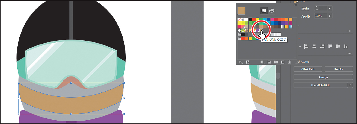
In the Swatches panel, you can identify spot-color swatches by the dot in the lower corner (
 ) of the swatch, by default. Process colors do not have a spot-color icon or a dot.
Choose Select > Deselect and then choose File > Save.
![]() Note
Note
After saving, you may see a warning dialog box about spot colors and transparency. To learn more about this message, visit helpx.adobe.com/illustrator/kb/spot-colors-transparency-illustrator.html.
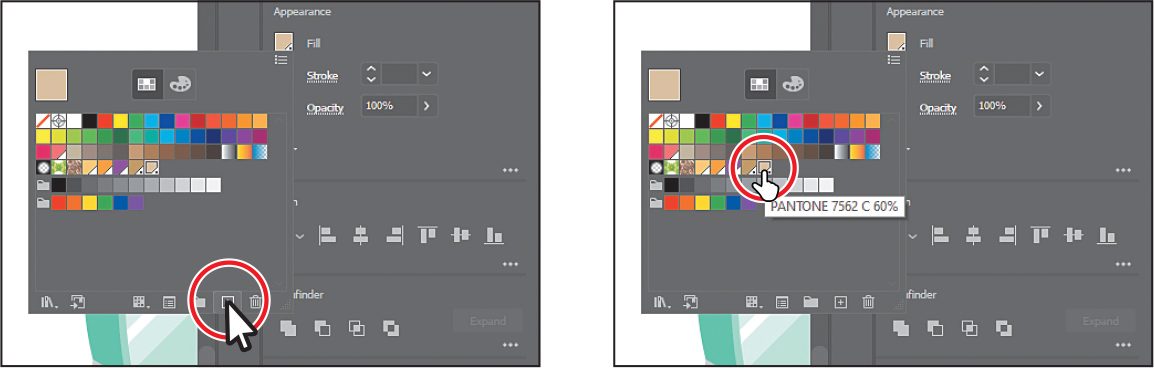
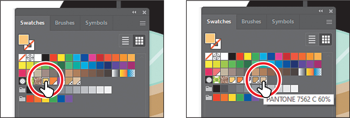
Creating and saving a tint of a color
A tint is a lighter version of a color. You can create a tint from a global process color, like CMYK, or a spot color. Next, you’ll create a tint of the Pantone swatch you added to the document.
With the Selection tool (
), click one of the lighter gray shapes above or below the shape you applied the Pantone color to.Click the Fill box in the Properties panel (
 ) on the right. Select the PANTONE 7562 C swatch to fill both shapes. Leave the panel open.
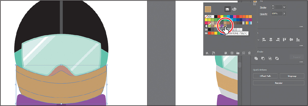
Click the Color Mixer button (
) at the top of the panel.In the section “Creating a custom color,” you created a custom color using the Color Mixer sliders. In that section, you were creating a custom color from scratch—that’s why there were CMYK sliders. Now you’ll see a single slider labeled “T” for tint. When using the color mixer for a global swatch, you’ll create a tint instead of mixing CMYK values.
Drag the tint slider to the left to change the tint value to 60%.
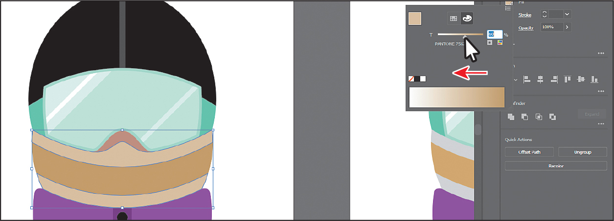
Click the Swatches button (
) at the top of the panel to show the swatches. Click the New Swatch button ( ) at the bottom of the panel to save the tint.
Move the pointer over the swatch icon to see its name, which is PANTONE 7562 C 60%.
Choose Select > Deselect and then choose File > Save.
Converting colors
Illustrator offers commands for selected artwork that allow you to convert colors between color modes—maybe make color artwork grayscale, blend colors, invert colors, and much more. Perhaps you can no longer justify the added cost of adding a spot color. You can convert the spot color to CMYK and get something close to the original result at a lower price. Next, you’ll change the snowboarder with the PANTONE 7562 C color applied to use CMYK colors instead of Pantone.
Choose Select > All On Active Artboard to select all artwork on the artboard, including the shapes with the Pantone color and tint applied.
NoteCurrently, Convert To RGB in the Edit Color menu is dimmed (you cannot select it). That’s because the document color mode is CMYK. To convert the selected content color to RGB using this method, first choose File > Document Color Mode > RGB Color.
Choose Edit > Edit Colors > Convert To CMYK.
Any colors in the selected shapes that had Pantone applied as a spot color are now composed of CMYK. The swatches in the Swatches panel are no longer applied to the artwork.
Choose Select > Deselect.
Copying appearance attributes
Using the Eyedropper tool (![]() ), you can copy appearance attributes, such as text formatting, fill, and stroke, from one object to another. This can speed up your creative process.
), you can copy appearance attributes, such as text formatting, fill, and stroke, from one object to another. This can speed up your creative process.
Choose View > Fit All In Window.
Using the Selection tool (
), Shift-click the two light gray shapes on the snowboarder’s face on the far right artboard. TipYou can double-click the Eyedropper tool in the toolbar before sampling to change the attributes that the Eyedropper picks up and applies.
Select the Eyedropper tool (
 ) in the toolbar on the left. Click in the same shapes on the artboarder’s face to the left to which you applied the tint. See the following figure.
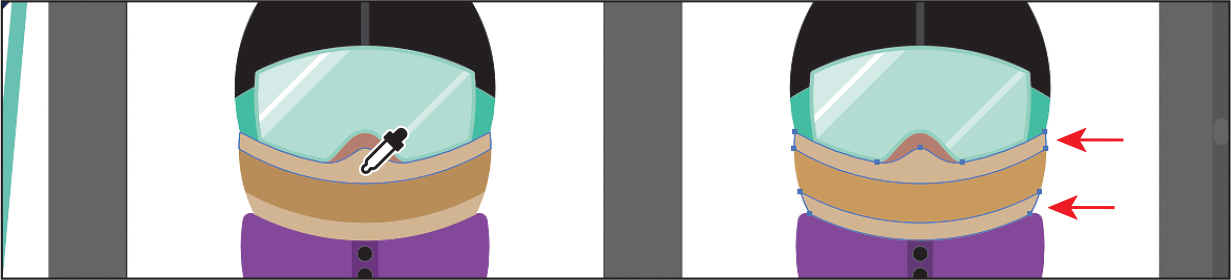
The once gray shapes now have the attributes from the tint-filled shapes on the left artboard.
Select the Selection tool (
).Choose Select > Deselect and then choose File > Save.
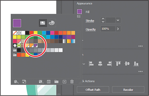
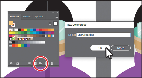
Creating a color group
In Illustrator, you can save colors in color groups, consisting of related color swatches in the Swatches panel. Organizing colors by use, such as grouping all colors for a logo, can improve organization and efficiency, as you’ll soon see. In the Swatches panel, there are a few groups by default, indicated by folders. Color groups cannot contain patterns, gradients, the None color, or the Registration color. Registration is a color that is typically composed of 100% of the four process colors: cyan (C), magenta (M), yellow (Y), and black (K), and 100% of any spot color present. Next, you’ll create a color group of some of the swatches you’ve created to keep them organized.
Choose Window > Swatches to open the Swatches panel. In the Swatches panel, drag the bottom of the panel down to see more of the content.
Click the swatch named “Light Orange” to select it. Pressing the Shift key, click the swatch named “PANTONE 7562 60% C” to select five color swatches.
Click the New Color Group button (
 ) at the bottom of the Swatches panel. Change Name to Snowboarding in the New Color Group dialog box, and click OK to save the group. Note
If objects are selected when you click the New Color Group button, an expanded New Color Group dialog box appears. In this dialog box, you can create a color group from the colors in the artwork and convert the colors to global colors.
With the Selection tool (
) selected, click a blank area of the Swatches panel to deselect all in the panel.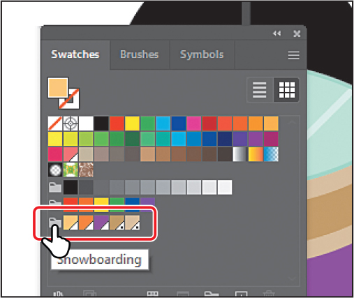
Move the pointer over the folder for the new group to see the name “Snowboarding.”
Each swatch in a color group can still be edited independently by double-clicking a swatch in the group and editing the values in the Swatch Options dialog box. You could also edit the colors in the group together by double-clicking the group folder icon.
TipAside from dragging colors in or out of a color group, you can rename a color group, reorder the colors in the group, and more.
Drag the tint swatch named “PANTONE 7562 C 60%” out of the color group, to the right of the last color swatch in the list. Leave the Swatches panel open.
You can drag colors into or out of a color group. When dragging a color into a color group, make sure that you see a blue line appear on the right edge of a swatch within the group. Otherwise, you may drag the swatch to the wrong place. You can always choose Edit > Undo Move Swatches and try again.
Using the Color Guide panel for creative inspiration
The Color Guide panel can provide you with color inspiration as you create your artwork. You can use it to pick color tints, analogous colors, and much more, and then apply them directly to artwork, edit them using several methods, or save them as a group in the Swatches panel.
Next, you’ll select a color from some artwork and then use the Color Guide panel to create new colors based on that original color.
Choose 3 Snowboarder Color Guide from the Artboard Navigation menu in the lower-left corner of the Document window.
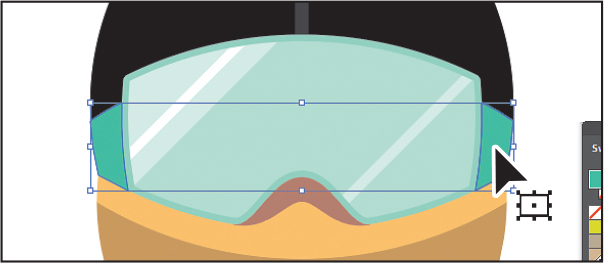
With the Selection tool (
), click either green shape on the side of the goggles. Make sure that the Fill box is selected toward the bottom of the toolbar.Choose Window > Color Guide to open the panel.
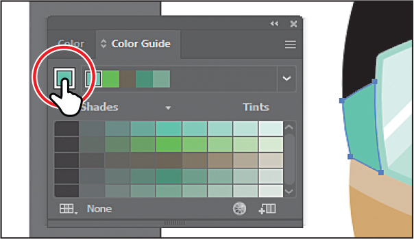
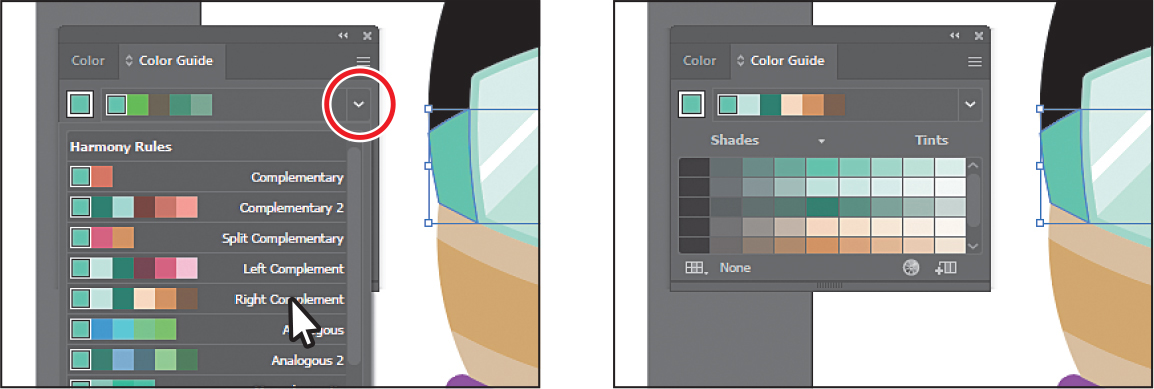
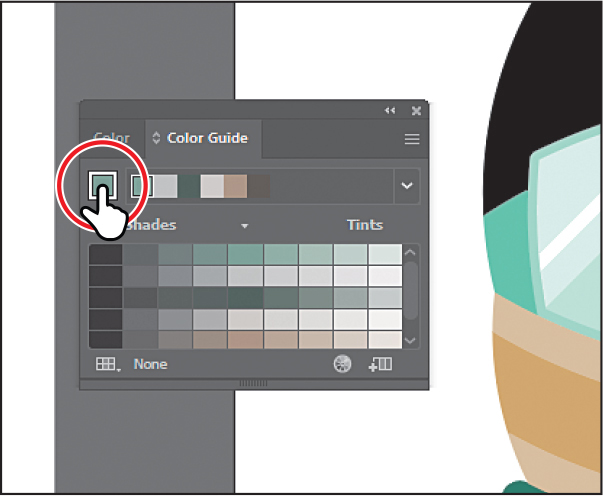
In the Color Guide panel, click the Set Base Color To The Current Color button (
 ) (circled in the figure).
The Color Guide panel suggests colors based on the color showing in the Set Base Color To The Current Color button. The colors you see in the Color Guide panel may differ from what you see in the figure. That’s okay.
Next, you’ll experiment with colors using harmony rules.
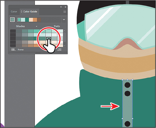
Choose Right Complement from the Harmony Rules menu (circled in the first part of the following figure) in the Color Guide panel.
TipYou can also choose a different color variation (different from the default Tints/Shades), such as Show Warm/Cool or Vivid/Muted, by clicking the Color Guide panel menu icon (
) and choosing one.A base group of colors is created to the right of the base color (green), and a series of tints and shades of those colors appears in the body of the panel. There are lots of harmony rules to choose from, each instantly generating a color scheme based on any color you want. The base color you set (green) is the basis for generating the colors in the color scheme.
Click the Save Color Group To Swatch Panel button (
 ) at the bottom of the Color Guide panel to save the base colors (the six colors at the top) in the Swatches panel as a group.
Choose Select > Deselect.
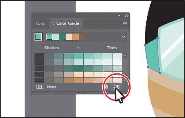
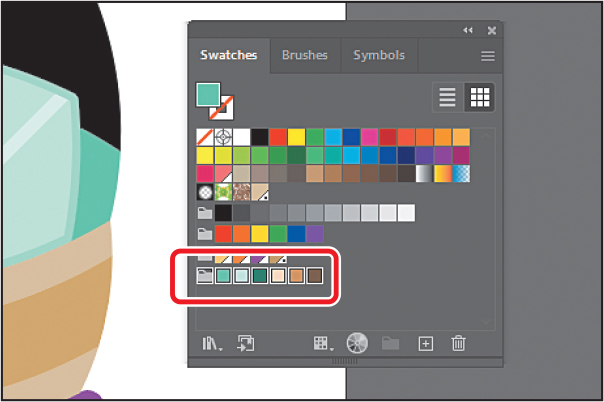
In the Swatches panel you should see the new group added. You may need to scroll down in the panel or drag the bottom of the panel down to make it taller.
Close the Swatches panel group.
Applying colors from the Color Guide panel
After creating colors with the Color Guide panel, you can either click a color in the Color Guide panel to apply it to selected artwork or apply colors you saved in the Swatches panel as a color group. Next, you’ll apply a color from the color group to the snowboarder artwork.
Click the purple jacket shape on the current artboard to select it.
Click a green color in the Color Guide panel to apply it.
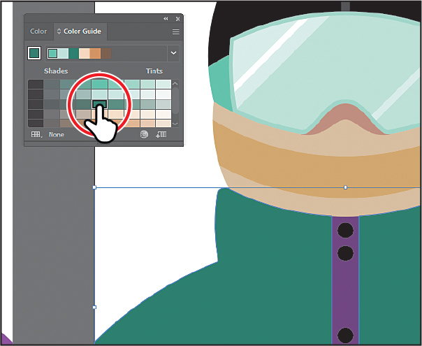
Select the center rectangle in the jacket with the black buttons on it. Click to apply a lighter green.
After selecting a color, it becomes the base color. If you were to click the base color (see the figure), but don’t, then the colors in the panel would be based on that color, using the Right Complement rule you set previously.
Close the Color Guide panel.
Choose File > Save.
Using Recolor Artwork to edit colors in artwork
You can edit colors in selected artwork using the Recolor Artwork command. It’s beneficial when global swatches weren’t used in the artwork. Without using global colors in your artwork, updating a series of colors may take a lot of time. Using Recolor Artwork, you can edit colors, change sample colors from other artwork or an image, change the number of colors, map an existing color to a new color, and do much more. Next, you’ll open a new document and get it ready.
Choose File > Open, and open the L8_start2.ai file in the Lessons > Lesson08 folder to open a new file to work with.
Choose File > Save As. If you see the Cloud Document dialog box, click Save On Your Computer (you most likely won’t since you already chose it the last time you saved a document).
In the Save As dialog box, navigate to the Lesson08 folder, and name the file Snowboards.ai. Leave Adobe Illustrator (ai) chosen from the Format menu (macOS) or Adobe Illustrator (*.AI) chosen from the Save As Type menu (Windows), and click Save.
In the Illustrator Options dialog box, leave the options at their default settings and then click OK.
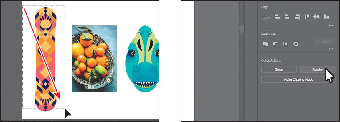
Choose 1 Snowboard Recolor from the Artboard Navigation menu in the lower-left corner of the Document window to fit the artboard in the window. You should see a brightly colored snowboard on the artboard, along with an image of some fruit and a dinosaur artwork.
Recoloring artwork
With the document open you can now recolor artwork using the Recolor Artwork dialog box.
Drag across the snowboard on the left to select the artwork.
With the snowboard artwork selected, click the Recolor button in the Properties panel to open the Recolor Artwork dialog box.
TipYou can also choose Edit > Edit Colors > Recolor Artwork.
The options in the Recolor Artwork dialog box allow you to edit, sample, or reduce the colors in your selected artwork and to save colors you create in groups.
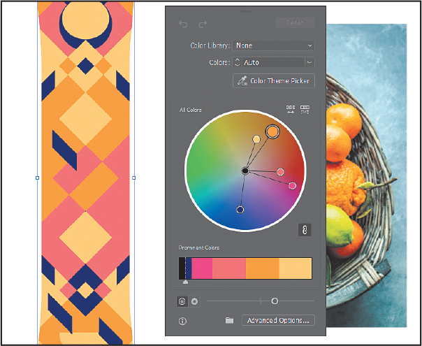
You’ll see a big color wheel in the middle of the dialog box. The colors in the selected snowboard artwork are each represented on the color wheel as circles, called markers. You can edit the colors individually or together visually by dragging or precisely by double-clicking using specific color values.
 Note
NoteThe Recolor Artwork dialog box will close if you click away from the selected artwork.
You can choose colors from a color library to change the number of colors in the selected artwork—maybe to make the artwork one single color with tints of that color applied.
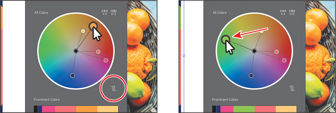
Make sure that the Link Harmony Colors icon is disabled so you can edit colors independently. The Link Harmony Colors icon should look like this:
 , not like this:
  . It’s circled in the following figure.
The lines between the color markers (circles) and the center of the color wheel are now dotted, telling you that you can edit them independently. If the Link Harmony Colors option were on and you edited one of the colors, the rest would change relative to your edited color.
Drag the largest orange marker (circle) into the green area to change the color.
NoteThe largest marker (circle) indicates the base color. If you were to pick a color harmony, like in the Color Guide panel as you did previously, the base color is what the resulting colors would be based on. You can set a color harmony after clicking the Advanced Options button at the bottom of the Recolor Artwork dialog box.
Know that if you make a mistake when editing the colors and want to start over, you can click the Reset button in the upper-right corner of the dialog box to reset the colors to their original values.
Double-click the now green marker (circle) to open the Color Picker. Change the color to something else, like a blue. Click OK.
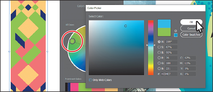
After clicking OK, notice that the marker has moved in the color wheel, and it’s the only one that moved. That’s because you unlinked the harmony colors before you started editing the color.
Sampling color
Next, you’ll see how to sample color from an image and vector artwork to apply that color to the snowboard.
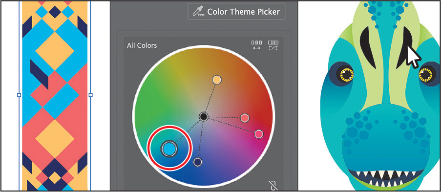
Click the Color Theme Picker button in the dialog box. The pointer becomes an eyedropper (
 ) that you can then click to sample color from a single raster image or vector art, for instance. You may want to drag the dialog box by the top so you can see the image of fruit and the dinosaur. Click in the image of the fruit to sample the colors from the entire image and apply them to the snowboard.
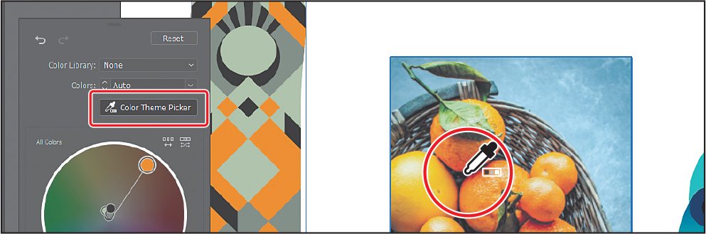
Click the dinosaur artwork to the right of the fruit image to sample the colors and apply it to the snowboard.
If you click a single vector object, like a shape, the color is sampled from that single object. If you click a group of objects, like the dinosaur head, the color is sampled from all of the objects within the group. With vector artwork that you sample color from, you can also select part of the artwork to sample color from. You don’t need to switch tools; simply drag a selection around to sample color within the selected area.
Drag around a smaller area of the dinosaur artwork to sample just those colors within the selection.
Depending on what color objects were within the selection area, your dinosaur may look different, and that’s okay.
To ensure that we all see the same colors in the snowboard art going forward, next you’ll click to sample the color from the dinosaur again.
Click the dinosaur artwork to the right of the fruit image again to sample the colors and apply it to the snowboard.
Click the Show Saturation And Hue On Color Wheel button toward the bottom to see brightness and hue on the color wheel (circled in the following figure).
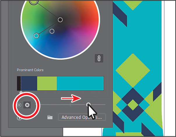
Drag the slider to the right to adjust the overall saturation. When you release, the colors will change.
The colors in the snowboard artwork are represented on the color wheel, but they are also shown in the Prominent Colors section below the color wheel. The size of the color areas in that bar is meant to give you an idea of how much area each color occupies in the artwork. In this case, the aqua color is more prominent, so it shows as larger in the Prominent Colors section.
TipProminent colors are colors that are more prominent in the artwork and are categorized based on the hue and shade of the color.
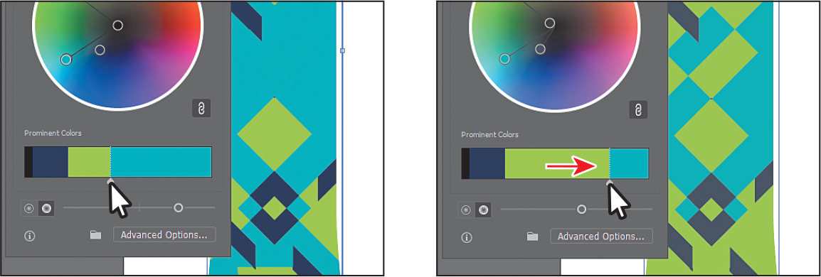
In the Prominent Colors section of the dialog box, move the pointer between the green color and the aqua color and a slider appears between them. Drag that slider to the right to make it wider. That means more of that color will be applied to the artwork as tints and shades.
As a last step, you’ll save the colors as a group in the Swatches panel.
Click the folder icon (
 ) at the bottom of the panel and choose Save Prominent Colors to save the prominent colors as a group in the Swatches panel.
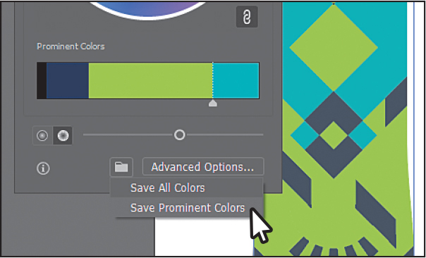
If the Swatches panel opens, you can close it.
Choose Select > Deselect and then choose File > Save.
Working with Live Paint
Live Paint lets you paint vector graphics intuitively by automatically detecting and correcting gaps that might otherwise affect the application of fills and strokes. Paths divide the drawing surface into areas that can be colored, whether the area is bounded by a single path or by segments of multiple paths. Painting objects with Live Paint is like coloring in a coloring book or using watercolors to paint a sketch. The underlying shapes are not edited.
![]() Note
Note
To learn more about Live Paint and all that it can do, search for “Live Paint groups” in Illustrator Help (Help > Illustrator Help).
Creating a Live Paint group
To start, you’ll make a change to snowboard artwork, and then turn it into a Live Paint group so you can edit the colors using the Live Paint Bucket tool (![]() ) .
) .
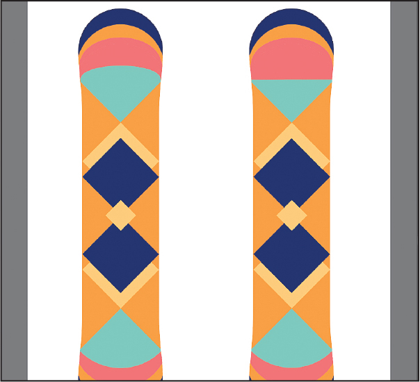
Choose 2 Snowboard Live Paint from the Artboard Navigation menu in the lower-left corner of the Document window.
You’ll work on the snowboard on the left—trying to match the snowboard on the right. You’ll start by copying a few shapes so you can color parts of the snowboard with different colors using Live Paint.
With the Selection tool selected, click one of the two dark blue diamonds in the snowboard on the left. Shift-click the other dark blue diamond to select both.
Select the Rotate tool (
 ) in the toolbar and Option-click (macOS) or Alt-click (Windows) the bottom point of the selected shapes, in the middle of the small orange triangle. The word “intersect” will most likely show. In the Rotate dialog box, change the Angle to 180 and click Copy.
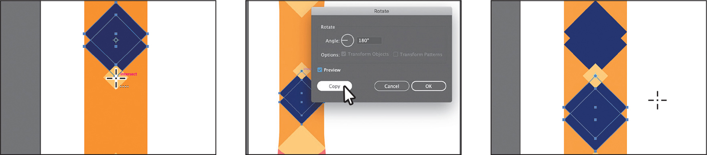
Select the Selection tool (
), and drag across all of the snowboard artwork on the left to select it.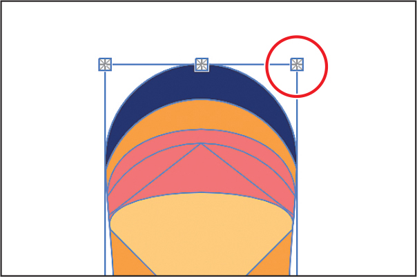 Tip
TipYou can convert selected artwork to a Live Paint group by clicking on it with the Live Paint Bucket tool selected. You’ll explore the Live Paint Bucket tool next.
Choose Object > Live Paint > Make.
The whole snowboard is now a Live Paint object. You can now see the points on the bounding box have changed (
 ). One of them is circled in the figure.
Painting with the Live Paint Bucket tool
With objects converted to a Live Paint group, you can paint them with the Live Paint Bucket tool using several methods, which is what you’ll do next.
Click Edit Toolbar (
 ) at the bottom of the toolbar. Scroll in the menu that appears, and drag the Live Paint Bucket tool (
 ) into the toolbar on the left to add it to the list of tools. Make sure it’s selected in the toolbar.
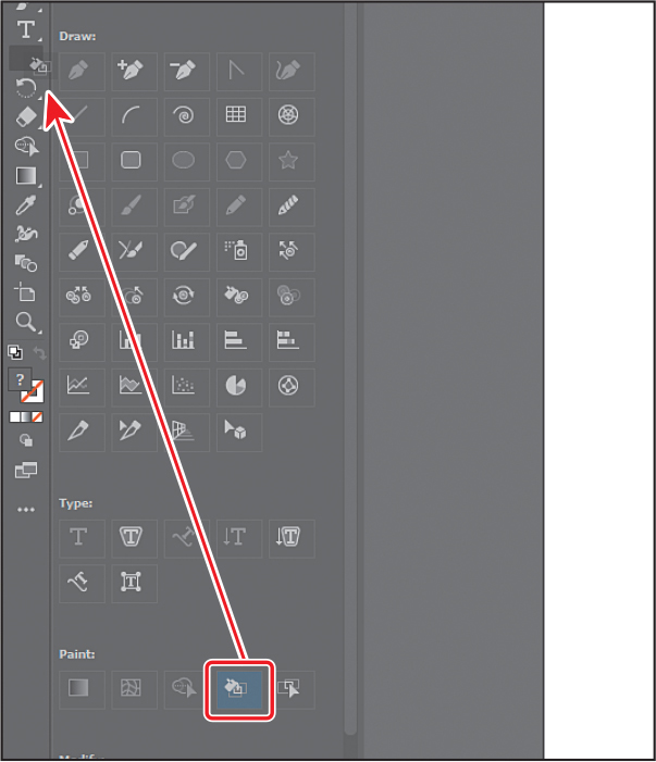 Note
NoteYou may want to press the Escape key to hide the extra tools menu.
Open the Swatches panel by choosing Window > Swatches.
NoteYou may want to drag the bottom of the Swatches panel down to see more colors.
You don’t have to have the Swatches panel open when working with the Live Paint Bucket tool. You can just select a color from the Fill color box in the Properties panel. It helps to have the Swatches panel open, so you can understand how color selection works with the tool.
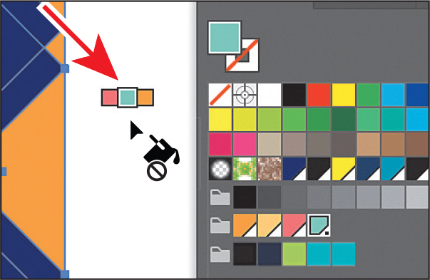
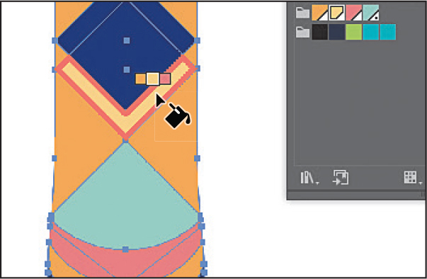
Select the light green color in one of the swatch groups, as you see in the figure.
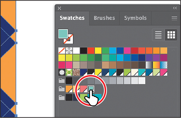
Move the pointer into an empty area of the artboard to see the three swatches above the pointer.
The three colors above the pointer represent the selected color (the middle, light green color), the color before it in the color group (the pink/red), and the color after it in the group (the orange).
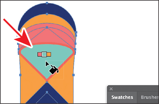
Click to apply the color to the area shown in the figure.
You just filled a face, which is an enclosed area. The color fills the area you click up to the path edges it finds.
Click to apply the color to the area shown in the figure.
You can select another color to paint with from the Swatches panel or you can work faster and switch to another color using the arrow keys.
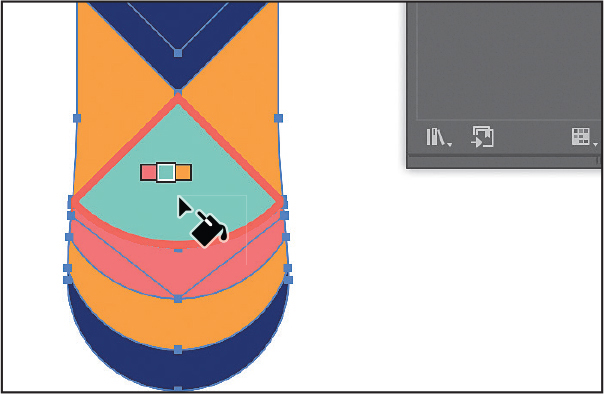
Press the Right Arrow key once to select the orange swatch, shown in the three swatches above the pointer.
Press the Right arrow key once more to select the lighter orange color in the Swatches panel group.
Click to apply the color to the area shown in the figure.
Click to apply the same color to the area shown in the figure.
Close the Swatches panel.
Choose Select > Deselect and then choose File > Save.
Modifying a Live Paint group
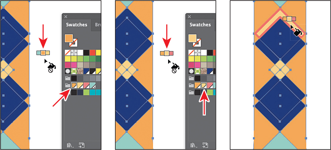
When you make a Live Paint group, each path remains editable. When you move or adjust a path, the colors that were previously applied don’t just stay where they were, as they do in natural media paintings or with image-editing software. Instead, the colors are automatically reapplied to the new regions that are formed by the intersecting paths. Next you’ll edit a path in the same Live Paint group.
Select the Selection tool (
). Double-click the snowboard on the left to enter Isolation mode.A Live Paint group is similar to a regular grouped object. The individual objects in the artwork are still accessible when you double-click to enter Isolation mode. When you enter Isolation mode, you can move, transform, add, or remove shapes as well.
Select the Direct Selection tool (
 ).
).Move the pointer over the path between the dark pink and light green at the top of the artboard. See the first part of the following figure.
Click the path. When the pointer changes (
 ), drag the path down.
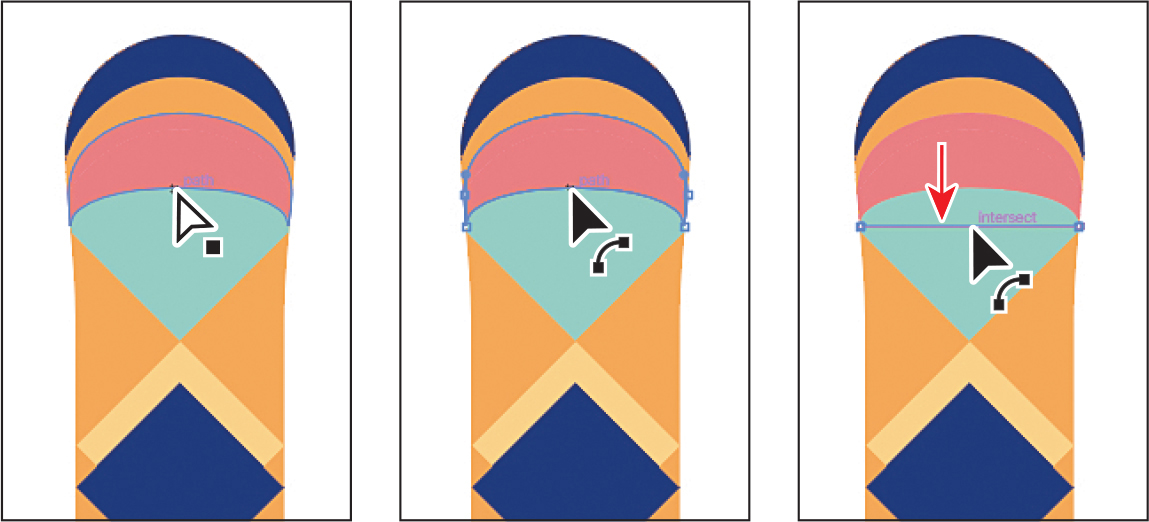
Press the Escape key to exit Isolation mode.
Choose Select > Deselect.
Choose View > Fit Artboard In Window.
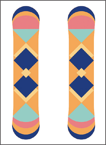
Choose File > Save and then choose File > Close as many times as necessary to close all open files.
Review answers
1 A global color is a color swatch that, when you edit it, automatically updates all artwork to which it is applied. All spot colors are global; however, process colors you save as swatches are global by default, but they can be either global or non-global.
2 You can save a color for painting other objects in your artwork by adding it to the Swatches panel by doing one of the following:
Drag the color from a Fill box, and drop it over the Swatches panel.
Click the New Swatch button (
 ) at the bottom of the Swatches panel.
Choose New Swatch from the Swatches panel menu (
).Choose Create New Swatch from the Color panel menu (
).
3 A tint is a lighter version of a color. You can create a tint from a global process color, like CMYK, or from a spot color.
4 You can choose color harmonies from the Color Guide panel. Color harmonies are used to generate a color scheme based on a single color.
5 You use the Recolor Artwork dialog box to change the colors used in selected artwork, create and edit color groups, or reassign or reduce the colors in your artwork, among other functions.
6 Live Paint lets you paint vector graphics intuitively by automatically detecting and correcting gaps that might otherwise affect the application of fills and strokes. Paths divide the drawing surface into areas, any of which can be colored, regardless of whether the area is bounded by a single path or by segments of multiple paths.