11. Gradients, Blends, and Patterns
Lesson overview
In this lesson, you’ll learn how to do the following:
Create and save a gradient fill.
Apply and edit a gradient on a stroke.
Apply and edit a radial gradient.
Adjust the direction of a gradient.
Adjust the opacity of color in a gradient.
Create and edit freeform gradients.
Blend the shapes of objects in intermediate steps.
Create smooth color blends between objects.
Modify a blend and its path, shape, and color.
Create and paint with patterns.

This lesson will take about 60 minutes to complete. To get the lesson files used in this chapter, download them from the web page for this book at adobepress.com/IllustratorCIB2022. For more information, see “Accessing the lesson files and Web Edition” in the Getting Started section at the beginning of this book.
To add depth and interest to your artwork in Illustrator, you can apply gradient fills, which are graduated blends of two or more colors, patterns, or shapes. In this lesson, you’ll explore how to work with each of these to complete several projects.
Starting the lesson
In this lesson, you’ll explore various ways to work with gradients, blend shapes and colors, and create and apply patterns. Before you begin, you’ll restore the default preferences for Adobe Illustrator. Then you’ll open a finished art file for the first part of the lesson to see what you’ll create.
To ensure that the tools function and the defaults are set exactly as described in this lesson, delete or deactivate (by renaming) the Adobe Illustrator preferences file. See “Restoring default preferences” in the “Getting Started” section at the beginning of the book.
 Note
NoteIf you have not already downloaded the project files for this lesson to your computer from your Account page, make sure to do so now. See the “Getting Started” section at the beginning of the book.
Start Adobe Illustrator.
Choose File > Open, and open the L11_end1.ai file in the Lessons > Lesson11 folder on your hard disk.
NoteFor more information on activating fonts, visit helpx.adobe.com/creative-cloud/help/add-fonts.html.
In the Missing Fonts dialog box, ensure that each font is selected (the checkbox to the right of each font name), and click Activate Fonts. After some time, the font(s) should be activated, and you should see a success message in the Missing Fonts dialog box. Click Close.
Choose View > Fit All In Window. If you don’t want to leave the document open as you work, choose File > Close. To begin working, you’ll open an art file that you need to finish.
Choose File > Open. In the Open dialog box, navigate to the Lessons > Lesson11 folder, and select the L11_start1.ai file on your hard disk. Click Open to open the file.
Choose View > Fit All In Window.
Choose File > Save As. If the Cloud Document dialog box opens, click Save On Your Computer.
In the Save As dialog box, name the file FoodTruck.ai, and select the Lessons > Lesson11 folder in the Save As menu. Leave Adobe Illustrator (ai) chosen from the Format menu (macOS) or Adobe Illustrator (*.AI) chosen from the Save As Type menu (Windows), and then click Save.
In the Illustrator Options dialog box, leave the Illustrator options at their default settings, and then click OK.
NoteIf you don’t see Reset Essentials in the workspace switcher menu, choose Window > Workspace > Essentials before choosing Window > Workspace > Reset Essentials.
Choose Reset Essentials from the workspace switcher in the Application bar.
Working with gradients
A gradient fill is a graduated blend of two or more colors, and it always includes a starting color and an ending color. You can create three different types of gradient fills in Illustrator. At their simplest, here they are described:
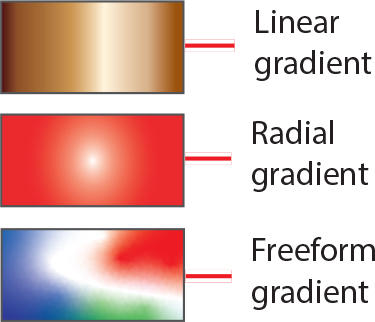
Linear—One color blends into another color along a line.
Radial—A beginning color radiates outward, from the center point to an ending color.
Freeform—A graduated blend of color stops within a shape in an ordered or random sequence that gives the blending a smooth appearance, like natural color.
You can use gradients provided with Adobe Illustrator or create your gradients and save them as swatches for later use (except for freeform gradients). You can create blends between colors, add volume, or add a light and shadow effect to your artwork using gradients. As you go through this lesson, you’ll see examples of each type of gradient and understand why you use each.
![]() Note
Note
If you opened the Gradient panel, what you see won’t match the figure, and that’s okay.
You can apply, create, and modify gradients with the Gradient panel (Window > Gradient) or the Gradient tool (![]() ) in the toolbar. In the Gradient panel, the Gradient Fill box or Stroke box displays the current gradient colors and gradient type applied to the fill or stroke of an object.
) in the toolbar. In the Gradient panel, the Gradient Fill box or Stroke box displays the current gradient colors and gradient type applied to the fill or stroke of an object.
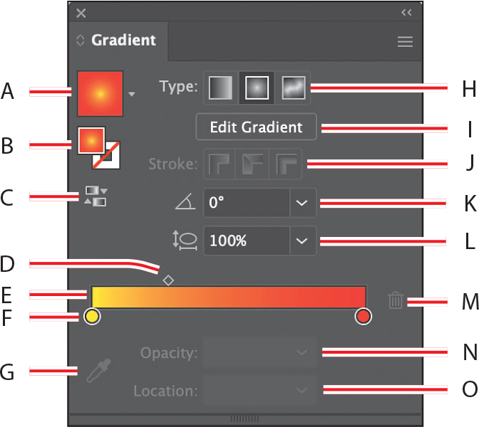
A. Gradient
B. Fill box/Stroke box
C. Reverse gradient
D. Gradient midpoint
E. Gradient slider (the color bar)
F. Color stop (the circle)
G. Color Picker
H. Gradient type
I. Edit Gradient
J. Stroke gradient type
K. Angle
L. Aspect ratio
M. Delete stop
N. Opacity
O. Location
In the Gradient panel under the gradient slider (labeled “E” in the previous figure), the leftmost gradient stop (labeled “F”) is called a color stop. This marks the starting color; the right gradient stop (the orange circle to the far right) marks the ending color. A color stop is the point at which a gradient completely changes from one color to the next. Between the color stops, the color is blending or transitioning from one color to another. You can add more color stops by clicking below the gradient slider. Double-clicking a color stop opens a panel where you can choose a color from swatches or color sliders.
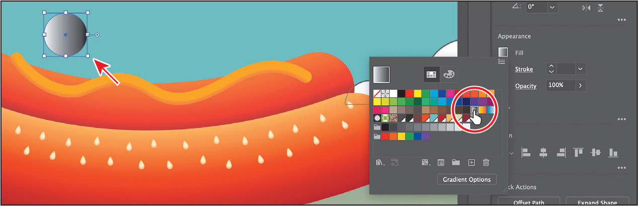
Applying a linear gradient to a fill
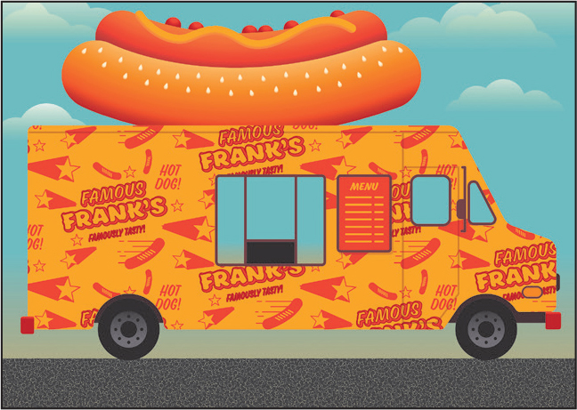
A starting color blends into an ending color along a straight line with the simplest two-color linear gradient. To begin the lesson, you’ll apply a gradient fill that comes with Illustrator to the brown background shape to give the idea of a sunset.
With the Selection tool (
 ) selected, click the brown rectangle in the background, behind the food truck.
Click the Fill box (
 ) in the Properties panel, click the Swatches button (
 ), and select the gradient swatch named “White, Black.” Leave the swatches showing. The figure shows right before clicking.
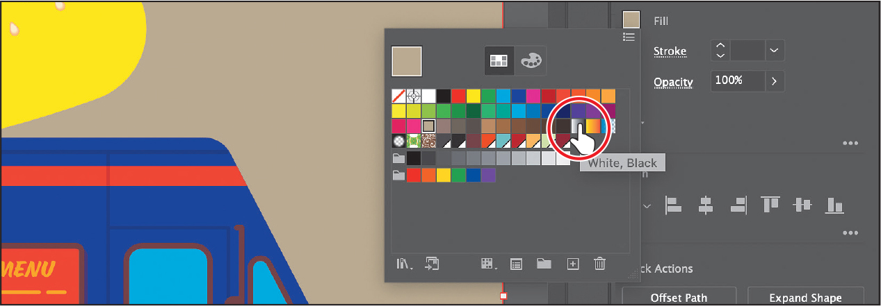
The default black-and-white gradient is applied to the fill of the selected shape.
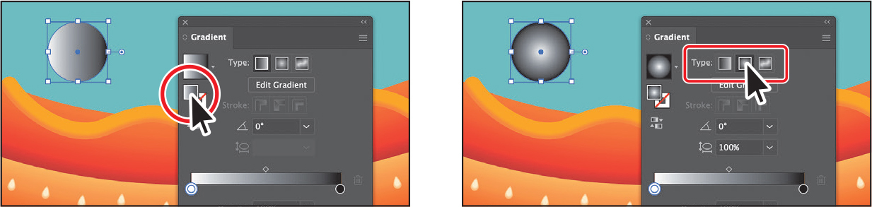
Editing a gradient
Next, you’ll edit the colors in the default black-and-white gradient you applied.
With the swatches panel still showing (click Fill color if it’s not still showing), click the Gradient Options button at the bottom of the panel to open the Gradient panel (Window > Gradient), and perform the following in the Gradient panel:
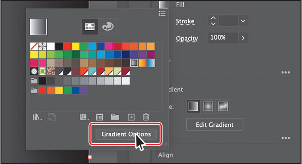
Make sure that the Fill box is still selected (circled in the following figure) so that you edit the fill color and not the stroke color.
Double-click the black color stop on the right side of the gradient slider (an arrow is pointing to it in the figure) to edit the color in the Gradient panel. In the panel that appears, click the Color button (
 ) to open a color panel.
Click the menu icon (
 ), and choose CMYK from the menu, if CMYK values aren’t showing.
 Tip
TipTo move between text fields, press the Tab key. Press Enter or Return to apply the last value typed.
Change the CMYK values to C=0, M=49, Y=100, and K=0 to make an orange. Press Return or Enter after entering the last value.

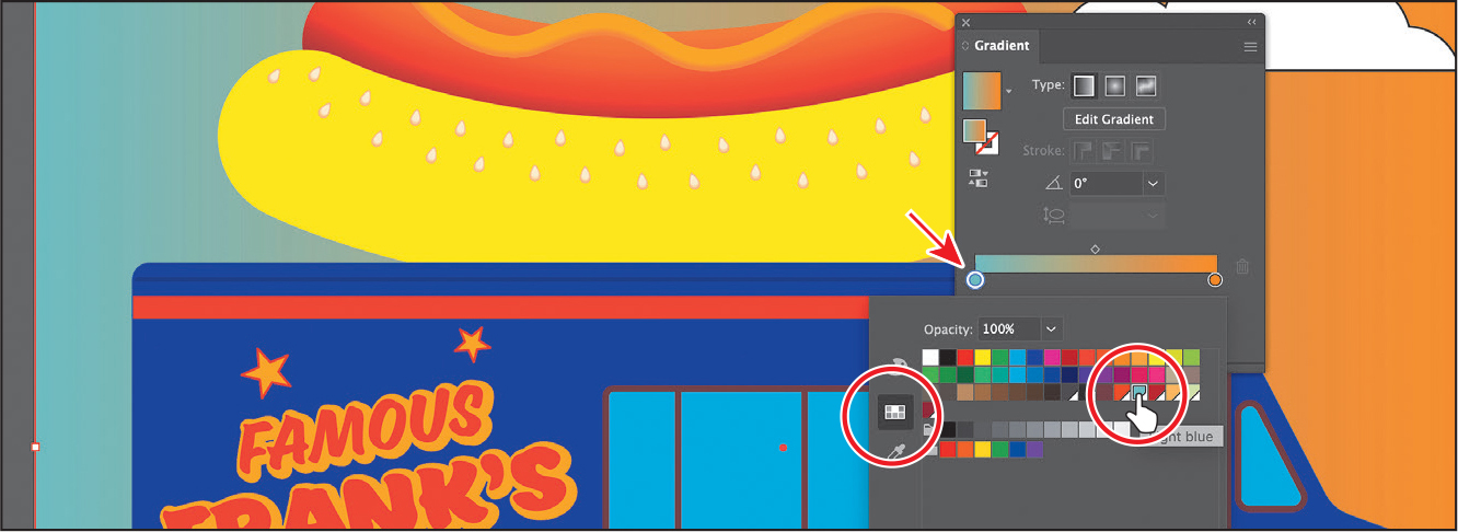
Double-click the white, leftmost white gradient stop to select the starting color of the gradient (an arrow is pointing to it in the following figure).
Click the Swatches button (
 ) in the panel that appears.
Click to select the blue swatch named “Light blue.”
Saving a gradient as a swatch
Next, you’ll save the gradient as a swatch in the Swatches panel. Saving a gradient is a great way to be able to apply it to other artwork easily and maintain consistency in the gradient appearance across artwork.
In the Gradient panel, click the Gradient menu arrow (
 ) to the left of the word “Type,” and click the Add To Swatches button (
 ) at the bottom of the panel that appears.
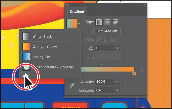 Tip
TipYou can also save a gradient by selecting an object with a gradient fill or stroke, clicking the Fill box or Stroke box in the Swatches panel (whichever the gradient is applied to), and then clicking the New Swatch button (
 ) at the bottom of the Swatches panel.
The Gradient menu you saw lists all the default and saved gradients that you can apply.
Click the X at the top of the Gradient panel to close it.
With the background rectangle still selected, click the Fill box in the Properties panel. With the Swatches option (
) selected, double-click the “New Gradient Swatch 1” thumbnail to open the Swatch Options dialog box.
In the Swatch Options dialog box, type Background in the Swatch Name field, and then click OK.
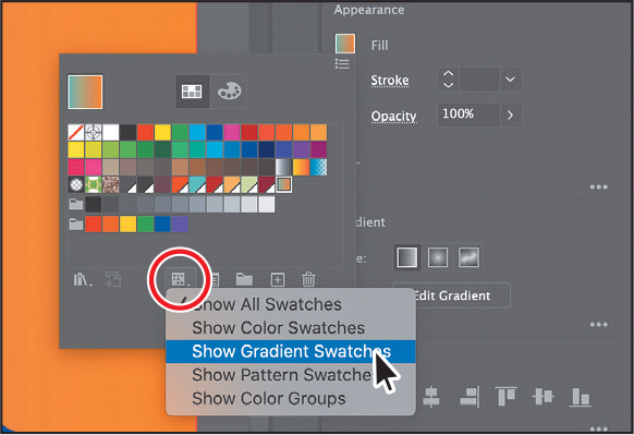
Click the Show Swatch Kinds Menu button (
 ) at the bottom of the Swatches panel, and choose Show Gradient Swatches from the menu to display only gradient swatches in the Swatches panel.
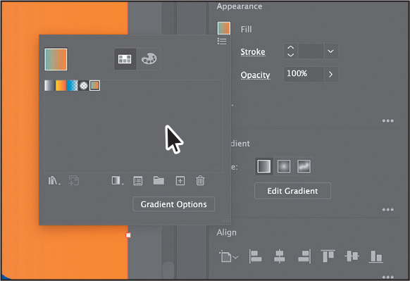
The Swatches panel lets you sort colors based on type, like gradient swatches.
With the shape still selected on the artboard, apply some of the different gradients to the shape fill by selecting them in the Swatches panel.
Click the gradient named “Background” (the one you just saved) in the Swatches panel to make sure it’s applied.
Click the Show Swatch Kinds Menu button (
 ) at the bottom of the Swatches panel, and choose Show All Swatches from the menu.
Save the file by choosing File > Save, and leave the shape selected.
Adjusting a linear gradient fill
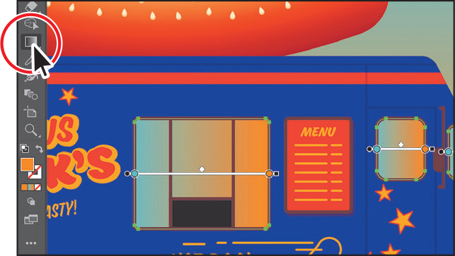
Once you have applied a gradient to the fill of artwork, you can adjust the gradient’s direction, origin, and beginning and endpoints using the Gradient tool. Now you’ll adjust the gradient fill in the selected shape so the colors follow the sunset.
With the Selection tool (
) selected, double-click the rectangle to isolate it.This is a great way to enter Isolation mode for a single shape so you can focus on it without the other content (in this case) on top of it.
Click the Edit Gradient button in the Properties panel.
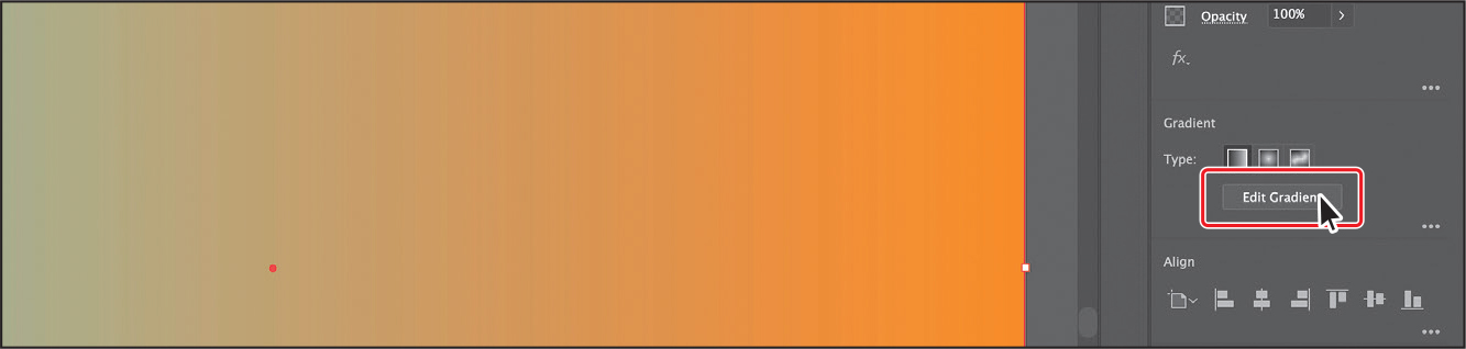
Clicking the Edit Gradient button selects the Gradient tool (
 ) in the toolbar and enters gradient editing mode. With the Gradient tool, you can apply a gradient to an object’s fill or edit an existing gradient fill.
Notice the horizontal gradient slider in the middle of the artwork, like the one found in the Gradient panel. The slider is called the gradient annotator. The gradient annotator is a slider that indicates the direction and length of the gradient. You can use the gradient annotator on the art to edit the gradient without opening the Gradient panel. The two-color circles on either end represent the color stops. The tiny circle on the left shows the starting point of the gradient, and the tiny square on the right is the ending point. The diamond you see in the middle of the annotator is the midpoint of the gradient.
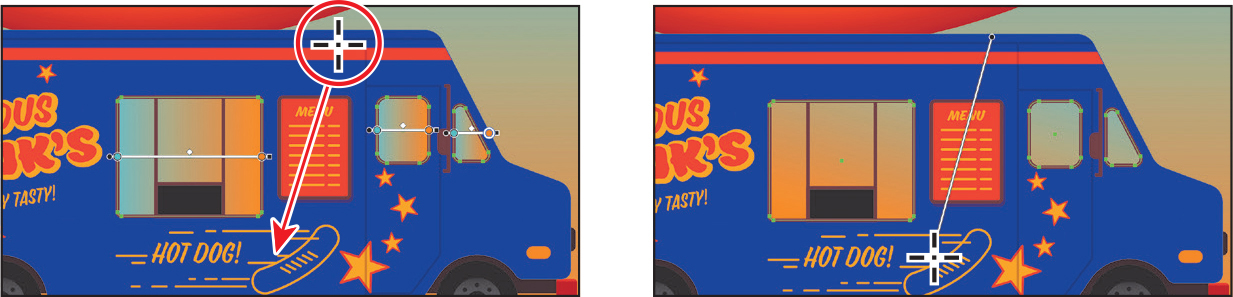
With the Gradient tool selected, drag from the top of the shape down to the bottom of the shape to change the position and direction of the starting and ending colors of the gradient.
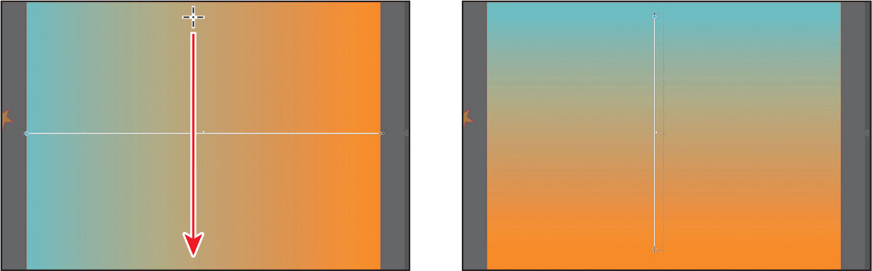
Where you begin dragging is where the first color starts, and where you end is where the last color stops. As you drag, you see a live preview of the gradient as it’s adjusted in the object.
With the Gradient tool, move the pointer just off the bottom of the small black square at the bottom of the gradient annotator. A rotation icon (
 ) appears. Drag to the right to rotate the gradient in the rectangle, and then release the mouse button.
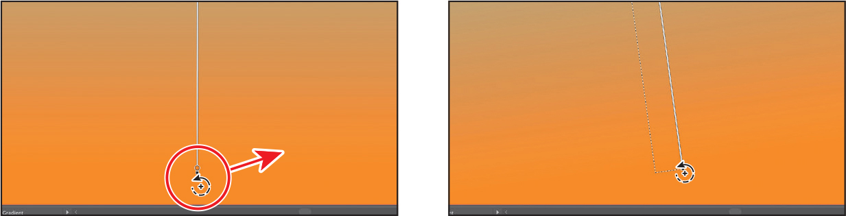
Double-click the Gradient tool in the toolbar to open the Gradient panel (if it isn’t already open).
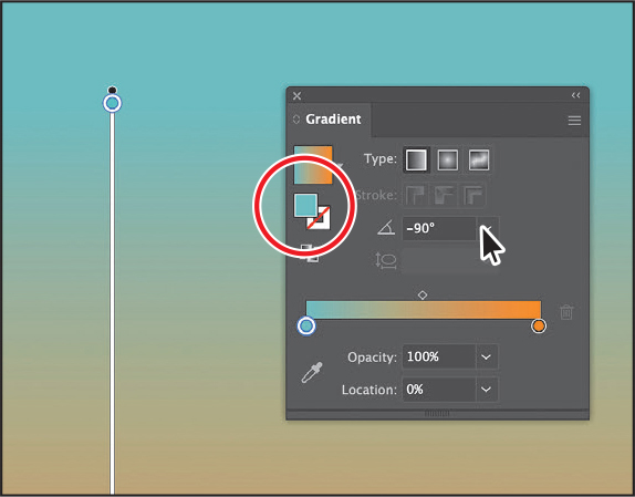
Make sure that the Fill box is selected in the panel (circled in the figure) so you can edit the gradient applied to the fill, and then change the Angle value to —90 by typing in the value. Press Return or Enter.
Make sure the gradient shows blue on top and orange at the bottom.
Choose Object > Lock > Selection to lock the shape (so you don’t accidentally move it later) and to make selecting other artwork easier.
Select the Selection tool, and press the Escape key to exit Isolation mode.
You should be able to select other artwork again.
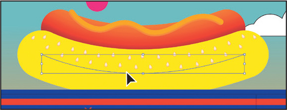
Applying a linear gradient to a stroke
You can also apply a gradient blend to the stroke of an object. Unlike with a gradient applied to the fill of an object, you cannot use the Gradient tool to edit a gradient on the stroke of an object. However, a gradient on a stroke has more options available in the Gradient panel than does a gradient fill. Next, you’ll add colors to a stroke to give a hot dog bun a three-dimensional appearance.
With the Selection tool (
) selected, click in the center of the yellow path sitting on top of the truck to select that path.The yellow object looks like a shape, but it’s actually a path with a large stroke. That’s why you need to select it from the center of the path and not just anywhere in the yellow fill.
 Note
NoteAfter clicking the Stroke box in the toolbar, the Color panel group may open. If it does, you can close it.
Click the Stroke box at the bottom of the toolbar on the left, and click the Gradient box below the Stroke box in the toolbar to apply the last used gradient for the current session.
Editing a gradient on a stroke
For a gradient applied to a stroke, you can choose different alignments on the stroke: within, along, or across. In this section, you’ll explore how to align a gradient to the stroke and edit the gradient’s colors.
In the Gradient panel (Window > Gradient), make sure the Stroke box is selected (an arrow is pointing to it in the figure) so you can edit the gradient applied to the stroke. Leave Type as Linear Gradient (circled in the figure), and click the Apply Gradient Across Stroke button (
 ) to change the gradient type.
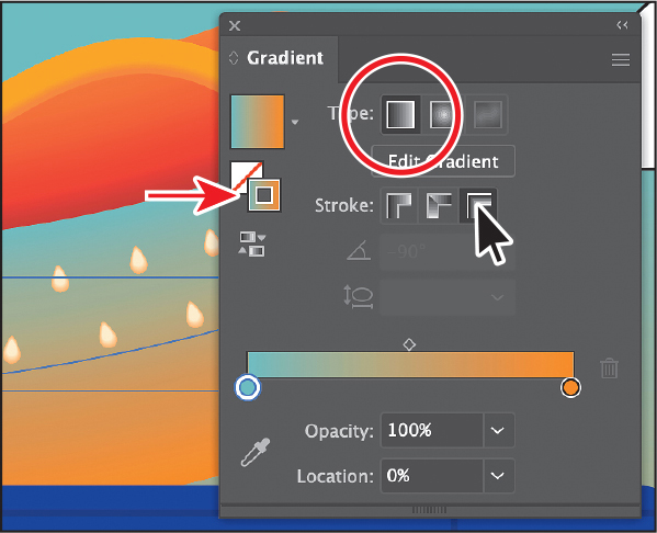 Note
NoteYou can apply a gradient to a stroke in three ways: within a stroke (default) (
 ), along a stroke (
 ), and across a stroke (
 ).
).With this type of path, aligning the gradient across the stroke can give the path a three-dimensional appearance.
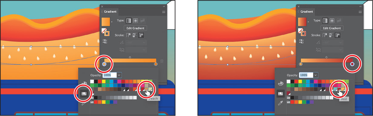
Double-click the blue color stop, and with the Swatches option selected, select the swatch named Peach to apply it.
Double-click the orange color stop on the right, and with the Swatches option selected, select the swatch named “Red” to apply it.
Move the pointer below the gradient slider, between the two color stops, in the Gradient panel. When the pointer with a plus sign (
 ) appears, click to add another color stop, as you see in the first part of the following figure.
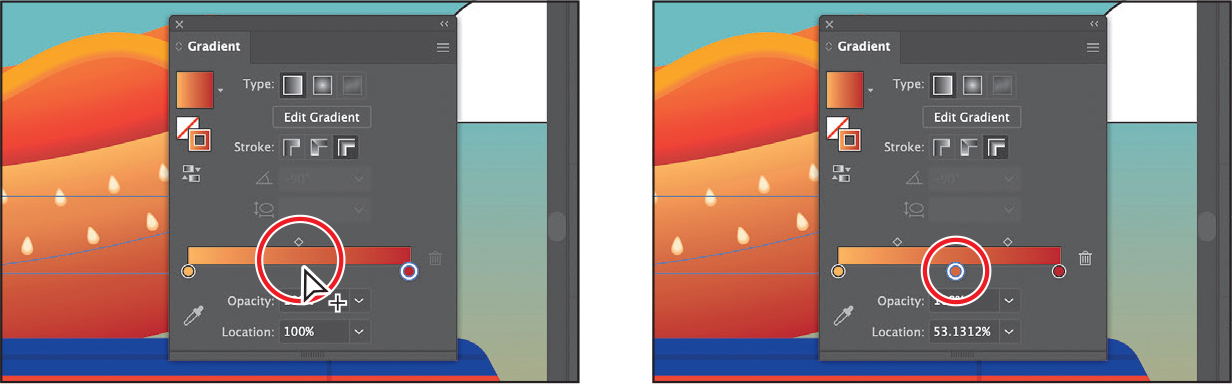
Double-click that new color stop and, with the swatches selected (
 ), click the swatch named “Orange red.”
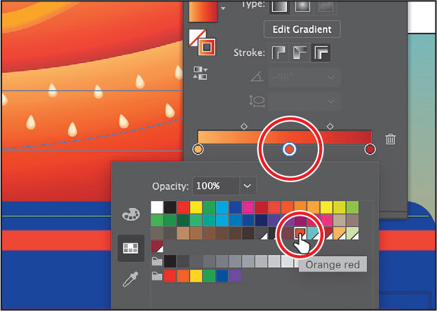
Press the Escape key to hide the swatches and return to the Gradient panel.
With the color stop still selected (you can tell it’s selected because it has a highlight around it), choose 50% from the Location menu.

The color is now exactly halfway between the other colors in the gradient. You could have also dragged the color stop along the gradient slider to change the Location value.
Next you’ll add a new color to the gradient by dragging to create a copy of a color stop in the Gradient panel.
TipWhen copying a color stop by pressing Option or Alt, if you release the mouse button on top of another color stop, you’ll swap the two color stops instead of creating a duplicate.
Pressing the Option (macOS) or Alt (Windows) key, drag the peach color stop on the far left end to the right; release the mouse button when you see roughly 70% in the Location value, and then release the modifier key.
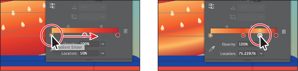
Looking at the hot dog, the color you just added isn’t necessary, so you’ll remove it.
Drag the new color stop at 70% down, away from the gradient slider. When you see that it’s gone from the slider, release the mouse button to remove it.
Click the X at the top of the Gradient panel to close it.
Applying a radial gradient to artwork
With a radial gradient, the starting color (leftmost color stop) defines the center point of the fill, which radiates outward to the ending color (rightmost color stop). Radial gradients help give elliptical shapes a circular type of gradient. Next, you’ll create and apply a radial gradient fill to the pink circle above the hot dog to make ketchup.
With the Selection tool (
) selected, click the pink circle above the hot dog.Click the Fill box in the Properties panel, and change the fill color to the White, Black gradient.
Click the Gradient Options button at the bottom of the Swatches panel to open the Gradient panel.
Click the Fill box in the Gradient panel to edit the fill and not the stroke. See the first part of the following figure.
Click the Radial Gradient button to convert the linear gradient to a radial gradient.
Choose File > Save.
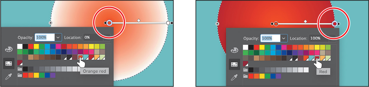
Editing the colors in the radial gradient
Previously in this lesson, you edited gradient colors in the Gradient panel. You can also edit the colors directly on artwork with the Gradient tool, which you’ll do next.
Select the Gradient tool (
) in the toolbar.In the Gradient panel, with the circle still selected, click the Reverse Gradient button (
 ) to swap the white and black colors in the gradient.
To zoom in to the circle, press Command and + (macOS) or Ctrl and + (Windows) a few times.

Notice that the gradient annotator starts from the center of the shape and points to the right on the circle. If you move the pointer over the gradient slider, a dashed circle around the gradient annotator indicates that it’s a radial gradient. You can set additional options for radial gradients, as you’ll soon see.
Move the pointer over the gradient annotator in the ellipse, and double-click the black color stop in the center of the ellipse to edit the color (it’s circled in the following figure). In the panel that appears, click the Swatches button (
), if it’s not already selected. Select the swatch named “Orange red.”Press Escape to hide the Swatches panel.
Double-click the white color stop on the circle. In the panel that appears, make sure that the Swatches option is selected, and select the swatch named “Red.”
Press the Escape key to hide the panel.
Choose File > Save.
Adjusting the radial gradient
Next, you’ll move the gradient within the circle and adjust the size to make the circle look more three-dimensional by changing the aspect ratio, radius, and origin of the radial gradient.
With the Gradient tool (
) selected in the toolbar and the circle still selected, move the pointer in the upper-right part of the circle (see the first part of the following figure). Drag toward the center of the circle to change the gradient in the circle.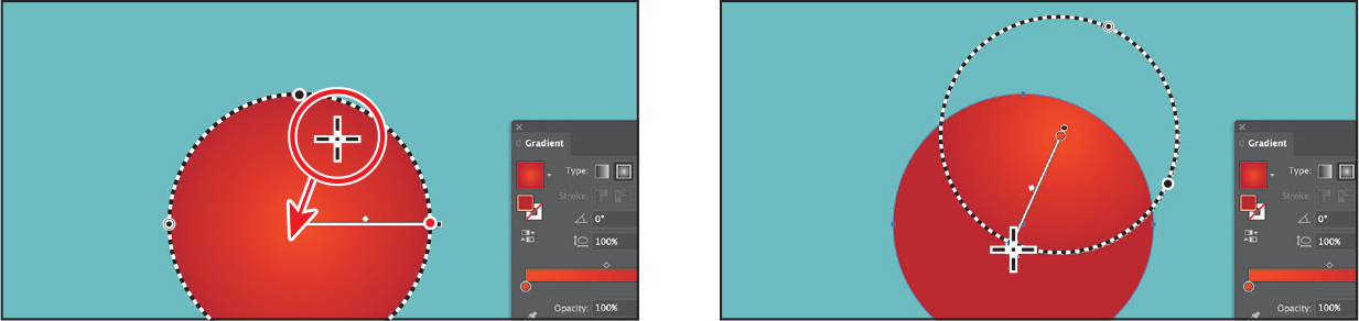
Move the pointer over the gradient annotator on the artwork so you can see the dashed ring around the gradient.
You can rotate this ring to change the angle of the radial gradient. The black point on the ring (
 ) is for changing the shape of the ring (called the aspect ratio), and the double-circle point (
 ) is for changing the size of the gradient (called the spread).
Move the pointer over the double-circle on the dashed circle (
) (see the first part of the following figure). When the pointer changes ( ), drag toward the center of the circle a little. Release the mouse button to make the gradient smaller.
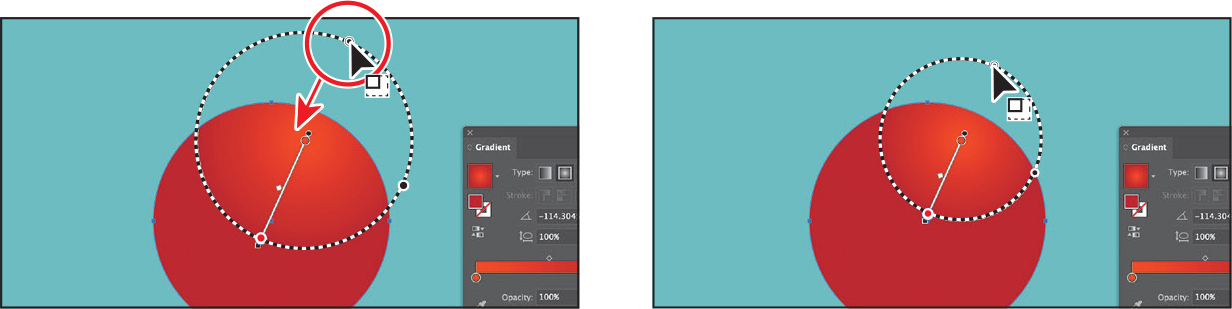
Move the pointer over the black circle (
) on the dashed ring. When the pointer changes ( ), drag to make the gradient wider. Leave the Gradient panel open.
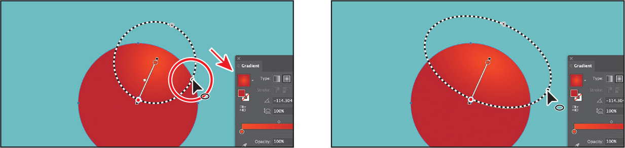
In the Gradient panel, you just changed the aspect ratio (
 ) by dragging the black circle. The aspect ratio changes a radial gradient into an elliptical gradient and makes the gradient better match the shape of the artwork. Note
As the aspect ratio gets smaller, the ellipse flattens and widens.
Select the Selection tool (
), and Shift-drag the corner of the circle to make it about half its size. Drag it onto the top of the hot dog.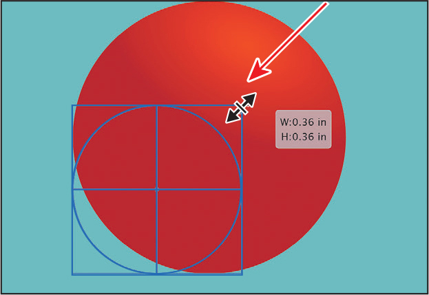
Make copies by Option-dragging (macOS) or Alt-dragging (Windows) the circle as many times as you want to make the ketchup on the hot dog. You may need to zoom out and pan.
Choose Select > Deselect, and then choose File > Save.
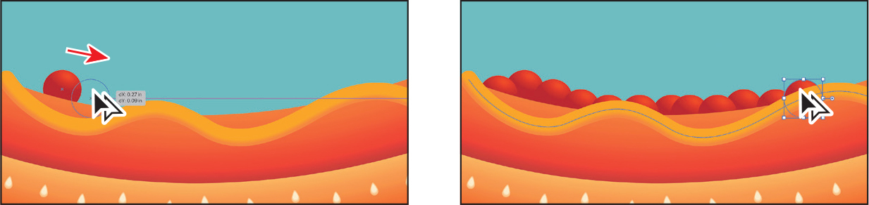
Applying gradients to multiple objects
You can apply a gradient to multiple objects by selecting all the objects, applying a gradient color, and then dragging across the objects with the Gradient tool.
Now you’ll apply a linear gradient fill to the windows of the food truck.
Choose View > Fit Artboard In Window.
With the Selection tool (
) selected, click one of the blue windows on the truck. Shift-click the other two to select all three windows.Click the Fill box in the Properties panel. In the panel that appears, make sure the Swatches button (
) is selected, and select the Background gradient swatch.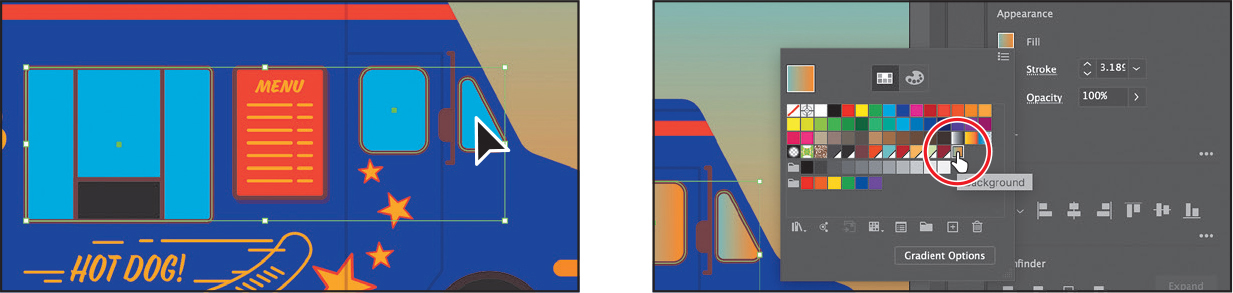
Select the Gradient tool (
) in the toolbar.You can see that every object now has the gradient fill applied separately. With the Gradient tool selected, you can see that each object has its own annotator bar.
Looking at the following figure for guidance, start from a point above the windows, and drag across the middle of the area they occupy.
Dragging across multiple shapes with the Gradient tool allows you to apply a gradient across those shapes.
Adding transparency to gradients
By specifying varying opacity values for the different color stops in your gradient, you can create gradients that fade in or out and that show or hide underlying artwork. Next, you’ll apply a gradient that fades to transparent in a cloud shape.
Select the Selection tool (
), and click to select the white cloud in the design.In the Gradient panel, ensure that the white Fill box is selected so you are editing the fill and not the stroke.
Click the Gradient menu arrow (
), and then select White, Black to apply the generic gradient to the fill (you might need to scroll up in the menu to see it).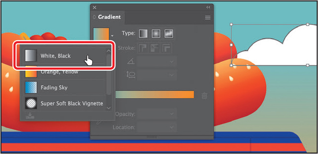
Select the Gradient tool (
 ) in the toolbar, and drag from just above the cloud down to the bottom edge at a slight angle.
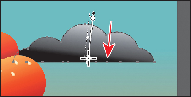
With the pointer over the shape, double-click the black color stop at the bottom. Make sure the Swatches button (
) is selected, and then select the light sage color named “Cloud” from the swatches. Choose 0% from the Opacity menu. Press Return or Enter to hide the swatches.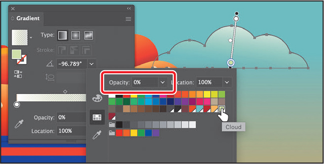
The color is completely transparent at the end of the gradient, but you’ll see the Cloud color in the gradient through the cloud.
Drag the bottom color stop up to shorten the gradient a little.
Select the Selection tool (
), and set the stroke weight in the Properties panel to 0 to remove it.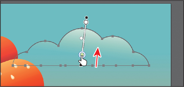
Make a series of cloud copies by Option-dragging (macOS) or Alt-dragging (Windows) the cloud a few times, and drag them around the sky.
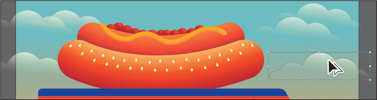
Choose File > Save.
Applying a freeform gradient
Aside from creating linear and radial gradients, you can also create freeform gradients. Freeform gradients are made of a series of color stops that you can place anywhere within a shape randomly or as a path. The colors blend between the color stops to create a freeform gradient. Freeform gradients help add color blends that follow the contour of a shape, adding more realistic shading and more to artwork. Next, you’ll apply a freeform gradient to the truck.
Select the Selection tool (
), and click to select the purple/blue truck shape.Select the Gradient tool (
) in the toolbar.Click the Freeform Gradient option (
 ) in the Properties panel on the right. Note
By default, Illustrator chooses color from surrounding artwork. This is because the preference Illustrator > Preferences > General > Enable Content Aware Defaults (macOS) or Edit > Preferences > General > Enable Content Aware Defaults (Windows) is on by default. You can deselect this option to create your own color stops.
Ensure that the Points option is selected in the Gradient section of the Properties panel (an arrow is pointing to it in the figure).
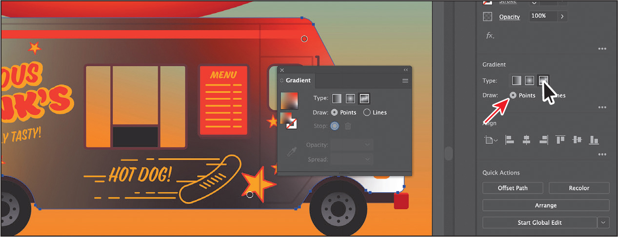
By default, a freeform gradient is applied in Points mode. Illustrator automatically adds individual solid color stops to the object with colors that blend into each other. The number of color stops Illustrator automatically adds depends on the shape and surrounding artwork. The color for each stop and the number of stops you see may not be the same as what is shown in the figures, and that’s okay.
Editing a freeform gradient in Points mode
You can add, move, edit, or delete the color stops independently to change the overall gradient with Points mode selected. In this section, you’ll edit the default individual color stops in the freeform gradient.
Double-click the color stop you see in the figure to show the color options. With the swatches showing, select the Freeform-Red swatch to apply it.
With each color stop, you can drag it, double-click to edit its color, and more.
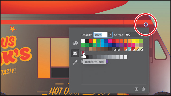
Drag the Freeform-Red color stop to the spot you see in the figure. You can see that the gradient blending changes as you drag it.
Next you’ll remove a few color stops, as well as edit and move color stops.
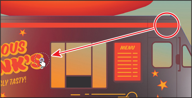
Click the color stop near the upper-left corner. Mine is light blue, but yours may be a different color. Press Delete or Backspace to remove it. If you see a color stop near the lower-left corner of the truck shape, select it and delete it as well. Notice how the gradient changes.

Double-click the color stop at the front of the truck (mine is white), and change the color to the Freeform-Red swatch.
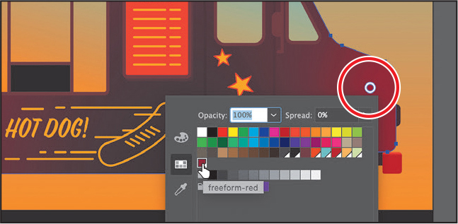
Double-click the color stop near the bottom middle of the truck and change the color to the swatch named, “Orange red.” Press the Escape key to hide the swatches.
 Note
NoteIf you don’t see a color stop where you see one in the figure, you can click in that area to add one.
The orange red color of the color stop you just edited needs to be more spread out. To do that, you can adjust the spread of the color.
Move the pointer over the orange red color stop you just changed the color for. When you see the dotted circle appear, drag the widget at the bottom of the circle away from the color stop.

The color from that stop will “spread” farther away from the color stop.
Applying color stops in Lines mode
You can also add multiple solid colors that blend along a line in Lines mode. In this section, you’ll add more color to the truck using Lines mode.
Click near the top middle part of the truck to add a new color stop.
NoteThe first part of the following figure shows a white color stop added. Yours may be a different color, and that’s okay.
Double-click the new color, and change the color to an orange swatch.

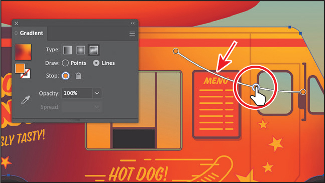
In the Gradient panel or Properties panel, select Lines to be able to draw a gradient along a path.
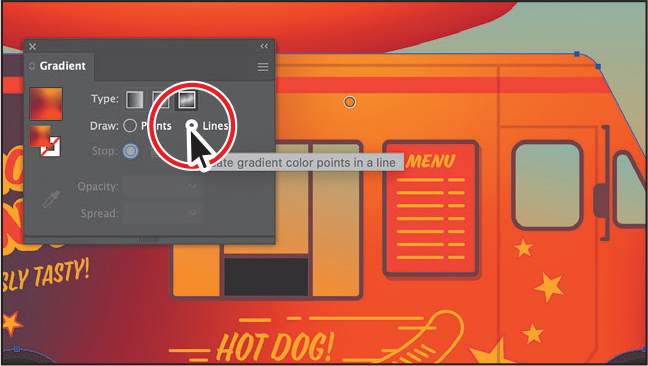
Click the orange color stop you just added. Move the pointer to the right, and you’ll see the path preview. Click to create a new color stop. You should see that it’s the same orange color.
NoteThe first part of the following figure shows the gradient before clicking to add the next color stop.
Click to make a final color stop down and to the right. The color stop should also be orange.
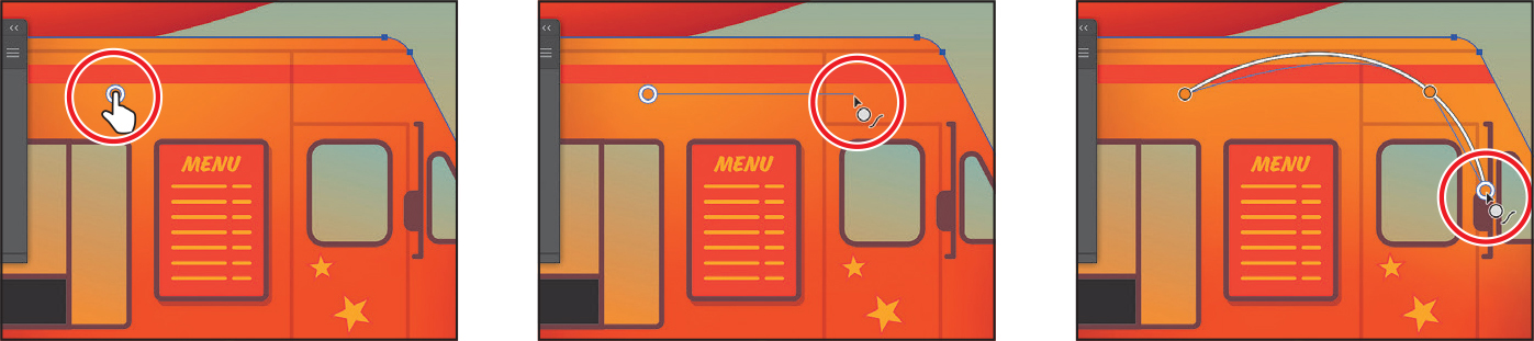
The color stops are part of a curved path.
Drag the middle color stop down to reshape the path that the color gradient follows.
Close the Gradient panel.
Choose Select > Deselect, and then choose File > Save.
Working with blended objects
You can blend two distinct objects to create and distribute shapes evenly between two objects. The two shapes you blend can be the same or different. You can also blend between two open paths to create a smooth transition of color between objects, or you can combine blends of colors and objects to create color transitions in the shape of a particular object.
The following are examples of different types of blended objects you can create:

Blend between two of the same shape.
Blend between two of the same shapes, each with a different color fill.

Blend between two different shapes with different fill colors.
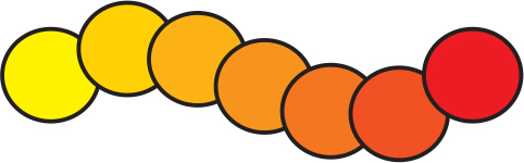
Blend between two of the same shape along a path.
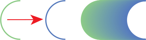
Smooth color blend between two stroked lines (original lines on left, blend on right).
When you create a blend, the blended objects are treated as one object, called a blend object. If you move one of the original objects or edit the anchor points of the original object, the blend changes accordingly. You can also expand the blend to divide it into distinct objects.
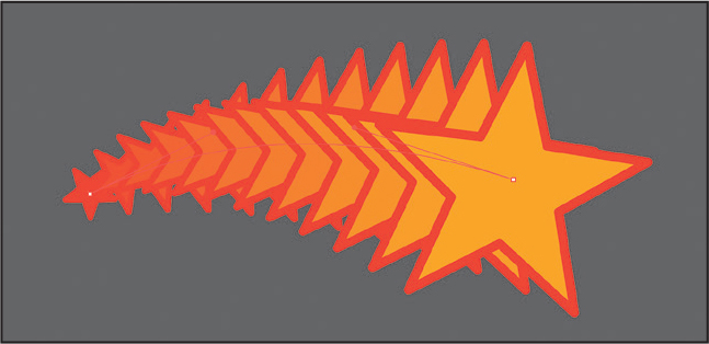
Creating a blend with specified steps
Next you’ll use the Blend tool (![]() ) to blend two shapes to create a shooting star for the side of the truck.
) to blend two shapes to create a shooting star for the side of the truck.
Choose View > Fit Artboard In Window. Choose View > Zoom Out a few times until you see the artwork off the upper-right corner of the artboard.
Zoom in to the stars.
Select the Blend tool (
 ) in the toolbar. Move the pointer around the shape; you’ll see the little box in the center changing from black to white. Black means you will click an anchor; white means the fill. Click when it’s white (
 ).
).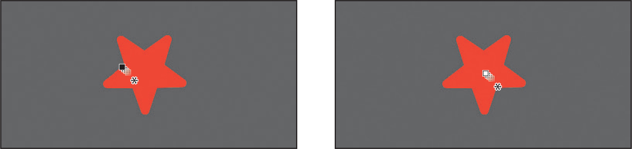
By clicking, you are telling Illustrator that this will be the starting point of the blend. Nothing will appear to happen.
TipYou can add more than two objects to a blend.
NoteIf you wanted to end the current path and blend other objects, you would first click the Blend tool in the toolbar and then click the other objects, one at a time, to blend them.
Move the pointer over the center of the large yellow star to the right. When the pointer looks like
 , click to create a blend between these two objects.
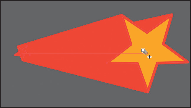 Tip
TipTo edit the blend options for an object, you can also select the blend object and then double-click the Blend tool. You can also double-click the Blend tool (
 ) in the toolbar to set tool options before you create the blend object.
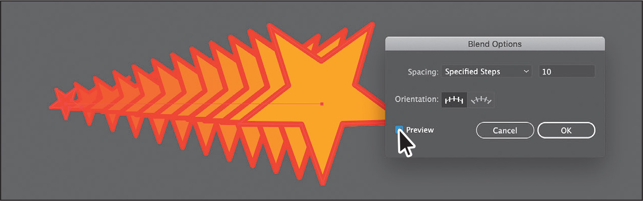
With the blended object still selected, choose Object > Blend > Blend Options. In the Blend Options dialog box, choose Specified Steps from the Spacing menu. Change Specified Steps to 10 to see what it looks like—there are 10 copies between the two stars. You may need to deselect and select Preview to see the change. Click OK.
Modifying a blend
Now you’ll edit one of the shapes in the blend as well as the spine of the blend you just created so the shapes blend along a curve.
Select the Selection tool (
) in the toolbar, and double-click anywhere on the blend object to enter Isolation mode.This temporarily ungroups the blended objects and lets you edit each original shape, as well as the spine. The spine is a path along which the steps in a blended object are aligned. By default, the spine is a straight line.
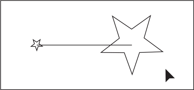
Choose View > Outline.
In Outline mode, you can see the outlines of the two original shapes and a straight path (spine) between them. These three objects are what a blend object is composed of, by default. It can be easier to edit the path between the original objects in Outline mode.
Click the edge of the larger star to select it. Move the pointer off a corner, and when the rotate arrows (
 ) appear, drag to rotate it a little.
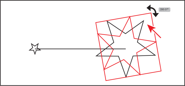
Choose Select > Deselect, and remain in Isolation mode.
Next, you’ll curve the spine (path) that the blend follows.
Select the Pen tool (
 ) in the toolbar. Press the Option key (macOS) or Alt key (Windows), and move the pointer over the path between the shapes. When the pointer changes (
 ), drag the path up and to the left a little, as in the figure.
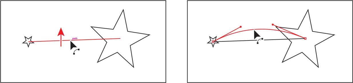
Choose View > Preview (or GPU Preview).
Press the Escape key to exit Isolation mode.
Choose Select > Deselect.
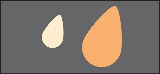
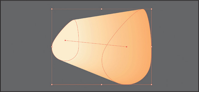
Creating and editing a smooth color blend
You can choose several options for blending the shapes and colors of objects to create a new object. When you choose the Smooth Color blend option in the Blend Options dialog box, Illustrator combines the shapes and colors of the objects into many intermediate steps, creating a smooth, graduated blend between the original objects, as you see in the figure above.

If objects are filled or stroked with different colors, the steps are calculated to provide the optimal number for a smooth color transition. If the objects contain identical colors, gradients, or patterns, the number of steps is based on the longest distance between the bounding box edges of the two objects. Now you’ll combine two shapes to see how the sesame seeds on the hot dog were made.
Zoom out or pan in the window with the Hand tool to see two tear-drop shapes below the stars that you just blended.
You’ll blend these two shapes together to give them a more three-dimensional appearance.
Select the Selection tool (
), and click the smaller shape on the left. Shift-click the larger shape on the right to select both.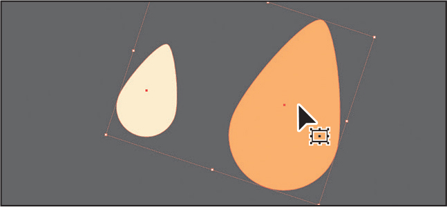
Choose Object > Blend > Make.
This is another way to create a blend and can be useful if creating a blend using the Blend tool proves challenging.
 Tip
TipYou can also click the Blend Options button in the Properties panel to edit the options for a selected blend object.
NoteCreating smooth color blends between paths can be difficult in certain situations. For instance, if the lines intersect or the lines are too curved, unexpected results may occur.
With the blend object still selected, double-click the Blend tool (
 ) in the toolbar. In the Blend Options dialog box, make sure that Smooth Color is chosen from the Spacing menu. Click OK.
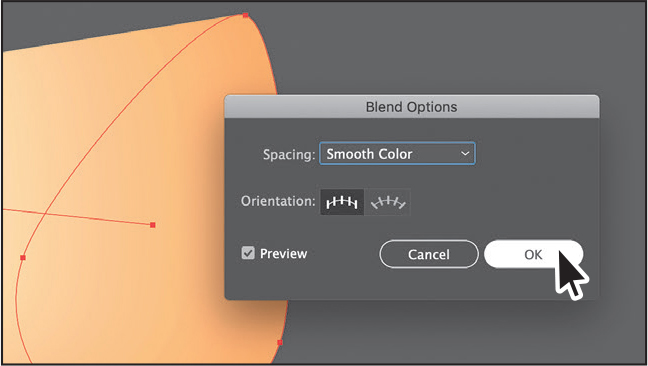
Choose Select > Deselect.
Next, you’ll edit the paths that make up the blend.
Select the Selection tool (
), and double-click within the color blend to enter Isolation mode. Click the smaller path on the left to select it. Drag it to the right until it looks like the figure. Notice that the colors are now blended.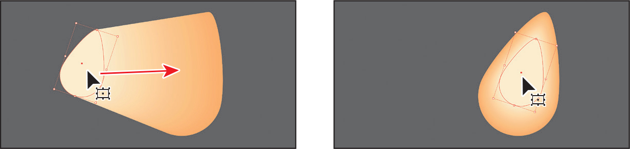
Press the Escape key to exit Isolation mode.
Choose Select > Deselect.
To see the artboard again, choose View > Fit Artboard In Window. To zoom out so you can see the artwork you blended off the right edge of the artboard, press Command and — (macOS) or Ctrl and — (Windows) a few times.
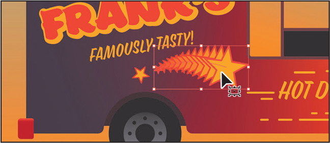
Drag the star onto the truck as in the figure. If the star artwork is behind the other artwork, choose Object > Arrange > Bring To Front.
Make a copy by Option-dragging (macOS) or Alt-dragging (Windows), releasing the mouse button and then the key.
To flip the artwork, click the Flip Horizontally button (
 ) in the Properties panel.
Rotate the stars by moving the pointer off a corner, and when you see rotate arrows (
), drag to rotate it a little.
Drag the stars into place.
If you want to drag the sesame seed off the right edge of the artboard onto the hot dog bun, do that now.

Choose File > Save, and then choose File > Close.
Creating patterns
In addition to process colors, spot colors, and gradients, the Swatches panel can also contain pattern swatches. A pattern is artwork saved in the Swatches panel that can be applied to the stroke or fill of an object. Illustrator provides sample swatches of each type in the default Swatches panel as separate libraries and lets you create your own patterns as well. In this section, you will focus on creating, applying, and editing patterns.
Applying an existing pattern
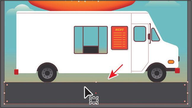
You can design patterns from scratch and customize existing patterns with any of the Illustrator tools. Patterns can start with artwork (a tile) that is repeated (tiled) within a fill or stroke, starting at the ruler origin and continuing to the right. Next, you’ll apply a pattern that comes with Illustrator to the road.
Choose File > Open. In the Open dialog box, navigate to the Lessons > Lesson11 folder, and select the L11_start2.ai file on your hard disk. Click Open to open the file.
Choose File > Save As. If the Cloud Document dialog opens, click Save On Your Computer.
In the Save As menu dialog box, name the file FoodTruck_pattern.ai, and select the Lessons > Lesson11 folder. Leave Adobe Illustrator (ai) chosen from the Format menu (macOS) or Adobe Illustrator (*.AI) chosen from the Save As Type menu (Windows) and then click Save. In the Illustrator Options dialog box, leave the Illustrator options at their default settings, and then click OK.
Choose View > Fit All In Window.
With the Selection tool (
) selected, click to select the dark gray road (rectangle). NoteYou’ll learn all about the Appearance panel in Lesson 13.
TipTo explore other pattern swatches in Illustrator, choose Window > Swatch Libraries > Patterns, and then select a pattern library.
Click More Options (
 ) in the Appearance section of the Properties panel to open the Appearance panel (or choose Window > Appearance).
Click the Add New Fill button at the bottom of the Appearance panel.
This adds a copy of the existing fill to the shape. The new fill is layered on top of the existing stroke and fill.
Click the new fill box to the right of the word “Fill” to show a panel of swatches. An arrow is pointing to it in the second part of the following figure. Select the Mezzotint Dot swatch.
The pattern swatch fills the shape as a second fill on top of the first. The swatch named “Mezzotint Dot” is found in a default pattern library.
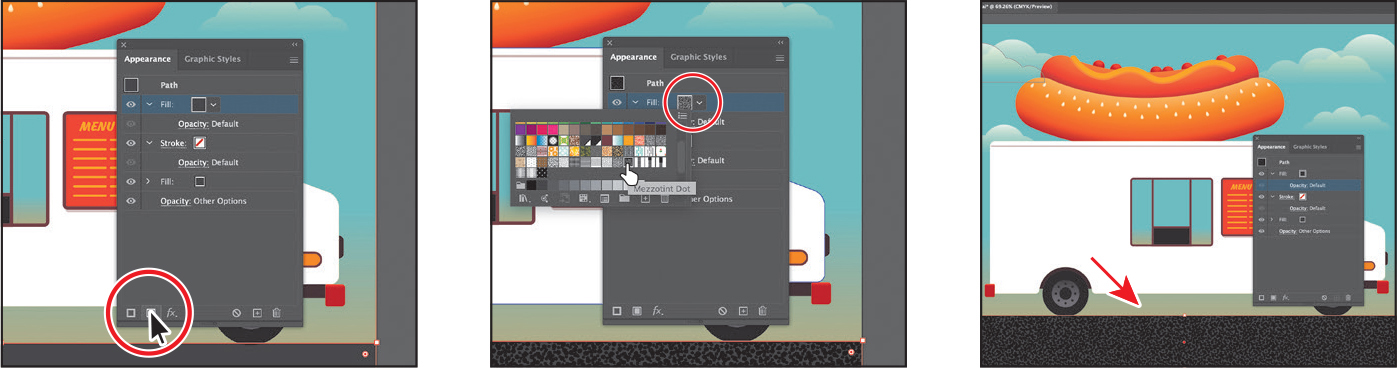
In the Appearance panel, just below the top word “Fill,” click the word “Opacity” to open the transparency panel (or choose Window > Transparency). Change the Opacity value to 90. Press the Escape key to hide the panel.
NoteIf you don’t see the word “Opacity” below the top Fill row, click the disclosure triangle (
 ) to the left of the top word “Fill” to show it.
Choose Select > Deselect, and then close the Appearance panel.
Creating your own pattern
In this section, you’ll create your own custom pattern. Each pattern you create is saved as a swatch in the Swatches panel for the document you’re working in.
Choose View > Fit Artboard In Window. Choose View > Zoom Out a few times until you see the artwork off the left side of the artboard.
With the Selection tool (
) selected, click the FRANK’S text off the left edge of the artboard to select a group of objects.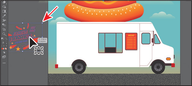
You’ll create a pattern from this group of objects.
NoteYou don’t need to have anything selected when you create a pattern. You can add content to a pattern when you edit it in Pattern Editing mode, as you’ll see.
NoteA pattern can be composed of shapes, symbols, or embedded raster images, among other objects that you can add in Pattern Editing mode. For instance, to create a flannel pattern for a shirt, you can create three overlapping rectangles or lines, each with varying appearance options.
Choose Object > Pattern > Make.
Click OK in the dialog box that appears.
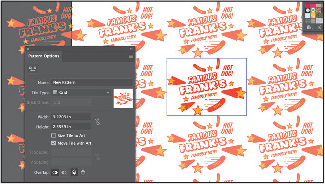
When you create a pattern, Illustrator enters Pattern Editing mode, which is similar to the Isolation mode you’ve worked with. Pattern Editing mode allows you to create and edit patterns interactively, while previewing the changes to the pattern on the artboard. All other artwork is not visible and cannot be edited while in this mode. The Pattern Options panel (Window > Pattern Options) also opens, giving you all the necessary options to create and edit your pattern.
Choose Select > All On Active Artboard to select the artwork.
Press Command and + (macOS) or Ctrl and + (Windows) to zoom in.
The series of lighter-colored copies around the artwork in the center are repetitions of the pattern. They are there for a preview and are a little dimmed so you can focus on the original. The blue box around the original group of objects is the pattern tile (the area that repeats).
TipWe use the word “vinyl” here because this pattern could be used to print a large vinyl graphic or decal that is then applied over the original paint of the food truck.
In the Pattern Options panel, change Name to Truck vinyl.
Try choosing different options from the Tile Type menu to see the effect on the pattern. Before continuing, make sure Hex By Column is selected.
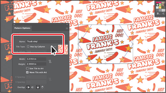
The name in the Pattern Options panel becomes the name of the swatch saved in the Swatches panel and can be useful to distinguish multiple versions of a pattern swatch, for instance. Tile Type determines how the pattern is tiled. You have three main Tile Type choices: the default grid pattern, a brick-style pattern, and the hex pattern.
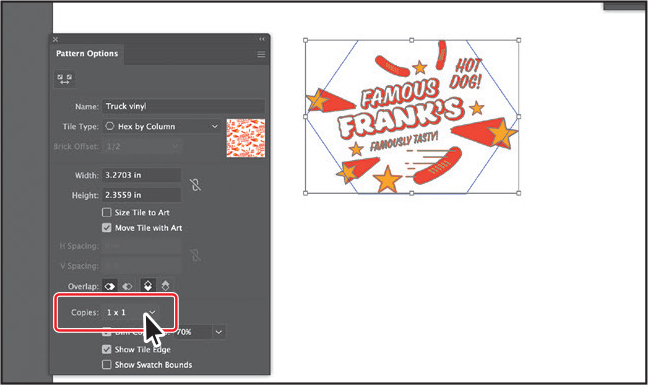
Choose 1 x 1 from the Copies menu at the bottom of the Pattern Options panel. This will remove the repeat and let you temporarily focus on the main pattern artwork.
Choose Select > Deselect.
Click to select the single star below “FAMOUSLY TASTY” and delete it.
Drag the shooting star to the right a little. See the second part of the figure.
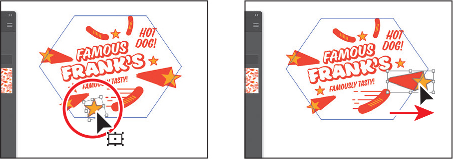
You can add, delete, and transform artwork at this point to make up the repeating content for your pattern.
In the Pattern Options panel, choose 5 x 5 from the Copies menu to see the repeat again.
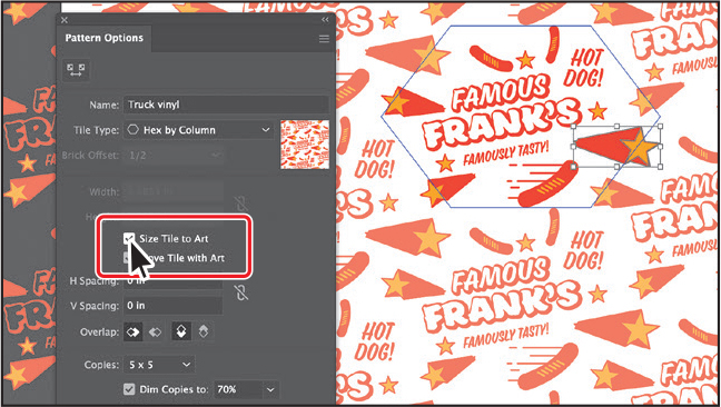
Select the Size Tile To Art option in the Pattern Options panel.
TipThe H Spacing and V Spacing values can be either positive or negative, and they move the tiles apart or bring them closer together either horizontally (H) or vertically (V).
The Size Tile To Art selection fits the tile area (the blue hexagon) to the bounds of the artwork, changing the spacing between the repeated objects. With Size Tile To Art deselected, you could manually change the width and the height of the pattern definition area in the Width and Height fields to include more content or edit the spacing between. You can also edit the tile area manually with the Pattern Tile Tool button (
 ) in the upper-left corner of the Pattern Options panel.
If you set the spacing values (H Spacing or V Spacing) to negative values, the artwork in the pattern tile will overlap. By default, when objects overlap horizontally, the left object is on top; when objects overlap vertically, the top object is on top. You can set the overlap values to Left In Front, Right In Front to change overlap horizontally, or to Top In Front, Bottom In Front to change the overlap vertically (they are the small buttons in the Overlap section of the panel).
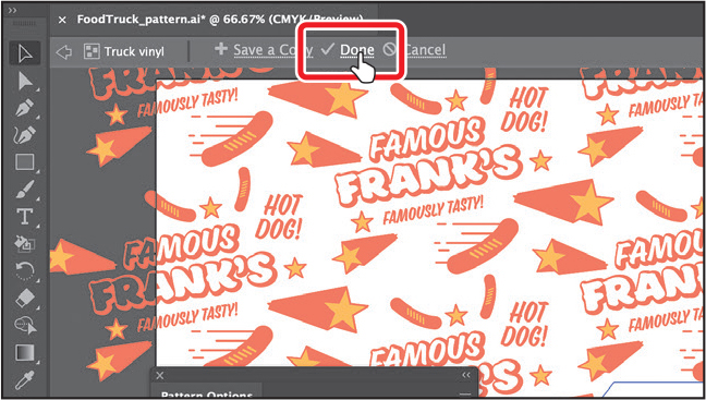
TipIf you want to create pattern variations, you can click Save A Copy in the bar along the top of the Document window when in Pattern Editing mode. This saves the current pattern in the Swatches panel as a copy and allows you to continue creating.
Click Done in the bar along the top of the Document window. If a dialog box appears, click OK.
Choose File > Save.
Applying your pattern
You can assign a pattern using a number of different methods. In this section, you’ll use the Fill color box in the Properties panel to apply your pattern.
Choose View > Fit Artboard In Window.
With the Selection tool (
), click the white truck shape.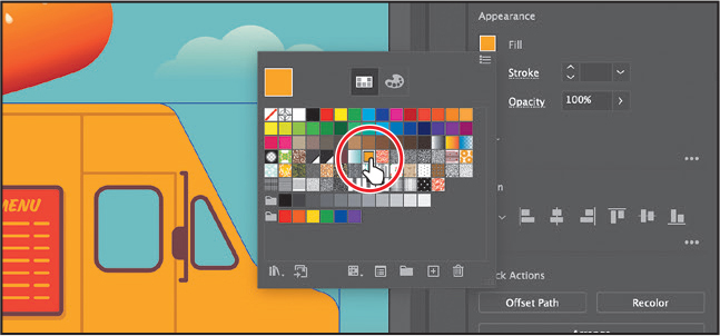
Click the Fill color in the Properties panel and select the yellow/orange color with the tool tip that shows as “C=0 M=33 Y=100 K=0.”
Click More Options (
) in the Appearance section of the Properties panel to open the Appearance panel (or choose Window > Appearance).Click the Add New Fill button (
 ) at the bottom of the Appearance panel to add a copy of the existing fill to the shape.
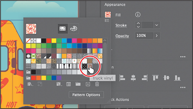
In the top “Fill” row, click the fill box to show a panel of swatches (see the following figure). Select the Truck Vinyl pattern swatch.
Close the Appearance panel.
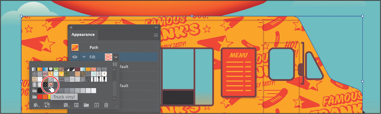
Editing your pattern
Next, you’ll edit the Truck Vinyl pattern swatch in Pattern Editing mode.
With the truck shape still selected, click the Fill box in the Properties panel. Double-click the Truck Vinyl pattern swatch to edit it in Pattern Editing mode.
Press Command and + (macOS) or Ctrl and + (Windows) to zoom in.
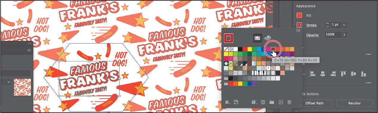
In Pattern Editing mode, with the Selection tool (
) selected, click the “FAMOUS FRANK’S” text.In the Properties panel, change the stroke color to a dark red swatch.
Click Done in the gray bar along the top of the Document window to exit Pattern Editing mode.
Choose View > Fit Artboard In Window.
Choose Select > Deselect, and then choose File > Save.
Choose File > Close.
Review questions
1 What is a gradient?
2 How do you adjust the blend between colors in a linear or radial gradient?
3 Name two ways you can add colors to a linear or radial gradient.
4 How can you adjust the direction of a linear or radial gradient?
5 What is the difference between a gradient and a blend?
6 When you save a pattern in Illustrator, where is it saved?
Review answers
1 A gradient is a graduated blend of two or more colors or tints of the same color. Gradients can be applied to the stroke or fill of an object.
2 To adjust the blend between colors in a linear or radial gradient, with the Gradient tool (![]() ) selected and with the pointer over the gradient annotator or in the Gradient panel, drag the diamond icons or the color stops of the gradient slider.
) selected and with the pointer over the gradient annotator or in the Gradient panel, drag the diamond icons or the color stops of the gradient slider.
3 To add colors to a linear or radial gradient, in the Gradient panel, click beneath the gradient slider to add a gradient stop to the gradient. Then double-click the color stop to edit the color, using the panel that appears, to mix a new color or to apply an existing color swatch. You can select the Gradient tool in the toolbar, move the pointer over the gradient-filled object, and then click beneath the gradient annotator that appears in the artwork to add or edit a color stop.
4 Drag across artwork with the Gradient tool to adjust the direction of a linear or radial gradient. You can also rotate the gradient using the Gradient tool and change the radius, aspect ratio, starting point, and more.
5 The difference between a gradient and a blend is the way that colors combine—colors blend together within a gradient and between objects in a blend.
6 When you save a pattern in Illustrator, it is saved as a swatch in the Swatches panel. By default, swatches are saved with the currently active document.