9. Adding Type to a Project
Lesson overview
In this lesson, you’ll learn how to do the following:
Create and edit area and point type.
Import text.
Change text formatting.
Fix missing fonts.

Work with glyphs.
Vertically align area type.
Snap to glyphs.
Create columns of text.
Create and edit paragraph and character styles.
Wrap type around an object.
Reshape text with a warp.
Curve text on a path.
Create text outlines.

This lesson will take about 75 minutes to complete. To get the lesson files used in this chapter, download them from the web page for this book at adobepress.com/IllustratorCIB2022. For more information, see “Accessing the lesson files and Web Edition” in the Getting Started section at the beginning of this book.

Text is an important design element in your illustrations. Like other objects, type can be painted, scaled, rotated, and more. In this lesson, you’ll create basic text and add interesting text effects.
Starting the lesson
You’ll be adding type to two recipe cards during this lesson, but before you begin, you’ll restore the default preferences for Adobe Illustrator. Then you’ll open the finished art file for this lesson to see the illustration.
To ensure that the tools function and the defaults are set exactly as described in this lesson, delete or deactivate (by renaming) the Adobe Illustrator preferences file. See “Restoring default preferences” in the “Getting Started” section at the beginning of the book.
 Note
NoteIf you have not already downloaded the project files for this lesson to your computer from your Account page, make sure to do so now. See the “Getting Started” section at the beginning of the book.
Start Adobe Illustrator.
Choose File > Open. Locate the file named L9_end.ai in the Lessons > Lesson09 folder. Click Open.
You will most likely see a Missing Fonts dialog box since the file is using specific Adobe fonts. Simply click Close in the Missing Fonts dialog box. You will learn all about Adobe fonts later in this lesson.
Leave the file open for reference later in the lesson, if you like. I closed it.

Choose File > Open. In the Open dialog box, navigate to the Lessons > Lesson09 folder, and select the L9_start.ai file on your hard disk. Click Open to open the file.
You’ll add text and formatting to complete the social media ads.
Choose File > Save As. If the Cloud Document dialog box opens, click Save On Your Computer.
In the Save As dialog box, navigate to the Lesson09 folder, and name the file HardwareStore_ads.ai. Leave Adobe Illustrator (ai) chosen from the Format menu (macOS) or Adobe Illustrator (*.AI) chosen from the Save As Type menu (Windows), and click Save.
In the Illustrator Options dialog box, leave the Illustrator options at their default settings, and then click OK.
NoteIf you don’t see Reset Essentials in the Workspace menu, choose Window > Workspace > Essentials before choosing Window > Workspace > Reset Essentials.
Choose Window > Workspace > Reset Essentials.
Adding text
Type features are some of the most powerful in Illustrator. As in Adobe InDesign, you can create columns and rows of text, place text, flow text into a shape or along a path, work with letterforms as graphic objects, and more.
In Illustrator, you can create text in three main ways:
Point type
Area type
Type on a path
Adding text at a point
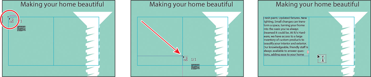
Point type is a horizontal or vertical line of text that begins where you click and expands as you enter characters. Each line of text is independent—the line expands or shrinks as you edit it but doesn’t form multiple lines unless you add a paragraph return or a soft return. Entering text this way is perfect for small amounts of text like a headline or text on a button. Next, you’ll add some heading text using point type.
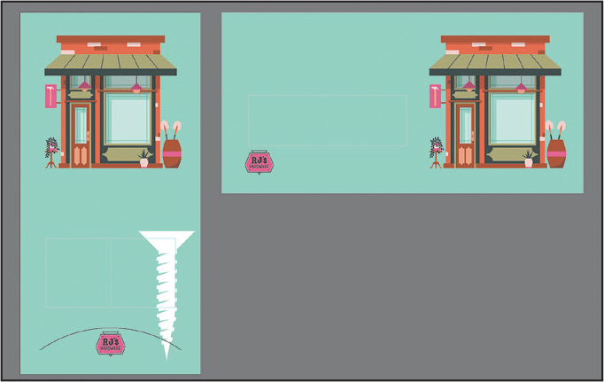
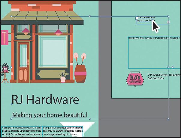
Choose 1 Vertical Ad from the Artboard Navigation menu below the document, if not selected. Then choose View > Fit Artboard In Window.
You will add some text below the building illustration, like you see in the figure.
Select the Type tool (
 ) in the toolbar on the left. Click (don’t drag) below the building, as you see in the previous figure. Type RJ Hardware.
The “Lorem ipsum” text you saw is just placeholder text that you can replace.
Select the Selection tool (
 ), and Shift-drag the lower-right bounding point to make the text much larger.
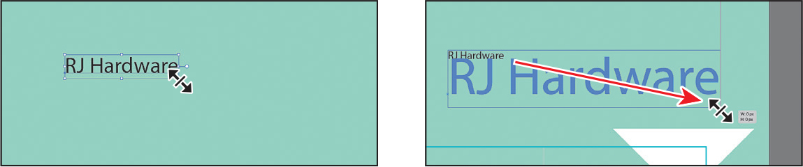
If you scale point type without the Shift key held down, the text stretches when you drag any bounding point.
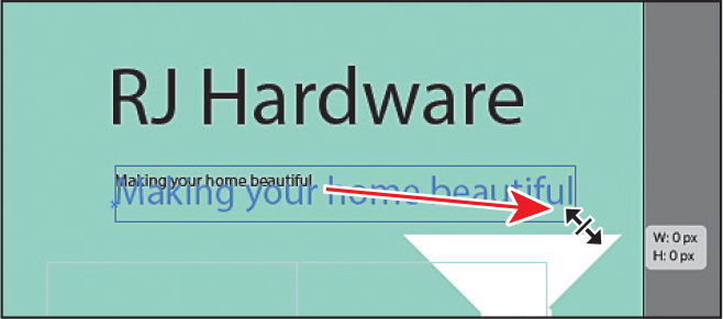
Practice by selecting the Type tool again and clicking to add more text. Type Making your home beautiful.
Select the Selection tool. Shift-drag a corner to make it as large as the other text you made.
As you go through this chapter, you will refine the appearance of this text and get it into place.
Adding area type
Area type uses the edges of an object, like a rectangle, to control how text flows either horizontally or vertically. When text reaches an edge, it automatically wraps to fit inside the object. Entering text in this way is useful when you want to create one or more paragraphs, such as for a poster or a brochure.
To create area type with the Type tool (![]() ), you drag where you want the text—which creates an area type object (also called a type object, text box, text area, or text object). Next, you’ll create some area type and add a heading to the ad.
), you drag where you want the text—which creates an area type object (also called a type object, text box, text area, or text object). Next, you’ll create some area type and add a heading to the ad.

Text flowing within a frame.
Choose 2 Horizontal ad from the Artboard Navigation menu below the document.
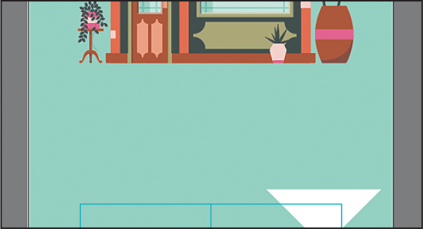
With the Type tool (
) selected, move the pointer into the aqua box. Press and drag to create a small type object that is about 100 pixels in width and 100 pixels in height.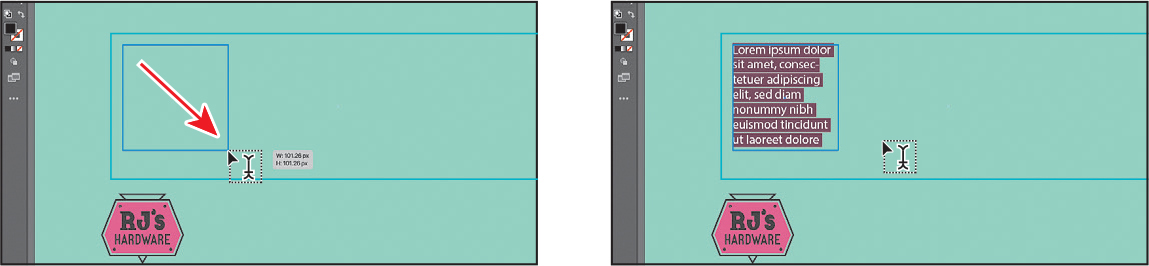
 Tip
TipFilling type objects with placeholder text is a preference you can change. Choose Illustrator > Preferences (macOS) or Edit > Preferences (Windows), select the Type category, and deselect Fill New Type Objects With Placeholder Text to turn the option off.
By default, area type objects are filled with selected placeholder text that you can replace with your own.
Choose View > Zoom In a few times to zoom in.
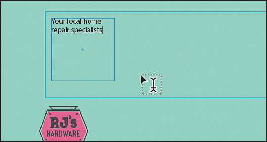
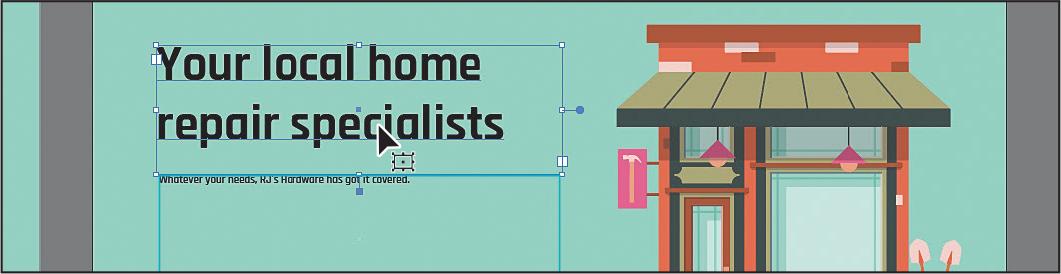
With the placeholder text selected, type Your local home repair specialists. (Without the period!)
Notice how the text wraps horizontally to fit within the type object.
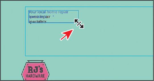
Select the Selection tool (
), and drag the lower-right bounding point to the left and then back to the right to see how the text wraps within but doesn’t resize.You can drag any of the eight bounding points on the type object to resize it.
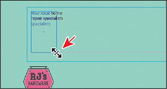
Drag the same point to make the type object shorter so that you still see all of the text and it wraps as you see in the figure.
Double-click on the text to switch to the Type tool.
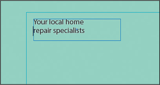
Put the cursor before the word “repair” and press Shift+Return or Shift+Enter to break the line using a soft return.
Soft returns keep the lines of text a single paragraph rather than breaking it into two. Later, when you apply paragraph formatting, this can make applying the formatting easier.
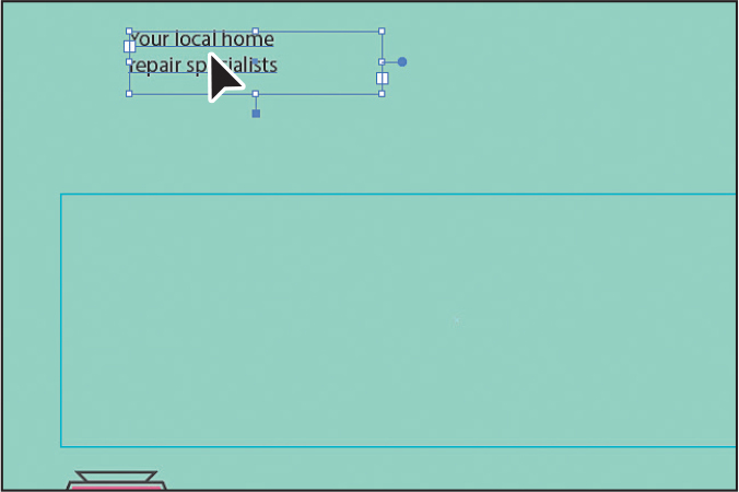
Select the Selection tool, and drag the text above the aqua box.
Converting between area type and point type
You can easily convert a text object from area type to point type and vice versa. This can be useful if you type a headline by clicking, which creates point type, but later want to resize and add more text without stretching the text inside.
Next, you will convert a type object from point type to area type.

With the Type tool (
) selected, to the right of the RJ’s Hardware logo in the lower-left of the same artboard, click to add some point type.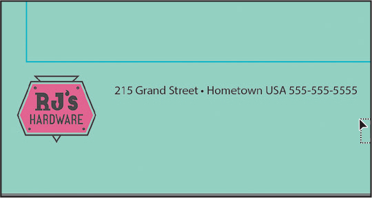
Type: 215 Grand Street · Hometown USA 555-555-5555.
TipTo add a bullet, place the cursor where you want the bullet, and then choose Type > Insert Special Character > Symbols > Bullet.
Notice that the text keeps going. We need to have the text wrap in different ways, so area type might be a better choice in this case.
Press the Escape key to select the Selection tool (
). TipWith a type object selected, you can also choose Type > Convert To Point Type or Convert To Area Type, depending on what the selected type object is.
Move the pointer over the annotator (
 ) off the right edge of the type object. A hollow end on the annotator means it’s point type. When the pointer changes (
 ), double-click the annotator to convert the point type to area type.
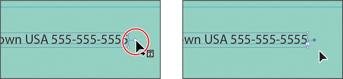
The annotator end should now be filled (
 ), indicating that it is area type.
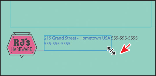
Drag the lower-right bounding point to wrap the text within until it looks like the figure.
Area type auto sizing
To learn about setting auto-resize on text objects, check out the video Area type auto sizing, which you’ll find in the Web Edition. For more information, see the “Web Edition” section of “Getting Started” at the beginning of the book.
Importing a plain-text file
You can import text into your Illustrator document from a text file created in another application. One of the advantages of importing text from a file, rather than copying and pasting it, is that imported text retains its character and paragraph formatting (by default). For example, text from an RTF file retains its font and style specifications in Illustrator, unless you remove formatting when you import the text.
In this section, you’ll place text from a plain-text file into your design to get the bulk of the text for the ads in place.
![]() Note
Note
To learn more about the types of text documents you can import, visit https://helpx.adobe.com/illustrator/using/importing-exporting-text.html.
Choose 1 Vertical Ad from the Artboard Navigation menu below the Document window to switch to the other ad.
Choose Select > Deselect.
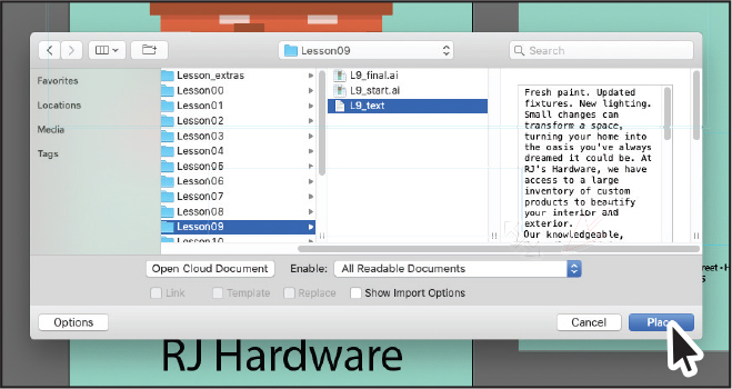
Choose File > Place. In the Place dialog box, navigate to the Lessons > Lesson09 folder, and select the L9_text.txt file.
Click Place.
In the Text Import Options dialog box that appears, you can set some options prior to importing text.
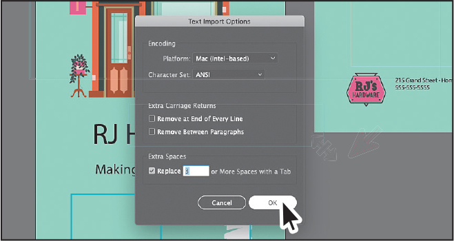
Leave the default settings, and click OK.
Move the loaded text icon into the lower-left part of the artboard, in the aqua box. Drag from the upper-left corner to make a text box. Use the figure as a guide.
If you were to simply click with the loaded text pointer, a type object would be created that is smaller than the size of the artboard.
Choose File > Save.
Threading text
When working with area type, each area type object has an in port and an out port. Those ports enable you to link type objects and flow text between them.

An empty out port indicates that all the text is visible and that the type object isn’t linked.
An arrow in a port indicates that the type object is linked to another type object.

A red plus sign (
 ) in an out port indicates that the object contains additional text called overflow text. You can adjust the text, resize the type object, or thread the text to another type object to show all of the overflow text.
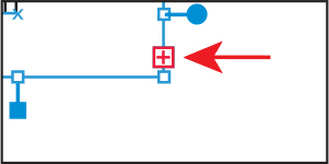
To thread or continue text from one object to the next, you have to link the objects. Linked type objects can be of any shape; however, the text must be entered in an object or along a path, not as point type (simply clicking to create text).
Next, you’ll thread text between two type objects.
Choose View > Fit All In Window.
With the Selection tool (
) selected, click the out port ( ) in the lower-right corner of the type object. Move the pointer away. Note
If you double-click an out port, a new type object appears. If this happens, you can either drag the new object where you would like it to be positioned or choose Edit > Undo Link Threaded Text, and the loaded text icon will reappear.

The pointer changes to a loaded text icon (
 ) when you move it away from the original type object.
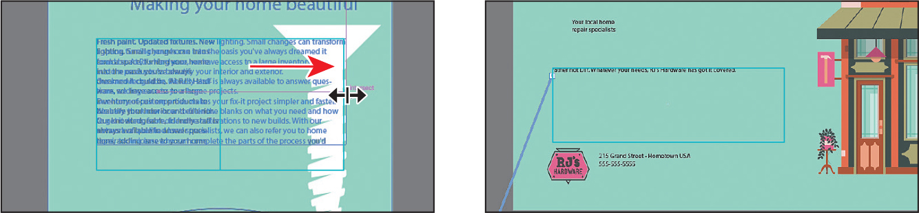
Move the pointer to the upper-left corner of the aqua box on the horizontal ad to the right. Drag across the aqua box to make an area type object. Use the figure as a guide.
With the second type object still selected, notice the line connecting the two type objects (an arrow is pointing to it in the previous figure). This (non-printing) line is the text thread that tells you that the two objects are connected. If you don’t see this thread (line), choose View > Show Text Threads.
TipAnother way to thread text between objects is to select an area type object, select the object (or objects) you want to link to, and then choose Type > Threaded Text > Create.
The out port (
 ) of the top type object on the artboard and the in port () of the bottom type object on the artboard contain small arrows indicating how the text is flowing from one to the other.
Click in the first threaded type object on the left.
Drag the right-middle point to the right to make it as wide as you see in the figure. Drag the bottom of that text object up until some of the text flows into the text area on the right. Leave the text selected.
The text will flow between the type objects. If you delete the second type object, the text is pulled back into the original object as overflow text. Although not visible, the overflow text isn’t deleted.
After resizing your text area, you may see more or less text in your text area on the right side artboard than you see in the second part of the previous figure, and that’s okay.
Formatting type
You can format text in a lot of creative ways. You can apply formatting to one character, a range of characters, or all characters. As you’ll soon see, selecting the type object, rather than selecting the text inside, lets you apply formatting options to all of the text in the object, including options from the Character and Paragraph panels, fill and stroke attributes, and transparency settings.
In this section, you’ll discover how to change text attributes, such as size and font, and later learn how to save that formatting as text styles.
Changing font family and font style
In this section, you’ll apply a font to text. In addition to local fonts, Creative Cloud members have access to a library of fonts for use in desktop applications such as InDesign or Microsoft Word and on websites. Trial Creative Cloud members can also access select fonts from Adobe. Fonts you choose are activated and appear alongside other locally installed fonts in the fonts list in Illustrator. By default, Adobe fonts are turned on in the Creative Cloud desktop application to activate fonts and make them available in your desktop applications.
![]() Note
Note
The Creative Cloud desktop application must be installed on your computer, and you must have an Internet connection to initially activate fonts. The Creative Cloud desktop application is installed when you install your first Creative Cloud application, like Illustrator.
Activating Adobe Fonts
Next, you’ll select and activate Adobe fonts so that you can use them in your project.
![]() Note
Note
To learn about the Creative Cloud desktop application, visit www.adobe.com/creativecloud/desktop-app.html.
Ensure that the Creative Cloud desktop application has been launched and you are signed in with your Adobe ID (this requires an internet connection).
Select the Type tool (
), move the pointer over the text in the threaded type object on the left, and click to insert the cursor.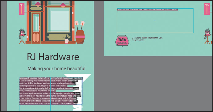
Choose Select > All or press Command+A (macOS) or Ctrl+A (Windows) to select all of the text in both threaded type objects.
In the Properties panel, click the arrow to the right of the Font Family menu, and notice the fonts that appear in the menu.
The fonts you see by default are those that are installed locally. In the font menu, an icon appears to the right of the font names in the list, indicating what type of font it is (
 is an activated Adobe font,
  is OpenType,
  is a variable font,
  is an SVG font,
 is TrueType, and
  is Adobe Postscript).
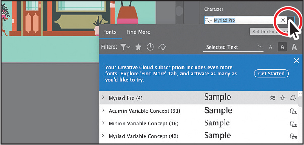
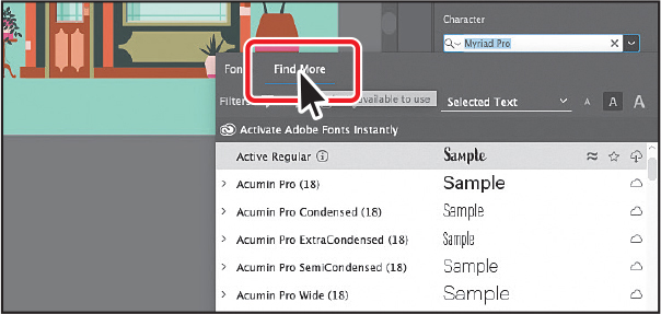
Click Find More to see a list of Adobe fonts you can choose from.
The menu content may take a few seconds to initialize. My list will look different from yours since Adobe is constantly updating the font selections.
Click the Filter Fonts icon (
 ) to open a menu. You can filter the font list by selecting classification and property criteria. Click the Sans Serif option under Classification to filter the fonts.
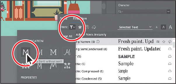 Tip
TipThe fonts are activated on all computers where you’ve installed the Creative Cloud application and logged in. To view fonts you’ve activated, open the Creative Cloud desktop application and click the Fonts icon (
 ) in the upper right.
Scroll down in the font list to find Rajdhani. Click the arrow to the left of Rajdhani, if necessary, to see the font styles.
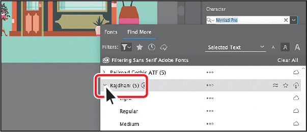
Click the Activate icon (
 ) to the far right of the name “Rajdhani SemiBold.”
If you see
 , or when the pointer is over the font name in the list,
  , then the font is already activated, so you don’t need to do anything.
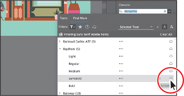
Click OK in the dialog box that appears.
Click the Activate button (
) to the far right of the name “Rajdhani Bold.” Click OK in the dialog box that appears.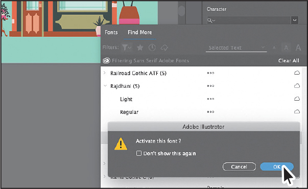
Once the fonts are activated (be patient; it may take some time), you may begin to use them.
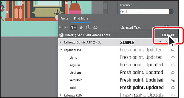
After activating the fonts, click the words “Clear All” toward the top of the menu to remove the Sans Serif filtering and see all of the fonts again.
Applying fonts to text in Illustrator
Now that the Adobe fonts are activated, you can use them in any application. That’s what you’ll do next.
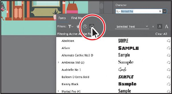
With the threaded text still selected and the Font Family menu still showing, click the Show Activated Fonts button (
 ) to filter the font list and show only activated Adobe fonts.
The list in the figure may be different than yours, and that’s okay as long as you see the Rajdhani fonts.
Move the pointer over the fonts in the menu. You should see a preview of the font the pointer is over, which is applied to the selected text. Click the arrow to the left of Rajdhani in the menu, and choose SemiBold (or simply choose Rajdhani SemiBold).
With the Selection tool (
) selected, click the “RJ Hardware...” text and Shift-click the “Making your home beautiful” and “Your local home repair specialists” text to select all three.If you want to apply the same font to all of the text in a point type or area type object, you can simply select the object, not the text, and then apply the font.
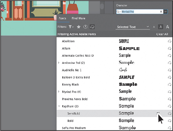
With the type object selected, click the font name in the Properties panel (I see Myriad Pro). Begin typing the letters raj (you may need to type more of the word “Rajdhani”).
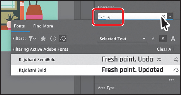
A menu appears beneath where you are typing. Illustrator filters through the list of fonts and displays the font names that contain “rajd,” regardless of where “rajd” is in the font name and regardless of whether it’s capitalized. The Show Activated Fonts (
) filter is still turned on from before, so you’ll turn it off next. TipWith the cursor in the Font Name field, you can also click the X on the right side of the Font Family field to clear the search field.
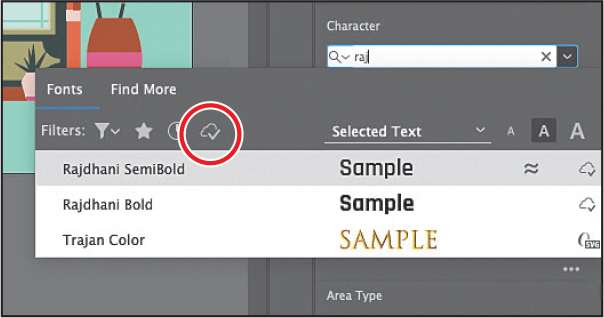
Click Clear Filter (
) in the menu that is showing to see all of the available fonts.In the menu that appears beneath where you are typing, move the pointer over the fonts in the list (my list will be different from yours because of the other fonts I already had activated). Illustrator shows a live font preview of the text.
Click to select Rajdhani Bold to apply the font.
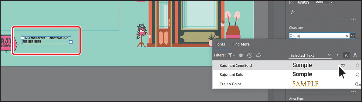
Click the 215 Grand Street · Hometown, USA... text on the horizontal ad.
Click the font name in the Properties panel and type the letters raj (for Rajdhani). Select the Rajdhani SemiBold font to apply it.
Fixing missing fonts
To learn how to fix missing fonts, check out the video Fixing Missing Fonts, which is part of the Web Edition. For more information, see the “Web Edition” section of “Getting Started” at the beginning of the book.
Changing font size
By default, typeface size is measured in points (a point equals 1/72 of an inch). In this section, you will change the font size of text and also see what happens to point type that is scaled.
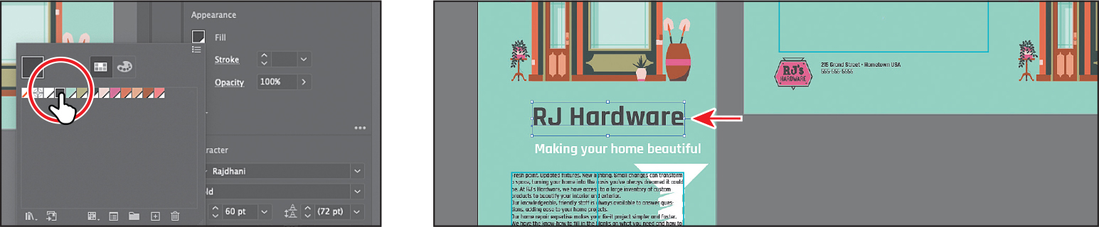
With the Selection tool, click to select the “RJ Hardware” heading on the artboard on the left.
Looking in the Character section of the Properties panel, you’ll see that the font size may not be a whole number. That’s because you scaled the point type earlier by dragging.
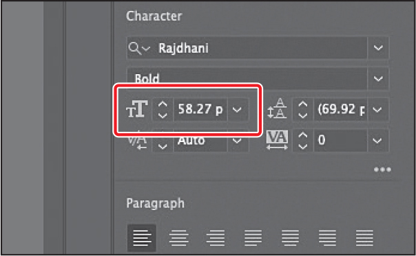
Choose 60 pt from the Font Size menu in the Properties panel.
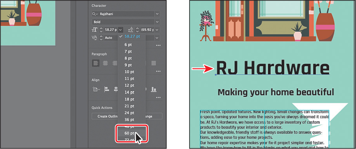
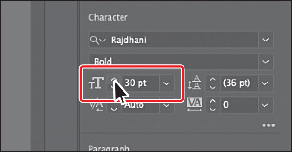
Click the “Making your home beautiful” text to select the text object.
Choose 24 pt from the Font Size menu.
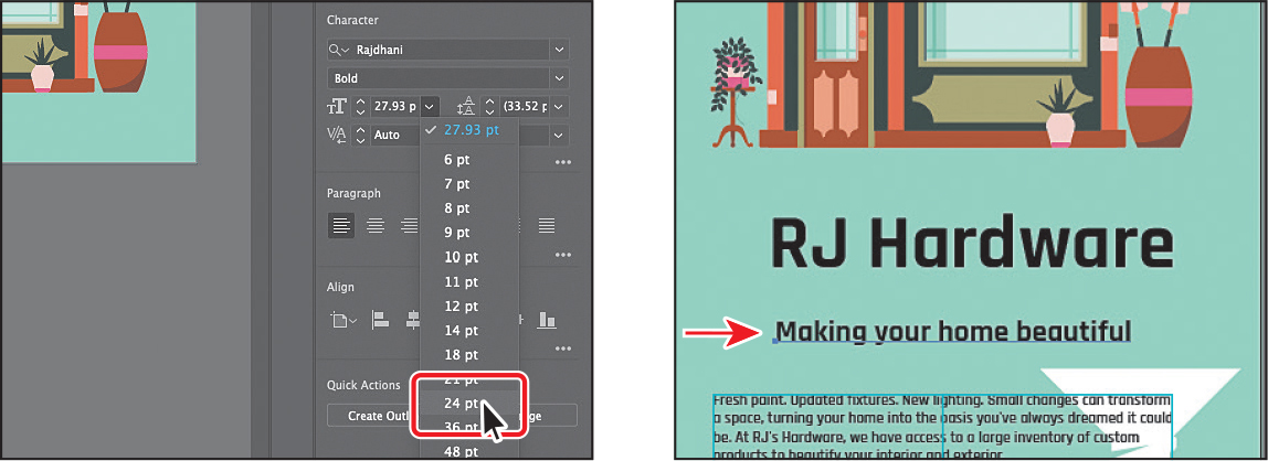
The font size is a little small, so click the up arrow until the text is 30 pt.
Click in the “Your local home repair specialists” text on the artboard on the right and practice by changing the font size to 54 pt.
Instead of clicking the arrow next to the font size field, you can also select the value and type in 54. Press Return or Enter to accept.
If the text disappears, it’s too big to fit in the text box. Drag a corner until you can see the text, and then drag it above the aqua box.
Changing the color of the text
You can change the appearance of text by applying fills, strokes, and more. In this section, you’ll change the fill of selected text by selecting type objects. Know that you can also select text with the Type tool to apply different color fills and strokes to text.
With the text “Your local home repair specialists” selected, Shift-click the “Making your home beautiful” text.
Click the Fill color box in the Properties panel. With the Swatches option (
 )selected in the panel that appears, select the white swatch.
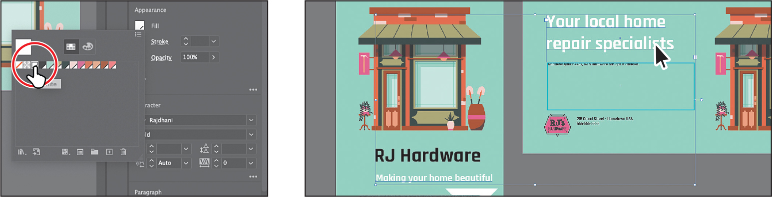
Click the text “RJ Hardware.” Click the Fill color box in the Properties panel. Select the dark gray swatch.
Choose Select > Deselect, and then choose File > Save.
Changing additional character formatting
In Illustrator, you can change a lot of text formatting besides font, font size, and color. As in InDesign, text attributes are split between character and paragraph formatting and can be found in the Properties panel, the Control panel, and two main panels: the Character panel and the Paragraph panel.
The Character panel, which you can access by clicking More Options (![]() ) in the Character section of the Properties panel or by choosing Window > Type > Character, contains the formatting for selected text such as font, font size, kerning, and more. In this section, you will apply a few of the many possible attributes to experiment with the different ways you can format text.
) in the Character section of the Properties panel or by choosing Window > Type > Character, contains the formatting for selected text such as font, font size, kerning, and more. In this section, you will apply a few of the many possible attributes to experiment with the different ways you can format text.
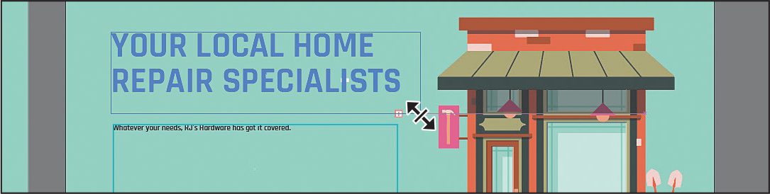
With the Selection tool (
) selected, click the “Your local home repair specialists” text. TipBy default, text is set to a value called Auto for leading. When looking at the Leading value in the Properties panel, you can tell it’s set to Auto if the value has parentheses around it, (). To return the leading to the default auto value, choose Auto from the Leading menu.
In the Properties panel, change Leading (
 ) to 54 pt by selecting the value and typing 54 (or you can change to a similar value that looks good). Press Return or Enter to accept the value. Leave the text selected.
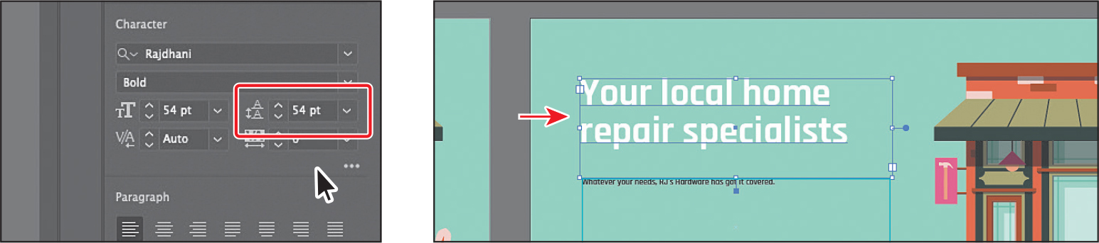
Leading is the vertical space between lines of text. Adjusting the leading can be useful for fitting text into a type object. Now, you’ll make all of the headings capital letters.
Shift-click the “RJ Hardware” and “Making your home beautiful” text to select all.
With the text selected, click More Options (
 ) (circled in the following figure) in the Character section of the Properties panel to show the Character panel. Click the All Caps button (
 ) to capitalize the headings.
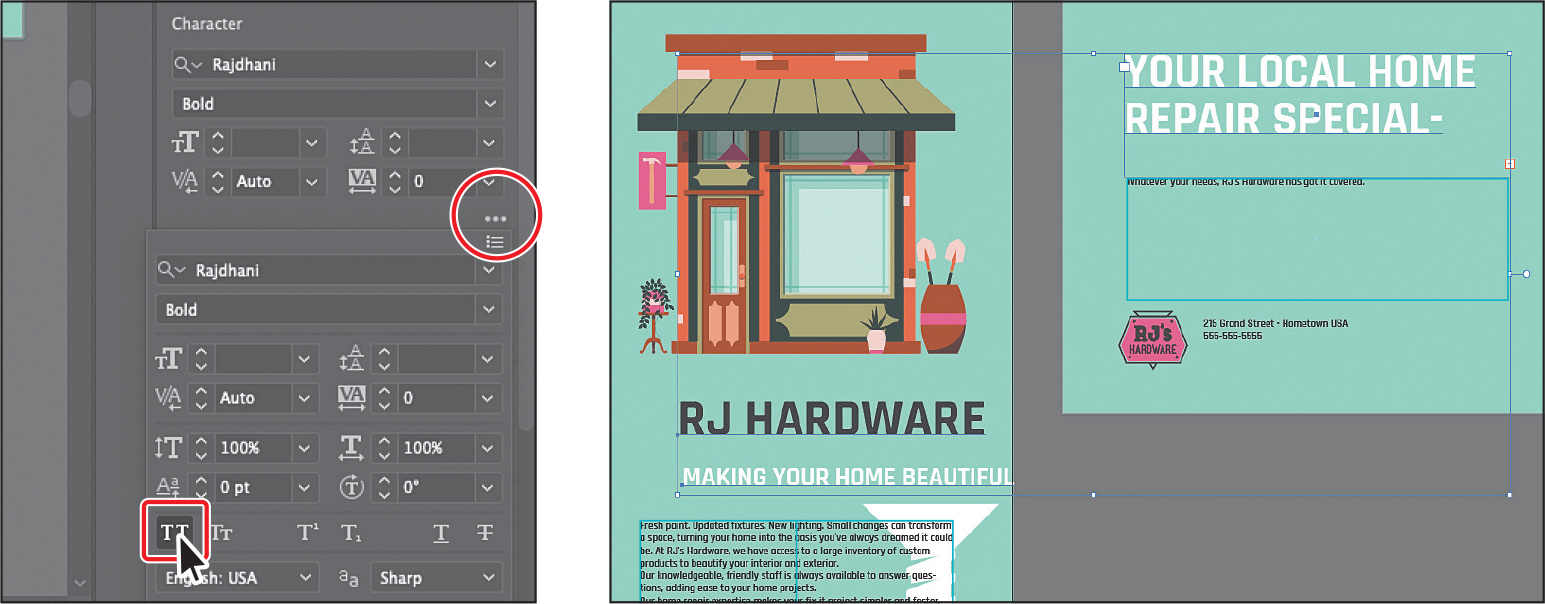
If part of the heading “YOUR LOCAL HOME REPAIR SPECIALISTS” on the artboard on the right disappears, it’s because it doesn’t fit in the type area. With the Selection tool, drag a corner of the box to show all of the text.
One of the benefits of point type versus area type is that no matter what formatting you throw at point type text, the box around it will always resize to show the text.
Changing paragraph formatting
As with character formatting, you can set paragraph formatting, such as alignment or indenting, before adding new text or changing existing text appearance. Paragraph formatting applies to entire paragraphs rather than just selected content and can be found in the Properties panel, Control panel, or Paragraph panel.
You can access the Paragraph panel options by clicking More Options (![]() ) in the Paragraph section of the Properties panel or choosing Window > Type > Paragraph.
) in the Paragraph section of the Properties panel or choosing Window > Type > Paragraph.
With the Type tool (
) selected, click in the threaded text in the artboard on the left.Press Command+A (macOS) or Ctrl+A (Windows) to select all of the text between the two type objects.
With the text selected, click More Options (
) in the Paragraph section of the Properties panel to show the Paragraph panel options.Change Space After Paragraph (
 ) to 9 pt in the Paragraph panel.
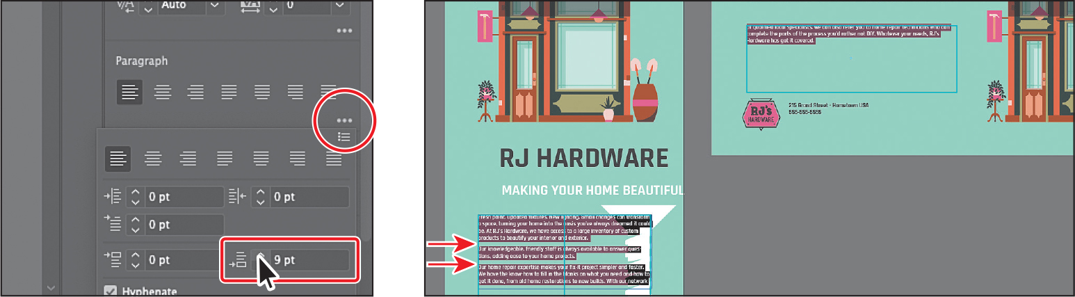
Setting a spacing value after paragraphs, rather than pressing the Enter or Return key, helps you maintain consistency and makes editing easier.
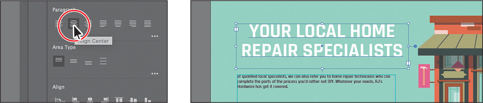
Select the Selection tool, and click the “Your local home repair specialists” text on the ad on the right to select it.
To align the text to center, click Align Center in the Paragraph section of the Properties panel.
Choose Select > Deselect, and then choose File > Save.
Working with glyphs
To learn about working with the Glyphs panel, check out the video Working with the Glyphs Panel, which you’ll find in the Web Edition. For more information, see the “Web Edition” section of “Getting Started” at the beginning of the book.
Vertically aligning area type
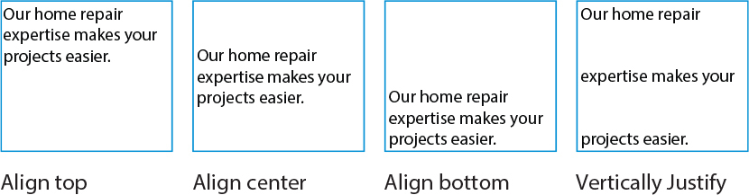
You can align or distribute lines of text in a frame vertically or horizontally when using vertical type. You can align text to the frame’s top, center, or bottom using each paragraph’s leading and paragraph spacing values. You can also justify text vertically, evenly spacing lines regardless of their leading and paragraph spacing values. Here are the different types of vertical alignment you can apply to text:
Next, you’ll vertically align one of the headings to more easily set the spacing between it and the paragraph of text.
![]() Note
Note
You can also access the vertical text align options in the Area Type Options dialog box (Type > Area Type Options).
.Select the Selection tool (
) and click the heading, “YOUR LOCAL HOME REPAIR SPECIALISTS.”In the Area Type section of the Properties panel, click Align Bottom to align the text to the bottom of the text area.
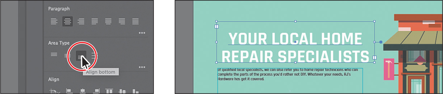
Drag the text area so it looks like the figure.
Using glyph snapping
To learn about glyph snapping, check out the video Working with glyph snapping, which you’ll find in the Web Edition. For more information, see the “Web Edition” section of “Getting Started” at the beginning of the book.
Resizing and reshaping type objects
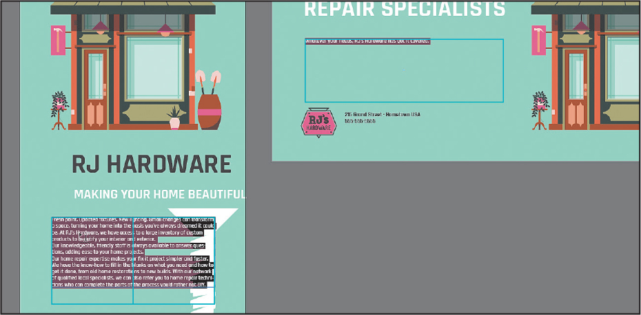
You can create unique type object shapes by reshaping them using a variety of methods, including adding columns to area type objects or reshaping type objects using the Direct Selection tool. To start this section, you’ll place some more text on artboard 1 so you have more text to work with.
Creating columns of text
You can easily create columns and rows of text by using the Type > Area Type Options command. This can be useful for creating a single type object with multiple columns or for organizing text, such as a table or simple chart, for instance. Next, you’ll add a few columns to a type object.

Area type in columns
![]() Tip
Tip
You will also see the Vertical option for vertically aligning text that you explored earlier in the lesson.
With the Selection tool (
) selected, click the paragraph of text in the horizontal ad (the artboard on the right).Choose Type > Area Type Options. In the Area Type Options dialog box, change Number to 2 in the Columns section, and the Gutter to 14 px. Select Preview to see the change, and then click OK.
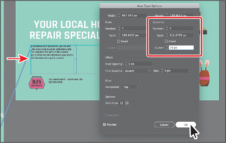
The text box is not split into two columns. There most likely isn’t enough text to fill the second column. You’ll fix that later.
NoteYou may see more or less text in your text area than in the figure, and that’s okay.
If necessary, drag the bottom-middle bounding point down so the area type object is the size of the aqua box on the artboard.

Reshaping type objects
In this section, you’ll reshape and resize a type object to better fit text.
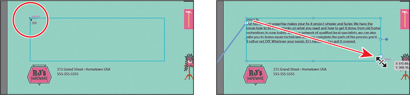
With the Selection tool (
), click the text object with the “215 Grand Street...” text.Press Command and + (macOS) or Ctrl and + (Windows) several times to zoom in to the text.
Select the Direct Selection tool (
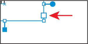
 ). Click and release on the lower-left corner of the type object to select the anchor point.
Drag that point to the right to adjust the shape of the path so the text follows the contour of the RJ’s Hardware logo.
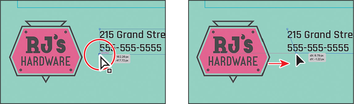
Select the Selection tool, and drag the text closer to the logo, if necessary.
Sampling text formatting
Using the Eyedropper tool (![]() ), you can quickly sample type attributes from text and apply those attributes to other text.
), you can quickly sample type attributes from text and apply those attributes to other text.
Choose 1 Vertical Ad from the Artboard Navigation menu below the Document window to switch to the other ad.
 Note
NoteYour text may be a different size than the figure. That’s okay because you’re about to change it!
Select the Type tool (
) in the toolbar. At the bottom of the artboard, above the curved black line, click and type FAMILY-OWNED SINCE 1918.Press the Escape key to select the text object and Selection tool.
To sample and apply formatting from other text, select the Eyedropper tool (
 ) in the toolbar, and click one of the letters in the “MAKING YOUR HOME BEAUTIFUL” text to apply the same formatting to the selected text.
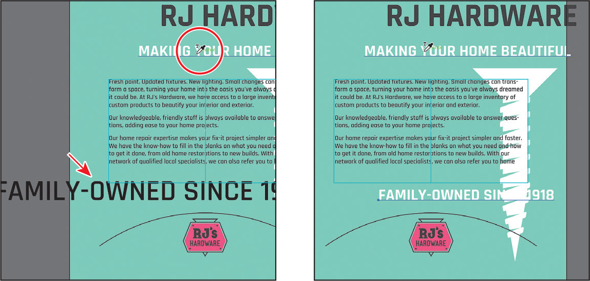
Choose Select > Deselect and then File > Save.
Creating and applying text styles
Text styles allow you to save text formatting to apply it consistently and to be updated globally. Once a style is created, you only need to edit the saved style, and then all text formatted with that style is updated. Illustrator has two types of text styles.
Paragraph—Retains character and paragraph attributes and applies them to an entire paragraph.
Character—Retains character attributes and applies them to selected text.
Creating and applying a paragraph style
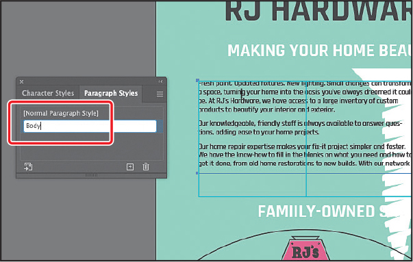
You’ll start by creating a paragraph style for the body copy.
Select the Selection tool (
). On the artboard on the left, double-click in the paragraphs of threaded text to switch to the Type tool and insert the cursor.Choose Window > Type > Paragraph Styles, and click the Create New Style button (
 ) at the bottom of the Paragraph Styles panel.
A new paragraph style appears in the panel and is called “Paragraph Style 1.” To create a paragraph style from text, you don’t have to select the text. You can insert the cursor in the text when making a paragraph style. The text formatting attributes are saved from the paragraph that the cursor is in.
Double-click directly on the style name “Paragraph Style 1” in the list of styles. Change the name of the style to Body, and press Return or Enter to confirm the name inline.
By double-clicking the style to edit the name, you apply the new style to the paragraph (where the cursor is). This means that if you edit the formatting for the Body paragraph style, only this paragraph will update.
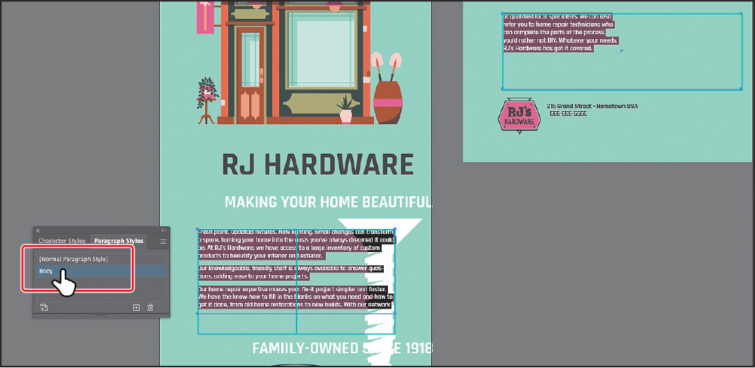
Now you’ll apply the style to all of the text in the threaded frames.
With the cursor in the paragraph text, choose Select > All to select it all.
Click the Body style in the Paragraph Styles panel to apply the formatting.
Practicing paragraph styles
With one paragraph style made, you’ll practice by creating another for a few of the headlines in the document.
Choose Select > Deselect.
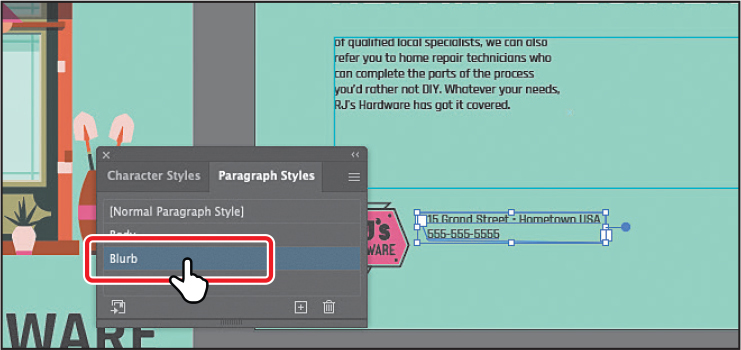
Select the Selection tool (
), and click the text “215 Grand Street” in the horizontal ad on the right.In the Properties panel, click the Fill color, and select the dark green swatch.
 Note
NoteIf you see the overset text icon (
 ) in the out port of the type object, with the Selection tool selected, drag the corner to make it larger so you can see all of the text.
To make a new paragraph style, click the Create New Style button (
) at the bottom of the Paragraph Styles panel.Double-click directly on the new style name “Paragraph Style 2” (or whatever the name you see is) in the list of styles. Change the name of the style to Blurb, and press Return or Enter to change the name.
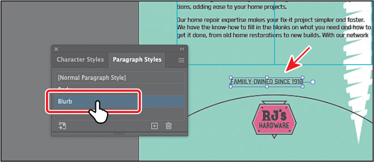
In the vertical ad on the left, click the text that toward the bottom of the artboard that starts with “FAMILY-OWNED...”
NoteIf your text is now lowercase, with the “family-owned...” text selected, choose Type > Change Case > UPPERCASE.
Click the Blurb style in the Paragraph Styles panel to apply the Blurb style to the text.
The Blurb formatting will suit that text better because you’ll add it to the black curved path later in the lesson.
Editing a paragraph style
After creating a paragraph style, you can easily edit the style formatting. Then anywhere the style has been applied, the formatting will be updated automatically. Next, you’ll edit the Body style to see firsthand why paragraph styles can save you time and maintain consistency.
![]() Tip
Tip
There are many more options for working with paragraph styles, most of which are found in the Paragraph Styles panel menu, including duplicating, deleting, and editing paragraph styles. To learn more about these options, search for “paragraph styles” in Illustrator Help (Help > Illustrator Help).
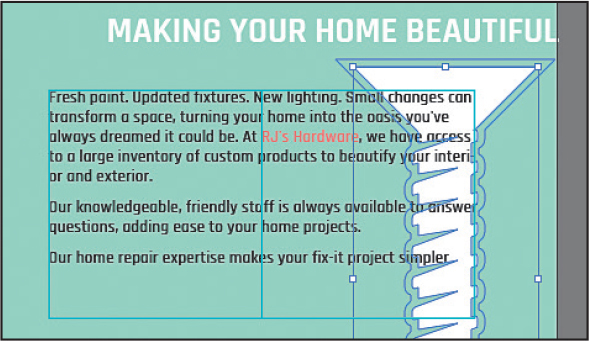
Double-click in the paragraphs of text with the Body style applied on either artboard to insert the cursor and switch to the Type tool.
To edit the Body style, double-click to the right of the style named “Body” in the Paragraph Styles panel list.

In the Paragraph Style Options dialog box, select the Basic Character Formats category on the left side of the dialog box.
Change the Font Size to 14 pt and choose Auto from the Leading menu to ensure it’s the default. The Font Size and Leading options will most likely be blank.
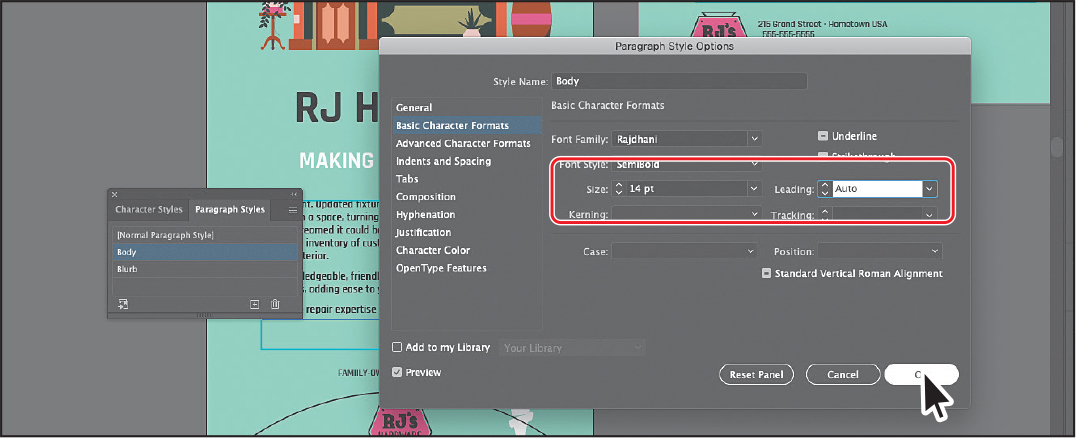
Since Preview is selected by default, you can move the dialog box out of the way to see the text change everywhere the Body style is applied.
Click OK. Leave the cursor in the paragraph so you can zoom into where the cursor is in the text.
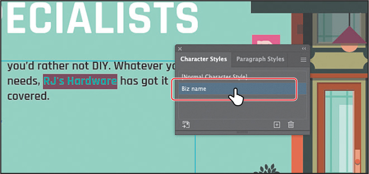
Creating and applying a character style
Character styles, unlike paragraph styles, can be applied only to selected text and can contain only character formatting. Next, you will create a character style from text styling.
With the cursor still in the paragraph, choose View > Zoom In a few times to zoom in to the text.
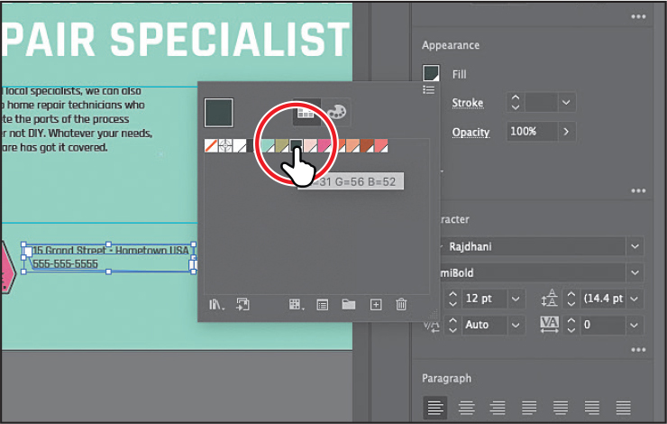
Drag across the “RJ’s Hardware” text to select it.
In the Properties panel, click the Fill box in the Properties panel, and select the swatch named “Salmon.”
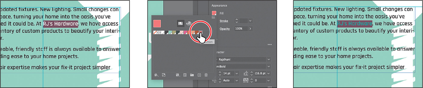
Change the Font Style in the Properties panel to Bold.
In the Paragraph Styles panel group, click the Character Styles panel tab.
In the Character Styles panel, Option-click (macOS) or Alt-click (Windows) the Create New Style button (
) at the bottom of the Character Styles panel.Option-clicking (macOS) or Alt-clicking (Windows) the Create New Style button in a Styles panel lets you edit the style options before the style is added to the panel.
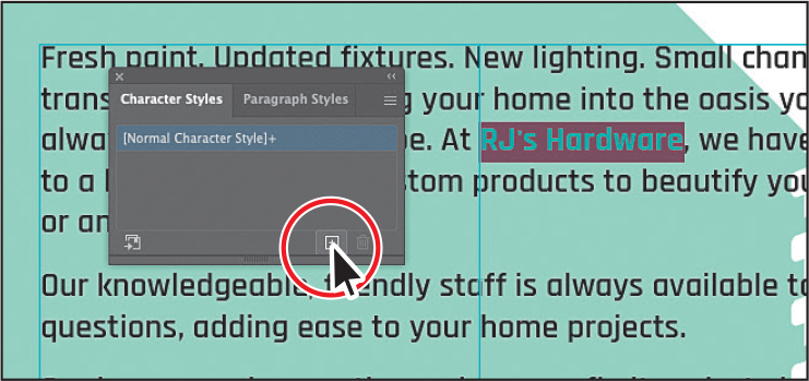
In the dialog box that opens, change the following options:
Style Name: Biz name
Add To My Library: Deselected (if it appears)
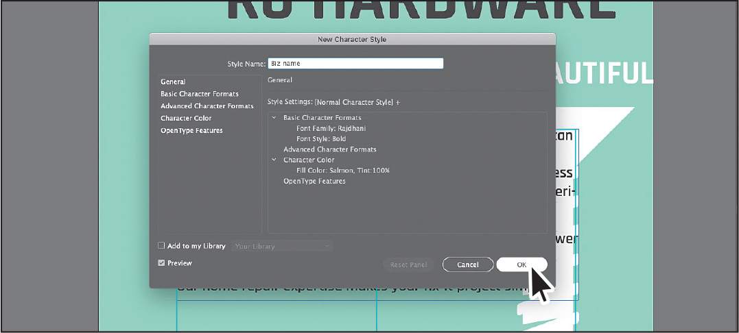
Click OK. The style records the attributes applied to your selected text.
NoteIf you apply the character style and a plus appears next to the style name, which indicates formatting applied to the text that is different from the style formatting, you can Option-click (macOS) or Alt-click (Windows) the style name to apply it.
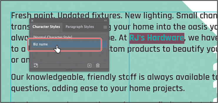
With the text still selected, click the style named “Biz name” in the Character Styles panel to assign the style to that text, and the text will change if the style formatting changes.
Choose 2 Horizontal Ad from the Artboard Navigation menu in the lower-left corner of the Document window.
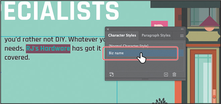
In the paragraph of text, select the “RJ’s Hardware” text, and click to apply the Biz name style in the Character Styles panel.
Choose Select > Deselect.
Editing a character style
After creating a character style, you can easily edit the style formatting, and anywhere that style is applied, the formatting is updated automatically.
Double-click to the right of the Biz name style name in the Character Styles panel (not the name).
In the Character Style Options dialog box, change the following:
Click the Basic Character Formats category on the left side of the dialog box, and change the Font Style back to SemiBold.
Add To My Library: Deselected (if it appears)
Preview: Selected
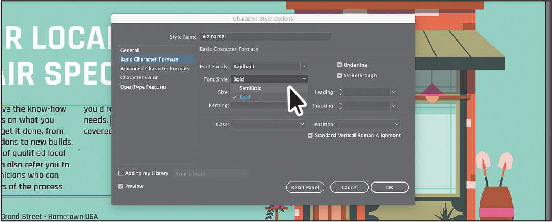
Click OK, and then close the Character Styles panel group.
Wrapping text
In Illustrator, you can wrap text around objects, such as imported images and vector artwork, to avoid text running over those objects or to create interesting design effects. Next, you’ll wrap text around part of the artwork. In Illustrator, as in InDesign, you apply text wrap to the content that the text will wrap around.
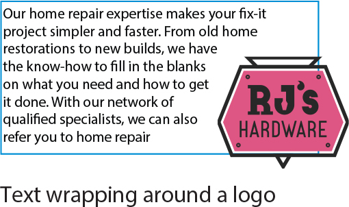
Text wrapping around a log
Choose 1 Vertical Ad from the Artboard Navigation menu below the Document window to switch to the other ad.
Select the Selection tool (
), and click the white screw in the artboard on the left. See the following figure.Text wrap needs to be applied to the object(s) that the text will wrap around.
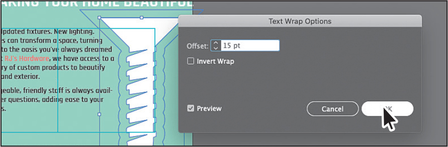
Choose Object > Text Wrap > Make. Click OK if a dialog box appears.
To wrap text around an object, that object must be in the same layer as the text that will wrap around it, and the object must also be located above the text in the layer hierarchy.
With the artwork selected, click the Arrange button in the Properties panel, and choose Bring To Front.

The screw artwork should now be on top of the text in the stacking order, and the text should be wrapping around it.
TipTry dragging the screw artwork to see how the text flows.
Choose Object > Text Wrap > Text Wrap Options. In the Text Wrap Options dialog box, change Offset to 15 pt, and select Preview to see the change. Click OK.
Curving text on a path
In addition to having text in point and type objects, you can have type along a path. Text can flow along the edge of an open or closed path and can lead to some uniquely creative ways to display text. In this section, you’ll add some text to an open path.

Text on a path.
With the Selection tool (
), select the black curved path at the bottom of the artboard on the left.Press Command and + (macOS) or Ctrl and + (Windows) a few times to zoom in.
Select the Type tool (
), and move the cursor over the left end of the black path to see an insertion point with an intersecting wavy path ( ) (see the figure). Click when this cursor appears.
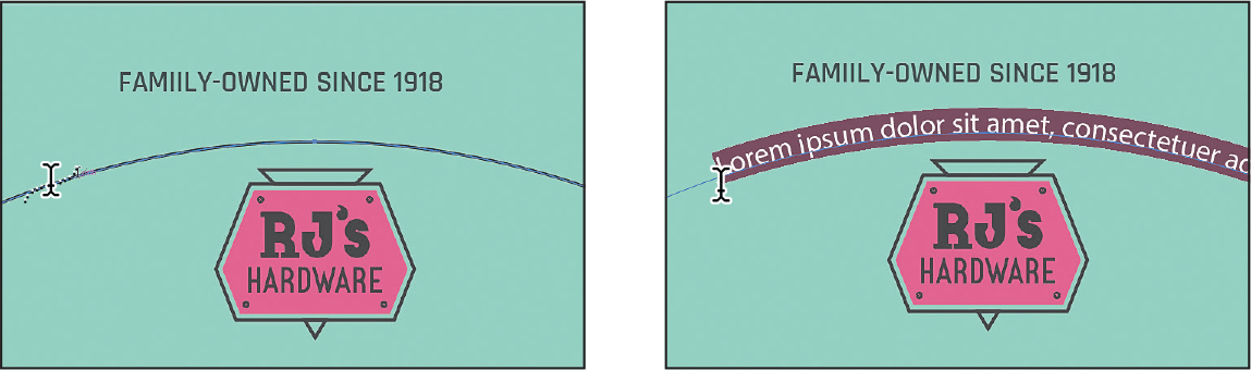
Placeholder text is added to the path, and it starts where you clicked. Your text may have different formatting than you see in the previous figure, and that’s okay.
Now you’ll cheat and copy the FAMILY-OWNED SINCE 1918 text onto the path.
Click in the “FAMILY-OWNED SINCE 1918” text and press Command+A (macOS) or Ctrl+A (Windows) to select it.
Choose Edit > Copy.
Click in the placeholder text on the path, and press Command+A (macOS) or Ctrl+A (Windows) to select it all.
Choose Edit > Paste to replace it.
For the next section, you may want to zoom in further!

Select the Selection tool, and move the pointer over the line on the left edge of the text (just to the left of the “F” in “FAMILY”). When you see this cursor (
 ), press and drag to try to center the text as best you can on the path. Use the following figure as a guide.
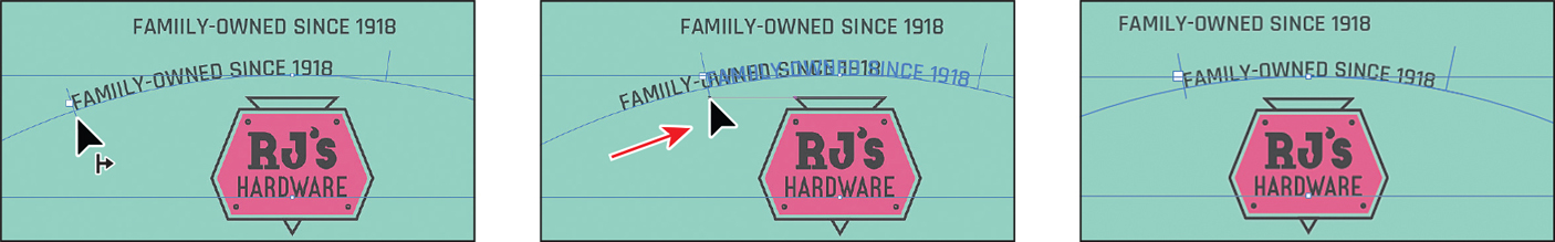
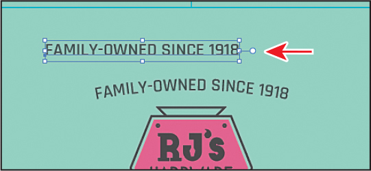
Click the “FAMILY-OWNED...” text that is not on the path. Select it and delete it.
An arrow is pointing to it in the figure.
Warping text
You can create some original design effects by warping text into different shapes using envelopes (shapes). You can make an envelope out of an object on your artboard, or you can use a preset warp shape or a mesh grid as an envelope.

warped text
Reshaping text with a preset envelope warp
Illustrator comes with a series of preset warp shapes that you can warp text with. Next, you’ll make a creative heading by applying a preset warp shape.
Choose View > Fit Artboard In Window.
With the Selection tool selected, click the “RJ HARDWARE” text.
Zoom in closely to the text by pressing Command and + (macOS) or Ctrl and + (Windows) a few times.
Choose Object > Envelope Distort > Make With Warp.
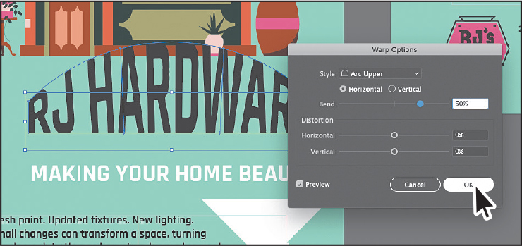
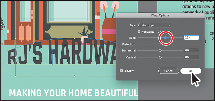
The Warp Options dialog box appears, with Preview selected. Make sure Arc Upper is chosen from the Style menu.
Drag the Bend, Horizontal, and Vertical Distortion sliders to see the effect on the text. You may need to deselect and then select Preview.
Ensure the Distortion sliders are 0%, and make sure that Bend is 50%. Click OK.
Editing the envelope warp
If you want to make any changes, you can edit the text and shape that make up the envelope warp object separately. Next, you will edit the text and then the warp shape.
With the envelope object still selected, click the Edit Contents button (
 ) at the top of the Properties panel.
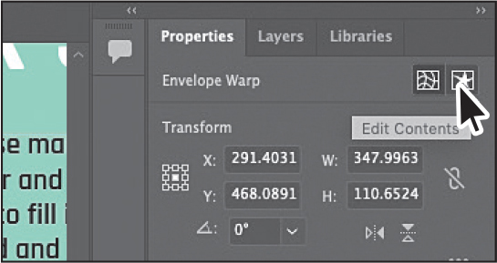
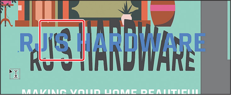
Select the Type tool (
), and move the pointer over the warped text. Notice that the unwarped text appears in blue. Change the “RJ” text to RJ’S.You can also edit the preset shape, which is what you’ll do next.
Select the Selection tool (
), and make sure the envelope object is still selected. Click the Edit Envelope button ( ) at the top of the Properties panel.
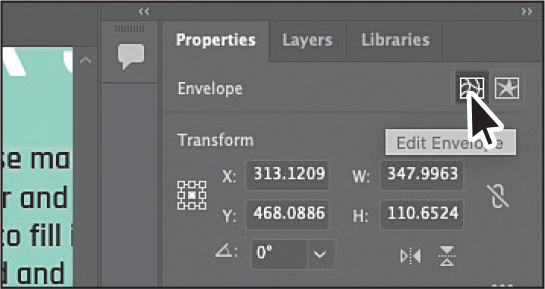 Tip
TipIf you double-click with the Selection tool instead of with the Type tool, you enter Isolation mode. This is another way to edit the text within the envelope warp object. Press the Escape key to exit Isolation mode.
TipTo take the text out of the warped shape, select the text with the Selection tool and choose Object > Envelope Distort > Release. This gives you two objects: the type object and an arc lower shape.
Click the Warp Options button in the Properties panel to show the same Warp Options dialog box you saw when you first applied the warp. Change the Bend to 25%, and click OK.
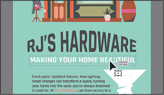
With the Selection tool, drag the warped text and then the white heading that starts with “MAKING YOUR...” to center them above the paragraphs of text.
Choose Select > Deselect, and then choose File > Save.
Creating text outlines
Converting text to outlines means converting text into vector shapes that you can edit and manipulate like any other vector graphic. When you create outlines from text, that text is no longer editable as text. Text outlines allow you to change the look of large display type or send a file to someone when you can’t or don’t want to send the font. They are rarely helpful for body text or other text formatted at small sizes. If you convert all text to outlines, the file recipient doesn’t need your fonts installed to open and view the file correctly.
![]() Note
Note
Bitmap fonts and outline-protected fonts cannot be converted to outlines, and outlining text that is less than 10 points in size is not recommended.
When type is converted to outlines, it loses its hints—instructions built into outline fonts to adjust their shape to display or print optimally at many sizes. You must also convert all text in a selection to outlines; you cannot convert a single letter within a type object. Next, you will convert the main heading to outlines.
Choose View > Fit All In Window.
With the Selection tool (
) selected, click the “YOUR LOCAL HOME REPAIR SPECIALISTS” text, on the right artboard.Choose Edit > Copy and then choose Object > Hide > Selection.
The original text is still there; it’s just hidden. This way, you can always choose Object > Show All to see the original text if you need to make changes.
Choose Edit > Paste In Front.

Choose Type > Create Outlines.
The text is no longer linked to a particular font. Instead, it is now editable artwork.

For a last bit of cleanup, click the two columns of text and drag the bottom middle handle up so the text is balanced across the columns.
Having the business name split on two lines is bothersome. To fix it, you could select the Type tool and insert the cursor right before “RJ’s” and then add a soft return (Shift+Enter [macOS] or Shift+Return [Windows]).
Choose Select > Deselect.
Choose File > Save, and then choose File > Close.
Review answers
1 The following methods can be used for creating text:
With the Type tool (
 ), click the artboard, and start typing when the cursor appears. A point type object is created to accommodate the text.
With the Type tool, drag to create a type area object. Type when a cursor appears.
With the Type tool, click a path or closed shape to convert it to text on a path, or click in a type object. Here’s a tip: Option-clicking (macOS) or Alt-clicking (Windows) when crossing over the stroke of a closed path creates text around the shape.
2 Overflow text is text that does not fit within an area type object or path. A red plus sign (![]() ) in an out port indicates that the object contains additional text.
) in an out port indicates that the object contains additional text.
3 Text threading allows you to flow text from one object to another by linking type objects. Linked type objects can be of any shape; however, the text must be entered in an area or along a path (not at a point).
4 A character style can be applied to selected text only. A paragraph style is applied to an entire paragraph. Paragraph styles are best for indents, margins, and line spacing.
5 Converting text to outlines eliminates the need to send the fonts along with the Illustrator file when sharing with others and makes it possible to add effects to type that aren’t possible when the type is still editable (live).