A Quick Tour of Adobe Illustrator (2022 Release)
Lesson overview
In this interactive demonstration of Adobe Illustrator (2022 release)you’ll get an overview of the main features of the application.

This lesson will take about 45 minutes to complete. To get the lesson files used in this chapter, download them from the web page for this book at adobepress.com/IllustratorCIB2022. For more information, see “Accessing the lesson files and Web Edition” in the Getting Started section at the beginning of this book.

Begin to get comfortable with some of the essential features of Adobe Illustrator as you create an advertisement.
Starting the lesson
For the first lesson of this book, you’ll get a quick tour of the most widely used tools and features in Adobe Illustrator, offering a sense of the many possibilities. Along the way, you’ll create artwork for an art supply advertisement. First, you’ll open the final artwork to see what you will create in this lesson.
![]() Note
Note
If you have not already downloaded the project files for this lesson to your computer from your Account page, make sure to do so now. See the “Getting Started” section at the beginning of the book.
![]() Note
Note
If finding the preferences file proves difficult, contact [email protected] for assistance.
To ensure that the tools and panels function exactly as described in this lesson, delete or deactivate (by renaming) the Adobe Illustrator preferences file. See “Restoring default preferences” in the “Getting Started” section at the beginning of the book.
Start Adobe Illustrator.

Choose File > Open, or click Open in the Home screen that is showing. Open the L00_end.ai file in the Lessons > Lesson00 folder.
Choose View > Fit Artboard In Window to see an example of the art supply ad you’ll create in this lesson. Leave the file open for reference, if you’d like.
Creating a new document
In Illustrator, you can start a new document using a series of preset options, depending on your needs. In this case, you will save the ad you create for social media, so you will choose a preset from the Web presets to start.
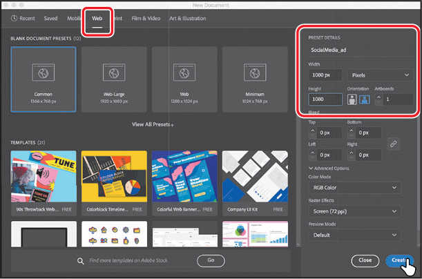
Choose File > New.
In the New Document dialog box, select the Web preset category at the top of the dialog box.
You could choose from a blank document preset size to start, but in this case, you’ll make the ad a specific size. In the Preset Details area on the right, change the following:
Enter a name for the document in the blank space under “Preset Details”: SocialMedia_ad
Width: Select the Width value, and type 1080 (pixels).
Height: Select the Height value, and type 1080 (pixels).
Click Create, and a new, blank document opens.
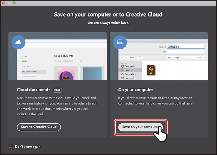
Choose File > Save As.
 Note
NoteLearn more about what a cloud document is in Lesson 1, “Getting to Know the Work Area.”
If the Cloud Document dialog box opens, click Save On Your Computer to save the file on your computer (locally).
 Note
NoteThe figures in this lesson were taken using macOS and may look slightly different from what you see if you are using Windows.
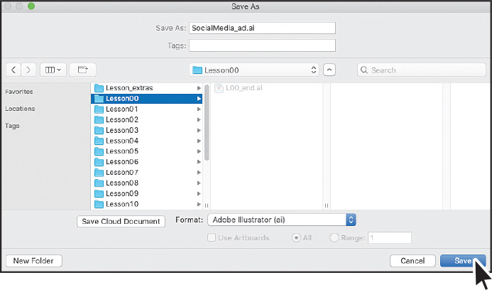
In the Save As dialog box set the following options:
Leave the name as SocialMedia_ad.ai.
Navigate to the Lessons > Lesson00 folder.
Leave Adobe Illustrator (ai) chosen from the Format menu (macOS) or Adobe Illustrator (*.AI) chosen from the Save As Type menu (Windows).
Click Save.
In the Illustrator Options dialog box that appears, leave the Illustrator options at their default settings, and then click OK.
Choose Window > Workspace > Essentials, and then choose Window > Workspace > Reset Essentials to reset the workspace.

Choose View > Fit Artboard In Window.
The white area you see is called the artboard, and it’s where your artwork will go. Artboards are like pages in Adobe InDesign or physical papers on a desk. Your document can have multiple artboards, and each can be a different size.
Drawing shapes
Shapes are the cornerstone of Illustrator, and you’ll create many of them in the coming lessons. To start your project, you’ll make several shapes that will become a marker in the ad.
![]() Note
Note
Explore how to make and edit all kinds of different shapes in Lesson 3, “Using Shapes to Create Artwork for a Postcard.”
Select the Rectangle tool (
 ) in the toolbar on the left.
Move the pointer into the top center of the artboard, and drag to make a small rectangle that will become the marker tip. As you drag, you’ll probably see a gray measurement label showing the size of the shape. That is a part of Smart Guides, which are turned on by default. When the gray measurement label next to the pointer shows a width of around 80 pixels and height of approximately 110 pixels, release the mouse button.

Now you’ll make a copy of the rectangle below it, to make the top part of the body of the marker.
Choose Edit > Copy, and then choose Edit > Paste In Place to paste a copy on top of it.
To move it down, drag the rectangle by the solid blue dot in the center. You’ll see a vertical magenta alignment guide as you drag, telling you the copy is aligned with the original. See the figure for how far to drag.

Below the new rectangle, drag to make a much larger rectangle.
For a reference, the rectangle I made is 280 pixels wide and about 600 pixels tall. See the figure for approximately how big.
Press and hold on the Rectangle tool to see a menu of tools. Select the Ellipse tool from that menu.

Press the Shift key and drag to make a perfect circle that fits within the largest rectangle. Release the mouse button and then the key.

Editing shapes
Most shapes are live, which means you can edit them without switching away from the tool you’re drawing with. Next you’ll edit the circle, and then the larger rectangle. The edits you will make will be more exacting.
![]() Note
Note
Learn more about editing shapes in Lesson 3, and Lesson 4, “Editing and Combining Shapes and Paths.”
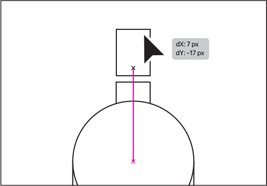
With the circle still selected, drag it from the blue dot in the center so the left edge aligns (snaps) to the left edge of the larger rectangle.
A vertical magenta guide will show when the circle is aligned with the rectangle.
To make the circle as wide as the rectangle, pressing the Shift key, drag the point on the right side of the box around the circle, to the right. When the pointer snaps to the right edge of the rectangle, release the mouse button and then the key.

With the circle still selected, drag it up from the blue dot in the center so the center of the circle aligns (snaps) with the top of the larger rectangle.
Magenta guides will show when the circle is aligned with the rectangle.

Select the Selection tool (
 ) in the toolbar on the left to edit the other shapes.
Click in the largest rectangle to select it. Drag the bottom middle point on the box down to make the rectangle taller until you see a height of about 670 pixels in the gray measurement label next to the pointer.

To move the two smaller rectangles in place, click one of the rectangles, and then Shift-click the other.
Drag them onto the circle, making sure they are centered on the circle. A vertical magenta guide will show when it is. Use the figure as a reference.
Choose File > Save to save the document.
Combine shapes using the Shape Builder tool
The Shape Builder tool (![]() ) is used to create more complex shapes by merging and removing simpler shapes. Next you’ll merge the circle, larger rectangle, and one of the smaller rectangles to make the body of the marker.
) is used to create more complex shapes by merging and removing simpler shapes. Next you’ll merge the circle, larger rectangle, and one of the smaller rectangles to make the body of the marker.
![]() Note
Note
Learn more about working with the Shape Builder tool in Lesson 4.

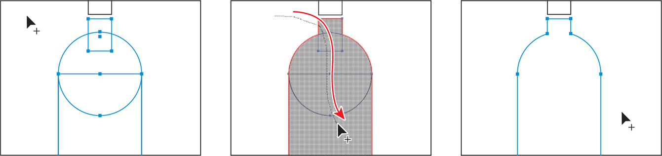
Starting in an empty area of the artboard, drag across the three shapes to select them.
Select the Shape Builder tool (
 ) in the toolbar on the left.
Move the pointer to roughly where you see the pointer in the first part of the following figure. Drag through all of the shapes to combine them, following the second part of the figure for where to drag. Release the mouse button, and the shapes are combined.
Now you’ll round a few of the corners on the bottle. To round only a few, you need to select certain anchor points using the Direct Selection tool.
NoteLearn more about paths and anchor points in Lesson 7, “Drawing with the Pen tool.”
The blue squares on the selected shape are called anchor points. They are used to control the path’s shape.
Select the Direct Selection tool (
 ) in the toolbar.
You will also see a bunch of double circles called corner radius widgets. They control the roundness of the corners. To round two corners at once, you will select the anchor points on just those corners.
Drag across the two anchor points you see in the following figure.
Drag either double-circle away from the shape to round the corners as much as you want.

If you drag far enough, the paths will turn red, telling you that’s as much as you can round the corners.
Save the file by choosing File > Save.
Applying and editing color
Applying color to artwork is a great way to express yourself creatively. Shapes you create can have a stroke (border) that goes around the edge and can be filled with a color. You can apply and edit swatches, which are saved colors that you make or that come with each document by default.
![]() Note
Note
Learn more about fill and stroke in Lesson 8, “Using Color to Enhance Artwork.”
Select the Selection tool (
) in the toolbar.Click the small marker tip rectangle to select it.
Click the white color box (
 ) to the left of the word “Fill” in the Properties panel. In the Swatches panel that opens, ensure that the Swatches option (
 ) is selected at the top. Move the pointer over the color swatches, and a tool tip appears, telling you the name of the swatch. Click an orange color with the tool tip (“R=247, G=147, B=30”) to change the fill color.
While you can use the default swatches, you can also create your own colors and save them as swatches to reuse later.
 Note
NoteGoing forward, you’ll find you need to hide panels such as the Swatches panel before you continue. You can press the Escape key to do this.
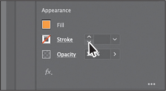
To remove the stroke (border) on the shape, in the Properties panel, click the down arrow for the stroke weight until it is gone.
Select the marker body shape to change its fill color as well.
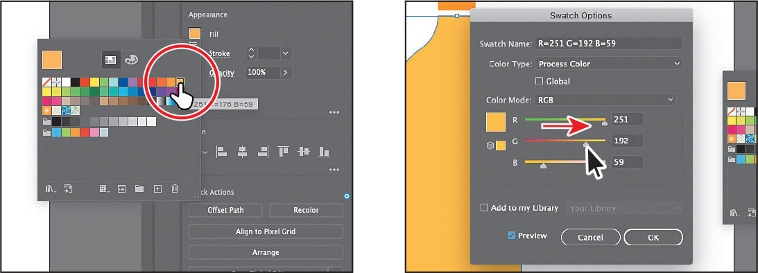
Click the Fill color box (
) to the left of the word “Fill” in the Properties panel. In the Swatches panel, click to apply a lighter orange color to the marker tip. Leave the Swatches panel showing. Now you’ll edit that color.
Double-click the swatch you applied in the Swatches panel (it has a white border around it).
In the Swatch Options dialog box, select Preview to see the change to the marker body. Drag the G (Green) slider to the right to give the color some more yellow and make it a bit lighter. The swatch is made of red, green, and blue colors.
Click OK to save the change you made to the swatch.
To remove the stroke (border) on the shape, in the Properties panel, click the down arrow for the stroke weight until it is gone.
Transforming artwork
From rotating and scaling to moving, shearing, and reflecting, transforming artwork in Illustrator will allow you to create unique and creative projects.
Now you’ll reshape the marker tip, and then make some copies of the whole marker, change the color, and rotate them.
Click the small marker tip rectangle to select it.
Select the Direct Selection tool (
) in the toolbar and click the upper-left corner point on the shape to select it. Release the mouse button, and then drag that selected corner point down to give the marker tip a chiseled look.
Select the Selection tool (
) in the toolbar.To deselect everything, choose Select > Deselect.
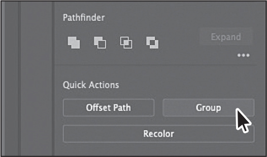
To select both shapes on the artboard, choose Select > All On Active Artboard.
 Note
NoteIf your marker is not in the middle of the artboard, go ahead and drag it into the middle.
Click the Group button toward the bottom of the Properties panel on the right.
Grouping treats the selected objects as one. The next time you want to select both the marker tip and the body you can simply click one to select them as a group.
Choose Edit > Copy and then Edit > Paste to make a copy.
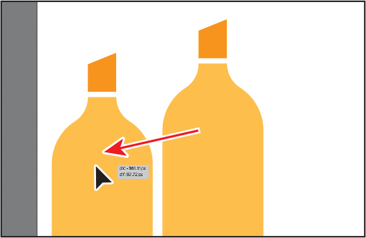
Drag the copy to the left, as in the figure.
To rotate the copy of the marker, move the pointer just off a corner of the box around it. When you see curved arrows, drag counter clockwise to rotate it a little.

With one marker copy in place, you’ll make another copy and flip it so it’s on the other side of the original marker.
With the marker still selected, make a copy by choosing Edit > Copy. This time, choose Edit > Paste In Place to make a copy right on top of the original.
To flip the copy, in the Properties panel, click the Flip Horizontally button (
 ).
).Press the Shift key, and drag the marker to the right of the marker in the middle. Release the mouse button and then the key. Leave the marker selected.

Recoloring artwork
In Illustrator, you can easily recolor artwork using the Recolor Artwork option. Next, you’ll recolor the two marker copies.
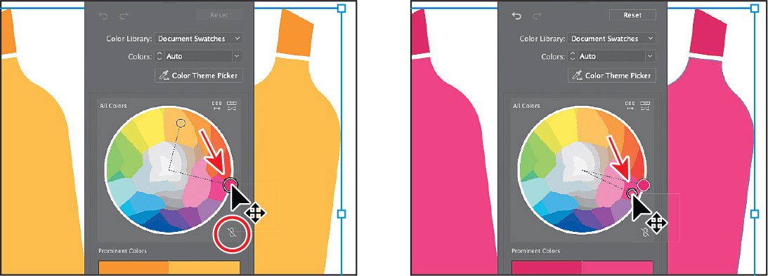
Shift-click the marker on the far left to select both.
Click the Recolor button toward the bottom of the Properties panel to open the Recolor Artwork dialog box.
NoteIf you click anywhere in the document, the Recolor Artwork dialog box will close. To open it again, make sure the markers are selected, and then click the Recolor button in the Properties panel.

You can see the two colors from the bottle—the orange and lighter orange, as circles on the color wheel in the middle of the dialog box. Recolor artwork lets you change color in selected artwork. Now, you’ll show the swatches that are in the document and then change the two orange colors.
Choose Document Swatches from the Color Library menu at the top of the panel.

The color wheel now shows the swatches you saw when editing the fill color of artwork in the Properties panel. You can drag the little color circles in the color wheel to change the corresponding color in the selected art. But, by default, dragging one color circle drags all together.
To edit the two colors independently, click the link icon (
 ) beneath the color wheel to turn it off. It will look like this after you click it:
  . It’s circled in the first part of the following figure.
Now, drag each of the orange circles, one at a time, into a different red color to change the artwork.
Click in an empty are of the document window to hide the Recolor Artwork dialog box.
To select all of the markers, choose Select > All On Active Artboard.
Choose Object > Group to group them all together.
If you need to edit one of the markers, you can always click the Ungroup button in the Properties panel to break the markers apart again.
Choose Select > Deselect.
Choose File > Save.
Creating and editing a gradient
Gradients are two or more colors that gradually blend one into another over a distance that you can apply to the fill or stroke of artwork. Next, you’ll up your color game and apply a gradient to a banner. Then you will add some text to it.
![]() Note
Note
Learn more about working with gradients in Lesson 11, “Gradients, Blends, and Patterns.”
Choose View > Zoom Out so it’s easier to see the edges of the artboard.
Press and hold the mouse button on the Ellipse tool (
 ) in the toolbar, and select the Rectangle tool () from the menu of tools.
Starting on the left edge of the artboard, drag across to the right edge, making a rectangle the width of the artboard and with a height of approximately 375 pixels.

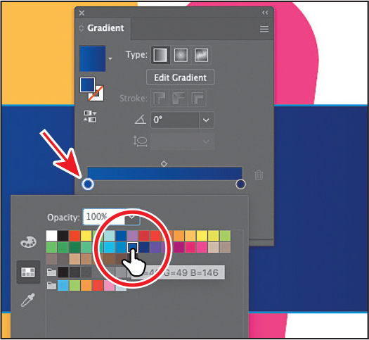
In the Properties panel, click the Fill color box, and select the white-to-black swatch with the tool tip “White, Black.” Leave the Swatches panel showing.

At the bottom of the Swatches panel, click the Gradient Options button to open the Gradient panel. An arrow is pointing to the button in the previous figure.
You can drag the Gradient panel by the title bar at the top to move it around.
In the Gradient panel, do the following:
Click the Fill box to make sure you are editing the fill (circled in the figure).
Double-click the little black color stop (
 ) on the right side of the gradient slider in the Gradient panel (an arrow is pointing to it in the figure).
Click the Swatches button (
) in the panel that appears. Select a dark blue swatch.Double-click the little white color stop (
 ) on the left side of the gradient slider in the Gradient panel (an arrow is pointing to it in the figure).
Select a lighter blue swatch.

There are a lot of creative possibilities with gradients, from applying gradients to the stroke (border) of objects to making color transparent (see-through).
Click the X at the top of the Gradient panel to close it.
Editing strokes
A stroke is the outline (border) of artwork such as shapes and paths. There are a lot of appearance properties you can change for a stroke, including width, color, dashes, and more. In this section, you’ll adjust the stroke of the banner rectangle.
![]() Note
Note
Learn more about working with strokes in Lesson 3.
With the rectangle still selected, click the word “Stroke” in the Properties panel.
In the Properties panel, when you click an underlined word, more options appear in a panel.
In the Stroke panel, change the following options:
Stroke Weight: 11 pt
Click Align Stroke To Inside (
 ) to align the stroke to the inside of the rectangle edge.

In the Properties panel, click the Stroke color box (
 ), and select the white swatch.
Choose Select > Deselect.

Creating with the Curvature tool
”With the Curvature tool (![]() ), you can draw and edit smooth, refined paths and also straight lines. In this section, you’ll explore the Curvature tool while creating a marker scribble.
), you can draw and edit smooth, refined paths and also straight lines. In this section, you’ll explore the Curvature tool while creating a marker scribble.
![]() Note
Note
Learn more about working with the Curvature tool in Lesson 6, “Using the Basic Drawing tools.”
Select the Curvature tool (
 ) in the toolbar. Before you start drawing, you’ll remove the fill and change the stroke color.
Click the Fill color box (
 ) to the left of the word “Fill” in the Properties panel. In the Swatches panel, click to apply the None (
 ) swatch to remove the fill.
Click the Stroke color box (
 ) to the left of the word “Stroke” in the Properties panel. In the Swatches panel, click to apply an orange swatch.
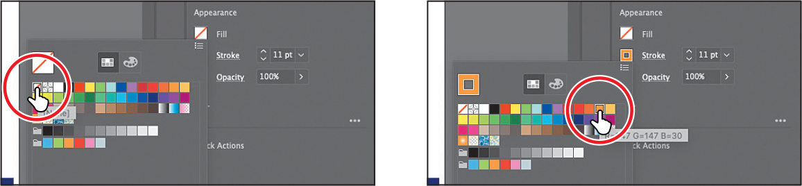
Move the pointer into the middle of the marker tip (see the first part of the following figure). Click and release to start drawing a shape.
NoteIf the pointers you see don’t match the figures, make sure Caps Lock is not on.
To make a serpentine shape (like an “s”), move the pointer to the left, and click and release (see the second part of the figure). Move the pointer away after clicking to see a curving path.
Every time you click, you are creating what is called an anchor point. As described earlier, anchor points you add (the circles you see on the path) control the shape of the path.

 Tip
TipAfter creating the path, you can move the pointer over any of the anchor points on the path—the circles—and drag to edit the path.
Make a scribble by clicking to the right, to the left, and then to the right. See the figure for where I clicked.
Press the Esc key to stop drawing.
With the path selected, next you’ll change the order of the artwork and put the path behind everything else on the artboard.

Click the Arrange button in the Quick Actions section of the Properties panel. Choose Send To Back to stack it behind everything. Leave it selected.

Applying a brush
With brushes, you can decorate paths with patterns, figures, brush strokes, textures, or angled strokes. You can also modify the brushes provided with Illustrator and create your brushes. Next, you’ll apply a brush to the path you just drew to make it look more like a marker scribble.
![]() Note
Note
Learn more about getting creative with brushes in Lesson 12, “Using Brushes to Create an Ad.”
Select the Selection tool (
) in the toolbar.With the path you drew still selected, choose Window > Brush Libraries > Artistic > Artistic_Ink. It’s toward the bottom of the long menu that displays.

Scroll in the Artistic_Ink panel, and click the brush named “Marker” to apply it.
In the panel that opens, you see some brushes that come with Illustrator.
Change the Stroke Weight in the Properties panel to 6 pt by clicking the up arrow to the right of the word “Stroke.”

Close the Brushes panel by clicking the X in the top corner of the panel.
Choose File > Save.
Working with type
Next you’ll add text to the project and make some formatting changes to it.
Select the Type tool (
 ) in the toolbar on the left, and click in the large rectangle with the gradient fill. Placeholder text will appear with the selected placeholder text, “Lorem ipsum.”
 Note
NoteLearn more about working with type in Lesson 9, “Adding Type to a Project.”
Type ART SUPPLIES in capital letters.
The text will be small and hard to read against the gradient. You’ll remedy that next.
Select the Selection tool (
) so the text object is selected.Click the Fill color box (
 ) in the Properties panel. In the Swatches panel, click to apply an orange color.
In the Character section of the Properties panel, select the font size, and type 73. Press Return or Enter to accept the size change.
In the same section of the Properties panel, change the Tracking (
 ) value by selecting the value in the field and typing 30 (highlighted in the following figure). Press Return or Enter to accept the change. Tracking is how you can adjust spacing between characters. Leave the text selected.
Warping text
You can create some great design effects by warping text into different shapes using envelopes. You can make an envelope out of an object on your artboard, or you can use a preset warp shape or a mesh grid as an envelope.
![]() Note
Note
Learn more about warping text in Lesson 9.
With the Selection tool selected and the text still selected, copy and paste the text by choosing Edit > Copy and then Edit > Paste.
Drag the two text boxes so they are still within the bounds of the rectangle and stacked one on top of the other.

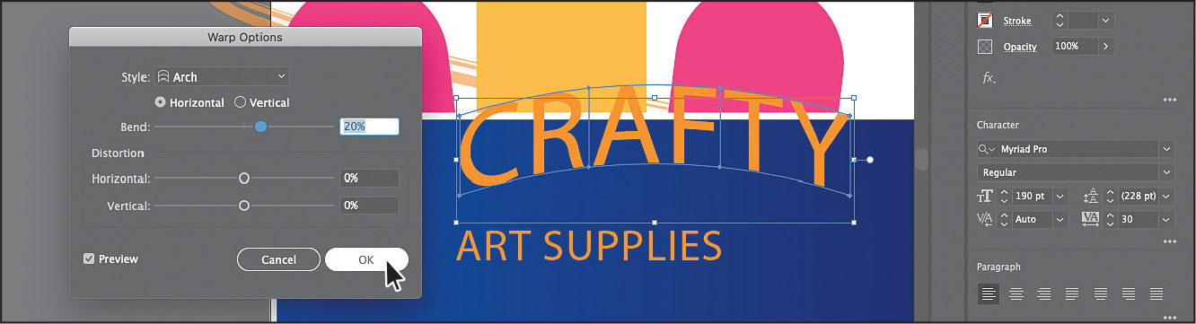
Select the Type tool, move the pointer over the top text, and triple-click to select it. Type CRAFTY.
Select the Selection tool (
) so the CRAFTY text object is selected.Change the font size to 190 in the Properties panel on the right.

Choose Object > Envelope Distort > Make With Warp to open the Warp Options dialog box. In that dialog box, change the following:
Style: Arch (not Arc)
Bend: 20%
 Tip
TipTo edit the warp options again in the Warp Options dialog box, click the Warp Options button in the Quick Actions section of the Properties panel.
Click OK. The text is now in a shape, but is still editable.

With the Selection tool selected, drag the curved text and the “ART SUPPLIES” text into position.
Choose Select > Deselect.
Working with effects
Effects alter the appearance of an object without changing the base object. Next you’ll apply an effect to a sale sticker you make.

![]() Note
Note
Learn more about effects in Lesson 13, “Exploring Creative Uses of Effects and Graphic Styles.”
Press and hold on the Rectangle tool (
) in the toolbar, and select the Ellipse tool (). Over the top of the banner rectangle, Shift-drag to make a circle like the one in the figure. Release the mouse button and then the key.Click the Fill color in the Properties panel. In the panel that opens, select a color. I chose a light blue.

In the Properties panel, click the Choose An Effect button (
 ), and choose Distort & Transform > Zig Zag.
In the Zig Zag dialog box, select Preview to see your changes, if it isn’t already selected, and then set the following options:
Size: 9 px
Absolute: Selected
Ridges Per Segment: 9
Points: Corner
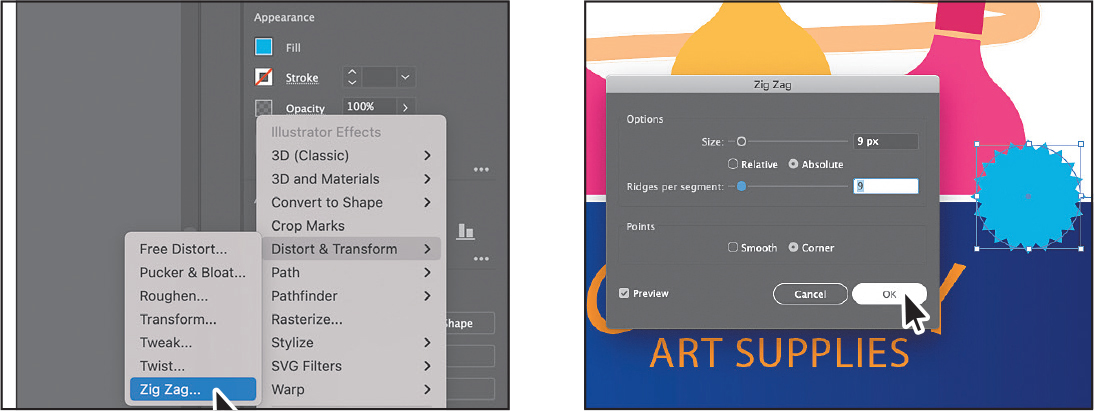
Click OK.
Adding more text for practice
Now for a little practice! Try adding some text on top of the circle. You’ll apply formatting you’ve already learned and a few more options. Here are the steps:
Select the Type tool (
), and click to add some text. To replace the text, type 30%, press Enter or Return, and then type OFF.Select the Selection tool (
) so the text object is selected.Set the following options in the Properties panel:
Change the fill color to white.
Change the font size to 60 pt.
Change the Leading (circled in the figure) to 50. This changes the distance between the lines of text.
In the Paragraph section of the Properties panel (below the formatting options you just set), click Align Center (
 ) so the text is center aligned.

Drag the text so it is approximately centered on the circle.
NoteIf your circle is too small, press the Shift key and drag a corner to make it larger. Release the mouse button and then the key.
Shift-click the blue circle to select the text and the blue circle.
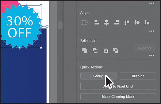
Click the Group button in the Quick Actions section of the Properties panel to keep them together as a group.
Aligning artwork
”Illustrator makes it easy to align or distribute multiple objects relative to each other, the artboard, or a key object. In this section, you’ll move artwork into position and align some of it to the center of the artboard.
![]() Note
Note
Learn more about aligning artwork in Lesson 2, “Techniques for Selecting Artwork.”
With the Selection tool (
) selected, click to select the group of markers.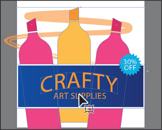
To select more content, press the Shift key, and click the banner rectangle, the “CRAFTY” text, and the “ART SUPPLIES” text.
Click the Align To Selection menu (
 ) in the Properties panel to the right of the document, and choose Align To Artboard from the menu. Any content you apply an alignment to will now align to the edges of the artboard.
Click the Horizontal Align Center button (
 ) to align the selected artwork to the horizontal center of the artboard.
If necessary, drag the marker scribble and the sale bug into position.
Choose File > Save, and then choose File > Close.
