Chapter 8. Leveling Up with Design
Chapter Learning Objectives
![]() Master the theory of design elements and principles.
Master the theory of design elements and principles.
![]() Evaluate typography.
Evaluate typography.
![]() Understand color theory.
Understand color theory.
Chapter ACA Objectives
DOMAIN 2.0
UNDERSTANDING PRINT AND DIGITAL MEDIA PUBLICATIONS
2.2 Demonstrate knowledge of basic design principles and best practices employed in the print and digital media publication industries.
2.3 Demonstrate knowledge of typography and its use in the print and digital publication industries.
2.4 Demonstrate knowledge of color and its use in the print and digital media publication industries.
Throughout the course of this book you’ve learned how to use InDesign, and there have been lots of hints about the design properties that lead to good solid design. You’ve been introduced to working with shapes, color, and spacing and even the rule of thirds.
Now that you have a good grasp of the InDesign’s tools and features, it’s time to level up and learn more about the best ways to use them creatively.
In this chapter, you’ll learn more about design hierarchy, and the combined role of design principles, such as contrast, or balance, and elements of art, such as lines, shapes, or color in creating designs that have impact.
Creativity Is a Skill
You’re now at the point when the only way to get better is to practice and to learn the thought processes that a real master craftsman goes through to create unique and creative work. The beauty of this stage is that it’s when you start to become an artist. Being good at any tool is not just about knowing how it works and what it does, but about knowing when to use it and what techniques to apply to create something new.
![]() Video 8.1
Video 8.1
![]() Video 8.2
Video 8.2
Let’s start by talking about creativity. Figure 8.1 is a highly scientific and statistically accurate diagram that I’ve created.
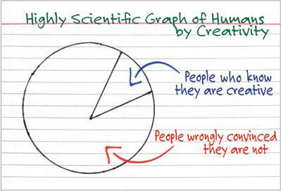
OK, so perhaps it isn’t exactly statistically accurate and maybe my methods weren’t really scientific, but it’s still true. Creativity is a skill that you can learn and improve with practice. But you have only one way to guarantee that you’ll never be more creative than you are now:
The biggest creative problem most people have is that they give up. Some people give up before even making their first effort. Others give up after their fifth effort or after 15 minutes of not creating a masterpiece. Nobody creates a 15-minute masterpiece. A big difference between a great artist and a terrible artist is that a great artist has tried and failed, made some adjustments, and tried again. The next try may also lead to failure, but the artist pushes forward. The artist isn’t deterred by bumping into a problem because it’s all part of the learning and creative process.
Of course, you can’t know how far you can take your creative skills until you start practicing and expanding those skills. But if you never use them, they’ll only grow weaker. Remember that every effort, every new attempt, and every goof-up builds strength.
Getting a Creative Workout
This chapter is about developing your creative skills and flexing those muscles. It’s about turning the craft of being a digital designer into a natural ability. Even if you take the big step of becoming an Adobe Certified Associate, you must realize that passing the test is just getting through the tryouts. When you get that credential, it’s like being picked to be on a professional football team. It’s certainly something to be proud of, but the real goal is the Super Bowl. You have a lot more work ahead, but it is fun and rewarding work.
This book obviously can’t directly respond to the skills you are developing, but it has introduced you to some exercises to help you explore and enhance those skills. Getting beyond the basics of creativity and design is just a matter of applying your basic skills in ways you’ve never tried. That’s really all there is to creativity.
Prepping Your Mindset
This is the most important part of increasing your creative skills. And for most of us, it’s the hardest because today’s culture is so focused on instant success and efficiency that people learn to fear the essence of creativity:
Failure.
Failure—and more specifically, the ability to comfortably accept failure—is the key ingredient in developing your artistic skillset. This is especially true if you are a beginner and aren’t entirely happy with your current abilities. Just face that you’re a design baby. And start acting like one.
Yes, I just encouraged you to act like a baby. But I mean an actual infant, not a grown person who is throwing a fit. Real babies are fearless and resilient when they fail. They keep trying. They don’t give up. Most of the time, they don’t even realize that they’re failing, because they haven’t yet learned that concept (Figure 8.2).

That’s what you need to tap into. In art, there are no failures, there are only quitters. Tap into your inner infant. Try and fail, and try and fail, and try and fail. Eventually, you’ll take your first step. You may quickly fail again on your second step, but don’t give up. Babies don’t know that they’ve failed. They just know that they got a little bit closer. They know what every true artist knows, and what the rest of us need to remember but have forgotten along the way: Failure is the path.
The Design Hierarchy
Almost everyone recognizes art when they see it, but nobody can agree on how to create it. In an attempt to provide a framework, artists have developed a list of design elements, the building blocks of art, and design principles, the essential rules or assembly instructions of art. Although every artist understands the importance of the elements and principles of art, there is no official list of those elements and principles that all artists agree on. This can be incredibly frustrating. How can you study and learn about something that nobody can fully identify?
![]() Video 8.3
Video 8.3
Actually, you should learn to celebrate this fact. The lack of an “official” list means that you really can’t be wrong. Different artists in different media look at the elements and principles of art differently. A sculptor and a painter see and approach their art in different ways. A movie producer approaches her art unlike a costume designer approaches his. But all these artistic people still study and embrace some elements and principles to guide their art.
Applying the Design Hierarchy
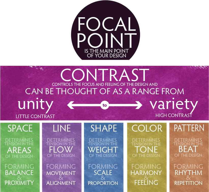
There’s a helpful way to understand and think about artistic elements and principles: the “design hierarchy.” This isn’t the ultimate approach to understanding and interacting with the artistic elements and principles. (Frankly, an “ultimate” approach probably doesn’t exist.) It is more of an organized starting place that might help you focus your design skills (Figure 8.3).
Design, unlike art, has a purpose. It’s often about creating or accomplishing something specific, rather than simply enjoying or exploring an artistic impulse. A design task might require that you advertise a product, communicate an idea, or promote a cause or specific issue. For most people it’s actually easier to be artistic when the result is something that has a purpose.
Thinking through these building blocks can also serve as a great little exercise when you’re looking at a piece of work that you are unhappy with but can’t quite figure out why. Sometimes, just rolling through the following elements and principles in your mind can be an excellent creative checklist.
Start With a Focal Point
The focal point is what your design is all about. In an advertisement, it’s your “call to action” phrase that motivates the consumer. For a cause, it’s the primary message that your cause is trying to get across. It’s the primary idea that you want people to take with them, like the title of a book or a chapter. It’s the “sales pitch” of your design. When you’re working with a client, they’ll often be the one to determine what the focal point should be. Your job as a designer is to translate their big idea into something visual and beautiful.
Because the focal point is the “focus” of a design, it should be the most memorable aspect of the design. In a symmetrical or radial design, center the focal point for the most emphasis. In an asymmetrical design, let it fall on one of the natural focal points, which you’ll learn about shortly when you study space.
Critical question: Do people know where to look in my design?
Create Focal Points Using Contrast
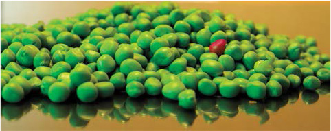
Contrast creates a focal point by generating “tension” in your design. Place one red golf ball in a pile of 10,000 white golf balls or one red pea amongst a series of green peas, and you’ll notice it immediately. The most dramatic way to create contrast is to vary the most common characteristic of the elements in the design. If you have a bunch of multicolored circles that are the same size, then varying the size of one circle, regardless of its color, will create a contrast that draws the eye (Figure 8.4). Keep the shape the same size, but make it a star instead of a circle to generate the same tension.
Establishing unity in a design is critical to allowing you to create tension. Without a degree of unity, you cannot create a focal point and the eye struggles to find something to focus on. Design is about forcing a focal point to be where you want it. When too many different, unrelated elements are present in your design, it makes chaos, and the viewer will not know where to look.
Critical question: Does my design lack sufficient contrast to see the important features clearly?
Contrast has A Range of Tension from Unity to Variety
Imagine that contrast can be described as the “tension” in the design. And that contrast can be imagined as a range from low contrast, which we call unity, to high contrast, which we call variety (Figure 8.5). Compositions with very low contrast have very little tension, and these designs are generally perceived as peaceful and calm but sometimes can feel emotionless, cold, and lifeless. Compositions with very high contrast have a lot of tension; they are generally perceived as energetic, lively, active, and hot but sometimes feel unpredictable or emotional.
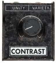
Figure 8.5 Keep the contrast in your image low toward the unity side unless you’re trying to make something stand out.
A Framework for Connecting the DOTS
The following framework connects artistic elements and principles to help you at the onset of the creative journey. They’re good starting points. Remember that with design, you’re not trying to define the artistic elements and principles as much as trying to embrace and apply them. As with every study of the artistic elements and principles, you won’t arrive at a destination. Rather, you’ll embark on a journey. These connections should help you make sense of the elements and principles long enough to help you find your own way to understand and apply them.
![]() Create balance and proximity by arranging the elements in your compositional space. Tension develops among the different areas of your composition. Unify the design with symmetry and equal spacing, or vary it using asymmetry and grouping elements.
Create balance and proximity by arranging the elements in your compositional space. Tension develops among the different areas of your composition. Unify the design with symmetry and equal spacing, or vary it using asymmetry and grouping elements.
Critical question: Does my design use space to help communicate relationships?
![]() Create movement and alignment by arranging your elements along lines. Tension is created with the direction or flow of your composition. Unify the design with strict alignment or movement along straight or flowing lines, or vary it with random, chaotic movements away from any single line or flow.
Create movement and alignment by arranging your elements along lines. Tension is created with the direction or flow of your composition. Unify the design with strict alignment or movement along straight or flowing lines, or vary it with random, chaotic movements away from any single line or flow.
Critical question: Does my design use lines to help communicate order and flow?
![]() Create scale and proportion by carefully designing shapes in your composition. Tension is created among the sizes of elements in your composition. Unify the design with similar or related sizes of elements, or vary it with a mix of unrelated sizes. Keep in mind that a paragraph has a shape, and a group of elements has a shape. Look at areas as well as objects in your design.
Create scale and proportion by carefully designing shapes in your composition. Tension is created among the sizes of elements in your composition. Unify the design with similar or related sizes of elements, or vary it with a mix of unrelated sizes. Keep in mind that a paragraph has a shape, and a group of elements has a shape. Look at areas as well as objects in your design.
Critical question: Does my design consider the message sent by the size of shapes I create?
![]() Create themes and feeling by using typography, colors, and values in your composition. Tension is created among elements of different type, value, or color. Unify the design with related type, colors, and values, or vary it with clashing colors or extreme difference in values or type.
Create themes and feeling by using typography, colors, and values in your composition. Tension is created among elements of different type, value, or color. Unify the design with related type, colors, and values, or vary it with clashing colors or extreme difference in values or type.
Critical question: Does my design consider the message sent by the typography, color, and value I used?
![]() Use repetition and rhythm to create patterns and texture in your compositions. Tension is created among elements with different texture or patterns. Unify the design with simple repetition to produce predictable patterns and rhythms, or vary it using complex, irregular, or chaotic patterns and rhythms.
Use repetition and rhythm to create patterns and texture in your compositions. Tension is created among elements with different texture or patterns. Unify the design with simple repetition to produce predictable patterns and rhythms, or vary it using complex, irregular, or chaotic patterns and rhythms.
Critical question: Does my design consider the message sent by the patterns and textures I designed?
Wrapping Up the Design Hierarchy
If you’re basically familiar with the artistic design elements and design principles, this hierarchy might be a framework you can use. But the goal of art is to continually explore the elements and principles. The next section will cover them all, and I’ll share some challenges that may help you dig a little deeper in learning to use them well.
![]() ACA Objective 2.2
ACA Objective 2.2
The Elements of Art
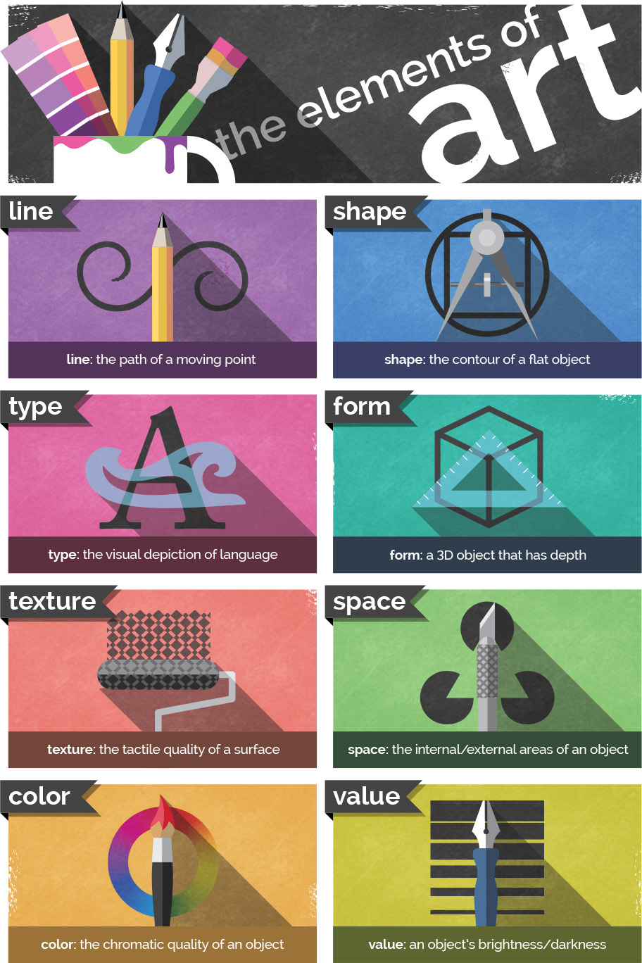
The elements of art are the building blocks, or design elements of creative works. Think of them as the “nouns” of design. The elements are space, line, shape, form, texture, value, color, and type (Figure 8.6). Many traditional artists leave type off the list, but for graphic designers, it is a critical part of how we look at design (and besides that, type is really fun to play with).
![]() Video 8.4
Video 8.4
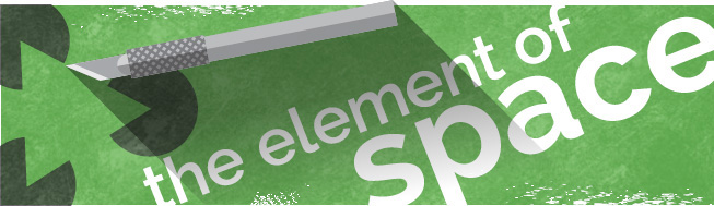
The Element of Space
Space is the first element of art to consider (Figure 8.7). It also happens to be one of the most abused, overlooked, neglected, and underrated elements in design. You can look at and consider space in multiple ways.
![]() Video 8.5
Video 8.5
Space as Your Canvas
The most basic way to look at space is as your canvas or working area. In InDesign the page size sets the area within which you work. You may be designing for a poster or an eBook that is diplayed on a tablet. These page dimensions you select for each design project define the space.
Space as a Creative Tool
Another important way to look at space is as a design element. The inability to use space well is an obvious sign of a new designer. A crowded design practically screams “newbie.” It takes a while to use space well, and it requires some practice. Start learning to use space as a creative element and you’ll see a drastic increase in the artistic feel of your designs (Figure 8.8).

When used properly, space can provide the following benefits to your designs:
![]() Creating emphasis or focus. When you have space around something, it tends to give it emphasis. Crowding things makes them seem less important.
Creating emphasis or focus. When you have space around something, it tends to give it emphasis. Crowding things makes them seem less important.
![]() Creating feeling. Space can be used to create a feeling of loneliness, isolation, or exclusivity. It can also be used to create a feeling of seriousness or gravitas.
Creating feeling. Space can be used to create a feeling of loneliness, isolation, or exclusivity. It can also be used to create a feeling of seriousness or gravitas.
![]() Creating visual rest. Sometimes space is needed to simply create some visual “breathing room” so that the other elements in your design can speak as intended.
Creating visual rest. Sometimes space is needed to simply create some visual “breathing room” so that the other elements in your design can speak as intended.
Tip
Beginning designers center everything, which can contribute to a static look and a feeling of boredom. A great way to get started with the rule of thirds is to simply stop centering things. You’ll notice that you tend to move elements quite naturally to a focal point suggested by the rule of thirds.
The Rule of Thirds
The rule of thirds provides a great way to think about space. This rule is critical in photography and video, as well as graphic design, and applies to all visual arts. To visualize it, think of the rule of thirds as a tic-tac-toe board overlaid onto your design. Two horizontal and two vertical divisions create nine equal boxes on your design. The basic rule is that major elements of your design should fall on the dividing lines, and the areas of emphasis for the design should fall on the intersections. Using this rule in your designs creates compositions that have much more interest, tension, and visual strength (Figure 8.9).
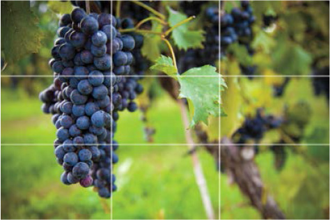
Figure 8.9 Use the rule of thirds to determine where major elements should fall to create a visually appealing layout.
Negative Space
In the design industry, people use the term negative space or “white space” to refer to blank areas in the design, even if you’re working on a colored background (Figure 8.10). Negative space is without a doubt one of my favorite creative uses of the element of space. It can be really fun to explore using negative space to create logos or designs that are really clever.
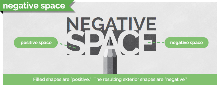
Figure 8.10 Negative space is the space that surrounds an object and helps to define and separate the objects around it.
Tip
Check out some awesome, updated examples of negative space online at www.brainbuffet.com/design/negative-space.
Sometimes you can place a really boring idea in negative space to get moving in a new, creative direction. It can be tough for beginners to even “see” negative space, but once you start to look for it, you’ll start to see creative uses of it everywhere. Begin to use it, and your design skills will jump up a level.
The following elements are much easier to understand because you can think of them as things. (Whereas we tend to think of space as the absence of things, or “nothing.”) Learn to use space well. The ability to do so is the mark of an experienced and talented artist.
Note
For many people, the terms negative space and white space are interchangeable. If you’re unclear about what someone is asking for, ask for clarification. Art and design are not entirely technical, accurate and organized processes, so you’ll need to get used to lots of “mushy” terms that are used in multiple ways.
The Element of Line
The meaning of line is pretty obvious (Figure 8.11). Although technical definitions exist, such as “a point moving through a space,” we are all aware of what a line is. If you’re not sure, ask a kindergartener. A line is exactly what you think it is: a mark with a beginning and an end. Don’t overthink the basics. We’re going to dig deeper than that, but start with the basic idea and then build the new understanding upon it.
![]() Video 8.6
Video 8.6

Level Up: Line ’em Up
![]() Level I: Short, long, straight, wavy, zigzag, geometric, organic
Level I: Short, long, straight, wavy, zigzag, geometric, organic
![]() Level II: Angry, lonely, worried, excited, overjoyed
Level II: Angry, lonely, worried, excited, overjoyed
![]() Level III: Opposition, contrast, politics, infinity
Level III: Opposition, contrast, politics, infinity
Common Line Descriptors
By thinking about the different ways that lines are used or drawn, you can more fully understand the meaning that your lines are giving to your design.
The following adjectives are often associated with lines:
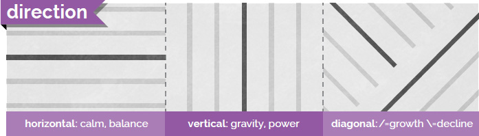
![]() Direction: A common way to describe lines is to describe the direction in which they travel (Figure 8.12). Lines can be horizontal, vertical, or diagonal. Sometimes the way a line is drawn can even express movement in a particular direction. Think about this and make sure that the lines of your art are moving in the directions you want. Vertical lines tend to express power and elevation, and horizontal lines tend to express calm and balance. Diagonal lines often express growth or decline, and they imply movement or change.
Direction: A common way to describe lines is to describe the direction in which they travel (Figure 8.12). Lines can be horizontal, vertical, or diagonal. Sometimes the way a line is drawn can even express movement in a particular direction. Think about this and make sure that the lines of your art are moving in the directions you want. Vertical lines tend to express power and elevation, and horizontal lines tend to express calm and balance. Diagonal lines often express growth or decline, and they imply movement or change.
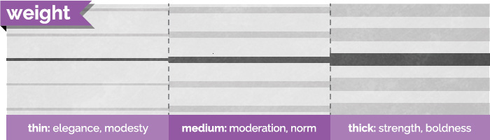
![]() Weight: Another common descriptor is the weight of a line, which describes its thickness (Figure 8.13). Heavy or thick lines generally represent importance and strength, and they tend to feel more masculine. Light or thin lines generally communicate delicacy and elegance, and they tend to represent femininity. Using a variable line width implies natural, artistic, flowing feelings and often suggests an intentional grace or natural beauty.
Weight: Another common descriptor is the weight of a line, which describes its thickness (Figure 8.13). Heavy or thick lines generally represent importance and strength, and they tend to feel more masculine. Light or thin lines generally communicate delicacy and elegance, and they tend to represent femininity. Using a variable line width implies natural, artistic, flowing feelings and often suggests an intentional grace or natural beauty.
Tip
Having a hard time remembering horizontal and vertical directions? “Horizontal” (like the horizon) has a crossbar in the capital “H” that is a horizontal line itself. Vertical starts with the letter “V,” which is an arrow pointing down.
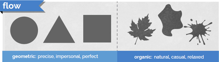
![]() Flow: This word is the category that is related to the energy conveyed by lines and shapes (Figure 8.14). Geometric lines tend to be straight and have sharp angles; they look manmade and intentional. Geometric lines communicate strength, power, and precision when used in design. Curved lines express fluidity, beauty, and grace. Organic lines are usually irregular and imperfect—the kind of lines you find in nature or as the result of random processes. Organic lines represent nature, movement, and elegance. Chaotic lines look like scribbles and feel very unpredictable and frantic. They convey a sense of urgency, fear, or explosive energy.
Flow: This word is the category that is related to the energy conveyed by lines and shapes (Figure 8.14). Geometric lines tend to be straight and have sharp angles; they look manmade and intentional. Geometric lines communicate strength, power, and precision when used in design. Curved lines express fluidity, beauty, and grace. Organic lines are usually irregular and imperfect—the kind of lines you find in nature or as the result of random processes. Organic lines represent nature, movement, and elegance. Chaotic lines look like scribbles and feel very unpredictable and frantic. They convey a sense of urgency, fear, or explosive energy.

![]() Style: A line style is an effect applied to the line, such as a double line or dotted line (Figure 8.15). (In graphics programs such as Photoshop, you can select from preset line styles or create your own.) Words used to describe popular line effects include varying width, hand-drawn, and implied. Varying width lines are useful for expressing flow and grace. Hand-drawn lines look as if they were created with traditional media, such as paints, charcoal, or chalk. Implied lines are lines that don’t really exist—like dotted or dashed lines, or the lines you create when you queue up for service at the grocery store. These implied lines are powerful tools for designers because individual things can feel unified or grouped together when they are aligned.
Style: A line style is an effect applied to the line, such as a double line or dotted line (Figure 8.15). (In graphics programs such as Photoshop, you can select from preset line styles or create your own.) Words used to describe popular line effects include varying width, hand-drawn, and implied. Varying width lines are useful for expressing flow and grace. Hand-drawn lines look as if they were created with traditional media, such as paints, charcoal, or chalk. Implied lines are lines that don’t really exist—like dotted or dashed lines, or the lines you create when you queue up for service at the grocery store. These implied lines are powerful tools for designers because individual things can feel unified or grouped together when they are aligned.

If you look at the left-most line of the paragraphs on this page, you can see a “line” formed by the beginning of each line of type. Pay attention to the implied lines you create using the design elements in your artwork. Think of creative ways to use and suggest lines, and pay attention to what you might be saying with them. Make sure that the message all your lines send matches the intent of your work.
The Element of Shape
The next element needs little introduction: Shapes are boundaries created by closed lines. Shape can be defined as an area enclosed or defined by an outline. You’re familiar with shapes such as circles, squares, and triangles, but there’s a ton more to them than that (Figure 8.16). Those specific shapes are created in geometry, but what about the shape of a hand or cloud? These are shapes too, and you often use the same descriptors for shapes as you do for lines.
![]() Video 8.7
Video 8.7

Common Shape Descriptors
The word “flow” describes how intentional a shape looks (Figure 8.17). Geometric shapes are more predictable and consistent, and they tend to feel more perfect, precise, calculated, and impersonal. Squares, circles, triangles, and stars are rarely found in nature and therefore convey more mechanical and manufactured impressions. Organic shapes often look random or generated by something natural. Organic shapes are usually asymmetric and generally convey a sense of natural, homemade, or relaxed feelings.
Representative Shapes
A pictograph (or pictogram) is a graphic symbol that represents something in the real world. Computer icons are pictographs that often suggest the function they represent (like a trash can icon to delete a file). Other examples of pictographs are the human silhouettes often used to indicate men’s and women’s restrooms. They’re not accurate representations of the real objects, but they are clear representations of them. Ideographs (or ideograms) are images that represent an idea. A heart shape represents love, a lightning bolt represents electricity, and a question mark represents being puzzled. Representative shapes are very helpful in communicating across language barriers and can assist when designing for multicultural and multilingual audiences (Figure 8.18).

Level Up: Shaping Up
![]() Level I: Short, long, straight, wavy, zigzag, geometric, organic
Level I: Short, long, straight, wavy, zigzag, geometric, organic
![]() Level II: Angry, lonely, worried, excited, overjoyed
Level II: Angry, lonely, worried, excited, overjoyed
![]() Level III: Opposition, contrast, politics, infinity
Level III: Opposition, contrast, politics, infinity
The Element of Form
Form describes three-dimensional objects or, at least, objects that look three-dimensional (Figure 8.19). The best way to visualize form clearly is to consider that circles, squares, and triangles are shapes, whereas spheres, cubes, and pyramids are forms. Like shapes, forms are basically divided into geometric and organic types. Geometric forms, such as a cube, are pretty common. You are also familiar with organic forms such as the human form or the form of a peanut. When you work with 3D in applications, these forms are often referred to as “solids.”
![]() Video 8.8
Video 8.8
3D Lighting
In art and design, there’s a special focus on the techniques that make images appear 3D in a 2D work of art. You have some standard elements to consider when you want to create a feeling of depth and form. Figure 8.20 explains the standard elements of a 3D drawing that you need to consider.
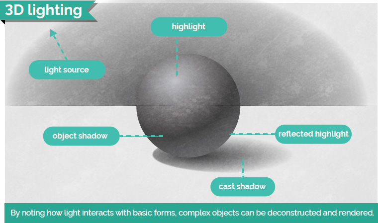
![]() Highlight is the area of a form directly facing the light and appears lightest.
Highlight is the area of a form directly facing the light and appears lightest.
![]() Object shadow is the area of the form that is facing away from the light source and appears darkest.
Object shadow is the area of the form that is facing away from the light source and appears darkest.
![]() Cast shadow is the shadow cast on the ground and on any objects that are in the shadow of the form. One thing to remember is that shadows fade as they get farther from the form casting the shadow. Be sure to consider this as you’re creating shadow effects in your art.
Cast shadow is the shadow cast on the ground and on any objects that are in the shadow of the form. One thing to remember is that shadows fade as they get farther from the form casting the shadow. Be sure to consider this as you’re creating shadow effects in your art.
![]() Light source is the perceived location of the lighting in relation to the form.
Light source is the perceived location of the lighting in relation to the form.
![]() Reflected highlight is the area of the form that is lit by reflections from the ground or other objects in the scene. This particular element of drawing a 3D object is most often ignored, but it provides believable lighting on the object.
Reflected highlight is the area of the form that is lit by reflections from the ground or other objects in the scene. This particular element of drawing a 3D object is most often ignored, but it provides believable lighting on the object.
The Elements of Texture and Pattern
Texture can describe an actual, tactile texture in real objects or the appearance of texture in a two-dimensional image (Figure 8.21). It is important to use texture to communicate feeling and authenticity in your art or designs. If you want to depict something elegant, soft, or comfortable, you could use a texture that resembles fabric or clouds. To represent strength or power, you might choose textures that represent stone or metal. And you could represent casual, informal, or nostalgic feelings using a texture that represents weathered wood or worn paint.
![]() Video 8.9
Video 8.9
Pattern can be defined as a repetitive sequence of colors, shapes, or values (Figure 8.22). Pattern is technically a different concept from texture, but in graphic design it’s often regarded as the same thing. You’ve used patterns in some of the design projects you’ve worked on. Remember the alternating row colors applied to the rows in a table and the grid of images that was the start for the comic book project?

As you work more as a designer, you’ll start to notice the nuances and subtle differences between textures and patterns. For now, just think of them as the visual qualities of your shapes and forms that can’t be described by color or value alone.
1. Grab a sheet of paper and a fine-point pen.
2. Draw a line that crosses over itself at least once, forming a loop that goes from one edge of the paper to another. That loop is your first “texture pit.”
3. In that loop, create a texture by just repeating a pattern.
4. Create another area and fill it with a different pattern or texture.
![]() Level I: Use only geometric textures and patterns.
Level I: Use only geometric textures and patterns.
![]() Level II: Attempt to create areas that look like textures of materials, plants, or animals. You might need to switch to pencil to be able to shade the areas well.
Level II: Attempt to create areas that look like textures of materials, plants, or animals. You might need to switch to pencil to be able to shade the areas well.
![]() Level III: Introduce color. Try adding color to your designs, and see how that works.
Level III: Introduce color. Try adding color to your designs, and see how that works.
![]() ACA Objective 2.2
ACA Objective 2.2
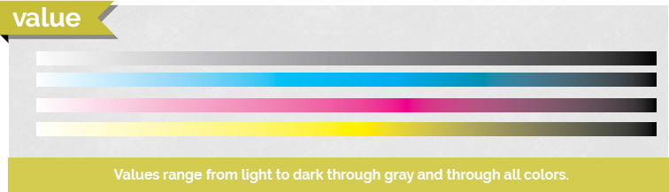
The Element of Value
Value describes the lightness or darkness of an object (Figure 8.23). Together with color, value represents the visible spectrum. Value is easily understood by thinking of a gradient that goes from black to white. But it is important to remember that value applies to color as well, and you can have a spectrum that fades from black, through a color, and then to white.
![]() Video 8.10
Video 8.10

![]() Level I: Create three levels of gray across a spectrum.
Level I: Create three levels of gray across a spectrum.
![]() Level II: Generate seven layers of gray across a gradient using mixed methods.
Level II: Generate seven layers of gray across a gradient using mixed methods.
![]() Level III: Generate a 3D sphere using purely duotone methods.
Level III: Generate a 3D sphere using purely duotone methods.
Professionals in the art and design industry often use the term value, but clients rarely use it. Clients will just ask you to lighten or darken a graphic or text, or sometimes use the words “tint,” “shade,” or “tone” in place of value (Figure 8.24). Technically, they’re different, but many people use the terms tone, shade, tint, and value interchangeably. As always, when clients use a term and you’re not exactly sure what they mean, ask for clarification. Sometimes they don’t even know exactly what they mean, so asking ensures that everyone is on the same page.
![]() ACA Objective 2.4
ACA Objective 2.4
The Element of Color
Color is really a study in itself (Figure 8.25). And when you think about it, it’s actually hard to define. How would you define color without using examples of colors? Check out its definition in a dictionary and you’ll find that defining color really doesn’t help you understand it. Color is best experienced and explored.
![]() Video 8.11
Video 8.11
We have so many ways to think about color and so many concepts to dig into that exploring color is a lifelong pursuit for most artists and designers. Color theory is a deep and complex study. We’ll explore the basics here, but remember that this is just the on-ramp toward understanding color. Grasp these concepts and you’ll still have a ton more to learn.
Color psychology is a relatively new discipline and an interesting study in itself: understanding the emotional and behavioral effects that colors can have on people. The colors you choose really do matter. For the purposes in this book, color is the perceived hue, lightness, and saturation of an object or light.
How Color Works
Color is created in two different ways: additive color and subtractive color (Figure 8.26). In InDesign, the intent you select when creating a new document defines how the color is created.
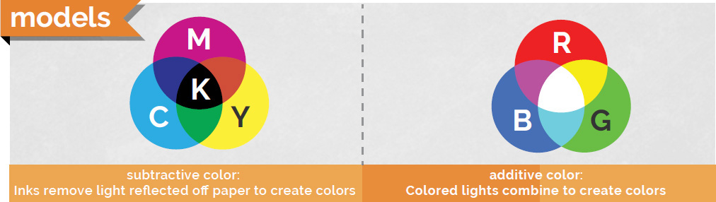
![]() Additive color is created by combining light. This is how your monitor works, and the most common color mode for additive color is RGB. The letters RGB stand for red, green, blue, which are the three colors used to create digital images. Monitors and electronic devices are dark when turned off, and you create colors by adding light to the screen. When designing for web or digital publishing in InDesign, you’ll work with additive color.
Additive color is created by combining light. This is how your monitor works, and the most common color mode for additive color is RGB. The letters RGB stand for red, green, blue, which are the three colors used to create digital images. Monitors and electronic devices are dark when turned off, and you create colors by adding light to the screen. When designing for web or digital publishing in InDesign, you’ll work with additive color.
Tip
In InDesign, set the intent of a new document (File > New > Document) to Web or Digital Publishing to work with additive color and RGB.
![]() Subtractive color is created by subtracting light. This is the color system you learned in early art classes. In it, red, blue, and yellow are the primary colors. For print, you use CMYK, which is cyan, magenta, yellow, and black. (The black is added due to impurities in ink and is required for the theoretical combination of cyan, magenta, and yellow to create all the colors in reality.) You start with a white surface (the paper) that reflects all the light back to us. Then you subtract color by using paints or inks that limit the light that is reflected back to the viewer. When creating InDesign documents for print, you work with subtractive color.
Subtractive color is created by subtracting light. This is the color system you learned in early art classes. In it, red, blue, and yellow are the primary colors. For print, you use CMYK, which is cyan, magenta, yellow, and black. (The black is added due to impurities in ink and is required for the theoretical combination of cyan, magenta, and yellow to create all the colors in reality.) You start with a white surface (the paper) that reflects all the light back to us. Then you subtract color by using paints or inks that limit the light that is reflected back to the viewer. When creating InDesign documents for print, you work with subtractive color.
Tip
In InDesign, set the intent of a new document (File > New > Document) to Print to work with subtractive color and CMYK.
The Color Wheel
Sir Isaac Newton invented the color wheel in the mid-17th century (Figure 8.27). The color wheel offers a way to display and build all the colors possible using paint. It’s a common exercise in beginning art classes to create a color wheel when learning to mix and experiment with colors. In digital imaging, it’s not as important to go through this exercise, but if you have a chance, give it a try. It’s kind of interesting to see how all the colors can mix to obtain the colors and shades you can perceive.
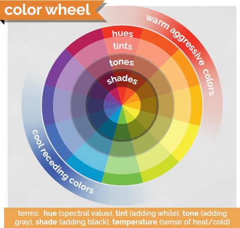
The color wheel is important because many color theories are named after their relative positions on the color wheel. They’re a lot easier to remember using the color wheel to illustrate.
The first thing to realize is that some colors are classified as primary colors. These colors can be combined to create every other color in the visible spectrum (Figure 8.28). For subtractive color, used in traditional art, the primary colors are red, blue, and yellow. For additive colors, the primary colors are red, blue, and green.
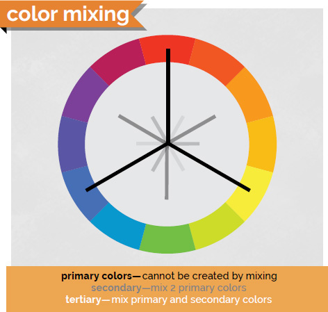
The colors that are created when you combine primary colors are known as secondary colors because you can create them only by applying a second step of mixing the colors. When you mix secondary and primary colors, you get another set of colors, known as tertiary colors.
![]() Level I: Create a traditional color wheel using paint on paper.
Level I: Create a traditional color wheel using paint on paper.
![]() Level II: Use adobe’s free color cc tool to create color wheels of your own. You’ll see many of the terms used here in this online tool, found at color.adobe.com/create/color-wheel.
Level II: Use adobe’s free color cc tool to create color wheels of your own. You’ll see many of the terms used here in this online tool, found at color.adobe.com/create/color-wheel.
Basic Color Rules
Color rules (also known as color harmonies) are a great way to start picking colors for your design projects in InDesign and are prominently featured if you use the Adobe Color CC. Color rules are named for their relative locations on the color wheel. When you’re choosing colors and exploring other ways to join colors to create contrast or harmony, these color rules are where you should begin. Let’s cover some of the basic color rules and the impressions they tend to communicate.
The three most common ways of thinking about colors (and, really, the basis of all color rules) are monochromatic, analogous, and complementary color schemes (Figure 8.29).
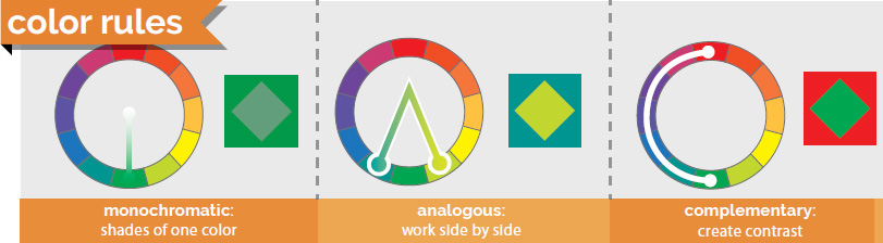
![]() Monochromatic colors, as you’ve probably guessed, are based on different shades and tints of the same color. They tend to communicate a very relaxed and peaceful feeling, and you’ll create very little contrast or energy in art using these colors.
Monochromatic colors, as you’ve probably guessed, are based on different shades and tints of the same color. They tend to communicate a very relaxed and peaceful feeling, and you’ll create very little contrast or energy in art using these colors.
![]() Analogous colors are side by side on the color wheel, and they tend to create gentle and relaxing color schemes. If you want to add a little more variation while maintaining a calm feeling, consider analogous colors. Analogous colors don’t usually stand out from each other; they seem to work together and can almost disappear together when overlaid.
Analogous colors are side by side on the color wheel, and they tend to create gentle and relaxing color schemes. If you want to add a little more variation while maintaining a calm feeling, consider analogous colors. Analogous colors don’t usually stand out from each other; they seem to work together and can almost disappear together when overlaid.
![]() Complementary colors are opposite each other on the color wheel. Complementary color combinations are high in contrast and normally very vibrant, so use with caution. When overused, complementary color can be very “loud” and can easily cross over into visually obnoxious if you’re not careful. You can remember this rule with the alliterative phrase “Complementary colors create contrast.”
Complementary colors are opposite each other on the color wheel. Complementary color combinations are high in contrast and normally very vibrant, so use with caution. When overused, complementary color can be very “loud” and can easily cross over into visually obnoxious if you’re not careful. You can remember this rule with the alliterative phrase “Complementary colors create contrast.”
You can explore a bunch of color combinations on the Adobe Color CC website (Figure 8.30). It’s an amazing way to browse other people’s color collections, or grab colors from an image you like and create a color set to use for your projects. When you register with your free Adobe ID, you can save the color themes you find or create and bring them into your Adobe apps to use and share with others. Adobe Color CC is also part of a free app for iOS and Android. Open the Adobe Capture CC app, and click COLORS. Then open an image or point your phone camera at something to create a color theme (Figure 8.31). Experiment with creating custom themes from your favorite blanket, a sunset, your goldfish, or your crazy uncle’s tie-dyed concert shirt from Woodstock.
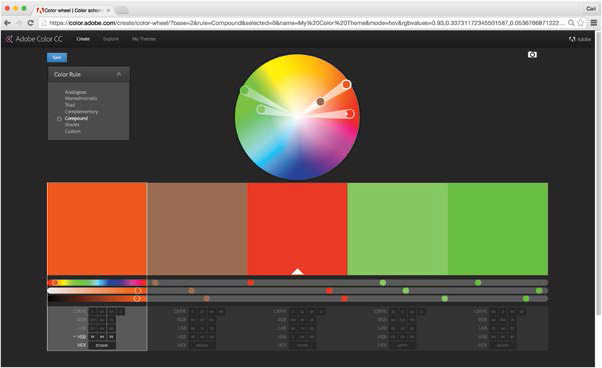
Figure 8.30 Use the Adobe Color CC website to explore color harmonies and save combinations to your Creative Cloud account.
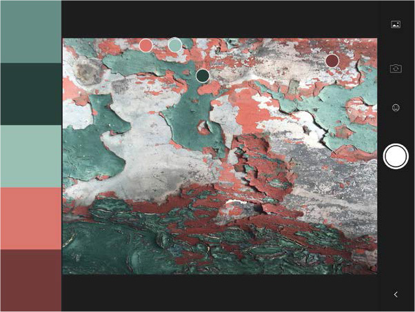
Figure 8.31 The Adobe Capture CC app lets you capture colors from photos you’ve taken or grab them live using the camera.
Creating color swatches for use in a design project is an important way that you can communicate your design intentions with your client and ensure that the colors throughout the site are harmonious and consistent.
Color Associations
We tend to associate different things with different colors. Whether this is learned behavior or instinct can be debated, but as a designer it’s important to recognize and properly use the right color for the right message. Again, this isn’t a science, and you’ll need to consider more than the chart in Figure 8.32 when developing your color-picking strategies. But understanding colors and their associations can be useful to produce the right “feel” in your designs. You can evoke interesting feelings and contrasts by capitalizing on these associations in your design work.

![]() ACA Objective 2.3
ACA Objective 2.3
The Element of Type
Type is generally not considered a traditional element of art, but it can be a critical part of designers’ work. Typefaces carry a lot of emotional meaning, and choosing the proper typefaces for a job is a critical skill that every designer needs (yet many don’t have). Like color, this area of design is so deep and has so many aspects that entire books and college courses are focused only on typography (Figure 8.33). You can’t reduce it to simple rules such as “Use three typefaces, maximum,” “When in doubt, use Helvetica,” or “Never use Chiller.” (Even though that’s not a bad starting place.)
![]() Video 8.12
Video 8.12
Working with type is often like being a marriage counselor or a matchmaker. Every typeface has a personality, and you need to carefully match the type in your design work with the overall feeling of the piece. The typefaces you use also need to work together and not clash with one another. It takes time and experience to master this balance, but over time you can become a skillful typeface matchmaker. Most artists have a few fonts they tend to lean on heavily, and that’s OK—especially at the beginning.
Check online at brainbuffet.com/design/typography for a list of fonts and typography-based resources to help you dig a little deeper with this concept.
Level Up: Puzzling Typography
![]() Level I: Do a puzzle like this with a group of friends and discuss your observations.
Level I: Do a puzzle like this with a group of friends and discuss your observations.
![]() Level II: Do a puzzle like this by yourself.
Level II: Do a puzzle like this by yourself.
![]() ACA Objective 2.3
ACA Objective 2.3
Typography
Typography is the art of using letterforms and type arrangement to help the language communicate a message. As mentioned earlier, type can be its own topic of study and can easily become overwhelming. I’ll skim the surface here, but I hope you’ll dig in a little more as you move forward in your design. Let’s get some vocabulary out of the way first (Figure 8.34).
Figure 8.34 Many of today’s typography terms were created in the days of movable type and have changed as publishing technology evolved.
Technically, a typeface is the specific letterform set that makes up the type. Helvetica, Arial, Garamond, and Chiller are examples of typefaces. In brief, it’s the “look” of the letters. Fonts are the whole collection of the typeface in each of its sizes and styles. So 12 pt Arial Narrow and 12 pt Arial Bold are different fonts of the same typeface. The same is true for two different sizes of the same typeface.
From now on, let’s use the term font, because that’s also the name of the file you’ll be installing when you add typefaces to your computer, and it’s the term that is used in InDesign.
![]() ACA Objective 2.3
ACA Objective 2.3
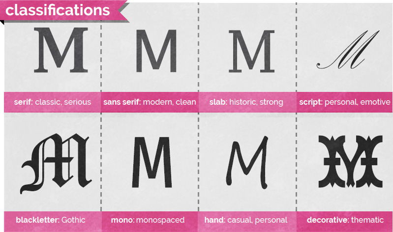
Type Classifications
Typefaces can be classified in many ways, but this chapter uses the Adobe Typekit classifications (Figure 8.35). Generally, people divide fonts into two main categories that should be used for large areas of type: serif and sans serif.
![]() Serif fonts are often associated with typewritten documents and most printed books. Generally, serif fonts are considered to be easier to read in larger paragraphs of text. Because so many books use serif fonts and early typewriters produced them, serif text often feels a bit more traditional, intelligent, and classy.
Serif fonts are often associated with typewritten documents and most printed books. Generally, serif fonts are considered to be easier to read in larger paragraphs of text. Because so many books use serif fonts and early typewriters produced them, serif text often feels a bit more traditional, intelligent, and classy.
![]() Sans serif fonts do not include serifs. “Sans” is a French word that migrated to English and simply means “without.” Sans serif fonts are often used for headlines and titles for their strong, stable, modern feel. Sans serif fonts are also preferred for large areas of text for reading on websites and screens. When publishing your project as a fixed-layout EPUB or online, consider using a sans serif font for the body text.
Sans serif fonts do not include serifs. “Sans” is a French word that migrated to English and simply means “without.” Sans serif fonts are often used for headlines and titles for their strong, stable, modern feel. Sans serif fonts are also preferred for large areas of text for reading on websites and screens. When publishing your project as a fixed-layout EPUB or online, consider using a sans serif font for the body text.
Beyond these basic types of text, designers do use other typefaces that are not appropriate for large areas of type because they are not easy to read in a long paragraph. Most designers consider the following fonts to be “decorative” for that reason.
![]() Slab serif fonts (also called Egyptian, block serif, or square serif) are a more squared-off version of a typical serif font. These fonts bridge the gap between serif and sans serif fonts and generally feel a bit more machine-built. The very simple design tends to make them feel a bit rougher than their serif counterparts.
Slab serif fonts (also called Egyptian, block serif, or square serif) are a more squared-off version of a typical serif font. These fonts bridge the gap between serif and sans serif fonts and generally feel a bit more machine-built. The very simple design tends to make them feel a bit rougher than their serif counterparts.
![]() Script fonts (often known as formal) have a very elegant feeling. These fonts are great to use for invitations to formal events, such as weddings, and in designs where you want to convey a feeling of beauty, grace, or feminine dignity. If you were designing for a spa, a beauty shop, or for products or services, script fonts would carry a feeling of relaxed and elegant beauty.
Script fonts (often known as formal) have a very elegant feeling. These fonts are great to use for invitations to formal events, such as weddings, and in designs where you want to convey a feeling of beauty, grace, or feminine dignity. If you were designing for a spa, a beauty shop, or for products or services, script fonts would carry a feeling of relaxed and elegant beauty.
![]() Blackletter fonts (also known as old English, Gothic, or Textura) feature an overly ornate style and are often used to title formal documents, such as certificates, diplomas, or degrees, as well as old German Bibles and heavy metal bands. It conveys a feeling of rich and sophisticated gravitas, often hinting at a long history of tradition and reliability.
Blackletter fonts (also known as old English, Gothic, or Textura) feature an overly ornate style and are often used to title formal documents, such as certificates, diplomas, or degrees, as well as old German Bibles and heavy metal bands. It conveys a feeling of rich and sophisticated gravitas, often hinting at a long history of tradition and reliability.
![]() Monospaced fonts (also known as fixed-width or non-proportional) use the same amount of horizontal space for each letter. Typically, fonts use a variable spacing technique known as kerning. (You’ll learn more about kerning later.) Monospaced fonts, in contrast, use the same width for every character. Monospaced fonts are good to use when you’re trying to make something look impersonal, machine-generated, or retro-geeky, because typewriters and early computers used monospaced fonts.
Monospaced fonts (also known as fixed-width or non-proportional) use the same amount of horizontal space for each letter. Typically, fonts use a variable spacing technique known as kerning. (You’ll learn more about kerning later.) Monospaced fonts, in contrast, use the same width for every character. Monospaced fonts are good to use when you’re trying to make something look impersonal, machine-generated, or retro-geeky, because typewriters and early computers used monospaced fonts.
![]() Handwritten fonts (also known as hand fonts) simulate handwriting. They are popular for adding a personalized, casual, or human touch to your designs and are often used on junk mail to try to trick you into opening that “special limited-time offer just for you!” (Don’t fall for it.) Handwritten fonts are great for communicating casual and friendly feelings, but they can be tough to read in a larger block of text.
Handwritten fonts (also known as hand fonts) simulate handwriting. They are popular for adding a personalized, casual, or human touch to your designs and are often used on junk mail to try to trick you into opening that “special limited-time offer just for you!” (Don’t fall for it.) Handwritten fonts are great for communicating casual and friendly feelings, but they can be tough to read in a larger block of text.
Tip
Want to create a font based on your own handwriting? Go to www.myscriptfont.com to do so for free.
![]() Decorative fonts (also known as ornamental, novelty, or display) don’t fall into any of the other categories. They also tend to convey really specific feelings. Decorative fonts should be used sparingly and very intentionally. Never use a novelty font just because you think it looks cool. That’s a typical newbie move. Make sure that you are striving to convey something very specific when using decorative fonts.
Decorative fonts (also known as ornamental, novelty, or display) don’t fall into any of the other categories. They also tend to convey really specific feelings. Decorative fonts should be used sparingly and very intentionally. Never use a novelty font just because you think it looks cool. That’s a typical newbie move. Make sure that you are striving to convey something very specific when using decorative fonts.
![]() Dingbat fonts (also known as wingdings) are a special type of font that doesn’t have an alphabet; they have a collection of shapes or objects instead of letters.
Dingbat fonts (also known as wingdings) are a special type of font that doesn’t have an alphabet; they have a collection of shapes or objects instead of letters.
Type Talk
You’ll need to learn a bunch of jargon concerning type when working in the design industry. Some of it is commonly used in discussion about design, and some of it will help you discuss fonts when trying to find the perfect typeface for your design. I’ll just cover the basics here, mentioning the easily accessible features in the Photoshop interface as well as mentioning ideas you should know to help improve the typography in your designs.
Note
You can find additional resources at the growing collection of typographical resources at brainbuffet.com/design/typography.
![]() ACA Objective 2.3
ACA Objective 2.3
Typographic Anatomy
Figure 8.36 illustrates many of the anatomical terms of typography. Software has no settings for these options, so I won’t go into detail about them. But when you start to study typography and learn these terms, you will more easily discern the differences between typefaces. It’s easiest to understand these terms by simply looking at Figure 8.35. You will hear these terms in the industry, and when you’re looking for a specific font, they’ll allow you to more easily describe what you’re looking for. Let’s face it, you can’t get too far professionally if you’re always using words like “doohickey” and “little hangy-downy thingy.” You need to use descriptive terms like ascenders and descenders; anthropomorphic terms like arms, shoulders, and tails; or architectural terms like counters and finials.

The Holy Trinity of Typography
Mike Skocko is an inspiring teacher and a brilliant designer with a very informative website, at maclab.guhsd.net, that features some amazing tutorials, designs, inspirations, and student art.
One video Mike shares explains three concepts of typography: kerning, leading, and tracking, the “holy trinity of design.” As a designer, you really need to master them. The following terms (Figure 8.37) affect the ways that letters are spaced from each other vertically or horizontally.

![]() Kerning is the space between specific letter pairs. For example, the first two letters in the word “Too” are closer than the first two letters in the word “The” because the letter “o” can kind of tuck under the crossbar of the “T.” A quality font file will have a good set of kerning pairs for specific letter combinations, but for some professional work (and with poorly designed fonts) you might need to get in there and tweak the kerning. Adjusting the kerning between specific letters can help you perfect your type presentation in logos and headlines.
Kerning is the space between specific letter pairs. For example, the first two letters in the word “Too” are closer than the first two letters in the word “The” because the letter “o” can kind of tuck under the crossbar of the “T.” A quality font file will have a good set of kerning pairs for specific letter combinations, but for some professional work (and with poorly designed fonts) you might need to get in there and tweak the kerning. Adjusting the kerning between specific letters can help you perfect your type presentation in logos and headlines.
![]() Tracking is the overall space between all the letters in a block of text. It allows you to compress or expand the space between the letters as a whole, rather than just between specific pairs, as you do with kerning. Adjusting tracking can greatly affect the feeling that text conveys. Experiment with tracking to help create various feelings in headlines and titles.
Tracking is the overall space between all the letters in a block of text. It allows you to compress or expand the space between the letters as a whole, rather than just between specific pairs, as you do with kerning. Adjusting tracking can greatly affect the feeling that text conveys. Experiment with tracking to help create various feelings in headlines and titles.
![]() Leading is the amount of space between the baselines of two lines of text. The baseline is the imaginary line that text sits on. Unlike with word processing applications, which let you choose single- or double-spaced, you can actually set the specific distance between the lines of paragraph text. Doing so can create great-looking space within a design or even overlap with your paragraph text. Experiment with and explore this option in your work. You can really change the mood of text by adjusting the leading of a paragraph.
Leading is the amount of space between the baselines of two lines of text. The baseline is the imaginary line that text sits on. Unlike with word processing applications, which let you choose single- or double-spaced, you can actually set the specific distance between the lines of paragraph text. Doing so can create great-looking space within a design or even overlap with your paragraph text. Experiment with and explore this option in your work. You can really change the mood of text by adjusting the leading of a paragraph.
![]() ACA Objective 2.3
ACA Objective 2.3
Size, Scale, and Small Caps
The following typographical features are available in the Character panel for most Adobe applications and may be used when working with text in your InDesign projects (Figure 8.38).

![]() Type size is traditionally the height from the highest ascender to the lowest descender in a font, expressed in points (1/72 of an inch). Today, it’s more a guideline than a firm definition, so most designers set the appropriate type size by eye. Different fonts of the same point size can appear to be much different in physical size if the ascenders and descenders are different from each other.
Type size is traditionally the height from the highest ascender to the lowest descender in a font, expressed in points (1/72 of an inch). Today, it’s more a guideline than a firm definition, so most designers set the appropriate type size by eye. Different fonts of the same point size can appear to be much different in physical size if the ascenders and descenders are different from each other.
![]() Vertical and horizontal scale describe the function of stretching letters and distorting the typeface geometry. Because they distort the typeface, use them with caution. They should be used only when you are trying to express a very specific feeling and should not be used in blocks of type because readability can suffer with either of these adjustments.
Vertical and horizontal scale describe the function of stretching letters and distorting the typeface geometry. Because they distort the typeface, use them with caution. They should be used only when you are trying to express a very specific feeling and should not be used in blocks of type because readability can suffer with either of these adjustments.
![]() All caps and small caps are similar in that they both use only the uppercase letterforms for each letter, but ALL CAPS makes all the letters the same size, whereas SMALL CAPS sets the letters that would normally be capitalized at a larger size. Small caps tend to increase readability over all caps, but both cap formats should be avoided in large blocks of text because they are more difficult to read than standard text.
All caps and small caps are similar in that they both use only the uppercase letterforms for each letter, but ALL CAPS makes all the letters the same size, whereas SMALL CAPS sets the letters that would normally be capitalized at a larger size. Small caps tend to increase readability over all caps, but both cap formats should be avoided in large blocks of text because they are more difficult to read than standard text.
Tip
Higher-end typefaces may provide a small-caps face that is much nicer than the setting in software. If small caps are critical for your design, look for a font that supports this feature.
To enable or disable the use of ligatures for text in InDesign, select the text, then select or deselect the Ligatures setting from the Character panel menu.
![]() Ligatures and swashes are special alternative settings offered with some fonts to combine letters or add special stylized touches to specific letter combinations or letters. For example, when the “Th” combination touches in a headline, you can replace it with a single ligature that looks much better. Swashes add flowing and elegant endings to letters with ascenders and descenders. Both of these are normally reserved for type that expresses an especially elegant or artistic feel.
Ligatures and swashes are special alternative settings offered with some fonts to combine letters or add special stylized touches to specific letter combinations or letters. For example, when the “Th” combination touches in a headline, you can replace it with a single ligature that looks much better. Swashes add flowing and elegant endings to letters with ascenders and descenders. Both of these are normally reserved for type that expresses an especially elegant or artistic feel.
Note
To access Swash alternates for selected text in InDesign, choose Type > Glyphs. Select the letter in the text to replace, then in the Glyphs panel click and hold the mouse on the letter to see if a Swash replacement is available. In InDesign CC (2015.2), alternate glyphs appear as a contextual menu when you select text.
Level Up: Games of a Certain Type
![]() Level I: Experiment with at least three typographic games online.
Level I: Experiment with at least three typographic games online.
![]() Level II: Achieve a high score on at least one typographic game online.
Level II: Achieve a high score on at least one typographic game online.
![]() Level III: Achieve a high score on five or more typographic games online.
Level III: Achieve a high score on five or more typographic games online.
Paragraph Settings
Paragraph settings affect an entire paragraph rather than selected words. These options adjust the alignment of the paragraph: left, centered, or right. Justified text aligns a straight edge on both edges of the paragraph, with the ability to dictate how the last line is aligned. Indent settings let you choose how far the entire paragraph is indented on each side or in just its first line. Paragraph spacing settings are similar to leading but apply to paragraphs—instead of lines of type within them—and you can also set the space above or below paragraphs. Hyphenation allows you to determine if and when words should be split with hyphenation at the end of a line (Figure 8.39).
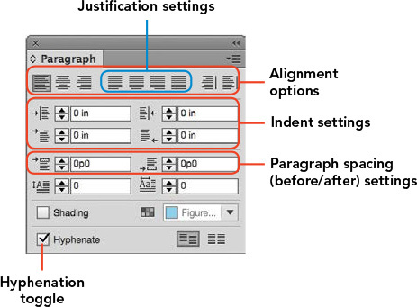
Figure 8.39 The icons for the paragraph settings are quite helpful in illustrating the function of each setting.
Wrapping up the Elements
As you’ve seen in this chapter, the elements are the building blocks or the raw materials of design. But what turns these elements into art is applying the principles to the way you arrange these elements on your workspace. In the next section, you’ll explore the principles, which are a framework that help you arrange your work in an artistic way.
The Principles of Design
Much like the elements of design, different artists and schools of thought will generate different ideas about what makes up the principles of design (Figure 8.40). As a young artist, this can be so frustrating. Sometimes you just want someone to tell you the “answer.”
![]() Video 8.13
Video 8.13
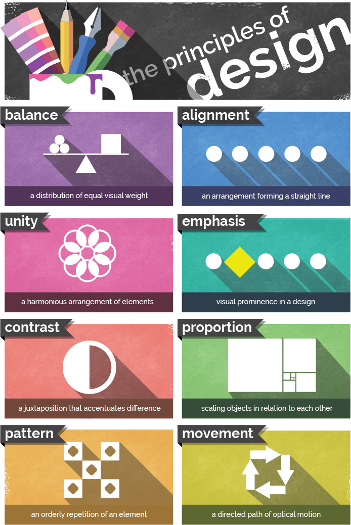
But after really understanding the principles, you’ll appreciate that no one can point to a universal list of artistic principles. If there’s no correct answer, there’s also no wrong answer either. Creatively, you always have another way to approach your art, and becoming an artist doesn’t mean that you learn to see any one approach. Becoming an artist means that you learn to see.
Until you really explore design principles, you will not be ready to understand them. Therefore, definitions are not that helpful as hands-on work. But truly grasping the principles and experiencing them is the only way to grow as an artist. They’re not something you understand; they’re something you undertake. This is the beginning of a lifelong exploration of beauty and creativity.
The bottom line is this: Don’t get hung up on names or descriptions. Try to engage with each idea as a loosely formed concept that remains fluid and flexible rather than “defining boundaries.” The fact is, by studying principles you’re trying to do just the opposite—moving in directions that have no boundaries. The goal of all good art and design is to explore new ways to use the elements and principles, and not to repeat what’s been done in the past. You examine these principles to start your understanding of something, not to limit it.
![]() ACA Objective 2.2
ACA Objective 2.2
The Principles of Emphasis or Focal Point
Emphasis describes the focal point to which the eye is naturally and initially drawn in a design (Figure 8.41). Some art has a focus that’s really obvious. Most marketing and advertising is that way. Other art invites you to step in and explore. It might encourage an exploration of color or texture, but it has no specific point other than the color or texture.
![]() Video 8.14
Video 8.14

Figure 8.41 Emphasis creates the focal point—a place where the eye is naturally drawn when encountering the image. Use this to your advantage when designing.
Let’s think of emphasis as the main point or primary idea in a piece of art. You can move the viewer’s eye to a specific point in the design by making something different. You can easily find examples right on the pages of this book. Chapter headings are larger than the rest of the type. Glossary terms are a different color. Even the simple process of italicizing words or putting them in boldface make text stand out. The human eye is naturally drawn to unique things. So if you want to make something stand out, make it different.
Careful use of contrast is critical to master because a typical design newbie tries to make everything special and unique. As a result, nothing stands out. The design looks random, not cool. Give a piece some unity, and it will feel right. You can then emphasize what’s truly important. Which brings us to our next principle.
![]() ACA Objective 2.2
ACA Objective 2.2
The Principle of Contrast
Contrast generally creates visual interest and a focal point in a composition. If you think about it, a blank canvas is a canvas with no contrast. As soon as you begin to alter the surface and create contrast, you also start to create a focus. The principle of contrast can be defined as a difference in the qualities of the elements within a design. To use contrast is to create something different from the surrounding pieces of the composition.
![]() Video 8.15
Video 8.15
Many artists limit their understanding of contrast by simply confining it to color or value. But contrast is much more than that. Any difference between one thing and another is a contrast. You can have contrast in size, texture, value, color, or any of the defining characteristics you learned about in exploring the elements.
The most important thing to remember about contrast is that all contrast creates some emphasis, and if you have too much emphasis you will have no focal point.
![]() ACA Objective 2.2
ACA Objective 2.2
The Principle of Unity
Unity generally communicates calm, peaceful, or cool feelings within your art. The principle of unity (also known as harmony) requires that the things that go together should look like they belong together. The elements in your design should feel like a family. This doesn’t necessarily mean that everything needs to be the same, just that they should share some similar traits. When you have no unity, you can have no focal point and, therefore, no emphasis (Figure 8.42).
![]() Video 8.16
Video 8.16

Figure 8.42 The similar lines, colors, and even values of this image give it a very unified feeling.
Note the headings of the different sections in this chapter. They make it really easy to find the content that you are looking for when skimming through the book. Even the breaks between paragraphs help distinguish one concept from another. But all the words in this paragraph belong together because they share a unity of typeface, spacing, color, and so on.
Unity is very important in your compositions so that when you create contrast it draws the viewer’s eye where you want it to go. In design, more than in art, you are interested in guiding a viewer’s perceptions. Design generally tends to be much more intentional than art. Both are very important, however, and beginning with design can make your experimentation with artistic elements and principles much more effective and productive.
![]() ACA Objective 2.2
ACA Objective 2.2
The Principle of Variety
Variety tends to communicate energy, heat, and high emotion in a design. When applying the principle of variety, you use different elements in a design to create visual interest. In many ways, it is the exact opposite of unity. You can think of unity and variety as being at the opposite ends of contrast. Unity is establishing a low degree of contrast in a composition (Figure 8.43). Variety does the opposite and brings a higher amount of contrast to the composition.
![]() Video 8.17
Video 8.17

Figure 8.43 When everything is different in an image, like these colored lights are, nothing stands out.
Variety is a principle that normally needs to be used sparingly. Too much variety quickly moves your art from interesting to chaotic and disorganized. Beginning artists and designers sometimes have a hard time properly using variety. They get a little bit carried away and lose all sense of focus or unity. Beware of that tendency. Nothing shouts “newbie” like chaos. Here’s another Cavanaughism to help you tone down the newbie impulse to go crazy with variety:
“Just because you can, doesn’t mean you should.”
![]() ACA Objective 2.2
ACA Objective 2.2
The Principle of Balance
Balance suggests that the arrangement of elements in a design should be evenly distributed. This is not to say that everything should be centered or that placing something in the top right means you should mirror it with something similar in the top left. That’s how a non-designer lays out a composition. An experienced artist learns to properly balance all the elements—including space—in their compositions.
![]() Video 8.18
Video 8.18
![]() Symmetrical balance is what most students latch on to at first. It occurs when you can divide a design along its middle and the left side of the page is a mirror image of the right (or the top reflects the bottom). Using a seesaw analogy, a symmetrical balance would have two equally sized people equally distant from the fulcrum. This is the easiest balance to execute, but it conveys a very intentional, formal, and mechanical feeling.
Symmetrical balance is what most students latch on to at first. It occurs when you can divide a design along its middle and the left side of the page is a mirror image of the right (or the top reflects the bottom). Using a seesaw analogy, a symmetrical balance would have two equally sized people equally distant from the fulcrum. This is the easiest balance to execute, but it conveys a very intentional, formal, and mechanical feeling.
![]() Asymmetrical balance achieves balance with different elements on each side (or the top and bottom) of a page. Imagine an adult on a seesaw with a child. They can balance, but only if the adult is closer to the fulcrum and the child is farther away. To achieve asymmetrical balance, you need to use space to counterbalance the different weights on each side (Figure 8.44).
Asymmetrical balance achieves balance with different elements on each side (or the top and bottom) of a page. Imagine an adult on a seesaw with a child. They can balance, but only if the adult is closer to the fulcrum and the child is farther away. To achieve asymmetrical balance, you need to use space to counterbalance the different weights on each side (Figure 8.44).

Figure 8.44 This image, though asymmetrical, is well balanced. The bright sun is offset by the visual weight of the rocks in the lower right.
Tip
Many artists and designers characterize pieces that are out of balance as “leaning to the left,” “leaning to the right,” or “top heavy.” Over time, you’ll develop these feelings too, and you’ll be able to spot it when art seems like it might physically tip over.
![]() Radial balance is a circular type of balance that radiates from the center instead of the middle of a design (Figure 8.45). Many artists get the feeling that they’re viewing a radially balanced image from above. This kind of balance is almost always circular. An excellent example of radial balance is a kaleidoscopic image, which can feel very balanced and unified but also typically feels more static than the other types of balance.
Radial balance is a circular type of balance that radiates from the center instead of the middle of a design (Figure 8.45). Many artists get the feeling that they’re viewing a radially balanced image from above. This kind of balance is almost always circular. An excellent example of radial balance is a kaleidoscopic image, which can feel very balanced and unified but also typically feels more static than the other types of balance.

The Principle of Proportion or Scale
Proportion, sometimes called scale, describes the relative sizes and scale of things. If you’ve ever seen a drawing and observed that “the head is too small” or “the body is too fat,” you’re evaluating the proportion. Correct proportion is simply the sense that things seem to be the proper size relative to each other.
![]() Video 8.19
Video 8.19
You can manipulate proportion and scale to create emphasis. Things that are larger than they should be appear stronger, more important, or more powerful. Take the chapter headings in this book. By making the headings disproportionately large, it indicates importance and emphasis. You can also reduce the perceived value, strength, or importance of something by reducing its scale.
![]() ACA Objective 2.2
ACA Objective 2.2
The Principles of Repetition and Pattern
The principles of repetition and pattern—along with movement and rhythm—seem to be the most confusing and difficult to grasp. As a matter of fact, some artists and writers more readily connect pattern and repetition with rhythm than with movement. Let’s think about the simplest and most concrete uses of them here. As always, you are encouraged to explore these areas much more deeply on your own.
![]() Video 8.20
Video 8.20
![]() Repetition is a principle that is pretty easy to grasp: repeating an element in your design. Repetition can convey many things, but it often represents importance, movement, or energy. Think of a cartoon illustration of a ball moving or a cartoon of a bird flapping its wings. Just repeating a few so-called “motion” lines can convey a sense of movement.
Repetition is a principle that is pretty easy to grasp: repeating an element in your design. Repetition can convey many things, but it often represents importance, movement, or energy. Think of a cartoon illustration of a ball moving or a cartoon of a bird flapping its wings. Just repeating a few so-called “motion” lines can convey a sense of movement.
Another important way to think about repetition is to share certain traits of the elements in your design. Doing so brings some unity to those elements and lets the viewer know they’re related. For example, you could repeat the colors of the logo in headers and bold type or repeat the same colors from a photo into the header text of an associated article in a magazine. Repetition of this kind conveys a sense of unity in the design.
![]() Pattern happens when different objects repeat in a sequence. The best way to think about the difference between repetition and pattern is that repetition is done with a single element (such as pinstripes on a suit), whereas pattern happens with a collection of elements (such as a floral pattern on fabric). Pattern also happens when elements are repeated consistently and, at some point, eventually move past repetition and become a pattern.
Pattern happens when different objects repeat in a sequence. The best way to think about the difference between repetition and pattern is that repetition is done with a single element (such as pinstripes on a suit), whereas pattern happens with a collection of elements (such as a floral pattern on fabric). Pattern also happens when elements are repeated consistently and, at some point, eventually move past repetition and become a pattern.
The Principles of Movement and rhythm
Movement and rhythm are similar, much like repetition and pattern. They modify a design much the way an adverb modifies an adjective. They explain a feeling that the elements create, rather than making specific changes to the elements.
![]() Video 8.21
Video 8.21
![]() Movement refers to the visual movement on a page. Depending on the context, it can refer to the movement the eye naturally follows across the page as it moves from focal point to focal point, or to the perceived movement or flow of the elements in the image.
Movement refers to the visual movement on a page. Depending on the context, it can refer to the movement the eye naturally follows across the page as it moves from focal point to focal point, or to the perceived movement or flow of the elements in the image.
Movement can also refer to the “flow,” and it is a critical principle to consider in your work. It’s more of a feeling than a concrete visual aspect of your design. When something “doesn’t feel right,” it may be that the flow is uncertain or contradictory. If you haven’t considered the flow of your design, analyze it and create a flow that guides the viewer through your design. The more linear your flow, the more your design will convey a sense of reliability, consistency, and calm. A more complex flow can convey a sense of creativity, freedom, or even chaos.
![]() Rhythm refers to the visual “beat” within the design, a sense of an irregular but predictable pattern. Just like a rhythm laid down by a drummer, a design’s rhythm is creative and expressive rather than a consistent pattern or repetition. Depending on the design you’re working on, rhythm may or may not be a critical principle to consider. A predictable rhythm can convey a sense of calm and consistency, whereas an erratic or complex rhythm can convey a sense of urgency or energy.
Rhythm refers to the visual “beat” within the design, a sense of an irregular but predictable pattern. Just like a rhythm laid down by a drummer, a design’s rhythm is creative and expressive rather than a consistent pattern or repetition. Depending on the design you’re working on, rhythm may or may not be a critical principle to consider. A predictable rhythm can convey a sense of calm and consistency, whereas an erratic or complex rhythm can convey a sense of urgency or energy.
These two principles tend to be the most subjective, so be sure to clarify anything you’re unsure about when discussing these principles with a client. Because they’re more of a feeling than a specific element or technique, it takes a little experience to get a handle on them. But these are just like all the principles: Once you start looking for them, you’ll start to see them.
Conclusion
It’s critical that you as a designer understand the elements and principles so that your work can communicate clearly with your audience. Learning the technical basics of design is fairly easy, and they can be mastered by people who will never “make it” in the industry. It’s not enough that you know (technically) how to compose things in a design if you don’t (artistically) know when and where to design them.
![]() Video 8.22
Video 8.22
Take the time to develop your design skillset and to remember that it is a skillset. You’ve got to practice and continue to develop your craft to level up those skills. Using InDesign without having a design sense is like starting up a jet engine without the jet. It’s powerful, but you won’t really be able to fly it to a destination. The artistic elements and principles are the wings and controls that let you harness that power and get your art to go where you want it.
Invest the time and effort to practice and refine your design sense. You’ll find not only that your personal art grows more impressive over time, but that the entire world opens up and becomes much more interesting, beautiful, and detailed.
InDesign is about learning to create visual designs with exceptionally high quality and detail, but becoming an artist and refining your skills is about learning to see.
Open your eyes... and enjoy the beauty you’ve been missing that’s all around you.
Tip
Connect at brainbuffet.com/design to see an ever-growing collection of design-related resources, or follow @brainbuffet on Twitter for weekly resources, inspiration, and freebies to use with your design projects.