13 Improving Clips with Color Correction and Grading
Lesson overview
In this lesson, you’ll learn about the following:
Working in the Color workspace
Using the Lumetri Color panel
Using vectorscopes and waveforms
Comparing and matching clip colors
Using color correction effects
Fixing exposure and color balance problems
Working with special color effects
Creating a look
This lesson will take about 150 minutes to complete. Please log in to your account on peachpit.com to download the lesson files for this lesson, or go to the “Getting Started” section at the beginning of this book and follow the instructions under “Accessing the lesson files and Web Edition.” Store the files on your computer in a convenient location.
Your Account page is also where you’ll find any updates to the lesson files. Look on the Lesson & Update Files tab to access the most current content.
Editing your clips together is just the first part of the creative process. Now it’s time to work with color. In this lesson, you’ll learn some key techniques for improving the look of your clips to give them a distinctive atmosphere.
Starting the lesson
So far you’ve organized your clips, built sequences, and applied special effects. All of these skills come together when working with color correction.
Consider the way your eyes register color and light, the way cameras record it, and the way your computer screen, a television screen, a video projector, a phone, a tablet, or a cinema screen displays it. There are a great many factors when considering the final look of your production.
Premiere Pro has multiple color correction tools and makes it easy to create your own presets. In this lesson, you’ll begin by learning some fundamental color correction skills and then meet some of the most popular color correction special effects, before using them to deal with some common color correction challenges.
Open Lesson 13.prproj in the Lesson 13 folder.
Save the project as Lesson 13 Working.prproj.
Select Color in the Workspaces panel, or choose Window > Workspaces > Color, to switch to the Color workspace.
Choose Window > Workspaces > Reset To Saved Layout, or double-click the Color workspace name to reset the workspace to its default layout.
This changes the workspace to the preset that was created to make it easier to work with color correction effects and, in particular, the Lumetri Color panel and Lumetri Scopes panel.
Understanding display color management
Computer monitors generally use a different system for displaying color than do TV screens and cinema projectors (see the sidebar “About 8-bit video” for more on this).
If you’re producing video for online distribution, knowing your audience will be using a computer monitor similar to yours to view your content, you can be confident the colors and brightness levels of your images will be comparable. If you’re delivering video for TV or the cinema screen, you’ll need a way to view video that matches the type of screen it’s intended for.
Professional colorists have multiple display systems to check their work on. If they’re working on a film intended for theaters, they’ll have the same kind of projector a theater would use.
Some computer monitors actually offer excellent color reproduction—better than television screens. If you have enabled GPU acceleration (see Lesson 2, “Setting Up a Project”) and you are using a computer monitor of this kind, Premiere Pro can adjust the way video is displayed in the Source Monitor and Program Monitors to match another type of screen.
This is a great help if you don’t have access to the right kind of screen.
Premiere Pro automatically detects if you have the right kind of monitor. To enable this feature, choose Premiere Pro CC > Preferences > General (macOS) or Edit > Preferences > General (Windows), and select Enable Display Color Management (requires GPU acceleration).

For more information about this feature, as well as a helpful breakdown of the types of color displays and the ways colors will be adjusted by Premiere Pro, including examples, check out the excellent article by Jarle Leirpoll on Display Color Management at premierepro.net: https://premierepro.net/color-management-premiere-pro/.
Following a color-oriented workflow
Now that you’ve switched to the Color workspace, it’s a good time to switch to a different kind of thinking. With your clips in place, it’s time to look at them less in terms of the action and more in terms of whether they fit together and have the right look.
There are two main phases to working with color.
Make sure clips in each scene have matching colors, brightness, and contrast so they look like they were shot at the same time, in the same place, and with the same camera.
Give everything a “look”—in other words, a particular tonality or color tint.

You’ll use the same tools to achieve both of these goals, but it’s common to approach them in this order, separately. If two clips from the same scene don’t have matching colors, it creates a jarring continuity problem.
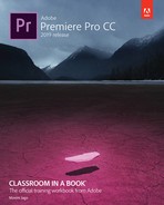
Working with the Color workspace
The Color workspace displays the Lumetri Color panel, which has a number of sections offering color adjustment controls, and places the Lumetri Scopes panel behind the Source Monitor. The Lumetri Scopes are a set of image analysis tools.
The remaining screen area is devoted to the Program Monitor, Timeline, and Project panels. The Timeline panel shrinks to accommodate the Lumetri Color panel.
Remember, you can open and close any panel at any time, but this workspace focuses on finishing work, rather than organizing or editing your project.

While the Lumetri Color panel is displayed, clips on the Timeline are selected automatically as the playhead moves over them. Only clips on tracks that are enabled will be selected this way.
This feature is important because adjustments made with the Lumetri Color panel are always applied to the selected clip. You can apply an adjustment and move the Timeline panel playhead over the next clip to select it, and work on it.
You can enable or disable automatic clip selection by choosing Sequence > Selection Follows Playhead.

Getting an overview of the Lumetri Color panel
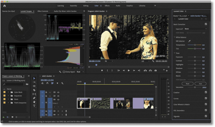
There is an effect available in the Effects panel called Lumetri Color, which provides all the controls and options available in the Lumetri Color panel. Like any other effect, its controls are displayed in the Effect Controls panel.
The first time you make an adjustment using the Lumetri Color panel, a Lumetri Color effect is applied to the selected clip. If there is a Lumetri Color effect already applied to the clip, the settings for that effect are adjusted.
In a sense, the Lumetri Color panel is a kind of remote control for the Lumetri Color effect settings in the Effect Controls panel. As with any other effect, you can create presets, copy and paste Lumetri Color effects from one clip to another, and change the settings in the Effect Controls panel.
You can apply more than one Lumetri Color effect to the same clip, each making different types of adjustment to produce a combined result. This can make it easier to stay organized when working on complex projects.
At the top of the Lumetri Color panel, you can choose which Lumetri Color effect you’re currently working on. You can also add a new Lumetri Color effect to work on.
The same menu allows you to rename the current Lumetri Color effect to make it easier to navigate your effects. You can also rename effects in the Effect Controls panel by right-clicking the effect name and choosing Rename.

The Lumetri Color panel is divided into six sections. Each section provides a group of controls with different approaches to color adjustment. You can use any or all of the sections to achieve the result you want.
![]() Note
Note
You can expand or collapse a section in the Lumetri Color panel by clicking its heading.
Let’s take a look at each section.
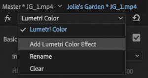
Basic Correction
This section provides you with simple controls to apply quick fixes to your clips.
At the top of the section, a menu allows you to apply a preset adjustment to your media in the form of an Input LUT (Lookup Table), which makes standard adjustments to media that might otherwise look quite flat.
A LUT is actually a file, a little like an effect preset intended to adjust the appearance of clips. LUTs can be imported and exported for advanced color grading workflows.
![]() Note
Note
Each section has a check box to enable and disable it, making it easy to toggle the result and check the effect against the original image.
If you’re familiar with Adobe Lightroom, you’ll recognize the list of simple controls in the Basic section. You can work your way down the list making adjustments to improve the look of your footage, or you can click the Auto button to let Premiere Pro work out some settings for you.

Creative
As the name suggests, the Creative section allows you to go a little further into developing a look for your media.
A number of creative looks are included, with a preview based on your current clip. Click the arrows on the preview to review different Looks, and click the image to apply a Look to the clip.
You can make subtle adjustments to the color intensity, and there are color wheels configured to adjust the color for the shadow (darker) pixels or highlight (lighter) pixels in the image.
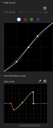
Curves
Curves allow quick but precise adjustments to visuals and make it easier to achieve more natural-looking results with just a few clicks.
![]() Tip
Tip
You can reset most controls in the Lumetri Color panel by double-clicking the control.
These are some of the more advanced controls, providing nuanced adjustments to the luminance, red, green, and blue pixels.
Adjustments are made in a similar way to those you applied to the Parametric Equalizer effect graph, or the audio rubber bands on clips. The position of the line indicates the adjustment.
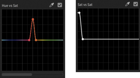
In addition to a traditional RGB curves control, there are multiple Hue Saturation Curve controls. Each of these gives precise control over a specific adjustment.
For example, the first control, Hue vs Sat, allows you to add (by clicking) and position (by dragging) control points to increase or decrease color saturation for specific hues.
The next, Hue vs Hue, allows you to change one hue into another.

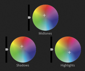
Color Wheels & Match
This section provides precise control over the shadow, midtone, and highlight pixels in the image. Simply drag the control puck from the center of a wheel toward the edge to apply an adjustment.
Each color wheel also has a luminance control slider on the left, which allows you to make simple adjustments to the brightness and, by appropriate adjustment, the contrast of your footage.
There’s also a button that opens the Program Monitor Comparison View and another button that automatically color matches clips.

HSL Secondary
The HSL Secondary setting is a color adjustment made to specific areas of an image, selected using Hue, Saturation, and Luminance ranges.
This is the section of the Lumetri Color panel you would use to selectively make a blue sky even bluer, or make a field of grass a deeper green, without affecting other areas of the picture.
The advanced Curves controls provide similar options, and you are likely to choose one method or the other based on personal preference.

Vignette
It’s surprising how much difference a simple vignette effect can make to a picture.
A vignette was originally caused by camera lenses darkening the edge of frame, but modern lenses rarely have this issue.

Instead, a vignette is commonly used to bring attention to the center of an image, and it can be highly effective, even when the adjustment is subtle.
The Lumetri Color panel in action
Because adjustments made using the Lumetri Color panel are added collectively as a regular Premiere Pro effect, you can also enable and disable the effect in the Effect Controls panel, or create an effect preset.
Let’s try some prebuilt looks.
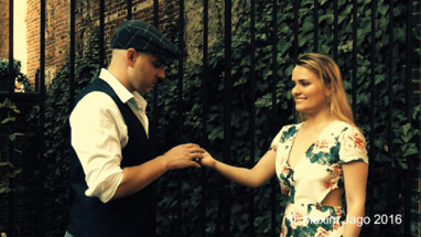
Open the sequence Jolie’s Garden in the Sequences bin. This is a simple sequence with a series of clips that have a good range of color and contrast.
Position the playhead over the first clip in the sequence. The clip should highlight automatically in the Timeline panel.
Click the Creative section heading in the Lumetri Color panel to reveal its controls.
Browse through several prebuilt looks by clicking the arrow on the right side of the preview display. When you see a look you like, click the preview image to apply it.
Try adjusting the Intensity slider to vary the amount of adjustment.
This is a good time to experiment with the other controls in the Lumetri Color panel. Some controls will make sense immediately, while others will take time to master. Use the clips in this sequence as a testing ground to learn about the Lumetri Color panel through experimentation; just drag all the controls from one extreme to the other to see the result. You’ll learn about many of these controls in detail later in this lesson.
Understanding Lumetri Scopes essentials
You might have wondered why the Premiere Pro interface is so gray. There’s a good reason: Vision is highly subjective. In fact, it’s also highly relative.
If you see two colors next to each other, the way you see one is changed by the presence of the other. To prevent the Premiere Pro interface from influencing the way you perceive colors in your sequence, Adobe has made the interface almost entirely gray. If you’ve ever seen a professional color-grading suite, where artists provide the finishing touches to films and television programs, you’ve probably noticed that most of the room is gray. Colorists sometimes also have a large gray piece of card, or a section of a wall, that they can look at for a few moments to “reset” their vision before checking a shot.
The combination of your subjective vision and the variation that can occur in the way computer monitors and television monitors display color and brightness creates a need for an objective measurement.
Video scopes provide just that. And they’re used throughout the media industry; learn them once, and you’ll be able to use them everywhere.
Open the sequence Lady Walking.
Position the Timeline playhead so that it’s over the clip in the sequence.
The Lumetri Scopes panel should be sharing the frame with the Source Monitor. Click to select the panel and make it active, or select it in the Window menu.
Open the Lumetri Scopes panel Settings menu
 and choose Presets > Premiere 4 Scope YUV (float, no clamp).
You should see the lady walking in the street in your Program Monitor, along with the synchronized display in the Lumetri Scopes panel.
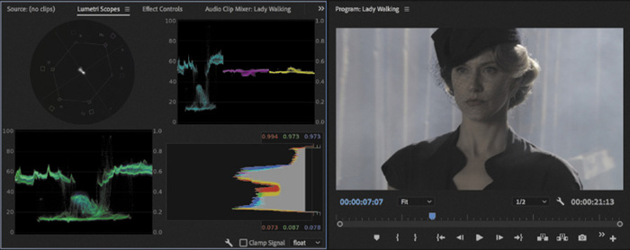
Working with the Lumetri Scopes panel
The Lumetri Scopes panel displays an array of industry-standard meters to get an objective view of your media.
The full complement of displays can be a little overwhelming at first, plus you’ll have smaller graphs because they are all sharing one panel. You can turn individual items off and on by opening the Settings menu and choosing items on the list.
Also in the Settings menu, you can specify whether you are working to an ITU Rec. 2020 (UHD), ITU Rec. 709 (HD), or ITU Rec. 601 (SD) color space. If you’re producing content for broadcast television, you will almost certainly be working to one of these standards. If not or if you’re not sure, you will probably be happy with Rec. 709.
At the bottom right of the Lumetri Scopes panel, you can choose to display the scopes in 8 bit, float (which is 32-bit floating-point color), or even HDR.
The option you choose does not change the clip or the way effects are rendered but does change the way the information is displayed in the scopes. You’ll want to choose an option that matches the color space you’re working in.


HDR refers to High Dynamic Range, which has a much higher range between the darkest and brightest parts of the picture. Though HDR is beyond the scope of these lessons, it’s an important new technology and one that will be increasingly relevant as new cameras and displays support it.
The Clamp Signal option constrains the scopes to standard legal levels for broadcast television. Again, this doesn’t impact the image or the result of your effects—it’s a matter of personal preference if you would like to limit the range of the scopes in this way to see the scales more clearly.
![]() Tip
Tip
You can also access the Lumetri Scopes Settings menu by right-clicking anywhere in the panel.
Let’s simplify the view.
Use the Lumetri Scopes settings menu to click each of the selected items to deselect them and remove them from the display. When there’s one item left, it’ll be dimmed so you can’t remove it.
Now let’s take a look at two of the main components in the Lumetri Scopes panel.
Waveform
Right-click in the panel and choose Presets > Waveform RGB.
If you’re new to waveforms, they can look a little strange, but they’re actually simple. They show you the brightness and color saturation of your images.
Every pixel in the current frame is displayed in the waveform. The brighter the pixel, the higher it appears. The pixels have their correct horizontal position (that is, a pixel halfway across the screen will be displayed halfway across the waveform), but the vertical position is not based on the image at all.
Instead, the vertical position indicates brightness or color intensity; the brightness and color intensity waveforms are displayed together in this version of the waveform, using different colors.
0, at the bottom of the scale, represents no luminance at all and/or no color intensity.
100, at the top of the scale, represents a pixel that is fully bright. On the RGB scale, this value would be 255 (you can see this scale on the right side of the waveform display).
This all might sound rather technical, but in practice it’s straightforward. There’s a visible baseline that represents “no brightness” and a top level that represents “fully bright.” The numbers on the edge of the graph might change depending on your settings, but the use is essentially always the same.
You can view the waveform in several ways. To access each type, open the Lumetri Scopes Settings menu and choose Waveform Type, followed by one of these options:
RGB: Shows the Red, Green, and Blue pixels in their own colors.
Luma: Shows the IRE value of pixels, from 0 to 100, against a scale of –20 to 120. This allows for precise analysis of bright spots and contrast ratio.
YC: Shows the image luminance (brightness) in green and the chrominance (color intensity) in blue.
YC No Chroma: Shows the luminance only, with no chrominance.
Let’s test this display a little.
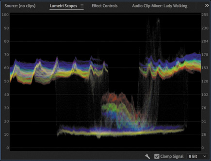
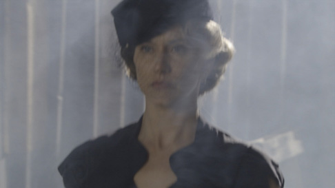
Continue using the Lady Walking sequence. Set the Timeline playhead to 00:00:07:00 so you can see the lady against the smoky background.
Set the waveform display to YC No Chroma. This is a brightness-only waveform, with no color information, that shows a full range, with no limits set for broadcast television.

The smoky parts of the image have little contrast and are displayed as a relatively flat line in the waveform display. The lady’s head and shoulders are darker than the smoky background. They’re around the middle of the image, and they are clearly visible in the middle area of the waveform display.
Expand the Basic Correction section of the Lumetri Color panel.
Experiment with the Exposure, Contrast, Highlights, Shadows, Whites, and Blacks controls. As you adjust the controls, watch the waveform display to see the result.
![]() Tip
Tip
You can double-click any part of a slider control in the Lumetri Color panel to reset it.
If you make an adjustment to the image and then wait a few seconds, your eyes will adjust to the new appearance, and it will seem normal. Make another adjustment, and a few seconds later the new appearance seems normal too. Which is correct?
Ultimately, the answer is based on perceived quality. If you like what you see, it’s right. However, the waveform display will give you objective information about how dark or bright pixels are or how much color is in the shot, which is useful when attempting to meet standards.
![]() Tip
Tip
It can sometimes seem as if the waveform display is showing an image. Remember, the vertical position of the pixels in your images is not used in a waveform display.
If you scrub through the sequence or play the sequence, you’ll see the waveform display update live.
The waveform display is useful for showing how much contrast you have in your images (the difference between the bright and dark areas of the image) and for checking whether you are working on video that has “legal” levels (that is, the minimum and maximum brightness or color saturation permitted by a broadcaster). Broadcasters adopt their own standards for legal levels, so you will need to find out for each case where your work will be broadcast.
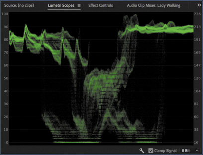
You can see right away that you do not have great contrast in this shot. There are some strong shadows, but few highlights in the upper part of the waveform display. Any time you see flat horizontal lines in the waveform display, it means there’s no visible detail. In the following example, the shadows have been darkened so much, they’re flattened at the bottom of the waveform.
The result is not necessarily bad and might be exactly the look you are seeking. It’s just important to know when adjustments are so extreme that detail is being lost.

You can reset the Lumetri Color panel at any time by clicking the Reset Effect button ![]() at the upper-right corner of the panel.
at the upper-right corner of the panel.
YUV Vectorscope
Whereas the Luma waveform shows luminance in terms of the vertical position of pixels displayed, with brighter pixels displayed at the top and darker pixels displayed at the bottom, the vectorscope shows only color.
![]() Note
Note
The HLS (Hue, Luminance, Saturation) vectorscope is sometimes used by film-grading artists in preference to the YUV vectorscope. It has no guiding overlay and is a little harder to read if you are not already familiar with it.
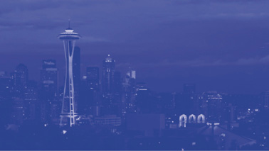
Open the sequence Skyline.

Open the Lumetri Scopes Settings menu and choose Vectorscope YUV; then open the Settings menu again and choose Waveform (YC No Chroma) to disable it.
Pixels in the image are displayed in the vectorscope. If a pixel appears in the center of the circle, it has no color saturation. The closer to the edge of the circle, the more color a pixel has.
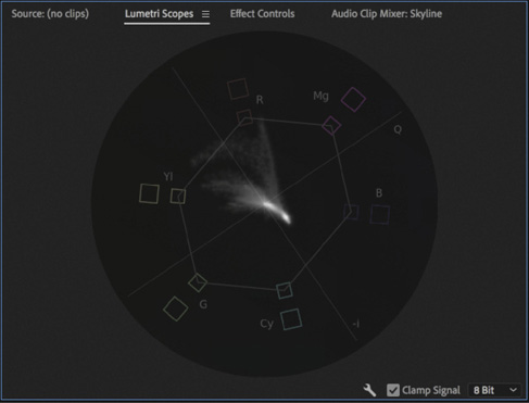
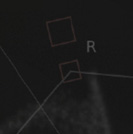
If you look closely at the vectorscope, you’ll see a series of targets indicating primary colors.
R = Red
G = Green
B = Blue
There are two boxes for each target. The smaller, inner box is at 75% saturation, the YUV color limit, while the larger, outer box is at 100% saturation, the RGB color limit. RGB color extends to a greater level of saturation than YUV. The thin line between the inner boxes shows the YUV color gamut (the range of YUV colors).

You’ll also see a series of targets indicating secondary colors.
Yl = Yellow
Cy = Cyan
Mg = Magenta
The closer a pixel is to one of these targets, the more of that color it has. Unlike the waveform display, which indicates the horizontal position of each pixel, no position information is indicated in the vectorscope.
It’s clear enough to see what’s happening in this shot of Seattle. There’s a lot of blue, and there are a few spots of red and yellow. The small amount of red is indicated by the streak of peaks reaching out toward the R marking in the vectorscope.
The vectorscope is helpful because it gives you objective information about the colors in your sequence. If there’s a color cast, perhaps because the camera was not calibrated properly, it’s often obvious in the vectorscope display. You can simply use one of the Lumetri Color panel controls to reduce the amount of the unwanted color or add more of the opposite color.
Some of the controls for color correction adjustments have the same color wheel design as the vectorscope, making it easy to see what you need to do.
Let’s make an adjustment and observe the result in the vectorscope display.
![]() Tip
Tip
You can jump to 00:00:01:00 by clicking the timecode in the Source Monitor, Program Monitor, or Timeline panel, and typing 1. and then pressing Enter because each dot (.) adds one pair of zeros.
Continue working with the Skyline sequence. Position the Timeline playhead at 00:00:01:00, where the colors are more vivid.
In the Lumetri Color panel, expand the Basic Correction section.
While watching the result in the vectorscope display, drag the Temperature slider from one extreme to the other.

The pixels displayed in the vectorscope move between the orange and blue areas of the display.
Reset the Temperature slider by double-clicking the slider control.
In the Lumetri Color panel, drag the Tint slider from one extreme to the other.

The pixels displayed in the vectorscope move between the green and magenta areas of the display.
Reset the Tint slider by double-clicking the slider control.
By making adjustments while checking the vectorscope, you can give an objective indication of the change you’re making.
RGB parade
Open the Lumetri Scopes Settings menu and choose Presets > Parade RGB.

The RGB parade provides another form of waveform-style display. The difference is that the red, green, and blue levels are displayed separately. To fit all three colors in, each image is squeezed horizontally to one-third of the width of the display.

You can choose which kind of parade you see by clicking the Lumetri Scopes Settings menu or by right-clicking in the Lumetri Scopes panel and choosing Parade Type.
The three parts of the parade have similar patterns in them, particularly where there are white or gray pixels, because these parts will have equal amounts of red, green, and blue. The RGB parade is one of the most frequently used tools in color correction because it clearly shows the relationship between the primary color channels.
To see the dramatic impact color adjustments can have on the parade, go to the Basic Correction section of the Lumetri Color panel and try adjusting the White Balance Temperature and Tint controls. Be sure to reset them when you finish by double-clicking each control.
Using Comparison View
As mentioned earlier, there are usually two phases to color adjustment work.
Color correction: Correcting for color cast or brightness issues and matching shots in the sequence to ensure they look like part of the same content were shot at the same time in the same location or that they match an in-house standard for final delivery.
Color grading: Establishing a creative look for shots on a shot-by-shot, scene-by-scene, or sequence-wide basis.
When color correcting, it’s helpful to compare one shot with another to achieve a match. This is especially helpful when the two shots come from different scenes, meaning some color variation is expected even if the overall tone should be similar.
You can drag your current sequence from the Project panel into the Source Monitor to use that monitor as a reference for side-by-side comparison, but there’s an easier way: set the Program Monitor to Comparison view.
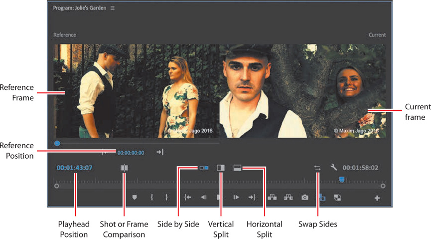
You can toggle between the regular playback view and Comparison View in the Program Monitor at any time. Let’s take a look at the new controls.
Reference Frame: The frame you are using as a reference or for automatic color matching.
Reference Position: The timecode for the reference frame.
Playhead Position: The timecode for the current frame.
Shot or Frame Comparison: Toggle between using another frame as a reference, or the current state of the current frame. The latter option is useful when working on effects, as it allows a constant “before-and-after” view when working with effects so your eyes can’t adjust to the finished version.
Side by Side: View the two images separately, side by side.
Vertical Split: View the two images as a single vertically split screen, with a divider you can drag to reposition.
Horizontal Split: The same as the Vertical Split option but now with a horizontal divider.
Swap Sides: Switch the left and right images.
Current frame: The frame you’re working on now.
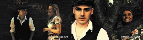
Open the Jolie’s Garden sequence, and position the Timeline playhead over the last clip in the sequence.

In the Lumetri Color panel, open the Color Wheels & Match section, and click the Comparison View button; or click the Comparison View button
 in the Program Monitor.
Try changing the reference frame in one of these ways:
Drag the mini playhead under the reference frame to a new position.
Click the reference position timecode and enter a new time, or drag on the timecode to choose another time.

Click the Go To Previous Edit or Go To Next Edit button on either side of the reference position timecode to jump between clips.
Try the split view options, and drag the divider between the two sides of the split.
Stay in Comparison View, ready for the next exercise.
Matching color
One of the most powerful and time-saving features of the Lumetri Color panel is the option to automatically match colors between two clips.
To use this feature, you’ll switch to Comparison View in the Program Monitor, choose a reference frame and a current frame, and click the Apply Match button in the Color Wheels & Match section of the Lumetri Color panel.
The result will not always be perfect, and you may need to experiment with different reference and current frame selections to get a closer match, but it’s often close enough for you to make final adjustments that are guided by the automated adjustment. If Premiere Pro gets you 80% of the way there, it’s a huge time-saver.
Let’s try it with our current sequence.
Continuing from the previous exercise: Set the reference frame to 00:01:00:00.
Set Timeline panel playhead to the start of the last clip in the sequence. You can use the Up and Down arrow keys to quickly jump between the clips in the sequence.

These are clips from different scenes in the same film. They don’t need to have exactly the same colors, but it would be helpful if perhaps the skin tones matched better. Make sure the Face Detection option is selected in the Lumetri Color panel. This way, Premiere Pro will automatically detect faces in the shots and prioritize matching those tones.
Click the Apply Match button.
The difference is clear. Within a few moments, it’s likely your eyes will adjust to the new appearance of the current frame. To help see the change more clearly, toggle the Color Wheels & Match check box off and on repeatedly.

Click the Comparison View button to switch back to the regular playback view in the Program Monitor.
The automated color matching offered by the Lumetri Color panel is not likely to produce an identical color match, partly because the perception of color is so subjective and contextual. However, all of the adjustments that were applied are editable, so you can finesse the result until it’s perfect.
Exploring the color-oriented effects
As well as adjusting color using the Lumetri Color panel, there are a number of color-oriented effects worth familiarizing yourself with. You add, modify, and remove color correction effects in the same way that you manage the other effects in Premiere Pro. Just as with the other effects, you can use keyframes to modify the settings over time.
As you build familiarity with Premiere Pro, you may find yourself uncertain about which effect is best for a particular purpose; this is normal! There are often several ways of achieving the same outcome in Premiere Pro, and sometimes the choice comes down to which interface you prefer.
The following are a few effects you may want to try first.
![]() Tip
Tip
You can always find an effect using the search box at the top of the Effects panel. Often, the best way to learn how to use an effect is to apply it to a clip that has a good range of colors, highlights, and shadows and then adjust all the settings to see the result.
Using coloring effects
Premiere Pro features several effects, all available in the Effects panel, for adjusting existing colors. The following two are for creating a black-and-white image and applying a tint and for simply turning a color clip into a black-and-white one.
![]() Tip
Tip
While in the Color workspace, the Effects panel may not be easy to locate. You can always access any panel by choosing it from the Window menu.
Tint
Use the eyedroppers or color pickers to reduce any image to just two colors. Whatever you map to black and white replaces any other colors in the image.
Black & White
Convert any image to simple black and white. This is useful when combined with other effects that can add color.

Black-and-white images can often withstand much stronger contrast. Consider combining effects for the best results.
Leave Color
You can use the advanced HSL Secondary section of the Lumetri Color panel or the Hue Saturation curves to achieve a similar result, but this filter is sometimes faster.

Use the eyedropper or color pickers to select a color you want to keep. Adjust the Amount To Decolor setting to turn the saturation down on every other color.
Use the Tolerance and Edge Softness controls to produce a subtler effect.
Using the Video Limiter effect
In addition to creative effects, Premiere Pro’s color correction repertoire includes effects used for professional video production.
When video is broadcast, there are specific limits that are permitted for maximum luminance, minimum luminance, and color saturation. Although it’s possible to confine your video levels to the limits permitted using manual controls, it’s easy to mix parts of your sequence that need adjustment.
In the Effects panel, the Video Limiter effect, found in Video Effect > Color Correction, automatically limits the levels of clips to ensure they meet the standards you set.

You’ll need to check the limits applied by your broadcaster before adjusting the Clip Level setting with this effect. The levels will not be permitted to go above this.
![]() Tip
Tip
While it’s common to apply the Video Limiter effect to individual clips, you might also choose to apply it to the whole sequence by using it on an adjustment layer or by enabling it as an export setting (see Lesson 16, “Exporting Frames, Clips, and Sequences”).
Then it’s simply a question of choosing the Compression Before Clipping amount. Using this, rather than simply chopping off levels that go above the Clip Level setting, a gradual compression of the higher levels is applied to produce a more natural-looking result.
You can choose for this gradual compression to begin 3%, 5%, 10%, or 20% before the cutoff level.
If you turn on the Gamut warning, pixels that go above the Clip Level setting are highlighted in the Gamut Warning color. This is a useful option when reviewing your sequence, but be sure to deselect the Gamut Warning option before exporting your sequence, as the color highlight will be included in the exported file.
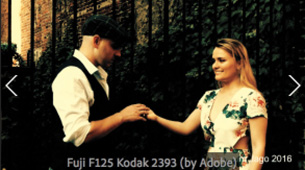
Using Lumetri Looks presets in the Effects panel
In addition to the manual controls available in the Lumetri Color panel, there are a number of Lumetri Look presets available in the Effects panel. These are a fantastic way to get started with advanced color adjustments, and as they are presets, you can modify the settings to achieve exactly the finish you want. If you resize the Effects panel, you can reveal previews of each of the built-in Lumetri Look preset effects.
You apply a Lumetri Look preset effect in the same way that you would apply any other effect available in the Effects panel.

Lumetri Look presets are actually Lumetri Color effects with settings already applied, including a Creative look in some cases.

You can modify the settings in the Effect Controls panel or in the Lumetri Color panel.
Fixing exposure problems
Let’s look at some clips that have exposure issues and use some of the Lumetri Color panel controls to address them.
Make sure you are in the Color workspace, and reset it to the saved version if necessary.
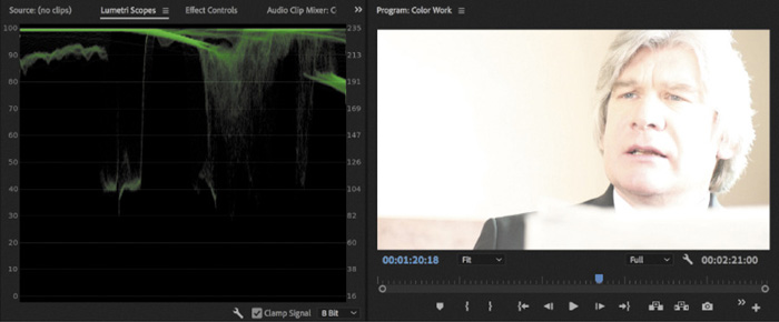
Open the sequence Color Work.
In the Lumetri Scopes panel, right-click or open the Settings menu to choose Presets > Waveform RGB. This is just a quick way to close any other scopes and open the waveform display on its own.
Again, in the Lumetri Scopes panel, right-click or open the Settings menu to choose Waveform Type > YC No Chroma. This changes the display to a waveform that uses the standard broadcast television range, which is a useful reference for most video projects.
Position the Timeline playhead over the first clip in the sequence. It’s the shot of the lady walking. You’re going to add some contrast.

The environment is smoky; 100 IRE (displayed on the left on the waveform) means fully exposed, and 0 IRE means not exposed at all. No part of the image comes close to these levels. Your eye quickly adjusts to the image, and it’ll soon appear fine. Let’s see whether you can bring it to life a little.
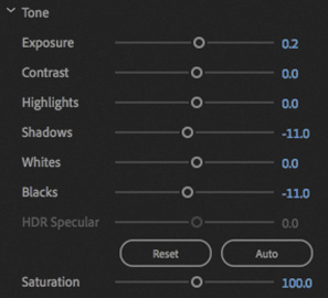
In the Lumetri Color panel, click the Basic Correction heading to display that section.
Use the Exposure and Contrast controls to make adjustments to the shot while checking the waveform display to make sure the image doesn’t become too dark or too light.
You’ll get the best perceived results if you have a frame from a later part of the clip on-screen. Around 00:00:07:09 there’s a section of sharp focus.
Try an Exposure setting of 0.6 and a Contrast setting of 60.

Your eye is likely to adjust quickly to the new image. Use the check box to toggle the Basic Correction section off and on to compare the image before and after.
The subtle adjustment you made adds more depth to the image, giving it stronger highlights and shadows. As you toggle the effect off and on, you’ll see the waveform changing in the Lumetri Scopes panel. You still don’t have bright highlights in the image, but that’s fine because the natural colors are mainly midtones.
![]() Tip
Tip
If the Lumetri panel is active, you can use the Bypass Lumetri Color Effects keyboard shortcut. While pressing the key, all instances of the Lumetri Color effect are turned off. By default, this shortcut has no key associated with it. For information on assigning keyboard shortcuts, see Lesson 1, “Touring Adobe Premiere Pro CC.”
Fixing underexposed images
Now let’s work with an underexposed image.
Switch to the Effects workspace.
Position the Timeline playhead over the second clip in the Color Work sequence. When you first look at this clip, it might look OK. The highlights don’t look strong, but there’s a reasonable amount of detail throughout the image. The face, especially, is sharp and detailed.
Open the Lumetri Scopes panel so you can view this clip in the waveform. At the bottom of the waveform there are quite a few dark pixels, with some touching the 0 IRE line.
In this instance, it looks like the missing detail is in the shoulder of the suit, on the left. The problem with such dark pixels is that increasing the brightness will simply change the strong shadows into gray, and no detail will emerge.
 Tip
TipRemember, you can open any panel by choosing it from the Window menu. The Lumetri Scopes panel, for example, isn’t limited to the Color workspace.
In the Effects panel, locate the Brightness & Contrast effect. Apply the effect to the clip.
Drag the panel name for the Lumetri Scopes panel to move it into a new panel group between the Effect Controls panel and the Program Monitor so you can see all panels at once.

Use the Brightness control in the Effect Controls panel to increase the brightness. Rather than clicking the number and typing a new number, drag to the right so you can see the change happening incrementally.
As you drag, notice that the whole waveform moves up. This is fine for bringing out the highlights in the image, but the shadows remain a flat line. You’re simply changing the black shadows to gray. If you drag the Brightness control all the way to 100, you’ll see just how flat the image still is.
TipThe Brightness & Contrast effect offers a quick, easy fix, but it’s easy to accidentally clip the black (dark) or white (bright) pixels, losing detail. The Lumetri Color panel Curves control keeps adjustments inside the 0 to 255 scale.

Remove the Brightness & Contrast effect.

Switch back to the Color workspace. Try to make an adjustment using the RGB Curves control in the Lumetri Color panel. Here’s an example of an RGB Curves adjustment that would improve the image.
Experiment with the third clip in the sequence. This clip demonstrates that there are limits to what can be “fixed in post” (post-production)!
That doesn’t mean it’s unusable, but you’d probably have to apply some significant artistic effects to create a look that seemed intentional.
Fixing overexposed images
The next clip you’ll work with is overexposed.
![]() Tip
Tip
Remember, you can reset Lumetri Color controls by double-clicking them. You can also delete the Lumetri Color effect in the Effect Controls panel to begin again, or you can click the Reset Effect button at the top of the panel.
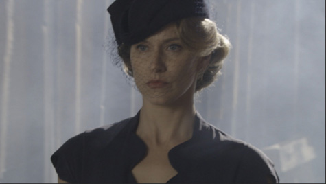
Move the Timeline playhead to the fourth clip in the sequence. Notice that a lot of the pixels are burned out. Just as with the flat shadows in the second clip in the sequence, there’s no detail in burned-out highlights. This means that lowering the brightness will simply make the character’s skin and hair gray; no detail will emerge.
Notice that the shadows in this shot don’t reach the bottom of the Waveform Monitor. The lack of properly dark shadows has a flattening effect on the image.
Try using the RGB Curves control in the Lumetri Color panel to improve the contrast range. This approach might produce acceptable results, although the clip definitely ends up looking processed.
Fixing color balance
Your eyes adjust to compensate for changes in the color of light around you automatically. It’s an extraordinary ability that allows you to see white as white, even if objectively it’s orange, for example, because it’s lit by tungsten light.
Cameras can automatically adjust their white balance to compensate for different lighting in the way that your eyes do. With the right calibration, white objects look white, whether you are recording indoors (under oranger tungsten light) or outdoors (in bluer daylight).
Sometimes automatic settings are hit or miss, so professional shooters often prefer to adjust white balance manually. If the white balance is set wrong, you can end up with some interesting results. The most common reason for a color balance problem in a clip is that the camera was not calibrated properly.
Balancing with the Lumetri color wheels
Let’s try using the Lumetri Color panel color wheels to adjust the last shot in the sequence.
Switch to the Color workspace, and reset it if necessary.
Position the Timeline playhead over the last clip in the Color Work sequence.
In the Lumetri Color panel, expand the Basic Correction section, and click the Auto button to automatically adjust the levels.
The Tone controls change to reflect the new levels.
Premiere Pro has identified the darkest pixels and the brightest pixels and has balanced automatically.
The adjustment is tiny! Clearly, the problem is not with the range of contrast in the shot.
Set the Lumetri Scopes panel to display the Vectorscope YUV.
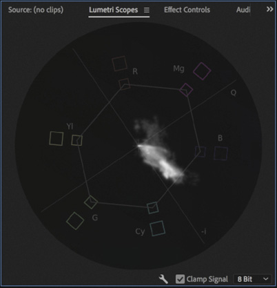
It’s clear there’s a reasonable range of colors in the shot, but there’s a strong bias toward the blue. In fact, this scene has mixed lighting, with bluer daylight coming from the window and warmer tungsten light coming from the interior of the room.
In the Basic Correction section of the Lumetri Color panel, use the Temperature slider to push the colors toward the orange. You’ll need to push the adjustment all the way to 100 to see a reasonable result because the color shift is so strong in the clip.
The result is pretty good, but perhaps it could be better.
The darker pixels in this shot are generally lit by the interior, warmer room light, while the lighter pixels are generally lit by the bluer daylight. This means different color wheels will interact with different areas of the picture in convincing and natural ways.
Expand the Color Wheels & Match section of the Lumetri Color panel. Try using the Shadows color wheel to pull the color toward the red, while using the Highlights color wheel to pull the color toward blue.
You’ve adjusted the color wheels to warm up the shadows and cool down the highlights. Experiment with the midtones to obtain the most natural result possible. Use the image as a guide.
Experiment with the other controls in the Lumetri Color panel to see whether you can improve the result further.

Making a secondary color adjustment
The Lumetri Color panel allows you to make adjustments that are limited to a particular range of hues, a level of color saturation, or a level of brightness.
This is useful if you want to bring out the blue in a subject’s eyes or give a flower a color boost.
Let’s try it.
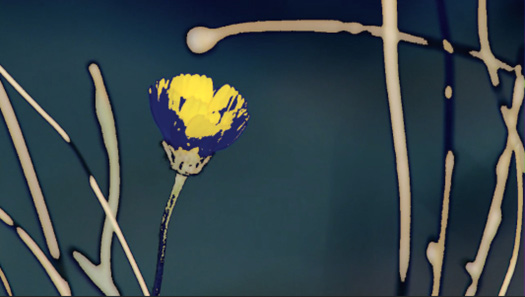
Open the sequence Yellow Flower and position the Timeline playhead over the first clip.
This sequence has two shots with clearly distinguished areas of color.

Expand the HSL Secondary section of the Lumetri Color panel.
Click the eyedropper
 to select it and then click the yellow petals of the flower to pick that color.
You may get a more useful result by holding Command (macOS) or Ctrl (Windows) while clicking, as this captures a 5x5 pixel average sample.
The color selection controls update based on the area of the petal you clicked.

When making a selection of this kind, it can be helpful to initially apply an extreme adjustment to the colors. This makes it easier to tell whether you have selected the right range of colors in the image.
Scroll down in the Lumetri Color panel and drag the Temperature and Tint controls to the far left to apply an extreme adjustment.
Drag the color range selection controls to expand the selection. Your initial selection probably selected only a few pixels, as there is quite a lot of variation in the yellow petals.
Each control sets the range of pixels you’re selecting, based on one of three factors.
H: Hue
S: Saturation
L: Luminance
The upper triangles represent the hard-stop range of the selection. The lower triangles extend the selection with a softening that reduces hard edges.
Experiment with the Denoise and Blur options. These adjust the selection, rather than the image, helping to smooth the areas impacted by the effect.

Once you’re happy you have selected all the pixels in the petals of the flower, reset the Temperature and Tint controls, and make a subtler adjustment.
The adjustments you make will be limited to the pixels in your selection.
Once you have mastered this effect, experiment with the sky in the second clip in this sequence.
Making precise adjustments with curves
The Hue Saturation curves in the Curves section of the Lumetri Color panel offer precise controls for selecting and adjusting the hue and luminance of images.
Though there are several different controls, they all work essentially the same way. Each control focuses on a different type of selection and adjustment.
Click to add control points to the curve (it starts as a straight line, but curves are added when you apply adjustments). Use those control points to apply an adjustment according to the type.
The first part of the name of a curve indicates the horizontal axis, while the second part of the name indicates the vertical axis.
Let’s take a look at each one.
Hue vs Sat: Increase or decrease the saturation of pixels based on specific hues.
Hue vs Hue: Change the hue of pixels based on their current hue.
Hue vs Luma: Change the brightness (luma) of pixels based on their hue.
Luma vs Sat: Change the color saturation of pixels based on their brightness (luma).
Sat vs Sat: Change the color saturation of pixels based on their current level of saturation. This is particularly useful for reducing the impact of highly color saturated parts of an image while leaving the rest of the image untouched.
As with so many effects, the best way to learn what each of these controls can do is to try them on some clips and apply extreme adjustments.
Let’s try these controls on some clips.
Open the sequence The Ancestor Simulation. Play the sequence to familiarize yourself with the shots. These images have muted colors with some specific regions with distinguishable colors, like the flowers on the table.

Expand the Curves section of the Lumetri Color panel, and then set the Timeline playhead over the first clip.

At the top right of each curve control, there’s an eyedropper
that you use to automatically set a control point based on the part of the image you click and to add two control points (one on either side) to separate the adjustment you’ll make from the rest of the curve.Use the eyedropper for the Hue vs Sat curve to select the petals of the reddish flower closest to the camera on the table.
The selection is right at the edges of the hue graph. Drag the navigator at the bottom of the curve control to access the control points more easily.
Drag the middle control point up to increase the saturation for the flower.
Use the eyedropper for the Sat vs Sat curve to select the pale beige color of the sofa. This selects pixels that have little color saturation. Drag the left control point up, quite high in the graph, to bring some life to the sofa and similar pale areas of the image.
Because you exclusively selected pixels that originally had little color saturation, other areas of the image with more saturation were unaffected. The result is a more natural-looking adjustment.

By combining multiple Lumetri Color effects with precise curve selections, you can make nuanced color adjustments to clips.
Experiment with the rest of the clips in this sequence. For example, for the sixth clip in the sequence, showing the castle with trees, try using the Hue vs Sat curve to increase the saturation of the green in the trees and then use the Hue vs Luma curve to darken the leaves. This adds more visual interest and contrast without making an adjustment to the whole clip.
Using special color effects
Several effects available in the Effects panel give you great creative control over the colors in your clips.
Using Gaussian Blur
While not technically a color adjustment effect, adding a tiny amount of blurring can soften the results of your adjustments, making an image look more natural. Premiere Pro has a number of blur effects. The most popular is Gaussian Blur, which has a natural-looking, smoothing effect on an image.
Using Stylize effects
The Stylize category of effects includes some dramatic options, some of which, like the Mosaic effect, you’ll use for more functional applications in combination with an effect mask, such as hiding someone’s face.
The Solarize effect gives vivid color adjustments that can be used to create stylized back plates for graphics or intro sequences.
Using Lumetri looks
The Lumetri Color panel includes a list of built-in looks you experimented with earlier, and as you have found, there are a number of Lumetri Look presets in the Effects panel to get you started.
These effects all make use of the Lumetri Color effect.
In addition to using the built-in Looks, the Lumetri effect allows you to browse to an existing .look or .lut file to apply nuanced, subtle color adjustments to your footage.
It’s possible you will be given a LOOK or LUT file to use as a starting point for your color adjustments. It’s increasingly common for cameras or location monitors to employ a color reference file of this kind. It helps to use the same reference when you are working on footage in post-production.
To apply an existing LOOK or LUT file, open the Input LUT menu in the Basic Correction section, at the top of the Lumetri Color panel, and choose Browse.

Creating a look
Once you’ve spent a little time with the color correction effects available in Premiere Pro, you should have a feel for the kinds of changes you can make and the impact those changes have on the overall look and feel of your footage.
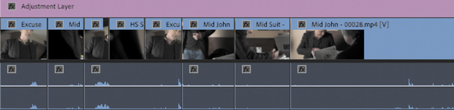
You can use effect presets to create a look for your clips. You can also apply an effect to an adjustment layer to give your sequence, or part of a sequence, an overall look. Changes made using the Lumetri Color panel apply just as well when applied to an adjustment layer.
Try using an adjustment layer to apply a color adjustment to a scene.
![]() Tip
Tip
You may need to resize the Project panel to see the New Item menu.
Open the Theft Unexpected sequence.
In the Project panel, open the New Item menu
 and choose Adjustment Layer. The settings automatically match the current sequence, so click OK.
Drag and drop the new adjustment layer onto the beginning of the Video 2 track in the sequence.
The default duration for adjustment layers is the same as the duration of still images. It’s too short for this sequence.
Trim the adjustment layer until it stretches from the beginning to the end of the sequence.
 Note
NoteIf you use adjustment layers in this way on a sequence that has graphics and titles, you may want to ensure that the adjustment layer is on a track between the graphics/titles and the video. Otherwise, you will adjust the appearance of your titles too.
In the Effects panel, browse to Lumetri Presets > SpeedLooks > Universal. Drag one of these SpeedLooks onto the adjustment layer. The look will apply to every clip in the sequence, and you can modify it using the controls in the Effect Controls panel or in the Lumetri Color panel.

![]() Tip
Tip
SpeedLooks available in the Effects panel are applied as regular effects, so it’s easy to combine them—just apply another.
You can apply any standard visual effect this way and use multiple adjustment layers to apply different looks to different scenes.
The Lumetri Color panel controls will adjust the Lumetri Color effect selected at the top of the panel.
This is just a brief introduction to color adjustment, and there’s an enormous amount more to explore. It’s worth investing the time to familiarize yourself with the advanced controls in the Lumetri Color panel. There are a great many visual effects that can add nuance or a striking look to your footage. Experimentation and practice are key to developing your understanding in this important and creative aspect of post-production.
Review questions
How do you change the display in the Lumetri Scopes panel?
How do you access the Lumetri Scopes panel when not viewing the Color workspace?
Why should you use the vectorscope rather than depending on your eyes?
How can you apply a look to a sequence?
Why might you need to limit your luminance or color levels?
Review answers
Right-click in the panel or open the Settings menu and choose the display type you would like.
Choose the Lumetri Scopes panel, like all panels, from the Window menu.
The way you perceive color is highly subjective and relative. Depending on the colors you have just seen, you will see new colors differently. The vectorscope display gives you an objective reference.
You can use effect presets to apply the same color correction adjustments to multiple clips, or you can add an adjustment layer and apply the effects to that. Any clips on lower tracks covered by the adjustment layer will be affected.
If your sequence is intended for broadcast television, you’ll need to ensure you meet the stringent requirements for maximum and minimum levels. The broadcaster you’re working with will be able to tell you the required levels.