15 Creating Graphics
Lesson overview
In this lesson, you’ll learn about the following:
Using the Essential Graphics panel
Working with video typography
Creating graphics
Stylizing text
Working with shapes and logos
Making text roll and crawl
Working with template graphics
This lesson will take about 90 minutes to complete. Please log in to your account on peachpit.com to download the lesson files for this lesson, or go to the “Getting Started” section at the beginning of this book and follow the instructions under “Accessing the lesson files and Web Edition.” Store the files on your computer in a convenient location.
Your Account page is also where you’ll find any updates to the lesson files. Look on the Lesson & Update Files tab to access the most current content.
Although you will rely upon audio and video sources as the primary ingredients for building a sequence, you will often need to incorporate text into your project. Adobe Premiere Pro CC includes powerful title and graphic creation tools you can work with right in the Timeline panel; or you can use the Essential Graphics panel to create text and shapes.
Starting the lesson
Text is effective when you need to convey information quickly to your audience. For example, you can identify a speaker in your video by superimposing their name and title during the interview (often called a lower-third). You can also use text to identify sections of a longer video (often called bumpers) or to acknowledge the cast and crew (with credits).
Text, properly used, is clearer than a narrator and allows for information to be presented in the middle of dialogue. Text can be used to reinforce key information.
The Essential Graphics panel offers a range of text-editing and shape-creation tools that you can use to design graphics. You can use the fonts loaded on your computer (and those available via Adobe Fonts as part of your Creative Cloud membership).
You can also control opacity and color and insert graphic elements or logos created using other Adobe applications, such as Adobe Photoshop or Adobe Illustrator.
Let’s try a few graphic and titling techniques.
Open Lesson 15.prproj in the Lesson 15 folder.
Save the project as Lesson 15 Working.prproj.
Switch to the Graphics workspace by clicking Graphics in the Workspaces panel or by choosing Window > Workspaces > Graphics.
Reset the workspace by opening the Graphics menu in the Workspaces panel and choosing Reset To Saved Layout, by choosing Window > Workspaces > Reset To Saved Layout, or by double-clicking the Graphics workspace name in the Workspaces panel.
The Graphics workspace reveals the Essential Graphics panel and positions the Tools panel next to the Program Monitor to make it easier to access the graphics tools you’ll work with directly on the video preview.
Getting an overview of the Essential Graphics panel
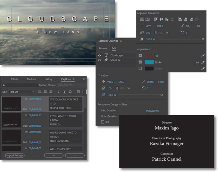
The Essential Graphics panel has two sections.
Browse: Allows you to browse a number of built-in or imported title templates, many of which include animation.
Edit: Allows you to make changes to titles you have added to a sequence or created in a sequence.
When browsing, you can look for templates you own in the My Templates area or switch to searching Adobe Stock. There are many free and paid templates available from Adobe Stock. For these lessons, we’ll focus on templates available in My Templates.
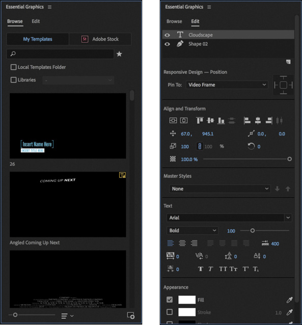
In addition to starting with a template, you can use the Type tool ![]() , Pen tool
, Pen tool ![]() , Rectangle tool
, Rectangle tool ![]() , or Ellipse tool
, or Ellipse tool ![]() to create a new graphic by clicking in the Program Monitor with no clips selected (if a title clip is selected, you’ll add to that clip).
to create a new graphic by clicking in the Program Monitor with no clips selected (if a title clip is selected, you’ll add to that clip).

If you press and hold the Type tool, the Vertical Type tool is revealed, which allows you to type text in a column, instead of a row.
You can also use the Pen tool ![]() directly in the Program Monitor to create shapes to use as graphic elements in titles.
directly in the Program Monitor to create shapes to use as graphic elements in titles.
If you press and hold the Pen tool, the Rectangle tool and the Ellipse tool are revealed.
Once you have created new graphic and text elements, you can reposition and resize them using the Selection tool ![]() .
.
All of this creative work is performed directly in the Program Monitor and in the Timeline panel.
Let’s start with some preformatted text and modify it. This is a good way to get an overview of the powerful features of the Essential Graphics panel. Later in this lesson, you’ll build a title from scratch.
If it’s not open already, open the sequence 01 Clouds.

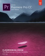
Position the playhead over the Cloudscape title on the V2 track and select it.
Switch to the Edit pane of the Essential Graphics panel.
Like the Effect Controls panel, the Edit pane of the Essential Graphics panel shows options for whichever clip is selected in the Timeline panel.
Also, just as with the Effect Controls panel, you can view the options for only one clip at a time.
Like the Lumetri Color panel, changes made in the Essential Graphics panel actually appear as effects in the Effect Controls panel, with the full range of settings available, including the options to create effect presets and to animate graphic elements with keyframes.
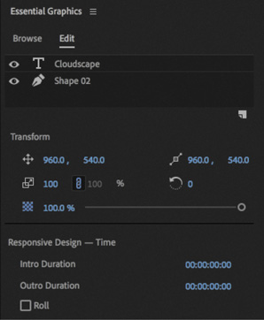
Notice there are two items listed at the top of the Essential Graphics panel: Cloudscape and Shape 02.

If you are familiar with Adobe Photoshop, you’ll recognize these as layers. Each item in a graphic is displayed as a layer in the Essential Graphics panel.
Just like Timeline tracks, the layers at the top are in front of the layers at the bottom, and you can drag items up and down the list.
You’ll also recognize the familiar eye button
 for making layers invisible or visible.
Below these layers you’ll see the Responsive Design controls. These allow you to specify a section at the start and end of the graphic clip that should not be stretched if you change the duration of the clip in the sequence. This is important if there are animation keyframes for the start and end of the graphic.
Click to select the Shape 02 layer at the top of the Essential Graphics panel.
This displays standard alignment and appearance controls for Shape layers—in this case, the red band that goes across the screen.
Many of the options will be familiar to you from the Motion effect in the Effect Controls panel.
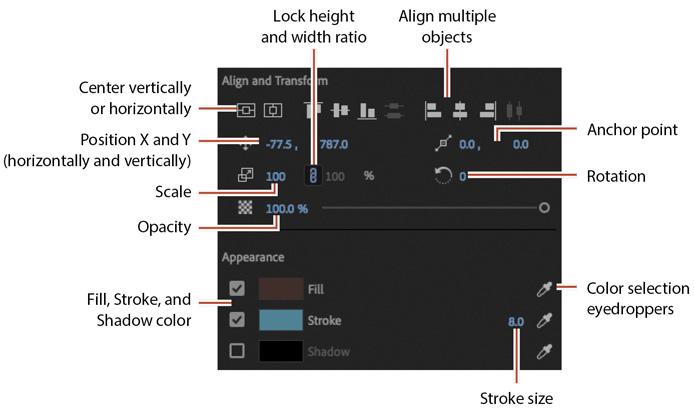
Items that are new to you are likely to be in the Appearance section, where you can specify a color for the shape fill, stroke (a colored line on the edges of a shape or text), and shadow (see “Text styles” later in this lesson for more information about these).
Perhaps these color swatches are already familiar to you. They work in an intuitive way.

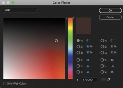
Click the Fill color swatch.
A color picker appears that allows you to choose a precise color. There are a number of color systems to choose between, or you can move your pointer over a sample of the color you want and click to select it directly.
Click Cancel and then click the eyedropper
 for the fill color on the right side of the Essential Graphics panel.
The eyedropper allows you to pick a color from anywhere in the image. In fact, you can pick colors from anywhere on your computer screen! This is particularly useful if you have a range of colors you always want to use, such as a logo or branding color.
Click the thin blue band of sky between the clouds. The shape fill changes color to match the sky.

Make sure you have selected the Selection tool in the Tools panel and that the Shape 02 layer is still selected in the Essential Graphics panel.
Notice the control handles visible on the shape in the Program Monitor. You can use the Selection tool to change the shape directly. For now, you’re going to use the Selection tool to select another layer in the title.
To select a layer in the Program Monitor, you may need to first deselect the layer that’s already selected. You can do this by clicking the background of the Program Monitor or by deselecting the title clip in the Timeline panel.
Use the Selection tool to click the word Cloudscape in the Program Monitor.
The same Align And Transform and Appearance controls are displayed in the Essential Graphics panel, but now there are additional controls that determine the appearance of the text.
 Note
NoteYou may have to expand the window or scroll to see all the Essential Graphics panel options.
NoteWhen working with CJK fonts, Tsume adjusts the spacing around characters without adjusting the vertical or horizontal scaling of the characters.
NoteWith all the clicking and testing, it’s easy to accidentally deselect layers. If there’s no bounding box with handles around the text or shape, select it using the Selection tool.

Try a few fonts and font styles to experiment with the controls. Anywhere you see blue numbers, you can drag with your mouse to update the setting. This is a quick way to find out what a control is for.
 Tip
TipIf you’re ever unsure about the purpose of a control, hover the pointer over an icon and a tooltip will tell you the name.
The specific fonts loaded on each system will vary, and your Adobe Creative Cloud membership includes access to many more fonts than you will have available to begin with.
To add more fonts, click the Add Fonts From Adobe button
 (or choose Graphics > Add Fonts From Adobe Fonts on the main menu bar). This will open the Adobe Fonts website in your default internet browser, where you will find thousands of fonts to use.
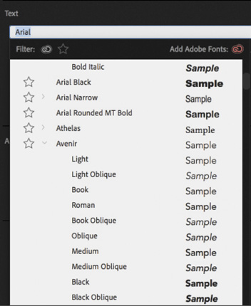
![]() Note
Note
Premiere Pro automatically saves your updated title in the project file. It does not show up as a separate file on your hard drive.
Mastering video typography essentials
When you design text for video, it’s essential that you follow typography conventions. If text is composited over a moving video background with multiple colors, it can take some work to create a clear design.
Find a balance between legibility and style, making sure enough information is on the screen without crowding it. If there’s too much text, it will quickly become hard to read, frustrating the viewer.
![]() Tip
Tip
If you’d like to learn more about typography, consider the book Stop Stealing Sheep & Find Out How Type Works, Third Edition (Adobe Press, 2013), by Erik Spiekermann.
Choosing a font
Your computer probably has many fonts, which can make choosing a good font for video work difficult. To simplify the selection process, try using a triage mentality and consider these factors:
Readability: Is the font easy to read at the size you’re using? Are all the characters readable? If you look at it quickly and then close your eyes, what do you remember about the text block?
Style: Using adjectives only, how would you describe the font you’ve chosen? Does the font convey the right emotion? Type is like a wardrobe or a haircut; picking the right font is essential to the overall success of the design.
Flexibility: Does the font mix well with others? Does it come in various weights (such as bold, italic, and semibold) that make it easier to convey significance? Can you create a hierarchy of information that conveys different kinds of information, such as a name and title for a speaker’s lower-third name graphic?
Language compatibility: Does the font include all the characters required for the language you are using?
![]() Note
Note
When creating text for use in a video, you will often find yourself placing it over a background that has many colors present. This will make it difficult to achieve proper contrast (which is essential to preserving legibility). To help in this case, you may need to add a stroke or shadow to get a contrasting edge. For more information about adding a stroke or shadow, see “Text styles” later in this lesson.
The answers to these guiding principles should help steer you toward better-designed titles. You may need to experiment to find the best font. Fortunately, you can easily modify an existing title or duplicate it and change the copy for a side-by-side comparison.
Choosing a color
Although you can create a nearly infinite number of possible color combinations, choosing the right colors to use in a design can be surprisingly tricky. This is because only a few colors work well for text while remaining clear for the viewer. This task becomes even more difficult if you’re editing your video for broadcast or if your design must match the style and branding of a series or product. The text may also need to work when placed over a busy moving background.
While it may feel a little conservative, the most common choices for text in video are black and white. If colors are used, they tend to be very light or very dark shades. The color you choose must provide suitable contrast from the background that the text is being placed over, which means you’ll be making constant assessments about ideal colors, which often include factors such as branding requirements or a consistent color palette for your sequence.
Consider a positive example with clear light text over a dark background.
![]() Note
Note
The Adobe Color service helps you choose harmonious and appealing color combinations for your design projects. For more information, visit color.adobe.com.

And now here’s a less positive example. The text is a similar color and tone to parts of the sky.

Adjusting the kerning
It’s common to adjust the spacing between the letters in a title to improve the appearance of text and help match it to the design of the background. This process is called kerning. Taking the time to manually adjust text becomes more important the larger the font gets (because it makes improper kerning that much more visible). The goal is to improve the appearance and readability of your text while creating optical flow.
![]() Note
Note
A common place to start kerning is to adjust between an initial capital letter and the succeeding lowercase letters, particularly in the case of a letter with very little “base,” such as T, which creates the illusion of excessive space along the baseline.
You can learn a lot about kerning by studying professionally designed materials such as posters and magazines. Kerning is applied letter by letter, allowing for creative use of spacing.

Try kerning an existing title.
Locate the title clip White Cloudscape in the Assets bin.
Edit the clip into the 01 Clouds sequence after the first title on the Video 2 track.
Make sure the title is positioned over the background video clip so you can use it as a reference for positioning.

Select the Type tool
 and click to place the insertion point between the D and the S of the word CLOUDSCAPE. Note that the insertion point may be offset from the text in some graphics, particularly if the graphic is animated.
In the Edit pane of the Essential Graphics panel, in the Text section, set Kerning to 250.

The kerning option is available only when a single letter is selected or when the I-bar is placed between two letters.
Repeat this process for the rest of the letters to the right.
Click the Horizontal Center button
 in the Align And Transform section of the Essential Graphics panel to reposition the text. Then deselect the text by clicking an empty track in the Timeline panel.
Select the Selection tool.
![]() Note
Note
After using a different tool, it’s a good idea to return to the Selection tool to avoid accidentally adding new text or making unwanted changes to your sequence.
Setting the tracking
Another important text property is tracking (which is similar to kerning). This is the overall control of spacing between all the letters in a line of text. Tracking can be used to globally condense or expand a text selection.
It’s often employed in the following scenarios:
Tighter tracking: If a line of text is too long (such as a lengthy title for a speaker’s lower-third), you may tighten it slightly to fit. This will keep the font size the same but fit more text into the available space.
Looser tracking: A looser track can be useful when using all uppercase letters or a more complex font. It’s used often for large titles or when text is used as a design or motion graphics element.
You can adjust tracking in the Text section of the Essential Graphics panel. Simply select a text layer and adjust the setting.
Drag the clip Cloudscape Tracking from the Assets bin onto the clip White Cloudscape in the 01 Clouds sequence to overwrite one clip with the other.
If Snap is turned on in the Timeline panel, the new clip will snap to the beginning of the existing title in the sequence.
Make sure the clip is selected and use the Selection tool to select the text.
In the Edit pane of the Essential Graphics panel, experiment with the tracking control. As you increase the tracking, the letters expand to the right, away from the anchor point.
Set the tracking to 530.
Click the Center Align Text button
 in the text section of the Essential Graphics panel, and then click Horizontal Center in the Align And Transform section to re-center the text.
It’s not necessary to click the Center Align Text button to center the text, as the Horizontal Center button will achieve the same result. However, centering the text first will mean any additional lines of text will be properly aligned.
Tracking adjustments tend to look neater and more intentional than individual kerning adjustments.

Adjusting the leading
Kerning and tracking control the horizontal space between characters. Leading (pronounced “led-ing”) controls the vertical space between lines of text. The name comes from the time when strips of lead were used on a printing press to create space between lines of text.
You adjust the leading in the Text section of the Essential Graphics panel Edit pane. Let’s add another line of text.
Continue to work with the Cloudscape Tracking clip in the 01 Clouds sequence.
With the Cloudscape Tracking clip selected in the Timeline panel, use the Selection tool to double-click the CLOUDSCAPE text in the Program monitor. This highlights the text, ready for editing.
Press the Right arrow key to move the cursor to the end of the text.
Press Return (macOS) or Enter (Windows) to enter a second line of text. Type (all in caps) A NEW LAND.
Select the second line of text. Give the new text a font size of 48, set the tracking to 1000, and set the Leading
 to 40.
Click an empty track in the Timeline panel to deselect the graphic.
This increase in leading helps to separate the second line of text, but it’s still difficult to read because of the background image.

Select the Cloudscape Tracking clip in the sequence, then select the text layer CLOUDSCAPE A NEW LAND at the top of the Essential Graphics panel (the text in the layer is condensed into a single layer name).
Now that the layer is selected, increase the leading to 140. This adds space between lines and improves readability.

Switch to the Selection tool, and click an empty track in the Timeline panel to deselect the clip.
In most cases, you’ll find the default setting works well for leading. Adjusting leading can have a big impact on your title. Don’t set the leading too tight; otherwise, descenders from the top line (such as the downward lines on j, p, q, and g) will cross ascenders from the lower line (like the upward lines on b, d, k, and l). This collision is likely to make the text more difficult to read, particularly against a moving background.
Setting the alignment
While you may be used to seeing text left-justified for things like a newspaper, there are no hard-and-fast rules for aligning video text. Generally, text used for a lower-third title is left- or right-justified.
You’ll often center text used in a rolling title sequence or segment bumper. In the Essential Graphics panel, there are buttons for aligning and justifying your text. The alignment buttons align selected point text to the left, center, or right relative to the origin point of the text. The buttons align paragraph type relative to the bounding box. Use the justification buttons to make paragraph text fill the width of its bounding box. The buttons set the justification for the final line of text: left, center, full, or right.

alignment buttons

justification buttons
It’s safe to experiment, and use the Undo option if necessary, so don’t worry about memorizing which alignment option is which.
You may find the position of text in the frame changes when choosing a new alignment setting. If so, manually reposition the text or click the Vertical Center button ![]() or Horizontal Center button
or Horizontal Center button ![]() to bring the text back into the middle of the frame.
to bring the text back into the middle of the frame.
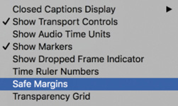
Setting the safe title margin
When creating titles, you may want to view guides to help you position text and graphic elements.
You can enable or disable these by opening the Settings menu in the Program Monitor and choosing Safe Margins.
By default, the outer box is 10 percent from the edge. The area inside this box is considered the action safe area. Things that fall outside this box may get cut off when the video signal is viewed on a television monitor. Be sure to place all critical elements that are meant to be seen (like a logo) in this region.
The inner box, is 20 percent from the edge by default. The area inside this box is called the title safe area. Just as this book has margins to keep the text from getting too close to the edge, it’s a good idea to keep text inside the innermost safe margin. This will make it easier for your audience to read the information.
If text is outside the title safe area, there’s a chance some letters may be missed on a miscalibrated screen.


Screen technology has improved over time, and it’s now common to set the action safe area to 3.5% from the edge, and the title safe area to 5% from the edge.
You can change these settings by opening the Settings menu in the Source Monitor or Program Monitor and choosing Overlay Settings > Settings.
Creating Graphics
When you create a title, you’ll need to make some choices about how the text is displayed. There are two approaches to creating text, each offering both horizontal and vertical text direction options.
Point text: This approach builds a text bounding box as you type. The text runs on one line until you press Return (macOS) or Enter (Windows). Changing the shape and size of the box changes the Scale property in the Essential Graphics panel.
Paragraph (area) text: You set the size and shape of the text box before entering text. Changing the box size later displays more or less text but does not change the size of the text.
When using the Type tool in the Program Monitor, you choose which type of text you are adding when you first click.
Click and type to add point text.
Drag to create a text box and then type to add paragraph text inside the box.
Most of the options in the Essential Graphics panel apply to both types of text.
Adding point text
Now that you have been introduced to some of the main factors when modifying and designing a graphic, let’s build one from scratch, working with a new sequence.
You’ll create a new title to help promote a tourist destination.
Open the sequence 02 Cliff.
Position the Timeline playhead at the beginning over the sequence and select the Type tool.
Click in the Program Monitor and type The Dead Sea.
A new graphic clip is added to the sequence in the Timeline panel on the next available video track. In this case, it’s Video 2.
NoteIf you have been experimenting with the Essential Graphics panel, your title may look different from the example shown. Whatever settings you used last will be applied to new titles you create.
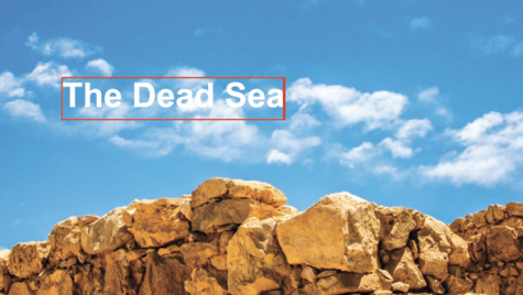
If you clicked the white clouds in the background image before typing, it might be difficult to read the text.
Try changing the background video frame by dragging the Timeline playhead. Choose the background frame carefully when designing a title. Because video moves, you may find a title works at the start of a clip but not at the end.
Select the Selection tool. Handles appear on the text bounding box.
You won’t be able to use a keyboard shortcut for the Selection tool because you’re typing into a text bounding box.
Choose the following settings in the Essential Graphics pane:
Font: Arial Bold
Font size: 83
Tracking: 0
Kerning: 0
Fill color: White
Try to match the example given here.


Using the Selection tool, drag the corners and edges of the text bounding box. Notice that the Font Size, Width, and Height settings do not change. Instead, the Scale setting
 is adjusted.
By default, the height and width maintain the same relative scale. You can adjust the height and width separately by clicking Set Scale Lock
 .
.Set the Scale back to 100%.
Hover the pointer just outside a corner of the text box until a curved pointer appears. This allows you to rotate the text box. Drag to rotate the bounding box off its horizontal orientation.

The anchor point is the point around which objects will rotate and the single point that’s referenced by position controls. When you adjust position settings, the position applies specifically to the anchor point, which itself has a position on the object. For many items it’s the exact center of the object (which makes sense, particularly when rotating).
Notice that the default location of this anchor point is the lower-left corner of the text (not the box around the text). When you rotate the text, it’s not around the center but instead around that corner.
With the Selection tool still active, click the blue number for the rotation setting
 in the Essential Graphics panel, type 45, and press Enter to manually set the angle to 45 degrees.
Click anywhere in the bounding box and drag the text and its bounding box toward the upper-right corner of the frame.
Disable the Video 1 track output by clicking the Toggle Track Output button
 in the Timeline panel.
Open the Program Monitor Settings menu, and choose Transparency Grid to enable it.
Now you can see the graphic against a transparency checkerboard, but it’s almost impossible to read!
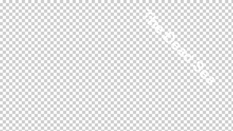

With the text selected, go to the Appearance section of the Essential Graphics panel, and enable the Stroke option to add an outline to the letters. Set the color to black and set Stroke Width to 7.
Now it’s easy to see the text, and you can be confident it will remain readable against a range of background colors. For more information about adding a stroke or a shadow to text, see “Text styles” later in this lesson.
Adding paragraph text
Although point text is flexible, you can take better control over layout with paragraph text. This option will automatically wrap the text as it reaches the edge of the paragraph text box.
Continue working with the same graphic clip.
Select the Type tool, and make sure the graphic clip is selected in the Timeline panel.
Drag in the Program Monitor to create a text box that fills the lower-left corner of the title-safe area.
Start typing. Start entering names of participants who will be attending the tour. Use the names here or add your own. Press Return (macOS) or Enter (Windows) after each name to start a new line.
Type at least one name with enough characters to go beyond the right edge of the text box. Unlike point text, area text remains within the confines of the bounding box you defined, and it wraps at the edges of the box onto the next line. If you add so much text that some won’t fit in the text box, the extra letters won’t be visible.
You may need to reduce the font size so you can see a few lines of text at once.
TipA good way to avoid spelling mistakes is to copy and paste text from an approved script or email that has already been reviewed by your client or producer.

Use the Selection tool to change the size and shape of the bounding box to fit around the text a little better.
As you resize the text box, the text stays the same size, adjusting its position in the text box.
NoteIf a title clip is selected, clicking to add new text or a shape will add to the existing clip. If no clip is selected, a new clip will be created on the next available track.
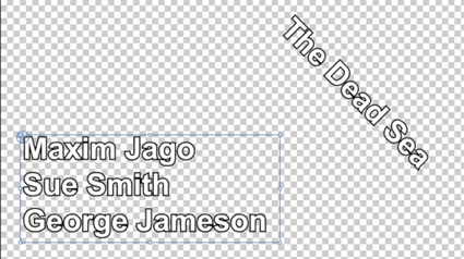
There are now two layers in the Essential Graphics panel. Each text item is a separate layer, with its own controls.

Text styles
In addition to choosing settings like a font, position, and opacity, the Essential graphics panel also allows you to apply a stroke and shadow to text or shapes in a graphic.
Changing a title’s appearance
In the Appearance section of the Essential Graphics panel, there are two main options for improving the readability of text.
Stroke: A stroke is a thin edge added to text. It helps to keep text legible over moving video or a complex background.
Shadow: A drop shadow is a common addition to video text because it makes the text easier to read. Be sure to adjust the softness of the shadow. Also, be sure to keep the angle of shadows identical for all titles in a project for consistency.
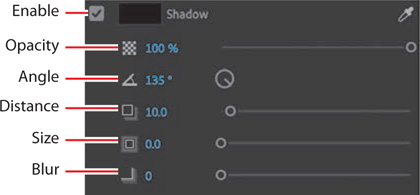
Just as with the text fill, you can give any color to strokes and shadows.
Enable the track output for Video 1.
Experiment with the options in the Essential Graphics panel to make the text more readable and add more color to the composition.
To set the color for point text in the upper right, select the text and use the Fill color eyedropper to select the orange rocks.
To set the color for the paragraph text in the lower left, select the text and use the Fill color eyedropper to select the pale blue sky around the clouds.
Because the colors in the rocks and clouds vary, you may wish to use the eyedropper to select an approximate color, then click the Fill color swatch to manually adjust the selection.
Try to match the appearance of the title in the following example.
NoteIf you see an exclamation point next to the color you’ve chosen, Premiere Pro is warning you that a color is not broadcast-safe. This means it may cause problems when the video signal is put into a broadcast television environment. Click the exclamation point to automatically choose the closest color that is broadcast-safe.

Saving custom styles
If you create a look you like, you can save time by storing it as a style. A style describes the color and font characteristics for text. You can use a style to change the appearance of text with a single click; all the properties of the text update to match the preset.
Let’s create a style from the text you modified in the previous exercise.
Continuing to work on the same title, use the Selection tool to select the paragraph text in the lower-left corner.
In the Essential Graphics panel, open the Master Styles menu, and choose Create Master Text Style.

Enter the name Blue Bold Text and click OK. The style is added to the Master Styles menu.
The new Master Style also appears in the Project panel.
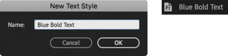
Select the other text layer, and use the Master Styles menu to apply the Blue Bold Text style.

So far, you have worked with a title that was already created in a sequence, edited one from the Project panel, and created a new one.
In almost all cases, Premiere Pro requires that any item included in a sequence also exists in the Project panel. Graphics created in Premiere Pro are an exception to this rule.
Remember that Cloudscape Tracking title you edited into the 01 Clouds current sequence earlier? Open that sequence and edit a second instance of that title into the timeline on the Video 2 track. You may need to move the other version of the title out of the way to make space for the new copy.
The changes you made to the title have been applied to the master clip in the Project panel, and the new copy is identical to the one you worked on. That’s because the title is a Master Graphic.

You can create a Master Clip item in your Project Panel from a graphic clip in your sequence. Any graphic clips made from that Master Graphic, including the one you upgraded it from, are duplicates of each other. Any changes made to the text, style, or contents in an instance of a Master Graphic get reflected in all other instances of the Master Graphic.
![]() Note
Note
Titles have a default duration set in the user preferences, just like other single-frame media.
You can convert any title to a Master Graphic by selecting it in the Timeline panel, going to the Graphics menu, and choosing Upgrade To Master Graphic.
A new graphic clip is added to the Project panel that you can easily share between sequences or multiple projects.
Creating a graphic or title in Adobe Photoshop CC
You can create titles or graphics for Premiere Pro in Adobe Photoshop. While Photoshop is known as the premier tool for modifying photos, it also has many capabilities for creating elegant titles or logo treatments. Photoshop offers several advanced options, advanced formatting (such as scientific notation), flexible layer styles, and even a spellchecker.
To create a new Photoshop document from inside Premiere Pro, follow these steps:
Choose File > New > Photoshop File.
The New Photoshop File dialog box appears, with settings based on your current sequence.
Click OK.
Choose a location to store your new PSD file, name it, and click Save.
Photoshop opens, ready for you to edit the file. Photoshop automatically displays safe action and safe title zones in the form of guides. These guides won’t appear in the finished image.
Select the Horizontal Type tool by pressing T.
You can click to add point text or draw a text block for area text. As in Premiere Pro, using a text box in Photoshop allows you to precisely control the layout of text.
Enter some text you’d like to use.
Adjust the font, color, and point size to taste using the controls in the Options bar across the top of the screen.
Click the Commit button
 (in the Options bar) to commit the text layer.
To add a drop shadow, choose Layer > Layer Style > Drop Shadow. Adjust to taste.
![]() Tip
Tip
If you have disabled guides in the Photoshop View options, you can enable them by choosing View > Show > Guides.
When you’re finished in Photoshop, you can save and close the file. It will already be in your Project panel in Premiere Pro.
If you’d like to edit the title in Photoshop, select it in the Project panel or Timeline and choose Edit > Edit In Adobe Photoshop. When you save changes in Photoshop, the title updates automatically in Premiere Pro.
Working with shapes and logos
When building titles, you’ll likely need more than just words to build a complete graphic. Fortunately, Premiere Pro offers the ability to create vector shapes as graphic elements. Many of the title properties you worked with for text also apply to shapes. You can also import completed graphics (like a logo) to enhance your title.
Creating shapes
If you’ve created shapes in graphics-editing software such as Photoshop or Adobe Illustrator, you’ll find creating geometric objects in Premiere Pro similar.
Select the Pen tool, and click multiple points in the Program Monitor to create a unique shape.
You can also use the Pen Tool submenu to select the Rectangle tool or Ellipse tool. Using either tool, drag in the Program Monitor to create a new shape.
Try these steps to draw shapes in Premiere Pro (this exercise is just for practice):
Open the sequence 03 Shapes.
Select the Pen tool, and click multiple points in the Program Monitor to create a shape. Each time you click, a new control point is added. Create something small and unique in the lower-left corner of the frame.


Complete the shape by clicking the first control point.
NoteRemember, new shapes will have the same appearance you last selected in the Essential Graphics panel. You can easily change the settings.
Try changing the fill color, adding a stroke, and changing the stroke color while the shape is selected.
You will need to switch to the selection tool and select the shape as an object to see changes made to the stroke.
Create a new shape with the Pen tool. This time, instead of just clicking, drag each time you click.
Dragging when you click creates control points with Bezier handles; these are the same handles you experimented with when setting up keyframes. These handles give you precise control over the shape you have created.

Press and hold the Pen tool in the Tools panel to give access to the Rectangle tool.
Use the Rectangle tool to create rectangles. Hold the Shift key as you drag to create squares.
Now press and hold the Rectangle tool in the Tools panel to select the Ellipse tool. Try drawing ellipses. The Shift key allows you to create perfect circles.
These kinds of random shapes may not win design awards, but they should give you an idea of the flexibility of these shape tools.

Press and hold the Ellipse tool in the Tools panel to select the Pen tool. The Pen tool allows you to adjust any existing shape. You can even click to add control points for more complex shapes. Try changing the existing shapes you have created.
Press Command+A (macOS) or Ctrl+A (Windows) and then press Forward Delete (macOS) or Delete (Windows) to make another clean slate.
TipIf the keyboard of your Mac doesn’t have a Forward Delete key, press Fn-Delete.
You can also select layers in the Essential Graphics panel and delete them.
Experiment with the different shape options. Try overlapping them and using different colors, with different levels of opacity. The layer position for an object in the Essential Graphics panel sets which objects will appear in front, just as tracks do in the Timeline panel.
Adding a graphic
You can add image files to your title designs using common file formats, including vectors (.ai, .eps) and still images (.psd, .png, .jpeg).
Let’s try this with an existing graphic.
Open the sequence 04 Logo.
This is a simple sequence with space in the graphic for a logo.

Select the “Add a logo” title clip in the sequence.
In the Essential Graphics panel, just below the layers area in the Edit pane, open the New Layer menu
 , and choose From File.
Browse to the file logo.ai in the Lessons/Assets/Graphics folder, and click Import.
With the Selection tool, drag the logo to position it where you want it in the title. Then adjust the size, opacity, rotation, or scale of the logo.

Making a graphic roll and crawl
You can make rolling text for opening and closing credits and crawling text for items such as headline bulletins. In fact, you can apply a roll or crawl to any graphic, not just to text.
Continued working with the 04 Logo sequence.
Use the Program Monitor Settings menu to deselect the transparency grid. For this exercise, you’ll use the background of the Timeline to provide a black backdrop for a rolling end credit.
Position the Timeline panel playhead at the end of the sequence, just after the clip on the Video 1 track, so the Program Monitor displays a black screen.
Using the Type tool, click in the Program Monitor to add point text.
Type some text in the box that you would like to use as a credit roll, pressing Return (macOS) or Enter (Windows) after each line.
For the purposes of this exercise, don’t worry about the precise words.
Type enough text to more than fill the screen vertically.
You’ll find it difficult to add many lines of text without constantly repositioning it. It’s often easier to have the text ready in a document so you can copy and paste it into Premiere Pro.
Use the Essential Graphics panel to format your text as desired.

Deselect the text layer (by clicking the background of the Program Monitor with the Selection tool).
This reveals the graphic properties in the Essential Graphics panel, including the option to create a title roll.
In the Essential Graphics panel, select the check box to add a Roll effect.
When you enable the Roll effect, a scroll bar appears in the Program Monitor. Now, when you play through the clip, it will roll on and off the screen.
You have the following options:
Start Offscreen: This sets whether the credit begins off-screen and rolls in or whether it begins where you placed it in the Program Monitor.
End Offscreen: This indicates whether the credits roll completely off the screen or end on the screen.
Preroll: This sets the amount of time to delay before the first words appear on-screen.
Postroll: This specifies the amount of time to play after the roll or crawl ends.
Ease In: This specifies the number of frames at the beginning to gradually increase the speed of the roll or crawl from zero to full speed.
Ease Out: This specifies the number of frames to slow down the speed of the roll or crawl at the end.

The length of a rolling or crawling title a sequence defines the playback speed. A shorter title will roll or crawl faster than a long one.
Play through your rolling title.
Working with template titles
The Browse pane of the Essential Graphics panel includes many prebuilt template graphics you can add to your sequences and modify to suit your projects. Many of the presets include motion, so they are referred to as Motion Graphics templates.
Motion Graphics templates can be created in Premiere Pro or Adobe After Effects, and there are differences in the templates each application creates:
Motion Graphics templates created in Premiere Pro produce graphics that are completely editable.
Motion Graphics templates created in After Effects can include more advanced design and complex animation. They also have restricted controls, set by the original designer to give flexibility while retaining the original core design.
The templates are divided into categories. Drag a template directly into any sequence to add it.
Some templates may have a yellow font warning symbol ![]() . This indicates that the template uses a font not currently installed on your system.
. This indicates that the template uses a font not currently installed on your system.

If you use one of these templates, the Resolve Fonts dialog box will appear.
If a missing font is available from the Adobe Fonts service, the option to automatically download the font will be available in this dialog box.
Select the box for the missing font, and click Sync Fonts, and it will be automatically installed, ready for use in this title.

Creating a custom template graphic
You can add your own custom graphics to the Browse pane of the Essential Graphics panel. Simply select a graphic clip in a sequence, open the Graphics menu on the main menu bar, and choose Export As Motion Graphics Template.
Choose a name for the new template graphic and choose a location from the Destination menu. You can add keywords to make the template easier to locate when searching by entering each keyword and pressing Return/Enter.
When you’re happy with the settings, click OK.
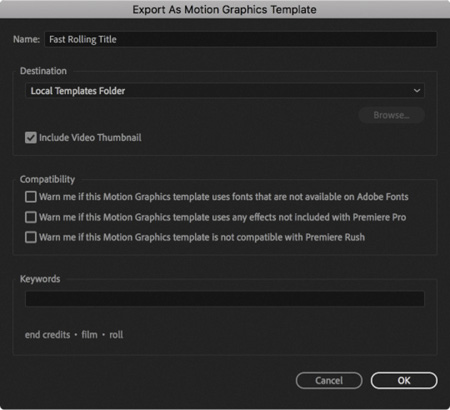
If you chose a local drive location, you can import the file on any computer by choosing Graphics > Install Motion Graphics Template or by clicking the button in the lower-right corner of the Essential Graphics panel Browse pane.
This makes it easy to share your custom template titles or store them in a collection for future use.
Introducing captions
There are two kinds of captions you might encounter when producing video for television broadcast and beyond: closed and open.
Closed captions are embedded in the video stream and can be enabled or disabled by the viewer. Open captions are always on-screen.
Premiere Pro allows you to work with either kind of caption in the same way. In fact, you can even convert one kind of caption file to another.
Closed caption files have a more limited range of colors and design features than open captions. This is because they are actually generated and displayed by the viewer’s TV, set-top box, or online viewing software, so controls are in place before you begin.
The following workflow describes working with closed captions, but open captions work the same way, as you’ll see in “Using open captions” later in this lesson.
Using closed captions
Video content can be enjoyed by more people when it is accessible. It’s a requirement for most broadcast television stations to add closed-captioning information that can be decoded by television sets. Visible captions are inserted into a video file and travel through supported formats to specific playback devices.
Adding closed-captioning information is relatively easy as long as you have captions that have been properly prepared. Caption files are often generated with software tools and there are multiple competing systems available.
Here’s how to add captions to an existing sequence:
Keeping the current project open, choose File > Open Project. Browse to the Lesson 15 folder, and open Lesson 15_02.prproj.
Save the project as 15_02 Working.prproj.

If it’s not displayed in the Timeline panel already, open the sequence NFCC_PSA.
Choose File > Import, and navigate to the Lessons/Assets/Closed Captions folder. Import the file NFCC_PSA.scc (.scc, .mcc, .xml, and .stl formats are supported).
The caption file is added to the bin as if it were a video clip, with a frame rate and duration.
Edit the closed captions clip to a track above all the clips in your sequence. In this case, use the V2 track.
Open the Settings menu
 in the Program Monitor and choose Closed Captions Display > Enable.
There are different caption types for different television systems. Within each type there are multiple possible streams. For example, one stream might be English language, while another might be French.
By default, the Program Monitor is configured to display Teletext captions, which are the wrong type for this caption file, so nothing will be displayed.
Open the Program Monitor Settings menu again and choose Closed Captions Display > Settings. Choose CEA-608 from the Standard menu for this caption file and click OK.
Play the sequence to see the captions.
After selecting the caption file in the sequence, you can adjust the captions using the Captions panel (Window > Captions). You can adjust the content, timing, and formatting of captions using the panel’s controls.

This public service announcement was produced by RHED Pixel and is provided courtesy of the National Foundation for Credit Counseling.
You can also change the timing by dragging the handles for each caption in the sequence.
Creating new captions
You can create your own closed captions right within Premiere Pro.
Choose File > New > Captions. The New Captions dialog box opens.
The default settings are based on your current sequence.
The Timebase will automatically match your current sequence. Use the Standard menu to choose the type of caption that will be created.

CEA-608 (also known as Line 21) is the most commonly used standard for analog broadcast.
CEA-708 is for digital broadcast.
Teletext is sometimes used in PAL countries.
Open Subtitling creates regular subtitles that are automatically visible (they don’t need to be enabled by the viewer).
Australian is the Australian OP4T2 closed captioning standard, particular to Australian broadcast television networks.
Open Captions are always visible and give the maximum flexibility for appearance (popular for social media videos).
For this clip, choose CEA-708.

The default option of Service 1 from the Stream menu sets this as the first stream of closed captions. Click OK. The closed caption clip is added to the Project panel.
Remove the existing closed caption clip on the Video 2 track by selecting it and pressing Delete (macOS) or Backspace (Windows).
Edit the new closed-caption clip onto the Video 2 track. It will be too short for the sequence (by default it’s three seconds long). Drag the end of the caption to trim it to the duration you need (usually the full length of the sequence). Next, select the closed-caption clip in the sequence and go to the Captions panel (Window > Captions).
Click the Program Monitor Settings menu and choose Closed Captions Display > Settings. In the Standard menu, choose CEA-708 to match the new captions, and click OK.
In the Captions panel, click where you see the words Type Caption Text Here to edit the caption contents. Enter text that matches the dialogue and/or narration being spoken and then click the + (plus) button at the bottom of the Captions panel to add another caption.
Adjust the In and Out durations for each caption in the Captions panel or directly on the Timeline.
Use the formatting controls at the top of the Captions panel to adjust the appearance of each caption. The options for these standard closed captions are quite limited (by design). For more information about this, see the next section, “Using open captions.”
If the total caption duration increases, you may need to trim the sequence clip longer to display all of its contents.
![]() Note
Note
Using the Button Editor ![]() , you can customize the Program Monitor by adding a Closed Captions Display button for easy access to toggling viewable captions.
, you can customize the Program Monitor by adding a Closed Captions Display button for easy access to toggling viewable captions.
![]() Note
Note
Premiere Pro can apply interpretation to .srt and .stl caption files as they are imported. Click Import Settings in the Captions panel to access the video, alignment, and style settings. These settings won’t modify caption files that are already imported but can save a lot of time if you plan to import multiple caption files and want them to have a matching style.
Using open captions
You can create, import, adjust, and export open captions in the same way that you would work with closed captions.
The difference is that open captions are always visible, so in many ways they function like graphic clips.
The benefit of working with open captions is that the timing is set in the caption file, or caption clip in Premiere Pro, saving you significant time synchronizing the text with the spoken words.
Another similarity with regular graphics is the broader range of appearance options than you’ll find with closed captions.
The reason for the limited range of colors and fonts when working with closed captions is that they’re actually displayed by the television set or software player. To be certain of the layout and appearance, universal standards have been set.
No such limitations exist for open captions.
You can modify the caption type by right-clicking a caption’s clip in the Project panel and choosing Modify > Captions to open the Modify Clip dialog box.

In the Target Stream Format section, you can specify the stream type for this caption clip by choosing Open Captions from the Standard menu.
Because of the additional options available for open captions, you can convert a closed-caption clip to an open caption type, but not the other way around.
Review questions
What are the differences between point text and paragraph (or area) text?
Why display the title-safe zone?
How do you use the Rectangle tool to make a perfect square?
How do you apply a stroke or drop shadow?
Review answers
You create point text by clicking in the Program Monitor with the Type tool. Its text box expands as you type. When you drag in the Program Monitor with the Type tool, you define a bounding box, and the characters remain within its confines. Changing the box’s shape displays more or fewer characters.
Some TV sets cut off the edges of the picture. The amount lost varies from set to set. Keeping your text within the title-safe margin ensures that viewers will see all your title. This is less of a problem with newer flat-screen TVs and isn’t important for online video, but it’s still a good idea to use the title-safe zone to frame your titles.
To create a perfect square, hold down the Shift key as you draw using the Rectangle tool. You can create a perfect circle with the Ellipse tool in the same way.
To apply a stroke or drop shadow, select the text or object to edit, and enable the Stroke (Outer or Inner) or Shadow options in the Essential Graphics panel.