
We just talked about seven widgets. The EditText, ImageView, RadioButton (and RadioGroup), Switch, CheckBox, WebView, and TextClock widgets. Let's make a mini app and do something real with each of them. We will also use Button as well.
First, we will set up a new project and prepare the UI layout. These quick steps will get all the widgets on the screen and set the id properties, ready to grab a reference to them. It will help us to take a look at the target app (as shown in this next figure), which is up and running, before we get started:
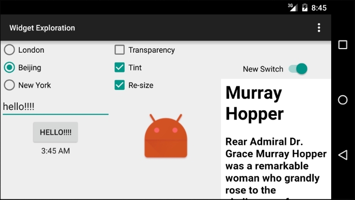
Here is how this app will demonstrate these new widgets:
- The radio buttons will allow the user to change the time displayed on the clock with a choice of three time zones
- The button on the left side, when clicked, will change its text to whatever is currently in the
EditTextwidget - The three checkboxes will add and remove visual effects from the Android robot image
Switchwill turn on and offWebView, which displays information about an eminent computer scientist
The exact layout positions are not essential, but the id properties specified must match with each other exactly. If you just want to see/use the code, you can find all the files in the Chapter 11/Widget Exploration folder of the download bundle.
- Create a new project called
Widget Exploration, set the Minimum API to17, use a blank Activity and keep all the other settings at their default values. We are using API 17 because one of the features of theTextClockwidget requires us to. - Let's create a new layout file as we want our new layout to be based on
LinearLayout. Right-click on thelayoutfolder in the project explorer and select Layout resource file under New from the pop-up menu. - In the New resource file window, enter
exploration_layout.xmlin the File name field andLinearLayoutin the Root element field. Now, click on OK. - In the properties window, change the
orientationproperty ofLinearLayoutto horizontal. - Using the drop-down controls above the design view, make sure that you have Nexus 5 selected in the Landscape view.
- We can now begin to create our layout. Drag and drop three RelativeLayout layouts onto the design to create three vertical divisions of our design. Set the weight property of each
RelativeLayoutlayout in turn to.33. We now have three equal vertical divisions just like in the previous figure. - Drag Switch and then WebView from the palette to the right-hand side of
RelativeLayout. The right-hand side of our layout should now look like as the previous figure. - Drag three CheckBox widgets, one above the other, and then drag ImageView below them onto the central
RelativeLayoutlayout. The central column should now look like it does in the previous figure, except that we can't seeImageViewuntil we put an appropriate value in itssrcproperty. We will do this in a few steps' time. - Drag RadioGroup to the left-hand side of
RelativeLayoutand add three RadioButton widgets within RadioGroup. - Under RadioGroup, drag a PlainText widget from the TextFields category of the palette. Add a Button widget to the right-hand side of the PlainText widget. Add TextClock from the palette to the bottom half of the left-hand side of
RelativeLayout. You will get a warning about the API level. We can ignore this because we will be running this on an up-to-date Nexus 5 emulator.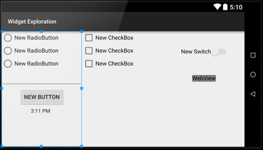
- Try and tweak your layout so that it resembles the previous image as much as possible. Note that ImageView is invisible until we add an actual image to it.
- Now, add the following properties shown in the following table to the widgets that we just laid out:
|
Widget Type |
Property |
Value to set to |
|---|---|---|
|
RadioGroup |
id |
radioGroup |
|
RadioButton (top) |
id |
radioButtonLondon |
|
RadioButton (top) |
text |
London |
|
RadioButton (top) |
checked |
true |
|
RadioButton (middle) |
id |
radioButtonBeijing |
|
RadioButton (middle) |
text |
Beijing |
|
RadioButton (bottom) |
id |
radioButtonNewYork |
|
RadioButton (bottom) |
text |
New York |
|
EditText |
id |
editText |
|
Button |
id |
button |
|
TextClock |
id |
textClock |
|
CheckBox (top) |
text |
Transparency |
|
CheckBox (top) |
id |
checkBoxTransparency |
|
CheckBox (middle) |
text |
Tint |
|
CheckBox (middle) |
id |
checkBoxTint |
|
CheckBox (bottom) |
text |
Re-Size |
|
CheckBox (bottom) |
id |
checkBoxReSize |
|
ImageView |
src |
@mipmap/ic_launcher |
|
ImageView |
id |
imageView |
|
Switch |
id |
switch1 |
|
Switch |
enabled |
true |
|
Switch |
clickable |
true |
|
WebView |
id |
webView |
We just laid out and set the required properties for our layout. There is nothing that we haven't done before, except that some of the widget types are new to us.
Now, we can get on with using all these widgets in our Java code.
As we have
WebView that will connect to the Internet (to show a web page), we need the user's permission as well. So, we need to add a line to the AndroidManifest.xml file. Open it up from the manifests folder in the project explorer.
Now, add the following line of code that is highlighted in the position indicated by the highlighted line's context:
...
<uses-permission android:name="android.permission.INTERNET" />
    <application
        android:allowBackup="true"
...
Now, let's make sure that our new layout is displayed by changing the call to setContentView in onCreate so that it looks like this:
setContentView(R.layout.exploration_layout);
This next block of code looks quite long and sprawling, but all we have done is get a reference to each of the widgets in our layout. When we come to use them, we will discuss the code in more detail.
The only thing that is new in this next block of code is that some of the objects are declared as final. This is required as they are going to be used within an anonymous class.
Tip
But doesn't final mean that the object can't be changed?
If you remember, back in Chapter 9, Object-Oriented Programming, we saw that variables declared as final cannot be changed, they are constant. So, how are we going to change the properties of these objects? Remember that objects are reference-type variables. That is, they refer to an object on the heap. They are not an object themselves. We can think of them as holding an address of an object. It is the address that cannot change. We can still use the address to reference the object on the heap and change the actual object as much as we like.
Enter this code just after the call to setContentView in the onCreate method:
// Get a reference to all our widgets

RadioGroup radioGroup = (RadioGroup) findViewById(R.id.radioGroup);
RadioButton rbBeijing = (RadioButton) findViewById
  (R.id.radioButtonBeijing);
RadioButton rbLondon = (RadioButton) findViewById
  (R.id.radioButtonLondon);
RadioButton rbNewYork = (RadioButton) findViewById
  (R.id.radioButtonNewYork);
final EditText editText = (EditText) findViewById(R.id.editText);
final Button button = (Button) findViewById(R.id.button);
final TextClock tClock = (TextClock) findViewById(R.id.textClock);
final CheckBox cbTransparency = (CheckBox) findViewById
  (R.id.checkBoxTransparency);
final CheckBox cbTint = (CheckBox) findViewById(R.id.checkBoxTint);
final CheckBox cbReSize = (CheckBox) findViewById
  (R.id.checkBoxReSize);

final ImageView imageView = (ImageView) findViewById(R.id.imageView);

Switch switch1 = (Switch) findViewById(R.id.switch1);
final WebView webView = (WebView) findViewById(R.id.webView);
Now we can create an anonymous class to listen for and handle clicks on the checkboxes. Each of the next three blocks of code implement an anonymous class for each of the checkboxes in turn. What is different in each of the next three blocks of code, however, is the way in which we respond to a click, and we will discuss each of them in turn.
The first checkbox is labeled Transparency, and we use the setAlpha method on imageView to change how transparent (see-through) it is. The setAlpha method takes a floating point value between 0 and 1 as an argument. Here, 0 is invisible and 1 is no transparency at all. So, when this checkbox is checked, we set the alpha to .1, so the image is barely visible, and when it is unchecked, we set it to 1, which is completely visible with no transparency. The boolean isChecked parameter of onCheckedChanged contains true or false as to whether the checkbox is checked or not.
Add this code after the previous block of code in onCreate:
/*
  Now we need to listen for clicks
  on the button, the CheckBoxes
  and the RadioButtons
*/

// First the check boxes using an anonymous class
cbTransparency.setOnCheckedChangeListener(new CompoundButton.OnCheckedChangeListener()
{
  public void onCheckedChanged(CompoundButton buttonView, boolean isChecked)
  {
    if(cbTransparency.isChecked()){
      // Set some transparency
      imageView.setAlpha(.1f);
    }else{
      imageView.setAlpha(1f);
    }

  }
});
In the next anonymous class, we handle the checkbox labeled as Tint. In the onCheckedChanged method, we use the setColorFilter method on imageView to overlay a color layer on the image. When isChecked is true, we layer a color, and when isChecked is false, we remove it.
The setColorFilter method takes a color in the alpha, red, green, and blue (ARGB) format as an argument. The color is provided by the argb static method of the Color class. The four arguments of the argb method are, as you might expect, values for alpha, red, green, and blue. These four values create a color. In our case, the 150, 255, 0, 0 values creates a strong red tint. And the 0, 0, 0, 0 values creates no tint at all.
Tip
To understand more about the
Color class, check out the Android developer site at http://developer.android.com/reference/android/graphics/Color.html, and to understand the RGB color system more, take a look at the Wikipedia website https://en.wikipedia.org/wiki/RGB_color_model.
Add this code after the previous block of code in onCreate:
// Now the next checkbox
cbTint.setOnCheckedChangeListener(new CompoundButton.OnCheckedChangeListener() {
  public void onCheckedChanged(CompoundButton buttonView, boolean isChecked) {
    if (cbTint.isChecked()) {
      // Checked so set some tint
      imageView.setColorFilter(Color.argb(150, 255, 0, 0));
    } else {
      // No tint required
      imageView.setColorFilter(Color.argb(0, 0, 0, 0));
    }

  }
});
In the anonymous class that handles the Resize labeled checkbox, we use the setScaleX method to resize the robot image. When we call setScaleX(2) and setScaleY(2) on imageView, we will double the size of the image, and setScaleX(1) and setScaleY(1) will return it to normal.
Add this code after the previous block of code in onCreate:
// And the last check box
cbReSize.setOnCheckedChangeListener
  (new CompoundButton.OnCheckedChangeListener() {
    public void onCheckedChanged(CompoundButton buttonView,
      boolean isChecked) {
      if (cbReSize.isChecked()) {
        // It's checked so make bigger
        imageView.setScaleX(2);
        imageView.setScaleY(2);
      } else {
        // It's not checked make regular size
        imageView.setScaleX(1);
        imageView.setScaleY(1);
      }
    }
});
Now we will handle the three radio buttons. As they are part of RadioGroup, we can handle them much more succinctly than we did the CheckBox objects. Here is how we do it.
First, we make sure that they are clear to start with by calling clearCheck() on radioGroup. Then, we create our anonymous class of the OnCheckedChangedListener type and override the onCheckedChanged method.
This method will be called when any radio button from RadioGroup is clicked. All we need to do is get the id of the RadioButton widget that was clicked on and respond accordingly using a switch statement with the three possible cases, one for each RadioButton widget.
Remember when we first talked about RadioButton that the ID supplied in the checkedId parameter of onCheckedChanged is int? This is why we must first create a new RadioButton object from checkedId:
RadioButton rb = (RadioButton) group.findViewById(checkedId);
Then, we can call getId on the new RadioButton widget as the condition for switch:
switch (rb.getId())
Then, in each case, we use the setTimeZone method with the appropriate Android time zone code as an argument.
Tip
You can see all the Android time zone codes here at https://gist.github.com/arpit/1035596.
Add this next code that incorporates everything we just discussed and includes the previous two lines of code. Add it in onCreate after the last code that we entered to handle the checkboxes:
// Now for the radio buttons
// Uncheck all buttons
radioGroup.clearCheck();

radioGroup.setOnCheckedChangeListener(new RadioGroup.OnCheckedChangeListener() {
  @Override
  public void onCheckedChanged(RadioGroup group, int checkedId) {

  RadioButton rb = (RadioButton) group.findViewById
    (checkedId);

    switch (rb.getId()) {

    case R.id.radioButtonLondon:
      tClock.setTimeZone("Europe/London");
      break;

      case R.id.radioButtonBeijing:
      tClock.setTimeZone("CST6CDT");
      break;


    case R.id.radioButtonNewYork:
      tClock.setTimeZone("America/New_York");
      break;


      }// End switch block
    }
  });
Now it's time for something a little bit new. In this next block of code, we use an anonymous class to handle the clicks on a regular button. We've called button.setOnclickListener as we have before. This time, however, instead of passing this as an argument, we've created a brand new class of the View.OnClickListener type and overridden onClick as the argument, just like we did with our other anonymous classes.
In the onClick method, we use setText to set the text property on button and the getText method of editText to get whatever text is currently in the EditText widget.
Add this code after the previous block of code in onCreate:
/*
   Let's listen for clicks on our regular Button.
   We can do this with an anonymous class as well.

*/

button.setOnClickListener(new View.OnClickListener() {
  @Override
  public void onClick(View v) {
    // We only handle one button
    // So no switching required
    button.setText(editText.getText());
  }
});
In the next block of code, we use the loadUrl method to load up a web page into webView:
Next, we will create yet another anonymous class to listen for and handle the changes made to our Switch widget.
When the isChecked variable is true, we show webView, and when it is false, we hide it.
Add this code after the previous block of code in onCreate:
// Make the webview display a page
webView.loadUrl("http://www.cs.yale.edu/homes/tap/Files/hopper-story.html");

webView.setVisibility(View.INVISIBLE);

switch1.setOnCheckedChangeListener(new CompoundButton.OnCheckedChangeListener() {
  public void onCheckedChanged(CompoundButton buttonView, boolean isChecked) {
    if(isChecked){
      webView.setVisibility(View.VISIBLE);
    }else{
        webView.setVisibility(View.INVISIBLE);
      }
    }
});
Now, we can run our app and try out all the features. The Android emulators can be rotated into the landscape mode by pressing the Ctrl + F11 keyboard combination on PC or Ctrl + fn + F11 on Mac.
Tip
At the time of writing this, the emulators seem to crash when their orientation is changed using Ctrl + F11. So if you have any trouble getting your emulator displayed in the landscape mode, just reconfigure it to startup in the landscape mode. You can do this by clicking on the AVD icon from the toolbar, then clicking on the edit (pencil icon) next to the Nexus 5 AVD, and selecting Landscape. Click on Finish and you're ready to run the app.
Try checking the radio buttons to see the time zone change on the clock. Enter different values into EditText and then click on the button to see it grab the text and display it on itself.
Change what the image looks like with different combinations of checked and unchecked checkboxes and hide and show the web page using the switch widget.
Let's move on to look at another way in which we can significantly enhance our UIs.