
Chapter 2. The main artifacts of an Angular app
This chapter covers
- Understanding components, directives, services, modules, and pipes
- Generating components, directives, services, and routes with Angular CLI
- Looking at Angular data bindings
- Building the first version of the ngAuction app
In this chapter, we’ll start by explaining the roles of the main artifacts of Angular applications. We’ll introduce you to each one and show how Angular CLI can generate these artifacts. Then we’ll do an overview of the Angular CLI configuration file where you can modify your project settings.
After that, we’ll discuss how data binding is implemented in Angular. At the end of the chapter, you’ll develop the initial version of the ngAuction application that you’ll continue working on throughout the book.
2.1. Components
A component, the main artifact of any Angular app, is a class with a view (UI). To turn a class into component, you need to decorate it with the @Component() decorator. A component can consist of one or more files—for example, a file with the extension .ts with the component class, a .css file with styles, an .html file with a template, and a .spec.ts file with test code for the component.
You don’t have to split the code of each component into these files. For example, you can have a component in just one file with inline styles and templates and no files with tests. No matter how many files will represent your component, they all should be located in the same directory.
Any component belongs to exactly one module of an app, and you have to include the name of the component’s class into the declarations property of the @NgModule() decorator in the module file. In chapter 1, we already had an AppComponent listed in the AppModule.
Even after generating a new project, you can keep using Angular CLI for generating artifacts by using the ng generate command or its alias ng g. Here are some options you can use with the ng g command:
- ng g c— Generates a new component.
- ng g s— Generates a new service.
- ng g d— Generates a new directive.
- ng g m— Generates a new module.
- ng g application— Generates a new app within the same project. This command was introduced in Angular 6.
- ng g library— Starting with Angular 6, you can generate a library project.
This is not an app, but can include services and components as well.
Each of these commands requires an argument, such as the name of the item, to generate. For a complete list of available options and arguments, run the ng help generate command or refer to the Angular CLI documentation.
Here are some examples of using the ng g command:
- ng g c product will generate four files for a new product component in the src/app/product directory and add the ProductComponent class to the declarations property of @NgModule.
- ng g c product -is --it --spec false will generate a single file, product.component.ts, with inlined styles and template and no test in the src/app/product directory, and add ProductComponent to the declarations property of @NgModule.
- ng g s product will generate the file product.service.ts containing a class decorated with @Injectable and the file product.service.spec.ts in the src/app directory.
ng g s product -m app.module will generate the same files as the preceding command and will also add ProductService to the providers property of @NgModule.
Let’s add a product component to the Hello CLI project you created in chapter 1 by running the following command in the root directory of that project:
ng g c product --is --it --spec false
This command will create the src/app/product directory with the product.component .ts file.
Listing 2.1. product.component.ts
@Component({
  selector: 'app-product',
  template: `
  <p>
  product Works!                                      1
   </p>
  `,
  styles: []
})
export class ProductComponent implements OnInit {     2

  constructor() { }

  ngOnInit() {}                                       3
 }
- 1 A default text to render
- 2 Implementing OnInit requires the ngOnInit() method in the class.
- 3 A lifecycle method
The generated @Component() decorator has the app-product selector, the template property with inlined HTML, and the styles property for inline CSS. Other components can include your product component in their templates by using the <app-product> tag.
The class in listing 2.1 has an empty constructor and one method, ngOnInit(), which is one of the component lifecycle methods. If implemented, ngOnInit() is invoked after the code in the constructor. OnInit is one of the lifecycle interfaces that require the implementation of ngOnInit(). We’ll cover a component lifecycle in section 9.2 in chapter 9.
Note
The @Component() decorator has a few more properties that we’ll discuss when it comes time to use them. All properties of the @Component() decorator are described at https://angular.io/api/core/Component.
The selector of the component in listing 2.1 has the prefix app-, which is a default prefix for apps. For library projects, the default prefix is lib-. A good practice is to come up with a more specific prefix that would better identify your application. Your project is called Hello CLI, so you may want to give the hello- prefix to all your components. To do this, use the -prefix option while generating your components:
ng g c product -prefix hello
That command would generate a component with the hello-product selector. An easier way to ensure that all generated components have a specific prefix is to specify the prefix in the file .angular-cli.json (or in angular.json, starting with Angular 6), discussed later in this chapter.
If you open the app.module.ts file, you’ll see that ProductComponent has been imported and added to the declarations section by your ng g c command:
@NgModule({
  declarations: [
    AppComponent,
    ProductComponent
  ],
  imports: [
    BrowserModule
  ],
  providers: [],
  bootstrap: [AppComponent]
})
export class AppModule { }
The newly generated ProductComponent class was added to the declarations property of @NgModule(). We’ll keep using components in each chapter of this book so you’ll get a chance to learn the various features of Angular components.
TypeScript decorators allow you to modify the behavior of a class, property, or method (or its arguments) without changing their code by enabling you to provide metadata about the decorated artifact. In general, metadata is additional information about data. For example, in an MP3 file, the audio is the data, but the name of the artist, song title, and album cover are metadata. MP3 players include metadata processors that read the metadata and display some of it while playing the song.
In the case of classes, metadata refers to additional information about the class. For example, the @Component() decorator tells Angular (the metadata processor) that this is not a regular class, but a component. Angular generates additional JavaScript code based on the information provided in the properties of the @Component() nsdecorator to turn a class into a UI component. The @Component() decorator doesn’t change the internals of the decorated class but adds some data describing the class so the Angular compiler can properly generate the final code of the component.
In the case of class properties, the @Input() decorator tells Angular that this class property should support binding and be able to receive data from the parent component. You’ll learn about the @Input() decorator in section 8.2.1 in chapter 8.
Under the hood, a decorator is a function that attaches some data to the decorated element. See section B.10 in appendix B for more details.
A component is a class with a UI, and a service is a class where you implement the business logic of your app. Let’s get familiar with services.
2.2. Services
For cleaner code separation, we usually don’t use a component for code that fetches or manipulates data. An injectable service is the right place for handling data. A component may depend on one or more services. Chapter 5 covers how dependency injection works in Angular. Here, we’ll give you an idea of how services and components work together.
Let’s start with generating a service in a shared folder, assuming that this service will be used by multiple components. To ensure that the providers property of @NgModule() will be updated with the newly generated service, use the following option:
ng g s shared/product -m app.module
The new file product.service.ts will be generated in the src/app/shared directory:
@Injectable()
export class ProductService {
  constructor() { }
}
Accordingly, the app.module.ts file will be updated to include the provider for this service:
@NgModule({
...
  providers: [ProductService]
})
export class AppModule { }
Next, implement some methods in ProductService with the required business logic. Note that the generated ProductService class is annotated with the @Injectable() decorator. To have Angular instantiate and inject this service into any component, add the following argument to the component’s constructor:
constructor(productService: ProductService){
  // start using the service, e.g. productService.getMyData();
}
A service isn’t the only artifact without a UI. Directives also don’t have their own UI, but they can be attached to the UI of components.
Starting from Angular 6, the ng g s command generates a class with the Injectable() decorator:
@Injectable({
  provideIn: 'root'
})
provideIn: 'root' allows you to skip the step of specifying the service in the providers property of the NgModule() decorator.
2.3. Directives
Think of an Angular directive as an HTML enhancer. Directives allow you to teach an old HTML element new tricks. A directive is a class annotated with the @Directive() decorator. You’ll see the @Directive() decorator used in section 11.7 in chapter 11.
A directive can’t have its own UI, but can be attached to a component or a regular HTML element to change their visual representation. There are two types of directives in Angular:
- Structural— The directive changes the structure of the component’s template.
- Attribute— The directive changes the behavior or visual representation of an individual component or HTML element.
For example, with the structural *ngFor directive, you can iterate through an array (or other collection) and render an HTML element for each item of the array. The following listing uses the *ngFor directive to loop through the products array and render an <li> element for each product (assuming there’s an interface or Product class with a title property).
Listing 2.2. Iterating through products with *ngFor
@Component({
  selector: 'app-root',
  template: `<h1>All Products</h1>
  <ul>
    <li *ngFor="let product of products">       1
      {{product.title}}                         2
     </li>
  </ul>
  `})
export class AppComponent {

  products: Product[] = [];                     3

 // the code to populate products is removed for brevity
}
- 1 Renders <li> for each product
- 2 Each <li> element shows the product title.
- 3 *ngFor iterates through this array.
The following element uses the structural *ngIf directive to either show or hide the <mat-error> element, depending on the return (true or false) of the hasError() method, which checks whether the value in a form field title has invalid minimum length:
<mat-error *ngIf="formModel.hasError('minlength', 'title')" >Enter at least 3
     characters</mat-error>
Later in this chapter when we talk about two-way binding, we’ll use the attribute ngModel directive to bind the value in the <input> element to a class variable, shippingAddress:
<input type='text' placeholder="Enter shipping address"
   [(ngModel)]="shippingAddress">
You can create custom attribute directives as well, described in the product documentation at https://angular.io/guide/attribute-directives.
Yet another artifact that doesn’t have its own UI but that can transform values in the component template is a pipe.
2.4. Pipes
A pipe is a template element that allows you to transform a value into a desired output. A pipe is specified by adding the vertical bar (|) and the pipe name right after the value to be transformed:
template: `<p>Your birthday is {{ birthday | date }}</p>`
In the preceding example, the value of the birthday variable will be transformed into a date of a default format. Angular comes with a number of built-in pipes, and each pipe has a class that implements its functionality (for example, DatePipe) as well as the name that you can use in the template (such as date):
- An UpperCasePipe allows you to convert an input string to uppercase by using | uppercase in the template.
- A LowerCasePipe allows you to convert an input string to lowercase by using | lowercase in the template.
- A DatePipe allows you to display a date in different formats by using | date.
- A CurrencyPipe transforms a number into a desired currency by using | currency.
- An AsyncPipe unwraps the data from the provided Observable stream by using | async. You’ll see a code sample that uses async in section 6.5 in chapter 6.
Some pipes don’t require input parameters (such as uppercase), and some do (such as date:'medium'). You can chain as many pipes as you want. The following code snippet shows how you can display the value of the birthday variable in a medium date format and in uppercase (for example, JUN 15, 2001, 9:43:11 PM):
template=
  `<p>{{ birthday | date: 'medium' | uppercase}}</p>`
As you can see, with literally no coding you can convert a date into the required format as well as show it uppercase (see the date formats in the Angular DatePipe documentation, http://mng.bz/78lD).
In addition to predefined pipes, you can create custom pipes that can include code specific to your application. The process of creating custom pipes is described at https://angular.io/guide/pipes. Code samples for this chapter include an app demonstrating a custom pipe that can convert the temperature from Fahrenheit to Celsius and back.
Now you know that your app can include components, services, directives, and pipes. All these artifacts must be declared in your app module(s).
2.5. Modules
An Angular module is a container for a group of related components, services, directives, and pipes. You can think of a module as a package that implements certain functionality from the business domain of your application, such as a shipping or billing module. All elements of a small application can be located in one module (the root module), whereas larger apps may have more than one module (feature modules). All apps must have at least a root module that’s bootstrapped during app launch.
From a syntax perspective, an Angular module is a class annotated with the @NgModule() decorator. To load the root module on application startup, invoke the bootstrapModule() method in the main.ts file of your app:
platformBrowserDynamic().bootstrapModule(AppModule);
The Angular framework itself is split into modules. Including some of the Angular modules is a must (for example, @angular/core), whereas some modules are optional. For example, if you’re planning to use the Angular Forms API and make HTTP requests, you should add @angular/forms and @angular/common/http in your package.json file and should include FormsModule and HttpClientModule in the root module of your app, as shown in the following listing.
Listing 2.3. A sample root module
@NgModule({
  declarations: [
    AppComponent              1
   ],
  imports: [                  2
     BrowserModule,
    FormsModule,
    HttpClientModule
  ],
  bootstrap: [AppComponent]   3
 })
export class AppModule { }
- 1 The only component included in this module
- 2 Other modules that are needed for this app
- 3 The top-level component to be loaded on app startup
If you decide to split your app into several modules, in addition to the root module you’ll need to create feature modules, covered next.
2.5.1. Feature modules
An Angular app may consist of a root module and feature modules. You can implement a certain feature of your app (for example, shipping) in a feature module. Whereas the @NgModule() decorator of the root module of a web application must include the BrowserModule, feature modules include the CommonModule instead. Feature modules can be imported by other modules. The @NgModule() decorator of feature modules doesn’t include the bootstrap property, because bootstrapping the entire app is the responsibility of the root module.
The following listing generates a small app called Hello Modules and adds a feature module called ShippingModule to it.
Listing 2.4. Generating a project and a feature module
ng new hello-modules      1
 cd hello-modules
ng g m shipping           2
- 1 Generates a new project called hello-modules
- 2 Generates a new feature module called shipping
This app will have a feature module with the following listing’s content in the file src/app/shipping/shipping.module.ts.
Listing 2.5. Generated feature module
@NgModule({
  imports: [
    CommonModule           1
   ],
  declarations: []
})
export class ShippingModule { }
- 1 Feature module imports CommonModule instead of the BrowserModule
Now let’s generate a new shipping component, instructing Angular CLI to include it into ShippingModule:
ng g c shipping -it -is -m shipping
This command generates the file shipping/shipping.component.ts with the decorated class ShippingComponent with an inline template and an empty styles property. The command also adds it to the declarations section of the ShippingModule. The code for the shipping component is shown in the following listing.
Listing 2.6. Generated shipping component
@Component({
  selector: 'app-shipping',
  template: `
  <p>
  shipping Works!                                     1
   </p>
  `,
  styles: []
})
export class ShippingComponent implements OnInit {    2

  constructor() { }

  ngOnInit() {}                                       3
 }
- 1 A default template
- 2 Implementing the lifecycle interface OnInit
- 3 This lifecycle hook is invoked after the constructor.
Note the selector of the shipping component: app-shipping. You’ll be using this name in the template of the AppComponent.
The code for your shipping module will include the shipping component and will look like the following listing.
Listing 2.7. Generated shipping module
@NgModule({
  imports: [
    CommonModule
  ],
  declarations: [ShippingComponent]
})
export class ShippingModule { }
A feature module may declare its own components and services, but to make all or some of them visible to other modules, you need to export them. In this case, you need to add an exports section to the shipping module so it looks as follows.
Listing 2.8. Exporting a shipping component
@NgModule({
  imports: [
    CommonModule
  ],
  declarations: [ShippingComponent],
  exports: [ShippingComponent]             1
 })
export class ShippingModule { }
- 1 Exporting a component from the module
External modules will see only those members of the shipping module that were explicitly mentioned in exports. The shipping module may include other members, like classes, directives, and pipes. If you don’t list them in the exports section, these members will remain private to the shipping module and will be hidden from the rest of the app. Now you should include the shipping module in the root module.
Listing 2.9. Adding the shipping module to the root module
@NgModule({
  declarations: [
    AppComponent
  ],
  imports: [
    BrowserModule,
    ShippingModule         1
   ],
  providers: [],
  bootstrap: [AppComponent]
})
export class AppModule { }
- 1 Adds the shipping module to the root module
To have the browser render the shipping component in the root component, you can add the <app-shipping> tag to the template of the AppComponent.
Listing 2.10. Adding a shipping component
@Component({
  selector: 'app-root',
  template: `
  <h1>Welcome to {{title}}!!</h1>
  <app-shipping></app-shipping>          1
   `,
  styles: []
})
export class AppComponent {
  title = 'app';
}
Run this app with ng serve and open the browser at http://localhost:4200. You’ll see the window that renders the AppComponent from the root module and the ShippingComponent from the shipping module, as shown in figure 2.1.
Figure 2.1. Running the two-module app
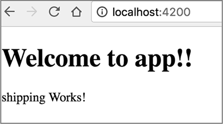
“Welcome to app!!” is the greeting from the AppComponent located in the root module, whereas “shipping Works!” comes from the ShippingComponent located in your feature module. This was a rather simple example, but it illustrates how you can modularize an app so its specific features are located in a separate reusable module and can be developed by a separate developer(s).
Your app modules can be loaded either eagerly on application startup, as was done with the Hello Modules project, or lazily, such as when the user clicks a specific link. In section 4.3 in chapter 4, you’ll see a sample app with a module that’s lazy loaded.
You know by now that a component consists of TypeScript code and the UI (the template). The next concept to learn is how the code and the UI can be synchronized as the data changes either programmatically or as the result of the user’s interaction with the app.
2.6. Understanding data binding
Angular has a mechanism called data binding that allows you to keep a component’s properties in sync with the view. In this section, we’ll explain how data binding works with properties and events.
Angular supports two types of data binding: unidirectional (default) and two-way. With unidirectional data binding, the data is synchronized in one direction: either from the class member variable (property) to the view or from the view event to the class variable or a method that handles the event. Angular updates the binding during its change detection cycle, explained in section 9.1 in chapter 9.
2.6.1. Binding properties and events
To display a value of a class variable in a template’s string, use double curly braces. If a class has a variable called name, you can show its value like this:
<h1>Hello {{name}}!</h1>
This is also known as interpolation, and you can use any valid expression inside these double curly braces.
Use square brackets to bind the value from a class variable to a property of an HTML element or an Angular component. The following binds the value of the class variable isValid to the hidden property of the HTML <span> element:
<span [hidden]="isValid">This field is required</span>
Note that the square brackets are used to the left of the equals sign. If the value of the isValid variable is false, the text of the span element isn’t hidden, and the user will see the message “This field is required.” As soon as the value of the isValid variable becomes true, the text “This field is required” becomes hidden.
The preceding examples illustrate unidirectional binding from the class variable to the view. The next listings will illustrate the unidirectional binding from the view to a class member, such as a method.
To assign an event-handler function to an event, put the event name in parentheses in the component’s template. The following listing shows how to bind the onClickEvent() function to the click event, and the onInputEvent() function to the input event.
Listing 2.11. Two events with handlers
<button (click)="onClickEvent()">Get Products</button>            1

<input placeholder="Product name" (input)="onInputEvent()">       2
- 1 If the button is clicked, invoke the method onClickEvent().
- 2 As soon as the value of the input field changes, invoke the method onInputEvent().
When the event specified in parentheses is triggered, the expression in double quotes is reevaluated. In listing 2.11, the expressions are functions, so they’re invoked each time the corresponding event is triggered.
If you’re interested in analyzing the properties of the event object, add the $event argument to the method handler. In particular, the target property of the event object represents the DOM node where the event occurred. The instance of the event object will be available only within the binding scope (that is, in the event-handler method). Figure 2.2 shows how to read the event-binding syntax.
Figure 2.2. Event-binding syntax
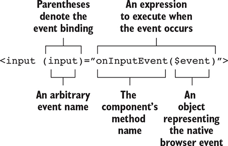
The event in parentheses is called the target of binding. You can bind functions to any standard DOM events that exist today (see “Event reference” in the Mozilla Developer Network documentation, http://mzl.la/1JcBR22) or that will be introduced in the future.
Parentheses are used for binding to the standard DOM events as well as the custom events of a component. For example, say you have a price-quoter component that can emit a custom event, lastPrice. The following code snippet shows how to bind the lastPrice event to the class method priceQuoteHandler():
<price-quoter (lastPrice)="priceQuoteHandler($event)">?</price-quoter>
You’ll learn how to create components that emit custom events in chapter 8, section 8.2.2.
2.6.2. One- and two-way data binding in action
Let’s run and review two simple apps from the project bindings that come with this chapter. If you use the Angular 5 code samples, the two apps oneway and twoway are configured by creating two elements in the apps array in the file .angular-cli.json. If you use the Angular 6 code samples, these two apps are configured in the file angular .json.
Prior to Angular 6, the generated projects include the configuration file .angular-cli.json, which allows you to specify where the source code is located, which directory will contain the compiled code, where to find the assets of your project, where the code and styles required by third-party libraries (if any) are, and more. Angular CLI uses properties of this file during generation of the your app artifacts, during builds, and while running tests.
You can find the complete and current description of each config property in the document “Angular CLI Config Schema,” available at https://github.com/angular/angular-cli/wiki/angular-cli. You’ll use the apps config property in this section and the styles and scripts properties in section 2.7.
Starting in Angular 6, projects are configured in the angular.json file, and its schema is described at https://github.com/angular/angular-cli/wiki/angular-workspace. Now the project is treated as a workspace, which can contain one or more apps and libraries with their own configurations, but all of them share the dependencies located in a single directory: node_modules.
These two apps will be configured similarly—only the app names and the names of the files that boot these apps will differ, as shown in the following listing.
Listing 2.12. Angular 5: Configuring two apps in .angular-cli.json
"apps": [
  {
    "name": "oneway",                         1
     ...
    "main": "main-one-way-binding.ts",        2
   ...
  },
  {
    "name": "twoway",                         3
     ...
    "main": "main-two-way-binding.ts",        4
   ...
  }
  ]
- 1 The name of the first app
- 2 The bootstrap file of the first app
- 3 The name of the second app
- 4 The bootstrap file of the second app
Because both apps are located in the same project, you need to run npm install once. In Angular 5 and earlier versions, you can bundle and run any of these app by specifying the --app option with the ng serve or ng build command. The file main-one-way-binding.ts contains the code to bootstrap the app module from the directory named one-way, and the file main-two-way-binding.ts bootstraps the app module from the two-way directory of this project.
In Angular 5, if you want to build the bundles in memory and start the dev server with the app configured under the name oneway, the following command will do it:
ng serve --app oneway
Note
If you use the Angular 6 version of the code samples, the option --app is not required: ng serve oneway.
If you also want Angular CLI to open the browser to http://localhost:4200, add the -o to the preceding command:
ng serve --app oneway -o
Open the bindings project in your IDE and run the npm i command in its Terminal window. After dependencies are installed, run the preceding command to see the one-way sample app in action. It’ll render the page as shown in figure 2.3.
Figure 2.3. Running a one-way binding app

In the Angular 6 version of the code samples, the apps oneway and twoway are configured in the angular.json file in the projects section. The following command will run the oneway app, rendering the UI shown in figure 2.3.
ng serve oneway
The following listing shows the code of the AppComponent that rendered this page.
Listing 2.13. The AppComponent for the one-way binding sample
@Component({
  selector: 'app-root',
  template:`
  <h1>{{name}}</h1>                   1
   <button (click)="changeName()">    2
   Change name
  </button>
  `
})
export class AppComponent {
  name: string = "Mary Smith";

  changeName() {
  this.name = "Bill Smart";
  }
}
- 1 Initially uses a one-way property binding to render the value of the class variable name
- 2 A button click updates the value of the variable name to Bill Smart using a one-way event binding to the method changeName().
As soon as the user clicks the button, the changeName() method modifies the value of name, one-way property binding kicks in, and the new value of the name variable will be shown on the page.
Now stop the dev server (Ctrl-C), and run the app configured under the name twoway:
ng serve --app twoway -o
The template of this page has the following HTML tags: <input>, <button>, and <p>. Enter 26 Broadway in the input field, and you’ll see a page like the one shown in figure 2.4.
Figure 2.4. Running a twoway binding sample app

The value of the text inside the <p> tag changes as soon as the value in the input field changes. If you click the button, the value of the input field and the paragraph will change to "The shipping address is 123 Main Street". In this app, you use two-way binding. The code for the app component is shown in the following listing.
Listing 2.14. A two-way binding sample
@Component({
  selector: 'app-root',
  template: `
  <input type='text'
   placeholder="Enter shipping address"
   [(ngModel)]="shippingAddress">                           1

  <button (click)="shippingAddress='123 Main Street'">
  Set Default Address
  </button>                                                 2
   <p>The shipping address is {{shippingAddress}}</p>
  `
})
export class AppComponent {
  shippingAddress: string;
}
- 1 Using ngModel to denote the two-way binding
- 2 Updating the value of shippingAddress on click
You bind the value of the input field to the shippingAddress variable by using the Angular ngModel directive:
[(ngModel)]="shippingAddress"
Remember, square brackets represent property binding, and parentheses represent event binding. To denote two-way binding, surround a template element’s ngModel with both square brackets and parentheses. In the preceding code, you instruct Angular to update the shippingAddress variable as soon as the value in the input field changes, and update the value of the input field as soon when the value of shippingAddress changes. This is what the two-way binding means.
When you were typing 26 Broadway, the value of the shippingAddress variable was changing as well. The click on the button would programmatically change the address to 123 Main Street, and this value is propagated back to the input field.
While reviewing the code of this app located in the two-way directory, note that the app module imports FormsModule, required because you use the ngModel directive, which is part of the Forms API, covered in chapter 7.
2.7. Hands-on: Getting started with ngAuction
From here on, most chapters will end with a hands-on section containing code review or instructions for developing a certain aspect of the ngAuction app, where people can see a list of featured products, view details for a specific product, perform a product search, and monitor bidding by other users. We’ll gradually add code to this application so you can see how different Angular parts fit together. The source code that comes with this book includes the completed version of such hands-on sections in the ngAuction folders of the respective chapters, but we encourage you to try these exercises on your own (source code can be found at https://github.com/Farata/angulartypescript and www.manning.com/books/angular-development-with-typescript-second-edition).
This hands-on exercise contains instructions for developing an initial version of the sample auction introduced in chapter 1. You’ll start by generating a new Angular CLI project, and then you’ll create the home page, split it into Angular components, and create a service to fetch products.
Note
The completed version of this exercise is located in the directory chapter2/ngAuction. To run this version of ngAuction, switch to the ngAuction directory, run npm install, and start the application by running the ng serve command. We assume you have Angular CLI and the npm package manager installed on your computer.
2.7.1. The initial project setup for ngAuction
Let’s start the development of ngAuction from scratch. Each section in the hands-on exercise will contain a set of instructions for you to follow so you can develop ngAuction on your own.
Generate a new directory and, using Angular CLI, generate a new project—ngAuction—by running the following command:
ng new ngAuction --prefix nga --routing
- ng new— Generates a new project.
- --prefix nga— The generated .angular-cli.json file will have the prefix property value nga (for ngAuction). The generated app component will have the nga-root selector, and all other components that we’ll be generating for ngAuction will also have selectors with the prefix nga-.
- --routing— You’ll add navigation to ngAuction in chapter 3. The --routing option will generate a boilerplate module for routing support.
Open the newly generated ngAuction directory in your IDE, go to the integrated Terminal view, and run the following command there:
ng serve -o
This command will build the bundles, start the dev server, and open the browser, which will render the page as in the Hello CLI app shown in chapter 1 in figure 1.5.
In chapters 2, 3, and 5 you’ll use the Bootstrap 4 framework (see http://getbootstrap.com) for styling and implementing the responsive web design in ngAuction. The term responsive web design (RWD) means that the view layouts can adapt to the screen size of the user’s device. Starting in chapter 7, you’ll redesign the UI of ngAuction using Angular Material components (see https://material.angular.io) and remove the Bootstrap framework from this project.
Because the Bootstrap library has jQuery and Popper.js as peer dependencies, you need to run the command in the following listing to install them in the ngAuction project.
Listing 2.15. Installing Bootstrap, jQuery, and Popper.js
npm i bootstrap jquery popper.js --save-prod
Tip
If you use npm older than 5.0, use the --save option instead of --save-prod. In npm 5, there are shortcuts: -P for --save-prod (default) and -D for --save-dev.
When you have to use global styles or scripts from an external JavaScript library, you can add them to the .angular-cli.json config file or, starting in Angular 6, to angular .json. In your case, the Bootstrap getting-started guide (see https://getbootstrap.com/docs/4.1/getting-started) instructs you to add bootstrap.min.css to the index .html of the app. But because you’re use Angular CLI, you’ll add it to the styles section in .angular-cli.json, so it looks like this:
"styles": [
  "styles.css",
  "../node_modules/bootstrap/dist/css/bootstrap.min.css"
]
The Bootstrap documentation also instructs you to add the jQuery js/bootstrap.min.js file, and you’ll add it to the scripts section in .angular-cli.json as follows:
"scripts": [
  "..node_modules/jquery/dist/jquery.min.js",
  "..node_modules/bootstrap/dist/js/bootstrap.min.js"
]
Tip
When you’re running the ng serve or ng build commands, the preceding scripts will be placed in the scripts.bundle.js file.
2.7.2. Generating components for ngAuction
Your ngAuction app will consist of several Angular components. In the last section, you generated the project with the root app component. Now, you’ll generate more components using the command ng generate component (or ng g c). Run the commands in the following listing in your Terminal window to generate the components shown in figure 1.10 in chapter 1.
Listing 2.16. Generating components for ngAuction
ng g c home
ng g c carousel
ng g c footer
ng g c navbar
ng g c product-item
ng g c product-detail
ng g c search
ng g c stars
Each of the components in listing 2.12 will be generated in a separate folder. Open app.module.ts, and you’ll see that Angular CLI has also added the import statements and declared all of the these components there.
Now you’ll generate the product service that will provide the data for ngAuction in the next chapter. Run the following command to generate the product service:
ng g s shared/product
Add ProductService to the providers property of @NgModule():
@NgModule({
  ...
  providers: [ProductService],
  ...
})
export class AppModule { }
Tip
While writing or generating code, you may see that some of your code fragments are marked with red squiggly lines. Hover over these lines to get more information. It may be not a TypeScript compiler error but a TSLint complaint about your coding style. Run the command ng lint --fix, and these styling errors could be automatically fixed.
2.7.3. The application component
The application component is the root component of ngAuction and will host all other components. Your app.component.html will include the following elements: navbar at the top, search on the left, the router outlet on the right, and the footer at the bottom. In chapter 3, you’ll use the tag <router-outlet> to render either the HomeComponent or ProductDetailComponent, but in the initial version of ngAuction, you’ll be rendering only HomeComponent there. Replace the content of app.component.html with the following listing.
Listing 2.17. The AppComponent template
<nga-navbar></nga-navbar>                  1
<div class="container">
  <div class="row">
    <div class="col-md-3">                 2
       <nga-search></nga-search>           3
     </div>

    <div class="col-md-9">                 4
       <router-outlet></router-outlet>     5
     </div>
  </div>
</div>

<nga-footer></nga-footer>                  6
- 1 The navbar component goes at the top.
- 2 Three columns of the Bootstrap’s flex grid are given to the search component.
- 3 Rendering the search component
- 4 Nine columns are given to the router outlet area.
- 5 Router outlet area
- 6 The footer component is rendered at the bottom.
You may see some unfamiliar CSS classes in HTML elements—they all come from the Bootstrap framework. For example, the styles col-md-3 and col-md-9 come from the Bootstrap flexible grid layout system, in which the width of the viewport is divided into 12 invisible columns. You can read about the Bootstrap grid system at https://getbootstrap.com/docs/4.0/layout/grid.
Out of the box, the Bootstrap grid supports five tiers for different widths of user devices: xs, sm, md, lg, and xl. For example, md stands for medium devices (992 px (pixels) or more), lg is 1200 px or more, and so on. In your app component, you want to allocate three columns in medium or larger viewports to the search component (<nga-search>) and nine columns to the <router-outlet>.
Since you didn’t specify how many columns to allocate to <nga-search> if the device is smaller than md, the browser will give the entire viewport’s width to your search component, and <router-outlet> will be rendered under the search. The UI elements of your app component will be laid out differently, depending on the width of the user’s screen.
Start the app with ng serve -o, and the browser will display a page that looks similar to the page shown in figure 2.5.
Figure 2.5. Running the first version of ngAuction

This doesn’t look like a landing page of an online auction app yet, but at least the app didn’t break after you added the Bootstrap framework and generated components and a service. Keep this app running and continue adding code according to the upcoming instructions, and you’ll see how it gradually turns into a more usable web page.
2.7.4. The navbar component
A typical navigation bar stays at the top of the page, providing the app menu. The Bootstrap framework offers multiple styles for the navigation bar component described at https://getbootstrap.com/docs/4.0/components/navbar. Replace the contents of navbar.component.html with the following listing.
Listing 2.18. The navbar component template
<nav class="navbar navbar-expand-lg navbar-light bg-light">               1
   <a class="navbar-brand" [routerLink]="['/']">ngAuction</a>             2
   <button class="navbar-toggler" type="button"
    data-toggle="collapse"
    data-target="#navbarSupportedContent"
    aria-controls="navbarSupportedContent"
    aria-expanded="false" aria-label="Toggle navigation>
    <span class="navbar-toggler-icon"></span>
  </button>

  <div class="collapse navbar-collapse"
    id="navbarSupportedContent">                                          3
     <ul class="navbar-nav mr-auto">
    <li class="nav-item active">
      <a class="nav-link" href="#">Home <span class="sr-
     only">(current)</span></a>
    </li>
    <li class="nav-item">
      <a class="nav-link" href="#">About</a>
    </li>
    <li class="nav-item dropdown">                                        4
       <a class="nav-link dropdown-toggle" href="#"
         id="navbarDropdown" role="button"
         data-toggle="dropdown" aria-haspopup="true" aria-expanded="false">
         Services
      </a>
    <div class="dropdown-menu" aria-labelledby="navbarDropdown">
      <a class="dropdown-item" href="#">Find products</a>                 5
       <a class="dropdown-item" href="#">Place order</a>
    <div class="dropdown-divider"></div>
      <a class="dropdown-item" href="#">Pay</a>
    </div>
    </li>
    </ul>
  </div>
</nav>
- 1 Bootstrap’s nav component and CSS selectors
- 2 Bootstrap’s navbar-brand denotes your auction brand and routes to the default page on click.
- 3 Bootstrap’s collapsible is rendered as three horizontal bars on small screens.
- 4 Services drop-down menu
- 5 Drop-down menu items
As soon as you save this file, Angular CLI will automatically rebuild the bundles, and your page will look like figure 2.6.
Figure 2.6. Rendering the navbar

What if you don’t see the page shown in figure 2.6, and the browser just renders an empty page instead? Any time you see something you don’t expect, open Chrome Dev Tools and see if there are any error messages in the Console tab.
Make the width of the browser window small, and the menu will collapse, rendering three horizontal bars on the right, as shown in figure 2.7.
Figure 2.7. Collapsed navbar menu

2.7.5. The search component
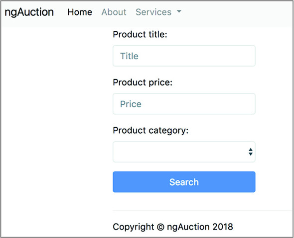
Eventually, you’ll implement the SearchComponent to perform the product search based on the product title, price, or category. But in the initial version of ngAuction, you just want to render the view of the SearchComponent. Replace the content of search.component.html to look like the following listing.
Listing 2.19. The search component template
<form name="searchForm">
  <div class="form-group">                                          1
     <label for="productTitle">Product title:</label>
    <input type="text" id="productTitle"
      placeholder="Title" class="form-control">                     1
   </div>
  <div class="form-group">
    <label for="productPrice">Product price:</label>
    <input id="productPrice"
     name="productPrice" type="number" min="0"
     placeholder="Price" class="form-control">                      1
   </div>
  <div class="form-group">
    <label for="productCategory">Product category:</label>
    <select id="productCategory" class="form-control"></select>     1
   </div>
  <div class="form-group">
    <button type="submit"
    class="btn btn-primary btn-block">Search</button>               1
   </div>
</form>
The rendered app is shown in figure 2.8.
Figure 2.8. Rendering the search component

Now, let’s take care of the footer component.
2.7.6. The footer component
Your footer will just display the copyright message. The following listing modifies the content of footer.component.html.
Listing 2.20. The footer component template
<div class="container">
<hr>
<footer>
<div class="row"> 1
<div class="col-lg-12"> 1
<p>Copyright © ngAuction 2018</p>
</div>
</div>
</footer>
</div>
- 1 All values in class selectors come from the Bootstrap framework.
Your ngAuction app renders the home page as shown in figure 2.9.
Figure 2.9. Rendering the footer
2.7.7. The carousel component
At the top of the ngAuction landing page, you want to implement a slide show of the featured products. For this, you’ll use the carousel component that comes with Bootstrap (see https://getbootstrap.com/docs/4.0/components/carousel). To rotate slides manually, the carousel component includes previous/next controls (little arrows on the sides) and indicators of the current slide (dashes at the bottom).
For simplicity, you’ll use gray rectangles instead of actual images. The handy https://placeholder.com service returns gray rectangles of a specified size, and in the carousel, you’ll use three 800 x 300 px gray rectangles.
Modify the code of carousel.component.html to look like the following listing.
Listing 2.21. The carousel component template
<div id="myCarousel" class="carousel slide" data-ride="carousel">
  <ol class="carousel-indicators">
    <li data-target="#myCarousel" data-slide-to="0" class="active"></li>
    <li data-target="#myCarousel" data-slide-to="1"></li>
    <li data-target="#myCarousel" data-slide-to="2"></li>
  </ol>
  <div class="carousel-inner">
    <div class="carousel-item active">
      <img class="d-block w-100" src="http://placehold.it/800x300">        1
     </div>
  <div class="carousel-item">
    <img class="d-block w-100" src="http://placehold.it/800x300">          2
   </div>
  <div class="carousel-item">
    <img class="d-block w-100" src="http://placehold.it/800x300">          3
   </div>
  </div>
  <a class="carousel-control-prev" href="#myCarousel"
   role="button" data-slide="prev">                                        4
     <span class="carousel-control-prev-icon" aria-hidden="true"></span>
    <span class="sr-only">Previous</span>
  </a>
  <a class="carousel-control-next" href="#myCarousel"
   role="button" data-slide="next">                                        5
     <span class="carousel-control-next-icon" aria-hidden="true"></span>
    <span class="sr-only">Next</span>
  </a>
</div>
- 1 The first slide is an 800 x 300 px gray rectangle.
- 2 Second slide
- 3 Third slide
- 4 Clicking the left arrow renders the previous image.
- 5 Clicking the right arrow renders the next image.
Now, you need to add some styles to the carousel. Because it’s a custom component, you’ll add display: block to its CSS file. You also want to add some space at the bottom of the carousel so other components won’t overlap. To apply these styles to the component itself and not to its internals, you’ll use the pseudo class selector :host that represents the carousel, in this case. To ensure that the slide images take the entire width of the <div> that hosts the carousel, add the following listing’s style to the carousel.component.css file.
Listing 2.22. carousel.component.css
:host {                        1
   display: block;             2
   margin-bottom: 10px;        3
 }

img {
  width: 100%;                 4
 }
- 1 Applies styles to the carousel component and not to its internals
- 2 Displays the component as a block element that takes the entire width
- 3 Adds some space below the carousel
- 4 Images should take the entire width of the carousel.
Most of the Bootstrap framework styles are located in the node_modules/bootstrap/dist/css/bootstrap.css file. If you want to override some of the default styles, see how Bootstrap defines them and decide what you want to change. Then, define the CSS style in your component that matches the selector of the Bootstrap file.
For example, the carousel indicators are rendered as dashes, and the Bootstrap CSS selector .carousel-indicators li looks like the following:
.carousel-indicators li {
  position: relative;
  -webkit-box-flex: 0;
  -ms-flex: 0 1 auto;
  flex: 0 1 auto;
  width: 30px;
  height: 3px;
  margin-right: 3px;
  margin-left: 3px;
  text-indent: -999px;
  background-color: rgba(255, 255, 255, 0.5);
}
If you want to change the indicators from dashes to circles, add the following style to the carousel.component.css:
.carousel-indicators li {
  width: 10px;
  height: 10px;
  border-radius: 100%;
}
Don’t be surprised if, after adding code in the carousel component, the rendering of ngAuction hasn’t changed and still looks like figure 2.9. That’s because you haven’t added the <nga-carousel> tag to any parent component yet. You’ll add <nga-carousel> to the home component, which you’ll create next.
2.7.8. The home component
The template of your app component includes the <router-outlet> area, which, on the md-size viewports, will be located to the right of <nga-search>. In chapter 3, you’ll modify ngAuction to render either the home or the product-detail component in the <router-outlet>, but for now, you’ll render the home component there. Your home component will host and render the carousel at the top and several products under it.
Modify the content of the generated home.component.html to look like the following listing.
Listing 2.23. The home component template
<div class="row carousel-holder">
  <div class="col-md-12">
  <nga-carousel></nga-carousel>                          1
   </div>
</div>
<div class="row">
  We'll render several ProductItem components here       2
 </div>
- 1 The carousel goes at the top of the home component.
- 2 In chapter 3, you’ll replace this text with product-item components.
The first <div> hosts the carousel, and the second one displays the text revealing your plans to render several product items there. Still, the UI of your running ngAuction hasn’t changed, and you may have guessed that it’s because you didn’t include the <nga-home> tag in your app component. And you won’t be doing that. You’ll use Angular Router to render HomeComponent inside the <router-outlet> area.
Chapters 3 and 4 cover the router in detail—for now, you’ll just make a small change in the generated app/app-routing.module.ts file, which includes the line in the following listing for route configuration.
Listing 2.24. Configuring routes
const routes: Routes = [];
Replace the code in the preceding listing with the code in the following one.
Listing 2.25. Mapping an empty path to the home component
const routes: Routes = [
  {
  path: '', component: HomeComponent
  }
];
This means that if the path after the base URL is empty (the URL of ngAuction has nothing after the port number), render the HomeComponent. You’ll also need to add an import statement for HomeComponent in the app-routing.module.ts file.
Now your ngAuction renders as shown in figure 2.10, and the carousel will run a slide show of gray rectangles.
Figure 2.10. Rendering ngAuction with the home component
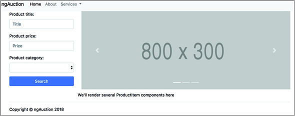
The initial version of ngAuction is ready. You can start reducing the width of the browser window to see how this UI will be rendered on a smaller device. As soon as the window width becomes smaller than 992 pixels (the value of the Bootstrap md size), the browser will change the page layout, giving the entire window’s width to the search component, and the home component will be rendered under the search. This is responsive web design in action.
Summary
- An Angular application is represented by a hierarchy of components that are packaged into modules.
- Each Angular component contains a template for UI rendering and a class implementing the component’s functionality.
- Templates and styles can be either inlined or stored in separate files.
- Angular CLI is a useful tool even after the project has been generated.
- Data binding is a mechanism to keep the UI of the component and the values in the underlying class in sync.
- You can use third-party JavaScript libraries in Angular projects.