Chapter 7. Laying out pages with Flex Layout
- Implementing responsive web design using the Flex Layout library
- Using the ObservableMedia service
- Changing the layout based on the viewport size
When it comes to developing a web app, you need to decide whether you’ll have separate apps for desktop and mobile versions or reuse the same code on all devices. The former approach allows you to use the native controls on mobile devices so the UI looks more natural, but you need to maintain separate versions of the code for each app. The latter approach is to use a single code base and implement responsive web design (RWD) so the UI layout will adapt to the device screen size.
Note
The term RWD was coined by Ethan Marcotte in the article “Responsive Web Design,” available at http://alistapart.com/article/responsive-web-design.
There’s a third approach: in addition to your web application that works on desktops, develop a hybrid application, which is a web application that works inside the mobile browser but can invoke the native API of the mobile device too.
In this chapter, you’ll see how to make your app look good and be functional on large and small screens using the RWD approach. Chapter 6 covered observables that can push notifications when certain important events happen in your app. Let’s see if you can use observables to let you know if the user’s screen size changes and change the UI layout based on the width of the viewport of the user’s device. Users with smartphones and users with large monitors should see different layouts of the same app.
We’ll show you how to use the Flex Layout library for implementing RWD and how to use its ObservableMedia service to spare you from writing lots of CSS.
Finally, you’ll start rewriting the ngAuction app, illustrating many of the techniques you’ve learned, with the main goal to remove Bootstrap from the app, using only the Angular Material and Flex Layout libraries.
7.1. Flex Layout and ObservableMedia
Imagine that you’ve laid out the UI of your application, and it looks great on a user’s monitor with a width resolution of 1200 pixels or more. What if the user opens this app on a smartphone with a viewport width of 640 pixels? Depending on the device, it may either render only a part of your app’s UI, adding a horizontal bar at the bottom, or scale down the UI so it fits in a small viewport, making the app difficult to use. Or consider another scenario: users with large monitors who reduce the width of their browser window because they need to fit another app on their monitor.
To implement RWD, you can use CSS media queries, represented by the @media rule. In the CSS of your app, you can include a set of media queries offering different layouts for various screen widths. The browser constantly checks the current window width, and as soon as the width crosses a breakpoint set in the @media rules (for example, the width becomes smaller than 640 pixels), a new page layout is applied.
Another way to implement flexible layouts is by using CSS Flexbox with media queries (see http://mng.bz/6B42). The UI of your app is styled as a set of flexible boxes, and if the browser can’t fit the Flexbox content horizontally (or vertically), the content is rendered in the next row (or column).
You can also implement RWD with the help of CSS Grid (see http://mng.bz/k29F). Both Flexbox and CSS Grid require a good understanding of @media rules.
The Angular Flex Layout library (see https://github.com/angular/flex-layout) is a UI layout engine for implementing RWD without writing media queries in your CSS files. The library provides a set of simple Angular directives that internally apply the rules of the flexbox layout and offer you the ObservableMedia service that notifies your app about the current width of the viewport on the user’s device.
Angular Flex Layout has the following advantages over the standard CSS API:
- It produces cross-browser-compatible CSS.
- It provides an Angular-friendly API for dealing with media queries using directives and observables.
Note
In this section, we provide a minimal description of the Flex Layout library to get you started quickly. For more details and demos, refer to the Flex Layout documentation at https://github.com/angular/flex-layout/wiki.
The Flex Layout library provides two APIs: static and responsive. The static API allows you to use directives to specify layout attributes for containers and their children. The responsive API enhances static API directives, enabling you to implement RWD so app layouts change for different screen sizes.
7.1.1. Using Flex Layout directives
There are two types of directives in the Flex Layout library: one for containers and one for their child elements. A container’s directives are used to align its children. Child directives are applied to child elements of a container managed by Flex Layout. With child directives, you can specify the order of each child, the amount of space it takes, and some other properties, as shown in table 7.1.
Table 7.1. Frequently used Flex Layout directives
|
Directive |
Description |
|---|---|
| Container directives | |
|
Instructs the element to use CSS Flexbox for laying out child elements. |
|
Aligns child elements in a particular way (to the left, to the bottom, evenly distribute, and so on). Allowed values depend on the fxLayout value attached to the same container element—see Angular Flex Layout documentation. |
|
Controls space between child elements. |
| Child directives | |
|
Controls the amount of space a child element takes within the parent container. |
|
Allows selectively changing a child’s alignment within the parent container prescribed by the fxLayoutAlign directive. |
|
Allows changing the order of a child element within the parent container. For example, it can be used to move an important component to the visible area when switching from desktop to a mobile screen. |
Note
Child directives expect to be inside an HTML element with a container directive attached.
Let’s take a look at how to use the Flex Layout library to align two <div> elements next to each other in a row. First, you need to add the Flex Layout library and its peer dependency, @angular/cdk, to your project:
npm i @angular/flex-layout @angular/cdk
The next step is to add the FlexLayoutModule to the root @NgModule() decorator, as shown in the following listing.
Listing 7.1. Adding the FlexLayoutModule
import {FlexLayoutModule} from '@angular/flex-layout';
@NgModule({
  imports: [
    FlexLayoutModule
    //...
  ]
})
export class AppModule {}
The next listing creates a component that displays the <div> elements next to each other from left to right.
Listing 7.2. flex-layout/app.component.ts
@Component({
  selector: 'app-root',
  styles: [`
    .parent {height: 100px;}
    .left   {background-color: cyan;}
    .right  {background-color: yellow;}
  `],
  template: `
    <div class="parent" fxLayout="row" >        1
       <div fxFlex class="left">Left</div>      2
       <div fxFlex class="right">Right</div>    2
     </div>
  `
})
export class AppComponent {}
- 1 The fxLayout directive turns the <div> into a flex-layout container where children are allocated horizontally (in a row).
- 2 The fxFlex directive instructs each child element to take equal space within the parent container.
To see this application in action, run the following command:
ng serve --app flex-layout -o
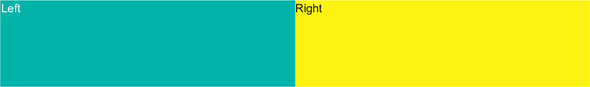
Figure 7.1 shows how the browser renders the child elements. Each child takes 50% of container’s available width.
Figure 7.1. Two elements aligned in a row
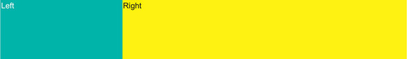
To make the right div take more space than the left one, you can assign the required space values to the child fxFlex directives. The following template uses the child-level directive fxFlex to allocate 30% of the available width to the left child and 70% to the right one:
<div fxLayout="row" class="parent">
  <div fxFlex="30%" class="left">Left</div>
  <div fxFlex="70%" class="right">Right</div>
</div>
Now the UI is rendered as shown in figure 7.2.
Figure 7.2. The right element takes more space than the left one.
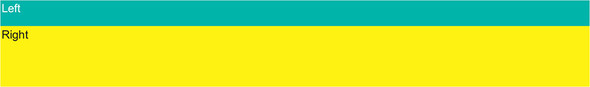
To lay out the container’s children vertically, change the direction of the container’s layout from rows to columns, as in fxLayout="column":
<div fxLayout="column" class="parent">
  <div fxFlex="30%" class="left">Left</div>
  <div fxFlex="70%" class="right">Right</div>
</div>
Figure 7.3 shows how the child elements are rendered vertically.
Figure 7.3. Column layout of the container element
Say that on a wide screen you have enough room to render your left and right components horizontally next to each other, but if the user opens the same app on a smaller screen, you want to automatically change the layout to vertical so the right component is shown under the left one.
Each directive in the Flex Layout library can optionally have a suffix (an alias to the media query rule) that specifies which screen size it has to apply. For example, the flexLayout.sm directive has the suffix .sm, which means it should be applied only when the screen width is small. These aliases correspond to the width breakpoints defined in the Material Design guidelines (see http://mng.bz/RmLN):
- xs— Extra small (less than 599 px)
- sm— Small (560–959 px)
- md— Medium (960–1279 px)
- lg— Large (1280–1919 px)
- xl— Extra large (1920–5000 px)
The next listing changes your app so its parent container lays out its children horizontally on medium and large screens, and vertically on small devices.
Listing 7.3. Adding the .sm suffix
<div class="parent"
        fxLayout="row"                                  1
         fxLayout.sm="column" >                         2
       <div fxFlex="30%" class="left">Left</div>
      <div fxFlex="70%" class="right">Right</div>
    </div>
- 1 Child elements are aligned in a row by default.
- 2 On small screen sizes, child elements are aligned vertically.
To illustrate how this will change the layout, you’ll use Chrome Dev Tools, which has an icon on the left side of its toolbar that allows you to toggle devices. For desktops, the small size means that the width of the window is between 600 and 959 pixels. Figure 7.4 shows how the UI is rendered if the width is 960 (still the medium size).
Figure 7.4. Rendering on a medium device with a width of 960 pixels

Let’s cross the breakpoint and change the width to 959 to emulate a small device. Figure 7.5 shows that the layout has changed from horizontal to vertical.
Figure 7.5. Rendering on a small device with a width of 959 pixels

Changing the width to anything smaller than 600 will cause a switch back to the horizontal layout, because you haven’t specified that for extra-small devices (the .xs suffix), the layout should remain vertical. You can add the vertical layout for extra small (xs) devices:
<div fxLayout="row" class="parent"
     fxLayout.sm="column"
     fxLayout.xs="column">
You can also apply less-than (lt-) and greater-than (>-) suffixes to the media query aliases. For example, if you use the lt-md alias, the respective layout will be applied to the small and extra-small screens. In your app, you can specify that on any screen with a width less than medium, the column layout should be applied:
<div fxLayout="row" class="parent"
     fxLayout.lt-md="column">
Using breakpoints, you can statically define how your UI should be laid out in the component’s template. What if you want not only to change the layout inside the container, but also to conditionally show or hide certain children, depending on the screen size? To dynamically decide what and how the browser should render depending on the screen size, you’ll use the ObservableMedia service, which comes with the Flex Layout library.
7.1.2. ObservableMedia service
The ObservableMedia service enables subscribing to screen-size changes and programmatically changing the look and feel of your app. For example, on large screens, you may decide to display additional information. To avoid rendering unnecessary components on small screens, you may subscribe to events emitted by ObservableMedia, and if the screen size becomes larger, you can render more components.
To implement this functionality, import the ObservableMedia service and subscribe to its Observable object. The following listing shows how to subscribe to notifications about screen-size changes with the async pipe and print the current size on the console.
Listing 7.4. observable-media/app.component.ts
import {Component} from '@angular/core';
import {ObservableMedia} from '@angular/flex-layout';
import {Observable} from 'rxjs';
import {map} from 'rxjs/operators';

@Component({
  selector: 'app-root',
  template: `<h3>Watch the breakpoint activation messages in the console.
  </h3>
  <span *ngIf="showExtras$ | async">                             1
   Showing extra info on medium screens</span>
  `
})
export class AppComponent {
  showExtras$: Observable<boolean>;

  constructor(private media: ObservableMedia) {                  2
     this.showExtras$ = this.media.asObservable()                3
       .pipe(map(mediaChange => {
           console.log(mediaChange.mqAlias);
           return mediaChange.mqAlias === 'md'? true: false;     4
           })
      );
  }
}
- 1 Shows/hides text based on the value of showExtras$; the async pipe subscribes to showExtras$
- 2 Injects the ObservableMedia service
- 3 Subscribes to the Observable that emits values when the screen size changes
- 4 showExtras$ emits true if the screen is medium.
Note
Note the use of the *ngIf structural directive. If the showExtras$ observable emits true, the span is added to the DOM. If it emits false, the span is removed from the DOM.
The values emitted by media.asObservable() have the type MediaChange that includes the mqAlias property, which holds the value representing the current width—lg for large or md for medium.
To see listing 7.4 in action, run the following command, and open the browser’s console:
ng serve --app observable-media -o
You’ll see the text “Showing extra info on medium screens” when the screen size is md (medium). Reduce the width of the browser window to the sm size, and this text will be hidden. To see the current CSS media query and other properties of the mediaChange class, change the log statement to console.log(mediaChange);.
In listing 7.4, you explicitly declared a showExtras$ observable and subscribed to it because you wanted to monitor MediaChange. But this code can be simplified by using the ObservableMedia.isActive() API, as shown in the following listing.
Listing 7.5. Using the ObservableMedia.isActive() API
import {Component} from '@angular/core';
import {ObservableMedia} from '@angular/flex-layout';

@Component({
  selector: 'app-root',
  template: `<h3>Using the ObservableMedia.isActive() API</h3>
  <span *ngIf="this.media.isActive('md')">                        1
    Showing extra info on medium screens</span>
  `
})
export class AppComponent {
  constructor(public media: ObservableMedia) {}
}
In the hands-on section later in this chapter, you’ll create the new version of ngAuction that will implement RWD using the Flex Layout library and ObservableMedia.
The Flex Layout library may be appealing to beginners because it’s simple to use. But it’s not the only solution for creating responsive layouts in Angular apps. Here are some other options:
- The Angular CDK (component development kit) package includes the layout module. After installing the @angular/cdk package, you can use the LayoutModule and BreakpointObserver or MediaMatcher classes that monitor changes in the viewport size. Besides, because Angular CDK is a peer dependency of Flex Layout, by working directly with Angular CDK, you’ll use one library instead of two.
- At the time of writing, the Flex Layout library remains in beta, and its creators often introduce breaking changes with new beta releases. If you’re not using the latest version of Angular, Flex Layout may not support the version of Angular you use. For example, the Flex Layout library doesn’t support Angular 4.
To minimize the number of libraries used in your app, consider implementing RWD by using CSS Flexbox and CSS Grid. Also, using CSS that’s natively supported by the browser will always be more performant than using any JavaScript library. We recommend the free CSS Grid video course by Wes Bos, available at https://cssgrid.io.
7.2. Hands-on: Rewriting ngAuction
Starting in this chapter, you’ll rewrite ngAuction from scratch. The new ngAuction will be written using Angular Material from the get-go and will include images, not just the grey rectangles. The search component will be represented by a small icon on the toolbar, and you’ll add shopping cart functionality. Users will be able to bid on products and buy them if they place winning bids.
7.2.1. Why rewrite the ngAuction app from scratch?
You may be thinking, “We already worked on ngAuction in chapters 2, 3, and 5. Why not just continue building the same app?” In the first chapters, the goal was to gently introduce you to the main artifacts of the Angular framework without overloading you with information on application architecture, implementing RWD, and customizing themes.
The ngAuction app developed in the previous chapters served that goal well. This rewrite will showcase the best development practices for real-world Angular applications. You want to accomplish the following:
- Create a modularized app where each view is a lazy-loaded module.
- Use Angular Material for the UI, illustrating theme customization with SaaS.
- Use the Flex Layout library.
- Remove the dependency on the Bootstrap and JQuery libraries.
- Remove the search box from the landing page to make better use of screen space.
- Keep shared components and services in a separate folder.
- Illustrate state management using injectable services and then reimplement it using the NgRx library.
- Create scripts for unit and end-to-end testing.
You’re not going to implement all of that in this chapter, but you’ll get started.
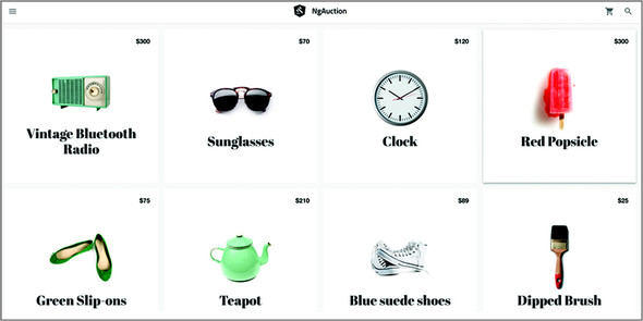
In this app, you’ll implement RWD using the Flex Layout library and its ObservableMedia service, introduced earlier. On large screens, the landing page of ngAuction will display four products per row, as shown in figure 7.6.
Figure 7.6. Rendering ngAuction on large screens

Note
We borrowed the data and images from the Google app illustrating the Polymer library (see http://mng.bz/Y5d9).
The app will be subscribed to the ObservableMedia service using the async pipe and will automatically change the layout to three products per row as soon as the width of the window changes to a medium size, as shown in figure 7.7.
Figure 7.7. Rendering ngAuction on medium screens

On small screens, the app will change to the two-column layout, as shown in figure 7.8.
Figure 7.8. Rendering ngAuction on small screens

The app will also change its layout when rendered on extra-small (one-column layout) and extra-large screens (five-column layout).
7.2.2. Generating a new ngAuction app
Note
Source code for this chapter can be found at https://github.com/Farata/angulartypescript and www.manning.com/books/angular-development-with-typescript-second-edition.
This time, you’ll generate the project using the Angular CLI new command with options. The new ngAuction will use the Sass preprocessor for styles with the SCSS syntax. You also want to specify the nga- prefix, so each newly generated component will have this prefix in its selector:
ng new ng-auction --prefix nga --style scss
Note
We discuss the benefits of using SCSS in the next section, “Creating a custom Angular Material theme with Sass.”
Change to the ng-auction directory and run the following commands to add Angular Material and Flex Layout libraries to the project:
npm install @angular/material @angular/cdk     1
npm i @angular/flex-layout                     2
- 1 Installs the Angular Material library and Component Development Kit. The Angular Material library also requires the animations package, which was already installed by Angular CLI during the project generation.
- 2 Installs the Flex Layout library
The Angular Material library comes with four prebuilt themes, and you had a chance to try one of them in section 5.6.1 in chapter 5. But what if none of the prebuilt themes fits your UI requirements?
7.2.3. Creating a custom Angular Material theme with Sass
If you want to create a custom Angular Material theme for your app, read the Theming Guide at https://material.angular.io/guide/theming. In this section, we’ll just give you a code review of the .scss files that we created to customize the theme for ngAuction.
When you generated the ngAuction app, you used the option --style scss. By doing so, you informed Angular CLI that you’re not going to use CSS files, but instead will use the Syntactically Awesome Style Sheets, also known as Sass (see http://sass-lang.com). Sass is an extension to CSS with its own preprocessor. Some Sass benefits include the following:
- Variables— Assigning styles to variables and reusing them in multiple stylesheets
- Nesting— An easy-to-write and -read syntax for nested CSS selectors
- Mixins— Blocks of styles that can include variables
Sass provides two syntaxes, Sass and SCSS, and you’ll use the latter in this book. If you were installing SaaS separately, you’d need to run your .scss files through the preprocessor to compile them into regular .css files before deployment. But Angular CLI supports Sass out of the box, so the preprocessor does its job during bundling.
Here’s a quick introduction to SCSS syntax:
- Variables— A variable name starts with the dollar sign. The following code snippet declares and uses the variable $font-stack:
$font-stack: Helvetica, sans-serif;

body {
  font: 100% $font-stack;
}
This variable can be used in multiple places, and if you decide to change the Helvetica font to another one, you do it in one place instead of making changes in each and every .css file where you used it. - Nesting— It’s an easy-to-read syntax for writing nested CSS selectors. The following sample shows how to nest the ul and a style selectors inside the div selector:
div { ul { margin: 0; } a { display: block; } } - Mixins— A mixin is a block of Sass style. A mixin can be added to your styles with @include. Mixins can also use variables and can be invoked as functions with arguments, as in mat-palette($mat-red);.
- Partials— Partials are just files with code fragments meant to be imported by other Sass files. Partials must have names that start with an underscore, such as _theme.scss. When you import a partial, the underscore isn’t needed, as in @import './theme'; Partials aren’t compiled into separate CSS files—their content is compiled only as a part of .scss files that import them.
- Imports— The @import statement allows you to import styles located in other files. Although CSS also has an @import keyword, it makes an additional HTTP request for each file. With Sass, all imports are combined into a single CSS file during preprocessing, so only one HTTP request is needed to load the CSS.
In your ngAuction app, you’ll create the styles directory, move the generated styles.scss file there, and add one more partial, _theme.scss. The content of _theme.scss is shown in the following listing. You use the $mat-cyan palette defined in the imported file _theming.scss.
Listing 7.6. _theme.scss
@import '~@angular/material/theming';
$nga-primary: mat-palette($mat-cyan);                                   1
$nga-accent:  mat-palette($mat-cyan, A200, A100, A400);                 2
$nga-warn:    mat-palette($mat-red);                                    3

$nga-theme:   mat-light-theme($nga-primary, $nga-accent, $nga-warn);    4

$nga-background: map-get($nga-theme, background);                       5
$nga-foreground: map-get($nga-theme, foreground);                       6

$nga-typography: mat-typography-config();                               7
- 1 Declares a variable for the primary palette and initializes it with $mat-cyan palette
- 2 Declares and initializes a variable for the accent palette specifying a default, lighter, and darker hue of $mat-cyan
- 3 Declares and initializes a variable for the warning palette
- 4 Creates the theme (Sass object containing all palettes)
- 5 Declares and initializes a variable for the background palette
- 6 Declares and initializes a variable for the foreground palette
- 7 Declares and initializes the variable for typography
In the _theme.scss file, you used the cyan color for the primary and accent palettes. You can find their definitions in node_modules/@angular/material/_theming.scss.
In the following listing, you add styles in styles.scss, starting from importing the preceding _theme.scss.
Listing 7.7. styles.scss
@import './theme';
@import url('https://fonts.googleapis.com/icon?family=Material+Icons');    1
 @import url('https://fonts.googleapis.com/css?family=Titillium+Web:600'); 2
 @import url('https://fonts.googleapis.com/css?family=Abril+Fatface');     3

// Be sure that you only ever include this mixin once!
@include mat-core();                                                       4

@include angular-material-theme($nga-theme);                               5

// Global styles.
html {
  -moz-osx-font-smoothing: grayscale;
  -webkit-font-smoothing: antialiased;
  -webkit-box-sizing: border-box;
  -moz-box-sizing: border-box;
  box-sizing: border-box;
  height: 100%;
}

body {
  color: #212121;
  background-color: #f3f3f3;
  font-family: mat-font-family($nga-typography);
  line-height: mat-line-height($nga-typography, body-1);
  font-size: mat-font-size($nga-typography, body-1);
  height: 100%;
  margin: 0;
}
- 1 Imports Google Material icons
- 2 Imports the Titillium Web fonts (you’ll use it for the toolbar title and later for bid values)
- 3 Imports the Abril Fatface fonts (you’ll use it for product titles)
- 4 Imports Angular Material core styles that aren’t theme-dependent
- 5 Loads your custom theme configured in _theme.scss
The styles.scss and _theme.scss files define your global styles for the entire app, and you’ll specify them in the styles property in the .angular-cli.json file. In ngAuction, you’ll also be styling individual components, and _theme.scss will be reused in each component. We’ve intentionally broken the style definition into two files so you can reuse _theme.scss (just the variables definitions) in components without duplicating the core styles, images, and fonts used in styles.scss.
Now your custom theme is configured, and you can start working on the UI of the landing page of ngAuction.
7.2.4. Adding a toolbar to the top-level component
Figure 7.6 shows the landing page of ngAuction, which includes the Material toolbar and the HomeComponent. To be more precise, it includes the toolbar and a <router-outlet> tag where you render the HomeComponent. Let’s start with creating the first version of the toolbar. This toolbar will include the menu icon on the left, the logo of ngAuction in the middle, and the shopping cart icon on the right. It won’t include the Search button (you’ll add that in section 11.8 in chapter 11) and will look like figure 7.9.
Figure 7.9. The toolbar
On the left, you use the Google Material icon menu, and on the right, shopping_cart. For the logo, you place the Google Material gavel icon on top of the shape resembling the Angular logo, and save it in the logo.svg file, included with the book’s source code.
As you learned in the hands-on section of chapter 5, to use Angular Material components, you should include the corresponding modules in the imports section of the root module of your app. In your toolbar, you’ll need MatToolbarModule, MatButtonModule, and MatIconModule. Since you’re going to use the Flex Layout library, you’ll also need to add FlexLayoutModule to the root module. Later in this section, you’ll use HttpClient to read the product data, so you need to add the HttpClientModule to the root module.
Update the CLI-generated app.module.ts to include the modules in the following listing.
Listing 7.8. app.module.ts
import {BrowserModule} from '@angular/platform-browser';
import {NgModule} from '@angular/core';
import {MatButtonModule} from '@angular/material/button';
import {MatIconModule} from '@angular/material/icon';
import {MatToolbarModule} from '@angular/material/toolbar';
import {FlexLayoutModule} from '@angular/flex-layout';
import {HttpClientModule} from '@angular/common/http';
import {AppComponent} from './app.component';

@NgModule({
  declarations: [
    AppComponent
  ],
  imports: [
    BrowserModule,
    MatButtonModule,       1
     MatIconModule,        1
     MatToolbarModule,     1
     FlexLayoutModule,     2
     HttpClientModule      3
   ],
  providers: [],
  bootstrap: [AppComponent]
})
export class AppModule {}
- 1 Adds the required modules from the Angular Material library
- 2 Adds the Flex Layout module
- 3 Adds HttpClientModule—you’ll use HttpClient for getting the product data
Replace the generated app.component.html with the following listing.
Listing 7.9. app.component.html
<mat-toolbar class="toolbar">
  <button class="toolbar__icon-button" mat-icon-button>       1
     <mat-icon>menu</mat-icon>
  </button>

  <div class="toolbar__logo-title-group"
       fxLayout
       fxLayoutAlign="center center">                         2
     <a routerLink="/"                                        3
        fxLayout>
      <img class="toolbar__logo"
           src="/assets/logo.svg"
           alt="NgAuction Logo">
    </a>
    <a class="toolbar__title"                                 4
        routerLink="/">NgAuction</a>
  </div>


  <div fxFlex></div>                                          5

  <button mat-icon-button class="toolbar__icon-button         6
                    toolbar__shopping-cart-button">
    <mat-icon>shopping_cart</mat-icon>
  </button>

</mat-toolbar>

<!--<router-outlet></router-outlet>-->                        7
- 1 The menu button with the icon
- 2 Displays the logo in the center of the toolbar
- 3 Turns the logo into a clickable link that will display HomeComponent after you configure routes
- 4 Turns the text ngAuction into a clickable link
- 5 A filler to push the shopping cart icon to the right
- 6 The shopping cart button with an icon
- 7 You’ll keep the router outlet commented out until you configure routes.
To make the toolbar look like figure 7.9, you need to add the following listing’s styling to the app.component.scss file.
Listing 7.10. app.component.scss
@import '../styles/theme';                                1
:host {                                                   2
   display: block;
  height: 100%;
}

.toolbar {                                                3
   background-color: mat-color($nga-background, card);
  position: relative;
  box-shadow: 0 1px mat-color($nga-foreground, divider);
}

.toolbar__logo-title-group {                              4
   position: absolute;
  right: 50%;
  left: 50%;
}

.toolbar__logo {                                          5
   height: 32px;
  margin-right: 16px;
}

.toolbar__title {                                         6
   color: mat-color($nga-foreground, text);
  font-family: 'Titillium Web', sans-serif;
  font-weight: 600;
  text-decoration: none;
}

.toolbar__icon-button {                                   7
   color: mat-color($nga-foreground, icon);
}

.toolbar__shopping-cart-button {                          8
   margin-right: 8px;
}
- 1 Imports your custom theme
- 2 Uses Angular pseudo selector :host to style the component that hosts the AppComponent
- 3 Applies the same background as in the Material card component in this theme (it’s white in your theme)
- 4 Styles the logo name
- 5 Styles the logo image
- 6 Styles the toolbar title
- 7 Styles the icon foreground
- 8 Styles the shopping cart button
Running the ng serve command will render the ngAuction app that looks like figure 7.9.
You have a toolbar UI rendered, and now you need to show products under the toolbar. First, you need to create the ProductService that will provide the product data, and then you’ll create the HomeComponent that will render the data. Let’s start with the ProductService.
7.2.5. Creating the product service
The product service needs data. In real-world apps, the data would be supplied by the server, and you’ll do that in chapter 12. For now, you’ll just use the JSON file that contains the information about the product. The product images will be located on the client side as well. The code samples that come with the book include the src/data/products.json file, of which a fragment is shown in the following listing.
Listing 7.11. A fragment from src/data/products.json
[
  {
    "id": 1,
    "description" : "Isn't it cool when things look old, but they're not...",
    "imageUrl" : "data/img/radio.png",
    "price" : 300,
    "title" : "Vintage Bluetooth Radio"
  },
  {
    "id": 2,
    "description" : "Be an optimist. Carry Sunglasses with you at all times..
     .",
    "featured" : true,
    "imageUrl" : "data/img/sunnies.png",
    "price" : 70,
    "title" : "Sunglasses"
  }
  ...
  ]
This file includes URLs of the product images located in the data/img folder. If you’re following along and are trying to build ngAuction by yourself, copy the src/data directory into your project from the code that comes with the book and add the line "data" to the app property assets in the .angular-cli.json file.
You’ll use the ProductService class in more than one component; you’ll generate it in the folder src/app/shared/services. You’ll be adding other reusable services in this folder later on (such as SearchService). You’ll generate ProductService using the following Angular CLI command:
ng generate service shared/services/product
Then you’ll add the provider for this service to the app.module:
...
import {ProductService} from './shared/services/product.service';

@NgModule({
  ...
  providers: [ProductService]
})
export class AppModule {}
The import statement for ProductService is rather long, and it points at the file where this service is implemented. As your application grows, the number of services as well as the number of import statements in your module increases, polluting the module code.
Create the file named index.ts in the services folder like so:
import {Product, ProductService} from './product.service';

export {Product, ProductService} from './product.service';
You import the Product and ProductService classes and reexport them right away. Now the import statement in the app.module can be simplified to look like this:
import {Product, ProductService} from './shared/services';
If you have just one reexported class, this may look like overkill. But if you have multiple classes in the services folder, you can write just one import statement for all classes, functions, or variables that you want to import—for example:
import { ProductService, Product, SearchService } from './shared/services';
Keep in mind, this will work only if the file with such reexports is called index.ts.
The product.service.ts file includes the Product interface and the ProductService class. The Product interface defines the type of objects returned by the methods of the ProductService class: getAll() and getById(). The code for your ProductService is shown in the following listing.
Listing 7.12. product.service.ts
import {Injectable} from '@angular/core';
import {HttpClient} from '@angular/common/http';
import {Observable} from 'rxjs';
import {map} from 'rxjs/operators';

export interface Product {                                            1
   id: number;
  title: string;
  price: number;
  imageUrl: string;
  description: string;
}

@Injectable()
export class ProductService {
  constructor(private http: HttpClient) {}                             2

  getAll(): Observable<Product[]> {                                    3
     return this.http.get<Product[]>('/data/products.json');
  }

  getById(productId: number): Observable<Product> {                    4
     return this.http.get<Product[]>('/data/products.json')
  .pipe(
    map(products => <Product>products.find(p => p.id === productId));  5
   )
  }
}
- 1 Defines the Product type
- 2 Injects the HttpClient object
- 3 This function declares an Observable that can return all Product objects.
- 4 This function declares an Observable that can return products by ID.
- 5 map() finds the product ID that matches the function argument.
Because you don’t have a real data server, both methods read the entire products.json file, and the getById() method also applies find() to the array of products to find the one with a matching ID.
You defined the type Product as an interface and not a class. Because JavaScript doesn’t support interfaces, the compiled code won’t include Product. If you were to define Product as a class, the TypeScript compiler would turn the Product class into either a JavaScript function or a class and would include it in the executable code. Defining types as TypeScript interfaces instead of classes reduces the size of the runnable code.
In the next section, you’ll create the feature module that will include HomeComponent—the first consumer of the ProductService.
7.2.6. Creating the home module
You want to create each view as a feature module. This will allow you to lazy load them, and the code of each view will be built as a separate bundle. Generate a feature home module as follows:
ng generate module home
This command will create a src/app/home directory containing the home.module.ts file with the content shown in the following listing.
Listing 7.13. home.module.ts
import {NgModule} from '@angular/core';
import {CommonModule} from '@angular/common';

@NgModule({
  imports: [
    CommonModule
  ],
  declarations: []
})
export class HomeModule {}
You can generate the home component with the following command:
ng generate component home
After running this command, Angular CLI will print the message that four files were generated (the home component) and one file was updated (the home module)—the HomeComponent was added to the declarations section in the @NgModule decorator of the module:
create src/app/home/home.component.scss (0 bytes)
create src/app/home/home.component.html (23 bytes)
create src/app/home/home.component.spec.ts (614 bytes)
create src/app/home/home.component.ts (262 bytes)
update src/app/home/home.module.ts (251 bytes)
You’ll use the Flex Layout library in this module, so you want to configure the default route so that it renders HomeComponent. Also, you’re going to display products using the <mat-grid-list> component from the Angular Material library. Add the required code to home.module.ts so it looks like the following listing.
Listing 7.14. modified home.module.ts
import {NgModule} from '@angular/core';
import {CommonModule} from '@angular/common';
import {RouterModule} from '@angular/router';
import {FlexLayoutModule} from '@angular/flex-layout';
import {MatGridListModule} from '@angular/material/grid-list';
import {HomeComponent} from './home.component';

@NgModule({
  imports: [
    CommonModule,
    RouterModule.forChild([                    1
       {path: '', component: HomeComponent}
    ]),
    FlexLayoutModule,                          2
     MatGridListModule                         3
   ],
  declarations: [HomeComponent]
})
export class HomeModule {}
- 1 Adds the route configuration for your feature module
- 2 Adds the Flex Layout library
- 3 Adds the Angular Material module required by <mat-grid-list>
The next step is to update the HomeComponent in the generated home.component.ts file. You’ll inject two services into this component: ProductService and ObservableMedia. You’ll invoke the getAll() method on ProductService to get product data. ObservableMedia will be watching the viewport width to change the UI layout accordingly. To be more specific, the product data will be shown in a grid, and the ObservableMedia service will change the number of columns in the grid from one to five, based on the current viewport width. The code of the HomeComponent is shown in the next listing.
Listing 7.15. home.component.ts
import {Observable} from 'rxjs';
import {map} from 'rxjs/operators';

import {Component} from '@angular/core';
import {ObservableMedia} from '@angular/flex-layout';
import {Product, ProductService} from '../shared/services';

@Component({
  selector: 'nga-home',
  styleUrls: [ './home.component.scss' ],
  templateUrl: './home.component.html'
})
export class HomeComponent {
  readonly columns$: Observable<number>;                                   1
   readonly products$: Observable<Product[]>;                              2

  readonly breakpointsToColumnsNumber = new Map([                          3
    [ 'xs', 1 ],
    [ 'sm', 2 ],
    [ 'md', 3 ],
    [ 'lg', 4 ],
    [ 'xl', 5 ],
  ]);

  constructor(private media: ObservableMedia,
              private productService: ProductService) {                    4
     this.products$ = this.productService.getAll();                        5

    this.columns$ = this.media.asObservable()                              6
       .pipe(
        map(mc => <number>this.breakpointsToColumnsNumber.get(mc.mqAlias)) 7
       );
  }
}
- 1 An observable to supply the number of columns in the grid
- 2 An observable of products
- 3 Maps the media query alias to the number of columns in the grid
- 4 Injects ObservableMedia and ProductService
- 5 Gets data about all products
- 6 Turns the ObservableMedia object into an Observable
- 7 Gets the number of the grid column based on the emitted media query alias; <number> means casting from object to number
The getAll() method on ProductService initializes the product$ variable of type Observable. You don’t see the invocation of the subscribe() method here, because you’ll use the async pipe in the template of the home component.
The role of ObservableMedia is to send the media query alias to the component, indicating the current width of the user’s device viewport. This width may be changing if the viewport is a window in the browser and the user resizes it. If the user runs this app on a smartphone, the width of the viewport won’t change, but HomeComponent needs to know it anyway to render the grid of products.
Now you need to replace the generated template in home.component.html with the markup to display products in a grid of rows and columns. For the grid, you’ll use the <mat-grid-list> component from the Angular Material library. The content of each grid cell will be rendered in a <mat-grid-tile> component.
In this template, you’ll use the async pipe twice. The first async pipe will subscribe to the observable that emits the number of columns in a grid, and the second pipe will subscribe to the observable that emits product data. The code of the home.component.html file is shown in the following listing.
Listing 7.16. home.component.html
<div class="grid-list-container">
  <mat-grid-list [cols]="columns$ | async"                                 1
                  gutterSize="16">
    <mat-grid-tile class="tile" *ngFor="let product of products$ | async"> 2
       <a class="tile__content"                                            3
          fxLayout="column"
         fxLayoutAlign="center center"
         [routerLink]="['/products', product.id]">                         4

        <span class="tile__price-tag"
              ngClass.xs="tile__price-tag--xs">                            5
           {{ product.price | currency:'USD':'symbol':'.0' }}
        </span>

        <div class="tile__thumbnail"
             [ngStyle]="{'background-image': 'url(' + product.imageUrl + ')'}"></div>

        <div class="tile__title"
             ngClass.xs="tile__title--xs"
             ngClass.sm="tile__title--sm">{{ product.title }}</div>
      </a>
    </mat-grid-tile>
  </mat-grid-list>
</div>
- 1 Subscribes to the number of columns and binds it to the cols property of <mat-grid-list>
- 2 Renders a <mat-grid-tile> for each product using the data from the products$ observable
- 3 Wraps the content of each tile in the <a> tag to turn the tile into a clickable link
- 4 Clicking on the tile will navigate to the path /products, passing the selected product’s id as a parameter.
- 5 For extra-small viewports, adds the styles defined in tile__price-tag--xs
Note
Navigation to the product-detail screen isn’t implemented in this version of ngAuction. Clicking the product tile will result in an error in the browser console.
We’d like to explain the last annotation in listing 7.16 a bit more. That <span> element is styled as defined in tile__price-tag, but if the size of the viewport becomes extra small (xs), the Flex Layout ngClass.xs directive will add the styles defined in tile__price-tag--xs. If you compare the definitions of the tile__price-tag and tile__price-tag--xs styles in listing 7.17, you see that merging these two styles would mean changing the font size from 16 px to 14 px.
Tip
We use the symbols __ and -- in naming some styles, as recommended by the block, element, modifier (BEM) methodology (see http://getbem.com).
To complete the HomeComponent, you need to add some styles in home.component .scss.
Listing 7.17. home.component.scss
@import '../../styles/theme';                               1
:host {
  display: block;
}

.grid-list-container {
  margin: 16px;
}

.tile {
  background-color: mat-color($nga-background, card);       2

  &:hover {
    @include mat-elevation(4);                              3
     transition: .3s;
  }
}

.tile__content {
  display: block;
  height: 100%;
  width: 100%;
  padding: 16px;
  position: relative;
  text-align: center;
  text-decoration: none;
}

.tile__price-tag {                                          4
   color: mat-color($nga-foreground, text);
  font-size: 16px;
  font-weight: 700;
  position: absolute;
  right: 20px;
  top: 20px;
}

.tile__price-tag--xs {                                      5
   font-size: 14px;
}

.tile__thumbnail {
  background: no-repeat 50% 50%;
  background-size: contain;
  height: 50%;
  width: 50%;
}

.tile__title {                                              6
   color: mat-color($nga-foreground, text);
  font-family: 'Abril Fatface', cursive;
  font-size: mat-font-size($nga-typography, display-1);     7
   line-height: mat-line-height($nga-typography, display-1);
}

.tile__title--sm {                                          8
   font-size: mat-font-size($nga-typography, headline);
  line-height: mat-line-height($nga-typography, headline);
}

.tile__title--xs {                                          9
   font-size: mat-font-size($nga-typography, title);
  line-height: mat-line-height($nga-typography, title);
}
- 1 Imports your customized theme
- 2 Makes the tile background color the same as the Angular Material card (white)
- 3 If the user hovers over the tile, elevates the tile to level 4 by adding the shadow effect (returned by the mat-elevation mixin)
- 4 Default style for the product price tag
- 5 Style for the product price tag for extra-small viewports
- 6 Default style for the product title
- 7 As per Material Design spec, uses Display 1 for font styles instead of specifying the hardcoded size
- 8 Style for the product title for small viewports
- 9 Style for the product title for extra-small viewports
The HomeComponent is ready. What do you need to do to render it under the toolbar?
7.2.7. Configuring routes
In the beginning of this hands-on exercise, we stated that each view on ngAuction will be a separate module, and you created the HomeComponent as a module. Now you need to configure the route for this module. Create an src/app/app.routing.ts file with the following content:
import {Route} from '@angular/router';
export const routes: Route[] = [
  {
    path: '',
    loadChildren: './home/home.module#HomeModule'
  }
];
As you see, you use the syntax for lazy-loaded modules, as explained in section 4.3 in chapter 4. You to load this configuration in app.module.ts by invoking Router.forRoot():
...
import {RouterModule} from '@angular/router';
import {routes} from './app.routing';

@NgModule({
  ...
  imports: [
    ...
    RouterModule.forRoot(routes)
  ]
  ...
})
export class AppModule { }
The last step is to uncomment the last line in app.component.html that has the <router-outlet> tag, so the app component template is laid out as follows:
<mat-toolbar>...</mat-toolbar>

<router-outlet></router-outlet>
The coding part of the landing page is done.
7.2.8. Running ngAuction
The first version of the new ngAuction is ready, so let’s build the dev bundles and see how it looks in the browser. Running ng serve produces the output shown in figure 7.10.
Figure 7.10. Bundling ngAuction with ng serve
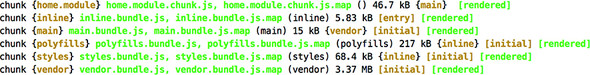
Note the first line: Angular CLI placed the home module in a separate bundle. It did that because in configuring routes, you used the syntax for lazy-loaded modules, but when you open the browser at http://localhost:4200, you’ll see that the home module was loaded, as shown in figure 7.11.
Figure 7.11. Running ngAuction
The home module was eagerly loaded because it was configured as a default route (mapped to an empty path). The landing page of ngAuction is ready, except it doesn’t have the Search button on the toolbar. You’ll add it in section 11.8 in chapter 11.
Tip
If you click on any of the product tiles, the browser console shows an error, as in “Cannot match any routes. URL Segment: ‘products/2’.” This error will disappear in chapter 9’s version of ngAuction, after you develop the product-detail page.
Summary
- You can keep a single code base of the web app that will adopt its UI based on the available width of the user device.
- The Flex Layout library allows you to subscribe to notifications about viewport width changes and apply the respective UI layout.
- The Flex Layout library includes the ObservableMedia class, which can notify you about the current width of the viewport, sparing you from writing CSS for this purpose.