Chapter 11. Validating forms
This chapter covers
- Using built-in form validators
- Creating custom validators
- Handling sync and async validation
The user fills out a form and clicks Submit, expecting that the app will process the data in some way. In web applications, the data is usually sent to the server. Often, the user receives some data back (for example, search results), but sometimes, the data is just saved in the server’s storage (for example, creating a new order). In any case, the data should be valid so the server’s software can do its job properly.
For example, an app can’t log in a user unless they’ve provided a user ID and a password in the login form. Both fields are required—otherwise, the form isn’t valid. You shouldn’t even allow submitting this form until the user has filled out all required fields. A user registration form may be considered invalid if the password doesn’t contain at least 8 characters, including a number, an uppercase letter, and a special character.
In this chapter, we’ll show you how to validate forms in Angular using built-in validators and how to create custom forms. At the end of the chapter, you’ll develop a new version of ngAuction that will include three fields. The entered values will be validated first, and only afterward will they be submitted for finding products that meet entered criteria.
We’ll start exploring built-in validators by using a reactive form and then move to a template-driven one.
11.1. Using built-in validators
The Angular Forms API includes the Validators class, with static functions such as required(), minLength(), maxLength(), pattern(), email(), and others. These built-in validators can be used in templates by specifying the directives required, minLength, maxLength, pattern, and email, respectively. The pattern validator enables you to specify a regular expression.
Validators are functions that conform to the interface in the following listing.
Listing 11.1. The ValidatorFn interface
interface ValidatorFn {
  (c: AbstractControl): ValidationErrors | null;
}
If a validator function returns null, that means no errors. Otherwise, it’ll return a ValidationErrors object of type {[key: string]: any}, where the property names (error names) are strings, and values (error descriptions) can be of any type.
A validator function should declare a single argument of type AbstractControl (or its descendants) and return an object literal or null. There, you implement business logic for validating user input. AbstractControl is the superclass for FormControl, FormGroup, and FormArray; hence, validators can be created for all model classes.
With the reactive Forms API, you can either provide validators while creating a form or form control or attach validators dynamically during runtime. The next listing shows an example that attaches the required validator to the form control represented by the variable username.
Listing 11.2. Attaching the required validator
import { FormControl, Validators } from '@angular/forms';
...
let username = new FormControl('', Validators.required);       1
- 1 Attaches the required validator to a FormControl
Here, the first parameter of the constructor is the initial value of the control, and the second is the validator function. You can also attach more than one validator to a form control.
Listing 11.3. Attaching two validators
let username = new FormControl('',
           [Validators.required, Validators.minLength(5)]);      1
- 1 Attaches required and minLength validators to a FormControl
To query the form or form control’s validity, use the valid property, which can have one of two values, true or false:
let isValid: boolean = username.valid;
The preceding line checks whether the value entered in the form control passes or fails all the validation rules attached to this control. If any of the rules fails, you’ll get error objects generated by the validator functions, as in the next listing.
Listing 11.4. Getting validators’ errors
let errors: {[key: string]: any} = username.errors; 1
- 1 Gets all errors reported by validators
With the method hasError(), you can check whether a form or control has specific errors and conditionally show or hide corresponding error messages.
Now let’s see how to apply built-in validators in a template-driven form. You’ll create an app that illustrates how to show or hide error messages for required, minLength, and pattern validators. The UI of this app may look like figure 11.1 if the user enters an invalid phone number.
Figure 11.1. Showing validation errors
The app component’s template will include the <div> element with error messages located under the <input>, and the <div> will be hidden if the phone number is valid or if its value wasn’t entered (pristine), as shown in the following listing. The Submit button will stay disabled until the user enters a value that passes all validators.
Listing 11.5. Conditionally showing and hiding errors
@Component({
  selector: 'app-root',
  template: `
    <form #f="ngForm" (ngSubmit)="onSubmit(f.value)" >
      <div>
        Phone Number:
        <input type="text" name="telephone" ngModel
               required                                                  1
                pattern="[0-9]*"                                         2
                minlength="10"                                           3
                #phone="ngModel">                                        4
         <div [hidden]="phone.valid || phone.pristine">                  5
           <div class="error" [hidden]="!phone.hasError('required')">    6
                Phone is required</div>
          <div class="error" [hidden]="!phone.hasError('minlength')">    7
                Phone has to have at least 10 digits</div>
          <div class="error" [hidden]="!phone.hasError('pattern')">      8
                Only digits are allowed</div>
        </div>

      </div>
      <button type="submit" [disabled]="f.invalid">Submit</button>       9
     </form>
  `,
  styles: ['.error {color: red}']
})
export class AppComponent {
  onSubmit(formData) {
    console.log(formData);
  }
}
- 1 Adds the required validator
- 2 Adds the pattern validator to allow only digits
- 3 Adds the minlength validator
- 4 The local variable #phone gives access to the value of this control’s model.
- 5 Hides the errors section if the form control is valid or pristine
- 6 Shows the error message if the value was entered and then erased
- 7 Shows the error message if the value violates the minlength requirement
- 8 Shows the error message if the value doesn’t match the regular expression
- 9 Disables the Submit button until the form is valid
To see this app in action, run npm install in the project folder named form-validation, and then run the following command:
ng serve --app threevalidators -o
The error returned by a validator is represented by a JavaScript object that has a property whose name briefly describes an error. The property value can be of any type and may provide additional error details. For example, the standard Validators.minLength() validator returns an error object as shown here:
{
  minlength: {
    requiredLength: 7,
    actualLength: 5
  }
}
This object has a property named minlength, which means that the minimum length is invalid. The value of this property is also an object with two fields: requiredLength and actualLength. These error details can be used to display a user-friendly error message. Not all validators provide error details. Sometimes, the property just indicates that an error has occurred. In this case, the property is initialized with the value true.
The following snippet shows an example of the built-in Validators.required() error object:
{
  required: true
}
In section 11.6, you’ll find an example of how to extract the error description from the ValidationErrors object.
Table 11.1 provides a brief description of Angular built-in validators offered by the Validators class.
Table 11.1. Built-in validators
|
Validator |
Description |
|---|---|
| min | A value can’t be less than the specified number; it can be used only with reactive forms. |
| max | A value can’t be greater than the specified number; it can be used only with reactive forms. |
| required | The form control must have a non-empty value. |
| requiredTrue | The form control must have the value true. |
| The form control value must be a valid email. | |
| minLength | The form control must have a value of a minimum length. |
| maxLength | The form control can’t have more than the specified number of characters. |
| pattern | The form control’s value must match the specified regular expression. |
In the code sample that validated the phone number, the validators were checking the value after each character entered by the user. Is it possible to control when validation starts?
11.2. Controlling when validation starts
Prior to Angular 5, the validators performed their work each time a value in the form control changed. Now, you can use the updateOn property, which gives you better control over the validation process. When you attach a validator, you can specify when validation should start. The updateOn property can take one of these values:
- change— This is the default mode, with validators checking a value as soon as it changes. You saw this behavior in the previous section when validating a phone number.
- blur— Checks validity of a value when the control loses focus.
- submit— Checks validity when the user submits the form.
To try out these options with a template-driven form, add [ngModelOptions]= "{updateOn:'blur'}" to the telephone input field in listing 11.5, and the user’s input will be validated only when you move the focus from this control. To start validation when the Submit button is clicked or the Enter key is pressed, use the option [ngModelOptions]="{updateOn:'submit'}".
Note
If you use the sample from listing 11.5 with the option updateOn: 'submit', remove the code that conditionally disables the Submit button or use the Enter key to test the validation.
In case of the reactive API, you would set the update mode for a form as follows.
Listing 11.6. Applying validators on blur using the reactive API
let telephone = new FormControl('',
           [{validators: Validators.minLength(10),    1
              updateOn:'blur'});                      2
- 1 Attaches the minLength validator to a FormControl
- 2 Validates the value when focus moves out of the FormControl
You can also specify the update mode on the form level using the property ngFormOptions, as shown in the following listing.
Listing 11.7. Applying validators on blur using template-driven API
<form #f="ngForm"
      (ngSubmit)="onSubmit(f.value)"
      [ngFormOptions]="{updateOn: 'blur'}">        1
   ...
</form>
- 1 Each form control is validated when focus moves out of it.
Built-in validators are good for basic validation, but what if you need to apply application-specific logic to decide whether the entered value is valid?
11.3. Custom validators in reactive forms
You can create custom validators in Angular. Similar to built-in validators, custom validators should comply with the interface in the following listing.
Listing 11.8. The interface custom validators must conform to
interface ValidatorFn {
  (c: AbstractControl): ValidationErrors | null;        1
 }
- 1 In case of errors, returns the ValidationErrors object; otherwise, null
You need to declare a function that accepts an instance of one of the control types—FormControl, FormGroup, or FormArray—and returns the ValidationErrors object or null. The next listing shows an example of a custom validator that checks whether the control’s value is a valid social security number (SSN).
Listing 11.9. A sample custom validator
function ssnValidator(control: FormControl): ValidationErrors | null {   1
   const value = control.value || '';                                    2
   const valid = value.match(/^d{9}$/);                                 3
   return valid ? null : { ssn: true };                                  4
 }
- 1 Validates the FormControl and returns either an error object or null
- 2 Gets the control’s value if available, or uses an empty string otherwise
- 3 Matches the value against a regular expression that represents the SSN nine-digit format
- 4 If the value is an invalid SSN, returns the error object; the error name is ssn
You can attach custom validators to form controls the same way you attach the built-in ones, as you can see in the following listing.
Listing 11.10. Attaching custom validators to form controls
@Component({
  selector: 'app-root',
  template: `
    <form [formGroup]="myForm">
      SSN: <input type="text" formControlName="socialSecurity">
         <span [hidden]="!myForm.hasError('ssn', 'socialSecurity')">     1
             SSN is invalid
         </span>
    </form>
  `
})
export class AppComponent {
  myForm: FormGroup;

  constructor() {
    this.myForm = new FormGroup({
      socialSecurity: new FormControl('', ssnValidator)                  2
     });
  }
}
- 1 Shows an error message if the socialSecurity form control has the error named ssn
- 2 Attaches your custom ssnValidator
You’ll see a window with an input field that requires you to enter nine digits to make the error message go away.
Your ssnValidator returns an error object that indicates there’s something wrong with the SSN value: { ssn: true }. You added the error text “SSN is invalid” to the HTML template. The ValidationErrors object can contain a more specific description of the error, for example {ssn: {description: 'SSN is invalid'}}, and you can get the error description using the getError() method. The following listing shows a modified version of ssnValidator and the template.
Listing 11.11. Adding the error description in a custom validator
function ssnValidator(control: FormControl): {[key: string]: any} {
  const value: string = control.value || '';
  const valid = value.match(/^d{9}$/);
  return valid ? null : {ssn: {description: 'SSN is invalid'}};            1
 }

@Component({
  selector: 'app',
  template: `
    <form [formGroup]="myForm">
      SSN: <input type="text" formControlName="socialSecurity">
           <span [hidden]="!myForm.hasError('ssn', 'socialSecurity')">     2
              {{myForm.getError('ssn', 'socialSecurity')?.description}}    3
            </span>
    </form>
  `
})
class AppComponent {
  myForm: FormGroup;

  constructor() {
    this.form = new FormGroup({
      'socialSecurity': new FormControl('', ssnValidator)
    });
  }
}
- 1 Creates a specific object with the description property that contains the description of the error
- 2 Gets the error message from the description property of the error
- 3 Shows an error message if the socialSecurity form control got the error named ssn
Note
In listing 11.10, you use Angular’s safe navigation operator, which is represented by a question mark and can be used in the component template. The question mark after the invocation of getError() means “Don’t try to access the property description if the object returned by getError() is undefined or null,” meaning when the entered value is valid. If you didn’t use the safe navigation operator, this code would produce the runtime error “cannot read property description of null” for valid SSN values.
If you run this app, the browser shows an empty input field and the message “SSN is invalid,” but the user didn’t have the chance to enter any value. Before showing a validation error message, always check whether the form control is dirty (has been modified). The <span> element should look like the following listing.
Listing 11.12. Using the dirty flag
<span [hidden]="!(myForm.get('socialSecurity').dirty                   1
                    && myForm.hasError('ssn', 'socialSecurity'))">
        {{myForm.getError('ssn', 'socialSecurity')?.description}}
 </span>
- 1 Checks whether the form control has been modified
Now let’s add some styling to this form. Angular’s Forms API offers a number of CSS classes that work hand in hand with their respective flags on the form: .ng-valid, .ng-invalid, .ng-pending, .ng-pristine, .ng-dirty, .ng-untouched, and .ng-touched. In the code sample, if the value is invalid and dirty, you want to change the background of the input field to be light pink, as shown in the following listing.
Listing 11.13. Adding styles to the input field
@Component({
  selector: 'app-root',
  template: `
    <form [formGroup]="myForm">
      SSN: <input type="text" formControlName="socialSecurity"
                  class="social">                                       1
       <span [hidden]="!(myForm.get('socialSecurity').dirty
                        && myForm.hasError('ssn', 'socialSecurity'))">
             {{myForm.getError('ssn', 'socialSecurity')?.description}}
      </span>
    </form>
  `,
  styles:[`.social.ng-dirty.ng-invalid {                                2
               background-color: lightpink;                             3
             }`]
})
- 1 Adds the CSS selector social
- 2 Is the field dirty and invalid?
- 3 Changes the background to light pink
The application that illustrates the use of ssnValidator in a reactive form is located in the reactive-validator directory, and you can run it as follows:
ng serve --app reactive-validator -o
Figure 11.2 shows how the browser will render this app if the value isn’t valid.
Figure 11.2. Showing the validation error and changing the background color
Now that you know how to create a custom validator for a single form control, let’s consider another scenario: validating a group of form controls.
11.4. Validating a group of controls
You can validate a group of form controls by attaching validator functions to a FormGroup instead of an individual FormControl. The following listing creates an equalValidator that ensures that the password and password confirmation fields on the sample user registration form have the same value.
Listing 11.14. A sample validator for a FormGroup
function equalValidator({value}: FormGroup): {[key: string]: any} {
  const [first, ...rest] = Object.keys(value || {});                 1
   const valid = rest.every(v => value[v] === value[first]);         2
   return valid ? null : {equal: true};                              3
 }
- 1 Using rest parameters, gets the names of all properties of FormGroup.value
- 2 Iterates through the properties’ values to check if they’re equal
- 3 If equal, returns null; otherwise, returns an error object with the error named equal
The signature of the preceding function conforms to the ValidatorFn interface: the first parameter is of type FormGroup, a subclass of AbstractControl, and the return type is an object literal. Note that you use object destructuring in the function argument to extract the value property from the instance of the FormGroup object.
You also use array destructuring combined with rest parameters in the first line of the function so you can iterate through the properties of FormGroup.value. You get the names of all properties in the value object and save them in two variables, first and rest. first is the name of a property that will be used as the reference value—values of all other properties must be equal to it to make validation pass. rest holds the names of all the other properties.
Finally, the validator function returns either null, if the values in the group are the same, or an error object, otherwise. Let’s apply the ssnValidator and equalValidator in the sample user registration form. The following listing shows the code of the modified AppComponent class.
Listing 11.15. A modified form model for a user registration form
export class AppComponent {
  formModel: FormGroup;

  constructor(fb: FormBuilder) {                        1
     this.formModel = fb.group({                        2
       username: ['', Validators.required],             3
       socialSecurity: ['', ssnValidator],              4
       passwordsGroup: fb.group({                       5
       password: ['', Validators.minLength(5)],         6
       pconfirm: ['']                                   7
     }, {validator: equalValidator})                    8
    });
  }

  onSubmit() {
      console.log(this.formModel.value);
  }
}
- 1 Injects the FormBuilder service
- 2 Creates the form model object
- 3 Creates the username control and attaches the required validator
- 4 Creates the socialSecurity control and attaches the ssnValidator
- 5 Creates the subgroup passwordsGroup for password and password confirmation controls
- 6 Creates the password control, applying the minLength validator
- 7 Creates the pconfirm control for confirming the password
- 8 Attaches the equalValidator to passwordsGroup to ensure that both entered passwords are the same
To display validation errors when the user enters invalid values, you’ll add a <span> element next to each form control in the template. Depending on the return of the hasError() method, the error text will be either shown or hidden, as in the following listing.
Listing 11.16. The template and styles of the user registration component
template: `
    <form [formGroup]="formModel" (ngSubmit)="onSubmit()">
      <div>
        Username: <input type="text" formControlName="username">
        <span class="error"
              [hidden]="!formModel.hasError('required', 'username')">       1
               Username is required</span>
      </div>

      <div>
        SSN: <input type="text" formControlName="socialSecurity">
        <span class="error"
              [hidden]="!formModel.hasError('ssn', 'socialSecurity')">      2
               SSN is invalid</span>
      </div>

      <div formGroupName="passwordsGroup">
        <div>
          Password: <input type="password" formControlName="password">
          <span class="error"
                [hidden]="!formModel.hasError('minlength',
                ['passwordsGroup', 'password'])">                         3
                 Password is too short</span>
        </div>

        <div>
          Confirm password: <input type="password" formControlName="pconfirm">
          <span class="error"
                [hidden]="!formModel.hasError('equal', 'passwordsGroup')">  4
                 Passwords must be the same</span>
        </div>
      </div>

      <button type="submit" [disabled]="formModel.invalid">Submit</button>
    </form>
  `,
  styles: ['.error {color: red;} ']
['passwordsGroup', 'password'])"> 3
Password is too short</span>
</div>
<div>
Confirm password: <input type="password" formControlName="pconfirm">
<span class="error"
[hidden]="!formModel.hasError('equal', 'passwordsGroup')"> 4
Passwords must be the same</span>
</div>
</div>
<button type="submit" [disabled]="formModel.invalid">Submit</button>
</form>
`,
styles: ['.error {color: red;} ']
- 1 If the value of the username control is invalid, shows the error message
- 2 If the value of the socialSecurity control is invalid, shows the error message
- 3 If the value of the password control is invalid, shows the error message
- 4 If passwords are not the same, shows the error message
Note how you access the form model’s hasError() method. It takes two parameters: the name of the validation error you want to check and the control name from the form model. In the case of username, it’s a direct child of the top-level FormGroup that represents the form model, so you specify the name of the control. But the password field is a child of the nested FormGroup, so the path to the control is specified as an array of strings: ['passwordsGroup', 'password']. The first element is the name of the nested group, and the second is the name of the password field itself.
You can find the code for this app in the group-validators directory. To see this app in action, run the following command:
ng serve --app groupvalidators -o
Figure 11.3 illustrates the error messages produced by invalid values in the individual fields Username, SSN, and Password, as well as invalid values in the form group—provided passwords don’t match.
Figure 11.3. Showing multiple validation errors
11.5. Checking a form control’s status and validity
You already used such control properties as valid, invalid, and errors for checking field status. In this section, we’ll look at a number of other properties that help improve the user experience.
11.5.1. touched and untouched form controls
In addition to checking a control’s validity, you can also use the touched and untouched properties to check whether a form control was visited by the user. If the user puts the focus into a form control using the keyboard or mouse and then moves the focus out, this control becomes touched; while the focus remains in the control, it’s still untouched. This can be useful when displaying error messages—if the value in a form control is invalid, but it was never visited by the user, you can choose not to highlight it with red, because the user didn’t even try to enter a value. The following listing shows an example.
Listing 11.17. Using the touched property
<style>.hasError {border: 1px solid red;}</style>       1
<input type="text" required                             2
        name="username" ngModel #c="ngModel"            3
        [class.hasError]="c.invalid && c.touched">      4
- 1 Defines a CSS selector that highlights the border of the invalid form control with red
- 2 Adds the required validator for the username field
- 3 Enables Forms API support for the field and saves a reference to the NgModel directive instance in the local template variable c
- 4 Conditionally applies the hasError CSS selector to the <input> element
Note
All the properties discussed in section 11.5.1 are available for the model classes FormControl, FormGroup, and FormArray as well as for the template-driven directives NgModel, NgModelGroup, and NgForm.
Note the CSS class binding example on the last line. It conditionally applies the hasError CSS class to the element if the expression on the right side is true. If you used only c.invalid, the border would be highlighted as soon as the page was rendered; but that can confuse users, especially if the page has a lot of fields. Instead, you add one more condition: the field must be touched. Now the field is highlighted only after a user visits and leaves this field.
11.5.2. pristine and dirty fields
Another useful pair of properties are pristine and dirty. pristine means the user never interacted with the form control. dirty indicates that the initial value of the form control was modified, regardless of where the focus is. These properties can be used to display or hide validation errors.
Note
All the properties in section 11.5.2 have corresponding CSS classes (ng-touched and ng-untouched, ng-dirty and ng-pristine, ng-valid and ng-invalid) that are automatically added to HTML elements when the respective property is true. These can be useful to style elements in a certain state.
11.5.3. Pending fields
If you have async validators configured for a control, the pending property may come in handy. It indicates whether the validity status is currently unknown. This happens when an async validator is still in progress and you need to wait for the results. This property can be used for displaying a progress indicator.
For reactive forms, the type of the statusChanges property is Observable, and it emits one of three values: VALID, INVALID, and PENDING.
11.6. Changing validators dynamically in reactive forms
Using the reactive Forms API, you can change the validators attached to a form or one of its controls during runtime. You may need to implement a scenario where, depending on user input in one control, validation rules for another control should be changed. You can do that using the setValidators() and updateValueAndValidity() functions.
Imagine a form that has two controls: country and phone. If the user enters USA in the country field, you want to allow entering the phone number without the country code, and the phone has to have at least 10 characters. For other countries, the country code is required, and the phone has to have at least 11 characters. In other words, you need to dynamically set the validator for the phone based on the input in the country field. The following listing shows how to implement this: you subscribe to the valueChanges property of the country field and assign the validator to the phone field based on the selected country.
Listing 11.18. Dynamically changing validators
@Component({
  selector: 'app-root',
  template: `
    <form [formGroup]="myFormModel">
      Country: <input type="text" formControlName="country">
      <br>
      Phone: <input type="text" formControlName="phone">

      <span class="error" *ngIf="myFormModel.controls['phone'].invalid &&
                                 myFormModel.controls['phone'].dirty">     1
             Min length: {{this.myFormModel.controls['phone']
            .getError('minlength')?.requiredLength}}
           </span>
    </form>
  `,
  styles: ['.error {color: red;}']
})
export class AppComponent implements OnInit{
  myFormModel: FormGroup;

  countryCtrl: FormControl;
  phoneCtrl: FormControl;

    constructor(fb: FormBuilder) {
      this.myFormModel = fb.group({                                        2
         country: [''],
        phone: ['']
      });
    }

    ngOnInit(){
      this.countryCtrl = this.myFormModel.get('country') as FormControl;   3
       this.phoneCtrl = this.myFormModel.get('phone') as FormControl;      4

      this.countryCtrl.valueChanges.subscribe( country => {                5
           if ('USA' === country){
            this.phoneCtrl.setValidators([Validators.minLength(10)]);      6
           }else{
            this.phoneCtrl.setValidators([Validators.minLength(11)]);      7
           }
          this.phoneCtrl.updateValueAndValidity();                         8
         }
      );
    }
}
- 1 Displays the error message only if the phone was modified and is invalid
- 2 Creates the form model using FormBuilder
- 3 Gets the reference to the instance of the country control
- 4 Gets the reference to the instance of the phone control
- 5 Subscribes to the changes in the country control
- 6 Sets the phone validator for the USA
- 7 Sets the phone validator for other countries
- 8 Emits the updated validator to the subscribers of valueChanges
To see this app in action, run the following command:
ng serve --app dynamicvalidator -o
So far, you’ve been performing validation on the client side, but what if you want to do server-side validation of form values?
11.7. Asynchronous validators
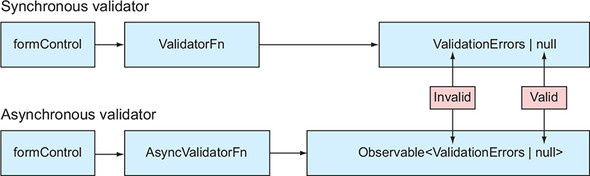
Asynchronous validators can be used to check form values by making requests to a remote server. Like synchronous validators, async validators are functions. The main difference is that async validators should return either an Observable or a Promise object. Figure 11.4 compares the interfaces that synchronous and asynchronous validators should implement. It shows the validators for a formControl, but the same applies to any subclass of the AbstractControl.
Figure 11.4. Comparing sync and async validators
Tip
If a form control has both sync and async validators, the latter will be invoked only after the value(s) pass all synchronous validators.
The code that comes with this chapter includes a directory called async-validator that uses both sync and async validators to validate the SSN. For synchronous validation, you’ll reuse the ssnValidator() function that you created in section 11.3. That validator checked that the user entered nine digits in the form control.
Now you also want to invoke a service that will check whether the entered SSN authorizes the user to work in the USA. By your rules, if a person’s SSN has a sequence 123 in it, they can work in the USA. The following listing creates an Angular service that includes such an asynchronous validator.
Listing 11.19. A service with an async validator
@Injectable()
export class SsnValidatorService {

  checkWorkAuthorization(field: AbstractControl):
                           Observable<ValidationErrors | null> {     1

    // In the real-world app you'd make an HTTP call to server
    // to check if the value is valid

    return Observable.of(field.value.indexOf('123') >=0 ? null       2
             : {work: " You're not authorized to work"});            3
   }
}
- 1 This function properly implements the async validator interface.
- 2 Returns an observable of null—the validation passed
- 3 Returns an observable of the ValidationErrors object—the validation failed
The following listing creates a component that, in addition to the synchronous ssnValidator(), attaches to the form control the async validator, checkWorkAuthorization().
Listing 11.20. async-validator/app.component.ts
function ssnValidator(control: FormControl): {[key: string]: any} {      1
   const value: string = control.value || '';
  const valid = value.match(/^d{9}$/);
  return valid ? null : {ssn: true};
}

@Component({
  selector: 'app-root',
  template: `
    <form [formGroup]="myForm">
      <h2>Sync and async validation demo </h2>

      Enter your SSN: <input type="text" formControlName="ssnControl">
       <span *ngIf ="myForm.hasError('ssn', 'ssnControl');
       else validSSN"> SSN is invalid.</span>                          2

       <ng-template #validSSN> SSN is valid</ng-template>                3

       <span *ngIf ="myForm.hasError('work', 'ssnControl')">
       {{myForm.get('ssnControl').errors.work}}</span>                 4
     </form>
  `
})
export class AppComponent{

  myForm: FormGroup;

  constructor(private ssnValidatorService: SsnValidatorService) {
    this.myForm = new FormGroup({
      ssnControl: new FormControl('',
                    ssnValidator,                                        5
                    ssnValidatorService.checkWorkAuthorization.bind
                    (ssnValidatorService))                             6
     });
  }
}
- 1 Synchronous validator
- 2 In case of an error, shows the text from <span>; otherwise, from the template validSSN
- 3 Defines the template validSSN
- 4 Extracts the description of the error named work
- 5 Attaches the sync validator to ssnControl
- 6 Attaches the async validator to ssnControl
Async validators are passed as the third argument to constructors of model classes. If you need to have several synchronous or asynchronous validators, specify an array as the second and/or third argument.
In general, the HTML <template> element is used to specify the content that’s not rendered by the browser on page load but can be rendered by JavaScript later on. The Angular <ng-template> directive serves the same purpose. In your component, the content of <ng-template> is “SSN is valid,” and it’s not rendered on page load. The Angular directive *ngIf will render it if the entered SSN is valid, using the template variable validSSN as a reference.
When assigning the asynchronous validator checkWorkAuthorization(), you want to make sure that this method runs in the context of the service ssnValidatorService. That’s why you used the JavaScript function bind(). To see this application in action, run the following command:
ng serve --app async-validator -o
Try entering the SSN with and without the 123 sequence to see different validation messages.
Note
The source code for this example includes one more async validator, checkWorkAuthorizationV2(), that can’t be attached to the form control because it doesn’t conform to the interface shown in figure 11.4. We added that validator just to show that you can invoke any function for validating the form values.
11.8. Custom validators in template-driven forms
With template-driven forms, you can use only directives to specify validators, so wrapping validator functions into directives is required. The following listing creates a directive that wraps the synchronous SSN validator from section 11.3.
Listing 11.21. SsnValidatorDirective
@Directive({                     1
   selector: '[ssn]',            2
   providers: [{
    provide: NG_VALIDATORS,      3
     useValue: ssnValidator,
    multi: true
  }]
})
class SsnValidatorDirective {}
- 1 Declares a directive using the @Directive decorator
- 2 Defines the directive’s selector to be used as an HTML attribute
- 3 Registers ssnValidator as an NG_VALIDATORS provider
The square brackets around the ssn selector denote that the directive can be used as an attribute. This is convenient, because you can add this attribute to any <input> element or to an Angular component represented as a custom HTML element.
In listing 11.20, you register the validator function using the predefined NG_VALIDATORS Angular token. This token is, in turn, injected by the NgModel directive, and NgModel gets the list of all validators attached to the HTML element. Then, NgModel passes validators to the FormControl instance it implicitly creates. The same mechanism is responsible for running validators; directives are just a different way to configure them. The multi property lets you associate multiple values with the same token. When the token is injected into the NgModel directive, NgModel gets a list of values instead of a single value. This enables you to pass multiple validators.
Here’s how you can use the SsnValidatorDirective:
<input type="text" name="my-ssn" ngModel ssn>
You can find the complete running application that illustrates directive validators in the template-validator directory. To see this app in action, run the following command:
ng serve --app template-validator -o
Chapter 10 covered the basics of the Forms API. In this chapter, we’ve explained how to validate form data. Now it’s time to modify ngAuction and add a search form so users can search for products.
Note
Source code for this chapter can be found at https://github.com/Farata/angulartypescript and www.manning.com/books/angular-development-with-typescript-second-edition.
11.9. Adding a search form to ngAuction
You made quite a few changes to the new version of ngAuction. The main addition is the new search component where you use the Angular Forms API. You’ll also add tabs with product categories, so the top portion of ngAuction will look like figure 11.5.
Figure 11.5. The new search icon and product category tabs

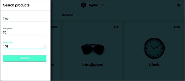
To return to the landing page from any other app view, the user should click the ngAuction logo. When the user clicks the search icon, the search-form component will slide from the left, where the user can enter search criteria, as shown in figure 11.6.
Figure 11.6. The search-form component
After the user clicks the Search button, the app will invoke ProductService .search(); the search-form component will slide back off the screen; and the user will see the products that meet the search criteria rendered by the search-results component. Note that there are no tabs with categories in the search result view displayed in figure 11.7. That’s because products from different categories can meet the search criteria—for example, a price between $70 and $100.
Figure 11.7. The search results view

In this section, we won’t be providing detailed instructions for implementing all the code changes, because that would take lots of pages to describe. We’ll do a code review of the new search-form component and search-results component. Then we’ll highlight other important changes made throughout the code of ngAuction.
11.9.1. The search-form component
You created the search-form component in the shared directory of the project just in case the search functionality will be required in other parts of this app. The template of the search-form component contains a form with three input fields: Title, Min price, and Max price.
Each of these fields, along with corresponding validation error messages (<mat-error>), is wrapped into an Angular Material <mat-form-field>, and the value in the placeholder attribute (or the field label, if present) becomes a floating label, as you can see in the following listing.
Listing 11.22. search-form.component.html
<h1 class="title">Search products</h1>
<form class="form" [formGroup]="searchForm" (ngSubmit)="onSearch()">
  <mat-form-field class="form__field">
    <input matInput type="text" placeholder="Title"                        1
            formControlName="title">
    <mat-error>Title is too short</mat-error>                              2
   </mat-form-field>

  <mat-form-field class="form__field">
    <input matInput type="number" placeholder="Min price"                  3
                     formControlName="minPrice">
    <mat-error>Cannot be less than 0</mat-error>                           4
   </mat-form-field>

  <mat-form-field class="form__field">
    <input matInput type="number" placeholder="Max price"                  5
         formControlName="maxPrice" [errorStateMatcher]="matcher">         6
     <mat-error *ngIf="searchForm.controls['maxPrice'].hasError('min')">
               Cannot be less than 0</mat-error>                           7
     <mat-error *ngIf="searchForm.controls['maxPrice'].hasError('max')">   8
                Cannot be more than 10000</mat-error>
    <mat-error *ngIf="searchForm.hasError('minLessThanMax')">              9
                Should be larger than min price</mat-error>
  </mat-form-field>

  <button class="form__submit" color="primary"
          mat-raised-button>SEARCH</button>
</form>
- 1 Title form control
- 2 Validation error message for Title
- 3 Min price control
- 4 Validation error message for negative values
- 5 Max price control
- 6 The matcher controls when to display validation errors.
- 7 Shows an error message if the value is negative
- 8 Shows an error message if the value is greater than max price
- 9 Shows an error message if the entered max price is less than the min price
In the TypeScript code, you’ll attach a validator to require at least two characters in the Title field. The <mat-error> will display the error message if the entered value won’t pass the validator. The Min price field has a validator that doesn’t allow negative numbers.
But the Max price field has three validators and three corresponding error messages: the first one is shown if the value is negative, the second is shown if the entered price is greater than 10,000, and the third one is shown if the entered Max value is less than the Min value.
You’ll create a custom validator named minLessThanMaxValidator in the TypeScript code of the search-form component. Because this validator needs the values from two fields, you’ll attach it to the entire form and not to the individual form control. Accordingly, for this validator in <mat-error>, you invoke hasError() not in the form control but in the form.
By default, validation errors are shown when the value is invalid and the user interacts with the control. The Max price field is special because one of its validators should kick in when the value in the Min price field is also entered. To specify when this validator should check the values, you’ll implement the ErrorStateMatcher interface in the TypeScript code of the search-form component. If the entered value doesn’t pass one or more validators, the respective error messages will be displayed, as shown in figure 11.8.
Figure 11.8. Showing two validation errors

The search-form.component.ts file includes the decorated class SearchFormComponent and the custom validator minLessThanMaxValidator. The form model is created using FormBuilder.
When the user clicks the Search button, the router navigates to the search-results component, passing the search criteria as query parameters (see section 3.5.2 in chapter 3). The search-results component implements the search functionality. You also emit a custom search event, which notifies the AppComponent that the search panel can be closed, as shown in the following listing.
Listing 11.23. search-form.component.ts
@Component({
  selector: 'nga-search-form',
  styleUrls: [ './search-form.component.scss' ],
  templateUrl: './search-form.component.html',
  changeDetection: ChangeDetectionStrategy.OnPush
})
export class SearchFormComponent {
  @Output() search = new EventEmitter();
  readonly matcher = new ShowOnFormInvalidStateMatcher();                1
   readonly searchForm: FormGroup;

  constructor(fb: FormBuilder, private router: Router) {
    this.searchForm = fb.group({                                         2
       title   : [, Validators.minLength(2)],
      minPrice: [, Validators.min(0)],
      maxPrice: [, [Validators.min(0), Validators.max(10000)]]
    }, {
      validator: [ minLessThanMaxValidator ]
    });
  }

  onSearch(): void {                                                     3
     if (this.searchForm.valid) {
      this.search.emit();                                                4
       this.router.navigate([ '/search-results' ],                       5
         queryParams: withoutEmptyValues(this.searchForm.value)          6
       });
    }
  }
}

export class ShowOnFormInvalidStateMatcher implements
ErrorStateMatcher {                                                    7
   isErrorState(control: FormControl | null,
  form: FormGroupDirective | null): boolean {
    return !!((control && control.invalid) ||
    (form && form.hasError('minLessThanMax')));
  }
}

function withoutEmptyValues(object: any): any {                          8
   return Object.keys(object).reduce((queryParams: any, key) => {
    if (object[key]) { queryParams[key] = object[key]; }
    return queryParams;
  }, {});
}

function minLessThanMaxValidator(group: FormGroup):                      9
                                  ValidationErrors | null {
  const minPrice = group.controls['minPrice'].value;
  const maxPrice = group.controls['maxPrice'].value;

  if (minPrice && maxPrice) {
    return minPrice <= maxPrice ? null : { minLessThanMax: true };
  } else {
    return null;
  }
}
- 1 The object that controls when to show the validation error for Max price
- 2 Creates a form model with validators
- 3 The user clicked the Search button.
- 4 Sends an event to app component to close the search-form component
- 5 Doesn’t send empty values in query parameters
- 6 Navigates to search-results, passing the search criteria
- 7 Reports an error when either the form or a control is invalid
- 8 Creates a queryParams object that contains only the properties with values
- 9 A custom validator for comparing min and max prices
The matInput directive has the errorStateMatcher property, which takes an instance of the ErrorStateMatcher object. This object must implement the isErrorState() method that takes the form control and the form and has the app logic to decide whether the error message has to be shown. In this case, this function returns true (show the error) if the control’s value is invalid or if the minLessThanMax validator returned an error.
While searching for products, keep an eye on the URL, which will contain the search parameters. For example, if you enter red in the title field and click Search, you’ll invoke Router.navigate(), and the URL will change to localhost:4200/search-results?title=red. The function withoutEmptyValues() ensures that if some search parameters weren’t used (for example, min and max price), they won’t be used in the query parameters.
Note
In ngAuction from chapter 10, the home component included <mat-grid-list> for rendering the list of products. In this version of ngAuction, we extracted the grid list into a separate product-grid component that now is reused by two components: categories and search-results (both belong to the home module).
11.9.2. The search-results component
The search-results component receives the query parameters via the observable property queryParams of the ActivatedRoute object. Using the switchMap operator, you pass the value emitted by the queryParams observable to another observable, the search() method on ProductService, as shown in the following listing.
Listing 11.24. search-results.component.ts
@Component({
  selector: 'nga-search',
  styleUrls: [ './search-results.component.scss' ],
  templateUrl: './search-results.component.html',
  changeDetection: ChangeDetectionStrategy.OnPush
})
export class SearchResultsComponent {
  readonly products$: Observable<Product[]>;                              1

  constructor(
    private productService: ProductService,
    private route: ActivatedRoute
  ) {
    this.products$ = this.route.queryParams.pipe(                         2
       switchMap(queryParams => this.productService.search(queryParams))  3
     );
  }
}
- 1 Declares an observable for products
- 2 Wraps the RxJS pipeable operator into the pipe() function
- 3 Passes the received parameters to the search() method
If you need a refresher on the switchMap operator, see section D.8 of appendix D. You can read about pipeable operators in section D.4.1.
The template of the search-results component incorporates the product-grid component and uses the async pipe to unwrap the observable products$, as shown in the next listing.
Listing 11.25. search-results.component.html
<div class="grid-list-container">
  <nga-product-grid [products]="products$ | async"></nga-product-grid>
</div>
The product-grid component receives the products via its input parameter as follows:
@Input() products: Product[];
Then it renders the grid with products as described in section 9.3.4 in chapter 9.
11.9.3. Other code refactoring
We won’t be providing complete code listings of other ngAuction components that underwent refactoring but rather will highlight the changes. You’re encouraged to go through the code of ngAuction that comes with this chapter. If you have specific questions about the code, post them on the book forum at https://forums.manning.com/forums/angular-development-with-typescript-second-edition.
Showing and hiding the search-form component
In the ngAuction from chapters 2, 3, and 4, the search component was always present on the UI, occupying 25% of the screen width. Why does it take so much space even when the user isn’t searching for products? In this version of the app, the search-form component is represented by a small search icon, which is a part of the app toolbar, as shown in figure 11.9.
Figure 11.9. The search icon in a toolbar
Angular Material offers components for side navigation with which you can add collapsible side content to a full-screen app. You use the <mat-sidenav-container> component, which acts as a structural container for both the side-navigation panel (the search-form component) and the toolbar of ngAuction. <mat-sidenav> represents the added side content—the search-form component, in your case—as shown in the following listing.
Listing 11.26. A fragment of app.component.html
<mat-sidenav-container>                                                1
   <mat-sidenav #sidenav>                                              2
     <nga-search-form (search)="sidenav.close()"></nga-search-form>    3
   </mat-sidenav>

  <mat-toolbar class="toolbar">
    <button mat-icon-button                                            4
             class="toolbar__icon-button"
            (click)="sidenav.toggle()">                                5
       <mat-icon>search</mat-icon>                                     6
     </button>

    <!-- The markup for the logo and shopping cart is omitted -->

  </mat-toolbar>

  <router-outlet></router-outlet>
</mat-sidenav-container>
- 1 Wraps the sidenav and the toolbar into <mat-sidenav-container>
- 2 Wraps the search-form component into <mat-sidenav>
- 3 On search event, closes the sidenav with the search-form component
- 4 Declares a button with an icon
- 5 Clicking the icon button toggles the sidenav (opening it, in this case).
- 6 Uses the icon named search, offered by Google Material icons
Refactoring the home module
In chapter 9, ngAuction had a home module with a home component. The home module still exists, but there’s no home component anymore. You split its functionality into three components: categories, search-results, and product-grid components. The categories component is rendered below the navbar. Below the categories component, the browser renders the product-grid component that encapsulates the search-results component.
The routing has also changed, and the route configuration looks like the following listing now.
Listing 11.27. The modified configuration of the routes
const routes: Route[] = [
  { path: '', pathMatch: 'full', redirectTo: 'categories' },         1
   { path: 'search-results', component: SearchResultsComponent },    2
   { path: 'categories',
    children: [
      { path: '', pathMatch: 'full', redirectTo: 'all' },            3
       { path: ':category', component: CategoriesComponent },        4
     ]
  }
];
- 1 By default, redirects to the componentless categories route
- 2 Adds the routing for the search-results component
- 3 By default, redirects to the categories/all route
- 4 Adds the routing for the categories component with a parameter
In this code, you use the so-called componentless route categories, which doesn’t have a specific component mapped to the path. It consumes the URL fragment, providing it to its children. By default, the fragment categories and all will be combined into categories/all.
The parameters passed to the componentless route are passed further down to the child routes. In your case, if there were a parameter after the URL fragment categories, it would be passed to the CategoriesComponent via the :category path.
The categories component
The categories component is a part of the home module. It uses the standard HTML <nav> element that’s meant to hold a set of links for navigation. To make these links fancy, you add the Angular Material mat-tab-nav-bar directive to the <nav> element. In chapter 9, the home component rendered the grid of products, but now the user will see tabs with product category names. The user can click tabs to select all products or those that belong to a particular category, and the product-grid component will render them. The template of the categories component is shown in the following listing.
Listing 11.28. categories.component.html
<nav class="tabs" mat-tab-nav-bar>                                       1
   <a mat-tab-link                                                       2
      *ngFor="let category of categoriesNames$ | async"                  3
      #rla="routerLinkActive" routerLinkActive                           4
      [active]="rla.isActive"
     [routerLink]="['/categories', category]">                           5
      {{ category | uppercase }}                                         6
   </a>
</nav>

<div class="grid-list-container">
  <nga-product-grid [products]="products$ | async"></nga-product-grid>
 </div>                                                                  7
- 1 Adds the mat-tab-nav-bar to the standard HTML <nav> tag
- 2 Each tab title is a link.
- 3 Iterates through the category names to create an <a> tag for each one
- 4 routerLinkActive shows the user which link is active now.
- 5 Navigates to the route categories, passing the category name as param
- 6 The link text (the tab title) is in uppercase.
- 7 The product-grid component gets the array of products to render.
The TypeScript code of the categories component comes next. It uses ProductService to retrieve the distinct names of categories to be used as tab titles. It also uses the same service to retrieve the products of all categories or from the selected one.
Listing 11.29. categories.component.ts
@Component({
  selector: 'nga-categories',
  styleUrls: [ './categories.component.scss' ],
  templateUrl: './categories.component.html',
  changeDetection: ChangeDetectionStrategy.OnPush
})
export class CategoriesComponent {
  readonly categoriesNames$: Observable<string[]>;                     1
   readonly products$: Observable<Product[]>;

  constructor(
    private productService: ProductService,
    private route: ActivatedRoute
  ) {
    this.categoriesNames$ =
         this.productService.getDistinctCategories().pipe(
             map(categories => ['all', ...categories]));               2

    this.products$ = this.route.params.pipe(
      switchMap(({ category }) => this.getCategory(category)));        3
   }

  private getCategory(category: string): Observable<Product[]> {
    return category.toLowerCase() === 'all'
      ? this.productService.getAll()                                   4
       : this.productService.getByCategory(category.toLowerCase());    5
   }
}
- 1 Category names to be used as tab titles
- 2 Creates an array of category names where the first one is “all”
- 3 Gets products that belong to the selected category
- 4 Gets all products because the user clicked All
- 5 Gets corresponding products because the user clicked a tab with a specific category name
This concludes the code review of ngAuction. To see it in action, run npm install in the project directory, and then run ng serve -o.
Summary
- Angular comes with several built-in validators, and you can create as many custom ones as you like.
- You can validate user input with synchronous and asynchronous validators.
- You can control when validation happens.