What CSS means by generated content is content that’s not physically present in the HTML markup. For example, when you create an ordered list, the numbers are not in the HTML. The browser generates and inserts them automatically, and it updates the sequence if items are added or removed. The ::before and ::after pseudo-elements perform a similar function, but go much further, allowing you to add just about any type of automatically generated content not only before list items, but before and after almost any HTML element.
The ::before and ::after pseudo-elements have been around for a long time. They’re part of the CSS2.1 specification (prefixed with a single colon rather than two), but Internet Explorer didn’t support them until IE 8. So, they went largely unnoticed. Now, they’re widely used for creating fun visual effects, such as ribbons and speech bubbles.
In this chapter, I’ll show you how to use the pseudo-elements to add text, images, and visual effects to various HTML elements, as well as how to generate complex numbered sequences.
In particular, you’ll learn how to do the following:
- Automatically prefix elements with text and images
- Extract the URL from a link and display it in the text
- Generate nested quotation marks in a predefined sequence
- Generate numbered sequences for page sections and lists
- Create ribbon and speech bubble effects without images
 Note The code examples in this chapter use the CSS3 syntax, which is supported by the latest versions of all browsers. If you need to support IE 8, use the CSS2.1 single-colon versions (:before and :after) instead.
To add generated content to elements other than list items, you need to use the ::before or ::after pseudo-elements. As their names suggest, they insert content before or after an element. The inserted content is generated by one or more of the properties in Table 15-1.
The properties in Table 15-1 are not inherited, but they accept the inherit keyword as a value.
Table 15-1. Generated Content Properties
Defining the Content to be Inserted
The content property is extremely versatile. It accepts any of the following values:
- none The pseudo-element is not generated.
- normal Same as none.
- A string: Literal text that is to be inserted.
- url() An external resource, usually an image.
- A counter: A function that generates a numbered sequence.
- attr(x) Use the value of the x attribute in the selected element.
- open-quote Insert an opening quote as defined by the quotes property.
- close-quote Insert a closing quote as defined by the quotes property.
- no-open-quote Omit the opening quote, but move to the next level of nesting.
- no-close-quote Omit the closing quote, but move up to the previous level.
Apart from the none and normal keywords, you can combine any of these values as a space-separated list to create complex content that is injected before or after an element.
Using the ::before and ::after pseudo-elements to insert images, text, or a combination of the two can be useful in situations where you need to label elements in a consistent way. For example, throughout this book points of interest are highlighted as Notes, Tips, or Cautions. The styles in image_text.html use the following three classes to mark up paragraphs in a similar way (see Figure 15-1):
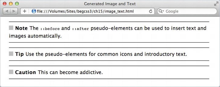
Figure 15-1. The icons and bold text are automatically generated by the pseudo-elements
.note::before {
    content: url(images/square_gray.gif) ' Note ';
    font-weight: bold;
}
.tip::before {
    content: url(images/square_gray.gif) ' Tip ';
    font-weight: bold;
}
.caution::before {
    content: url(images/square_gray.gif) ' Caution ';
    font-weight: bold;
}
The ::before pseudo-element is appended to the selector in the same way as a pseudo-class. In this example, each selector is a class, but you can use any valid selector. The value specified for content begins with the path to the gray square image, followed by a space and the text in quotes. It doesn’t matter whether you use single or double quotes, as long as they’re a matching pair. I’ve added a space on either side of the text to separate it both from the icon and from the following text.
Normally the generated content is displayed inline, and the text inherits the same properties as the text in the element it’s being added to. But you can style the generated content like any other element.
The styles in text_image_display.html adapt the classes in the previous example like this:
.note::before {
    content: url(images/square_gray.gif) ' Note ';
    font-weight: bold;
    display: block;
}
.tip::before {
    content: url(images/square_gray.gif) ' Tip ';
    font-weight: bold;
    display: inline-block;
    vertical-align: 24px;
}
.caution::before {
    content: url(images/square_gray.gif) ' Caution ';
    font-weight: bold;
    color: #F8A809;
    font-size: 24px;
    font-family: Tahoma, Geneva, sans-serif;
}
As Figure 15-2 shows, the generated content in the note class becomes a block-level element occupying a separate line. In the tip class, it’s converted to an inline block and raised above the baseline. The caution class changes the color, font size, and font of the generated text.
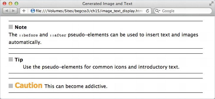
Figure 15-2. The generated content can be styled independently of the element it’s added to
Caution The generated content doesn’t become part of the HTML markup, so don’t use ::before and ::after for essential content. It won’t be seen by users of older browsers.
Using the ::after pseudo-element to append generated content works exactly the same way. The styles in image_text_after.html identify the final paragraph using the :last-child pseudo-class. The ::after pseudo-element is appended to the selector to add a couple of images and some text, and style it to be centered on a separate line like this:
p:last-child::after {
    content: url(images/flourish1.png) ' The End ' url(images/flourish2.png);
    display: block;
    text-align: center;
    color: #B20000;
    margin-top: 1em;
}
As Figure 15-3 shows, this adds a stylized “The End” at the foot of the page.
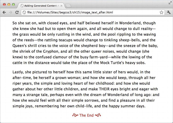
Figure 15-3. The ::after pseudo-element appends generated content at the end of an element
IE 8 doesn’t support the :last-child pseudo-class. For the preceding example to work in IE 8, you not only need to use the single-colon version of :after, but also to assign a class or ID to the last paragraph and use that as the selector, for example p.last:after.
Caution Although the ::before and ::after pseudo-elements can insert images before or after other HTML elements, they can’t add generated content to an image or to other replaced elements such as objects and videos. So, you can’t use them, for example, to add a caption after an image. They don’t work with form elements either.
Generating Content from an Attribute
The content property can inspect HTML tags, search for an attribute, and display the text value of the attribute. If the attribute doesn’t exist, the browser simply ignores it. To access the attribute, you insert the attribute name (without quotes) between the parentheses of attr().
This can be useful for displaying an external URL. You can use the attribute selector a[href^="http://"] to style external links differently from internal ones. So it’s just a question of using the ::after pseudo-element with the same selector like this (the code is in attribute.html):
a[href^="http://"]::after {
    content: ' (' attr(href) ') ';
}
The content property uses attr(href) to extract the link’s URL. It’s surrounded on both sides by literal spaces and parentheses in quotes. As Figure 15-4 shows, the pseudo-element appends the URL in parentheses after an external link, but ignores an internal one.
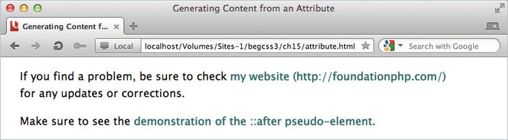
Figure 15-4. The ::after pseudo-element automatically appends the URL to the external link
Generating Quotes Automatically
HTML has two elements that are intended to mark up quotations: <q> and <blockquote>. The first one is intended for short, inline quotations, whereas <blockquote> is reserved for lengthy quotations that are intended to be set off from the surrounding text.
You shouldn’t use quotation marks with <q> tags. The browser inserts them for you. For a long time, browsers failed to do so, but all modern browsers (including IE 8) now insert quotation marks correctly. However, IE 8+ uses single curly quotes, Firefox uses double curly quotes, and other browsers use double straight quotes.
The <blockquote> element> doesn’t automatically add quotation marks. You need to add them yourself if you want them.
With the help of the quotes property and the ::before and ::after pseudo-elements, you can control the generation of quotation marks not only for <q>, but also for any other element. What’s more, you can set up sequences to ensure that nested quotations are marked up correctly. For example, you can follow the American typographical practice of double quotes first, followed by single ones for nested quotations. Alternatively, you can use the British convention of single quotes followed by double ones. Or if you’re working with another language, you can use the correct glyphs.
The quotes property expects a space-separated list of pairs of opening and closing quotation marks. If you specify multiple pairs, they’re used in sequence depending on how deep the quotations are nested. The browser automatically keeps track of the level of nesting.
To generate curly quotes or other types of quotation marks, use the hexadecimal codes listed in Table 15-2.
Table 15-2. Hexadecimal Codes for Generating Quotation Marks
| Hexadecimal Code | Mark | Description |
|---|---|---|
| 2018 | ‘ | Left single quotation mark |
| 2019 | ’ | Right single quotation mark |
| 201C | “ | Left double quotation mark |
| 201D | ” | Right double quotation mark |
| 201E | „ | Double low-9 quotation mark |
| �0AB | « | Left double-angle quotation mark |
| �0BB | » | Right double-angle quotation mark |
Tip The hexadecimal codes for other quotation marks can be found in the Unicode General Punctuation block (http://unicode.org/charts/PDF/U2000.pdf). Prefix the hexadecimal code with a backslash.
Standardizing Quotes on <q> Elements
Although browsers use different types of quotes on <q> elements, you can make all browsers conform to your preferred style with the quotes property. Because <q> elements automatically insert quotation marks, there’s no need to use the ::before and ::after pseudo elements. Just specify the sequence of opening and closing quotes in a style rule for the <q> element. For example, the following style rule in quotes_single.html tells <q> elements to use double curly quotes:
q {
    quotes: '201C' '201D';
}
If you test quotes_single.html in a browser, apart from a few ancient ones, they all use double curly quotes instead of the browser default.
Generating Quotes for Other Elements
To generate quotes for elements other than <q>, you need to use the ::before and ::after pseudo-elements in addition to defining the opening and closing quotes with the quotes property.
As noted earlier, the content property accepts as values open-quote, no-open-quote, close-quote, and no-close-quote. The first two are normally used with ::before, and the others with ::after. The values that begin with no- suppress the insertion of a quotation mark, but keep track of the correct place in the sequence.
It’s common to omit a paragraph’s closing quote if the quotation continues in the next paragraph. Explicitly setting no-close-quote ensures that the next paragraph uses the correct opening quotes, as the next example demonstrates.
The HTML in quotes_nested.html is identical to the preceding example. It contains a <blockquote> element within which <q> elements are nested. The styles begin by specifying a sequence of quotes for paragraphs nested inside the <blockquote> element:
blockquote p {
    quotes: '201C' '201D' '2018' '2019';
}
This specifies double curly quotes as the first pair, and single curly quotes as the second pair. When multiple pairs are specified with the quotes property, each pair is used in sequence. What’s particularly impressive is that <q> elements are automatically included in the sequence.
The quotes are added automatically to the <q> elements, but you need to use the ::before and ::after pseudo-elements for the paragraphs. The following style rules specify opening quotes for each paragraph, but suppress closing quotes on all but the last paragraph.
blockquote p::before {
    content: open-quote;
}
blockquote p::after {
    content: no-close-quote;
}
blockquote p:last-child::after {
    content: close-quote;
}
As Figure 15-5 shows, this produces double quotes at the beginning of the <blockquote>, but single quotes on the first <q> element. The first paragraph in the <blockquote> ends with a single quote because it’s the end of a <q> element. The double closing quote is suppressed because the content property of the ::after pseudo-element is set to no-close-quote. But the next paragraph correctly opens and closes with double quotes. The browser keeps track of the correct level of quotes at all times.
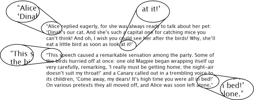
Figure 15-5. The nested quotes are correctly sequenced
It’s not always appropriate to use an ordered list for a numbered sequence. For example, you might want to number the headings and paragraphs in a page that describes a company’s terms of service.
Generating a numbered sequence involves the following steps:
- Initialize a counter using the counter-reset property.
- Increment the counter using the counter-increment property.
- Display the counter using ::before and the content property.
The counter is like a variable in JavaScript. It stores the current number in the sequence. You can call it anything you like, except the keywords none, inherit, or initial. It needs to be initialized in a style rule for an element that precedes or is the parent of the first element that you want to number.
There are two functions that display the counter’s value. Most of the time, you use the counter() function, which keeps track of the value only in its current level of nesting. The similarly named counters() function keeps track of the counter at higher levels of nesting, and resumes the correct sequence when backing out from a lower level.
Using counter() is easier to understand, so I’ll deal with that first.
Rather than explaining the theory in a vacuum, let’s walk through an actual example. The <h1>, <h2>, and <h3> headings in numbered_headings.html are numbered in sequence, as shown in Figure 15-6.
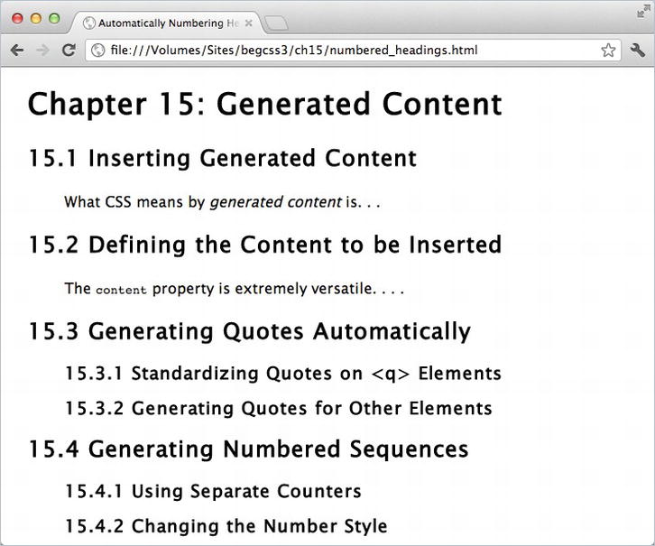
Figure 15-6. The numbers alongside each heading are generated automatically
Because the numbers are generated and inserted by the ::before pseudo-element, the sequence automatically updates when a new heading is added in numbered_headings_add.html (see Figure 15-7).
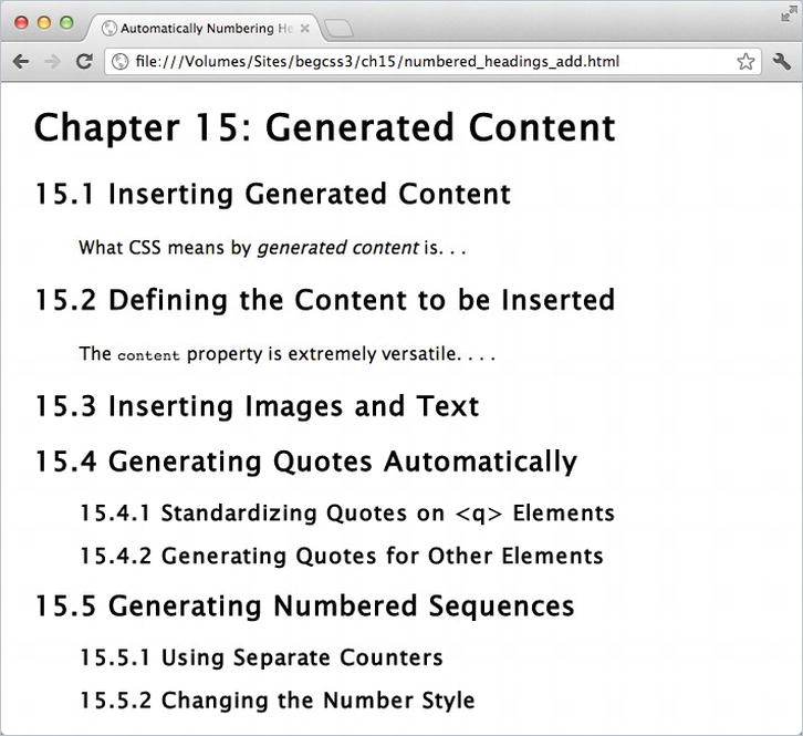
Figure 15-7. The sequence updates automatically when a new heading is inserted
The numbers are generated by three counters: chapter, section, and subsection. Counters need to be initialized before they can be used, so the chapter counter is initialized in the body style rule like this:
body {
    background-color: #FFF;
    color: #000;
    font-family: "Lucida Sans Unicode", "Lucida Grande", sans-serif;
    counter-reset: chapter 15;
}
This creates a counter called chapter, and initializes it at 15. In most cases, values are incremented before being displayed. So, you normally initialize the counter at one less than the first number you want to display. In this instance, however, the chapter number is never incremented, which is why it’s initialized at 15 rather than 14.
The value is displayed by passing the name of the counter to the counter() function in the ::before pseudo-element like this:
h1::before {
    content: 'Chapter ' counter(chapter) ': ';
}
This sets the value of the content property to the literal text “Chapter” followed by a space, then the value of the chapter counter, followed by a colon and another space. The result, as shown in Figures 15-6 and 15-7, is that the main heading is prefixed by Chapter 15 :.
The section counter generates the sequence number for the <h2> headings, so it needs to be initialized before it’s used. The <h1> heading comes first, making it the ideal place to create it with the counter-reset property like this:
h1 {
    counter-reset: section;
}
Only the counter name has been specified, so counter-reset initializes section at 0. The ::before pseudo-element then increments and displays the sequence number like this:
h2::before {
    counter-increment: section;
    content: counter(chapter) '.' counter(section) ' ';
}
By default, counter-increment increases the value of a counter by 1. So, the first <h2> heading increments section to 1, the next <h2> heading increases it to 2, and so on. The content property uses the counter() function twice to display the values of the chapter and section counters. Literal text strings insert a dot between the numbers and a space after them.
The subsection counter numbers the <h3> headings, which always follow <h2> headings. Because they represent subsections of the <h2> sections, the counter needs to be created or reset to 0 by each <h2> heading. So, the counter is initialized and reset like this:
h2 {
    counter-reset: subsection;
}
Finally, the ::before pseudo-element increments the subsection counter and displays all three numbers like this:
h3::before {
    counter-increment: subsection;
    content: counter(chapter) '.' counter(section) '.' counter(subsection) ' ';
}
Tip When the ::before pseudo-element increments and displays a counter, the counter is always incremented first. The order of counter-increment and content in the style rule makes no difference.
The counter() function takes an optional second argument: one of the values for list-style-type (see “Ordered Lists” in Chapter 10). Separate the two arguments with a comma.
The styles in numbered_headings_style.html have been amended like this:
h2::before {
    counter-increment: section;
    content: counter(chapter) '.' counter(section, lower-roman) ' ';
}
h3::before {
    counter-increment: subsection;
    content: counter(chapter) '.' counter(section, lower-roman) '.' counter(subsection, ←
    lower-alpha) ' ';
}
This changes the style of the numbers to look like Figure 15-8.

Figure 15-8. You can style the numbers in the same way as ordered lists
Changing the Size and Direction of the Increment
By default, counter-increment increases the sequence number by 1. To change the size of the increment, add an integer after the counter name separated by a space. You can also use a negative number to count in reverse.
This is demonstrated in numbered_headings_increment.html, which initializes each subsection sequence at 7. The section counter is incremented in steps of 5, and the subsection counter is reduced in steps of 3 like this:
h2 {
    counter-reset: subsection 7;
}
h2::before {
    counter-increment: section 5;
    content: counter(chapter) '.' counter(section) ' ';
}
h3::before {
    counter-increment: subsection -3;
    content: counter(chapter) '.' counter(section) '.' counter(subsection) ' ';
}
As Figure 15-9 shows, the section numbers begin at 5 and increase in steps of 5. The subsection numbers begin at 4, not 7, because counter-increment deducts 3 from the start number before displaying the counter. The sequence continues with negative numbers once it falls below zero.
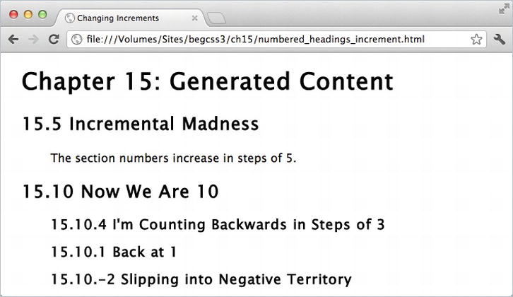
Figure 15-9. Numbers in a sequence can be increased or decreased by any amount
Caution To reset more than one counter in the same style rule, they must be specified together as a space-separated list like this: counter-reset: counter1 counter2;. If you put them in separate declarations, the last one overrides the previous ones following the normal rules of the cascade.
Generating Subsection Numbers with Nested Lists
If you reset a counter in a descendant element, the browser creates a new instance of the counter, restarting the sequence in the descendant element’s siblings, and resuming it when backing out to the parent’s level. This is similar to what happens when you nest ordered lists (see Figure 15-10).
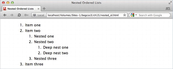
Figure 15-10. Nested ordered lists keep track of the sequence number at each level
The counters() function—not to be confused with the similarly named counter() function—is designed to create custom numbering sequences for nested elements. It keeps track of the counter at all levels of nesting. The function requires two arguments: the counter name, and a string of literal text to be used as a separator for the sequence numbers. As an optional third argument, you can add one of the list-style-type values to specify how the numbers are displayed.
The simple way to demonstrate the use of the counters() function is with a series of nested ordered lists. Because ordered lists automatically display numbers, you need to suppress the default numbering and replace it with the ::before pseudo-element and the counters() function like this (the code is in nested_counters.html):
ol {
    list-style-type: none;
    counter-reset: nested;
}
li::before {
    counter-increment: nested;
    content: counters(nested, '.') '. ';
}
In a modern browser, this produces the numbered sequence shown in Figure 15-11.
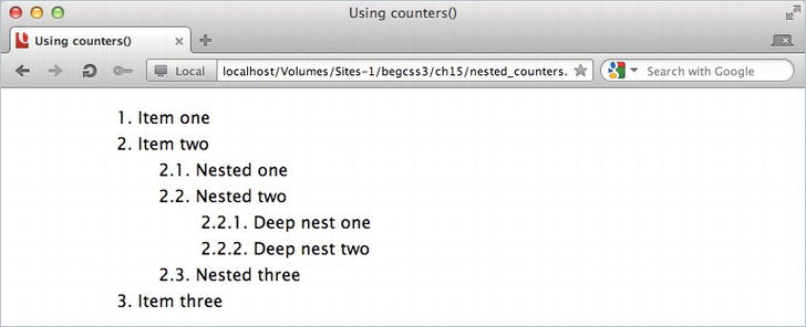
Figure 15-11. The counters() function automatically generates the subsection numbers
Each nested <ol> element creates a new instance of the nested counter, which is reset to 0. The ::before pseudo-element on each list item increments the counter, and the counters() function displays the value not only for the current level, but also for the preceding ones separated by a dot. The final dot and space are added as a string at the end of the content value.
Creating Fun Visual Effects with Generated Content
One of the most fascinating aspects of working with CSS is the way that properties and selectors can be used in ways that were almost certainly not envisaged when the specification was first drawn up. The ::before and ::after pseudo-elements were originally conceived as being used to generate the type of content described in the preceding sections. But they’re increasingly used to create visual effects such as ribbons and speech bubbles.
Caution All the preceding examples work with the CSS2.1 syntax for pseudo-elements (:before and :after). However, the visual effects in the rest of this chapter rely on CSS3 features not supported by IE 8. To prevent problems with IE 8, always use the CSS3 syntax (::before and ::after) with these techniques.
The visual effects are made possible thanks to absolute positioning and the ability to generate shapes using background colors, borders, and properties such as border-radius. For example, you can create triangles by setting the width and height of an element to 0, and giving it a wide border. If you give each border a different color, they intersect as triangles, as shown on the left of Figure 15-12. Make three of the borders transparent, and you’re left with a triangle as shown on the right.

Figure 15-12. Wide borders on an element with no width and height can be used to create triangles
The shapes in Figure 15-12 were created by styling empty <div> elements with the following styles in triangles.html:
#borders, #right {
    margin: 20px;
    float: left;
    height: 0;
    width: 0;
    border-style: solid;
    border-width: 50px;
    border-color:  green orange blue red;
}
#right {
    border-color: transparent transparent transparent red;
}
The style rule for the right <div> overrides the border-color property, setting the top, right, and bottom borders to transparent. As a result, you get a red right-facing triangle.
Tip There’s a gallery of CSS shapes (with code) at http://css-tricks.com/examples/ShapesOfCSS/.
A very simple effect that you can create with triangles and the ::before and ::after pseudo-elements is a ribbon that gives a heading a 3D look.
EXERCISE: SIMPLE RIBBON EFFECT
In this exercise, you’ll add triangles at either end of a heading’s background using the ::before and ::after pseudo-elements and a combination of relative and absolute positioning. Use as your starting point ribbon_begin.html in the ch15 folder. The finished file is ribbon_end.html.
- View the page in a browser. The heading has a chocolate background and drop shadow, but is constrained by the padding in the wrapper <div>, as shown in Figure 15-13.
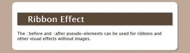
Figure 15-13. The heading’s background doesn’t extend beyond the padding
- To create the ribbon effect, the heading’s background needs to extend through the padding and into the margins of the wrapper <div>. The padding is 20px wide, so to extend the background a further 20px into the margin, you need to add negative left and right margins of 40px to the heading. It also needs to be relatively positioned so that it becomes the containing block for the absolutely positioned ::before and ::after pseudo-elements (see Chapter 11 for an explanation of the containing block). Add the following styles to the h1 style block:
      h1 {
            background-color: #5C4837;
            color: #FFF;
            padding: 5px 40px;
            -webkit-box-shadow: 3px 3px 3px rgba(51,51,51,0.3);
            box-shadow: 3px 3px 3px rgba(51,51,51,0.3);
            margin: 0 -40px;
            position: relative;
} - The ::before and ::after pseudo-elements both need display triangles of a slightly darker color than the background. The triangles are made by setting the content property to an empty string (a pair of quotes with nothing between them), setting the width and height to 0, and adding a 20px solid top border. The triangles need to be absolutely positioned directly beneath the heading. Add the following style rule for properties common to both pseudo-elements:
      h1::before, h1::after {
            content: '';
            height: 0;
            width: 0;
            border-top: 20px solid #453629;
            position: absolute;
            bottom: -20px;
} - To complete the triangles and position them horizontally, the one in the ::before pseudo-element needs a transparent left border the same size as the top border, and it needs to be flush with the left side of the heading. The triangle in the ::after pseudo-element needs a transparent right border, and should be flush with the right side of the heading. Add the following styles for the two pseudo-elements:
      h1::before {
            border-left: 20px solid transparent;
            left: 0;
        }
        h1::after {
            border-right: 20px solid transparent;
            right: 0;
} - Save the page, and test it in a browser. It now looks like a ribbon wrapped around the <div>, as shown in Figure 15-14.
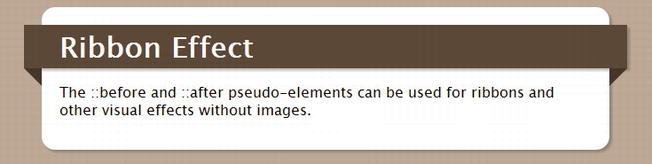
Figure 15-14. The absolutely positioned pseudo-elements create a 3D feel
This exercise demonstrates the basic technique of adding visual effects with the ::before and ::after pseudo-elements. The content property is set to an empty string, creating an empty element that can be styled as a shape and then moved into position using absolute positioning. In this example, the shapes are 20px high, so they are accurately positioned below the heading by setting a negative bottom offset of the same amount.
Tip You can create more sophisticated ribbon effects using the ribbon builder, a free visual tool at http://livetools.uiparade.com/ribbon-builder.html. The tool generates all the HTML and CSS ready for you to download. It involves the use of some nonsemantic elements, but is an impressive example of what can be achieved using only CSS and no images.
In the preceding exercise, the ::before and ::after pseudo-elements are used to position triangles at either end of a heading. As you might imagine, the ::after pseudo-element is created last, so it can be superimposed on the ::before pseudo-element. That’s the technique to create the comment bubble in Figure 15-15.

Figure 15-15. The two pseudo-elements are superimposed to create the illusion of a continuous border
The effect is created by a class called comment, which sets the position property to relative and draws a rounded border around some text, as shown in Figure 15-16.
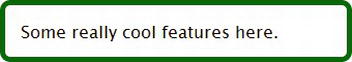
Figure 15-16. The basic class simply adds the border to the text
The styles in comment.html then add the common properties for the ::before and ::after pseudo-elements, and create a left-facing green triangle in the ::before pseudo-element like this:
.comment::before, .comment::after {
    content: '';
    width: 0;
    height: 0;
    position: absolute;
}
.comment::before {
    border-style: solid;
    border-width: 15px 30px;
    border-color: transparent #060 transparent transparent;
    left: -60px;
    top: 10px;
}
The triangle is created with left and right borders that are twice the width of the top and bottom ones, and by setting the color of all sides except the right to transparent. This produces a more acute angle. The negative left offset is equivalent to the width of the left and right borders, attaching the green triangle to the edge of the border, as shown in Figure 15-17.

Figure 15-17. The ::before pseudo-element creates a solid green triangle
Finally, the ::after pseudo-element creates a smaller, white left-facing triangle, and superimposes it on the green triangle like this:
.comment::after {
    border-width: 8px 23px;
    border-style: solid;
    border-color: transparent #FFF transparent transparent;
    left: -46px;
    top: 17px;
}
Again, the triangle is created using a narrower top and bottom border. Getting exactly the right size is mainly a question of trial and error. However, the negative left offset should be equal to the width of the horizontal borders.
Superimposing one triangle on top of the other creates the illusion of a continuous border, as shown earlier in Figure 15-15.
A variation of the same basic technique is used to create the thought bubble in Figure 15-18.
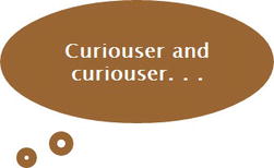
Figure 15-18. Using other shapes brightens up plain text
In this example, border-radius on the main text background has been set to 50%, producing an ellipse. Instead of setting the width and height of the pseudo-elements to 0, they’re made into small empty squares that are then converted to circles with border-radius.
The styles for the pseudo-elements in thought_bubble.html look like this:
#thought::before, #thought::after {
    content: '';
    border: #963 solid 10px;
    border-radius: 50%;
    position: absolute;
}
#thought::before {
    height: 10px;
    width: 10px;
    bottom: -40px;
    left: 60px;
}
#thought::after {
    height: 5px;
    width: 5px;
    bottom: -55px;
    left: 20px;
}
A slightly more complex example of this technique creates the speech bubble shown in Figure 15-21. The tail is formed by styling both pseudo-elements as circles and using a negative z-index to tuck them behind the parent element. The ::after pseudo-element also masks part of the ::before pseudo-element.
As in the preceding example, the text background is converted to an ellipse by setting border-radius to 50%. The ::before pseudo element is an empty 70px square of the same background color, converted to a circle using border-radius. It has a bottom offset of -30px, and a z-index of -1 so that it goes behind the ellipse with only the bottom part of the circle protruding, as shown in Figure 15-19.
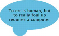
Figure 15-19. The ::before pseudo-element is a circle partially tucked behind its parent
Use the ::after pseudo-element to position alongside it a slightly smaller circle of a different color, as shown in Figure 15-20.

Figure 15-20. The circle in the ::after pseudo-element overlaps the first one
Finally, change the color of the shape in the ::after pseudo-element to match the page’s background color—and you have a speech bubble, as shown in Figure 15-21.
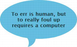
Figure 15-21. The second circle is the same color as the page and masks the first one
The styles for the two pseudo-elements in speech_bubble.html look like this:
#quote::before, #quote::after {
    content: '';
    position: absolute;
    border-radius: 50%;
    z-index: -1;
}
#quote::before {
    background-color: #0CF;
    height: 70px;
    width: 70px;
    bottom: -30px;
    left: 60px;
}
#quote::after {
    background-color: #FFF;
    height: 60px;
    width: 60px;
    bottom: -45px;
    left: 45px;
}
Summary
Generated content with the ::before and ::after pseudo-elements has a wide range of uses. As well as creating labels for common elements, you can ensure the typographic integrity of nested quotes, and generate complex numbered sequences. But it’s important to remember that the generated content does not become part of the underlying HTML, so it remains inaccessible to older browsers. Don’t use it for vital content. In this chapter, you also saw several examples of how generated content can be used for attractive visual effects, such as ribbons and speech bubbles.
In the next chapter, we’ll look at how to create styles that ensure your pages look good when printed out. The techniques used in the next chapter also lay the foundations for creating responsive web designs that adapt to a variety of devices ranging from mobile phones to desktop computers.