If you ask anyone who has used Drupal for a while what the "killer module" is, the answer will likely be Views, Panels, or the Content Construction Kit (CCK). Views is usually mentioned first, and it's the module that many users say they can't live without. What does the Views module do that is so special? Simply stated, Views provides an easy-to-use tool for selecting and displaying lists of content on your website. Examples of how you might use Views include:
Displaying the most recent news articles posted to your website, sorted in descending order by the date of posting.
Displaying a list of company locations as a table that is sortable by clicking on the titles for the location name, city, state, and country.
Displaying a photo gallery.
Displaying a list of blog postings that is filterable by subject.
Creating an RSS feed that lists the most recent content posted on your website.
Displaying just about any kind of list that you can think of, created from the content that is stored on your website, as a list, table, or RSS feed.
In Chapter 10, we created the Event content type. Let's put it to work by creating lists of events that will be useful to site visitors using the Views module.
Views is a contributed module and must be downloaded, installed, and enabled before you can use it. We used the Views module as an example in Chapter 8, where I covered installing modules. If you did not install Views as part of that exercise, please revisit that chapter and follow the step-by-step instructions.
To verify that Views is installed and enabled, visit the Modules configuration page by clicking on the Modules link in the top menu, which reveals the list of modules that are installed and available on your site. Scroll to the bottom of the list to verify that you have the Views module installed and enabled. See Figure 11-1.
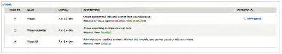
The Views components that you will need to work through this chapter are the main Views module (the first item listed) and Views UI. Views Exporter is a good module to use if you want to export the definition of a view and import that definition as a new view. It is not, however, a way to export the data that is rendered in a view. But, there's a module for that, too. Check out http://drupal.org/project/views_export_xls.
With Views installed and enabled, we're ready to proceed. But a view without content is, well, just a blank page, so the first step is to create some content. In Chapter 10, we created a content type for Events, and a very common use for Views is to create a list of upcoming events. Take a moment to create several Events so you have content to display when you set up your first View.
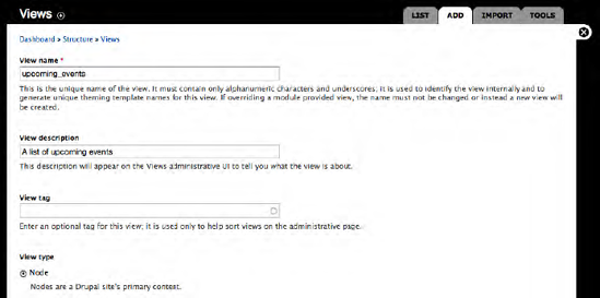
To create a View, click on the Structure link at the top of the page and click on the Views link, which brings you to the Views administration page. To add a View, click on the Add tab at the top of the page, which reveals the page for creating a new view(see Figure 11-2). On this page, define the following:
View name: The name must be unique (a name that has not been used for another view on your site), and can only contain alphanumeric characters and underscores (so no blank spaces). It's a good idea to pick a descriptive name that conveys the purpose of the view so that others looking at the list can easily identify the right one to use. For the first view, use upcoming_events as the name.
View description: This is another field that you can use to provide additional information about the view. For this view, use "A list of upcoming events" as the description.
View tag: This is an optional field that you can use to provide a list of tags that define what the view is about.
View type: A list of the types of information stored in the Drupal database that you can use to generate your view. The most common selection is the Node option, as nodes represent a vast majority of the information stored in your Drupal database.
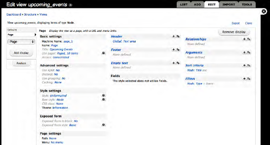
Click the Next button to proceed. You'll see the page that is shown in Figure 11-3.
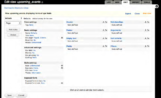
At first glance, the form for defining a view looks complex and overwhelming. Fortunately, looks are deceiving.
To define our new view, we'll start with the far left-hand column. At the top of the column, you'll see the word Defaults, which means that any values you set to the right of the column will be treated as the default parameters set for this view. Below Defaults you'll see a drop-down list that includes values for:
Attachment: Attachments are used to create a view that is a secondary display 'attached' to a primary view. Effectively, they are a simple way to create multiple views within the same view. This is an advanced feature that you can read about at
www.drupal.org/project/views.Block: I covered blocks in previous chapters, and described a block as a container for content that is assigned to a region on a page. If you want to embed a view on a page in a region, you'll want to use the Block option.
Feed: Views is the mechanism for automatically generating RSS feeds.
Page: A page represents a view that is rendered in full-page mode and is accessible through a URL that you define through the configuration process. I will revisit the Page option in a moment.
For now we will leave everything in this column as is.
In the middle column are a number of options that we can set, which I'll discuss in the following sections.
In the Tag field, we can enter a Taxonomy tag that can be used for searching and accessing the view. For this example, leave this value as None. To change the value, simply click on the None link, which exposes a field at the bottom of the configuration form where you can enter a new value.
In Figure 11-3, you can see that the Basic Settings field includes the Name, Title, Use pager, More link, and Access attributes of your new view. I will explain these here.
You can set the name of the view to something other than Defaults. To change the name, click on the Defaults link and change the value at the bottom of the configuration area. The value entered here is only used for internal uses, and isn't visible to site visitors. For demonstration purposes we'll leave the value as Default.
The value associated with this option is displayed at the top of the list that is generated by Views. To change the value, click on the None link, revealing a text box at the bottom of the Views configuration form where you can change the values. We will change the value to something that is meaningful to a site visitor who is viewing the page where this list is generated. Enter a value such as Upcoming Events.
After changing the value, click on the Update button, which brings you back to the Views configuration page. The value you entered appears next to the Title label.
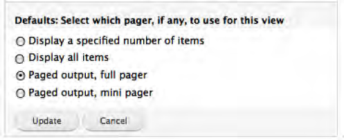
For lists that will contain dozens or hundreds of items, you can limit the number that appear on a page (usually to 10 or so) and use a "pager" at the bottom of the page instead. A pager looks like this: << previous 1,2,3,4,5,6,7... next >>. Visitors use the pager to navigate through all of the items. Views automatically creates and displays the appropriate pager based on the number of items that are in the complete list. By default, the Views module renders lists using a pager with 10 items per page. You can change this by clicking on the "Paged, 10 items" value. You'll see a list of four options (shown in Figure 11-4). "Display a specified number of items" allows you to specify how many content items will be displayed without a pager being rendered. You might want to use this approach when you only want to list the first three items. I've used this option in cases where I want to display only the last three items created on the site in a "What's New" block. "Display all items" lists every content item that meets the criteria specified in the view definition. This option works well for situations where there are fewer than 25 content items in the list. More than 25, and visitors are unlikely to scroll through them all. "Paged output, full pager" results in a list of items (say, 10 items) followed by a pager. A full pager lists other options, such as "Jump to the start of the list," "Jump to the end of the list," "Previous," and "Next." The "Paged output, mini pager" is similar to the full pager, but only provides navigational controls for previous and next.
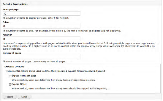
If you decide to use a pager for your view, you can set the number of items that will appear on each "page" by clicking on the small gear icon to the right of the "Use pager" option. Clicking on the gear reveals a form where you can set the number of items that will be displayed per page, the offset (think of the offset as the starting item for your view; for example, if you want to skip the first 10 items and start at number 11, you would enter 10 in the offset field), the pager ID (in nearly every case you can just leave this value as the default), the number of pages you want to display (in most cases you'll want to leave it as blank to show all pages), and you have the option of exposing the options for the visitor to set the number of items per page and the offset. See Figure 11-5.
If your view is limited by the items-per-page field to a number that is less than the number you have defined for your view, and you decide not to use a pager, you can provide a "Read more" link, which the visitor can click to see the complete list of items. You can set this value by clicking on No and changing the value on the pop-up form to Yes. For now, let's leave the value at No, as we're using a pager.
We can define which types of visitors have the ability to access the Access view by selecting from the list of user roles or permissions that are defined on our site. You may have a view, for example, that lists information that only people assigned to the Human Resources Department role should be able to access. To set the value, click on the Unlimited link to reveal the configuration options shown in Figure 11-6.
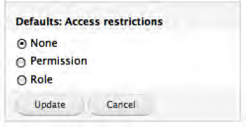
We can select Permission (for example, we might have a permission that defines the ability to view a particular content type) or Role. Typically, permissions are assigned to roles, and roles are granular enough to define the ability to access a view. There may be cases where you need fine-grained control over who can access a content type, or you have dozens of roles that all have the same permission. In such cases, you can use permissions to restrict instead of having to select dozens of roles. For this example, select Role and then click the Update button, which reveals a page with a list of roles that we can select from. Select the appropriate roles and click Save. For this example, we will select "Authenticated user," which means anyone who has an account and is logged into the site.
Advanced settings control features such as the use of Ajax, whether Views should remove duplicate rows, and whether caching should be used.
Note
Ajax is a set of technologies that enable things like sorting and paging through pages of a view, without refreshing the page. It is a nice added feature that makes it quicker for site visitors to manipulate your views. It is, however, optional.
To enable this feature, click on No and change the value to Yes in the form that appears at the bottom of the Views configuration form. Do this for our example.
There may be cases where your view returns duplicate items due to the filters you defined (although it is highly unlikely, it can happen). If you see duplicate items in your list, check this box. To remove duplicates, you can set the Distinct value by clicking on No and checking the box on the form that appears at the bottom of the Views configuration form. In our example, we will leave the value as unchecked.
Grouping is a powerful feature that allows you to break data returned from a view into separate sections based on a field that is contained in the view. As an example, we could decide that we want to list events grouped by venue, where each venue has its own section of the report that is generated through views. I'll revisit groups in a bit.
There may be cases where views that return a large number of items take longer than desired to load on the screen. If you have a high-traffic site with views that return large numbers of items, it is advisable to use the caching mechanism provided by Views. Caching causes the view to first check to see if that list exists in cache and, if so, renders it from cache instead of going to the database and retrieving every row that meets the specified criteria. It is a great feature that improves performance. The downside of this feature surfaces if you have content that changes frequently. A highly dynamic list of content using caching may result in items that were added, changed, or removed from the database not appearing as they currently do in the database, as the view was cached and Views did not go to the database to re-read all of the values. It is a helpful feature and something that you should consider using. In our example, the list of events is short and we don't anticipate having a large number of visitors, so we'll leave the value set to None.
This is the "meat and potatoes" section in the first column. These are key settings that impact how the view is rendered on the page. You'll want to pay special attention to these values as you build your view.
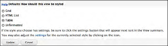
Views provides the ability to render the output of your view as a Grid (a good example of a grid is a photo gallery where there are rows and columns of pictures displayed), an HTML list (just a list of items with bullet points), a Table (output that looks like an Excel spreadsheet with rows and columns where each item fills a single row), or unformatted, which renders the content as it would appear on the page in Teaser or Full Node view. We will start with unformatted in our first pass through creating a view, and will update the view to a table later in the chapter.
We can define how each item displayed on the screen appears with the Row Style option. To view the configuration options, click on Fields to reveal the configuration options form at the bottom of the Views configuration form. See Figure 11-7.
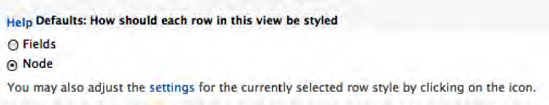
We can select the Fields option, which provides the ability to pick individual fields out of our content type to display on the list (you may only want to list the titles of your items in the list and nothing else). Or you may want to display the list of items as a Node, meaning either the Teaser or the Full Node version. When you see lists of the latest news stories, for example, on a site, that would likely be someone using the Node option and rendering the teaser of that node with a "Read more" link to view the entire article). For now, we'll select the Node option.
Since we selected the Node option, we'll want to define whether we want the view to render the Teaser version of our item or the Full Node version. To set that option, select Node to see the Node configuration options at the bottom of the Views configuration form. See Figure 11-8.
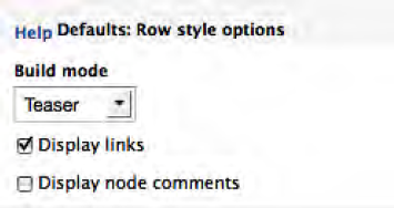
On this form, we can select either the Teaser or Full Node mode for how the item will be displayed. For demonstration purposes, we'll leave the option set at Teaser. The "Display links" option provides a mechanism for turning off the "Read more" link for teasers or other links, such as links to file attachments for this node. We'll leave it checked for our example. The "Display node comments" option allows you to specify whether comments associated with each item should be displayed along with the node itself in the list. If comments are an important part of what you are trying to communicate to your visitor, you should check this box. For our example, we do not want to display comments, so we will leave it unchecked. When finished, click on Update to return to the previous screen.
The CSS class option allows you to assign a class attribute to your view. Click on None to access the form where you can change the value from None to the name of a CSS class class.
The Exposed form provides the ability to separate view controls from the view itself, exposing those controls as a block that you can place elsewhere on your page. You might use this when you have an exposed filter and don't want that filter to appear at the top of the view, but somewhere else as a block (say you provide the ability for the visitor to select options that reduce the number of records that appear in the view, based on a specific criteria; for example, to only show all upcoming events that are taking place at the Civic Center). It's a helpful feature, but an advanced topic that is beyond what I will cover in this chapter.
We've made it through the first column and are ready to tackle the second column. Because we made several changes to our view, it's a good idea to save it before proceeding. If we were to close the window for some reason, all of our changes would be lost. From personal experience, it's a good idea to save often. Before proceeding, click Save.
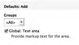
With this option, you have the ability to author text that will appear at the top of your list. You may want to provide an introductory paragraph that describes the content in the list, or any other static content that you wish to author for this list. To create the content, simply click on the plus (+) sign to the right of the Header title, which reveals a form at the bottom of the Node configuration form where you can select where the header should be applied (either globally on every page or at the top of a specific group, if you defined grouping as an option). For the events example select <All> and check the Global: Text area option. See Figure 11-9.
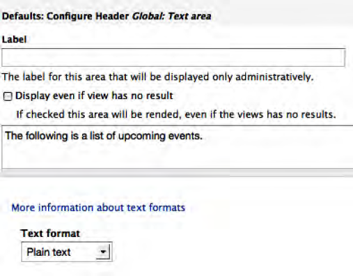
After clicking on the Add button, the form shown in Figure 11-10 is displayed. On this form, enter the text that you want to display at the top of your view. For our example, enter "The following is list of upcoming events" and click the Update button.
We can also provide a footer for our view, which is text that will be displayed at the bottom of our list. Creating a footer is the same process as the header. Click on the plus (+) sign to view the form.
The Empty text option provides the ability to display a sentence or paragraph in the case where your view does not return any values. This is a good option to use, as it provides a more user-friendly result in the case where the view is empty. Instead of displaying a blank page, you could display a sentence that says, "We're sorry, we did not find any upcoming events at this time." Go ahead and add this empty text message. To do so, follow the same steps outlined for the header.
If we had selected Field as the option for Row Style in the first column, we would have been presented with the ability to add the fields that we want to display on our view here. But because we picked Node instead, the concept of fields doesn't apply. I'll revisit this configuration option when we update our view later in this chapter.
We completed the second column, albeit without doing much. It's time to save our view again before proceeding to the last column.
The Relationships column provides the ability to "link together" related information. As an example, say you have a content type for an employee, and in it you have a field that is a reference to that employee's location. The address information for the location is stored in the Location content items, and your requirements call for a view that lists employees and their location's address. Because address isn't stored on the Employee content type, you need some method for "linking" the two content types together to display both employee and location information as a single item in the view. Relationships provides that mechanism. For details on using relationships visit the documentation pages for Views at www.drupal.org/project/views. Our example view for events doesn't have a relationship, so we'll bypass this setting.
Arguments provides a mechanism for passing values to your view, typically through the URL that is used to render the view. An example of how you might use arguments is to limit the values returned for our list of events to a specific venue.
One of the "power" features of Views is the ability to sort the output of our view before it is rendered on the screen. You can sort on none, one, or several fields that are associated with your content type. For our example, we want to sort on the list of upcoming events by the title, in ascending order. To set the sort criteria, click on the plus (+) sign in the heading for sort criteria. You'll see the form shown in Figure 11-11.
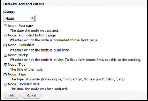
On this page, you will see every field that is defined for any content type that exists on your site. The list is long and will grow over time as you create new content types. Views does provide a filtering mechanism to narrow the list of options based what group the field belongs to. The two primary options that you'll use are <all>, which lists every field, and Node, which lists the Drupal core fields that are associated with a generic node. Since the title field is part of core Drupal, we can select the Node filter to limit the number of fields that are displayed. Check the box next to "Node: Title" and click the Add button at the bottom of the screen. Views then displays another configuration form where we set the order that we want our items to be sorted (see Figure 11-12).
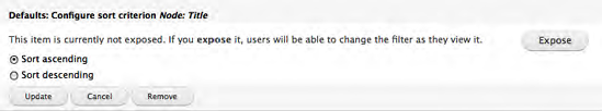
We want our items to be sorted alphabetically in ascending order, so we will use the default option and finish the process by clicking the Update button.
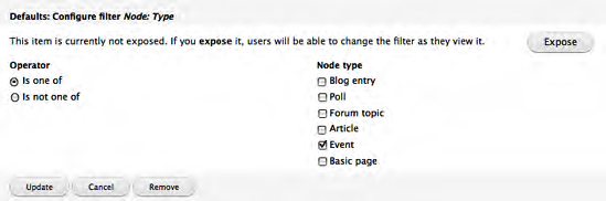
The last set of configuration options define the filters that Views will use to narrow the list of items that are returned to our view. You can filter the results on every available field for your content type, including the Drupal core fields associated with a node. You could filter by author (as in, only show me articles that were written by John), by published date (only show articles published in the past week), by Taxonomy term (only show me articles about basketball), by content type (only show me Event content), or any other field or combination of fields that are exposed to your content type. For our example, we want to filter the results by content type, as we only want to show nodes that were created as Events. To set that filter, click on the plus (+) sign in the bar associated with the Filter, exposing the same list that appears in Figure 11-11.
To narrow the list of options that are displayed, select Node from the Groups field, as we want to filter by Node Type. After the page is refreshed, scroll down until you see Node: Type and check the box. Click on the Add button to proceed to the next step (see Figure 11-13).
On this screen, we want to limit the types of content that are displayed in our view to only Events. To do this, we simply click on the "is one of" option on the left and check the box next to Event and click on the Update button. If we wanted to provide the option for visitors to select the content type that is rendered, we click Expose. If we had more than one Node type selected, the visitor could select one or more of the values to control what is shown in the list. For our purposes, we only want to show Events, and we don't want to provide visitors with the ability to change that behavior. Check the box next to Event, and click on the Update button to proceed.
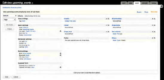
At this point your Views configuration screen should look something like Figure 11-14, depending on which options you selected during the previous process.
Click the Save button before proceeding.
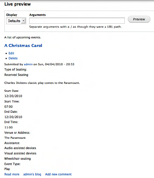
You may have noticed a feature at the bottom of the Views configuration page called Live Preview. This allows you to quickly test your view to see if it is displaying the right values in the right order. You can click on the Preview button at any step in the process to see how the view will look on a page. See Figure 11-15.
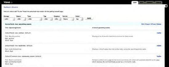
Views can be embedded in a page as a block, in a node, or they can be their own stand-alone page with their own unique URL (one view per URL). To render a view as a page, we need to add a display type to the view. If you return to the main Views configuration page for the view that we just created (if you are not on that page, you can return to that page by clicking on the Structure link at the top of the page and on the Structure page, clicking on the Views link). Clicking Views presents a list of the views that are defined on your site (see Figure 11-16). Included in this list are default views that are created automatically when you install the Views module, as well as any views that have been created on your site by administrators.
Find the view you want to update in the list and click on the edit link. Our view was the Upcoming Events list. Clicking on the edit tab reveals the Views configuration page.
On this page we want to add a new display, specifically a page display, because page displays have the ability to specify a URL and renders the view in full-page mode. To add the page display, ensure that the value Page is selected in the drop-down list in the far left-hand column of the Views configuration form. Once it is selected, click on the "Add display" button. Views will redisplay the Views configuration page with additional options that are associated with rendering a view as a page. See Figure 11-17.
There are two primary changes to notice on the Views configuration form: first, the left-hand column now has a link for a Page display, and second, there is a new configuration block for Page settings (at the bottom of the middle column). We can now specify the URL for accessing the view and we can add our view to one of the menus on our site.
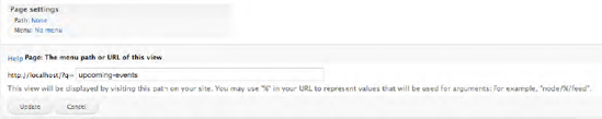
To specify the URL for this page, click on None next to the Path label, revealing a form at the bottom of the Views configuration form (see Figure 11-18). On this form, you will see that there is a text box for entering the URL that you want to expose that allows a user to see the view in full-page mode. In our example, the new URL is http://localhost/?q=upcoming-events. It is a good practice to use URLs that contain words that are related to the content on that page, using hyphens to separate individual words. Our example creates a human- as well as search-engine-friendly URL for our view. After entering the URL click on the Update button.
The second option that we have on this form is to assign our view to a menu. To add our view to a menu, click on the "No menu" link to define the type of menu (a normal menu entry or a tab) and the menu that you want to assign your view to. For our demonstration we will not add our view to a menu.
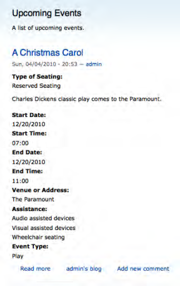
Remember to save your view before doing anything else! We are now ready to test our view by entering the URL that we just created into the address bar of our browser: http://localhost/upcoming-events. After clicking Enter, your view will be rendered on the page. See Figure 11-19.
In the previous examples we rendered views as simple nodes. There are likely cases where you will want to render lists as tables. We are going to update our list of upcoming events view that we created in the previous example, changing the output from a list of upcoming event nodes to a list of upcoming events in a table.
The benefits of the table include the ability to render specific fields from your content type and not the whole node, in a format that is sortable by the visitor by clicking on the column titles. Figure 11-20 is an example of how I used a tabular view for one project.
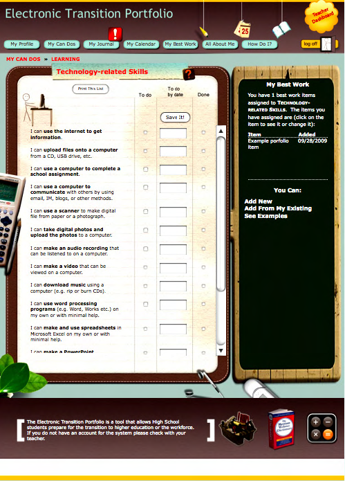
In this example, the author created a view that renders content items as a table on the left, and a list of files that were uploaded as a table in the column on the right. The left column lists several custom content types in a table ("can-do" nodes that capture skills that high school students must demonstrate in order to graduate). This is an advanced version of a table based view, as it allows the student who is using this page to update several nodes at a time by checking boxes next to list items and picking dates from a pop-up calendar. But it is a prime example of a creative way to use tabular views as a mechanism for rendering lists of data as rows and columns.
To update our list of upcoming events view, return to the Views configuration form that we have used in the past (click on the Structure link at the top of the page, click on the Views link on the Structure page, and click Edit next to the Upcoming Events view).
There are two basic changes that we need to make in order to enable our view as a table. First we need to change the Style field from Unformatted to Table, then we need to select the fields that we wish to display in our table.
So first, click on the Unformatted link and, on the configuration form, select Table. See Figure 11-21.
After changing the value to Table, click on the Update button. The next step is to list the fields that we want to appear as columns in our table. To add the list of fields click on the plus (+) sign in the second column next to the Fields heading to see the screen shown in Figure 11-22.
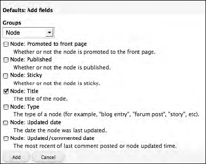
Scroll down the list and choose the fields that you want to display to your site visitors. Likely candidates include the event title (shown in the list as Node: Title), the event start date, the event end date, and the event venue. Place a checkmark in the box next to each of the fields and then click the Add button at the bottom of the list.
After clicking Add, you will be prompted through a series of screens for setting various attributes of each field that will be displayed. See Figure 11-23.
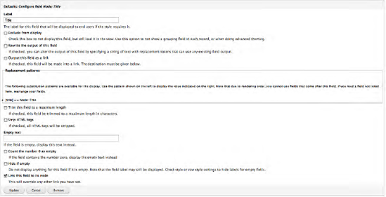
In most cases, you can leave the default values alone and proceed to the next field. The one exception is that you'll likely want the title to be a field that is rendered as a link to the full-node version of that content item. On the form for configuring the title, check the "Link this field to its node" box. Click the Update button for each field until you reach the end of the list. Views then displays the Views configuration page.
There may be scenarios where you want the site visitor to have the ability to sort the data rendered in the view by clicking on the column titles. Clicking on a title will resort the list in ascending (or descending) order, based on the values contained in that column. To enable this feature and to specify which columns should be sortable, click on the gear icon that is to the right of the Style: Table item in the Style settings section of the Views configuration form. Clicking on the gear reveals a spreadsheet-like interface where we can specify which column is sortable by checking the box in the Sortable column. See Figure 11-24.
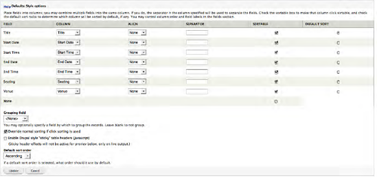
We also have the ability to group values in our table by a specific column of information in the view. A good example might be that you want to group all of our Events by venue. Each venue would have its own separate table in the view as it is rendered on the page. A powerful and often overlooked feature!
After clicking the Update button after assigning sort options, make sure you click the Save button for your view.
You are now ready to test your view to see how it looks in table mode. To see the view, enter the URL you created for the page view in your browsers address bar, and click Enter.
Another "power" feature of views is the ability to generate RSS feeds from content stored on your site. RSS stands for Real Simple Syndication and is a mechanism that visitors can use to display content from your site in a newsreader like MyYahoo or iGoogle. Any view you create can also become an RSS feed by simply adding the Feed display in the left column of the views configuration form and clicking on the Add display button.
After clicking the Add display button click on the Feed link in the left column to reveal the configuration options for RSS feeds. See Figure 11-25.
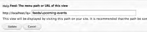
A Feed has the same configuration options as a Page, and requires that you enter a path that a visitor can capture to import into their feed aggregator package. For our example upcoming events view, we'll create a new URL of http://localhost/?q=feeds/upcoming-events. We added "feeds" before "upcoming-events" just as a mechanism for organizing all of our feeds into a specific URL structure. The use of "feeds" is purely a personal preference. You can use any URL structure that you wish. After entering the URL, click on the Update button, and after the update, remember to click on the Save button to save all of your changes.
If you followed the example, you can now enter http://localhost/feeds/upcoming-events to see that Views generates a standard RSS feed that your users can now use to pull content from your site into their own site or into their RSS reader.
I've only scratched the surface of how you can use Views on your new site. Views is extremely powerful, and one of the "killer" modules for Drupal. There are also add-on modules for Views that we did not cover in this section. Please visit www.drupal.org/project/modules and click on the Views link in the categories listed in the right column. At the time of writing, there are 299 contributed modules just for Views! Browse through the list (remembering to look to see if there is a Drupal 7 version of the modules you may be interested in). People have created many amazing capabilities for Views.
As part of the "holy trinity" of Drupal modules, Views is even more powerful when used in conjunction with panels. If you think Drupal is awesome, just wait until you see what you can do with Panels and Views!