The third of the "holy trinity" of must-have Drupal moduleas is the Panels module. You may have noticed that, up to this point, our page layouts have been constrained to the regions that were defined by the developer of the theme we are using. If you look at the Garland theme shown in Figure 12-1, there are three primary "containers" for elements on our site: the left sidebar, the right sidebar, and the center content area (I exclude the footer and header from this list because you would typically not put dynamic content in either of those regions, although you could if you wanted to).
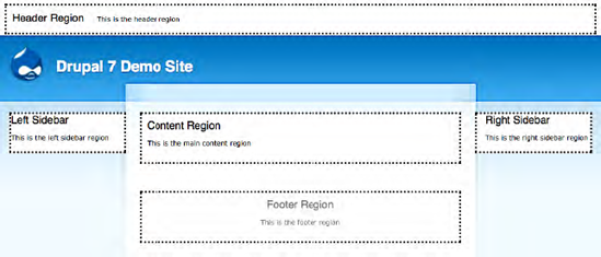
The primary container that is used in such a theme is the center content region, which is more or less just a box. Although this layout may work perfectly for every page of your site, there are likely cases where you'll want to divide the content region into multiple "mini-regions." As examples of this, I'll show you two different I've developed, both of which rely heavily on the Panels module.
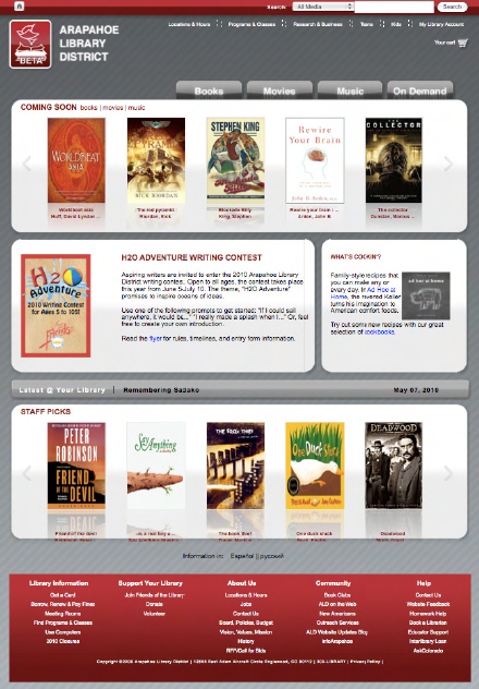
The first example (see Illustration 12-1) has seven separate "panel panes" (the official name of "mini-regions") divided into six separate "rows":
The top row has one panel pane that contains the navigation tabs for books, movies, and music.
The second row has one panel pane for the carousel of items called "Featured Picks."
The third row has two panel panes, the one of the left is titled "Featured" and shows a featured item from the library, and the one on the right shows a featured story.
The fourth row is a rotating news banner.
The fifth row displays another carousel, this time of featured items that are recommended by library staff.
The sixth row shows a language selection option.
The second example (see Illustration 12-2) is less complex, representing a more typical use of panels to divide the content region into multiple panel panes.
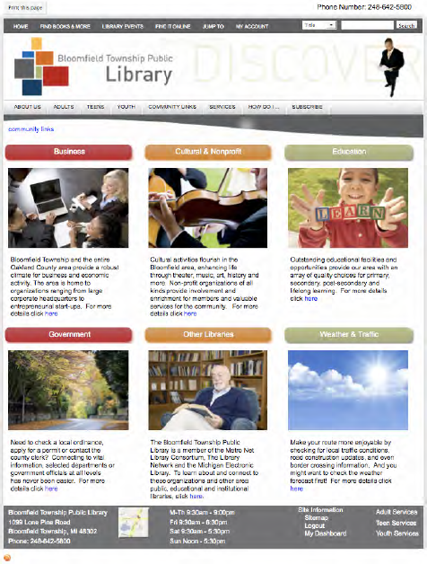
On this page, the content region is divided into two rows, each row having three columns.
Both of these examples make it extremely easy for content authors to place content in a specific panel pane. When creating the site I used Views for each panel pane to define what content should be rendered, how many items should be included in the list, and how those items should be rendered. Using Taxonomy, content authors select the appropriate taxonomy term that is associated with each panel pane, and the content automatically appears in the right spot on the right page. Simply by the author creating a content item and selecting a taxonomy term from a list. I will cover more on putting a solution like this together in a few moments.
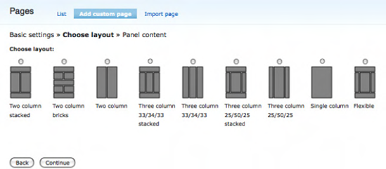
The Panels module provides eight standard layouts and one "flexible" layout for you to use to divide up your content area. Figure 12-3 shows the layouts provided by each option.
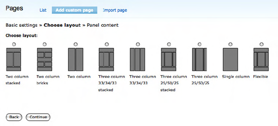
The first eight options are "pre-built" layouts, while the "flexible" option provides the ability create your own layout. I will walk you through examples of using a pre-built and a flexible layout in this chapter.
Before creating our first panel page, we need to address an unfortunate case of confusing terminology. Drupal provides a basic, out-of-the-box content type called a Page. You use this content type to create a new page. In the Panels module, you create a page, albeit a panel page. To make it even more confusing, you can assign page content, created using the Page content type to a page built through the Panels module. Confused yet? To minimize the confusion, I will always call pages created through the Panels module "panel pages." I'll call content created using the page content type a "node."
When creating a panel page, you need to decide what content is going to go on the page, as well as the layout for the page. You can use Figure 12-2 to figure out whether an "off-the-shelf" layout exists that meets your needs. If one of the eight basic layouts doesn't work, you can always create a custom layout using the flexible option. For demonstration purposes, we're going to assume that we want to divide the content region into three rows, with the first row having a single column, the second row having two columns, and the last row having a single column. We could have just as easily picked one of the other layouts, but let's say our requirements called for the layout we just described.
Note
At the time of writing, the Panels module was not ported to Drupal 7. Discussions with the primary developer of the Panels module revealed that the differences between the Drupal 6 and 7 versions of Panels would be minimal. Some of the operations that I describe in the remainder of this chapter may differ slightly from the actual implementation of Panels under Drupal 7. I suggest checking the Apress website and the pages associated with this book for any updates that occur after the book is published. I will provide updates to this chapter on the Apress website once Panels is available for Drupal 7.
To begin creating a new panel page, you must first install the Chaos Tools (www.drupal.org/project/ctools) and Panels modules (Panels is dependent on the Ctools module; you can download Panels from www.drupal.org/project/panels). To install the modules, follow the step-by-step instructions in Chapter 8. Installing Ctools and Panels is the same as installing any other contributed module in Drupal 7. Make sure that you enable the module after you have installed it. I suggest enabling all of the Panel's module components (Mini panels, Panel nodes, Panel pages), as you will likely use all three types of Panels as you build out your website.
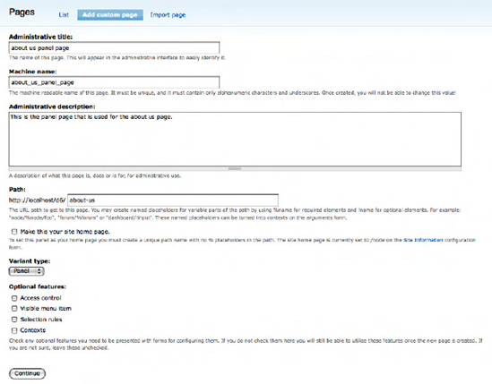
Once the module is installed and ready to use, click on the Structure link on the top menu and click Panels on the Structure page. We will want to create a new custom panel, so select the option for creating a new panel page. The information that we well enter on this page (see Figure 12-3) includes:
Administrative title: This title appears on the administrator's page that lists all of the panel pages that we have created. This title is not exposed to site visitors, only site administrators. For our example panel page, we'll use "about us panel page" as the administrative title.
Machine name: This is the internal name that Drupal will use to reference this panel page. The name must be unique, be alphanumeric, and use underscores to separate words (no blank spaces are allowed). For our example panel page, we'll use "about_us_panel_page" as the machine name.
Administrative description: This is a place to describe the form and its purpose. This description is only viewable by administrators. We'll enter a brief description about the purpose of the page: "This is the panel page that is used for the about us page."
Path: This is the URL that a user would use to get to the panel page. The URL could also be part of a menu or a link on a page. We'll use "about-us" as the URL for accessing our new panel page.
Variant type: We will be creating a panel.
Optional features: Features that we can enable for our panel page include access control (restricting who can see the panel page), visible menu item (putting a link to the panel page on a menu), selection rules, and contexts. Selection rules and contexts are advanced topics that you can read more about at
http://drupal.org/project/panels. For our demonstration, we will leave all of the optional items unchecked.
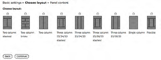
After clicking the Continue button, you will be taken to the page shown in Figure 12-4, where you can select the layout that you want to use for your new page. For our example panel page, we'll use the first option, the "Two columns stacked" layout.
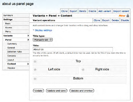
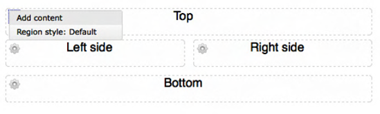
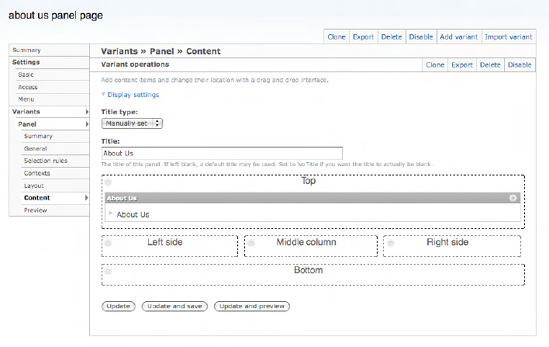
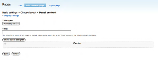
After clicking the Continue button, you are taken to the page that you will use to assign "things" to the various panel panes on your new panel page. As you can see from Figure 12-5, you have a panel pane across the top, two columns below the top row, and a single panel pane across the entire panel page at the bottom. Before moving away from this page, click the Finish button to save your panel page, returning you to the main configuration page for this panel page (shown in Figure 12-5). Enter About Us in the title field and click the "Update and save" button.
For our first pass through this exercise, we will create a new node and assign pre-built components that ship with Drupal core into panel panes. To create a new node, either open a new browser window or a new browser tab and use this shortcut URL to get to the content creation form for a new page content type: http://localhost/node/add/page (replace "localhost" with the appropriate domain name if you are not using your desktop/laptop as your server). Enter the URL and click Enter. Add a title and body text, say a paragraph or two. Your new content should look something like Figure 12-6, only with your content and title.
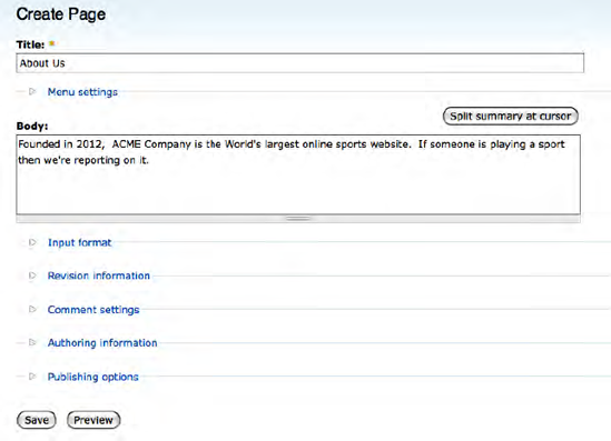
Click the Save button to create your new node.
To begin the process of assigning "things" to each of the panel panes (Top, Left side, Right side, and Bottom), click on the gear icon at the left edge of the top panel pane. Clicking on the gear reveals a pop-up menu with an option to assign content and an option to change the style. We want to assign content, so click on the "Assign content" link (see Figure 12-7).
Next you see the "Add content to Top page," where "Top" represents the pane that we clicked on to add content. See Figure 12-8.
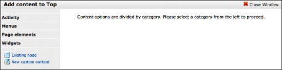
Before adding anything to a pane, let's walk through the items that are available for you to assign to a pane. On the "Add content to Top" page (see Figure 12-9) you will see a menu of options in the left column. Click on the Activity link to reveal a list of items that you can assign to the pane.
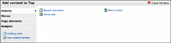
The list of items includes recent comments posted on the site, a list of new users who were recently added to the site ("Who's new"), and a list of currently logged-in users ("Who's online"). If you've installed contributed modules, you may find additional items that are enabled through the additional modules.
Next, click on the Menus link in the left column. This reveals a list of all the menus that are present on the site. The two menus that you can assign to a pane are the Main menu and Secondary links.
Next, select the "Page elements" link in the left menu to reveal the following list of items:
Breadcrumb is a list of links that represents how the user got to this page. For example, they may have clicked on "About us" on the home page, resulting in a breadcrumb that would just show "Home."
Help displays the help text associated with an item on the page that provides context-sensitive help.
Mission displays the mission statement for the organization as defined on the theme configuration option page.
Page footer message is another item that is defined on the theme configuration options page.
Page title displays the page title for this page.
Site slogan is another item that is defined on the theme configuration options page.
Status messages displays any messages that Drupal or a module generates to represent the results of an action (for example, your updates were successfully saved).
Finally, tabs. There are various modules that provide a tabbed interface to access various pages on a form.
In most cases, all of these elements are exposed to the visitor through the theme instead of through a panel page. You should consult your theme definition to see if these elements are already included.
The next link in the left column is the Widgets category. Clicking on Widgets displays the following list of items:
The links below the Widgets link provide the ability to insert an existing node or add new custom content. To insert the node that we created a few minutes ago, click on the "Existing node" link, revealing the page shown in Figure 12-10.
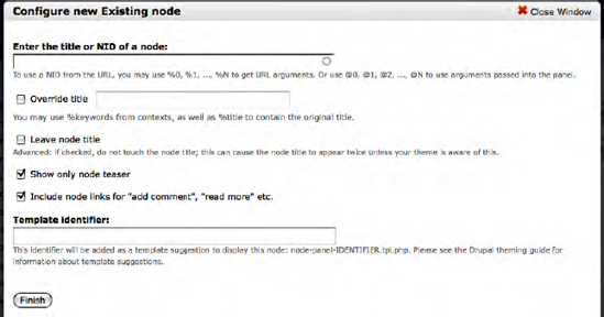
To insert the node that we created earlier, enter the title or, if you don't remember the whole title, enter a word or two that reveals a drop-down list of all nodes with those words in the title. This is a great feature when you have hundreds of nodes to pick from. The example node we created had "About us" as the title, so go ahead and enter that in the "Enter the title or NID of a node" box. (If you know the node ID, you can enter that number instead of the title, but typically the title is the easiest method for assigning a node to a pane.) We'll leave the other options alone, as we don't want to override the title, we don't want to duplicate the node title, we only want to show the teaser, and we want to provide the ability to add a comment. When you've entered the Node ID, you're ready to click the Save button, which brings you back to the main Panel Page configuration page. You'll note in Figure 12-11 that the node that we assigned in the previous step now shows up in the Top pane of the page.
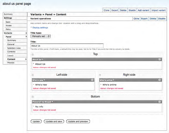
To demonstrate the layout, repeat the process above for the Left side, Right side, and Bottom panel panes. Click on the gear for the Left side pane, then click on the Activity link in the left column and select the "Who's new" item. Leave the title as is and click the Finish button. Do the same for the Right side, only this time select the "Who's online" item. Finally, do the same thing for the Bottom pane, and add the "Powered by Drupal" widget. After you've added your node to each of the other three panel panes, your page should look like Figure 12-12.
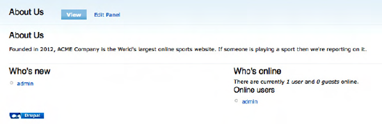
We are now ready to save our panel page and test it. Click on the "Update and save" button to complete the configuration, which returns you to the main Panel Page configuration page. Once saved, we can now test the page. Visit the page at http://localhost/about-us (if you're not running the site on your desktop or laptop, then change "localhost" to the appropriate domain name). The final result should look something like Figure 12-13.
Congratulations, you just created your first panel page! The process that we just went through shows how simple it is to create amazing layouts without having to touch a single line of code, HTML, or CSS.
Things change, and it is likely that, at some point in the life of your website, you'll want to change the layout of a page, or the content that is on that page. For our example, let's say we decide that we need to
To begin the process, we'll click on the Edit Panel link at the top of our page (if you are not on the page that we want to change, enter the URL of the page in your browser's address bar), revealing the Panel Page configuration page, as shown in Figure 12-14.
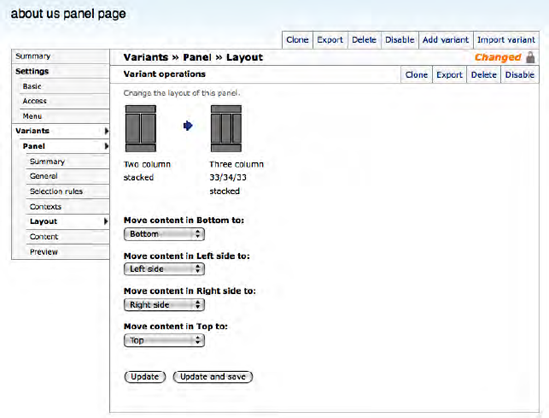
Before adding the new elements to the page, we'll change the layout so we have a place to put the login form. To change the layout, click on the Layout link in the left column of the panel page configuration area. Clicking this link reveals the standard layout options provided by the Panels module (see Figure 12-4). Select the three column 33/34/33 stacked option. After clicking on the radio button for the new layout option, click on the Continue button at the bottom of the page. You are now presented with a page that asks you where in the new layout you want to move the content that was present in the previous layout.
In our example, we'll leave the content that was in the top panel. We'll move the "Who's new" item to the center column by grabbing the title bar of the "Who's new" block and dragging it and dropping it on the center column. The next step is to add the User login component to the left column. Follow the same process that you used in the previous example to add elements to the panel. The User login component is under the Widgets menu item. After adding the widget, it's a good idea to click the "Update and save" button.
The last step in our updates is to add a second node to the top pane. Let's see if you were paying attention in the previous steps. Create a new node and assign it to the top area and arrange it so that it appears under the top item. A good example that you could use is the Company's contact information (e.g., address, phone, fax). After adding the node, don't forget to click the "Update and save" button. The resulting screen should look something like Figure 12-15.
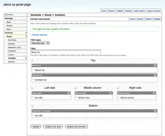
Clicking "Update and save" takes us back to the Panel Page configuration page, with the Login widget now shown in the right column.
Repeat this process (clicking on the gear icon for the right-side panel pane and clicking the add content link), this time selecting Activity from the left menu instead of Widgets, and select first the "Who's online" item. When that item is added to the right column, repeat the steps for the "Who's new" item.
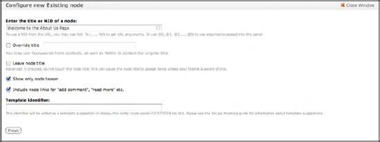
Before proceeding, click the Update button as a safety measure before proceeding to the process for adding a second node to the top panel pane. We're now ready to add the second node. First create a new node to insert in the top area by either opening a new window or a new tab in your browser and, in the address bar, entering the following URL to get to the Node add form for the Page content type: http://localhost/node/add/page (if you are hosting your Drupal site, you will need to replace "localhost" with the appropriate domain name). On the Page creation form, enter a title and body text. When complete, click the Save button, remembering the title you used for the new node. You can now click the gear icon for the top panel pane and the "Add content" link.
SelectClick the "Existing node" link and then enter either the node ID of the node you just created or the title of the node in the top text box. In Figure 12-16, you can see that entering the first word from the node's title reveals a drop-down list of all nodes with that word in the title. You can select the node from the list by clicking on it. Once selected, you can then skip the other options and click the Finish button.
You will be returned to the Panel Page configuration screen, which now shows your second article in the top panel pane, below the previously submitted node.
We have completed the changes that we set out to accomplish, so you can once again click the Update button. Finally, click the Save button at the bottom of the page to complete the updates.
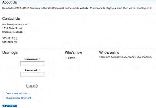
If you return to the About Us page (http://localhost/about-us), you will see results of our changes reflected on the page. See Figure 12-17.
There may be situations where one of the eight pre-defined layouts available in the Panels module do not meet the layout needs of a particular page. In these situations, you can use the flexible layout option, which provides the ability to create virtually any layout you can imagine. To create a new flexible layout page, follow the steps outlined in the previous section for creating a new panel page (click on the Structure link in the top menu, followed by Panels on the Structure link, and the Add link on the Panels page). Fill out the main panel creation form as we did previously using "Products and services" as the administrative title, "products_and_services" as the Machine name, and "products-and-services" as the URL of the page. Click the continue button revealing the panels layout page. See Figure 12-18.
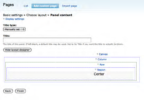
In the figure, you can see the flexible layout listed as the last option. This option provides you with essentially a blank canvas on which you can "draw" the rows and columns you need on your layout. Clicking Flexible followed by the Continue button brings you to the Flexible Layout configuration page. See Figure 12-19.
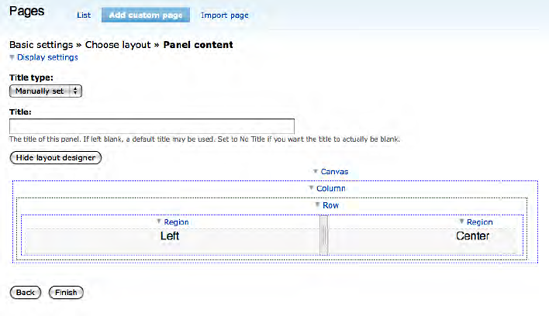
Right now the panel page has a single panel pane (named Center). To add new rows and columns, click on the "Show layout designer" button, revealing the layout designer page shown in Figure 12-20.
On this page, we can add new regions (for example, we could add a left and right region to the row where our Center region is), new rows, and new columns. If we wanted to add a new region to the left of the existing Center region, we would click on the Row link to expose a list of options. See Figure 12-21.
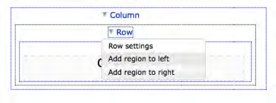
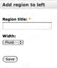
The options allow us to add a new region to the left or the right of the existing region. Selecting a new region to the left reveals the configuration options for the new region. In Figure 12-22, the title was set to Left and the width was set to Fluid (the column width will expand or shrink based on the content in that column).
This results in a layout that now appears like that shown in Figure 12-23.
You could continue to add regions to this row, add new rows, and move things around on this form until you have a layout that matches your requirements. Once you have the layout set, click the "Hide layout designer" button to return to the page where you assign items to your various panel panes, just as we did with the stock layouts that we used in previous examples.
There are virtually no limits to what you can assign to panel panes. A common assignment is to insert a view into a panel page. One of the features included in the Chaos Toolset module that we installed in a previous chapter is the ability to assign a view to a panel pane. Once installed and configured, views will appear on the page where you can select items to assign to a panel pane.
Other modules may provide components that you can insert into a panel pane, or you can create your own custom component for a specific panel pane using the "Custom content" option (under "Add existing node").
Panel pages are a "must have" feature for most websites. The Panels module is one of the contributed modules that will likely become one of your "always install this module before starting a new site" module.
You now have the knowledge required to embark on the journey of creating interesting and creative pages on your new website. With all those interesting pages, you are surely going to see a wave of site visitors. To prepare yourself for the onslaught of activity on your site, I'll take you through the common activities involved in managing your new site in the next chapter.