
Chapter 17
XHTML and HTML 5
WHAT YOU WILL LEARN IN THIS CHAPTER:
- The relationships between XML, HTML, XHTML, and XHTML 5
- The structure of XHTML documents
- Creating XHTML with XSLT and XQuery
- Styling XHTML and XML with CSS
- The HTML 5 Open Web Platform
- Differences between HTML 5 and XHTML
- When to use which sort of HTML
The HyperText Markup Language (HTML) was introduced in 1989 as the way to create documents on the World Wide Web (WWW). The World Wide Web (Web for short) combined several ideas at the same time: it is decentralized, meaning that anyone can put up a web server without needing permission from a central authority. This decentralization allowed the Web to scale. The Web scales because it is unreliable: you can encounter broken links. Previous attempts at large-scale HyperText systems had required a single, central link database. Despite being unreliable and decentralized, the Web also gives every reachable resource a name. These names, Uniform Resource Identifiers, are commonly known as URIs, URLs, or web addresses. Any web client, such as a browser, can fetch any resource given its URI. The resources are usually fetched using the HyperText Transfer Protocol (HTTP); HTTP takes a list of formats and languages, and returns the requested resource in the best format available in the requested language. Most often, that format is HTML.
There was actually nothing special about any of the ideas in the World Wide Web, but the combination of ideas was new. For many early users, also new was the ability to mix links and text in the same document. Competing systems, such as Gopher, could not do this. Other systems could do this, but they were not freely available, or were not decentralized, or tried to be reliable and as a result did not scale.
In this chapter you learn how HTML works, how to style HTML with CSS, how to link JavaScript to HTML, and about the various dialects of HTML, including HTML 5. The short historical perspective in this introduction and the start of this chapter will help you to understand the relationship between the various parts.
BACKGROUND OF SGML
HTML and XML were both derived from an older international standard, ISO 8879, the Standard Generalized Markup Language (SGML). Like XML, SGML is a system for specifying your own markup languages. HTML was one such language. Up until HTML 4 there was an SGML document type definition (DTD) published for HTML.
 NOTE HTML, then, as you already know from earlier chapters in this book, supports hyperlinks in the middle of text. It’s worth emphasizing this because most other formats used on the Web, including JSON and RDF, cannot easily do this.
HTML and SGML
The most obvious feature of SGML that HTML used, and that is not available in XML, is called minimization. This feature lets you omit tags that the parser can imply. The following two HTML fragments are equivalent:
<P>This is a paragraph
<P>And this is another one.
and:
<P>This is a paragraph</P>
<P>And this is another one.</P>
The HTML parser knows you can’t have one <P> element inside another, so it closes the current one automatically. This led some people to imagine that <P> was some sort of command to start a new line and that paragraphs did not contain content — a misconception one still encounters!
SGML also allows quotes to be left off attribute values in some cases; in others you can omit the attribute name and just put a value.
Elements declared as EMPTY in XML, as you know, use the self-closing tag, <br/>, or a close tag immediately after the open tag, <br></br>. But SGML uses the form <br>, and the SGML parser, after reading the DTD for HTML, would know that <br> was declared EMPTY, and would not even allow an end tag for it, but would just want <br> by itself.
HTML elements are also case insensitive, so you can close <p> with </P> if you like, or use <Br>.
XML and SGML
The syntactic flexibility of SGML also makes it complicated, and the truth is that most people writing web pages just guessed the syntax, saw what worked in their web browser, and used that. Because the early web browsers were often buggy, it was common for web pages to work in only one web browser. Soon, web browsers had to start copying each other’s bugs.
By 1995, web development was already difficult because of browser differences. At the same time, a number of people and organizations who had been using SGML heavily wanted the web browsers to display their markup languages, and not only HTML.
They lost that battle, but the next best thing was to have browser plug-ins that displayed SGML directly. The plug-ins, though, did not support the full range of SGML minimization that HTML uses.
Work at the World Wide Web Consortium (W3C) on standardizing this subset of SGML without minimization led, as you know, to XML. Meanwhile, HTML and Web browsers continued to develop, and today’s Web browsers provide a rich environment that mixes both XML and HTML.
THE OPEN WEB PLATFORM
Today’s web has evolved into a powerful and thriving ecosystem in which the central parts are all defined by open, freely available, and freely implementable standards. The World Wide Web is not just a collection of documents; websites can be entire applications: word processors, spreadsheets, mapping tools, banking, music, painting, and much more. And the Web no longer needs an expensive workstation; most mobile phones can browse and interact with the Web. Tablets, multi-touch surfaces, spectacles, and even shoes are all connected as well.
The Web has become an operating environment, one step up from an operating system: it is the Web Platform. It is also called the Open Web Platform because the APIs, the formats, and the protocols are all freely available.
NOTE The Web can also be scripted, or programmed, using the JavaScript language. You will have already seen some JavaScript if you have worked through Chapter 16, “AJAX.” Web pages can be styled using cascading style sheets (CSS), and you learn more about CSS later in this chapter.This new flexibility and power demanded that Web browsers all behave the same, so that applications could be reliable. To do this, a new version of HTML (HTML 5) was produced that specifies exactly how browsers are to handle syntax errors, as well as introducing some new features.
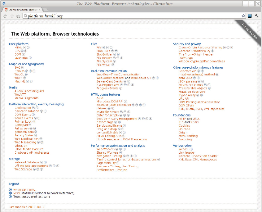
Figure 17-1 is a screenshot of a modern web browser displaying http://platform.html5.org/ with a list of some of the technologies that are part of the Open Web Platform. Many of those technologies are large enough and complex enough (or important enough, or at least self-important enough) to have had entire books written about them. This chapter focuses on HTML 5 and on two flavors of XHTML — 1.x and its successor, XHTML 5 — plus a few other technologies are mentioned as they arise.
INTRODUCTION TO XHTML
The original creators of XML had no intention of replacing HTML; they just wanted to be able to use their SGML documents on the web so as not to have to worry about HTML.
However, there was such immediate popularity of XML (many would say over-popularity) that the idea arose to try to redefine HTML in terms of XML.
The result of this endeavor was XHTML, which has its benefits: XHTML documents can be processed by regular XML tools, edited in XML-aware software, and can also contain little islands of “non-HTML,” including XML vocabularies such as MathML or Scalable Vector Graphics (SVG). However, XHTML does not attempt to replace HTML. It sits alongside HTML. It is compatible: if you are careful how you create it (explained later), you can feed XHTML to a regular HTML web browser and have everything work.
In this section you see the structure of an XHTML document, and also learn the main differences between XHTML and regular XML.
The section first describes XHTML 1.1, and then covers the differences between that and HTML 5, together with its XML representation that is sometimes called XHTML 5.
 WARNING Because XHTML is really XML, element names are case sensitive, and must be in lowercase instead of capital letters. Use <div> and not <DIV>, for example.
The XHTML <html> Element
An XHTML 1.x document always begins with a reference to the XHTML DTD like so:
<!DOCTYPE html
    PUBLIC “-//W3C//DTD XHTML 1.0 Transitional//EN”
           “http://www.w3.org/TR/xhtml1/DTD/xhtml1-transitional.dtd”
>
You can actually use several different XHTML DTDs including strict, transitional, loose, and frameset (for documents using the Netscape <frame> element; the frameset DTD is now relatively rarely used).
See http://www.w3.org/QA/2002/04/valid-dtd-list.html for the full list. In general, you should use the strict versions if you are generating XHTML documents, but you may need to use the transitional DTDs if you have external content, such as advertising that’s included on your server, or for a few compatibility features.
WARNING Many XML programs will try to download these DTD files from www.w3.org; they will fail, because W3C does not allow this. Unfortunately, W3C’s web servers get tens of millions of requests for these files a day (sometimes in a single hour), and so W3C now slows down (throttles) requests for the files.After the XML declaration and the DOCTYPE declaration you get to the start of the XHTML document, which looks like this:
<html xmlns=”http://www.w3.org/1999/xhtml” lang=”en” xml:lang=”en”>
It is unfortunate that the designers of XHTML chose to use an XML namespace, but they did. You must get it exactly right. Worse, to match XHTML elements in XPath, whether from XQuery, XSLT, or some other environment, you will generally need to bind a namespace prefix to that URI (h perhaps) and use XPath expressions like this:
/h:html/h:body/h:div//h:span[contains(concat(“ “, @class, “ “), “ date “)]
It’s all too easy to forget the prefix and fail to get a match! Refer to Chapter 7, “Extracting Data from XML,” for more detail. If you call XPath from JavaScript, or use the jQuery XPath plug-in, you may find you do not need to worry about namespaces in XPath expressions.
The lang and xml:lang elements in the <html> tag repeat the same value, and should indicate the primary language of the document.
If your document is using SVG, MathML, or other vocabularies that use a namespace, you should normally declare them on the <html> element. It’s not uncommon to see XHTML documents start with a dozen or more namespace declarations.
The <html> element normally has exactly two children: <head> and <body>. These are discussed in the following sections. The exception is for documents using frames, which have a <frameset> element instead of <body>.
The XHTML <head> Element
The <head> element in all versions of HTML is a place to store information about the document: it’s not generally rendered, although it does contain the document title, which is used on many platforms for bookmarks and window titles. Any unknown element ends the <head> regardless of your tagging structure.
The following sections describe the elements that are most commonly used inside the document’s head. After reading about the head, you get to the body and try some examples.
Information about the Document: The <meta> Element
You use the <meta> element to describe the document. Some of this information is used by web servers, proxies, and clients (browsers); some is used by search engines such as Google; and some may be used by other applications, or for your own purposes. This section examines some examples. Following is the first:
<meta http-equiv=”Content-Type” content=”text/html; charset=utf-8” />
This example, using http-equiv, is used by some web servers and by web browsers to override the default character encoding for HTTP, which is Latin 1 (ISO 8859-1). The http-equiv attribute contains the name of the HTTP header, and the content attribute contains the requested value.
Early web servers supported using http-equiv to override any of the HTTP headers that would be sent back before the document; today most servers (including Apache) ignore this, and you have to use external configuration to have a document served in UTF-8. Even so, including this header tells a web browser that the encoding is UTF-8 even when the file is read from a local disk, and this is a good idea. To send HTML documents as UTF-8 with Apache, add the following to an .htaccess file in the same directory as the files:
<Files ~ “*.html”>
ForceType 'text/html; charset=UTF-8'
</Files>
Notice the trailing space inside the empty element tag, just before the />. This is needed so that web browsers can read the document as HTML, which does not use the XML empty-element syntax.
If you generate XHTML with XSLT, use the xhtml output method and the XSLT processor will add the space automatically. This isn’t needed with XSLT inside the web browser, because the elements are never actually written out in that case. Web browser XSLT processors do a direct tree transform. But it is needed if you generate web pages on the server to be sent over the network, or if the files are to be opened directly.
Now take a look at some informational examples. The first, generator, is really a sort of vanity header; some programs add it so that you can tell which application was used to create or edit the file:
<meta name=”generator” content=”/usr/bin/vi” />
The next two headers, description and keywords, are used by search engines. The description should be a short sentence or two describing the purpose of the web page, and the keywords are a list of up to ten words or phrases relevant to the content.
<meta name=”keywords” content=”isaac newton,gravity,biography,biographies,people” />
<meta name=”description”
  content=”An account of the life and works of Sir Isaac Newton, written in 1814” />
The description is sometimes shown alongside search results or in directories.
The idea of keywords is that when someone searches for one of the words or phrases you give, they will find your web page, even if the keywords do not appear elsewhere in the document.
Unfortunately, these two headers are widely abused. Therefore, if you use more than ten keywords, your page will probably be downgraded in search results on the grounds that it’s likely to be a fake web page with ads on it. However, there’s some evidence that current search engines do take note of the description and keywords headers.
Finally, here’s an example of a proprietary header: Pinterest is a website that enables people to upload pictures that are of interest to them. Because of copyright and terms-of-use concerns, web publishers can opt out of Pinterest using the following header on every page:
<meta name=”pinterest” content=”nopin” />
If you use Google AdSense or Yahoo ads, you will be asked to add a meta header to your homepage to show the page is yours. If you look at the source of homepages of large commercial websites, you will probably see quite a lot more examples of meta headers.
The Document Title: The <title> Element
The document title is used in bookmarks, browser history, window title bars or tab labels, and other places where a web page has to be named. It is a plain string: it cannot contain any elements, which limits its usefulness for mathematical documents (no formulas!) and for Japanese or Chinese (no ruby annotations).
Although the items in the document head can appear in any order, the character set and the title should normally be the first two, and in that order so that the title can be interpreted correctly, like so:
<title>Isaac Newton - his life and works (1814)</title>
The title is often truncated in user interfaces — for example, if a browser tab is too narrow — so it’s a good idea to put the most important information at the beginning. If you want to identify your website in the title, do so at the end, because otherwise all the web pages from your website will have the same prefix, which may be all that the user sees!
Every XHTML document should have a title, even if the document does not contain any headings or is an intermediate page.
Linking to External Resources: The <link> Element
Use the XHTML <link> element to connect your web page to other files and documents. This is not a hyperlink: users don’t get to see any of the document head directly, and that includes link elements, so they won’t be clicking these links. Instead, these are links to style sheets, scripts, icons, and other supporting resources that make up the web page.
Using JavaScript and CSS: The <script> and <style> Elements
See Chapter 16 for details of JavaScript; you learn more about the <style> element later in this chapter.
The XHTML <body> Element
The <body> element contains the actual text of the document. This section looks at some of the most important elements you can use in an XHTML document, and then shows you how to control the appearance of the document using cascading style sheets (CSS). After you’ve tried it out, you go through more of the elements with some of the more commonly used techniques for styling them.
WARNING The HTML specification is several hundred pages long; CSS is also very large. The goal of this chapter is to show you how XML, XHTML, and HTML fit together, and to you teach enough to get started and be able to learn from other resources. A complete description of HTML, CSS, JavaScript, and how to use them requires an entire bookshelf! Most people learn just enough HTML, CSS, and JavaScript to do what they need and search the web when they need more, perhaps keeping some reference books by their side. But after working through this chapter, you’ll have started the journey!Listing 17-1 shows a complete, if not very interesting, XHTML 1.1 document.
 LISTING 17-1: Isaac Newton in XHTML.html
<!DOCTYPE html PUBLIC “-//W3C//DTD XHTML 1.0 Strict//EN”
    “http://www.w3.org/TR/xhtml1/DTD/xhtml1-strict.dtd”>
<html xmlns=”http://www.w3.org/1999/xhtml” lang=”en-UK” xml:lang=”en-UK”>
 <head>
  <meta http-equiv=”Content-Type” content=”text/html; charset=utf-8” />
  <title>Newton, Isaac: Life and Works</title>
 </head>
 <body>
   <h1>Sir Isaac Newton</h1>
   <p>Isaac Newton was born at a very young age,
   had a brief but unsuccessful career as an apple picker,
   and later died.</p>
 </body>
</html>
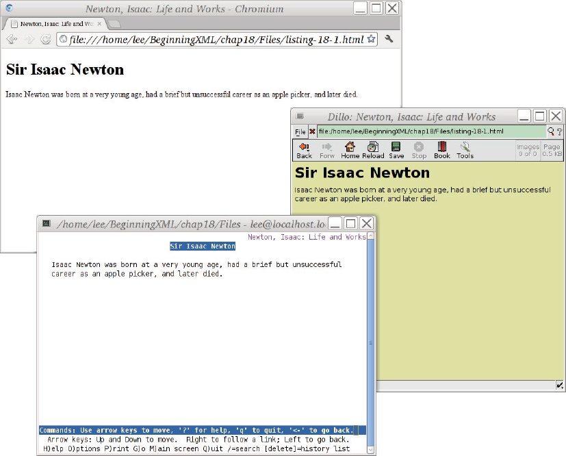
Figure 17-2 shows the result of loading this XHTML file in three different web browsers: Google Chrome (Chromium), Dillo (a very simple and fast web browser), and Lynx (a text-only web browser running in a terminal emulator). In the two graphical browsers (rear left and right) the contents of the HTML <title> element was used for the window title, along with the browser name. Lynx (lower front left) does not use windows directly, and did not attempt to set the terminal’s window title. Similarly, the fonts and text sizes differ between the browsers. However, the document is recognizably the same in all three cases.
 NOTE If you download any of the HTML files in this chapter, you may need to use your web browser’s View Source feature (it’s usually in the File or View menu), or open the file in a text editor, to see the actual HTML markup.
Your goal in making web pages should not be to get the page to look identical in every browser, but rather to make a page that will convey the right information.
In the following sections you learn about the things you can put inside the HTML <body> element (such as the <h1> and <p> elements shown in Listing 17-1), but first, you need to validate your XML document against its DTD, and to do that you need an XML Catalog file.
Using an XML Catalog File for Local Validation
One of the first problems you’ll run into if you try to work with XHTML documents using XML tools is that you can’t validate your documents against the DTD files from the W3C website, http://www.w3.org, W3C restricts DTD traffic because so many programs try to download the files.
The solution to this is to make a local copy of the DTD files and to use an XML Catalog to tell XML software to use your local copies instead of going to www.w3.org for them.
Listing 17-2 shows a complete XML Catalog file for this purpose; it assumes that the DTD files are in a subfolder called dtds. Note that the forward slash (/) is used in the filenames, even on Windows, because they are really URLs. You can use any name you like for the file, but catalog.xml or xhtml-catalog.xml might be good choices.
LISTING 17-2: samplexmlcatalog.xml
<catalog prefer=”public” xmlns=”urn:oasis:names:tc:entity:xmlns:xml:catalog”>
  <system systemId=”http://www.w3.org/TR/xhtml1/DTD/xhtml1-strict.dtd “
          uri=”dtds/xhtml1-strict.dtd”/>

  <public publicId=”-//W3C//DTD XHTML 1.0 Strict//EN”
          uri=”dtds/xhtml1-strict.dtd”/>

  <public publicId=”-//W3C//DTD XHTML 1.0 Transitional//EN”
          uri=”dtds/xhtml1-transitional.dtd”/>

  <public publicId=”-//W3C//DTD XHTML 1.0 Frameset//EN”
          uri=”dtds/xhtml1-frameset.dtd”/>

  <public publicId=”-//W3C//ENTITIES Latin 1 for XHTML//EN”
          uri=”dtds/xhtml-lat1.ent”/>

  <public publicId=”-//W3C//ENTITIES Symbols for XHTML//EN”
          uri=”dtds/xhtml-symbol.ent”/>

  <public publicId=”-//W3C//ENTITIES Special for XHTML//EN”
          uri=”dtds/xhtml-special.ent”/>
</catalog>
You can use an XML Catalog with most XML tools; here is an example of using the catalog with the xmllint program in a Linux shell:
$ export SGML_CATALOG_FILES=$HOME/lib/xmlcatalog/catalog.xml
$ xmllint --noout --valid --loaddtd --catalogs listing-17-1.html
$
The first line sets the shell variable $GML_CATALOG_FILES to the name of the XML Catalog file; you will have to use the actual filename you created, of course.
The second line runs the xmllint program with no output (except error messages, if any exist), telling it to check validity, to load the DTD files, and to use the XML Catalog file named by the $SGML_CATALOG_FILES variable.
NOTE The xmllint command is very useful because most web servers run the GNU/Linux operating system, Solaris, FreeBSD, or another Unix or Unix-like operating system on which the xmllint program is likely to be preinstalled. You can also configure Saxon, oXygen, and other programs to use catalogs.Paragraphs, Block Quotes, and Headings
Paragraphs, block quotes, and headings are all block-level elements: they are rendered by web browsers starting on a new line and with blank space above and below them.
The <p> element is used to contain a logical paragraph; a browser might display the first line indented, or put a blank line between paragraphs.
The <blockquote> element is intended to contain a long quotation, and is normally rendered indented, with a left margin; it contains block-level elements such as paragraphs, lists, and even block quotes.
Do not use paragraphs or block quotes just for formatting: if you want an indented block of text (that’s not really a logical paragraph), use a <div> element as described later in this chapter. If you want a paragraph that’s formatted slightly differently from other paragraphs, give it a class attribute and use CSS, as described in the “Cascading Style Sheets (CSS)” section later in this chapter.
Paragraphs can only contain phrase-level markup and text; block quotes can contain block-level elements.
For headings you use <h1> for the most important heading in the document. This is often the same as the <title> element but doesn’t need to be; <h1> can contain phrase-level markup, whereas <title> is a plain string. There’s usually only one <h1> element in an HTML document.
For the next most important heading you use <h2>, and there can be any number of these. Then there’s <h3>, <h4>, and so on. If you find yourself wanting anything over <h5> or <h6>, you should ask yourself how the reader will keep track, and maybe split the document into multiple web pages, the body of each starting with an <h1> element.
If you’re used to more traditional XML vocabularies such as DocBook or the Text Encoding Initiative, you may be wondering whether there’s a container around each section. No container is required. HTML 5 supplies a <section> element for this purpose, but older versions of HTML and XHTML do not have such a thing. The headings are interspersed between paragraphs and it’s a flat structure. You can have an <h3> directly followed by an <h6> if you like.
If this sounds too chaotic, you can use <div> elements as if they were sections as shown in the following snippet. The <div> element is explained in more detail in the “Generic <div> and <span> Elements” section later in this chapter.
<div class=”section”>
  <h2>His Life As An Apple Picker</h2>
  <p>After leaving school, young Isaac was very poor,
  and had no mobile 'phone or shoes, so he picked apples.</p>
</div>
Using <div> elements in this way can make processing your XHTML documents with XQuery or XHTML much easier, and can also help with styling, as you learn in the section “Cascading Style Sheets.”
Lists
A list is a sequence of related items, perhaps numbered, or perhaps with a bullet at the start of each item. You can use CSS to turn numbering on or off, or to change the shape of the bullet. You can also turn off list-like rendering with CSS; this is most commonly used when you’re making a drop-down menu effect. You mark up the data as a list so that a non-CSS-aware browser will still show something reasonable, but then you use CSS to turn off the list bullets and indents, and to add borders, making something that looks like a user-interface component.
Use <ol> for an ordered (that is, numbered) list, and <ul> for an unordered bulleted list. Of course, the web browser always presents the list items in the order they were found in the document; ordered/unordered is just an obscure way to say whether the items are numbered. Lists of either sort contain zero or more list items, marked up with <li> elements.
You can also have definition lists — showing the origin of HTML as a language for computer documentation! A definition list uses <dl> as the container, <dt> for terms to be defined, and <dd> for the definitions.
List items can only contain block-level elements such as <p>, <blockquote>, and <ol>, and not text or <li> elements. The only exception is that you can have <li> elements inside an <ol> or <ul> that’s inside an <li> element.
If you wanted to format the preceding paragraphs in this section as a bulleted list, you would mark it up like this:
<ul>
<li>
<p>A <i>list</i> is . . . </p>
</li>
<li>
<p>Use <ol> for . . .</p>
</li>
. . .
</ul>
NOTE To help you remember, notice that ol stands for ordered list, ul stands for unordered list, and dl stands for definition list.Hypertext Links
The best-known HTML element is probably the <a> element; “a” is short for anchor, a term in HyperText meaning one end or another of a link. In its simplest form a link is just an <a> element around some text like so:
<a href=”http://www.fromoldbooks.org/”>my web site</a>
The href attribute contains a URI reference; that is, a web address. A web browser will follow this link when you click (or activate) the link.
The URI reference part means you can put a fragment identifier after the URL, separated from it by a hash (#), and the browser will search for an element in the target document having that identifier (without the #), and scroll to that location. See the following code snippet:
<a href=”http://www.example.org/staff.html#daniel”>More about Daniel</a>
When you click this link, your browser will load the staff.html document and search for a name=”daniel” or id=”daniel” attribute; if it finds one, it will scroll the view to make that visible.
NOTE Most web browsers will highlight links, usually by coloring them blue and underlining them (because that is what an early web browser from NCSA called “Mosaic” used to do). Browsers show links differently if you have visited the destination recently and also sometimes when the link is active, meaning, for example, you clicked it but the browser hasn’t yet gone there.An <a> element with a name attribute is a potential target for a link. An example is shown here as it might appear in the staff.html file mentioned in the previous example:
<a name=”daniel”>Daniel is the grand vizier of Shemyaza.</a>
WARNING Although XHTML uses the id attribute name on various elements, and browsers will indeed find them, many users will put values in them that are not, in fact, legal XML (or SGML) ID values. An SGML or XML ID value must start with a (Unicode) letter and then contain only name characters: letters, digits, hyphens, dots, and underscores. If you are generating XHTML for use with XML tools, you should make sure that your ID attribute values are legal.Here’s a slightly longer example:
<a href=”liam.html” title=”Author of this chapter” rel=”author”>About Liam</a>
The content of the title attribute here will usually be used to make a tooltip when a mouse pointer hovers over the link; this is a poor design because you can’t put element markup inside attribute values, but this is the way it is.
You can also indicate the relationship between the web page containing the link and the link destination, using the rel attribute; this is not often done in practice, but some specialist applications use it.
One common use of the rel attribute is to add rel=”nofollow” to your links. This is a proprietary value for the rel attribute introduced by Google, and it indicates that you do not endorse the target page. What does that mean? When Google’s search engine displays search results, it tends to favor web pages that have a lot of links pointing to them. This is called Google’s pagerank algorithm, and although these days it is only one of more than 200 factors Google takes into account when generating search results, the advantage of being linked to is still high enough that people are willing to pay for links to their websites selling somewhat dubious services (the sleazy side of the Web). If Google finds that you link to such a site, it will downgrade your web page, or even remove you from its search results altogether. Adding rel=”nofollow” to a link indicates that you don’t want it to affect search result placement, perhaps because the link came from user-supplied content such as a forum posting on your website.
Additionally, you can include any mixture of text and phrase-level markup inside an <a> element. Phrase-level markup, unlike block-level markup, does not begin and end on a new line, but just affects part of a sentence or paragraph. Some examples of phrase-level markup include emphasis, inline images, formatting, and of course the <a> element, as in the following example:
<p>All about <a href=”liam.html”>Liam <em>and</em> his nice clean socks</a>.
The href value here, liam.html, is a relative URI reference: it does not begin with a URI scheme such as http: or file: and does not start with a /. The web browser will look for the resource in the same place it got the resource containing the link, and will use the same method (for example, HTTP, FTP) to fetch it. This lets you move whole trees of documents around without changing them, or publish a website from your own computer to a server, perhaps using a remote file copy program such as ftp or (more securely) rsync or scp over the secure shell, ssh.
Images
The ability to mix text, images, and links in one document is one of the things that helped the World Wide Web succeed in its early days. Soon after, images of a particularly intimate nature were, for a while, the driving force of Web commerce. We are past that today: the Web has matured considerably, but images are still very important.
An image can be the subject of a web page or an image can be part of the page background, perhaps providing texture like old paper or a canvas, so that the contents of the page overwrite the image. Images are also used for page components such as borders, buttons, and decoration. Finally, images can be used as part of corporate branding or marketing, including organizational logos.
You have three main ways to include images in your web pages:
- Using the HTML <img> element. This is described shortly.
- Using cascading style sheets (CSS); see the section on CSS later in this chapter.
- Using SVG markup in the document; see Chapter 18, “Scalable Vector Graphics (SVG).”
To include an image in your web page using the HTML <img> element you write something like this:
<p>Daniel's socks: <img src=”argyle.jpg” alt=”picture of blue and yellow argyle socks” /></a>.
The src attribute (pronounced source) indicates where the image comes from; as with the <a> element, it can be a relative URI, although the fragment identifier is not currently used.
The alt attribute contains a short textual description of the image.
WARNING When you are including images you must remember that not everyone can see them in the same way. Some people will have difficulty seeing fine details in images; others will see colors differently than you, and some won’t be able to see at all. Laws exist about making web pages accessible, and about not discriminating against people based on their abilities, so even if it were not a moral imperative to be as inclusive as possible, it can become a legal imperative.When an image is an important part of a web page, you must include a short piece of text to be used as an alternative to the image. If necessary you can also link to a longer description, either using a longdesc attribute containing a URI, or, more commonly, with a letter D linked to the description, and perhaps hidden by default using CSS.
NOTE The <img> element is empty: it does not have any content. In XML the tag needs to end with />, but this is a syntax error in HTML. To get around this, put a space before the /> — it’s still technically an error, but it works in all browsers.Loading Images More Quickly
Images will appear to load much faster if you include width and height attributes on your <img> elements; the result is also less disruptive to the user. This is because the browser will leave space for the image. In the following example the picture is presumably a JPEG image 700 pixels wide and 900 pixels high:
<img src=”argyle.jpg” alt=”picture of blue and yellow argyle socks” width=”700” height=”900” />
WARNING Make sure you use the actual pixel width and height for images. If you give a different size the browser will scale the image to fit, but this can look very bad. If you try to make a thumbnail-sized picture of a large image this way, users still have to wait for the whole image to download before they can see the thumbnail. Image sizes mentioned in height and width attributes must always be measured in pixels, not in other units such as inches.Because XSLT and XQuery do not give access to image sizes, XML-based content management systems have to provide some way to communicate the information. Some systems do this with calls to external functions; some simply encode the image size in the filename (argyle-socks-700x900.jpg); and others store image meta data in a separate database.
You can find out the size of the image using the identify command (part of the ImageMagick package) on many systems, including most Linux servers.
If your images files are particularly large and slow to download, you can include an alternate image by putting its URI in the lowsrc attribute; some browsers will load this first and display it while the larger image is loading.
Images and Links
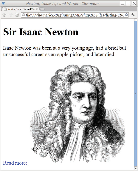
The obvious way to make an image link to another web page is this:
<p>
  <a href=”newton-sir-isaac.html”>Read more:
    <img src=”isaac-newton-300x310.jpg”
         alt=”Sir Isaac Newton” width=”300” height=”310” />
  </a>
</p>
Although this is technically correct, the result of adding this to the Isaac Newton biography from Listing 17-1 is shown in in Figure 17-3. Notice the underlined space after the “Read more:” — that comes from the spaces between the text and the <img> tag. With some older browsers you’ll also see an irritating blue border around the image. You can get rid of this border in HTML using the border=”0” attribute, but the approved way is to use CSS; you learn about that later in this chapter, but for now you could add a CSS style attribute to the <img> element to get rid of the blue border. That still leaves the underlined space; you could get rid of that by changing the markup so that the space isn’t inside an <a> element like so:
<p>
  <a href=”newton-sir-isaac.html”>Read more:</a>
  <a href=”newton-sir-isaac.html”><img src=”isaac-newton-300x310.jpg”
         style=”border: 0;”
         alt=”Sir Isaac Newton” width=”300” height=”310” /></a>
</p>
NOTE Notice that the bottom of the image in Figure 17-3 is lined up with the baseline of the text saying “Read more.” You will see how to change this using CSS in the section on cascading style sheets later in this chapter.Image Formats
The most common image formats used on the Web are shown in Table 17-1.
TABLE 17-1: Common Image Formats Supported by Web Browsers
| FORMAT | DESCRIPTION |
| GIF (8-bit) | Can be animated, but as implemented generally supports only a limited “web-safe” palette of 256 colors, one of which can be used for transparency. For most uses of GIF today, except animation, PNG is preferred. |
| PNG | Open format defined by the IETF and W3C; has lossless compression and supports 256 levels of transparency. Internet Explorer 6 needs an add-on such as CSS3 PIE to handle transparent PNG images properly, but despite this PNG is very commonly used. |
| JPEG | This format is lossy: if you convert an image from PNG to JPEG, you will lose some detail, and the colors may change slightly. If you convert back to PNG the lost detail is not restored. Excessive levels of JPEG compression tend to introduce visible fringes so you need to check image files carefully, and always keep a copy of your images in some other format. If you start with a JPEG image, for example from a digital camera, save your work in PNG as well as in JPEG at the end, because there is a loss in quality every time you open a JPEG file and save it again. |
People use JPEG images more on the Web because they are typically much smaller in file size than PNG for a given image size in pixels, and this means they get downloaded more quickly. See Chapter 18 for more on SVG.
You may encounter some other image formats, including TIFF (mostly on the Mac) or BMP (mostly on Windows), as well as proprietary or application-specific formats such as Adobe Photoshop files (PSD) or The GIMP’s save files (XCF), but most web browsers can only be relied upon to display JPEG, PNG, and GIF.
Inline Emphasis and Formatting Elements
So far all of the text you have seen has been pretty plain; links were underlined, but that’s as far as it went.
HTML supports a number of inline elements, also called phrase-level elements, both to add meaning and for stylistic purposes. You’ve already read about some of these in this chapter. You should use the semantic elements where they are available rather than the formatting elements: for example, it’s better to use <em> for emphasis rather than <i> for italics, because then a text reader can use different inflection in its auto-generated voice. However, you should not use <em> if the italics are for some purpose other than emphasis. The word other in the previous sentence is an example of emphasis; the italics used for inline elements and phrase-level elements at the start of this paragraph signify a keyword, and are not emphasis. For those you might use this: <i class=”keyword”>inline elements</i>.
NOTE If you are transcribing a document you didn’t write, and the author is not available to answer questions, you should not normally try to add semantics; if you don’t know why a particular word is in italics, just use <i> rather than guessing.Table 17-2 shows most of the more common phrase-level elements in HTML that are used for formatting. Note that not all elements are available in all versions of the HTML DTDs.
TABLE 17-2: Some Inline HTML Elements Associated with Formatting
| ELEMENT | DESCRIPTION | EXAMPLE |
| abbr | An abbreviation; also used for acronyms | <abbr title=”adjective”>adj.</abbr> |
| b | Bold (other than strong emphasis or headings) | Vol <b>3</b> No. 6. |
| big | Bigger text | I want to say <big>I love you</big> |
| dfn | A single word or phrase being defined | A <dfn>sock</dfn> is a covering for the foot, often made of milk custard. |
| em | Emphasis, usually italicized | He was <em>very</em> nervous |
| i | Italics, other than emphasis | She was an <i lang=”la”>ex post facto</i> standard! |
| q | A quote; use CSS to add quote marks | She said <q>Take off your boots</q> |
| small | Smaller text; use CSS instead | <small>By reading this text you agree...</small> |
| strike, s | Strikethrough, crossed-out text | This is <s>wrong</s>. |
| strong | Strong emphasis, shouting, often displayed in bold | The sock was <strong>extremely</strong> dangerous. |
| sub | Subscript | <i>x</i><sub>j</sub> (xj) |
| sup | Superscript | e = mc<sup>2</sup> (e = mc2) |
| tt | Typewriter text | <tt>dear archie, I am typing this letter...</tt> |
| u | Underline, but not a link | See <u>The Journal Of Ankle Coverings</u> for July 1895 |
Generic <div> and <span> Elements
When you need to produce a particular formatting effect with HTML, but it’s not about semantics, or if there is no built-in semantics close to what you want, you can use the <div> and <span> elements. The <div> element can contain any mix of text, phrase-level elements, and block-level elements, including more <div> elements. The <span> element is a phrase-level element and can contain text and other phrase-level elements (including, of course, more <span> elements).
You can use the class attribute to attempt to impart meaning to your HTML source code; this will generally be of more use to you in maintaining the markup than to anyone else, but as you see soon, the class attributes are also used by CSS. If you have read Chapter 16, “AJAX” already you’ll also recall that jQuery uses class attributes in constructs like this:
$(“div.sock-weaving-pattern”).css(“background-color: grey;”);
to match:
<div class=”sock-weaving-pattern”>. . .</div>
The <div> and <span> elements are used extensively in almost every modern web page, partly because they are free from the baggage of history and are not weighed down with existing style rules that might vary from browser to browser, and partly because they’re the closest HTML ever got to user-defined elements.
More Advanced HTML Topics
Because this book is really about XML and not HTML, it’s time to move on a little faster. The following sections provide you with just enough of an idea about some other HTML tools to pique your interest so that you can learn more.
HTML Forms
Use the HTML <form> element along with its children to generate buttons, controls, and areas where users can enter text or upload files. See Chapter 16 for a simple example of an HTML form.
HTML and JavaScript
Refer back to Chapter 16 for an introduction to the JavaScript language, jQuery, and AJAX.
HTML and Accessibility
If you become involved with professional web development you will need to dive into accessibility feet first, perhaps with one of the many books on the topic.
The high-level view is that anyone, regardless of physical abilities, must be able to use your web pages. If you design your pages using the semantic elements like <h1>, <p>, <em>, and <strong>, there’s a good chance they will be easy to make very accessible indeed. Visit http://www.w3.org/WAI/ for lots of helpful articles, resources, tutorials, and testing tools for web accessibility.
Of course, the devil is in the details. Make sure your <img> elements have alt attributes (if the image is decorative, give it alt=”” rather than leave off the alt attribute: this reassures readers that they aren’t missing something). Don’t use HTML tables for layout when you could use CSS. Try to use flexible layouts, not fixed-width layouts, and make sure people can do everything on your web page from the keyboard.
XHTML AND HTML: PROBLEMS AND WORKAROUNDS
Most HTML on the web is not even close to being syntactically correct, so there was never any hope of replacing HTML with XML or XHTML, as some people thought was the intent.
One difficulty is that the XML specification forbids applications from claiming that a data stream was a well-formed XML document if it contains errors. The web browser makers interpret this as meaning the web browser should not display the document at all if it contained errors. In fact, a fix-up is perfectly fine in this situation and allowed as long as you let the user know. An error message in the browser’s developer console would be enough. In practice, this situation means that XHTML, unlike HTML, is very unforgiving of errors.
Another difficulty is that if you serve XHTML documents with the correct Internet media type (MIME Content Type) of application/html+xml, older versions of Internet Explorer will not display the document but instead will prompt the user to save it to a file! As a result, it’s best to serve XHTML documents as text/html.
Some people use “browser sniffing” to serve different documents to IE users; others use a simple trick with client-side XSLT in the browser to fix the problem, but this turns out to have other difficulties, not least of which is that it makes the resulting web pages hard to debug.
Because the syntax of HTML and of XML is slightly different, you have to do some special tricks to get the XHTML to work properly. You can find more details on these at http://www.w3.org/TR/xhtml1/#guidelines on the W3C website, but a few of the most important ones are listed here:
- Avoid using the XML declaration or processing instructions; this means you must use UTF-8 or UTF-16 for your files and make sure they are served correctly.
- Put a space at the end of empty element tags: <br /> rather than <br/>.
- Do not use close tags for empty elements, even though XML allows this; <br><br/> in HTML does not do what you might expect.
- Avoid inline style sheets or JavaScript; refer to external files instead.
- Do not rely on being able to include newlines in attribute values.
- Use both xml:lang and lang attributes to specify language.
- The ' XML entity does not work reliably in HTML; use ' instead.
If you are using XSLT or XQuery to generate XHTML, you will need to make sure you enable the appropriate serialization options to make this work. You may need to check the documentation of the XQuery or XSLT system you use in order to learn how to set the serialization options.
The XHTML Working Group at W3C went on to define a much more sophisticated version of XHTML, XHTML 2, but it did not get the necessary support in web browsers.
As a result, work on XHTML at W3C ended, and the XML representation of HTML 5 took over. XHTML 1 is still widely useful in its own right, and, as you see later in this chapter, HTML 5 keeps most of the same ideas. First, though, you need to look at cascading style sheets, and also at Unobtrusive JavaScript, so that you have more of the background you’ll need.
CASCADING STYLE SHEETS (CSS)
Cascading style sheets are a mechanism to associate formatting with HTML or XML markup. A style sheet is simply a name for a set of rules for formatting a document; the cascading part is that several such style sheets get combined to format an HTML document, and the cascading rules determine how the styles are merged. Most modern web browsers let authors have their own style sheet, which is merged with that of the document author.
As you read in the first part of this chapter, most HTML elements already have styles associated with them. The <em> element is usually rendered in italics, and <h1> headings usually appear in larger text, possibly a different font, and in bold. Unfortunately, the default styles were created by computer programmers with no experience in graphic design or typography, and, as a result, they are not very appropriate. Luckily, you can override them with CSS.
CSS Levels and Versions
CSS has four “levels”: CSS 1, CSS 2.1, CSS 3, and CSS 4. CSS Level 2 second edition is the odd ball that is (confusingly) called CSS 2.1, but it has the best support. CSS 3 introduces many new features but is less widely supported. CSS 4 is new and not yet defined, and because CSS 3 is not yet finished, CSS 4 won’t be available for a while, but now at least if someone mentions it you can guess what they’re talking about. You can find out more about the different levels at http://www.w3.org/Style/. This chapter mostly talks about CSS 2.1, with occasional mention of CSS 3 features.
Individual web browsers also support features of their own, and sometimes support features that have been proposed for CSS but that are not yet standardized. Such features are given a vendor prefix so you know you’ve left the safety of the boardwalk, and are well into walking-on-broken-glass territory. Mozilla Firefox uses -mozilla- as a prefix, Apple Safari and Google Chrome (both based on a browser toolkit called WebKit) use -webkit-, Opera uses -o-, and Internet Explorer tends to stick to standards.
WARNING CSS is evolving rapidly, and support for some of the more advanced features of CSS is not available in all web browsers. Internet Explorer Version 6 is the best-known browser that has incomplete support for CSS 2.1 selectors; for CSS 3 you have to be using IE 9 or later, and Opera doesn’t work in all cases (as of June 2012). See http://www.quirksmode.org/css/contents.html or http://www.caniuse.com for more information.CSS at a Glance
Cascading style sheets are collections of rules, and each rule is made of a selector and a declaration. Here is a rule with a CSS selector to match any <h1> element in the document; it sets the color of text inside the heading to blue and also adds a margin at the top of the heading:
h1 {
    color: blue;
    margin-top: 300px;
}
The selector in the example is h1 and the declaration is inside the curly braces. Inside the declaration are two properties, color and margin-top, together with values for them. The semicolon separates the individual property-value pairs, but it turns out to be easier to remember and edit if you always put a semicolon after every value.
You can put the style rules into the document or into a separate file. If you put them in the document some very old browsers will display the styles rather than using them, so it’s usually best just to put them in a separate file. If you have more than one web page using the same CSS file, your site will work faster if the CSS is in a separate file, too.
In the following activity you use some basic CSS to work through an example.
<!DOCTYPE html PUBLIC “-//W3C//DTD XHTML 1.0 Strict//EN”
“http://www.w3.org/TR/xhtml1/DTD/xhtml1-strict.dtd”>
<html xmlns=”http://www.w3.org/1999/xhtml” lang=”en-UK” xml:lang=”en-UK”>
<head>
<meta http-equiv=”Content-Type” content=”text/html; charset=utf-8” />
<title>Newton, Isaac: Life and Works</title>
<link rel=”stylesheet” type=”text/css” href=”newton.css” />
</head>
<body>
<h1>Sir Isaac Newton</h1>
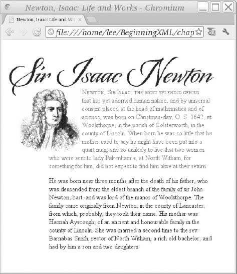
<p class=”intro”><img src=”isaac-newton-150x155.jpg”
alt=”Sir Isaac Newton” width=”150” height=”155”
style=”float: left;” />Newton, Sir Isaac, the most splendid genius that has
yet adorned human nature, and by universal consent placed at the head of
mathematics and of science, was born on Christmas-day, O. S. 1642, at
Woolsthorpe, in the parish of Colsterworth, in the county of Lincoln. When
born he was so little that his mother used to say he might have been put
into a quart mug, and so unlikely to live that two women who were sent to
lady Pakenham's, at North Witham, for something for him, did not expect to
find him alive at their return.</p>
<p>He was born near three months after the death of his father,
who was descended from the eldest branch of the family of sir John Newton, bart. and was lord of the manor of Woolsthorpe. The
family came originally from Newton, in the county of Lancaster, from which,
probably, they took their name. His mother was Hannah Ayscough, of an
ancient and honourable family in the county of Lincoln. She was married a
second time to the rev. Barnabas Smith, rector of North Witham, a rich old
bachelor, and had by him a son and two daughters.</p>
</body>
</html>
NewtonWithCSS.html
body {
    background: #fff;
    color: #000;
    margin-left: 1em;
}

h1 {
    font-family: “Origins”, “Palatino”, “Book Antiqua”,serif;
    font-weight: normal;
    font-size: 64pt;
    margin-top: 24pt;
    line-height: 120%;
    margin-bottom: -24pt;
}

p.intro {
    color: #666;
}

p.intro:first-line {
    font-variant: small-caps;
}

p {
    max-width: 25em;
    margin-left: 100px;
    margin-right: auto;
}

p img {
    display: block;
    float: left;
    margin-left: -73px;
    margin-right: 3px;
}
newton.css
background: yellow;
CSS Selectors
You’ve seen some examples of CSS selectors in the previous section and in the Try It Out. Selectors are patterns that identify one or more elements in a document. They are like a quirky and less powerful version of XPath, and were developed independently, but they do have a lot in common.
Recall that CSS rules have a selector and then a set of property-value pairs in braces; the properties are set to the values you give on every element that matches the selector.
NOTE HTML element names are not case sensitive, so you can use either uppercase or lowercase for them in selectors; H1 { color: blue; } and h1 { color: blue; } do the same thing. You should leave the property names in lowercase, however.Table 17-3 shows the different CSS selectors you can use.
TABLE 17-3: CSS Selectors
| CSS SELECTOR | DESCRIPTION | EXAMPLES |
| element type | The name of an HTML element | p |
| * | Any single element | * |
| B > A | Any A element that is a direct child if a B element (like the XPath expression B/A) | p > span > a |
| B + A | Any A elements when immediately preceded by a B element | blockquote + p matches a <p> element immediately after a <blockquote> element |
| [attr] | Matches on attribute presence | a[name] |
| A[attr=”value”] | Matches any A elements having an attribute called attr whose value is exactly equal to value | img[alt=”argyle socks”] |
| A[attr~=”value”] | Matches any A elements whose attr attribute contains a word equal to value, where words are separated by spaces | div[class~=”navigation”] |
| A[lang|=”lang”] | Language-specific matching | div[lang|=”en”] |
| A.word | Matches any A element whose class attribute contains the given word | div.navigation would match <div class=”navigation redbg”>... |
| A#id | Matches the first A element (or all A elements) having the given id value | div#topbar to match <div id=”topbar”>... |
| A:first-child | Any A elements that are the first child (not counting whitespace) of their parents | li:first-child |
| A:link, A:visited, A:active, A:hover, A:focus | Matches an unvisited link, a visited one, an active link, an element when the mouse pointer is over it, and an element ready to accept keyboard input | a:visited { color: purple; } img:hover |
| A:lang(lang) | Any A elements in language lang | a:lang(en) |
| A:first-line | A pseudo-element matching the first formatted line of content | p:first-line |
| A:first-letter | A pseudo-element matching the first letter of content, if it is at the very start of the element | p:first-letter |
| A:before, A:after | Pseudo-elements considered to occur immediately before, or after, the A element’s content | div.caption:before |
| A, B, C | Matches any of A, B, or C elements (a shorthand) | h1, h2, h3, h4 {font-weight: bold;} |
| ns|A | Matches A with the namespace URI bound to prefix “ns” using @namespace (see CSS and XML) | svg|text |
CSS 3 adds more selectors, including :nth-child(), :nth-of-type(), :nth-last-of-type(), and more bizarre variations, but these are not all available today. If you find yourself needing them, for example with jQuery, ask yourself if the XPath jQuery plug-in wouldn’t be a little saner.
CSS Properties
Once you’ve identified your HTML elements with CSS selectors, you can assign values to their formatting properties. Again, since this is an XML book, only a few are listed in this section; you can go to http://www.w3.org/TR/CSS21/ for a longer list, and also see www.quirksmode.org for information on which properties are actually supported by browsers.
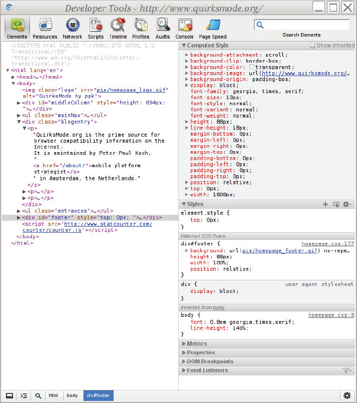
Figure 17-5 shows the WebKit Developer Tools (found in Epiphany, Midori, Safari, Chrome, and other WebKit-based browsers); for Firefox there is the Web Developer extension and also FireBug with roughly similar functionality. You can see the Computed Style and Matched CSS Rules windows for the selected element (a <div> element with class=”footer” in this case). If you double-click the CSS property values, you can change them and see the results right away. If you click the Console icon in the list of icons on the top of the window, you can see any syntax errors in the CSS, which is obviously also important. See Chapter 16, “AJAX” for instructions on how to find the Console in various different Web browsers.
You look at some of the more important CSS properties later, but first you need to understand the CSS Box Model.
The CSS Box Model
In the CSS Box Model every block element, like a paragraph, has an invisible margin all round it, and then a border, and then padding, and then the actual content. The vertical margin between two blocks is actually the larger of the margins of the two boxes, not the result of adding up the margins. This process of using the larger value is called collapsing. Horizontal margins do not collapse.
NOTE For vertical text, such as is common with Japanese or Chinese writing, browsers presumably would collapse the horizontal margins instead; CSS 2.1 appears not to account for this case though.You can refer to the individual margin, border, and padding properties as padding-top, padding-right, padding-bottom, padding-left (the values go clockwise), margin-top, border-top, and so on.
You can also use shorthand properties to set top, right, bottom, and left all in one go. For example:
p img.button {
    padding: 0.5em 12px 0.5em 12px;
}
is the same as:
p img.button {
    padding-top: 0.5em;
    padding-right: 012px;
    padding-bottom: 0.5em;
    padding-left: 12px;
}
You control the box size with the width and height properties. If you set the size too small, you will get overflow and you can use the overflow property to tell the browser whether to “clip” (throw away whatever does not fit) or add a scroll bar. The default width and height are 100% (relative to the available space in the containing element) and auto, respectively. You can also constrain the box size with min-width, max-width, min-height, and max-height.
You can draw the border and give it thickness with the border property; this is shorthand for setting border-width, border-style, and border-color individually. You can also have rounded corners; the following example makes a bright-red dotted (rather than solid) border 4 pixels (actually 4/96ths of an inch) wide with rounded corners having a corner radius of 12 pixels. You would have to use CSS3 PIE or some other add-on to get border radius working in Internet Explorer 6, however, and vendor prefixes for other browsers.
p {
    border: 4px dotted red;
    border-radius: 12px;
}
If you set the border radius you normally need to make sure that your element’s padding is at least as large as the radius, to stop text from getting chopped off at the corners.
You can set the individual border widths with border-top, border-right, border-bottom, and border-left, and these are, in turn, shorthand properties for border-top-width, border-top-style, border-top-color, and so on.
NOTE CSS 3 also proposes image borders, using repeated images to make borders.You can use the display property of any inline element to make it into a block. One reason to do that is so that you can position it: display can be set to inline or block. You can use other values of display for special-purpose formatting, including list-item, inline-block, inline-table, and more. In CSS 2 each element is either entirely inline or a block; CSS 3 adds a display value of run-in for elements that cause a break at one end and not the other.
If you need to have a border around more than one element, you must put a wrapper element there; most people use <div> elements for this purpose.
CSS Units
CSS property values can be given units of em (the current font size), px (there are officially 96 CSS pixels per inch), pt (there are officially 72 CSS points per inch), pc (picas, equal to 12 points), and you can also try for in, mm, and cm (inches, millimeters, and centimeters), although that depends on the user having set the screen resolution correctly, an event with vanishingly small probability. There is also ex, for the “x-height” of the font, a unit both obscure and unreliable. You can also use percentages or the keyword inherit in most cases; a percentage is usually relative to the value of the same property in the parent element. However, CSS is irregular: for example, a percentage value for the line-height property is taken as a percentage of the font-size property.
Some More CSS Properties
Following are some of the more widely used CSS properties:
- font-family: Fonts matching the given family names will be searched in order for characters. Note that depending on the characters in the fonts and the text in your document you could end up with an E from Palatino and an É from Palatino Linotype even in the same word. See the following code for an example of a font-family property:
body { font-family: “Palatino”, “Palatino Linotype”, “Book Antiqua”, “Sistina”, serif; } - font-weight: Values are bold or normal; you can also use bolder, lighter, or a multiple of 100 between 100 and 900 inclusive, where 900 is very dark and 100 is very light.
- font-variant: You can use this to turn on Fake Small Caps. Uppercase letters in the input remain uppercase and lowercase letters become small caps. A professional typographer would want to do this only if the font had real small caps, and to do that you have to use the OpenType font property access that’s been proposed for CSS 3; it’s still an early draft, though, so not included in this book, unfortunately.
- font-size: This sets the size for text. Remember that most people have configured their browsers to make the default font size be readable comfortably for them, so you should not normally make it smaller. There was a fashion for a while to start with font-size: 80% to make a more professional look, but for most people all this does is cause irritation and a reach for the zoom button, which in turn will make the images on your site look bad.
- line-height: When you set the text size you should also set the distance apart for lines of text. A good value is 120 percent for headings and 130 percent for text, to give space between the lines. The percentage is relative to the font size.
- background: This is a shorthand for setting background-color, background-image, background-repeat, background-attachment, and background-position; see http://www.w3.org/TR/CSS21/colors.html#propdef-background for the full details. If you set the background color you also need to set colors for the foreground (that is, the text) for links in all states (default/unvisited, visited, active, and hover) so that users don’t end up getting (for example) white text on a white background. Do not assume that users have the same browser defaults as you: browsers have been “theme-able” for more than a decade, and some people have light-colored text on a dark background for accessibility or aesthetic reasons. The newton1.css example does not set link colors because the sample HTML document contains no links.
If you use a background image, for example a texture of paper or canvas, it’s a good idea to set the background color to be the same as the predominant color of the image so that if the image loads slowly, or doesn’t load at all, the page still more or less works. You could change the style for the <body> element in the newton1.css file to be like this and reload the HTML document:
body {
  background: url('000-paper-tile-256x256.jpg') #faf1de repeat scroll;
  margin-left: 1em;
}
The color in this example, #faf1de, was chosen using the color picker in an image editor with the 000-paper-tile image open. The values repeat (for background-repeat) and scroll (for background-attachment) are likely defaults; repeat means the background is tiled, and scroll means that as you scroll the document the background moves along with the text. NOTE Some image editing programs include a filter that will make any image tile without obvious joins; in The GIMP this is under Filters  Map Make Seamless, for example. You can also find lots of tutorials for how to do this with The GIMP and other programs.
 - color: This property sets the color of text, borders (unless overridden), and text decorations like strikethrough and underline.
- float: Normally, the renderer in the web browser shows the block-level elements in the document one after the other when they’re loaded. You can use the float property to make the text wrap around an object such as a <div> element or an image. This property was used on the image in NewtonWithCSS.html to put the image on the left and have the text of the document flow around it, with the result shown in Figure 17-4. Usually, you’d also set a margin on the floated element to keep it from bumping into the text. You also need to give a width for the object so that the browser knows where to put the text that flows around it. Values for float are left, right, inherit or none. The float property is also commonly used to make a multi-column web page design, by floating an entire column to one side of the page. The floated column must appear in the HTML before anything you want to float around it.
- clear: Sometimes you want to make sure an element appears after any floated content. If you use clear: left; on an element, and the element started part-way down a floated object to its left, the element is moved down beneath the floated object, leaving a gap. Values are left, right, both, none, and inherit.
CSS Special Rules
CSS defines a number of rules starting with an at sign (@); these rules affect the behavior of the style sheet in some way. The most important of these are defined in the following list and include @charset, @font-face, @import, @media, and @page. @font-face is defined in a separate specification.
- @charset: Use this if your CSS file is not in Unicode UTF-8. In practice you should always use UTF-8 these days.
- @import: You can use this to include other style sheets; it can also be conditional on media type like so:
#import url(“print.css”) print;
- @media: You can use this for rules that are specific to a particular context in which the style sheet is used. Media can be any of all, braille, embossed (a variant of braille), handheld, print, projection, screen, speech, tty (fixed-width printers), and tv. In the following example, footnotes are shown in print but not on the screen:
@media print { body { font-size: 11pt; line-height: 12pt; } div.footnote { font-size: 9pt; line-height: 11pt; } } @screen { div.footnote { visibility: hidden } } - @font-face: It’s impossible to know what fonts users will have available on their computer when they view a web page; with @font-face you can arrange for a web browser to download fonts on the fly. Fonts are often fairly large files, so doing this can cause a delay, or can cause the page to be redrawn once the font is available, but if your users typically visit several pages on your site that all use the same font, they will experience the delay only the first time they encounter each font.
Support for downloaded fonts is changing rapidly, but the following example works well at the time of writing. It assumes you have a font called biography in the subdirectory f in multiple font formats: EOT for Microsoft Explorer 3.5 and later, WOFF (a W3C format) for most recent browsers, raw TrueType for a couple of older browsers, and SVG as a fallback.
    @font-face {
     font-family: 'biography';
     src: url('f/biography.eot?#iefix') format('embedded-optntype'),
              url('f/biography.woff') format('woff'),
              url('f/biography.ttf') format('truetype'),
              url('f/biography.svg#svgFontName') format('svg'),
     style: normal;
     weight: 400;
    }
You would then use this example with font-family: biography; elsewhere in the same CSS file. You can get both free and paid fonts at Typekit, Google Fonts, MyFonts.com, OpenFontLibrary.org, Adobe, Linotype, Scriptorium, and elsewhere. Check the end-user license agreement (EULA, often in a file called README) to make certain that web use is permitted.
CSS and XML
You can use CSS with arbitrary XML documents, although it can be tricky. In September 2011, more than a decade after the release of XML, the CSS namespaces module became a W3C Recommendation. You declare a namespace and use it like this:
@namespace svg “http://www.w3.org/2000/svg”;

svg|text {
  color: red;
}
Now, you may be wondering what good this is when XML doesn’t define a <style> element or a <link> element to point to your CSS file. It means that to refer to the file you must use a processing instruction like so:
<?xml-stylesheet type=”text/css” href=”mydoc.css” title=”My Nice Styles”?>
This must appear after the XML declaration and before any content. The style rules must be in an external file, and cannot appear inline in the XML document.
WARNING Web browsers do not load external DTDs, and generally do not process entity declarations in the internal subset, so it’s best to avoid a DOCTYPE declaration.In addition to web browsers, a number of commercial XML editors, including XMetaL, Oxygen XML, and Serna, support styling documents with CSS in this way.
Web search engines however, such as Bing, Yahoo, and Google, won’t know how to display result fragments from your XML documents, and may not be able to index them very well. CSS is primarily useful for the author, not for web publication of arbitrary XML documents.
Separating Style and Markup: Unobtrusive CSS
In XHTML and HTML any element can have a style attribute containing CSS property/value pairs. For a while this was widely used, then widely misused. It is now better in most cases to use HTML class attributes and to use CSS selectors to associate those elements with styles. The class attribute takes a space-separated list of words, so you can write the following:
<span class=”person blue linktobio”>Isaac Newton</span>
and have a CSS rule for the separate classes like so:
span.blue { color: blue; }
span.person:before {
    content: “[person] “;
    color: #AAA;
}
This example colors Isaac Newton blue and puts the text [person] just before his name. You see the linktobio word in use in the next section.
UNOBTRUSIVE JAVASCRIPT
Taking the JavaScript out of the document and into a separate file is called Unobtrusive JavaScript. As with CSS, the class attribute is used to decouple the markup from the behavior, and to make web pages that degrade gracefully in the face of errors or if JavaScript is not available. You can refer to Chapter 16 to see examples using jQuery with CSS selectors like span.linktobio to make the span clickable like so:
$(“span.linktobio”).click(function(){
  // go to the biography
  document.location = this.innerText + “.html”;
});
See also http://en.wikipedia.org/wiki/Unobtrusive_JavaScript for more information on good practice and Unobtrusive JavaScript.
HTML 5
As you recall, HTML 5 is the latest version of HTML, after HTML 4. It came about when a group of browser implementers were unhappy with slow progress since HTML 4 and didn’t want to move to XHTML. HTML 5 has lots of new elements and ideas that are discussed here. Many of these new features are beneficial, but they also have their caveats. This section explains both the pros and cons of HTML 5 so you can make an informed decision of when to use it for yourself.
Benefits of HTML 5
The HTML 5 specification introduces several new ideas to HTML. The first is that it specifies exactly how web browsers and other programs are to read HTML documents. This is intended to mean that documents will be handled the same way in all browsers even if they contain syntax errors.
HTML 5 and the renewed interest in web browser features is driving renewed interest in CSS; HTML and CSS are being used for electronic books, and publishers are also demanding more sophisticated styling. XML-based workflows are very widespread in book publishing, so XML’s promise of “write once, publish many” is being fulfilled.
This is also the first HTML specification that includes both the older SGML-influenced HTML syntax and an XML syntax. People often refer to the XML syntax for HTML 5 as XHTML 5, but, unlike the HTML syntax, the XML syntax must not contain syntax errors.
SVG and MathML are included in HTML 5 and are scriptable. You return to SVG in the next chapter, and look very briefly at MathML in Chapter 19, “Case Study: XML in Publishing.”
Internationalization is also greatly improved with the downloadable fonts you saw earlier in this chapter, and with better OpenType support. At the time of writing, support for Graphite fonts from the Summer Institute of Linguistics (SIL) is also being considered, which will improve support for some more complex scripts, including the Devanagari writing system used for the Hindi language.
But above all, HTML 5 is the foundation for the Open Web Platform, and today is as much about writing sophisticated web applications with a rich “user experience” as it is about marking up documents. Earlier in this chapter Figure 17-1 showed you http://platform.html5.org/, a page listing the specifications that are part of the Open Web Platform. HTML 5 and the Open Web Platform is becoming the universal operating system of the future.
Caveats of HTML 5
New technology always comes with a mixture of benefits and drawbacks, and the hype and enthusiasm must be tempered with cautions; this is as true for HTML 5 as it was for XML in the early days. HTML 5 is not yet mature, and people are still learning how best to use it, but already it has brought huge changes to the Web.
The first two features that got people excited about HTML 5 were the ability to do dynamic, scripted graphics with <canvas> and the precise parsing algorithm that made browsers behave the same way in the face of errors in markup. But the caveats with these two features are that it can be difficult or impossible to create fully accessible applications using <canvas>, and that saying what the browser should do in the face of errors appears to legitimize invalid markup. HTML 5 is also still evolving, and if you’re going to dive in to HTML 5 Web development you need to keep an active eye out for changes.
HTML 5 also plays fast and loose with namespaces, and the XML syntax, if deployed as the HTML 5 specification mandates, won’t work in Internet Explorer 6, 7, or 8. It is planned that XSLT 3 and Query 3 processors will be able to read and write HTML 5 documents, but these specifications are not yet final at the time of writing this book.
So the HTML 5 Open Web Platform is not necessarily mature, but it’s growing up fast.
New Elements in HTML 5
HTML 5 introduces more than two dozen new elements. The descriptions here are taken from http://www.w3.org/TR/html5-diff/, which is a useful document to read. There are other changes besides new elements too. For example the HTML DOCTYPE declaration has changed to:
<!DOCTYPE html>
This declaration has no SYSTEM or PUBILC identifiers: HTML 5 is no longer an SGML application. Other changes include new attributes, new input controls for forms, but, above all, entirely new elements; Table 17-4 lists the new elements.
TABLE 17-4: New Elements in HTML 5
| ELEMENT | DESCRIPTION |
| article | Represents an independent piece of content of a document, such as a blog entry or newspaper article. |
| aside | Represents a piece of content that is only slightly related to the rest of the page. |
| audio | (see entry for “video”) |
| bdi | Represents a span of text that is to be isolated from its surroundings for the purposes of bidirectional text formatting. |
| canvas | Used for rendering dynamic bitmap graphics on the fly, such as graphs or games. |
| command | Represents a command the user can invoke. |
| datalist | Together with a new list attribute for input can be used to make combo boxes. |
| details | Represents additional information or controls that the user can obtain on demand. The summary element provides its summary, legend, or caption. |
| embed | Used for plug-in content. |
| figcaption | Can be used as a caption in a figure. |
| figure | Represents a piece of self-contained flow content, typically referenced as a single unit from the main flow of the document. |
| footer | Represents a footer for a section and can contain information about the author, copyright information, and so on. |
| header | Represents a group of introductory or navigational aids. |
| hgroup | Represents the header of a section. |
| keygen | Represents control for key pair generation. |
| mark | Represents a run of text in one document marked or highlighted for reference purposes, due to its relevance in another context. |
| meter | Represents a measurement, such as disk usage. |
| nav | Represents a section of the document intended for navigation. |
| output | Represents some type of output, such as from a calculation done through scripting. |
| progress | Represents a completion of a task, such as downloading or when performing a series of expensive operations. |
| ruby, | rt and rp allow for marking up ruby annotations, for example for Japanese or Chinese text. |
| section | Represents a generic document or application section. It can be used together with the h1, h2, h3, h4, h5, and h6 elements to indicate the document structure. |
| time | Represents a date and/or time. |
| track | Provides timed tracks for the video element, such as subtitles or captions. |
| video | (Added along with “audio” for multimedia content.) Both provide an API so application authors can script their own user interface, but there is also a way to trigger a user interface provided by the user agent. <source> elements are used together with these elements if multiple streams of different types are available. |
| wbr | Represents a line break opportunity. |
New types of HTML form input are also available. A number of elements and attributes are changed, and the HTML Working Group has removed some elements from the specification that were in previous versions of HTML. Browsers will still have to support these older elements, because otherwise users would complain that web pages had stopped working, so the desirability of removing them from the specification is questionable.
The new elements and the overall changes are incremental, and yet at the same time are part of a stunning revival in interest in web browser features. The main people to benefit are not the implementers of web browsers, but web developers and, ultimately, web users.
SUMMARY
In this chapter you learned:
- HTML is a very simple markup language, which is why it’s so widely used.
- The Cascading Style Sheets (CSS) specification adds more sophisticated formatting.
- MathML and SVG are both included directly in HTML 5 and are supported by today’s web browsers.
- HTML 5 introduces other new features and greatly increases the scriptability of the browser using JavaScript.
- The most important innovation of HTML 5 is that it is parsed in the same way by all web browsers, so that you can develop to a standard instead of working around differences between browsers.
- When you generate HTML using XQuery or XSLT, you must use the appropriate html or xhtml serialization option.
- As the Open Web Platform matures it is commoditizing the user interface, so that many applications that used to be standalone desktop programs are becoming web applications.
EXERCISES
You can find suggested solutions to these questions in Appendix A.
WHAT YOU LEARNED IN THIS CHAPTER
| TOPIC | KEY POINTS |
| SGML, XML, and HTML | HTML was originally defined using ISO 8879 SGML, the Standard Generalized Markup Language. XML, the Extensible Markup Language, was designed so people could put documents on the World Wide Web that were defined in their own SGML markup languages, not just HTML. |
| XHTML and HTML | XHTML is a version of HTML that uses XML syntax. It is useful for authors because of its stricter syntax. |
| Cascading Style Sheets (CSS) | CSS is a property-value system for specifying how HTML documents are to be formatted. CSS can also be used with XML. |
| HTML 5 | HTML 5 was the first major new version of HTML in over a decade. It is no longer based on SGML, although it does have an alternative syntax defined in XML. HTML 5 defines behavior, so that web pages work the same across different browsers. HTML 5 introduces new elements and attributes. HTML 5 includes SVG and MathML as part of the language. |
| The Open Web Platform | HTML 5, JavaScript APIs and recent versions of CSS are collectively called the Open Web Platform. The Open Web Platform is used for building cross-platform Web apps, both for mobile and for desktop systems. |