
The iPhone and iPad are amazing pieces of engineering. Apple engineers found all kinds of ways to squeeze maximum functionality into a pretty darn small package. One example of this is how these devices can be used in either portrait (tall and skinny) or landscape (short and wide) mode, and how that orientation can be changed at runtime simply by rotating the device. You can see an example of this behavior, which is called autorotation, in iOS’s web browser, Mobile Safari (see Figure 5-1).

Figure 5-1. Like many iOS applications, Mobile Safari changes its display based on how it is held, making the most of the available screen space
In this chapter, we’ll cover autorotation in detail. We’ll start with an overview of the ins and outs of autorotation, and then move on to different ways of implementing that functionality in your apps.
Autorotation might not be right for every application. Several of Apple’s iPhone applications support only a single orientation. Contacts can be edited only in portrait mode, for example. However, iPad applications are different. Apple recommends that most applications (with the exception of immersive apps like games that are inherently designed around a particular layout) should support every orientation when running on an iPad.
In fact, most of Apple’s own iPad apps work fine in both orientations. Many of them use the orientations to show different views of your data. For example, the Mail and Notes apps use landscape orientation to display a list of items (folders, messages, or notes) on the left and the selected item on the right. In portrait orientation, however, these apps let you focus on the details of just the selected item.
For iPhone apps, the base rule is that, if autorotation enhances the user experience, you should add it to your application. For iPad apps, the rule is you should add autorotation unless you have a compelling reason not to. Fortunately, Apple did a great job of hiding the complexities of autorotation in iOS and in the UIKit, so implementing this behavior in your own iOS applications is actually quite easy.
Autorotation is specified in the view controller. If the user rotates the device, the active view controller will be asked if it’s okay to rotate to the new orientation (which you’ll see how to do in this chapter). If the view controller responds in the affirmative, the application’s window and views will be rotated, and the window and view will be resized to fit the new orientation.
On the iPhone and iPod touch, a view that starts in portrait mode will be 320 points wide and 480 points tall (568 points tall on the iPhone 5 series). On the iPad, portrait mode means 768 points wide and 1024 points tall. The amount of screen real estate available for your app will be decreased by 20 points vertically if your app is showing the status bar. The status bar is the 20-point strip at the top of the screen (see Figure 5-1) that shows information like signal strength, time, and battery charge.
When the device is switched to landscape mode, the view rotates, along with the application’s window. The app is also resized to fit the new orientation, so that it is 480 (or 568) points wide by 320 points tall (iPhone and iPod touch) or 1024 points wide by 768 points tall (iPad). As before, the vertical space actually available to your app is reduced by 20 points if you’re showing the status bar, which most apps do.
Points, Pixels, and the Retina Display
You might be wondering why we’re talking about “points” instead of pixels. Earlier versions of this book did, in fact, refer to screen sizes in pixels rather than points. The reason for this change is Apple’s introduction of the retina display.
The retina display is Apple’s marketing term for the high-resolution screen on the iPhone 4, iPhone 4s, iPhone 5, and later-generation iPod touches, as well as the Retina iPad. It doubles the iPhone screen resolution from the original 320 × 480 pixels to 640 × 960 pixels (now up to 640 × 1136 on iPhone 5), and the iPad screen resolution from 1024 × 768 to 2048 × 1536.
Fortunately, you don’t need to do a thing in most situations to account for this. When we work with on-screen elements, we specify dimensions and distances in points, not in pixels. For older iPhones, iPad 1 , iPad 2, and iPad Mini 1, points and pixels are equivalent. One point is one pixel. On more recent model iPhones and iPod touches, however, a point equates to a 4-pixel square (2 pixels wide and 2 pixels high) and the screen is still 320 points wide, even though it’s actually 640 pixels across. Likewise, the latest iPads still have a screen geometry of 1024 × 768 points, although they actually have 2048 × 1536 pixels. Think of it as a “virtual resolution,” with iOS automatically mapping points to the physical pixels of your screen. We’ll talk more about this in Chapter 16.
In typical applications, most of the work in actually moving the pixels around the screen is managed by iOS. Your application’s main job in all this is making sure everything fits nicely and looks proper in the resized window.
Autorotation Approaches
Your application can take three general approaches when managing rotation. Which one you use depends on the complexity of your interface. We’ll look at all three approaches in this chapter.
With simpler interfaces, you can specify the correct constraints for all of the objects that make up your interface. Constraints tell the iOS device how your controls should behave when their enclosing view is resized. If you’ve worked with Cocoa on OS X, you may already be familiar with the basic process because it is the same one used to specify how Cocoa controls behave when the user resizes the window in which they are contained. This system is also known as Cocoa Autolayout, but we’ll be describing things in terms of constraints, which are the parts of Cocoa Autolayout that we can most directly interact with and configure.
The simplest way of using constraints is to configure them in Interface Builder (IB). Interface Builder lets you define constraints that describe how your GUI components will be repositioned and resized as their parent view changes or as other views move around. You did a little bit of this in Chapter 4 and will delve further into this subject in this chapter. You can think of constraints as equations that make statements about view geometry and the iOS view system itself as a “solver” that will rearrange things as necessary to make those statements true.
Constraints were added to iOS 6, but have been present on the Mac for a bit longer than that. On both iOS and OS X, constraints can be used in place of the old “springs and struts” system that came before. Constraints can do everything the old technology could do, and a whole lot more.
Configuring constraints in Interface Builder is quick and easy, but this approach isn’t appropriate for all applications. More complex interfaces must handle autorotation in a different manner. For more complex views, you will need to override methods from UIViewController in your view’s controller class. This will enable you to lay out your views the way you want. We’ll show you this approach at the end of this chapter.
Let’s get started, shall we? Before we get into the different ways you can configure your GUI to shuffle its views around, we’ll show you how to specify which orientations your app will allow.
Choosing Your View Orientations
We’ll create a simple app to show you how to pick which orientations you want your app to work with. Start a new Single View Application project in Xcode, and call it Orientations. Choose iPhone from the Devices pop-up, and save it along with your other projects.
Before we lay out our GUI in the storyboard, we need to tell iOS that our view supports autorotation. There are actually two ways of doing this. You can create an app-wide setting that will be the default for all view controllers, and you can further tweak things for each individual view controller. We’ll do both of these things, starting with the app-wide setting.
Supported Orientations at the App Level
First, we need to specify which orientations our application supports. When your new Xcode project window appeared, it should have opened to your project settings. If not, click the top line in the project navigator (the one named after your project), and then make sure you’re on the General tab. Among the options available in the summary, you should see a section called Deployment Info and, within that, a section called Device Orientation (see Figure 5-2) with a list of checkboxes.
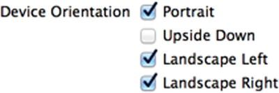
Figure 5-2. The General tab for our project shows, among other things, the supported device orientations
This is how you identify which orientations your application supports. It doesn’t necessarily mean that every view in your application will use all of the selected orientations; but if you’re going to support an orientation in any of your application’s views, that orientation must be selected here.
Note The four checkboxes shown in Figure 5-2 are actually just a shortcut to adding and deleting entries in your application’s Info.plist file. If you single-click Orientations-Info.plist in the Supporting Files folder in the project navigator, you should see an entry called Supported interface orientations, with three subentries for the three orientations currently selected. Selecting and deselecting those checkboxes in the project summary simply adds and removes items from this array. Using the checkboxes is easier and less prone to error, so we definitely recommend using the checkboxes. However, we thought you should know what they do.
Have you noticed that the Upside Down orientation is off by default? That’s because, if the phone rings while it is being held upside down, the phone is likely to remain upside down when you answer it. iPad app projects default to all four orientations being supported because the iPad is meant to be used in any orientation. Since our project is an iPhone project, we can leave the checkboxes the way they are.
Now, select Main.storyboard, find a Label in the object library, and drag it into your view, dropping it somewhere just above the center, as shown in Figure 5-3. Select the label’s text and change it to This way up. Changing the text may shift the label’s position, so drag it to make it horizontally centered again.
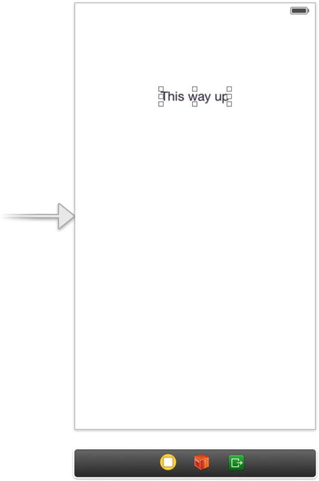
Figure 5-3. A useful reminder in case you lose your sense of gravity
Now, press  R to build and run this simple app. When it comes up in the simulator, try rotating the device a few times by pressing -Left-Arrow or -Right-Arrow. You’ll see that the entire view (including the label you added) rotates to every orientation except upside-down, just as we configured it to do.
We’ve identified the orientations our app will support, but that’s not all we need to do. We can also specify a set of accepted orientations for each view controller, giving us some more fine-grained control over which orientations will work in different parts of our apps.
Per-Controller Rotation Support
Let’s configure our view controller to allow a different, smaller set of accepted orientations. Note that the global configuration for the app specifies a sort of absolute upper limit for allowed orientations. If the global configuration doesn’t include upside-down orientation, for example, there’s no way that any individual view controller can force the system to rotate the display to upside-down. All we can do in the view controller is place further limits on what is acceptable.
Single-click BIDViewController.m. Here we’re going to implement a method, defined in the UIViewController superclass, that lets us specify which orientations we’ll accept.
- (NSUInteger)supportedInterfaceOrientations {
    return (UIInterfaceOrientationMaskPortrait |
            UIInterfaceOrientationMaskLandscapeLeft);
}
This method lets us return a C-style mask of acceptable orientations. This is iOS’s way of asking a view controller if it’s okay to rotate to a specific orientation. In this case, we’re returning a value that indicates that we’ll accept two orientations: the default portrait orientation and the orientation you get when you turn your phone 90º clockwise, so that the phone’s left edge is at the top. We use the Boolean OR operator (the vertical bar symbol) to combine these two orientation masks and return the combined value.
UIApplication.h defines the following orientation masks, which you can combine in any way you like using the OR operator, as previously discussed:
- UIInterfaceOrientationMaskPortrait
- UIInterfaceOrientationMaskLandscapeLeft
- UIInterfaceOrientationMaskLandscapeRight
- UIInterfaceOrientationMaskPortraitUpsideDown
In addition, there are some predefined combinations of these for common use cases. These are functionally equivalent to OR’ing them together on your own, but can save you some typing and make your code more readable:
- UIInterfaceOrientationMaskLandscape
- UIInterfaceOrientationMaskAll
- UIInterfaceOrientationMaskAllButUpsideDown
When the iOS device is changed to a new orientation, the supportedInterfaceOrientations method is called on the active view controller. Depending on whether the return value includes the new orientation, the application determines whether it should rotate the view. Because every view controller subclass can implement this differently, it is possible for one application to support autorotation with some of its views but not with others, or for one view controller to support certain orientations under certain conditions.
Have you noticed that the defined system constants on the iPhone are always designed so that values that work together start with the same letters? One reason why UIInterfaceOrientationMaskPortrait, UIInterfaceOrientationMaskPortraitUpsideDown, UIInterfaceOrientationMaskLandscapeLeft, and UIInterfaceOrientationMaskLandscapeRight all begin with UIInterfaceOrientationMask is to let you take advantage of Xcode’s code completion feature.
You’ve probably noticed that as you type, Xcode frequently tries to complete the word you are typing. That’s code completion in action.
Developers cannot possibly remember all the various defined constants in the system, but you can remember the common beginning for the groups you use frequently. When you need to specify an orientation, simply type UIInterfaceOrientationMask (or even UIInterf), and you’ll see a list of all matches pop up. (In Xcode’s preferences, you can configure the list to pop up only when you press the Esc key.) You can use the arrow keys to navigate the list that appears and make a selection by pressing the Tab or Return key. This is much faster than needing to look up the values in the documentation or header files.
Feel free to play around with this method by returning different orientation mask combinations. You can force the system to constrict your view’s display to whichever orientations make sense for your app, but don’t forget the global configuration we talked about earlier! Remember that if you haven’t enabled upside-down there (for example), none of your views will ever appear upside-down, no matter what their views say.
Note iOS actually has two different types of orientations. The one we’re discussing here is the interface orientation. There’s also a separate but related concept of device orientation. Device orientation specifies how the device is currently being held. Interface orientation is which way the views on the screen are rotated. If you turn a standard iPhone upside down, the device orientation will be upside down, but the interface orientation will almost always be one of the other three, since iPhone apps typically don’t support portrait upside down.
Designing an Interface Using Constraints
In Xcode, make another new project based on the Single View Application template and name itAutosize. Select Main.storyboard to edit the interface file in Interface Builder. One nice thing about using constraints is that they accomplish quite a lot using very little code. We do need to specify which orientations we support in code, but the rest of the autoresize implementation can be done right here in Interface Builder.
To see how this works, drag four Labels from the library over to your view, and place them as shown in Figure 5-4. Use the dashed blue guidelines to help you line up each one near its respective corner. In this example, we’re using instances of the UILabel class to show how to use constraints with your GUI layout, but the same rules apply to all kinds of GUI objects.
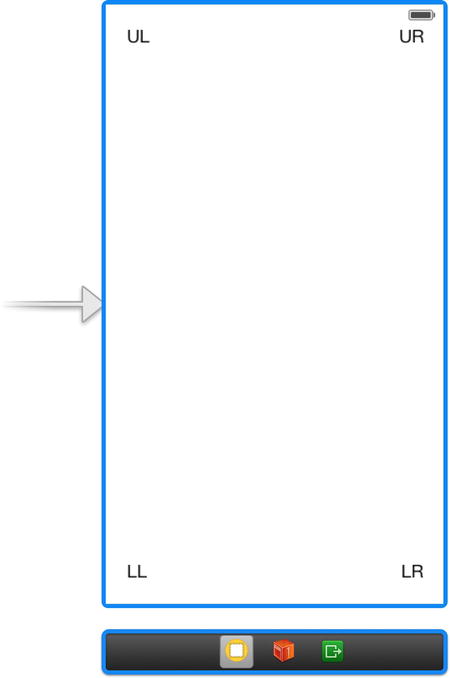
Figure 5-4. Adding four labels to the interface
Double-click each label, and assign a title to each one so you can tell them apart later. We’ve used UL for the upper-left label, UR for the upper-right label, LL for the lower-left label, and LR for the lower-right label. After setting the text for each label, drag all of them into position so that they are lined up evenly with respect to the container view’s corners (see Figure 5-4).
Let’s see what happens now that we’ve specified that we support autorotation, but haven’t set any autosize attributes. Build and run the app. Once the iOS simulator comes up, select Hardware  Rotate Left, which will simulate turning the iPhone to landscape mode. Take a look at Figure 5-5.
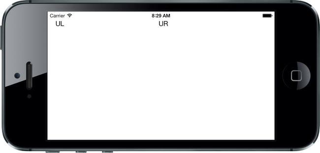
Figure 5-5. So far, not so good. What happened?
As you can see, things aren’t looking so good. The top left label is in the right spot after rotating, but the upper right label is floating somewhere around the middle, and the bottom labels aren’t visible at all! What’s happened is that every object has maintained its distance relative to the upper-left corner of the view.
What we really want is to have each label sticking tightly to its nearest corner after rotating. The labels on the right should shift out to the right to match the view’s new width, and the labels on the bottom should be pulled up to match the new height instead of disappearing off the bottom edge. Fortunately, we can easily set up constraints in Interface Builder to make these changes happen for us.
In fact, Interface Builder is smart enough to examine this set of objects and create a set of default constraints that will do exactly what we want. It uses some rules of thumb to figure out that if we have objects near edges, we probably want to keep them there. To make it apply these rules, first select all four labels. You can do this by clicking one, and then holding down the key while clicking each of the other three. With all of them selected, choose Editor Resolve Auto Layout Issues Add Missing Constraints from the menu. Next, just press the Run button to launch the app in the simulator, and verify that it works.
Knowing that this works is one thing, but to use constraints like this most effectively, it’s pretty important to understand how it works, too. So, let’s dig into this a bit. Back in Xcode, click the upper-left label to select it. You’ll notice that you can see four solid blue lines attached to the label: one leading to the left edge of the container view, one to the top edge, and two leading to other labels. These blue lines are different from the dashed blue guidelines you see when dragging objects around the screen (see Figure 5-6).
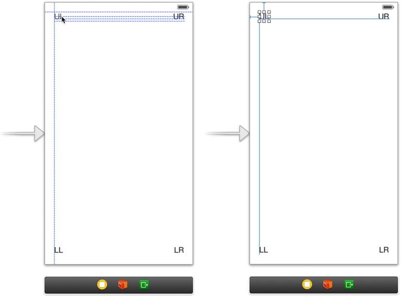
Figure 5-6. On the left, the dashed blue lines help you line up objects while you’re dragging. On the right, the solid blue lines show constraints that are configured for the chosen object
Each of those solid blue lines represents a constraint. If you now press  5 to open the size inspector, you’ll see that it contains a list of four constraints. Two of them deal with this label’s position relative to its superview, the container view: one controlling the space between the top of this view and the top of its superview, and one controlling the leading space, which generally means the space to the left. These constraints cause the label to maintain the same distance to the top and left edges of its superview when the superview’s size changes. The other two constraints are attached to two of the other labels and work to keep them lined up with this label.
Note that in languages where text is written and read from right to left, “leading space” is on the right, so a leading constraint may cause a GUI to be laid out in the opposite direction if the user has picked a language such as Arabic for their phone. For now, let’s just act as if “leading space” means “left space.”
Now, select the label which you placed in the upper right of your view, and you’ll see that things look a little different. This one has its solid lines extending to the right edge of its superview and to two of the other labels. A look at the Constraints section in the size inspector shows constraints controlling the baseline, which is the vertical position, and the trailing space, which for our purposes means “space to the right” (the same caveat mentioned earlier applies here, as well). This set of constraints makes this label stick to the upper-right corner of its superview when the superview’s size changes. Examine each of the remaining labels to see what constraints they have.
Overriding Default Constraints
Grab another label from the library and drag it over to the layout area. This time, instead of moving toward a corner, drag it toward the left edge of your view, lining up the label’s left edge with the left edges of the other labels on the left side, and centering it vertically in the view. Dashed lines will appear to help you out. Figure 5-7 shows you what this looks like.
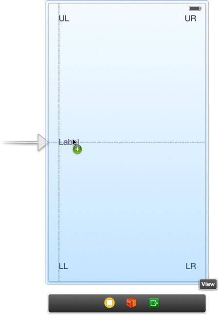
Figure 5-7. Placing the Left label
After placing the left label, give it a title like “Left.” Press R to run your app in the simulator, rotate it to landscape mode, and you’ll see that the left label maintains its distance from the top (again, just like the upper-left label), placing it a fair bit below center. Oops!
We need to create a new constraint to make this work, so go back to Xcode and select the left label in your nib. Adding a constraint to force this label to stay vertically centered is really easy—just select Editor Align Vertical Center in Container. When you do this, Xcode creates a new constraint and immediately selects the new constraint itself in the editor view. This is slightly confusing, but don’t worry! Just click the label again to select it. Make sure the size inspector is on display by pressing 5, and you’ll see that this label now has a constraint aligning its center Y value to that of its superview. Press R to run the app again, do some rotating, and you’ll see that all the labels now move perfectly into their expected places. Nice!
Now, let’s complete our ring of labels by dragging out a new one to the right side of the view, lining up its right edge with the other labels on the right, and aligning it vertically with the Left label. Change this label’s title to Right, and then drag it a bit to make sure its right edge is vertically aligned with the right edges of the other two labels, using the dashed blue line as your guide. We want to use the automatic constraints that Xcode can provide us with, so select Editor Resolve Auto Layout Issues Add Missing Constraints to generate them.
With the label selected, take a peek at the constraints that Xcode has created for us. You should see two of them, one tying the label’s right edge to the right edge of the UR label above it, and another one aligning its baseline (i.e., the imaginary bottom line of the text in the label) to the Left label. Xcode actually made a perfect guess! Build and run again, do some rotating again, and you’ll see that all the labels stay on the screen and are correctly positioned relative to each other (see Figure 5-8). If you rotate back, they should return to their original positions. This technique will work for a great many applications.
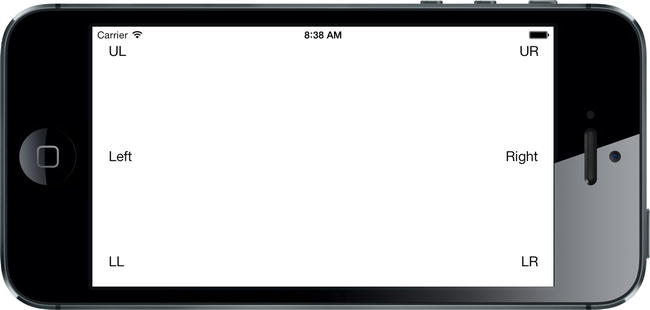
Figure 5-8. The labels in their new positions after rotating
That’s all fine, but we can do a lot more with just a few clicks! Let’s say that we’ve been struck by a great visionary idea and decide that we want the two uppermost labels, UL and UR, to form a sort of header, filling the entire width of the screen. With a bit of resizing and some constraints, we’ll sort that out in no time.
We’re going to create some constraints that make sure that our labels stay the same width as each other, with tight spacing to keep them stretched across the top of the view even when the device rotates. Figure 5-9 shows what we’re shooting for.

Figure 5-9. The top labels, spread across the entire width of the display, in both portrait and landscape orientations
The hardest part about this is being able to visually verify that we’ve got the result we want, where each label is precisely centered within its half of the screen. In order to make it easier to see whether we’ve got it right, let’s temporarily set a background color for the labels. Select both the UL and UR labels, open the attributes inspector, and scroll down to the View section. Use the Background control to select a nice, bright color. You’ll see that the entire frame of each label fills with the color you chose.
Now, direct your attention to the UL label and drag the resizing control on its right edge, pulling it almost to the horizontal midpoint of the view. You don’t have to be exact here, for reasons that will become clear soon. After doing this, resize the UR label by dragging its left-edge resizing control to the left until you see the dashed blue guideline appear, which tells you that it’s the recommended width from the label to its left. Now we’ll add a constraint to make these labels fill the whole width of their superview. Select both the UL and UR labels, and select Editor Pin Horizontal Spacing from the menu. That constraint tells the layout system to hold these labels beside one another with the same horizontal space they have right now. Build and run to see what happens. Rotate the device, and you’ll probably see something like Figure 5-10.
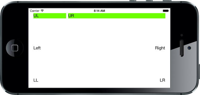
Figure 5-10. The labels are stretched across the display, but not evenly
That’s pretty close, but not really what we had in mind. So what’s missing? We’ve defined constraints that control each label’s position relative to its superview and the allowed distance between the two labels, but we haven’t said anything about the size of the labels. This leaves the layout system free to size them in whatever way it wants (which, as we’ve just seen, can be quite wrong). To remedy this, we need to add one more constraint.
Make sure the UL label is selected, then hold down the Shift key ( ) and click the UR label. With both labels selected, you can make a constraint that affects both of them. From the menu, select Editor Pin Widths Equally to make the new constraint. You’ll now see a new constraint appear, and just like before, it’s automatically selected. Whenever a constraint is selected, the affected views are highlighted with a yellow color, so here you’ll see that both of the top labels have a yellow highlight, as shown in Figure 5-11. You may also note that if the two labels weren’t exactly the same width before you created this constraint, they certainly are now, as the existence of this new constraint snaps them into place.
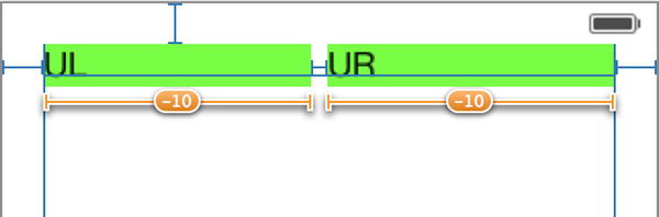
Figure 5-11. The top labels are now made equal in width by a constraint
If you run again at this point, you should now be able to rotate the device and see the labels spread across the entire screen (see Figure 5-9).
In this example, all of our labels are visible and correctly laid out in multiple orientations; however, there is a lot of unused space on the screen. Perhaps it would be better if we also set up the other two rows of labels to fill the width of the view or allowed the height of our labels to change so that there will be less empty space on the interface? Feel free to experiment with the constraints of these six labels and perhaps even add some others. Apart from what we’ve covered so far, you’ll find more actions that create constraints in the Editor Pin menu. And if you end up making a constraint that doesn’t do what you want, you can delete it by selecting it and pressing the Backspace key, or try configuring it in the attributes inspector. Play around until you feel comfortable with the basics of how constraints work. We’ll use them now and then throughout the book; but if you want the full details, just search for “auto layout” in Xcode’s documentation window.
In the course of your experimentation, you’re bound to notice that sometimes no combination of constraints will give you exactly what you want. In some cases, you’ll need to rearrange your interface more drastically than can be handled with this technique. For those situations, a little more code is in order. Let’s take a look at that next.
Restructuring a View When Rotated
Back in Xcode, make a new Single-View project like you’ve done before, naming this one Restructure. We’re going to show you how to construct a layout that changes quite a bit between portrait and landscape by manually specifying frame rectangles for each component. We’ll still use Interface Builder to configure our GUI and make connections between objects, but we’ll use code to place each part of the GUI exactly where we want it.
We’re going to construct a GUI that consists of one large content area and a small set of buttons that perform various actions. If the device is in portrait orientation, the buttons should be ordered in a small grid at the bottom of the screen; but in landscape orientation, they should be in a single column on the right. Figure 5-12 shows both alternatives.
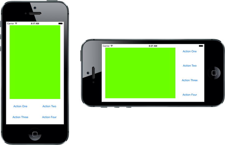
Figure 5-12. The final GUI of the Restructure app, shown in both orientations
Select Main.storyboard to start editing the GUI. Since we don’t really have an interesting content view we want to display, we’ll just use a large colored rectangle. Drag a single UIView from the object library into your container view. You’ll notice as you do so that it expands to fill your container view completely, which is really not what we want. While it’s still selected, use the size inspector to change the new view’s width and height to 280 each. Next, switch over to the attributes inspector and use the Background pop-up to pick some other background color. You can choose anything you like, as long as it’s not white, so that the view stands out from the background. Finally drag the view into the upper center of its superview (see Figure 5-13).
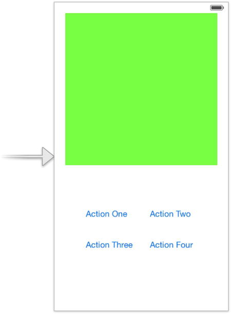
Figure 5-13. The basic portrait layout for the Restructure view
Now drag a button from the object library and place it in the lower part of the view. Double-click to select the text in its label, and change it to Action One. Now alt-drag three copies of this button and place them in a grid (see Figure 5-13). You don’t have to line them up perfectly because we’re going to adjust all their positions in code. Adjust the titles of three of them to Action Two, Action Three, and Action Four.
Can you guess what’s going to happen now when we rotate the screen? Go ahead and run the app in the simulator to find out. Chances are, you won’t be pleased. As usual, each view’s position is based on keeping the same distance from the upper-left corner, which means the small views probably disappear off the bottom again.
There’s really no way we can get the result we want here using constraints, so we’ll fix this layout in our code instead. Before we write any layout code, we first need to disable the constraint system for the content of this nib file. Otherwise, the automatic constraints created by Xcode when our app is compiled would kick in during our view’s layout, which would defeat the purpose of manually specifying the geometry of our GUI in code.
Press 1 to open the file inspector. In the middle of the Interface Builder Document section, you’ll see a checkbox labeled Use Autolayout. Click to turn it off, which will make Interface Builder forget about constraints for this nib file. Now the layout of the view in this nib file is completely in your control.
Creating and Connecting Outlets
Make sure Main.storyboard is still selected and bring up the assistant editor (as you did in the previous chapter). Make sure you can see BIDViewController.m next to the GUI layout area, and then control-drag from each of the four buttons to the class extension in your code (the section between the first @interface and @end lines near the top of the file) to create four outlets called actionButton1, actionButton2, actionButton3, and actionButton4. Now do the same for the large view, naming this outlet contentView.
Once you’ve connected all five buttons to new outlets, the upper part of BIDViewController.m should look like this:
#import "BIDViewController.h"

@interface BIDViewController ()
@property (weak, nonatomic) IBOutlet UIButton *actionButton1;
@property (weak, nonatomic) IBOutlet UIButton *actionButton2;
@property (weak, nonatomic) IBOutlet UIButton *actionButton3;
@property (weak, nonatomic) IBOutlet UIButton *actionButton4;
@property (weak, nonatomic) IBOutlet UIView *contentView;

@end
To move these views around and make the best use of space, we need to override the method willAnimateRotationToInterfaceOrientation:duration: in BIDViewController.m. This method is called automatically after the device has been rotated into a new orientation, but before the final rotation animations have occurred.
Add the following method at the bottom of BIDViewController.m, just above the @end:
- (void)willAnimateRotationToInterfaceOrientation:(UIInterfaceOrientation)
             toInterfaceOrientation duration:(NSTimeInterval)duration {
   [self doLayoutForOrientation:toInterfaceOrientation];
}
As you can see, this method just passes the new orientation along to another method, one which you haven’t written yet. We put this functionality into a new method for reasons that will become clear soon. Here’s the new method:
- (void)doLayoutForOrientation:(UIInterfaceOrientation)orientation {
    if (UIInterfaceOrientationIsPortrait(orientation)) {
        [self layoutPortrait];
    } else {
        [self layoutLandscape];
    }
}
The doLayoutForOrientation: method simply passes control off to one of two other methods, which individually set up the views in the correct positions. We haven’t defined those yet either, so here they are, along with some constant values we’re going to use for some of our layout geometry:
static const CGFloat buttonHeight = 40;
static const CGFloat buttonWidth = 120;
static const CGFloat spacing = 20;

- (void)layoutPortrait {
    CGRect b = self.view.bounds;

    CGFloat contentWidth = CGRectGetWidth(b) - (2 * spacing);
    CGFloat contentHeight = CGRectGetHeight(b) - (4 * spacing) -
                            (2 * buttonHeight);

    self.contentView.frame = CGRectMake(spacing, spacing,
                                        contentWidth, contentHeight);

    CGFloat buttonRow1y = contentHeight + (2 * spacing);
    CGFloat buttonRow2y = buttonRow1y + buttonHeight +  spacing;

    CGFloat buttonCol1x = spacing;
    CGFloat buttonCol2x = CGRectGetWidth(b) - buttonWidth - spacing;

    self.actionButton1.frame = CGRectMake(buttonCol1x, buttonRow1y,
                                          buttonWidth, buttonHeight);

    self.actionButton2.frame = CGRectMake(buttonCol2x, buttonRow1y,
                                          buttonWidth, buttonHeight);

    self.actionButton3.frame = CGRectMake(buttonCol1x, buttonRow2y,
                                          buttonWidth, buttonHeight);

    self.actionButton4.frame = CGRectMake(buttonCol2x, buttonRow2y,
                                          buttonWidth, buttonHeight);
}

- (void)layoutLandscape {
    CGRect b = self.view.bounds;

    CGFloat contentWidth = CGRectGetWidth(b) - buttonWidth - (3 * spacing);
    CGFloat contentHeight = CGRectGetHeight(b) - (2 * spacing);

    self.contentView.frame = CGRectMake(spacing, spacing,
                                        contentWidth, contentHeight);

    CGFloat buttonX = CGRectGetWidth(b) - buttonWidth - spacing;
    CGFloat buttonRow1y = spacing;
    CGFloat buttonRow4y = CGRectGetHeight(b) - buttonHeight - spacing;
    CGFloat buttonRow2y = buttonRow1y + floor((buttonRow4y - buttonRow1y)
                                              * 0.333);
    CGFloat buttonRow3y = buttonRow1y + floor((buttonRow4y - buttonRow1y)
                                              * 0.667);

    self.actionButton1.frame = CGRectMake(buttonX, buttonRow1y,
                                          buttonWidth, buttonHeight);

    self.actionButton2.frame = CGRectMake(buttonX, buttonRow2y,
                                          buttonWidth, buttonHeight);

    self.actionButton3.frame = CGRectMake(buttonX, buttonRow3y,
                                          buttonWidth, buttonHeight);

    self.actionButton4.frame = CGRectMake(buttonX, buttonRow4y,
                                          buttonWidth, buttonHeight);
}
Each of those methods functions in a similar way, but they achieve different results. They first store the superview’s bounds rectangle in a local variable for the sake of convenience. Next, they use that rectangle’s size and our geometry constants to figure out a good position for the big content view, and then set that view’s frame so that it ends up in the right spot. After that, some button positions are calculated, and each button’s frame is adjusted so that they all end up in the right places, too.
That’s the 10,000-foot view, but there are lots of interesting details here. The size and position of all views, including controls such as buttons, are specified in properties called frame and bounds, both of which are structs of type CGRect. The difference between the two is this. A view’s frame describes its location within its parent view’s coordinate system, while a view’s bounds describe its own coordinate system, which is useful in case you want to figure out where subviews belong. There are many ways of using these values, but one of the most typical uses is the kind of thing we’re doing here: using the position of one or more objects to decide the position of another. As a rule, if you want to calculate a view’s position, you are likely to read a parent view’s bounds or a sibling view’s frame to base things on—you end up setting the target view’s frame to put it in its place. We’ll see more of this throughout the book.
Apart from that, the Apple-provided CGRectMake() function lets you easily create a CGRect by specifying the x and y positions along with the width and height. We also use the CGRectGetHeight() and CGRectGetWidth() functions here, which simply tell you the height and width, respectively, of a given CGRect.
Note You may have noticed something in this code that you haven’t seen before. Remember when we created properties for all those buttons using Interface Builder’s drag-to-code feature? Those properties declare the existence of methods for each button, allowing us to access their values by calling the methods or by using Objective-C’s dot notation (e.g., [self contentView] or self.contentView). In the past, you were required to create those methods in your .m file, either by really implementing them with code or by using the @synthesize declaration to have them made for you. If you did any Objective-C development before 2012 or so, you probably remember doing this sort of thing a lot.
Over the past few years, this behavior has been tweaked a bit. If you leave out the @synthesize declaration, as the click-to-code feature now does, the compiler just creates those methods for you, anyway. At the same time, it creates an instance variable, the name of which is established by putting an underscore in front of the method name. In concrete terms, take a look at this line of code:
@synthesize bigButton = _bigButton;
In modern versions of Xcode (4.4 and up), that line of code is now completely redundant. If your property declarations look just like that, you can leave them out entirely. Unless you really want to use a different naming convention for your instance variables, you should be able to skip the step of explicitly synthesizing accessors entirely.
There’s one more thing to do here before we’re done. Since we’ve gone to all the trouble of setting exact positions for all our GUI elements in code, we should use that code for all of our GUI layout, including the moment when the view objects have just been loaded from the storyboard or nib file. Add the bold lines shown here to the viewDidLoad method to make this happen:
- (void)viewDidLoad
{
    [super viewDidLoad];
    // Do any additional setup after loading the view, typically from a nib.
    UIApplication *app = [UIApplication sharedApplication];
    UIInterfaceOrientation currentOrientation = app.statusBarOrientation;
    [self doLayoutForOrientation:currentOrientation];
}
Here we’re grabbing the shared instance of the UIApplication class and asking it for its statusBarOrientation. This tells us in which direction the screen is oriented when the view loads. We pass that along to the doLayoutForOrientation: method that we wrote earlier, so that it will position all of our GUI elements properly.
Save this code. Now build and run the application to see it in action. Try rotating and watch how the buttons slide over to new positions, nicely lined up along the right side of the screen. Rotate back, and they go right back to where they started from. Smooth! You should also try running in different simulated devices. Xcode lets you choose whether you want to run as a 3.5-inch or 4-inch iPhone. Both should work equally well.
Rotating Out of Here
In this chapter, you tried out a few different approaches to supporting autorotation in your applications. You learned about using constraints to define view layout; and you also saw how to restructure your views, in code, when the iOS device rotates.
In the next chapter, we’re going to start looking at true multiview applications. Every application we’ve written so far has used a single view controller and a single content view. A lot of complex iOS applications, such as Mail and Contacts, are made possible only by the use of multiple views and view controllers, and we’re going to look at exactly how that works in Chapter 6.