
In this chapter, we’re going to look at a fairly recent addition to UIKit: the UICollectionView class. You’ll see how it relates to the familiar UITableView, how it differs, and how it can be extended to do things that UITableView can’t even dream about.
For years, iOS developers have used the UITableView component to create a huge variety of interfaces. With its ability to let you define multiple cell types, create them on the fly as needed, and handily scroll them vertically, UITableView has become a key component of thousands of apps. And Apple has truly given its table view class lots of API love over the years, adding new and better ways to supply it with content in each major new iOS release.
However, it’s still not the ultimate solution for all large sets of data. If you want to present data in multiple columns, for example, you need to combine all the columns for each row of data into a single cell. There’s also no way to make a UITableView scroll its content horizontally. In general, much of the power of UITableView has come with a particular trade-off: developers have no control of the overall layout of a table view. You can define the look of each individual cell all you want; but at the end of the day, the cells are just going to be stacked on top of each other in one big scrolling list!
Well, apparently Apple realized this, too. In iOS 6, it introduced a new class called UICollectionView that addresses these shortcomings. Like a table view, this class lets you display a bunch of “cells” of data and handles things like queuing up unused cells for later use. But unlike a table view, UICollectionView doesn’t lay these cells out in a vertical stack for you. In fact, UICollectionView doesn’t lay them out at all! Instead, it uses a helper class to do layout, as you’ll see soon.
Creating the DialogViewer Project
To show some of the capabilities of UICollectionView, we’re going to use it to lay out some paragraphs of text. Each word will be placed in a cell of its own, and all the cells for each paragraph will be clustered together in a section. Each section will also have its own header. This may not seem too exciting, considering that UIKit already contains other perfectly good ways of laying out text. However, this process will be instructive anyway, since you’ll get a feel for just how flexible this thing is. You certainly wouldn’t get very far doing something like Figure 10-1 with a table view!

Figure 10-1. Each word is a separate cell. All of this is laid out using a single UICollectionView, and no explicit geometry calculations of our own
In order to make this work, we’ll define a couple of custom cell classes; we’ll use UICollectionViewFlowLayout (the one and only layout helper class included in UIKit at this time); and, as usual, we’ll use our view controller class to glue it all together. Let’s get started!
Use Xcode to create a new Single View Application, as you’ve done many times by now. Name your project DialogViewer and use the standard settings we’ve used throughout the book (leaving Class Prefix set to BID, choosing iPhone in the Devices popup, etc).
Fixing the View Controller’s Class
There’s nothing in particular we need to do with the app delegate in this app, so let’s jump straight into BIDViewController.h and make just one simple change, switching our super class to UICollectionView:
@interface BIDViewController : UIViewController
@interface BIDViewController : UICollectionViewController
Next, open up Main.storyboard. We need to set up the view here to match what we just specified in the header. Select the one and only View Controller Scene in the editing area and delete it. Now use the object library to locate a Collection View Controller and drag it into the editing area. Select the icon for the View Controller you just dragged out and use the Identity Inspector to change its class to BIDViewController.
Next, let’s define some cell classes. As you saw in Figure 10-1, we’re displaying two basic kinds of cells: a “normal” one containing a word and another that is used as a sort of header. Any cell you’re going to create for use in a UICollectionView needs to be a subclass of the system-supplied UICollectionViewCell, which provides basic functionality similar to UITableViewCell. This functionality includes a backgroundView, a contentView, and so on. Because our two cells will have some shared functionality, we’ll actually make one a subclass of the other and use the subclass to override some functionality.
Start by creating a new Objective-C class in Xcode. Name the new class BIDContentCelland make it a subclass of UICollectionViewCell. Select the new class’s header file and add declarations for a couple of properties and one class method:
#import <UIKit/UIKit.h>

@interface BIDContentCell : UICollectionViewCell

@property (strong, nonatomic) UILabel *label;
@property (copy, nonatomic) NSString *text;

+ (CGSize)sizeForContentString:(NSString *)s;

@end
The label property will point at a UILabel used for display. We’ll use the text property to tell this cell what to display, and we’ll use the sizeForContentString: method to ask a class how big the cell needs to be to display a given string. This will come in handy when creating and configuring instances of our cell classes.
Now switch over to BIDContentCell.m, where several pieces of work await us. Let’s start by filling out the initWithFrame: method, as shown here:
- (id)initWithFrame:(CGRect)frame
{
    self = [super initWithFrame:frame];
    if (self) {
        // Initialization code
        self.label = [[UILabel alloc] initWithFrame:self.contentView.bounds];
        self.label.opaque = NO;
        self.label.backgroundColor = [UIColor colorWithRed:0.8
                                                     green:0.9
                                                      blue:1.0
                                                     alpha:1.0];
        self.label.textColor = [UIColor blackColor];

        self.label.textAlignment = NSTextAlignmentCenter;
        self.label.font = [[self class] defaultFont];
        [self.contentView addSubview:self.label];
    }
    return self;
}
That code is pretty simple. It just creates a label, sets its display properties, and adds the label to the cell’s contentView. The only mysterious thing here is that it uses the class method defaultFont to get a font, which is used to set the label’s font. The idea is that this class should define which font will be used for displaying content, while also allowing any subclasses to declare their own display font by overriding the defaultFont method. But we haven’t created this method yet, so let’s do so:
+ (UIFont *)defaultFont {
    return [UIFont preferredFontForTextStyle:UIFontTextStyleBody];
}
Pretty straighforward. This uses a new piece of iOS 7 functionality that lets the user determine, in the Settings app, what their preferred font sizes are. By using this instead of hard-coding a font size, we make our apps a bit more user friendly.
To finish off this class, let’s add the method we mentioned in the header, the one that computes an appropriate size for the cell:
+ (CGSize)sizeForContentString:(NSString *)string {
    CGSize maxSize = CGSizeMake(300, 1000);

    NSStringDrawingOptions opts = NSStringDrawingUsesLineFragmentOrigin |
                                  NSStringDrawingUsesFontLeading;

    NSMutableParagraphStyle *style = [[NSMutableParagraphStyle alloc] init];
    [style setLineBreakMode:NSLineBreakByCharWrapping];

    NSDictionary *attributes = @{ NSFontAttributeName : [self defaultFont],
                                  NSParagraphStyleAttributeName : style };

    CGRect rect = [string boundingRectWithSize:maxSize
                                       options:opts
                                    attributes:attributes
                                       context:nil];

    return rect.size;
}
That method does a lot of things, so it’s worth walking through it. First, we declare a maximum size; no word will be allowed to be wider than the screen space we want to use. Next, we define some options that will help the system calculate the right dimensions for the string we’re dealing with. We also create a paragraph style that allows for character wrapping, so in case our string is too big to fit in the minimum width we presented early, so it can wrap around to a subsequent line. We also create an attributes dictionary that contains the default font we defined for this class and the paragraph style we just created. Finally, we use some NSString functionality provided in UIKit that lets us calculate screen sizes for a string. We pass in an absolute maximum size and the other options and attributes we set up, and we get back a size.
All that’s left for this class is some special handling of the text property. Instead of letting this use an implicit instance variable as we normally do, we’re going to define methods that get and set the value based on the UILabel we created earlier, basically using the UILabel as storage for the displayed value. By doing so, we can also use the setter to recalculate the cell’s geometry when the text changes. Here’s what this looks like:
- (NSString *)text {
    return self.label.text;
}

- (void)setText:(NSString *)text {
    self.label.text = text;
    CGRect newLabelFrame = self.label.frame;
    CGRect newContentFrame = self.contentView.frame;
    CGSize textSize = [[self class] sizeForContentString:text];
    newLabelFrame.size = textSize;
    newContentFrame.size = textSize;
    self.label.frame = newLabelFrame;
    self.contentView.frame = newContentFrame;
}
The getter is nothing special; but the setter is doing some extra work. Basically, it’s modifying the frame for both the label and the content view, based on the size needed for displaying the current string.
That’s all we need for our base cell class. Now let’s make a cell class to use for a header. Use Xcode to make another new Objective-C class, naming this one BIDHeaderCell and making it a subclass of BIDContentCell. We don’t need to touch the header file at all, so jump straight to BIDHeaderCell.m to make some changes. All we’re going to do in this class is override a few methods to change the cell’s appearance, making it look different from the normal content cell:
- (id)initWithFrame:(CGRect)frame
{
    self = [super initWithFrame:frame];
    if (self) {
        // Initialization code
        self.label.backgroundColor = [UIColor colorWithRed:0.9
                                                     green:0.9
                                                      blue:0.8
                                                     alpha:1.0];
        self.label.textColor = [UIColor blackColor];

    }
    return self;
}

+ (UIFont *)defaultFont {
    return [UIFont preferredFontForTextStyle:UIFontTextStyleHeadline];
}
That’s all we need to do to give the header cell a distinct look, with its own colors and font.
Configuring the View Controller
Now let’s focus our attention on our view controller. Select BIDViewController.m and start by importing the headers for our custom cells and declaring an array to contain the content we want to display:
#import "BIDViewController.h"
#import "BIDContentCell.h"
#import "BIDHeaderCell.h"

@interface BIDViewController ()
@property (copy, nonatomic) NSArray *sections;
@end
Next, we’ll use viewDidLoad to define that data. The sections array will contain a list of dictionaries, each of which will have two keys: header and content. We’ll use the values associated with those keys to define our display content. The actual content we’re using is adapted from a well-known play:
- (void)viewDidLoad
{
    [super viewDidLoad];
    // Do any additional setup after loading the view, typically from a nib.
    self.sections =
    @[
      @{ @"header" : @"First Witch",
         @"content" : @"Hey, when will the three of us meet up later?" },
      @{ @"header" : @"Second Witch",
         @"content" : @"When everything's straightened out." },
      @{ @"header" : @"Third Witch",
         @"content" : @"That'll be just before sunset." },
      @{ @"header" : @"First Witch",
         @"content" : @"Where?" },
      @{ @"header" : @"Second Witch",
         @"content" : @"The dirt patch." },
      @{ @"header" : @"Third Witch",
         @"content" : @"I guess we'll see Mac there." },
      ];

}
Much like UITableView, UICollectionView lets us register the class of a reusable cell based on an identifier. Doing this lets us call a dequeuing method later on, when we’re going to provide a cell. If no cell is available, the collection view will create one for us. Just like UITableView! Add this line to the end of viewDidLoad to make this happen:
[self.collectionView registerClass:[BIDContentCell class]
        forCellWithReuseIdentifier:@"CONTENT"];
By default, UICollectionView has a black background. We want a lighter look in this app, so let’s make it white instead:
self.collectionView.backgroundColor = [UIColor whiteColor];
We’ll make just one more change to viewDidLoad. Since this application has no navigation bar, the main view will once again interfere with the status bar. To prevent that, add the following lines to the end of viewDidLoad (we’ve done something very similar with some other views in past chapters):
UIEdgeInsets contentInset = self.collectionView.contentInset;
contentInset.top = 20;
[self.collectionView setContentInset:contentInset];
That’s enough configuration in viewDidLoad, at least for now. Before we get to the code that will populate the collection view, we need to write one little helper method. All of our content is contained in lengthy strings, but we’re going to need to deal with them one word at a time to be able to put each word into a cell. So let’s create an internal method of our own to split those strings apart. This method takes a section number, pulls the relevant content string from our section data, and splits it into words:
- (NSArray *)wordsInSection:(NSInteger)section {
    NSString *content = self.sections[section][@"content"];
    NSCharacterSet *space = [NSCharacterSet whitespaceAndNewlineCharacterSet];
    NSArray *words = [content componentsSeparatedByCharactersInSet:space];
    return words;
}
Now it’s time for the group of methods that will actually populate the collection view. These next three methods are remarkably similar to their UITableView correspondents. First, we need a method to let the collection view know how many sections to display:
- (NSInteger)numberOfSectionsInCollectionView:(UICollectionView *)collectionView {
    return [self.sections count];
}
Next, we have a method to tell the collection how many items each section should contain. This uses the wordsInSection: method we defined earlier:
- (NSInteger)collectionView:(UICollectionView *)collectionView
     numberOfItemsInSection:(NSInteger)section {
    NSArray *words = [self wordsInSection:section];
    return [words count];
}
And here’s the method that actually returns a single cell, configured to contain a single word. This method uses our wordsInSection: method. As you can see, it uses a dequeuing method on UICollectionView, similar to UITableView. Since we’ve registered a cell class for the identifier we’re using here, we know that the dequeuing method always returns an instance:
- (UICollectionViewCell *)collectionView:(UICollectionView *)collectionView
                  cellForItemAtIndexPath:(NSIndexPath *)indexPath {
    NSArray *words = [self wordsInSection:indexPath.section];

    BIDContentCell *cell = [self.collectionView
                            dequeueReusableCellWithReuseIdentifier:@"CONTENT"
                            forIndexPath:indexPath];
    cell.text = words[indexPath.row];
    return cell;
}
Judging by the way that UITableView works, you might think that at this point we’d have something that works, in at least a minimal way. Build and run your app, and you’ll see that we’re not really at a useful point yet.
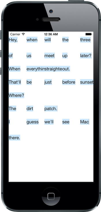
Figure 10-2. This isn’t very useful
We can see some of the words, but there’s no ”flow” going on here. Each cell is the same size, and everything is all jammed together. The reason for this is that we have more delegate responsibilities we have to take care of to make things work.
Until now, we’ve been dealing with the UICollectionView; but as we mentioned earlier, this class has a sidekick that takes care of the actual layout. UICollectionViewFlowLayout, which is the default layout helper for UICollectionView, has some delegate methods of its own that it will use to try to pull more information out of us. We’re going to implement one of these right now. The layout object calls this method for each cell to find out how large it should be. Here we’re once again using our wordsInSection: method to get access to the word in question, and then using a method we defined in the BIDContentCell class to see how large it needs to be:
- (CGSize)collectionView:(UICollectionView *)collectionView
                  layout:(UICollectionViewLayout*)collectionViewLayout
  sizeForItemAtIndexPath:(NSIndexPath *)indexPath {
    NSArray *words = [self wordsInSection:indexPath.section];
    CGSize size = [BIDContentCell sizeForContentString:words[indexPath.row]];
    return size;
}
Now build and run the app again, and you’ll see that we’ve taken a pretty large step forward.

You can see that the cells are now flowing and wrapping around so that the text is readable, and that the beginning of each section drops down a bit. But each section is jammed really tightly against the ones before and after it. They’re also pressing all the way out to the sides, which doesn’t look too nice. Let’s fix that by adding a bit more configuration. Add these lines to the end of the viewDidLoad method:
UICollectionViewLayout *layout = self.collectionView.collectionViewLayout;
UICollectionViewFlowLayout *flow = (UICollectionViewFlowLayout *)layout;
flow.sectionInset = UIEdgeInsetsMake(10, 20, 30, 20);
Here we’re grabbing the layout object from our collection view. We assign this first to a temporary UICollectionViewLayout pointer, primarily to highlight a point: UICollectionView only really seems to “know” about this generic layout class, which cannot in fact be used directly at runtime. In practice, unless we specify something else, it’s really using a UICollectionFlowLayout instance. Knowing the true type of the layout object, we can use a typecast to assign it to another variable, enabling us to access methods that only that subclass has.
Build and run again, and you’ll see that our text cells have gained some much-needed breathing room.

The only thing missing now is the display of our header objects, so it’s time to fix that. You will recall that UITableView has a system of header and footer views, and it asks for those specifically for each section. UICollectionView has made this concept a bit more generic, allowing for more flexibility in the layout. The way this works is that, along with the system of accessing normal cells from the delegate, there is a parellel system for accessing additional views that can be used as headers, footers, or anything else. Add this bit of code to the end of viewDidLoad to let the collection view know about our header cell class:
[self.collectionView registerClass:[BIDHeaderCell class]
        forSupplementaryViewOfKind:UICollectionElementKindSectionHeader
               withReuseIdentifier:@"HEADER"];
As you can see, in this case we’re not only specifying a cell class and an identifer, but we’re also specifying a ”kind.” The idea is that different layouts may define different kinds of supplementary views and may ask the delegate to supply views for them. UICollectionFlowLayout is going to ask for one section header for each section in the collection view, and we’ll apply them like this:
- (UICollectionReusableView *)collectionView:(UICollectionView *)collectionView
           viewForSupplementaryElementOfKind:(NSString *)kind
                                 atIndexPath:(NSIndexPath *)indexPath {
    if ([kind isEqual:UICollectionElementKindSectionHeader]) {
        BIDHeaderCell *cell = [self.collectionView
                               dequeueReusableSupplementaryViewOfKind:kind
                               withReuseIdentifier:@"HEADER"
                               forIndexPath:indexPath];

        cell.text = self.sections[indexPath.section][@"header"];
        return cell;
    }
    return nil;
}
Build and run, and you’ll see . . . wait! Where are those headers? As it turns out, UICollectionFlowLayout won’t give the headers any space in the layout unless we tell it exactly how large they should be. So go back to viewDidLoad and add the following line at the end:
flow.headerReferenceSize = CGSizeMake(100, 25);
Build and run once more, and now you’ll see the headers in place, as Figure 10-1 showed earlier and Figure 10-5 shows again.
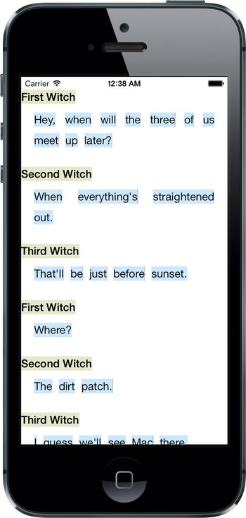
Figure 10-5. The completed DialogViewer app
In this chapter, we’ve really just dipped our toes into UICollectionView and what can be accomplished with the default UICollectionFlowLayout class. You can get even fancier with it by defining your own layout classes, but that is a topic for another book.
Now that you’ve gotten familiar with all the major big-picture components, it’s time to learn how to use them in whole new ways and whole new screen sizes. We’re talking about iPad, and Chapter 11 is where we get started.