Chapter 13
Business Intelligence Applications
Abstract
Develop business intelligence (BI) content specifications in order to design and document the BI applications that will be built. Review the BI content specifications to create a revised and agreed-upon list of BI application deliverables. To help ensure the application is built to meet the needs of its intended audience, use the concept of personas. For BI, these are casual consumers, analysts, power users, and data scientists. Effective BI applications are focused on their purpose (helping business people glean knowledge from data), and they are created with best practices for layout and design that make them intuitive. And while cluttered and poorly designed visual layouts can hinder business analysis, it also affects data layouts, particularly with self-service BI. It is important to match the type of analysis someone needs to do with the appropriate visualization, so understand when to use bar charts, scattergrams, maps, etc.
Keywords
BI application; BI content specifications; BI design; Data layout; Personas; Visual layout; Visualization• Creating BI content specifications
• Choosing the BI application
• Creating personas
• Best practices for BI design layout
• Data design for self-service BI
• Matching visualization and analysis types
BI Content Specifications
The project team needs to develop BI content specifications in order to design and document the BI applications they are going to build. The requirements gathering processes discussed in Chapter 3 will have collected the preliminary content for the specifications, but more details are needed, and the input from the requirements must be organized in the context of the BI applications.
The BI project should use an iterative and incremental methodology that includes a mix of waterfall and agile for specific portions of the project. (You will find these concepts covered in Chapter 18.) Developing the specification is not an end unto itself. Rather, it is a tool to help in the design, development, and maintenance of each BI application. The specification is a living document that will be updated and modified at various points in the project as designers, developers, and business people (its consumers) discover different aspects of the BI application or the data that it analyzes throughout the project lifecycle.
The amount of time and resources required to develop the BI content specifications will vary considerably based on the complexity of the BI application and its underlying data, as well as whether the project needs to source and integrate new data into the BI environment.
Is the data that the BI application needs already in the BI environment? And is it documented either in the enterprise data warehouse or in an operational application (assuming it supports operational BI)? If so, the BI application can be moved along a faster path, because data discovery, profiling, and integration will not be necessary. Under these circumstances, the project team should consider using either prototyping or an agile project methodology to design and develop the BI application. When BI vendors discuss how quickly a dashboard can be built, they are really referring to this serendipitous set of circumstances. If they were more forthcoming, they would have a legal disclaimer that says, “you can quickly develop a dashboard provided the data exists and is documented.”
The BI application content specification includes the following:
• Identifier: A unique identifier. It is useful to create a naming convention for this identifier, similar to what is being used for table and column naming.
• Name: A brief, descriptive name. This may be used as the display name in portals, menus, or in title fields. Stick to a naming convention. It is common for this field to be modified later in the project as you get business feedback.
• Description: A brief description of its business purpose. This should be descriptive enough that a business person can decide if this application will be useful.
• Category: A functional grouping of BI applications, such as customer profitability, sales performance, or expense tracking.
• Business processes: A list of the one or more business processes supported by this BI application.
• Data: Lists of the data used by the BI application. The granularity will be at the column or field level and includes the following attributes:
• Data sources. List the data sources that the BI application directly queries. A partial list of sources are the enterprise data warehouse (EDW), a data mart, an online analytical processing (OLAP) cube, a spreadsheet, or an operational system.
• Data source structures. List the data structure of the data sources, such as relational, columnar, comma separated value (CSV), XML, OLAP cube, Hadoop, or NoSQL.
• Table names. List the names of the tables or files used from the BI data sources.
• Column names. List the names of the columns or fields from the BI data sources.
• Column data type. List the column or field data type. Note: column attributes, such as whether it can contain nulls, its default value (if any), and the possible values are not necessary for the data content, but they will be useful for the functional content design.
• Status in the data source. The options are:
- It already exists in the BI data source and just needs to be queried when the application is executed.
- The underlying data exists in the data source, but a business transformation, business rules, or an algorithm needs to be created to make this data available to the BI application. An example is a new measure, metric, or key performance indicator (KPI) that needs to be created from data that already exists.
- The data does not exist in the BI data source, but needs to be obtained from one or more systems of record (SORs). The details of this are in the data integration specifications.
• SOR. List the originating source system for this data. The details will be in the data integration specifications and data profiling reports.
• Business transformations for incoming data: List the filters, business rules, and algorithms used as data is retrieved from the BI data store. Note: this is not the business or data transformation performed on the SORs by the data integration processes, but what needs to happen in this BI application.
• Business transformations for analysis: Calculate measures and KPIs.
• Analytical style: List the BI analytical styles that this application will use to present the data for analysis. These styles include reports, dashboards, scorecards, OLAP cubes, pivot tables, ad hoc queries, data discovery, data visualization, triggers or alerts, and others. Note: this is not the functional specification, so this does not include such items as visual layouts and charts.
• Business people: List the potential business people who will use the application along with their level of data and analytical skills. Although later you will need their actual names, at this point it is just essential to categorize them by their data and analytics skill levels. Also, if actual names are not provided, then provide an estimate of how many people are in each of these categories.
• Business owner: List the business owners of this application.
• Business contact: List the business person who is the contact for discussions on the content and functioning of this application if the business owner is delegating this responsibility.
• BI owner: List the BI team member responsible for the project delivery of the BI application.
• BI developer: List the BI developer responsible for the development of the BI application.
• Business priority: List the business priority or value assigned to this BI application relative to the other BI applications on the BI program or project lists.
• Technical level of effort: Estimate the time, resources, and degree of difficulty of building this BI application.
• Risks: List risks, complexities, or dependencies of this BI application.
• Comments: List overall comments provided by business and technical staff.
Revise BI Applications List
Create the initial list of BI applications by reviewing the data and business requirements gathered earlier in the project. The BI content specification process will help you create a revised and agreed-upon list of BI application deliverables. The revisions will evolve during the following steps:
• Assessing scope
• Consolidating BI applications
• Reviewing specifications
• Creating an agreed-upon BI deliverables list
Assessing scope. Defining the BI content specifications involves categorizing the BI applications, getting the business to set priorities, and estimating the level of effort to create them. The BI team members developing the specifications will need to coordinate with data modeling and data integration efforts. Review any data schemas that will be used by the BI applications. BI application design (especially if prototyping is involved) and BI development efforts will need to have BI data stores populated with data, even if it is just sample or test data to begin with. Identify and document project dependencies and risks in the BI application specifications.
Consolidating BI applications. Refine the initial list of BI applications to be delivered during the BI content specification process. Examine each of the individual BI applications in the context of the entire list. First, there are often overlapping requirements across multiple BI applications that can be consolidated into a single BI application with the use of filtering or parameters. Second, the use of more self-service oriented BI analytical styles, such as data discovery, OLAP, and in-memory columnar analytics, enable what appeared to be separate BI applications to be viewed on a dashboard. Both of these scenarios are very common when legacy reports are included in the mix of BI deliverables. Do not be intimidated if there are hundreds or even thousands of legacy reports to be migrated; I have been in projects where the consolidation ratio was 10 to 1. This is likely to be the only time during the BI project where BI deliverables will be reduced rather than expanded.
Reviewing specifications. The consolidated list of BI applications with their content specifications needs to be reviewed by the business stakeholders and reporting subject matter experts (SMEs) to provide feedback and confirm or refine deliverables. In addition, the project dependencies and risks must be reviewed within the context of business priorities to determine if any adjustments need to be made to the list of deliverables, the schedule, or project resources.
Creating an agreed-upon BI deliverables list. This milestone reflects the exit criteria for the BI content specification process and, more importantly, BI scoping. With the agreed-upon list in place you can proceed with the tasks of data modeling, data integration, and BI development.
BI Personas
In almost every industry, marketing groups perform customer segmentation analysis for their companies to sell products or services targeted at specific segments. They target restaurants, hotels/motels, vehicles, cameras, and beer to different customer segments based on needs, perceived value (by customers), income, and many other factors.
Customer segmentation is marketing 101, but for some reason the high tech industry does not seem to get it. In fact, their strategy is often one-size-fits-all. In the business intelligence market, product vendors and industry analysts have been targeting one narrow segmentation over the years: the business power user. Power users are business people who are enamored by technology and typically prefer that to their business role. Many successful business managers have a power user on their staff to whom they can off-load any analytical chore. Most industry analysts estimate the power users are just five percent of the total business population, yet it seems every BI tool is pitched to the power user.
Fortunately, there is a wide variety of BI analytical styles available to implement BI applications. The key to success, just like in marketing, is to target the BI application to the correct customer segmentation. We refer to the characteristics of a segmentation of business people as a persona. Product vendors and IT personnel have been frustrated for years that they have not been able to get BI to be pervasive throughout an enterprise. The key to making it pervasive is to identify the BI personas, determine what tools support them, and then structure BI applications for them.
The business personas are:
• Casual consumers
• Analysts
• Power users
• Data scientists
Although the personas very greatly in their data and technology skills, it is a mistake to associate competence with how data- or technology-savvy a person is. BI applications are merely an enabling tool for a business person. Although power users love using technology for its own sake, the typical business person just sees it as a means to an end. Only a small segment of the population includes car geeks, the equivalent of the BI power user, yet the auto industry sells a wide variety of cars to all sorts of auto personas. If BI is to truly become pervasive and enterprises leverage the potential return on investment (ROI) from BI, then the industry needs to recognize different BI personas, and the BI development team needs to create BI applications for all BI personas.
Casual Consumers
Many, if not most, of the people in an enterprise are casual consumers of analytics. These business people will use reports and dashboards to obtain information they need to perform their jobs and will not loiter in the BI applications. They wish to have their report or dashboard filled in with the data they need when they view it. If filters or parameters need to be input in order to obtain their specific data, then they would prefer to save the settings so they do not have to remember them for the next time.
Casual consumers may range from operations staff to executives. Operations staff access real time or near real time data from specific operations systems, and they often use embedded BI in those systems. Executives access prebuilt and populated scorecards and dashboards that track enterprise KPIs they are using to monitor and manage. IT will have created at least some of the BI applications the executives use, but it is likely that power users on their staff will have created very tailored BI applications to meet current and emerging analytical requirements.
There are certainly operations staff and executives who are more data-savvy and analytical-savvy, but in general, an operations person is not being paid to spend his time working on dashboards, and an executive will delegate any analytical workload onto her staff.
Analysts
The analyst persona includes people in an enterprise who regularly use BI applications to gather and explore data they need to perform their jobs. Data analysis is in their job descriptions. The job titles may include the word “analyst” (business analyst, financial analyst, sales analyst, operations analyst, etc.) but many other managerial or staff jobs also apply.
Analysts will leverage their business knowledge to explore and analyze data using spreadsheets and BI applications. They are quite comfortable using pivot tables, so BI applications that present data in that context are easy for them to use. A wide range of BI styles present data in this context, including OLAP cubes, in-memory columnar data, discovery, data visualization, dashboard, scorecard, and report tools.
Analysts typically use a dashboard or report template rather than building it from scratch. They will drag the dimensions and measures presented in the power pivot palette onto the templates to perform their analysis. Analysts will also typically use existing data models, but may augment those by adding calculated measures or augmenting the data with something from a spreadsheet.
Analysts offer the most significant opportunity for the BI application to expand and increase its overall business ROI because they are underserved in most enterprises, yet their job role means they would benefit from becoming BI application consumers.
Power Users
Power users have always been the sweet spot for BI sales, as they have the business needs of the analyst persona, but they also love technology. These people are the departmental experts in the BI tools that have been bought, and they are their core enterprise customers. Over time, their peers and managers will anoint them as the “go to” people in the business group whenever they need new or enhanced analytics. In fact, their job role and time spent shifts to using BI applications. Whenever BI evaluations are conducted or prototypes developed, they are at the forefront. Because their efforts to build and enhance BI applications gives them a pseudo IT role, they take the time to learn all the BI tools’ features and keep asking for more.
Although power users are the core of an enterprise’s BI efforts, they present risks to those efforts:
• First, their skills and enthusiasm for BI tools does not represent those of the other business people. The others may enjoy using BI applications because of the results they get, but they are not feature addicts. BI vendors and IT departments need to position BI applications to support the power users but, more importantly, support the rest of the business community.
• Second, power users are the people who have been creating data shadow systems for years. These systems provide them with their gravitas with their peers and managers—something they are not likely to give up easily. Keep in mind that power users may build their next data shadow system with the BI tools rather than a spreadsheet. With that in mind, make sure that migration of legacy reporting and data shadow systems are part of the deliverables for BI projects.
Data Scientists
These are the data and statistical geeks! I have an undergraduate engineering degree, so I use the terms geeks and nerds with pride and respect. Data scientists work with predictive analytics.
Predictive analytics moves BI from merely analyzing the past and present to leveraging that knowledge to predict outcomes. The predictions are just that—predictions, as they present probabilities not absolutes. When done well, however, predictive analytics improves business outcomes. Data scientists know statistics and math, but what is often overlooked is their expertise in their enterprise’s business and industry. They may also have expertise in psychology, economics, or other disciplines that help build predictive models.
The size of the data scientist population in most enterprises is small, but their business impact may be significant. This book covers predictive analytics and how to build BI applications for the data scientist persona in Chapter 15.
BI Design Layout—Best Practices
BI is an enabling technology. It is the business person who performs the analysis, gains insights, and takes actions based on those insights. BI applications have no value unless they are used and they assist business people in their jobs. The BI developer is not creating a work of art, but rather a functional tool. This section discusses how to design the applications so they are intuitive and functional.
Focus on the Purpose
The BI team identifies the who, what, where, and how of each BI application in the BI content specifications and establishes its specific purpose. Designing the application should begin with finding the area focus up front and then ensuring that it will be adhered to. The business person will inevitably ask for more, tempting the BI developer to expand the focus, but that should be avoided at all costs. If new purposes arise, then the BI team needs to determine if it needs to develop new BI applications to fulfill those requirements.
BI design techniques, such as wireframes, mockups, and prototyping, are extremely useful in getting business feedback and in maintaining focus on the purpose of the application.
Design Layout
Follow these basic design layout practices when developing BI applications:
Consistency beats elegance. The BI team should develop a template layout for each BI style deployed in BI applications. The layouts should be as consistent as the variation in BI styles allows. The template should include standard positioning for titles, legends, navigation tools, help, and visual elements, such as icons and text styles. There should also be a standard background and branding such as a company or product logo. Business people should feel that each BI application is familiar in both layout and navigation, which improves their productivity and allows them to concentrate on the analysis rather than on the application. Effective Web sites have been using this technique of standardizing layouts for years. In addition, developing templates improves the productivity of the BI team, speeds up BI delivery, and decreases maintenance costs.
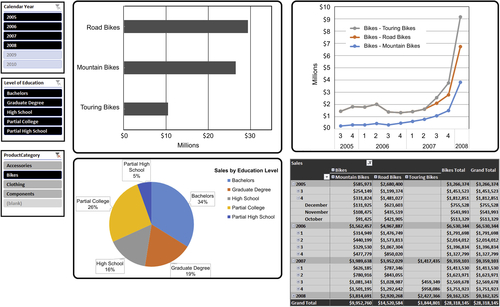
Figure 13.1 depicts a standard template designed by a BI team for a product marketing group. Design elements that are standardized in this example include:
• Filters located on the upper left corner of the display.
• Comparison and contribution analysis presented in two left-hand quadrants. Data is aggregated and drillable when there is a dimensional hierarchy.
• Trending analysis presented as a line chart in the upper right quadrant.
• Sales data presented in tabular form in the lower right quadrant.
Keep it simple. There is a temptation to try to cram too much information or too many visual elements onto a BI application’s display. Creating too much visual clutter makes it more difficult or sometimes impossible to work effectively. Do not be afraid of white space, as it is not a sign of weakness; rather, it shows restraint. The term data-ink ratio identifies the relationship between data and white space. Business people should be able to determine at a glance what elements on the layout they are going to work with.
Location, location, location. Place the most important data at the top of the dashboard, in particular the upper left-hand corner, which is where a person’s eyes travel first. If visualizations are linked together to support a particular business analysis, then the workflow should be from top to bottom and from left to right. This workflow places the last visualization at the bottom or bottom right of the layout.
Use colors judiciously. Colors can be used very effectively to enhance the understanding of data, but they can also become a distraction or even a hindrance. It is very common to encode or associate colors with specific values of something, such as a different color for each product category displayed on a line chart. In addition, making a color hue darker or increasing the size of an object on a chart can portray increasing values, such as sales or income. Always keep in mind that the layout needs to be understandable even if only seen in grayscale in order to accommodate people who are color blind, or when the display has been printed (or saved to a PDF document) without color. There are several guidelines:
• Use a limited number of colors, as too many colors makes it impossible to discern how the data has been encoded. Also limit the number of color palettes in the layout to no more than two.
• Color gradients are effective in displaying differences in measures’ sizes or rankings. This technique can reduce the total number of visualizations necessary to convey information and can also reduce the number of colors needed.
• Use contrasting colors rather than colors with slightly different hues, as it will be difficult to distinguish between the colors.
• Color schemes should represent distinct things on the single display. Overlapping color schemes on different views creates confusion because the same color is used to represent two different things.
• Use colors conventionally whenever possible. The best example is to use the color green for positive values such as business profits and the color red for negative values such as business losses. This enables the business person to mentally encode the visualization without the need for any legend or other visual cue.
It looked great on my monitor. Many data visualization tools enable the dashboard to be designed once and deployed on many platforms, such as PC, tablet, and smartphone. These devices range in size from huge wide-screen monitors to handheld phones and will also vary in display quality. Dashboards designed on a huge wide-screen monitor may look very compelling, but may be too cluttered on the typical notebook’s screen and impossible to use on a tablet. If the BI applications are planned to be deployed on multiple platforms, then the developer needs to prototype the layout on each of those platforms from screen size and display quality perspectives. It is quite possible that, similar to Web sites, there needs to be different versions of the BI application display for different target devices. And even if the BI application will only be displayed on PCs, notebooks, and monitors, the BI developers cannot assume everyone will have their size monitor.
Limit the visualizations on a single layout. The classic dashboard has four visualizations or charts that are related to each other in a business context. If the layout starts adding more than four visualizations, it gets cluttered, the data-ink ratio goes astray, visualizations get smaller, and the overall usefulness of the BI application decreases. If additional visualizations are linked to one of the four selected for the BI applications layout, you should place those visualizations on another dashboard or report.
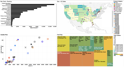
Figure 13.2 depicts a different standard template designed by a BI team for a product marketing group. This template uses a:
• Bar chart for ranking analysis.
• Geomap for sales.
• Scatter graph for correlation analysis.
• Heat map for contribution analysis.
Leverage filters and slicers. Filters enable business people to customize their data discovery and exploration within a BI application. They allow business people to reduce the data set into more detail. There are several guidelines:
• It is best to apply filters to all visualizations in a layout. This avoids different visualizations using different filters, which would be misleading. For example, if there is a product category filter, then all the visualizations with the product category should only display those filtered product categories.
• Filters are typically implemented by selecting from a list of values; however, deep and numeric values are best displayed by using a sliding bar filter.
• Visibly display filters that are in use so that the business person knows what they are saying in the visualizations. In addition, dynamic titles that include filters that were applied are often useful if the number of values is limited.
• If attributes being used in filters have hierarchies, then the filters should be displayed in hierarchical order from highest to lowest. Filter values applied in a hierarchy should cascade to all levels of the hierarchy.
• If a filter value list is lengthy, it may be useful to include all or none options in the filter list.
Use legends judiciously. Legends are another visualization that can lead to clutter if overused. Only use legends when needed to understand a visualization such as when colors aren’t labeled. Also, many times visualizations that are related to each other may be able to share the same legend. When using a common legend for multiple visualizations, make sure it is visible everywhere it is needed.
Outliers should be flagged. Assuming that outliers are the exception rather than the rule on the display, then there should be a visual cue indicating that it is an outlier. These cues may involve using color, size, boldness, highlighting, or icons. The outliers may represent the best and/or worst measure values, depending on what the business is interested in tracking.
Make it easy to read labels. Horizontal labels are much easier to read than vertical labels. Consistent text style, fonts, and size also adds to readability.
Scrollbars. Typically it is best to avoid scrollbars because it is difficult to ascertain the full context of the data being presented. If the business person does need to see a tabular data grid, then consider linking to a stand-alone grid from the initial dashboard.
Data Design for Self-Service BI
BI designers need to be concerned with the analytical functionality and the visual layout of their BI applications. Both of these aspects are adequately being addressed as BI vendors enhance their products with ever-increasing functionality and evolving best practices to design effective BI application layouts. Function and form are just as critical in regards to the data that is presented to the business person using the BI application, but too often this gets overlooked because people keep thinking that as long as the BI tool can access data, then everything is fine. This shortsightedness is why so many self-service BI initiatives fail to meet expectations.
The data presented in each BI application must be designed in the context of the ease-of-use and functionality that is appropriate for its intended use and audience. In the previous section, you read that cluttered and poorly designed visual layouts can hinder business analysis. It’s the same with data layouts. When the data model that business people see when using the BI application is cluttered and poorly designed, it makes it much harder to use. We will refer to this as the BI presentation model.
The Last Data Preparation Step
Most BI tools present data to the business people in the context of a dimensional model, displaying the data as dimensions and measures (or facts). This context exists regardless of the data structure of the data sources the BI tool is accessing. In addition, hierarchies can be created by linking dimensions together, new measures can be derived by performing functions on other measures, entities can be renamed, and things can be hidden from view. All of this information is stored in the BI tool’s repository. The dimensional model with all of its modifications results in the BI presentation model that business people see when using the BI applications. Two approaches for the BI presentation model are:
• Vertical—it is tailored to meet the needs of its BI application just like the visualizations and analytical functionality. It is geared toward a specific business group and the functions that they perform. This is a vertical orientation with the same people performing different functions. Examples include the accounts receivables (A/R) or the sales group.
• Horizontal—it focuses on a specific business process. This is a horizontal orientation with one process supported by people who work across different business groups. Examples include supply chain management and budgetary planning.
Assuming that the data sources used by the BI application conform to the 5 C’s, then the key design principle is to create a BI presentation model with data that is relevant to the business people using it. For example, it could include:
• Facts, including measures, metrics, KPIs, and business transformations.
• Dimensions and associated hierarchies, such as sales organization and product hierarchy.
• Filters and subsets of the content, including both the rows and columns that the business people need.
Too often, business people get information overload when presented with the BI presentation model for their particular analysis. Just as a dashboard overloaded with irrelevant or inappropriate visualizations is distracting, an overloaded BI presentation model is also a hindrance. The project team can build relevancy into the BI presentation model by:
• Eliminating clutter. When a business person is performing analysis, it is best to have available relevant dimensions or measures rather than have to sort through dozens of irrelevant choices. For example, if the business person is interested in sales data, then manufacturing measures will not be useful.
• Using business terminology. The dimensions and measures should use the names and terminology of the people who will be using it. Although the BI team or source system applications may have well-thought-out data-naming conventions, what the business people see is not the database column name, but the name they use.
• Prebuilding hierarchies and business-specific measures. During data discovery, the project team should have uncovered the hierarchies and business-specific measures that are being used in the business process or analysis being supported.
When Inconsistency is Reintroduced
BI applications can be built to access a wide variety of data sources as depicted in Figure 13.3. One group of data sources is the BI environment that may include operational data stores (ODS), EDW, data marts, and OLAP cubes. Each of these data stores was created using data integration processes that generated the information 5 C’s, so along with the steps we just discussed the business people will have consistent and relevant data.
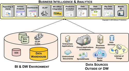
The other group of data sources comes from the operational environment with enterprise applications, cloud applications, unstructured data, spreadsheets, databases, or files. These data sources may be terrific for operational reporting, but when used together, may result in inconsistent or incompatible data.
The best practice is to work with the business people who are going to be involved with self-service BI and discuss what data sources from the operational and BI environments they plan to intermix. The BI team should perform data profiling and data discovery on the operational data sources, if they have not done so already, when building the BI environment. From the data profiling and discovery activities you can classify the operational data in the following categories:
• Data augmentation. The operational data sources do not overlap any existing BI data source and expand the amount of data that can be used for analysis while retaining consistency.
• Data consistent but semantically different. The operational data source does augment the BI environment; however, due to naming or other metadata differences, it may be difficult for the business people to conduct their analysis. In this case, the BI team should assist the business people by creating consistent semantics within the BI presentation model.
• Data consistent but not able to link together. The operational data sources have relevant data but it does not have the form or relationships to support the dimensions and measures presented in the BI application. In this case, the BI team may expand an ODS, EDW, or data mart, depending on the scope of the data involved, to integrate the data into a dimensional model.
• Data is inconsistent. Sometimes the operational data and BI data sources are not consistent or compatible. Under these circumstances, the BI team and business people using the BI application must discuss the issues. Then the business people must decide which data is more valid for their business analysis.
OLAP Cubes and In-Memory Columnar Databases
BI tools support various BI analytical styles that use OLAP cubes or in-memory columnar databases as one or more of their BI data sources. Both require building a logical data model to present the data to business consumers, even though they have different underlying physical structures.
OLAP cubes and in-memory columnar databases require mapping and then loading data from relational databases, flat files, spreadsheets, or other data sources. Some BI tools enable the mapping and loading of these data structures with data integration tools, but most require the use of their own tool-specific utilities. In the case of data discovery tools and spreadsheets, often the responsibility rests with the business person using the BI tool.
Although BI tools are optimized to work with a dimensional model, the reality is that they will work without one or with a poorly constructed schema. Without a dimensional schema, business people are basically using the equivalent of a series of flat or denormalized tables, which limits the tool’s effectiveness for their business analysis and lessens their productivity. Unfortunately, many proofs of concept and pilots use a limited number of data sources and do not expose the problem of a poorly designed schema.
The best practice is to designate a BI team member to be responsible to define and create the dimensional models that will then be loaded into the OLAP cubes or in-memory columnar databases. The BI team should work with the business people using the BI application to then fine-tune the BI presentation model for effective business analysis.
Matching Types of Analysis to Visualizations
When designing the BI application, keep in mind the type of analysis that the business person needs it to perform. This will help you choose the best type of chart to optimize visualization. The most common types of analysis performed include:
• Comparative
• Time-series or trending
• Contribution
• Correlation
• Geographic data
• Distribution
Comparative Analysis
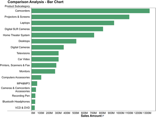
People frequently compare and rank data. An enterprise, for example, will compare sales by categories of product and then rank those sales by the top products, as depicted in Figure 13.4. Bar charts, as illustrated in the example, are very effective for comparative analysis because the lengths of the bars represent quantitative measures that can be compared quite easily. When ranking is important, sorting bars by the measure’s value enables a person to quickly discern the ranking order.
It is best to use one color for the bars rather than multiple colors, because it is easier to estimate the different bar sizes. Horizontal bars work well for any number of items. Vertical bars work well with fewer than a dozen items.
Time-Series or Trending Analysis
Examining trends over time, such as tracking sales or the changing of people’s opinion, is a very frequent analytical activity. Often the data tracked is broken down by some form of segmentation, such as product categories or by a person’s income level. The best visualizations for time-series analysis are line, area, and bar charts.
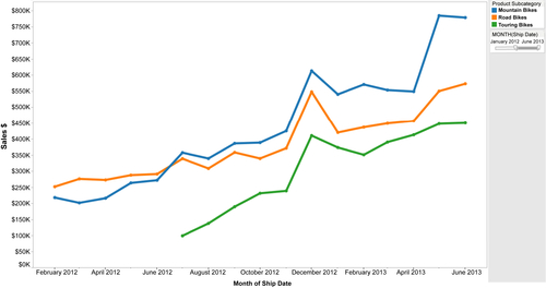
Line charts are very effective at displaying segmented data as it changes over time, as depicted in Figure 13.5. Both the trends and relative differences in each of the segments are easy to discern. Different colors or line types often enhance usability.
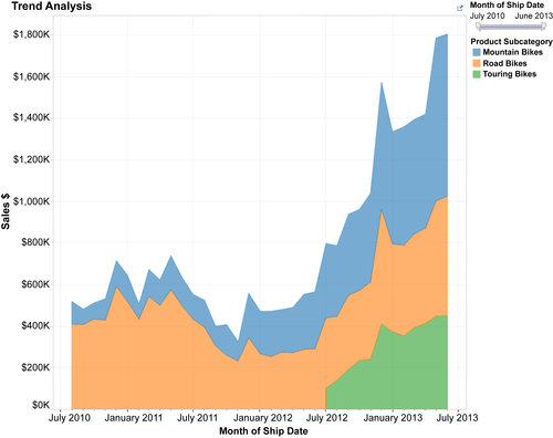
Line charts are better than bar charts if the person using the chart is interested in examining the trends, not only of the individual segments, but also their totals. Figure 13.6 illustrates how the segments and their total are highlighted using an area chart.
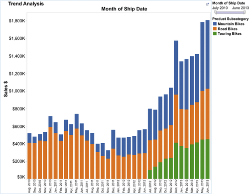
Bar charts, as depicted in Figure 13.7, are effective when there are only a few segments to be tracked or when each time period is discrete and people are not interested in seeing the trend, such as in a line chart.
The convention for the trending charts is for time to be displayed horizontally on the X-axis while the measure is displayed on the Y-axis.
Contribution Analysis
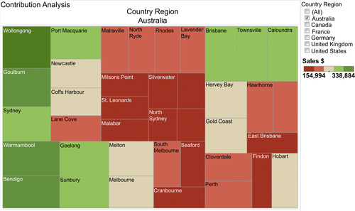
In this analysis, the contribution that each segment of something makes in relationship to the whole is typically represented by a percentage. The most common visualization used for this purpose is a pie chart, but it really is only effective when there are only a few elements to display, such as three or four. When there are too many slices it is very difficult to compare the slices relative to each other, especially when they are nonadjacent. As the number of slices gets larger, use other visualizations. Bar charts where each bar is the same length and segments are sized by percentages support a larger number of segments than pie charts, but they still encounter an upper bound fairly quickly. As shown in Figure 13.8, the preferred contribution analysis visualization is the heat map, as it can accommodate a large number of slices, especially when a color gradient is used to enhance its usefulness.
Correlation Analysis
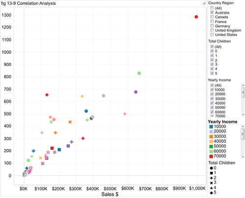
Visualizations are more effective than tables of numbers for enabling people to identify potential relationships among measures. This is especially true when there is a lot of data to show. Visually, people have become adept at discerning potential patterns. Scatter plots (see Figure 13.9 for an example) are very effective for correlation analysis, especially when size and color are used to depict variation in the measure’s quantitative values. Also, combinations of line and bar charts are sometimes effective to support correlation analysis, especially when trend analysis is being used to identify correlations.
But be cautious, however, because a potential relationship does not guarantee a correlation. Validate causation prior to declaring there is a correlation.
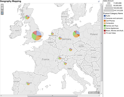
Geographic Data
The most effective method to visualize data by location is to use a map. Sales by the location of the retail store where the product was bought or by where the customer lives are excellent examples of how a map can show the distribution of sales. See Figure 13.10 for an example. Pairing an additional chart, such as a line chart showing trends or a data table providing the underlying detail with the map, is often very useful in enhancing the information conveyed.
Distribution Analysis
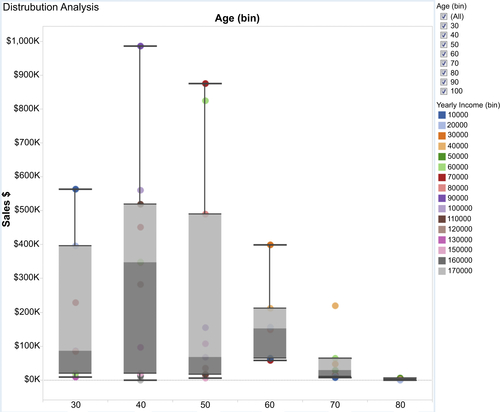
This type of analysis displays the distribution of values across your full quantitative range. For example, call center talk time is examined by the length of call with its average, minimum, and maximum for different types of support calls. The two visualization techniques used to support distribution analysis are box plots and histogram. Figure 13.11 provides an example.
..................Content has been hidden....................
You can't read the all page of ebook, please click here login for view all page.