In This Chapter
Creating charts
Choosing the right kind of chart
Finding out about the chart layout choices
Placing charts in the right spot
Troubleshooting chart format and placement problems
The essential purpose of a report is to communicate meaning to its readers. Lines of text and columns of numbers undeniably communicate meaning, but sometimes they don't do so as forcefully as a visual image. The right picture can sometimes be worth much more than a thousand words.
Crystal Reports delivers information visually in several ways. In several of the previous chapters, I told how to include a company logo in a report. You can use the same technique to include a wide variety of graphical images. In Chapter 16, I discuss adding a visual dimension to geographical information with maps. In this chapter, I tell you how to add charts to a report. Charts are probably the most popular method used to convey an overview of data that might otherwise be difficult to interpret. Trends in the data clamor to be recognized. Anomalies are much more noticeable than they would be, buried in a column of numbers. If your report contains numerical values of any kind, it would probably benefit from the inclusion of one or more charts.
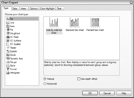
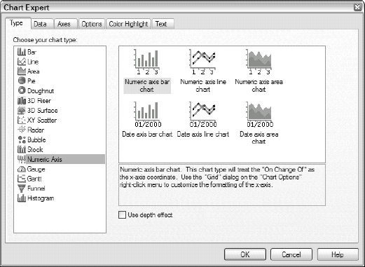
The first tab on the left when you first open Chart Expert is the Type tab (see Figure 15-1).
From this tab, you can select the type of chart you want to include in your report. As you can see, 12 different bar charts are available (three 2-D vertical, three 2-D horizontal, three vertical with depth effect, and three horizontal with depth effect). The other types of charts have multiple variants as well.
When you select the Vertical option, the bars rise vertically from the bottom of the chart. When Horizontal is selected, the bars move horizontally from left to right. These options don't appear when you select a chart type that doesn't distinguish between vertical and horizontal (such as a pie chart).
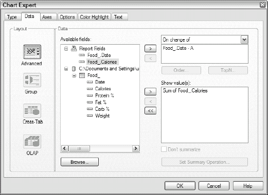
The Data tab, which is shown in Figure 15-2, has two areas: Layout and Data. The Layout options are described in the later section, "Different Chart Layouts for Different Data Types." In the Data area, you specify what data to show in the chart and what event will trigger the chart display. The triggering event is the change in the value of some field.
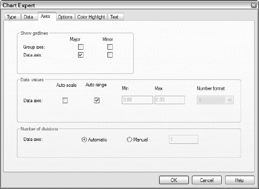
The Axes tab relates to only some of the chart types. It gives you the option of showing gridlines on the chart, scaling the axes, and indicating the number of divisions displayed. Figure 15-3 shows the Axes tab.
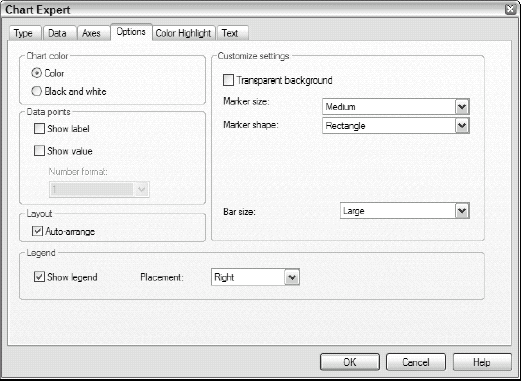
The Options tab is shown in Figure 15-4. The areas on this tab are Chart Color, Data Points, Customize Settings, Layout, and Legend. You can specify a chart color of either Color or Black and White. Black and White, for use with grayscale printers, uses different patterns to show the different areas.
Tip
Even if you have a grayscale printer, it might be better to specify color anyway. The different colors show up as different shades of gray on a grayscale printer and thus might be easier to interpret.
In the Data Points area, you can put labels and values in the vicinity of points on the graph. Sometimes these are helpful, but often they just clutter up the chart, without adding much additional information. In many cases, leaving both options unchecked is a good idea.
Select the Transparent Background check box of the Customize Settings area to underlay content beneath a chart and make the underlaid content visible. You can select from several marker sizes, marker shapes, and bar sizes (for a bar chart). The defaults are good choices to start with.
On charts, a legend is not a tale of heroic deeds handed down from long ago. It's an explanation of what the various elements of the chart represent.
From the Color Highlight tab, you can give the individual elements of a chart the exact color that you want rather than merely accepting the default colors that are automatically assigned to each element. Figure 15-5 shows the Color Highlight tab.

The Text tab in Chart Expert, which is shown in Figure 15-6, is where you add some text to the chart. The two areas are Titles and Format. In the Titles area, the Auto-Text check boxes are selected by default. This means that Chart Expert selects a title for you, based on the fields that the chart uses. (Usually the default choice is not the best albeit somewhat descriptive.) The Format area at the bottom of the dialog box displays the default fonts chosen for the different types of text objects on the chart. You can select a different font for each of the Title, Subtitle, Footnote, and Legend Title categories by clicking the Font button. Doing so displays the Font dialog box, from which you can specify the font you want.
In this section, you run through the steps of using Chart Expert to create a chart. It's not difficult after you do it a few times, but in the beginning, there are behaviors that might have you scratching your head. Before you can create a chart, you must have a report, and the report must have data upon which to base the chart:

Open a report and switch to Design mode.
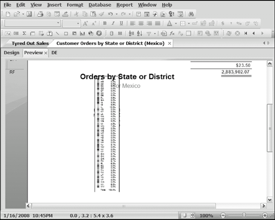
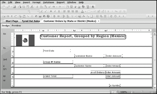
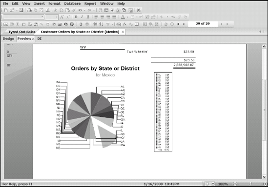
For the example, use the Customer Orders, by State or District (Mexico) report from Chapter 8 as the basis for the chart. The chart shows the relative contributions of the various states or districts. Figure 15-7 shows what this report looks like.

Right-click within the chart image that appears.
The Chart menu appears.
Choose Chart Expert.
Chart Expert appears.
Switch to the Type tab (refer to Figure 15-1); if necessary, make your selections.
To follow along with the example, from the Choose Your Chart Type selection pane, select Pie (probably the best way to show the fraction of sales orders coming from each state).
The Vertical and Horizontal options at the bottom disappear because they don't apply to pie charts.
Switch to the Data tab (refer to Figure 15-2) and make your selections.
To follow along with this example, make the following choices:
The only layout allowed is Advanced, so keep that.
In the Data area, keep the default choices of On change Of: Customer. Region and Show: Sum of Orders. Order Amount.
Again, Crystal Reports has guessed correctly. You want the pie chart to start a new segment when Customer.Region changes. Customer.Region is the field that contains the state or district names. Also, the quantity you want to depict with the chart is the Sum of Orders.Order Amount field. Chart Expert didn't have to be too smart to select this field because it's the only numeric field in the report.
Click the Options tab (refer to Figure 15-4) and make your selections.
To follow along with this example, make the following choices:
In the Chart Color area, select the Color radio button.
In the Data Points area, select the Show Label check box.
In the Customize Settings area, select Detach Pie Slice and then Largest Slice.
In the Legend area, select the Show Legend check box, keep Right Placement, and leave Layout as Percentage.
Click the Text tab (refer to Figure 15-6) and make your selections.
To follow along with the example, make the following choices:
Clear the Title Auto-Text check box and replace the default title with Orders by State or District.
Clear the Subtitle Auto-Text check box and type for Mexico.
In the Format area, accept the defaults or change them to fonts you like better.
When you're finished, click OK to add the chart to your report.
The bottom of the report page looks like Figure 15-8. The pie chart is displayed, the largest slice is pulled out, and the legend appears on the right. It is clear that Distrito Federal is by far the biggest contributor to sales.

The steps in the preceding section create a chart based on a report in which the details were hidden. Because the details are hidden — and not suppressed — you can drill down to see them if you hover the cursor over the subtotal fields in each Group Footer. When the cursor changes from the arrow shape to the magnifying-glass shape, a double-click drills down to the detail of the group.
You can do the same thing with the chart. When you hover over one of the pie slices in the chart, the cursor changes to the magnifying glass drill-down cursor, and you can double-click. You see the same detail that you'd see if you drilled down from the associated Group Footer. At the same time, a new tab appears to the right of the Preview tab, corresponding to the group you drilled into. From now on, when you want to view the detailed information for that group, you need only click its tab.
After you create a chart on a report and viewed it, you might want to change it. Perhaps the audience for the report has changed, and a new chart type would be more appropriate. Perhaps some changes would improve the chart. Here's how:
Right-click somewhere in the chart and choose Chart Expert.
Chart Expert appears, with all the options and other selections that you have made.
Make your changes:
To change the type of chart: Use options on the Type tab.
To change the layout: Use options on the Data tab.
Note
You can change any of the parameters that you originally set when you created the chart.
Click OK.
Your changes are instantly incorporated into the chart.
The charting capabilities of Crystal Reports give numbers and statistics an added dimension of communication. Numerical data represented visually in a chart can much more readily reveal trends or show relative sizes. Different types of data are best displayed with different types of charts, and Crystal Reports offers a wide variety to accommodate just about any data set you may have. This section provides a brief summary of each chart type.
A side-by-side bar chart represents data as a series of bars, lined up side by side and extending vertically from the bottom or horizontally from the left edge of the chart. This type of chart is an excellent choice for displaying comparative values, such as the annual sales volume for a company's major divisions for a period of several years. Not only sales totals, but also any trends, in sales would be evident.
Figure 15-9 shows a 2-D, side-by-side bar chart (top). Another option is the side-by-side chart using depth effect, also shown in Figure 15-9 (bottom).

A percent bar chart also represents multiple series of data as vertical or horizontal bars, but a single bar represents each value for all series. The value of the second series is stacked on top of the value of the first series, the value of the third series stacked on top of the second series' value, and so on. Using a percent bar chart is good to show how the relative contributions of the elements of each series change over time. Figure 15-10 shows a 2-D percent bar chart. 3-D percent bar charts are also available.
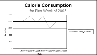
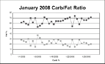
A line chart displays one or more lines that each connects a series of points. This type of chart is excellent for showing the value of a single variable as it changes over time or the values of several variables with comparable scales. Figure 15-11 shows a line chart of calories consumed daily for the week starting January 1, 2008.

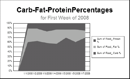
In an area chart, areas that are filled in with colors or patterns represent the values of variables. This type of chart is good for showing the percentage contribution of a small number of variables to a total. Figure 15-12 shows an area chart displaying the same information as the bar charts earlier in this chapter.
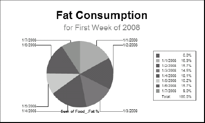
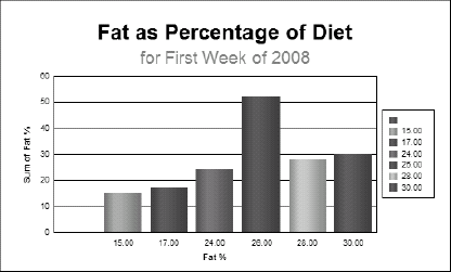
Pie charts are 2-D circular charts that display one series of data values, where each value determines how large a sector of the pie that element of the series receives. You might use a pie chart to show the relative contribution each operating division makes to a corporation's sales. Or you might use it to look at food consumption. Figure 15-13, which is a pie chart that looks at only the fat data for the first week of 2008, shows that fat consumption varied quite a bit.
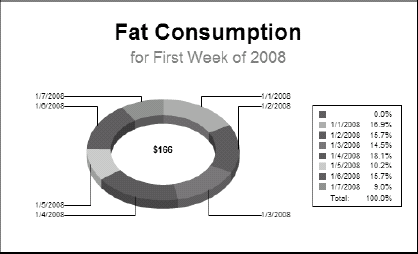
A doughnut chart is similar to a pie chart, but the center of the pie is cut out. In Crystal Reports, the hole is either a 2-D or 3-D ring that encircles a number, which might or might not bear any relationship to what you're trying to emphasize with your chart. The number is supposed to show how many records are being represented; however, depending on your data, that number might not relate to anything pertinent. Figure 15-14 shows a doughnut chart for the same data illustrated by the pie chart in Figure 15-13. The doughnut's colored sections are equivalent to the pieces of the pie. In this case, the number in the center of the doughnut is unrelated to the percentage of fat in a person's meals.
Note
Pie charts and doughnut charts are used for pretty much the same things. Which one you choose to use is largely a matter of personal preference.
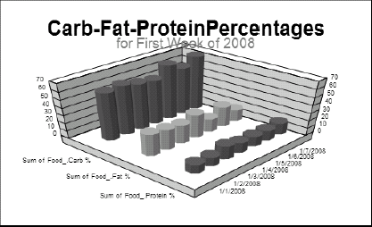
A 3-D riser chart is a cool way to represent several series of data points. If the number of series and the number of data points are both under about ten, a 3-D riser chart can convey a lot of meaning—and look great, too. Values are represented by 3-D pillars rising from a plane. Various shapes of objects are available.
Figure 15-15 shows a 3-D riser chart. It uses octagon-shaped risers, which I think are the best looking of the several available riser shapes. For some data sets, however, one of the other shapes may be better. Try them all out to see which one communicates your data best.
A 3-D surface chart represents several series of data points with a multicolor surface that sits over a plane. Several variants of the 3-D surface chart are available. With a 3-D riser chart (see the preceding section), a 3-D surface chart is most meaningful with fewer than ten series and ten data points within each series.
Figure 15-16 is an example of a honeycomb, 3-D surface chart. It gives the data a different look from that obtained with the 3-D riser chart.

XY scatter charts are effective when you have a large number of data points and you want to see (for example) whether any clusters show up in the data — and, if so, how compact the clusters are. These graphs are also good at showing whether two variables are correlated. If they are, you'll be able to draw a line with a characteristic slope through the average location of the points. The slope indicates the nature of the relationship. The closeness of the points to the line indicates the strength of the relationship.
This chart in Figure 15-17 plots carbohydrate consumption on the horizontal axis against fat consumption on the vertical axis. The two are definitely correlated because they fall close to a straight line. The variation from a perfect linear relationship is caused by varying protein consumption (not shown) from day to day. The legend to the right of the chart is not legible. The XY scatter chart was apparently not designed for this many data points.

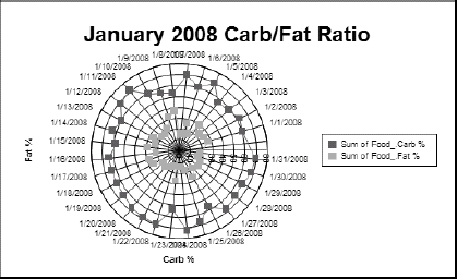
A radar chart is a polar graph that looks somewhat like a radar screen or a plot of an antenna's radiation characteristics. Arrayed around the perimeter are the changing values that generate the chart. The magnitudes of the one or more series of data depicted by the chart are shown by how far they extend from the center toward the perimeter. This type of chart is good for showing how several quantities vary with respect to each other as time or some other variable changes.
The chart in Figure 15-18 shows the same data as the XY scatter chart, but in a very different form. In this chart, the outer jagged line shows the amount of carbohydrate consumed on a daily basis, and the inner jagged line shows the amount of fat.
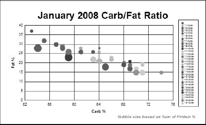
A bubble chart is similar to an XY scatter chart, which illustrates the relationship between two data series. In a bubble chart, though, the markers that indicate data points are circles that vary in size, depending on the value of a third data series. The larger the value of a point in that third data series, the bigger the circle. The value of one variable is plotted against the X axis; the value of a second variable is plotted against the Y axis; and the value of a third variable is indicated by the size of the bubble. Use this type of chart when you have three series of data that vary with time or with some other fourth variable.
The bubble chart in Figure 15-19, like the XY scatter chart, shows a definite linear relationship between carbohydrate and fat. In addition, the bubble chart explicitly shows the magnitude of the protein variable. Once again, the legend to the right of the chart is unreadable. Bubble charts have many of the characteristics of XY scatter charts.
A stock chart is familiar to anyone who reads the financial section of a newspaper. It's used to show the daily price ranges of stocks and of indexes, such as the Dow Jones Industrial Average. For a given date, a line indicates the range of the variable, extending from the variable's lowest to highest values for that day. Crystal Reports gives you a similar chart; you can create it with or without the little tick marks that identify the opening and closing prices. To include the opening and closing tick marks, you need to have four columns of data: Open, High, Low, and Close.
This type of chart is good for showing the differences between two variables.
Figure 15-20 shows a stock chart.

Numeric axis charts come in six types, as shown in Figure 15-21. They are the numeric axis bar, line, and area charts; and the date axis bar, line, and area charts.
These charts are similar to the ordinary bar, line, and area charts except that their X axis must be a numeric or date type. The ordinary, bar, line, and area charts are more flexible, but the numeric axis charts may be somewhat simpler to create, assuming that you want the horizontal axis to represent either numbers or dates.
Figure 15-22 is a numerical axis chart, showing one month of data on the composition of a person's food intake.
A gauge chart displays a graphic that looks like an automobile speedometer gauge, with a rotating hand indicating the value of the reported quantity. This type of chart is appropriate only when you have a small number of values to display. If you have too many, the gauges get stacked one atop the other in a jumbled mess.
Figure 15-23 shows a gauge chart of a person's food intake for January 19, 2008.

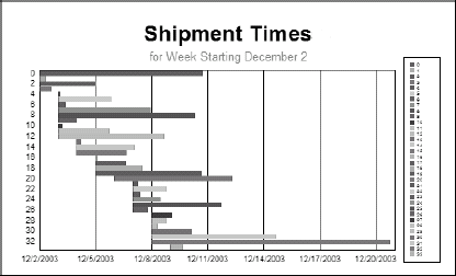
Project managers often use Gantt charts to track progress. Figure 15-24, for example, shows five weeks of data on how quickly Xtreme Mountain Bikes, Inc. ships its products. Each bar represents the interval of time between the entry of an order and when that order was shipped. As you can see, some orders are shipped promptly while others are not. Management can examine which orders were shipped after an excessive delay, and possibly make changes to enable the faster shipment of such orders.
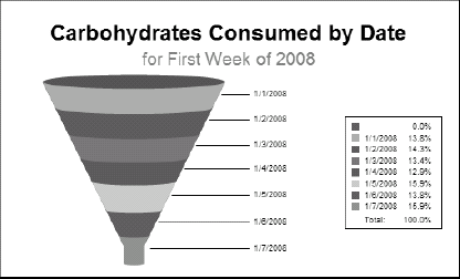
A funnel chart, usually used in customer relationship management (CRM) applications, shows how one series of data points varies over a period of time. Figure 15-25 shows a week of carbohydrate consumption. This type of chart is not particularly applicable to nutrition data, but this example does show what a funnel chart looks like.
A histogram divides data up into intervals called "buckets" and displays the relative amounts of whatever is being measured that falls within each interval. Figure 15-26 shows a histogram that displays how much fat a dieter consumed during the first week of 2008. Histograms differ from bar charts in that each bar in a histogram represents a range of values, while each bar in a bar chart represents a single discrete value.
Crystal Reports deals with data sets of four different types. The most basic is data retrieved from the database and sent more or less directly to the Details section of the report. No grouping or summarizing is involved. The Advanced chart layout deals with this kind of data; using it, you can filter the data with one or two conditions. You can also group values in several different orders, plot a value for each data record, plot a grand total for all records, and base charts on formulas or running-total fields.
The Group layout provides a higher-level overview than an Advanced layout can. It displays summary information when the value of a specified field changes. Logically enough, you can use the Group layout with only those reports that have at least one group—and at least one summary field for that group.
Figure 15-27 shows a cross-tab report of glove inventory for Xtreme Mountain Bikes, Inc.
The OLAP layout is the structure of a chart based on an OLAP cube. Figure 15-28 shows an example of a chart derived from an OLAP cube. (You can read about using OLAP and OLAP cubes in Chapter 13.) It shows how Xtreme's helmets are selling in California. Clearly, Bike Shop from Mars is selling more Triumph Pro helmets than the other dealers. The Triumph Vertigo helmet is selling well at Off the Mountain Biking and Sporting Wheels, Inc.


As you can read earlier in this book, a report has multiple sections: a Report Header; a Page Header; zero or more Group Header sections; Details sections; and Report, Page, and Group Footer sections. Charts can appear in the Report Header and Footer or in a Group Header and Footer.
A chart in the Report Header or Report Footer section draws its data from the entire report. A chart in a Group Header section draws its data from only that group.
With a chart in the Report Header or Report Footer, you can graphically convey the main point of the report. With charts in either a Group Header or a Group Footer, you can show a chart that displays the important information specific to each group.
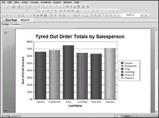
Figure 15-29 shows a Report Header chart located above data for one of Xtreme Mountain Bikes, Inc.'s customers in California. It shows the values of the sales that Xtreme's various salespeople have made to this customer.
Sometimes the chart you're creating for a report just doesn't turn out the way you expect. This is less likely to happen as you gain experience with Crystal Reports, but in the beginning, it might occur frequently. Some problems result from a beginner's unfamiliarity with the powerful Crystal Reports features. It's also possible to envision a report that simply isn't possible to create, regardless of the power of your report writer. Other problems occur if you try to squeeze too much information into too small of a space.
Earlier in this chapter, I show you how to create a chart that displays cumulative sales orders for all the states and districts in Mexico where Xtreme Mountain Bikes, Inc. has customers. Suppose you want to create a similar chart for the United States. The report would be essentially the same, but with a different selection condition. That is, Customer.Country is equal to USA instead of Mexico. However, if you build the same report in the same way, but this time for the USA rather than Mexico, you might get something like Figure 15-30. I changed the selection condition to USA, but did not yet change the subtitle from Mexico.
If you had sales in all 50 states plus the District of Columbia, you'd have too many states to make a good pie chart. The result would not communicate very well (tiny slices, hard to see, that sort of thing). However, if you display only the states with the ten largest sales volumes, you get a reasonable chart.
When you created the chart for Mexico, I had you keep the default legend placement (on the right side of the page). If you select a bottom placement, however, your chart looks quite different, as shown in Figure 15-31.
The legend at the bottom is so tall that it covers the entire chart. If you ever encounter bizarre behavior such as this, check whether one element of the chart is hogging the area that rightfully belongs to another element. If it is, you can usually find a way to rearrange things so that everything is displayed.