In This Chapter
Discovering different map layouts and map types
Creating group, cross-tab, and OLAP layout maps
Troubleshooting maps problems
Many reports contain geographic information, which is easier to comprehend when you add maps that show how the information relates to relevant geographic locations. For example, the Xtreme database (the sample database used throughout this book) contains information on customers located in various cities, regions, and countries around the world. A sales manager might want to know which localities have a concentration or lack of customers, or a high or low sales volume.
All the reasons why charts are a valuable addition to a report apply to maps as well. For data that has a geographical connection, maps are even more valuable. If you can identify a fact (such as a sales total) with a particular city, state, or country, you lock that fact into the reader's mind much more securely than you would if you displayed only a table of numbers.
Crystal Reports has a built-in feature for adding maps to reports, with several different layouts and map types. The various choices enable you to create a map that does the best job of communicating important parts of your report.
Before you can create a map with Crystal Reports, you must have a data source with one or more geographical fields (such as City, Region, or Country). Depending on the specific data you have (and on how you want to display it geographically), you can choose the kind of map most likely to have the biggest effect on readers. You can choose both the map layout and the type of map.
Four map layouts are available: Group, Cross-Tab, OLAP, and Advanced. Each layout is designed for a specific kind of report, as follows:
Group layout is usually best when your report has groups, and you want to associate a map with each group. Chapter 6 covers how to create groups in your report.
Cross-Tab layout is designed to be a part of a cross-tab report. I cover cross-tab reports in Chapter 14.
OLAP layout is designed for use with a report containing an OLAP grid. Chapter 13 discusses OLAP reports.
Advanced layout is for any map that doesn't fall into the other three categories. It works well for reports that don't have groups or summaries, as well as reports that do.
In addition to the four map layouts, you can choose one of five map types. If the data you're reporting has a geographic component, one of these map types is probably the best way to show the geographical relationships of the data. The major value of Crystal Reports maps is that they associate some numerical quantity (such as a sales total) with a geographic location in a memorable visual impression that is more likely to be retained.
Ranged type
For numerical quantities that can take on an almost infinite variety of values (such as sales totals), it's helpful to aggregate records with similar values into bins — digital storage areas for related records. Each one holds the records for a range of values: a subset of the total range of values. By assigning each bin a different color, shade of gray, or other indicator of magnitude, you can associate geographical regions on a ranged map with specific quantities, making comparisons easy. You can establish bin size in four ways:
Equal count: With an equal count ranged map, the same number of regions (or as close to the same number as possible) appears in each bin. For example, if the regions are the 50 states of the United States and 10 different bins show ranges of sales volume, each of 10 different shades of gray can be applied to 5 states. The five states with the highest level of sales would perhaps be shown as white, and the five states with the lowest level of sales would be shown as black, with progressively darker shades of gray in between, moving from high sales volume to low.
This map type is best to use when values are unevenly distributed among the regions. It prevents a situation in which most regions are the same color, with only one or a few that fall into different bins and thus have different colors.
Equal range: This map type has bins of equal size (or as close to equal as possible), regardless of how many records fall into each bin. Equal range maps are most useful when the distribution of values being displayed is fairly uniform, with approximately equal numbers of records in each bin.
Natural break: This map type applies only to reports that contain summary values. It assigns separate clusters in the data into separate bins.
Standard deviation: This map type is used to show statistical analysis. It is best used with three bins: no more, no fewer. The middle bin shows regions associated with values within one standard deviation of the mean of the entire data set. The bins above and below hold the regions that are more than one standard deviation removed from the mean.
The dot density type of map is a good tool to use for giving the reader a general idea of where concentrations of records are located and the overall distribution of records. One dot is placed on the map for each record. A company might use this type of map to show the locations of their dealerships. The map would make obvious which regions are adequately covered and which are not —but wouldn't be good at conveying quantitative information.
The graduated type of map is similar to the ranged type, putting a symbol in the middle of each region (instead of giving an entire region a specific color or shade of gray) to represent the numerical value associated with that region. The size of the symbol corresponds to the magnitude of the associated value. The default symbol is a circle, but you can use a different symbol if you want.
The pie chart type of map associates a pie chart with each geographic area being displayed. It's useful only when you're comparing the values of several related items in a geographic region. For example, if you want to know the relative sales levels of Xtreme's five major product categories in each region, a pie chart associated with each region on the map would give you a visual picture of that comparison.
Note
Pie charts make sense only if the values of all segments of the pie add up to 100 percent of the total.
As with pie charts, bar charts associated with maps are useful only when you're comparing the values of several related items in a geographical region. Unlike pie charts, bar charts don't require that the total of all values represented by the bars add up to 100 percent. You can use bar charts to show, for instance, the relative sales of bicycles and helmets for the regions of interest, ignoring the other products that Xtreme sells.
Where you place a map on a report depends on the information you want it to display. If the map uses data taken from the entire report, you want to place it in the Report Header or Report Footer section so it can access the needed data. If you want to associate a map with a specific group in the report, place the map in the Group Header or Group Footer for that group. You can also place a map in a subreport of your main report. (See Chapter 11 for information on subreports.)
To create a map, start with a report that has the kind of data best illustrated by a map. This means the report should have at least one geographical field, such as city, state, or country. It also should have at least one numerical field, the value of which varies from one geographical location to another. Certain kinds of maps, such as the pie chart and bar chart types, have additional constraints, as noted previously.
This section uses the Advanced layout to add a map to a report:
Load the Customer Orders, by State or District (Mexico) report.
See how to create this report in Chapter 8.

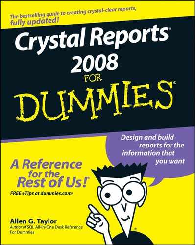
The Data tab of Map Expert appears.
In the Placement area, select Once Per Report for the Place Map pull-down list, and then select the Footer option.
This places the map in the Report Footer.
In the Layout area, click the Advanced icon.
The display of the Data area changes, as shown in Figure 16-1.
Drag Customer.Region from the Available Fields pane to the Geographic Field text box.
The Customer.Region field automatically appears in the On Change Of text box, also.
Drag Report Area:Sum of Orders.Order Amount from the Available Fields pane to the Map Values pane.
Click the Type tab.
The default type shows as Ranged, which is what you want, so keep it. The other defaults are good, too, so leave these setting as they are:
Number of Intervals: 5
Distribution Method: Equal count
Color of Highest Interval: White
Color of Lowest Interval: Black
Verify that the Allow Empty Intervals option is checked.
Click the Text tab.
Type a map title and legend titles, if appropriate, and then click OK.
Map Expert generates your map, as shown in Figure 16-2.
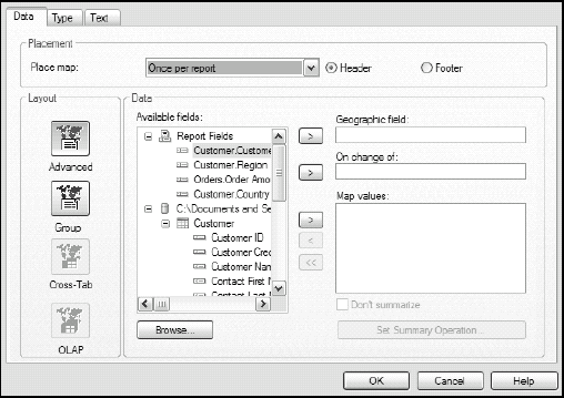
The five states or districts appear in five shades of gray as you specified. The top-producing Distrito Federal is white — and a little difficult to see because it encompasses only Mexico City. The state of Guerrero is black because it has the lowest order total. The three other states that have Xtreme customers have three different shades of gray.
You can make various alternate choices — different types, different fields, different options — but the procedure for any of the Advanced layout reports is essentially the same. The procedure for the other layouts is a little different.
To create a map with a Group layout, your report must have at least one group and at least one summary field for that group. To illustrate this, you can use the Customer Orders, Grouped by State or District (USA) report created for the United States in Chapter 6. The Mexico report doesn't have enough states to show grouping.
To create a Group layout map, do the following:

Make sure that the Data tab of Map Expert is displayed.
In the Placement area, specify a placement of Once Per Report, in the footer.
Confirm that in the Layout area, Group is selected.
In the Data area, retain the Customer.Region option in the On Change Of pull-down list, and the Show: Percentage of Sum of Orders.Order Amount option.
Switch to the Type tab and verify that Ranged is selected, the Number of Intervals is 5, and the Distribution Method is Equal Count.
Also, leave Color of Highest Interval as White, and Color of Lowest Interval as Black. Leave the Allow Empty Intervals check box marked.
Click OK.
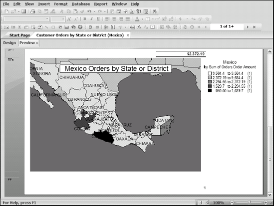
The map shown in Figure 16-3 appears in the Report Footer. As the map shows, several states (including Pennsylvania, California, and Idaho) are doing substantial business. However, Maine, Mississippi, and Georgia (among others) are doing relatively little.

To create a Cross-Tab layout, your report must have a cross-tab summary field, and the rows or the columns must contain a geographical field. In Chapter 14, I show you how to build a report that shows Xtreme's sales from several provinces of Canada (Sales by Province). You can use that report as the base for a Cross-Tab layout map.
To create a map showing the relative sales figures for Canadian provinces that contain Xtreme customers, do the following:

The Data tab of Map Expert appears.
In the Placement area, select the Footer radio button.
Click the Cross-Tab icon to change the Data area to the Cross-Tab function.
In the Data area, for the Geographic Field, select Customer.Region.
Verify that Map Values pane contains Sum of Orders.Order Amount.
Click the Type tab, and verify that the Ranged type is selected.
Adjust the options the way you want them, and then click OK.
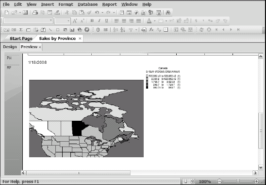
I chose white to be the color of the highest interval and black to be the color of the lowest, with five intervals, because Xtreme has dealers on only five provinces. Crystal Reports draws your map, which should look something like Figure 16-4. British Columbia is white, indicating it has the highest order volume. Manitoba is black because it had the smallest order totals. The other regions are in shades of gray.
The procedure for creating a map with an OLAP layout is similar to the procedure with a Cross-Tab layout. The main difference is that the report must contain an OLAP grid rather than a cross-tab object. One of the dimensions of the grid must be a geographical field. Chapter 13 describes creating a report with an OLAP grid. However, it doesn't have a geographical dimension, so a map with an OLAP layout would make no sense in that report.
To add a map to OLAP grid that does have a geographical dimension, follow these steps:
Map Expert appears.
In the Placement area, select either Header or Footer.
In the Layout area, click the OLAP icon if it's not already selected.
In the Data area, select a geographical field in the On Change Of pull-down list.
If you're adding a pie chart or bar chart to the map, select a field in the Subdivided By pull-down list. For a ranged map, leave this option at None.
For a simple map, leave the Other Dimensions option alone.
Click OK.
Crystal Reports draws the map you specified, basing it on the information in the OLAP grid.
If you create a map and it doesn't look the way you expect it to, make sure that the Preview tab is active. If the Design tab is active, Crystal Reports displays a generic placeholder map in the location where the actual map is located.
If you create a map and all you see is a blank rectangle, make sure you based the map on a geographical field. If you based it on a non-geographical field, Crystal Reports displays a non-geographical map — in effect, nothing.
If you create a map of the Ranged type and you don't get the spectrum of colors or shades of gray that you expected, check to make sure that the distribution method you chose is appropriate for the data you're illustrating.