
Now that we have examined binding data and generating SVG visuals with D3, we will turn our attention to creating a bar graph using SVG in this chapter. The examples in this chapter will utilize an array static of integers, and use that data to calculate the height of bars, their positions, add labels to the bars, and add margins and axes to the graph to assist the user in understanding the relationships in the data.
In this chapter, we will cover the following topics:
- Creating a series of bars that are bound to data
- Calculating the position and height of the bars
- Using a group to uniformly position multiple elements representing a bar
- Adding margins to the graph
- Creating and manipulating the style and labels in an axis
- Adding an axis to the graph
We have explored everything that we need to draw a series of bars based upon data in the first three chapters. The first example in this chapter will leverage using SVG rectangles for drawing the bars. What we need to do now is calculate the size and position of the bars based upon the data.
The code for our bar graph is available at the following location. Open this link in your browser, and we will walk through how the code creates the visual that follows.
Note
bl.ock (4.1): http://goo.gl/TQo2sX
The code starts with a declaration of the data that is to be represented as a graph. This example uses a hard-coded array of integers. We will look at more complex data types later in the book; for now, we simply start with this to get used to the process of binding and that of creating the bars:
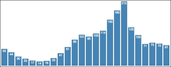
var data = [55, 44, 30, 23, 17, 14, 16, 25, 41, 61, 85,
            101, 95, 105, 114, 150, 180, 210, 125, 100, 71,
            75, 72, 67];
Now we define two variables that define the width of each bar and the amount of spacing between each bar:
var barWidth = 15, barPadding = 3;
We need to scale the height of each bar relative to the maximum value in the data. This is determined by using the d3.max() function.
var maxValue = d3.max(data);
Now we create the main SVG element by placing it inside the body of the document, and assign a width and height that we know will hold our visual. Finally, and as a matter of practice that will be used throughout this book, we will append a top-level group element in the SVG tag. We will then place our bars within this group instead of placing them directly in the SVG element:
var graphGroup = d3.select('body')
    .append('svg')
    .attr({ width: 1000, height: 250 })
.append('g');In this example, we are not going to scale the data, and use an assumption that the container is the proper size to hold the graph. We will look at better ways of doing this, as also for calculating the positions of the bars, in Chapter 5, Using Data and Scales. We simply strive to keep it simple for the moment.
We need to perform two pieces of math to be able to calculate the x and y location of the bars. We are positioning these bars at pixel locations starting at the bottom and the left of graphGroup. We need two functions to calculate these. The first one calculates the x location of the left side of the bar:
function xloc(d, i) { return i * (barWidth + barPadding); }During binding, this will be passed the current datum and its position within the data array. We do not actually need the value for this calculation. We simply calculate a multiple of the sum of the width and padding for the bar based upon the array position.
Since SVG uses an upper-left origin, we need to calculate the distance from the top of the graph as the location from where we start drawing the bar down towards the bottom of the visual:
function yloc(d) { return maxValue - d; }When we position each bar, we will use a translate transform that takes advantage of each of these functions. We can facilitate this by declaring a function which, given the current data item and its array position, returns the calculated string for the transform property based upon this data and the functions:
function translator(d, i) {
    return "translate(" + xloc(d, i) + "," + yloc(d) + ")";
   }
All we need to do now is generate the SVG visuals from the data:
barGroup.selectAll("rect")
.data(data)
.enter()
.append('rect')
.attr({
fill: 'steelblue',
transform: translator,
width: barWidth,
height: function (d) { return d; }
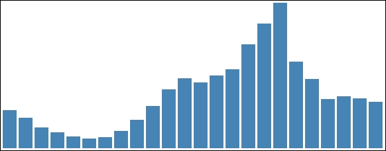
});Pretty good for just a few lines of code. But all we can tell from the graph is the relative sizes of the data. We need more information than this to get an effective data visualization.
Now we will add a label holding the value of the datum right at the top of each bar. The code for this example is available at the following link:
Note
bl.ock (4.2): http://goo.gl/3ltkHT
The following image demonstrates the resulting visual:
To accomplish this, we will modify our SVG generation such that:
- Each bar is represented by an SVG group instead of a
rect. - Inside each group that represents a bar, we add an SVG and a text element.
- The group is then positioned, hence positioning the child elements as well.
- The size of the
rectis set as before, causing the containing group to expand to the same size. - The text is positioned relative to the upper-left corner of its containing group.
By grouping these elements in this manner, we can reuse the previous code for positioning, and utilize the benefit of the group for locating all the child visuals for a bar. Moreover, we only need to size and position those child elements relative to their own group, making that math very simple. The code for this is identical to the previous example through the declaration of the positioning functions.
The first change is in the creation of the selector that represents the bars:
var barGroups = g.selectAll('g')
    .data(data)
    .enter()
    .append('g')
    .attr('transform', translator);
Instead of creating a rect, the code now creates a group element. The group is initially empty, and it is assigned the transform that moves it into the appropriate position.
Using the selector referred to by barGroups, the code now appends a rect into each group while also setting the appropriate attributes.
barGroups.append('rect')
    .attr({
        fill: 'steelblue',
        width: barWidth,
        height: function(d) { return d; }
    });
The next step is to add a text element to show the value of the datum. We are going to position this text such that it is right at the top of the bar, and centered in the bar.
To accomplish this, we need a translate transform that represents an offset halfway into the bar and at the top. This is common for each bar, so we can define a variable that is reused for each:
var textTranslator = "translate(" + barWidth / 2 + ",0)";Next, the we append a text element into each group, setting its text (the string value of the datum), the appropriate attributes for the text, and finally, the style for the font.
barGroups.append('text')
    .text(function(d) { return d; })
    .attr({
        fill: 'white',
        'alignment-baseline': 'before-edge',
        'text-anchor': 'middle',
        transform: textTranslator
    })
    .style('font', '10px sans-serif');
That was pretty easy, and it is nice to have the labels on the bars, but our graph could still really use axes. We will look at adding those next.