
A brush in D3.js provides the ability for the user to interact with your visualization by allowing the selection of one or more visual elements (and the underlying data items) using the mouse.
This is a very important concept in exploratory data analysis and visualization, as it allows users to easily drill in and out of data or select specific data items for further analysis.
Brushing in D3.js is very flexible, and how you implement it depends upon the type of visualization you are presenting to the user. We will look at several examples or brushes and then implement a real example that lets us use a brush to examine stock data.
To understand brushes, let's first take a look at several brush examples on the Internet. These are all examples available on the web that you can go and play with.
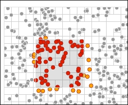
The following brush shows the use of rectangular selection for selecting data that is within the brush (http://bl.ocks.org/mbostock/4343214):
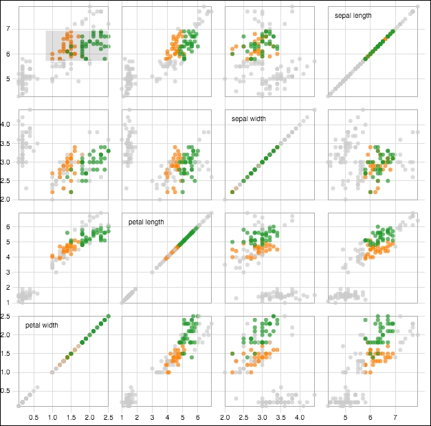
Another example of this brushing is the scatterplot matrix brush at http://bl.ocks.org/mbostock/4063663. This example is notable for the way in which you can select points on any one of the scatter plots. The app then selects the points on all the other plots so that the data is highlighted on those too:
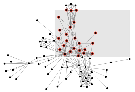
The following example demonstrates using a brush to select a point within a force-directed network visualization (http://bl.ocks.org/mbostock/4565798):
Note
We will learn about force-directed network visualizations in greater detail in Chapter 11, Visualizing Information Networks.
The creation of custom brush handles is a common scenario you will see when using brushes. Handles provide you a means of providing a custom rendering of the edges of the brush to provide a visual cue to the user.
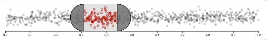
As an example of a custom brush, the following creates semicircles as the handles: http://bl.ocks.org/mbostock/4349545.
You can resize the brush by dragging either handle and reposition it by dragging the area between the handles:
The last example of a brush (before we create our own) is the following, which demonstrates a concept referred to as focus + context:
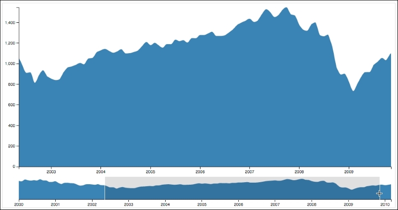
In this example, the brush is drawn atop the smaller graph (the context). The context graph is static in nature, showing a summary of the entire range of data. As the brush is changed upon the context, the larger graph (the focus) animates in real-time while the brush is changed.
In the next section, we will examine creating a similar version of this graph which utilizes financial data, a common domain for this type of interactive visualization.
Now let's examine how to implement focus + context. The following example that we will use will apply this concept to a series of stock data:
Note
bl.ock (8.7): http://goo.gl/Niyc56
The resulting graph will look like the following graph:
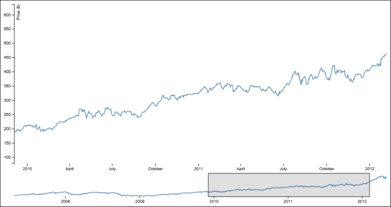
The top graph is the focus of the chart and represents the detail of the stock data that we are examining. The bottom graph is the context and is always a plot of the full series of data. In this example, we focus on data from just before the start of 2010 until just after the start of 2012.
The context area supports brushing. You can create a new brush by clicking on the context graph and dragging the mouse to select the extents of the brush. The brush can then be slid back and forth by dragging it, and it can be resized on the left and right by dragging either boundary. The focus area will always display the details of the area selected by the context.
To create this visualization, we will be drawing two different graphs, and hence, we need to layout the vertical areas for each and create the main SVG element with a size enough to hold both:
var width = 960, height = 600;

var margins = { top: 10, left: 50, right: 50,
                bottom: 50, between: 50 };

var bottomGraphHeight = 50;
var topGraphHeight = height - (margins.top + margins.bottom + margins.between + bottomGraphHeight);
var graphWidths = width - margins.left - margins.right;
This example will also require the creation of a clipping area. As the line drawn in the focus area scales, it may be drawn overlapping on the left with the y axis. The clipping area prevents the line from flowing off to the left over the axis:
svg.append('defs')
    .append('clipPath')
    .attr('id', 'clip')
    .append('rect')
    .attr('width', width)
    .attr('height', height);
This clipping rectangle is referred to in the styling for the lines. When the lines are drawn, they will be clipped to this boundary. We will see how this is specified when examining the function to style the lines.
Now we add two groups that will hold the renderings for both the focus and context graphs:
var focus = svg
    .append('g')
    .attr('transform', 'translate(' + margins.left + ',' + margins.top + ')');

var context = svg.append('g')
    .attr('class', 'context')
    .attr('transform', 'translate(' + margins.left + ',' +
            (margins.top + topGraphHeight + margins.between) + ')');
This visual requires one y axis, two x axes, and the appropriate scales for each. These are created with the following code:
var xScaleTop = d3.time.scale().range([0, graphWidths]),
    xScaleBottom = d3.time.scale().range([0, graphWidths]),
    yScaleTop = d3.scale.linear().range([topGraphHeight, 0]),
    yScaleBottom = d3.scale.linear()
                     .range([bottomGraphHeight, 0]);

var xAxisTop = d3.svg.axis().scale(xScaleTop)
                 .orient('bottom'),
    xAxisBottom = d3.svg.axis().scale(xScaleBottom)
                        .orient('bottom');
var yAxisTop = d3.svg.axis().scale(yScaleTop).orient('left');
We will be drawing two lines, so we create the two line generators, one for each of the lines:
var lineTop = d3.svg.line()
    .x(function (d) { return xScaleTop(d.date); })
    .y(function (d) { return yScaleTop(d.close); });

var lineBottom = d3.svg.line()
    .x(function (d) { return xScaleBottom(d.date); })
    .y(function (d) { return yScaleBottom(d.close); });
The last thing we need to do before loading the data and actually rendering it is to create our brush using d3.svg.brush():
var brush = d3.svg.brush()
    .x(xScaleBottom)
    .on('brush', function brushed() {
        xScaleTop.domain(brush.empty() ? xScaleBottom.domain() :
                                         brush.extent());
        focus.select('.x.axis').call(xAxisTop);
    });
This preceding snippet informs the brush that we want to brush along the x values using the scale defined in xScaleBottom. Brushes are event-driven and will handle the brush event, which is raised every time the brush is moved or resized.
And finally, the last major thing the code does is load the data and establish the initial visuals. You've seen this code before, so we won't explain it step by step. In short, it consists of loading the data, setting the domains on the scales, and adding and drawing the axes and lines:
d3.tsv('https://gist.githubusercontent.com/d3byex/b6b753b6ef178fdb06a2/raw/0c13e82b6b59c3ba195d7f47c33e3fe00cc3f56f/aapl.tsv', function (error, data) {
    data.forEach(function (d) {
        d.date = d3.time.format('%d-%b-%y').parse(d.date);
        d.close = +d.close;
    });

    xScaleTop.domain(d3.extent(data, function (d) {
                  return d.date;
    }));
    yScaleTop.domain(d3.extent(data, function (d) {
        return d.close;
    }));
    xScaleBottom.domain(d3.extent(data, function (d) {
        return d.date;
    }));
    yScaleBottom.domain(d3.extent(data, function (d) {
        return d.close;
    }));

    var topXAxisNodes = focus.append('g')
        .attr('class', 'x axis')
        .attr('transform', 'translate(' + 0 + ',' +
                           (margins.top + topGraphHeight) + ')')
        .call(xAxisTop);
    styleAxisNodes(topXAxisNodes, 0);

    focus.append('path')
        .datum(data)
        .attr('class', 'line')
        .attr('d', lineTop);

    var topYAxisNodes = focus.append('g')
        .call(yAxisTop);
    styleAxisNodes(topYAxisNodes);

    context.append('path')
        .datum(data)
        .attr('class', 'line')
        .attr('d', lineBottom);

    var bottomXAxisNodes = context.append('g')
        .attr('transform', 'translate(0,' +
                           bottomGraphHeight + ')')
        .call(xAxisBottom);
    styleAxisNodes(bottomXAxisNodes, 0);

    context.append('g')
        .attr('class', 'x brush')
        .call(brush)
        .selectAll('rect')
        .attr('y', -6)
        .attr('height', bottomGraphHeight + 7);

    context.selectAll('.extent')
        .attr({
            stroke: '#000',
            'fill-opacity': 0.125,
            'shape-rendering': 'crispEdges'
        });

    styleLines(svg);
});
Congratulations! You have stepped through creating a fairly complicated interactive display of stock data. But the beauty is that through the underlying capabilities of D3.js, it was comprised of a relatively small set of simple steps that result in Beautiful Data.