

Job:11-15877/15287 Title:RP-Design Matters Portfolios
#175 P DTP:216 Page:116
(RAY)
Job:11-15877/15287 Title:RP-Design Matters Portfolios
#175 P DTP:216 Page:117
094-192_15877.indd 117 11/30/09 7:46:19 PM
117
D E S I G N M AT T E R S / / P O R T F O L I O S 0 1
c A S E S T u D I E S
Text
π
Some of Fusion Hill’s preliminary designs
illustrate their direction of celebrating the
atmosphere of the northern climes of
Minnesota, where Fusion Hill is located,
while playing on the minty freshness of the
candies themselves.
Job:11-15877/15287 Title:RP-Design Matters Portfolios
#175 P DTP:216 Page:116
(RAY)
Job:11-15877/15287 Title:RP-Design Matters Portfolios
#175 P DTP:216 Page:117
094-192_15877.indd 117 11/30/09 7:59:30 PM

(RAY)
Job:11-15877/15287 Title:RP-Design Matters Portfolios
#175 P DTP:216 Page:118
094-192_15877.indd 118 11/30/09 7:46:19 PM
118
D E S I G N M AT T E R S / / P O R T F O L I O S 0 1
c A S E S T u D I E S
Text
They branded the product “Wave Makers”—the double entendre plays off being
out at sea and the idea that Fusion Hill could deliver change and impact for
those ready for a new perspective. Of those attending, Fusion Hill was the
only firm from Minnesota, so they wanted to play on that a bit—poking fun at
themselves and their frosty climate.
Fusion Hill also chose a tin with an aluminum finish to match an oversize tin that
they sent as a follow-up to prospects with their full-size portfolio included inside.
“We also needed to make sure that the mints were protected from the portfolio
and for it not to feel tampered with—so we included a vellum wrap that covered
the mints and added a layer between the portfolio and a business card we in-
serted. We then closed the tin with a clear wafer seal,” Hatzung says. “Our team
wore hairnets and latex gloves and put all the mint tins together in assembly-line
fashion at our office.”
The mints are wrapped with a little frosted vellum that says “dive in,” and once
you’ve depleted the contents and reached the bottom, there is a message that
says “hungry for more?” with Fusion Hill’s contact information.
IMPlEMENTING
A first “wave” of forty tins was handed out in person at the networking event. An
additional 350 tins were mailed out to prospects and clients. Fusion Hill made
a version for clients with customized messaging. The mailer included a clear
pouch with the tins floating inside (for visual effect and protection).
“We love the personality of the artwork that uses our corporate blue and strong
elements like the waves and the name Wave Makers,” Hatzung says. “We like
how the whole approach sets us apart from the competition and being new
on the scene (for this event), heralds our location and then takes the time to
introduce who we are with quick snippets and examples. We packed everything
we wanted into a tiny little presentation.”
Sending out the “second wave” of their portfolio to clients and prospects after
the first event also proved to be very beneficial. “Because we weren’t handing
them out personally, we needed a unique method of transport. Our mission is
always impeccable and creative presentation and packaging,” Hatzung says.
“We took what is a heavy-looking little tin and made it look light as air by fugitive
gluing it inside a clear pillow pack. It just floated inside that pack with nothing
but clear air around it.”
(RAY)
Job:11-15877/15287 Title:RP-Design Matters Portfolios
#175 P DTP:216 Page:118
094-192_15877.indd 118 11/30/09 7:59:30 PM

Job:11-15877/15287 Title:RP-Design Matters Portfolios
#175 P DTP:216 Page:118
(RAY)
Job:11-15877/15287 Title:RP-Design Matters Portfolios
#175 P DTP:216 Page:119
094-192_15877.indd 119 11/30/09 7:46:21 PM
119
D E S I G N M AT T E R S / / P O R T F O L I O S 0 1
c A S E S T u D I E S
Text
The mailing label and stamp all fit on a 2 × 3.75-inch (5 × 9 cm) label that was
adhered to the pillow pack on the back of the label so that as you looked at the
package from the front you didn’t see any of the mailing clutter.
“Because any printing and packaging we found from vendors was such low
quality, we had our own labels printed on a durable, sticky substrate that could
withstand the bumps we knew it would encounter in pockets and purses and
still look great,” Hatzung says.
The total run with both versions was 650 quantity, and costs for production and
supplies (printing of labels, inserts, mints, and assembly) was $1,650, with an
additional $500 for postage. “This was one of our least expensive mailers by
far,” Hatzung says. “Our holiday mailings in past years have been closer to $10
with a similar quantity.”
The overall response to the tins was very positive—in fact, many recipients
requested more. They were also a great conversation starter for follow-up phone
calls—people remembered receiving them and easily recalled the design firm.
“When we handed them out, people of course just thought we were giving them
mints,” Hatzung says. “We’d tell them there was a tiny portfolio inside, and they
would look at us with surprise and start guessing what it might look like or what
form it was in, and they’d just have to open them up right there. To us the idea of
a portfolio and a giveaway was just the criteria of doing it at all, but people just
loved it and thought it was so unique. I think the quality of the finishes, printing,
layering, candies, and messages made it really stand out from other standard
giveaways we saw. The ability to package so much punch and personality in
such a small vehicle proved ingenious.”
π
To entice each recipient to open the
self-promotional tin, each tin was housed
in a clear envelope that both enticed and
engaged the recipient.
Job:11-15877/15287 Title:RP-Design Matters Portfolios
#175 P DTP:216 Page:118
(RAY)
Job:11-15877/15287 Title:RP-Design Matters Portfolios
#175 P DTP:216 Page:119
094-192_15877.indd 119 11/30/09 7:59:30 PM

(RAY)
Job:11-15877/15287 Title:RP-Design Matters Portfolios
#175 P DTP:216 Page:120
094-192_15877.indd 120 11/30/09 7:46:26 PM
120
D E S I G N M AT T E R S / / P O R T F O L I O S 0 1
/// CASE STUDY
c A S E S T u D I E S
Text
Celebrating the Historical Passion
for Design
With offices in San Francisco and Minneapolis, Larsen creates identities, mar-
keting collateral, websites, packaging, and a plethora of other design elements
that help organizations establish or enhance their presence in the marketplace.
PLANNING
Over the past thirty-four years, Larsen has developed a significant body of
work and a reputation for environmental graphics—a unique medium not accom-
modated by many graphic design firms, and one that can be difficult to demon-
strate. “To reproduce images of the work that are representative of its scale, we
launched our current brochure series by designing a larger format piece (9.5 ×
11.5 inches [24.1 × 29.2 cm]) that feels more like a magazine,” says Tim Larsen,
principal at Larsen Design. “When first handing it out, we gained an immediate
increase in environmental design inquiries, mainly from clients who didn’t know
we had the expertise.”
For Larsen, the firm’s printed brochures serve as the primary component of their
portfolio system. “We categorize the brochures based on wanting to present
an overview of Larsen’s current broad range of work (general capabilities), and
to highlight specialties within our suite of services (particularly environmental
graphics and identity design),” Larsen says. “On occasion, we also feature a
particular industry of work from which we are interested in acquiring more
business, such as retail.”
DESIGN FIRM: LARSEN
(RAY)
Job:11-15877/15287 Title:RP-Design Matters Portfolios
#175 P DTP:216 Page:120
094-192_15877.indd 120 12/1/09 9:19:36 AM
Job:11-15877/15287 Title:RP-Design Matters Portfolios
#175 P DTP:216 Page:120
(RAY)
Job:11-15877/15287 Title:RP-Design Matters Portfolios
12-C54244 (204) #175 P DTP:216 Page:121
094-192_15877.indd 121 12/16/09 3:06:57 PM
121
D E S I G N M AT T E R S / / P O R T F O L I O S 0 1
c A S E S T u D I E S
Text
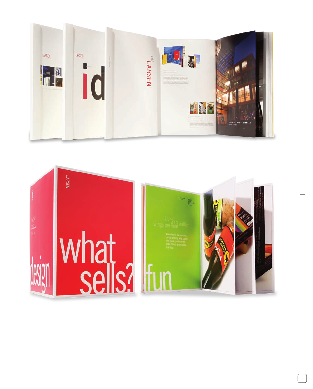
π
With the redesign of Larsen’s own identity,
the company adapted a crisp, white look
and feel to all of its marketing materials and
expanded its arsenal of capabilities literature
to include brochures specific to identity
design and environmental graphics.
π
Larsen’s experience can be focused in
specific industry segments, and the team was
excited to promote recent work in retail and
consumer products. To address the inherently
louder, more assertive sales environment,
this piece features large type and even bigger
visuals for immediate impact.
Job:11-15877/15287 Title:RP-Design Matters Portfolios
#175 P DTP:216 Page:120
(RAY)
Job:11-15877/15287 Title:RP-Design Matters Portfolios
#175 P DTP:216 Page:121
094-192_15877.indd 121 11/30/09 7:59:30 PM
..................Content has been hidden....................
You can't read the all page of ebook, please click here login for view all page.