
[ 18 ]
Now See What You’ve Done?
Congratulations! You are ready to design an experience based on multiple levels of human experience, and can test the experience of your product or service more systematically than ever before by using the Six Minds framework. Be prepared to get to better designs faster, and with less debate over design direction.
In this chapter, I’ll present a summary of everything we’ve looked at up to this point. I’ll also provide a few examples of some of the kinds of outcomes you might expect when designing using the Six Minds.
One of the things that I think is unique to this approach is the notion of empathy on multiple levels. Not only are we empathizing with the problem our audience is trying to solve, but we’re also taking into account several other cognitive systems when making design decisions. By focusing on specific aspects of the experience (e.g., language, or decision making, or emotional qualities), our Six Minds approach allows us to undertake the decision-making process with much more evidence than if we had relied on more traditional audience research channels.
The last thing I want to speak to in this chapter goes back to something I mentioned back in Chapter 1, about all the elements that together make an experience brilliant—and when I say “experience,” I’m actually thinking of the series of little experiences that add up to what we think of as a singular experience. The experience of going to the airport, for example, is made up of many small experiences, like being dropped off at the curbside, finding a kiosk to print your boarding pass, checking your bag, going through security, getting to customs, finding the right terminal, heading to your gate, buying a snack, etc. In many cases, our “experience” actually involves a string of experiences, not a singular moment in time, and I think we need to keep this realization in mind as we design.
Empathy on Multiple Levels
In Lean Startup speak, people talk about GOOB, which stands for Get Out Of (the) Building. In traditional design thinking, empathy research starts with simply seeing the context in which your actual users live, work, and play. We need to empathize with our target audience to understand what their needs and issues really are. There are some great people out there who can do this by intuition. But for the rest of us mortals, I think there are ways to systematize this type of research. If you do it the way I proposed in Part II of this book, through contextual inquiry, you’ll come home with pages of notes, scribbles, sketches, diagrams, and interview tapes.
Findings from each of the Six Minds won’t necessarily influence every design decision. But below, I provide a representative example where I think they all come into play (Figures 18-1 and 18-2).

Figure 18-1
How an understanding of the customer’s vision, wayfinding, and memory needs influenced the design of the PayPal for business website
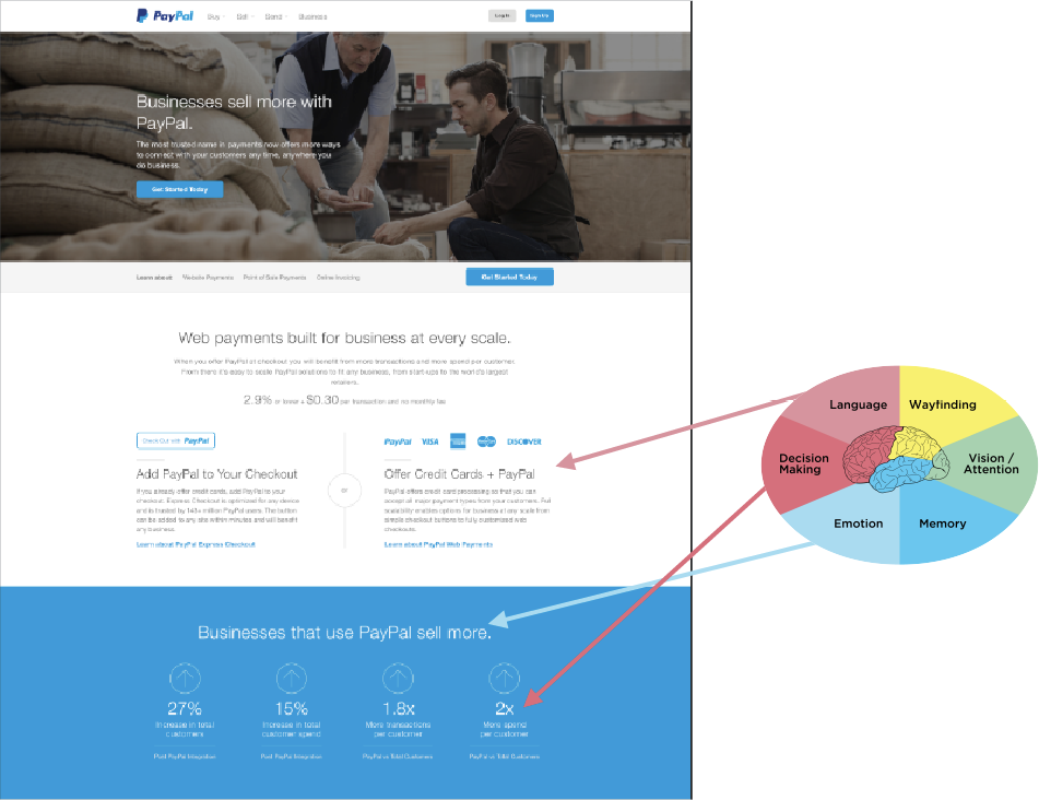
Figure 18-2
How an understanding of the customer’s emotions, language, and problem solving goals directly affected the design of the PayPal for business website
In this example, we were designing a page for PayPal for small businesses. The end users were people who might consider using PayPal for their small business ventures, allowing them to receive credit card payments on their websites or accept in-person credit card payments instead of cash. Let’s put our design to the Six Minds test, based on the interviews we conducted and watching people work:
Vision/Attention
We designed this page to only have one image at the top. It’s darker than the rest of the page and has much more visual complexity. Inevitably, people’s attention will be drawn to that picture. On top of it, we placed white type that’s much bigger than the rest, and stands out against the dark image. People’s eyes are drawn to that box of text. The other visual thing is that we wanted to make it clear how small business owners could sign up for PayPal. That’s why we made sure our sign-up button visually “pops out” in terms of its blue color and shape relative to the background image.
Language
The text at the top of the page simply says “Businesses sell more with PayPal.” It’s very straightforward language. It doesn’t use a lot of fancy marketing terms. It matches word-for-word what we heard business owners say they wanted to accomplish. It literally speaks their language. This was intentional. We found that the majority of the business owners we talked to were quite new to ecommerce and credit card processing. They wanted to add PayPal because they didn’t want to slow down anyone making purchases through their websites. That’s why we added buttons that say things like “add PayPal to your checkout,” and “offer credit cards + PayPal”—these statements were taken verbatim from our interviews. Our interviewees told us they wanted the presentation to be straightforward, so why complicate things by putting a marketing spin on their words?
Memory
We wanted to appeal to people’s memory and interpretation of the picture to set the tone of what we’re talking about here. The image looks like it’s in the back of a coffee shop. You can see big sacks of coffee beans and it looks like these two casually dressed men are looking at some of the beans. The image doesn’t give off a big, corporate vibe. It feels more like a small, two-man, maybe even family-owned operation, a sort of boutique coffee shop where the owners would know the names of their “regulars.” We’re trying to evoke something smaller and tucked away, the work of two artisans who really understand their craft. Just by using one image, we can set the stage and let small business owners know they’re in the right place.
Wayfinding
In light gray, above the fold, we used some navigation to show users what’s available further down the page: “Learn about us,” Website Payments, Point-of-Sale Payments, and Online Invoicing. This navigation bar shows the audience both where they are and where they can jump to next. It orients them to what this page is all about and how they can interact with it. We also introduced an equivalent navigation in the responsive mobile version.
Decision Making
At the end of the day, we wanted to awaken our audience’s passion while at the same time providing rational reasons for acting. We knew the problem these business owners were trying to solve: how to sell more. At the bottom of the page, we added four statistics about companies that use PayPal for their business and what selling more has looked like for them. We provided these statistics: because business owners and partners need the cold, hard, logical rationale before they’re going to jump into any business decision with both feet.
Emotion
We also wanted to get people excited about the possibility of selling more. Tapping into the audience’s immediate objective of selling more (appeal), we stated—twice—in our mock-up that businesses sell more with PayPal. The statement reinforces that our audience could be selling more, which opens up endless possibilities for their lives (enhance) and even their overall sense of success and identity. We wanted to awaken this longing to reinforce the possibility of their success as business owners.
Evidence-Driven Decision Making
In the example we just looked at, just in this portion of a webpage, we talked about all Six Minds and how we can use evidence-driven decision making when we’re formulating a product design or determining what direction to go in. I believe, of course, that this process gives us much clearer input than traditional types of prototyping and user testing.
That said, getting to this mock-up didn’t happen overnight, or even halfway through our contextual interviews. Sure, we saw some patterns and inklings through our Six Minds analysis. But getting to that actual design was a slow and gradual process. We tried out many iterations and made microdecisions as we went based on customer input. We also considered comparable sites and some of the weaknesses that we found in those to make sure we did better than all of them.
I believe there is much we can learn through the process of just formulating these designs, or “design thinking.”
Figure 18-3 shows some early sketches of the different ideas we had for what the page would look like, including things like flow, functionality, and visuals. We started with lots of sketches and possibilities, doing a lot of ideating, rapid prototyping, and considering alternatives. As we narrowed down the possibilities through user testing and our own observations, we went from our really simple sketches to black-and-white mock-ups to clickable prototypes to the very high-fidelity one that you saw a little earlier in the chapter.

Figure 18-3
Design brainstorming: identifying strong concepts consistent with customer needs and iterating
Experience Over Time
The example we just walked through was a snapshot of someone’s decision to sign up for PayPal for Business at a certain point in time. I want to go one step further here and show you how the Six Minds are applicable throughout the life cycle of a decision, and can actually be quite fluid, rather than static, over time.
Service design is a good example of the lifecycle of a decision. In this case, Figure 18-4 shows sticky notes with all the questions we heard from business owners about why they would or wouldn’t consider PayPal for Business to start an ecommerce store.
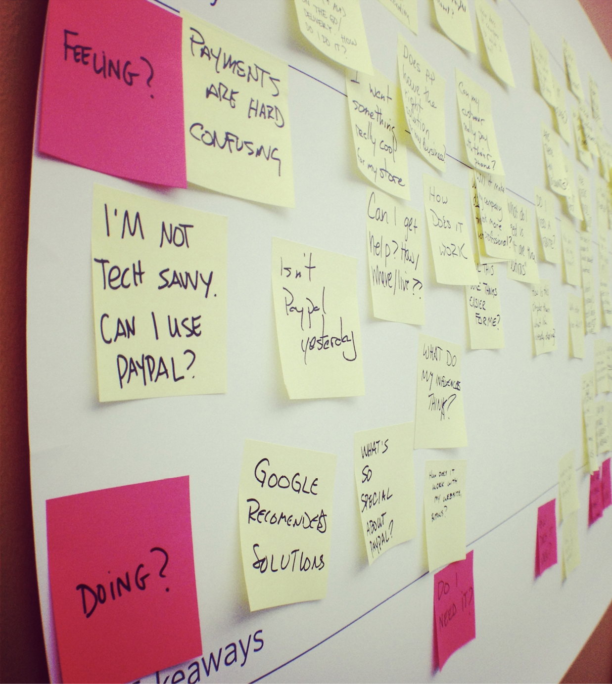
Figure 18-4
Creating a journey map through all the microquestions customers have before they commit to a purchase
When we looked at all the questions together, we saw that they extended from a pretty fundamental level (e.g., “Can this do what I need?”), to follow-up questions (e.g., “Is the price fair?”), to implementation concerns (e.g., “Is this compatible with my website provider?”), all the way to emotions like fear (e.g., “What happens to me if someone hacks the system?”). We organized these questions into several key steps along the decision-making continuum.
People’s questions, concerns, and objections tend to get more and more specific as they go. As you test your system, take note of when different questions come up in the process. Then you can design a system that presents information and answers questions at the logical time. It may be that in the steps right before they hit “buy,” you’re presenting things to customers in a more sophisticated way because they now already know the basics of what you’re offering in relation to what they’re currently using. Now you can answer those last questions that might relate to any fears that are holding them back.
Multiple Vantage Points
In summary, I first encourage you to embrace the notion of user experience as multidimensional and multisensory. We can and should tap into these multiple dimensions and levels when we’re doing empathy research and design.
Second, as you encounter microdecisions within your product or service, remember that even these seemingly small steps can have a logical rationale based on your interviews. Embrace this rationale, especially in the face of HIPPO opposition—and embrace your creativity while you’re at it. The type of evidence-driven design methodology I’m suggesting allows for plenty of creativity within what’s more likely to be a winning sphere.
Last, try thinking about your product or service as more than just a transaction. Think about it as a process that will touch multiple people, over multiple points in time. Try thinking of the Six Minds of your product—where people’s attention is, how they interact with it, how they expect this experience to go, the words they are using to describe it, what problem they’re trying to solve, and what’s really driving them—as constantly evolving. The more they learn about this topic through your product or service, the more expert they’ll become, which changes how you engage them, the language you use, and so on.
Concrete Recommendations
- Consider your users’ experience over time:
- How will their behaviors change over time as they gain expertise with this product and in this area?
- How will their problem space change over time?
- How will their language and semantic representations of the words change?