THIS CHAPTER IS DEVOTED TO CREATING PRACTICAL and skillful text effects. In addition to its industrial-strength tools for handling continuous text, InDesign has an impressive array of features for creating logo treatments and special effects. With its path editing and transparency tools, it’s now possible to create type effects directly within InDesign that until recently would have required Photoshop or Illustrator. It remains true that Photoshop and Illustrator offer more in the type effects department, but recent versions of InDesign have incorporated some of the features of these venerable programs into its own toolset, so that if you don’t have or don’t know Photoshop or Illustrator you can still create great text effects from within InDesign.
A simple technique to enliven display type is to make its fill color a gradient. Not surprisingly, this works best when you have bold letter shapes, allowing more of the gradient to show in the “letter windows.” When a gradient is applied to a selected range of type, the gradient either starts and finishes within the letter shapes, or, if you drag with the Gradient tool, the gradient fill can start and/or finish outside of the letter shapes.
To apply a gradient to text either:
Select the text with the Type tool and apply a gradient from the Swatches palette, or use the Gradient palette to apply a gradient. Using this technique the gradient will affect only the selected text.
Select the text frame with the Selection tool, then click the Formatting Affects Text button, and then apply a gradient using the Swatches palette or the Gradient palette. Using this technique the gradient will affect all of the text within the frame.
Once the gradient has been applied, you can drag the Gradient tool over the selection to determine the angle of the gradient and its starting and finishing points.
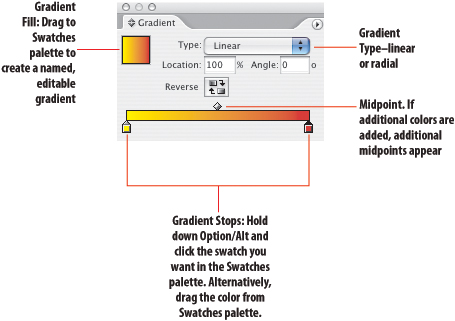

Figure 18.2. Gradient Type. In example A, the gradient was applied by clicking the gradient swatch in the Swatches palette. Type in the angle of the gradient on the Gradient palette. In example B, the angle and extent of the gradient were defined by dragging over the selected text with the gradient tool, arguably a more freeform approach.
Applying a stroke to display type can help more clearly define it when it is set on a low-contrast background. It’s also useful if the type overlaps an image, especially if that image contains areas of busy detail. When you apply a stroke, the weight of the stroke is centered on the character outline. However, you won’t see the part of the stroke inside the character unless you set the fill of the character to None because the fill is drawn in front of the stroke. This means that the letters will “grow” in size and appear closer together, so you may want to adjust the tracking and kerning of the words. Be judicious, and definitely avoid applying strokes to body text.
To apply a stroke to type, either select a range of type with the Type tool, then choose the Stroke swatch at the bottom of the tool palette or at the top of the Swatches palette and click on the swatch you want in the Swatches palette. You can adjust the stroke weight and stroke style using the Control palette of the Stroke palette.
Alternatively you can select a Text Frame and click the Formatting Affects Text button then apply the stroke color, stroke weight and style. Doing it this way the stroke is applied to all the text in the text frame rather than to a specific range of text.
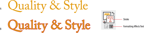
Figure 18.3. Stroked Type. Example A has no stroke; example B has a .75 pt stroke (on 36 pt type). The kerning has been adjusted to compensate for tightened letter spacing caused stroking.
To create type with multiple strokes:
Apply a thick stroke to a piece of type.
Copy the text frame and choose Edit > Paste in Place. This will give you a duplicate exactly on top of the original.
Select the duplicate and choose a stroke of a different color and a lesser weight.
Choose Object > Group to make sure both text frames are moved or transformed as one.
Note
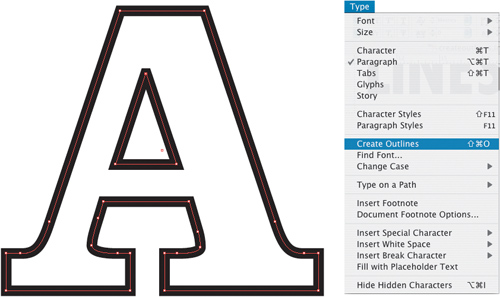
If you want to control how the stroke straddles the character shape, you must first convert the type to outlines (Type > Create Outlines Cmd+Shift+O/Ctrl+Shift+O). Then you can choose to put the stroke inside, outside, or centered on the character shape using the Stroke palette.
This effect works best with bold fonts with little transition between the thick and thin parts of the letter shapes. Be sure to apply enough positive tracking to compensate for the stroke weight being added to the outside of the characters.
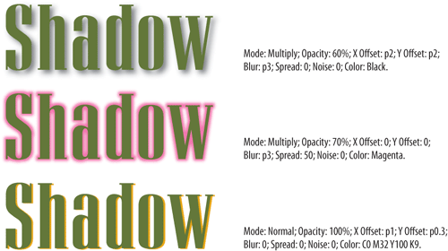
To take this further, you can create a glow effect either by using a drop shadow (see below) or stacked copies of the text frame, where each copy has a lighter weight and tint of stroke than the one beneath it.

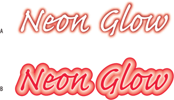
Figure 18.5. Example A uses two copies of the type. The bottom copy has a drop shadow with a 4 pt red blur with no offsets. The top has a 2 pt black blur with no offsets. For example B, I started out with a 6 pt stroke at 100 percent tint. With each successive copy, I incrementally reduced both the stroke weight and the tint percentage.
As an alternative to stroking the type, you can offset the stroke by sandwiching together three layers of the same piece of type. The topmost text frame is the colored type. Beneath that is a duplicate, slightly offset, with its fill set to the background color, in this case white. At the bottom is a third copy, offset some more, and with a different color fill that serves as the “stroke.”
Create your type with a fill and no stroke, then choose Edit > Copy Cmd+C/Ctrl+C
To paste the copy directly on top of the original choose Edit > Paste in Place (Cmd+Shift+Option+V/Ctrl+Shift+Alt+V).
Offset this copy from the original nudge the type with your cursor arrows. In the example shown I used one nudge right and one down.
Apply a fill color to the copy that is the same as your background color, in my case, Paper.
Choose Object>Arrange>Send to Back (Cmd+Shift+[/Ctrl+Shift+[) to send the copy behind the original.
With the copy still selected repeat the above steps, applying a different fill color to this second copy.

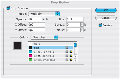
Go on then, if you must—add a drop shadow: Object > Drop Shadow (Cmd+Option+M/Ctrl+Alt+M). Just bear in mind the following:
Need to customize a letter shape? Turn your type into outlines, and, with your Direct Selection tool, you’ll be able to adjust the individual anchor points of the characters. Letters with counters (the trapped space inside the letters) or dots (lowercase “i” and “j”) are compound paths because they consist of more than one path. In order to selectively modify their component paths, you first have to release the existing compound path: Object > Compound Paths > Release (Cmd+Option+8/Ctrl+Alt+8).

Compound paths are needed when two path shapes overlap and you want the top shape to punch a hole through the shape beneath—the “bagel” effect. For type, compound paths are necessary to create characters with counter shapes. You can also create custom compound paths for logo-style artwork that plays on the negative space created by overlapping shapes.
Type you text and kern/position as necessary so that the characters overlap.
Choose Type > Create Outlines to convert the type to paths.
Before you make the combined letter shapes into a compound path, you’ll need to first Choose Object > Compound Paths > Release to release any existing compound paths for characters with counters. This will cause the counters to become filled in.
With your Direct Selection tool. select on a character-by-character basis the character and its counter, and choose Object > Pathfinder > Subtract to “knock out” the counter.
Select all the character shapes and choose Object > Compound Paths > Make. The text path is cut away where it overlays the underlying object, revealing whatever lies beneath the background object.

When executed well, this can be an especially effective technique, making the type serve as letter-shaped windows to your image. Again it works best with bold sans serif type—allowing you to see more of the image and allowing you to kern the type closely so that the image retains continuity from one “type window” to the next.
Arrange your type on top of an image and kern appropriately.
In order for type to function as a picture frame for an image, it must first be converted to outlines. Choose Type > Create Outlines.
Select the image and choose Edit > Cut (Cmd+X/Ctrl+X) to cut it into memory.
Choose the type shapes and choose Edit > Paste Into (Cmd+Option+V/Ctrl+Alt+V).
Use the Direct Selection tool to move the image around within the type shapes.

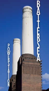
To put type on a path, use the Type on a Path tool (on the same tool space as the Type tool—click, hold down and slide across or press Shift+T). Type on a path is essentially a one-line paragraph. When you click an insertion point on an open path, the starting point of the text is determined by the paragraph’s alignment.
You can change the text alignment using the standard alignment options—left, center, right. You can also change the starting point of the text by dragging the left or right I-beams that show up when you click the path with the Selection tool. Dragging these I-beams will shift the text to the left or the right accordingly.
Text on a Path can be threaded just like regular text, by clicking the In and Out ports that appear when you click the path with your Selection tool. They can even be included with normal text frames as part of a longer text thread.
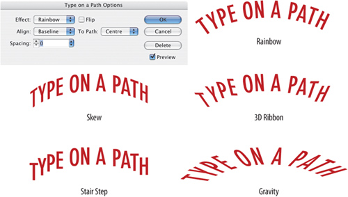
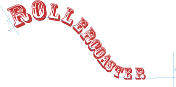
Figure 18.15. Type on a path. The effect is enhanced in this case by selectively sizing the letters and adjusting the kerning.
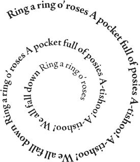
To center text on the top of a circle, select the circle, then switch to the Type on a Path tool and click an insertion point on the bottom handle at the 6 o’clock position on the circle. Change the paragraph alignment to centered, and then type your text.
If you want text along the bottom of the circle:
Enter the text along the top, then choose Type > Type on a Path > Options.
Click the Flip checkbox.
From the Align menu choose Ascender if you want the text to move downward, or Baseline if you want the text to move upward.
Alternatively, if you want type at the top and bottom of the circle and you already have text at the top, copy the circle and then choose Edit > Paste in Place. You now have a duplicate of the text exactly on top of the original. Select the path of the top copy with the Selection tool—you’ll see a perpendicular line in the middle of the path. Drag this line to the other side of the path and the text will flip over.
Roman letters are designed to sit side by side, not on top of one another, so it’s hard to make this technique work effectively. But every once in a while…
Using InDesign’s Transparency palette is so easy it feels like cheating. Blend Modes determines how the colors of overlapping objects are affected and are applied on a frame-by-frame basis. If you want one piece of type to overlap another and create a transparency effect, it must be in its own text frame.

Figure 18.19A. Each letter is in its own text frame, which has been rotated and positioned so that it overlaps another text frame. Experiment with different combinations of Blend Mode and opacity to get the effect you like—Multiply and Color Burn usually work well, but the results will depend on the colors you are using.
Figure 18.19B. Four-color printing misalignment is simulated by placing four identical text frames (one in cyan, one magenta, one yellow, one black 70 percent) on top of each other and then nudging the position of each to misregister the frames. The blend mode of each is set to Multiply.
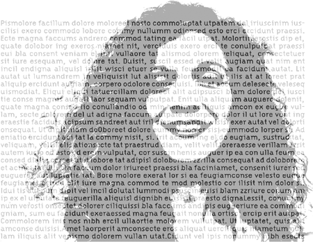
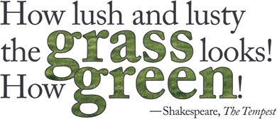
Figure 18.20. A grayscale image is placed on a layer above the type layer. The image color is 50 percent black. The Blend Mode of the image layer is Hard Light and the Opacity is 75 percent. This effect works best when the type is intended more as a textural element rather than designed to read.
In general, putting type over an image is a bad idea: You dilute the message of the image and you reduce the readability of the type—a worst-of-both-worlds scenario. However, when used sparingly, it can be an effective technique. Combining it with Transparency can help integrate the two elements, while preventing the type from becoming unreadable.
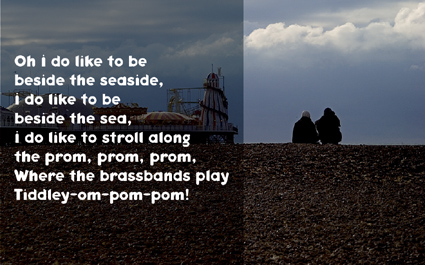
Figure 18.21. Ghosted Panel. A black panel with a blend mode of Hard Light and an opacity of 50% sits on top of the image. Note the text frame and the color panel must be separate objects so that you can adjust their opacity independently. Using this technique you have several variables, which, combined, offer a wealth of possibilities: type color, image color, image detail, the color, blend mode and opacity of the top panel.
Text frames typically start off as rectangles, but they don’t need to stay that way. With your Direct Selection Tool, pull on the anchor points of a text frame to change its shape. You can also add or subtract points to the text frame using the Pen Tool.
The Shear tool should be approached with extreme caution because shearing type can turn lovingly and reverently crafted characters into a dog’s dinner of distorted character shapes in a fraction of a second. That said, because the tool is there, we are bound to use it. You’ll likely get the best results when it is used sparingly and applied to a small amount of type.
The Shear tool can be unruly and difficult to control: The first click establishes the point of origin for the transformation, and then you drag to make the shearing happen. It’s usually easiest to make the point of origin the center point of the text frame. To maintain the proportions of your text frame, hold the Shift key.
Here’s a practical example:
Draw a rectangle or framing shape.
Enter the text into a separate text frame and center it horizontally and vertically.
Shear the text frame to the desired angle and position in the bottom left corner of the framing rectangle.
Cut the text frame, Edit > Cut (Cmd+X/Ctrl+X)
Select the framing rectangle and choose Edit > Paste Into (Cmd+Option+V/Ctrl+Alt+V). The edges of the sheared frame will be cropped by the framing rectangle.