CRITIQUING MY DESIGN FOR A PRODUCT CATALOG, my client referred to the justified type as “very masculine.” I wasn’t sure how to take it and I wasn’t confident enough or quick-thinking enough to ask for clarification. Masculine type? Was that good or bad? Or was it just a neutral observation?
I’m not sure that I buy into the notion that text alignments can be assigned a gender, but the alignment of your text definitely gives your work a certain vibe and should serve the message of your type.
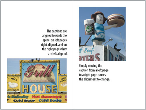
There are two new types of alignment on the Control palette in InDesign CS2. Align towards Spine aligns text on a left-hand page so that it is right aligned. If the same text flows onto a right-hand page, it becomes left aligned. Align away from Spine does the opposite: It aligns text on a left-hand page so that is left-aligned, while text on a right-hand page is right-aligned.
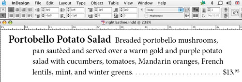
The Paragraph palette also has one additional indentation option—Last Line Right Indent. This can be useful for outdenting the last line of a paragraph, for example as in a table of contents or a price list.
Center alignment is widely used in magazine design for crossheads and in book design for title pages. When chosen consciously centering can be extremely effective; when chosen as a “default” or fall-back option, it can make layouts appear stodgy or generic. At its best, it is formal and classical; at its worst, it is static and conventional, and—if you are centering whole paragraphs—it is less readable. The potential pitfall of centered type is that the even amount of white space on either side of the heading can create a symmetry that may be at odds with asymmetrical nature of the ragged right text. Centering is also commonly associated with birth announcements, wedding invitations, and…gravestones.
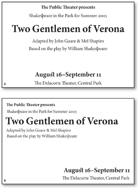
When centering display type over left-aligned body text, you may need to tweak the alignment to compensate for the type looking off center if the display type is followed by a line of ragged type that does not fill the full measure.
Avoid using an italic headline over roman type because the slant of the italic can make the headline appear off-center.
Centered lines that begin or end with punctuation may look off-center and require optical centering.
Avoid centering paragraphs with too many lines, especially on a wide measure, because it is harder to find the beginning of the next line.
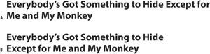
Break lines into phrases that make sense.
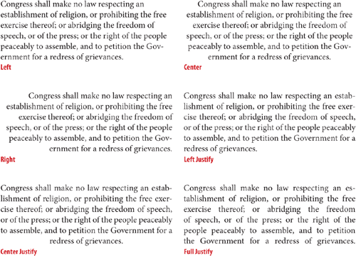
Because centered alignment and right alignment have limited applications when it comes to continuous text, we are essentially concerned with the pros and cons of using Left or Left Justified type, and the main difference between them—what happens to the leftover space. On every line of type there will be leftover space—unless, like Jack Nicholson in The Shining, you’re just typing the same line over and over. With Justified type the extra space is distributed between the words and varied to give you lines that are exactly the same width. With left-aligned type, the extra space is added at the end of the line, giving you lines of varying width.
Left-aligned type has the following characteristics:
Consistent word spacing.
Asymmetry. The ragged margin adds shape and interest—as well as white space—to what would otherwise by a rectangular block.
Informal. The differing line lengths can give a casual feel.
Justified type has the following characteristics:
Economical. You get more words on your page when you justify your text. The difference may be insignificant with a short document, but in a magazine or book your document may be several pages shorter.
Symmetrical. Columns with smooth edges can make your document seem balanced.
Formal. The uniformity of the smooth right-hand margin can cause your text to be perceived as more formal, which, depending on the text, may be a good or a bad thing.
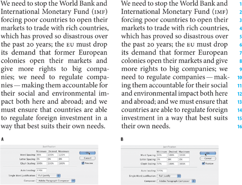
Justification is achieved by varying the size of the word spaces on the line—or in the entire paragraph—in an attempt to get even word and letter spacing, or at least word and letter spacing that looks even. If justification can’t be achieved by adjusting the Word Spacing alone, then InDesign will adjust the Letter Spacing according to your minimum, desired, and maximum settings. After that, it moves on to your Glyph Scaling settings. Too much variation in word or letter spacing will cause the tight lines to look darker than the rest of your text and disturb the paragraph’s rhythm. At the other extreme, if the word spacing is too big, you will get unsightly “rivers” of white running through your lines. This is particularly problematic when the columns are narrow and/or when the word spacing exceeds the leading, because the eye is tempted to read down through the gaps rather than from left to right.
Good type color is essential regardless of what alignment you are using, but it’s harder to achieve in justified text, because the space left over at the end of the line has to be redistributed across the line to give you a smooth right margin. The more words you have in a line the easier it will be to get even word spacing. You get more words either by making your type smaller or your column wider. It’s a balancing act because if you make your column too wide relative to your type size, you’ll be swapping one evil for another (see Chapter 15: “Set Up”).
Tip
To check for rivers, turn your page upside down—without the distraction of actually reading the words, any problems should shout themselves out.
InDesign’s Justification options can seem intimidating, but ultimately they are extremely logical. Using them well will make a dramatic difference in the appearance of your type.
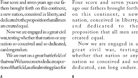
Figure 8.7. Many rivers to cross. Word spacing and Letter Spacing too tight (example A) and too loose (example B).
No prizes for guessing that this refers to the space between words, i.e., the width of space you get when you press the spacebar.
If you make your word spacing too tight, words will blend together making it hard for the eye to distinguish one from the next. At the other extreme, word spacing that’s too loose creates unsightly blocks of white space between words, which makes reading groups of words more difficult.
Determining word spacing is more of an aesthetic consideration than an exact science. A good starting point is 100 percent—the width of the spaceband designed by the font designer. However, you may want to reduce this from 60 to 80 percent in the following circumstances:
If you’re working with condensed type.
If the weight of your typeface is relatively light.
If your typeface is tightly fit, i.e., if you are using tight letter spacing, you will want your word spacing to be correspondingly tight.
If you’re working with larger point sizes.
This is the distance between letters and includes any kerning or tracking values you may have applied. A character’s width is determined not just by the character itself, but also by the space that the font designer adds around the character—known as the side bearing.
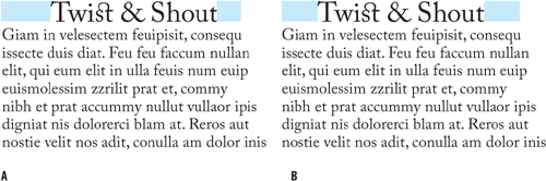
A purist will tell you that come hell or high water all three values should be set to 0. That is, under no circumstances is any variation in letter spacing permissible. However, if you are working with a narrow measure you’ll need to be more liberal with these settings. Depending on the font, you might try reducing the Desired Letter Spacing to –3, and set the minimum and maximum can be set to –5 and 0, respectively.
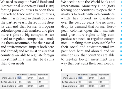
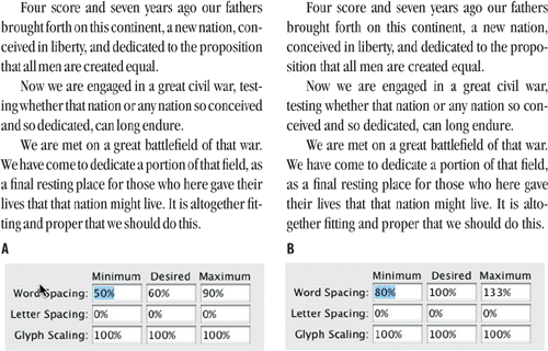
Figure 8.10. Letter Spacing: A slight adjustment to the Letter Spacing (example A) significantly improves the type color over example B, where InDesign has to rely solely upon the Word Spacing values to justify the type.
With both Word and Letter Spacing you need to find a balance between being strict and being reasonable. There’s no point in specifying restrictive settings if your text-to-column width ratio makes it impossible for InDesign to honor these settings.
Glyph Scaling is the process of adjusting the width of characters in order to achieve even justification—and a little glyph scaling goes a long way. Entering a value other than 100 percent for your Desired Glyph Scaling when working with ragged text is the same as entering a value for Horizontal Scaling. In other words, it’s a bad idea. Glyph scaling might sound like the kind of crime that the Type Police will bust you for in an instant. But in reality, moderate amounts of glyph scaling can—combined with your other justification settings—improve type color significantly. Moderation is the key: Keep your glyph scaling to 97, 100, 103 for Minimum, Desired, and Maximum, respectively. No one will ever know that you varied the horizontal scale of your type. They will, however, appreciate the splendidly even word spacing. Mum’s the word.

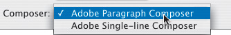
The Adobe Paragraph Composer is the jewel in the crown of InDesign’s typographic features. Before InDesign came along, page layout programs would compose paragraphs line by line. Because there was only a limited number of word spaces across which the extra space at the end of the line could be distributed, this often caused bad type color. Using the Adobe Paragraph Composer (it is the default choice of Composer), InDesign analyzes the word spaces across a whole paragraph, considering the possible line breaks, and optimizing earlier lines in the paragraph to prevent bad breaks later on. Not only does this mean fewer hyphens and better breaks where hyphens do occur, it also means better spacing. Because InDesign looks in the whole paragraph, there are more places where it can add or subtract an imperceptible amount of space. The default values of 80, 100, 133 for the Minimum, Desired, and Maximum word space allow the program enough latitude to distribute the space over a range of lines.
The Adobe Paragraph Composer works for both ragged and justified type, but it’s with the latter that you really see its benefits.
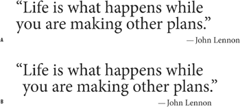
It is often necessary to break display type: either at logical places for meaning and/or to achieve a visual balance. InDesign’s Balance Ragged Lines feature goes some way towards achieving the latter and is useful to include as part of the style definition of headings, pull-quotes, and centered paragraphs. Using Balance Ragged Lines will reduce the amount of manual intervention (in the form of forced line breaks, or nonbreaking spaces), but you’re still going to need to check your display type carefully for meaning.
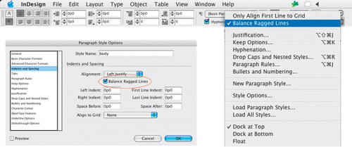
Figure 8.15. Balance Ragged Lines applied locally from the Control palette and incorporated into a Paragraph Style definition.
Balance Ragged Lines can also be used to adjust the line endings in left-aligned body text to produce a more even rag—what you’re aiming for is a gentle ripple down the edge of your page. Note that Hyphenation settings also play an important role in determining the way a paragraph rags (see Chapter 11: “Don’t Fear the Hyphen”) as does your chosen method of composition: Adobe Paragraph Composer or Adobe Single-line Composer. Balance Ragged Lines has no effect in justified text.
The line lengths in ragged type should be clearly irregular, i.e., they shouldn’t look like carelessly set justified type. On the other hand, they shouldn’t be so irregular that they create distracting shapes that impede fast reading.
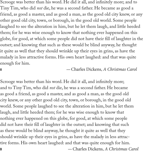
Figure 8.17. Balance Ragged Lines in body text. Both paragraphs are composed using the Adobe Paragraph Composer, and both permit hyphenation. Example A is without Balance Ragged Lines; example B has Balance Ragged Lines applied. Using Balance Ragged Lines for body text can yield unpredictable results—it is best applied locally, or, if incorporated into a Paragraph Style definition, to paragraphs that typically run only a few lines.
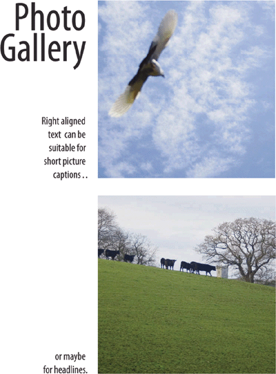
Right-aligned or flush-right type can be effective for short bursts of text like captions, pull quotes, or sometimes headlines. Because we read from the left, right-aligned type is hard going for anything more than a few lines. The unevenness of the rag becomes distracting and finding the beginning of lines is difficult.
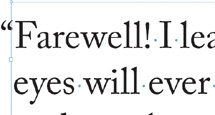
Ever notice how opening quotation marks and letters such as “W” or a “T” can make the left or right edges of a column appear misaligned? The problem—like all typographic problems more noticeable at large type sizes—exists because InDesign aligns characters mechanically, that is, by the edge of the character plus its side bearing (the built-in space that surrounds each letter). Also, when the line begins with punctuation, like an opening quotation mark, you can get a visual hole or indentation at the beginning of the line relative to the characters below.
Until recently these shortcomings were regarded as part of the price of progress. After all, we could all do so much more with our page layout programs, at the end of the day did it really matter that we had to forgo a few niceties? Along came InDesign to the rescue.
Optical Margin Alignment allows the edges of letters to hang outside the text margin so that the column edge actually looks straighter. And not only that: Optical Margin Alignment will hang punctuation marks such as periods, commas, quotation marks, hyphens, and dashes outside the right-hand text margin.
It looks at the shapes and alignment of all the characters on the left and right margins and adjusts the spacing optically according to their letter shapes. Fan-frickin-tastic! Surprisingly, some people don’t like this look, preferring everything contained within the text block. But then some people have become so accustomed to the taste of instant coffee that they no longer like the real thing.
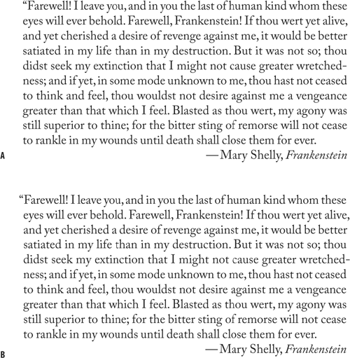
Figure 8.19. Without Optical Margin Alignment (example A); Optical Margin Alignment applied (example B).
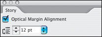
To apply Optical Margin Alignment to a story, select a text frame, then choose Type > Story and check Optical Margin Alignment. The font size setting determines the amount of overhang. Usually this should be the same size as the text, but you’ll want to eyeball it.
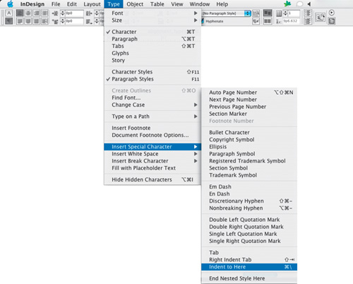
To create hanging punctuation, for example on a pull quote, use the Indent to Here character—Cmd+ (Ctrl+). This special character indents all subsequent lines in the paragraph to the point where you added the character.
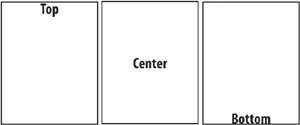
When we talk of type alignment, for the most part we mean the horizontal alignment of the text. InDesign also gives you options for the vertical alignment of your type within a text frame. The default is for type to begin at the top of the frame, and this is appropriate in most instances, but there are times when Center or Bottom alignment of type within a text frame will be necessary. With a text frame selected or your pointer inserted into the text, choose Object > Text Frame Options—Cmd+B (Ctrl+B).
A fourth vertical alignment option—Justified—can be used on text frames with multiple columns to make text “bottom out” by adding extra space above paragraphs and potentially to the leading of your type.
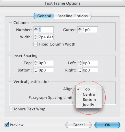
This is a super-convenient feature and one that I confess to using when I think no one will notice and/or when time is tight. However, vertical justification is a something of a Faustian bargain—yes, it makes your columns end on the same baseline, but it does so at a price. Vertical justification overrides your leading, knocking your type off the baseline grid if you are using one, and potentially makes your type color uneven. That said, you do not surrender all control: Paragraph Spacing Limit lets you specify the maximum amount of space permissible between paragraphs. Once the Paragraph Spacing Limit has been reached, there’s nowhere to go but to increase the leading. You can prevent this by setting a massive amount in this field (up to a maximum 8640 points). That way spacing will only be added between paragraphs (the lesser of the two evils) and your leading will remain unaffected.
How effective this is will depend on how many paragraphs you have in the column. If you have text with subheads and body text, for example, the extra space can usually be added unobtrusively above the subheads. If your column is a single paragraph, however, this approach isn’t going to work.