THE SPACES BETWEEN LETTERS are as important as the letters themselves. Kerning—and its cousin tracking—are ways of adjusting the space between characters to create a better fit, and thus a better rhythm, to your type. It’s this steady rhythm that makes your type readable.
We need kerning because certain letter shapes don’t fit well together. Sometimes it’s necessary to adjust the space between letters to achieve the appearance of even spacing.
Note
A surefire way to raise the hackles of a purist typographer is to use the terms kerning and tracking interchangeably. While closely related, they are distinct. Kerning refers to adjusting the space between a pair of characters. Tracking means adjusting the space across a range of text.
The objective of kerning is to achieve the appearance of equal spacing on either side of each character. Thankfully, the majority of your kerning needs are addressed by InDesign’s automatic kerning methods, of which there are two kinds: Metrics and Optical. Either method adequately handles kerning at small type sizes, so you don’t need to drive yourself crazy finding every instance of troublesome kerning pairs and manually adjusting their spacing. Regardless of the method you use, you can always add manual kerning as needed.
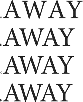
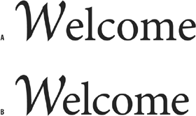
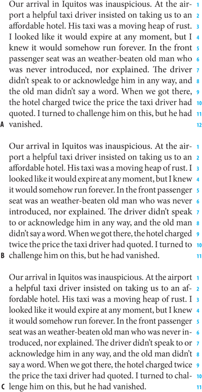
Figure 5.1. Why we kern. (A) No kerning, (B) Metrics Kerning, (C) Optical Kerning, (D) Optical Kerning with additional manual kerning.
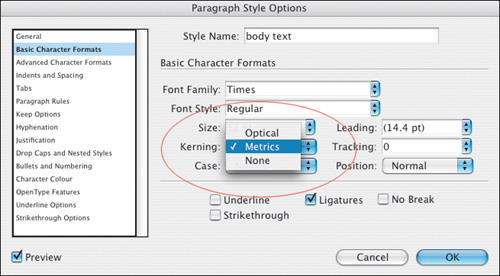
Automatic kerning can be applied locally by selecting a range of text, then choosing Metrics or Optical from the Control palette (or the Character palette), but you’re better off choosing your automatic kerning method as part of a style sheet definition.
Metrics Kerning uses the kern pairs that are built into the font, or most fonts. Adobe typefaces tend to have between 500 and 1000 kerning pairs. The El Cheapo font that you downloaded for free from the Web may not have any. This is one reason some fonts cost more than others. Some common kerning pairs—those that a type designer will pay special heed to when creating a typeface—are LA, P., To, Tr, Ta, Tu, Te, Ty, Wa, WA, We, Wo, Ya, and Yo.
Optical Kerning adjusts the spacing between adjacent characters based on their shapes and pays no mind to the kerning pairs.
Theoretically, Optical kerning will give you more consistent character spacing, because every character pair, even the most unlikely ones like zh or xw or gk, is kerned based on its character shapes. It’s a matter of preference, but here are some things to consider:
If your font includes few built-in kerning pairs, you’re better off with Optical Kerning. Decorative and novelty fonts are likely to have few kerning pairs.
When combining two typefaces in the same paragraph, the two fonts may use very different kerning metrics and may not look right side by side. This is another occasion when you’ll be better served by Optical Kerning.
You might want to view Metrics vs. Optical Kerning as a microcosm of the timeless drama of man vs. machine. Optical Kerning will be more consistent, more mathematically correct—but will it look better? Ultimately it depends on the quality of the metrics you are comparing it against.
To adjust kerning manually, insert your Type Tool between two characters. Press Option+Left/Right Arrow (Alt+Left/Right Arrow) to decrease or increase the kerning between two characters. This method kerns using the increment specified in your Units and Increment Preferences. The default kern increment is 20/1000 of an em, which is too coarse. Do yourself a favor and change this increment to 5 in your application Preferences. Because these adjustments are in relative units, a kerning or tracking adjustment made at one point size will have proportionally the same effect at any other point size. Holding down Cmd (Ctrl) when using these keystrokes multiplies the kerning increment by five.
To adjust tracking manually, follow the same steps but with a range of text selected.
As your type gets larger, any irregular spacing between characters becomes more noticeable. Manual intervention may be required. Possible candidates for kerning include:
Headlines and display type
Drop Caps (See Chapter 10: “ First Impressions: Creating Great Opening Paragraphs”)
Combined fonts (especially roman-italic combinations)
Script typefaces

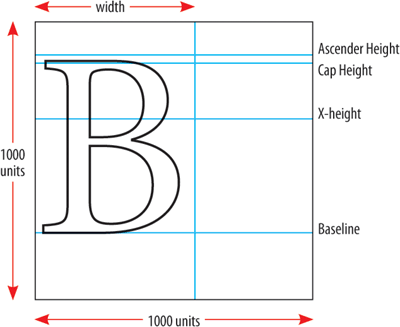
PostScript fonts are designed in an em square—a box that is 1000 units x 1000 units. An em is a relative unit the same size as your type and InDesign kerns (and tracks) in increments of 1/1000 of an em. Place your Type cursor between any pair of characters to see how much kerning is applied—the Kerning field displays the amount in parentheses in 1000s of an em.
Tip
When making kerning adjustments, zoom in to a large enough view size to be able to truly evaluate your results—and then zoom out again to 100 percent view to make sure your changes look appropriate.
Don’t overdo it. Along with the ease of kerning comes a tendency to want to fix things that ain’t broke in the first place. Most of the letter shapes we know—and have been reading all our lives—were designed so that well-distributed weight would compensate for their odd shapes. Consequently, they fit well with nearly all of their possible neighbors. It takes time to develop an eye for kerning; until you feel confident, be cautious and make only slight adjustments. And make sure you’re consistent: If you decide that certain letter combinations require kerning at display sizes, then make sure you kern all the instances of those letter combinations.
This chapter is also about tracking—adjusting the letter spacing across a range of characters. Tracking can be applied as part of a style sheet definition.
Tracking, a cousin to kerning, is an overall increase or decrease in letter spacing over a range of characters. Tracking can also be applied locally to fix widows and orphans by (imperceptibly) tightening the letter spacing across a range of words and “pulling back” a short line. Tracking values can also be applied “globally” as part of a style definition to give the type a denser or airier look (Word and Character space options in the Justification dialog can give you the same effect). Remember, when you do this you are overriding what the type designer, who slaved long and hard over his or her font, considered the optimum character spacing. Tracking body text is like taking a musician’s composition and playing it at a different tempo. Track your body text and you could be breaking some poor font designer’s heart. If you do use negative tracking as part of a style definition, pay careful attention to what happens to pairs like rn; tracked too tight these might look like an “m,” ri might look like an “n,” and cl like a “d.”
Then there is the other extreme. Track type too loosely and you disrupt the relationships between the letters that readers rely on. The letters no longer form the familiar shapes of words or phrases, but are merely a scattershot of disconnected characters. Spacing your letters too loosely might not seem like such a big deal to a lay person, but typographers get quite upset about such practices. The American typographer Frederick Goudy famously said, “Men who would letter-space lower case would steel sheep.” Reputedly, that’s the sanitized version of the quote.
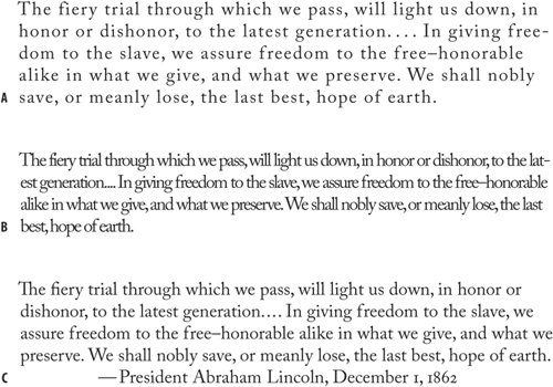
Figure 5.9. Type tracked too loosely (example A), too tightly (example B), and without tracking (example C).
Tracking is best used in moderation. If you’re tempted to use tracking often, consider using a condensed typeface that has been designed with the efficient use of space in mind.
Note
Kerning and tracking are cumulative; they don’t cancel each other out. You can use tracking to adjust the overall look of your type, and use kerning to adjust particular letter combinations.
To track a range of type, highlight the type and press Option+Left Arrow (Alt+Left Arrow) to go tighter, Option+Right Arrow (Alt+Right Arrow) to go looser. As with kerning, the default increment of 20/1000 of an em is too coarse, so it’s a good idea to change this in your application Preferences.
OK, after all the safety warnings and disclaimers, here are some scenarios when negative tracking can come in handy:
In headlines, especially sans serif headlines, the space between the letters can look disproportionately large. Because widely set letters make the words harder to read, applying negative tracking can help the characters hold together better and form more easily recognized word shapes. Don’t overdo it, though; tracking too tightly will cause characters to collide and words to run into each other.
Condensed typefaces may benefit from a modest amount (–10) of negative tracking.
Negative tracking can be used to help fix composition problems in passages of text. When tracking tighter across a range of text or a paragraph to pull back a line, remember that, like so much of good typography, your tracking adjustments should be “invisible.” If the reader can tell, then you’ve gone too far—as a general rule of thumb, avoid using more than –15/1000 of an em. Also, if you have your Justification and Hyphenation set up correctly, there will be much less need for manual intervention in the form of tracking. (See Chapter 8: “ Aligning Your Type”)
Tip: Quark Kerning and Tracking Conversions
If you’re a Quark refugee, you’ll need to multiply your old Quark kerning and tracking values by 5 to give you the equivalent InDesign values. In Quark terms, a kerning/tracking value of 1 equals 1/200th of an em; in InDesign, “1” equals 1/1000th of an em. For example, if you tracked text to 1 in Quark, you would need to track it to 5 in InDesign.
In script faces, the characters should connect with each other so that the type looks like handwriting. If the font has well-designed kerning metrics, no intervention will be necessary. But pay careful attention to the way these characters connect—or don’t connect, as the case may be—and adjust your tracking accordingly.
Positive tracking might be useful in these situations:
Headlines set in all caps, especially in serif faces, look more elegant with positive tracking of up to 50/1000 of em.
Positive tracking can help improve the type color of very small type like captions or photo credits. Again, be cautious—too much tracking will cause the type to fall apart and lose its distinctive word shapes.
When reversing type out of a solid background, positive tracking can improve readability.

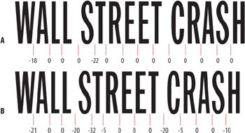
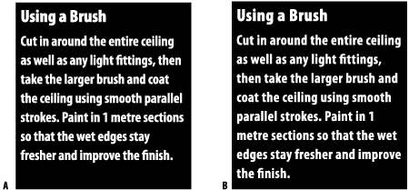
Figure 5.12. All caps serif title treatment with no tracking (example A) and reduced in size with +200 tracking (example B).
Tip: Adjusting Word Spacing
Here’s a handy feature: The ability to adjust the word spacing across a range of characters while leaving the character spacing unaffected. Command+Option+Delete (Ctrl-Alt-Backspace) will tighten the word spaces; Command+Option+Shift-Backslash (Ctrl+Alt+Shift+ Backslash) will increase the word spaces.
Given the drama of their names, the actual definition of widows and orphans may be a little disappointing:
A widow is the last line of a paragraph, stranded at the top of a column or page. They should always be avoided.
An orphan is the first line of a paragraph that occurs at the bottom of a column or page. They are not desirable, but neither are they a typographic sin, especially when fixing them may cause more problems than it solves.
Ultimately you’re better off fixing widows, orphans, and their wicked cousin—the short exit line—by a judicious use of tracking, hyphenation, and perhaps rewriting. If you plump for the first option, the golden rule is that no one should be able to tell. You don’t want your type looking like a concertina: getting tighter here and looser there as you squeeze or pad your text with space. Restrict yourself to no more than –15 (minus 15/1000 of an em) and no one will notice.
To use tracking, select the paragraph that needs attention and track, usually tighter, to cause a different wrap. With the Paragraph Composer on, (the default), this may not work as expected, because InDesign will recompose every line in the paragraph. If you can’t get the result you’re after with tracking try one of these other options:
Adding discretionary hyphens (See Chapter 11: “ Don’t Fear the Hyphen”)
Applying No Break to a selected range of text to prevent it breaking across a line (See Chapter 11: “ Don’t Fear the Hyphen”)
Rewording. This is a sensitive issue and may not be an option at all depending on the kind of document you’re working with. If you have license to rewrite, then go for it—often a subtle rewording will do the trick.
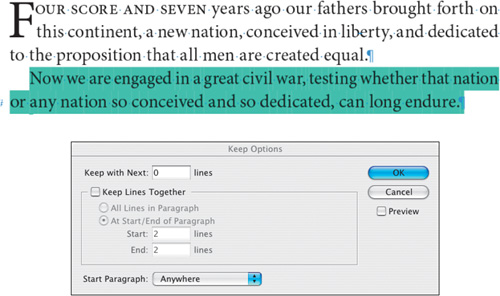
If your document does not require your columns to “bottom out,” i.e., share the same last baseline, then you can control your paragraph breaks by using Keeps Options. This will keep a specified number of lines at the end of the paragraph together. Beware: Overzealous use of Keeps can cause your text to behave very oddly with paragraphs jumping about from frame to frame as if they had a life of their own. That said, Keep with Next can be useful for preventing headings and subheads from being divorced from the text that follows them. You can highlight paragraphs that violate your specified Keep Options by choosing Preferences>Composition and checking Keep Violations
Note
To remove all custom tracking or kerning from a range of text, select the text and press Cmd+Option+Q (Ctrl+Alt+Q). Because this sets the automatic kerning method back to Metrics, it won’t be much use if you are using Optical Kerning.
Tip: Turn on Show Custom Tracking/Kerning
This will highlight in green any paragraphs that have been custom tracked or kerned. This is helpful in a couple of ways. First, you may have inherited a document in progress and want to quickly make sure that the text hasn’t been overzealously tracked. Second, if the layout or text of a document is revised so that the tracking in certain areas is no longer necessary, you can easily identify these areas to remove the tracking.
It’s good to develop an eye for where you might need to track to gain better text color: Flipping through your pages at a small view percentage with the type greeked can often help to identify the problem areas.
We zoom in on the small and sometimes persnickety details of typography. This has and probably always will be a labor intensive process, but, just as with the bigger picture stuff, InDesign offers an unprecedented amount of control over these fiddly bits. Harness these controls and you’re guaranteed to raise the level of your type.