BACK IN THE TWENTIETH CENTURY when PostScript fonts battled it out with TrueType fonts in what the trade press dubbed “font wars,” managing fonts was a thorn in the side of every graphic designer. With PostScript fonts you had to keep track of the two parts of your font: a screen font, which contained the information about the font’s spacing characteristics and kerning pairs, and a printer or outline font, which contained the data about each character shape. It was this second part that was downloaded to your PostScript printer so it could print the characters. TrueType fonts were simpler in that there was only one part to them, but too often caused problems when printing to a PostScript imagesetter.
Note
A short-lived solution to the shortcomings of Type 1 Postscript fonts was the Multiple master, which allowed the user to generate different weights and widths of the typeface from a small number of master outlines. But Multiple masters didn’t catch on, mainly because they were expensive and confusing. Names like MyriadMM 215LT didn’t exactly roll off the tongue. Multiple masters were discontinued in 2001, though they still pop up in font menus.
![The OpenType menu. Features not supported in the current font appear in square brackets, such as [Swash].](http://imgdetail.ebookreading.net/design/12/0321385446/0321385446__indesign-type-professional__0321385446__graphics__figure7_01_opentypemenu.jpg)
Figure 7.1. The OpenType menu. Features not supported in the current font appear in square brackets, such as [Swash].
Today, on the Mac, Type 1 PostScript fonts continue to abound, and on the Windows platform, there are still plenty of TrueType fonts. However both formats are being superseded by OpenType fonts (Adobe released its whole type library in the OpenType format in 2003). OpenType is a cross-platform standard developed by Adobe and Microsoft. There are no compatibility headaches going from Mac to Windows, or visa versa, and there’s only one file to manage. What makes OpenType fonts so compelling, though, is their massively expanded character set. With room for so many more characters, OpenType fonts include the full range of Latin characters used in the Western world. Others add a full range of accented characters to support central and eastern European languages, such as Turkish and Polish. Some OpenType Pro fonts also contain Cyrillic and Greek characters. In addition to making multilingual typography easier, OpenType fonts give us all kinds of typographic delicacies that we formerly had to switch to an “Expert Set” in order to access. Let’s take a look at what we’ve got:
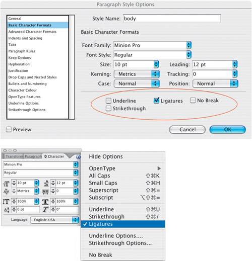
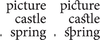
Ligatures are two or more characters fused into a single character. An example of a character that has evolved from a ligature into a character in its own right is the ampersand (&), which is a stylized abbreviation of et, the Latin word for “and.” Today we use ligatures to avoid collisions between different parts of the characters as well as to add sophistication to type. InDesign allows you to substitute standard ligatures for the lowercase fi and fl combinations whether you are using OpenType, PostScript, or TrueType fonts. Whether you do so depends on the font you’re using. First try setting the type without ligatures, if the characters collide, then turn on Ligatures. If the characters do not collide, well—if it ain’t broke, don’t fix it, especially since using ligatures in such instances may make these letter combinations appear tighter set than the rest of your type.
OpenType fonts extend the range of standard ligatures.
InDesign’s Check Spelling is smart enough to recognize ligatures and not flag as misspelled any word that contains them.
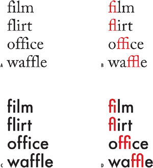
Figure 7.2. The need for ligatures: Depending on the font you are using, you may or may not want to use ligatures A. Adobe Caslon without ligatures: Note the collision of the f and i and f and l. B. Adobe Caslon with ligatures turned on. C. Futura doesn’t require ligatures because of its character shapes, so using them (D) is redundant.

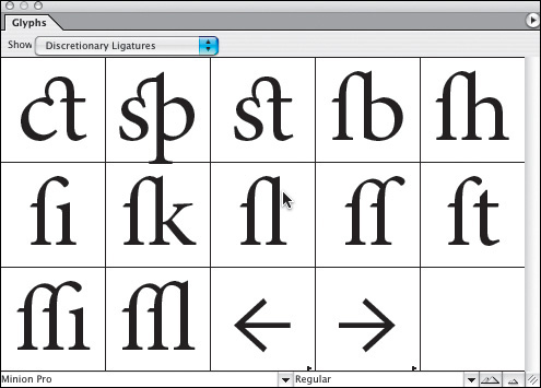
Discretionary ligatures are not for everyday use, but perfect for special occasions. Next time you’re working on something fancy like a wedding invitation, discretionary ligatures might be just the extra seasoning you need.
If available, you can use Ordinals and/or Raised and Lowered Characters instead of the scaled superscripts and subscript that you get on the Character palette menu. You have four flavors to choose from:
In most cases Ordinal will be the same as Superior and Denominator or Subscript/Inferior will be the same as Subscript.

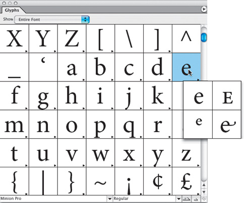
Need to add a flourish to your type? You can cut a dash by using swash characters. Swashes should be used sparingly—typically at the beginning of words or sentences. Some fonts have them, most don’t—you can check by opening the Glyphs palette and looking for Swash in the Show pop-up menu. Some OpenType fonts may also have lowercase swash characters that are called finials or terminal characters, intended for use at the end of a word or line.
Some OpenType fonts have special “titling” characters designed for uppercase type set at large sizes.
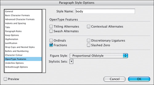
Turning on Fractions converts anything that looks like a fraction to a proper fraction. Unfortunately, leaving this feature on will “fractionize” all numerals in your text, so it’s necessary to apply it on an as-needed basis.
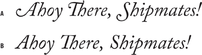
Figure 7.9. Bickham Script Pro with Swash (example A) and without (example B). Warnock Pro with finials (C).

Figure 7.10. Titling Alternates: Adobe Garamond Pro Regular 72 pt (example A) and using Titling Alternates (example B). The difference is subtle, but the titling characters are slightly thinner.
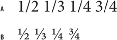
The default numbers in most typefaces are called lining figures and are designed to be used in columns so that we can add them up. The problem is that lining numbers stand out too much in a line of type.
In terms of bang for your buck, there’s nothing like using old-style numerals for giving your type a more sophisticated look. Old style figures are as tall as the x-height of your type and so have a better type color in body text than full-height “lining figures.” Figures 3, 4, 5, 7, and 9 have descenders; while 6 and 8 have ascenders. There are four styles of numerals:
Tabular Lining and Tabular Oldstyle for use in tables.
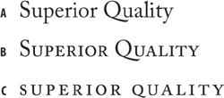
Proportional Lining for use in text set in all caps
Proportional Oldstyle for use in body text.
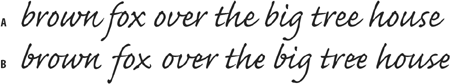
Some OpenType fonts—mostly script faces—have connecting alternates that connect better in certain letter combinations and will make your type look more like handwriting. You can also access alternate glyphs manually using the Glyphs palette.
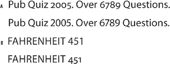
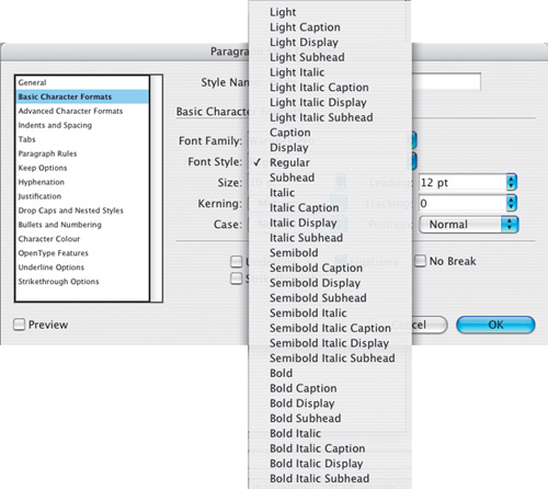
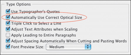
Some OpenType fonts include four optical size variations: caption, regular, subhead, and display. To take advantage of this, turn on Automatically Use Correct Optical Size in your Type Preferences.
With display type in all caps, the positioning of hyphens, dashes, and parentheses will require optical adjustment. Hyphens are centered on the x-height, which is appropriate for lowercase letters, but looks too low for text in all caps. Without OpenType fonts you would need to nudge up the hyphens, dashes, and parentheses using baseline shift. The beauty of OpenType fonts—and InDesign’s support of them—is that this glyph positioning happens automatically.
If you format an OpenType font as All Caps, glyph shifting automatically adjusts the punctuation for a better fit: Hyphens, dashes, parentheses, braces, and brackets all shift vertically. Note, this only happens when you choose the All Caps character formats, not when you key in text with the Caps Lock key on.
Some OpenType fonts include stylistic sets—alternate glyphs that can be applied one character at a time or to a range of text. If you select a different stylistic set, the glyphs defined in the set are used instead of the font’s default glyphs. Using a stylistic set is one way you can apply small caps to a range of text, for example. You can see the glyphs for each stylistic set using the Glyphs palette.