LEADING (PRONOUNCED “LEDDING”) is the space between the lines of type. In the days of hot metal typesetting this space was created by inserting thin strips of lead between the lines. Lines of type without these strips of lead were—and still are—referred to as “set solid.” Leading plays a big part in the readability of your text. All body text is made more readable by a positive amount of leading (a leading value greater than the point size of the type). Headlines and display type, on the other hand, may benefit from negative leading (a leading value less than the point size of the type).
InDesign regards leading as a character level format (as opposed to a paragraph format in QuarkXPress). Leading can be applied “locally” to a selected range of text using the Control palette or the Character palette, or “globally” as part of a style sheet definition.
Bad leading makes your text harder to read because the eye has trouble locating the next line of type. When leading is too tight, the type may appear intimidatingly dense, and the descenders of one line will collide with the ascenders of the next. At the other extreme, when the leading is too loose the type lack cohesion. This is especially so if the leading is greater than the space between the paragraphs.
Leading is measured in points from one baseline to the next. The leading value includes the point size of the typeface and the actual space between the lines. Thus, 12 points of leading using 10-point type really means two points of space between lines.
When it comes to leading there is no one size fits all. How much leading you give your type depends on several variables. Here are some factors to consider:
The nature of the text. While text intended for continuous reading will always benefit from some breathing space, a short burst of advertising copy or a title might be more effective if the lines are tightly leaded.
Type size: As point size increases you will want proportionally less leading. Body text that is 10 points in size is commonly set with 12 points of leading—written 10/12, spoken 10 on 12. When you get to display sizes, the spaces between the lines appears much larger. So much so that it’s common to use negative leading for display type.
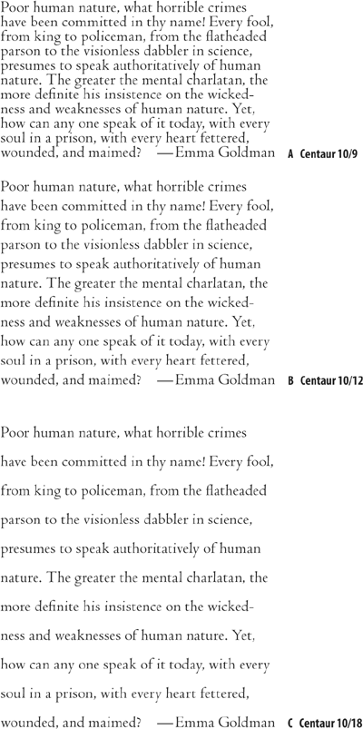
Figure 4.2. Text block with tight leading (example A); plus two points of leading (example B); and plus eight points of leading (example C).
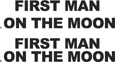
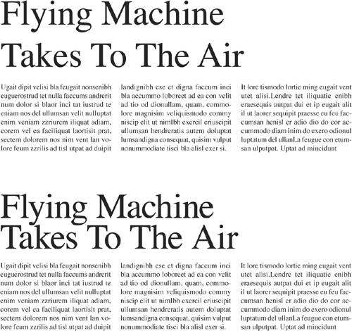
Figure 4.4. Leading and display type. Example A shows the headline with Auto Leading applied (42/50.4), with the result that the two lines seem disconnected from each other. The problem is exacerbated by the all-cap treatment, meaning there are no ascenders or descenders. Example B shows negative leading applied (42/38).
Typefaces with larger x-heights—certain serif typefaces like Times New Roman, or sans serifs typefaces in general—are perceived to be bigger because the lowercase letters take up a relatively large part of the overall area of the character bounding box. Such typefaces require more leading. Conversely, type with small x-heights, Like Garamond, will seem to have more horizontal space between the lines and thus require less leading. Sans serif typefaces typically have higher x-heights and thus require more leading than serif faces.
Some typefaces, like Bernhard Modern, may have particularly tall ascenders—meaning that with tight leading you run the risk of the ascenders colliding with the descenders of the previous line.
Typefaces with heavy stroke weights benefit from extra leading to prevent the type color—the darkness or blackness of the letterforms as a block—appearing too dense.
When your type is in all caps, there are no descenders, making the lines of type appear farther apart. Time to tighten the leading.
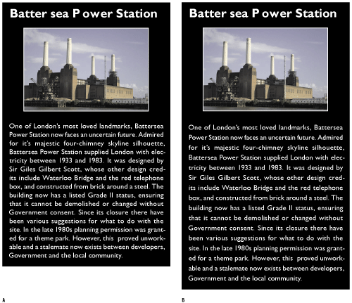
Column Width: It’s best to avoid setting type in wide columns, but if you have no choice, increasing the leading anywhere from a half point to 2 points will improve readability by keeping the lines distinct and preventing the eye from dropping off to the line below or doubling back to reread the same line.
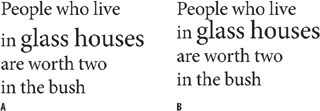
At the other extreme, justified type set in a narrow column may cause word-spacing problems. Because we read in words or clusters of words, rather than letter by letter, if the space between the words is bigger than the space between the lines, the eye may jump to the next line rather than to the next word. In such situations, extra leading might be necessary to ensure that the space between the lines is greater than the space between the words. The best solution is to avoid justified type on a narrow measure altogether, but in the real world we don’t always have as much say as we might like.
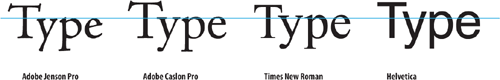
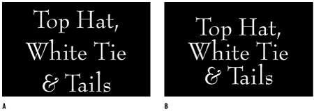

Figure 4.7. Leading and Column Width. The text set solid (example A), and with three points of leading 8/11 (example B).
Reversing Out: Because we are used to reading black type on white paper, when we choose to use the opposite, we’re guaranteed to make our type attention-getting. However, reversed type tends to sparkle, making it harder to read. A slight increase in leading—as well as avoiding any fonts with delicate serifs—may compensate for the diminished readability of reversed out type.
Very loose leading can create a luxurious look. But sometimes there’s a fine line between looking spacious and looking like the different lines of type bear no relation to each other.
Tight leading will increase the density of the type and can make it feel claustrophobic.
Economy often dictates leading: You have a fixed number of words and you have to fit them into a finite amount of space. In such situations, choose a font that lends itself to being tightly leaded.
While leading has existed since the days of metal type, Auto Leading is a relatively new concept, emerging with desktop publishing in the mid-1980s. Auto Leading allows InDesign to automatically assign a leading value to the text you set, based on the type’s point size.
The advantage of Auto Leading is convenience. You can change your text size as many times as you like and your type will always be readable. As your font size increases or decreases, so does your leading. Although this can be useful when experimenting with type sizes, Auto Leading will probably cause more problems than it solves.
Don’t by seduced by Auto Leading. Here’s why:
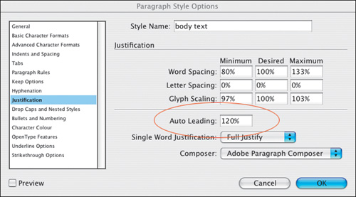
Auto Leading is proportional to your type size—but specific to the biggest piece of type in the paragraph. This means that if you have one word larger than the rest of the paragraph, you leading value will be 120 percent of the largest word or character. Leading values in parenthesis signify Auto Leading. By default, Auto Leading is 120 percent of your type size although you can change this in your Justification options.
Auto Leading doesn’t give you the kind of control of your text you need. Sure, if you’re using 10-point type Auto Leading is 12 point, a nice easy number to work with. However, if you’re working with 11-point type, then your leading value is 13.2, which is a cumbersome number, difficult to calculate in multiples if you intend working with a baseline or leading grid.
While Auto Leading works OK for body text, it can look terrible when applied to display type, which generally requires less leading. This is especially true if you have headings in all caps, because there will be no descenders to fill the lines.
Trust your eye, not your software, to determine how much leading you need. Auto Leading is useful when experimenting with type sizes, but when you decide upon the size you need be sure to convert your leading values to an absolute number, even if the Auto Leading value is the same as that number.
Leading like so much in typography is all about rhythm, and you want your rhythm to be steady. The best way to do this is to set your leading value as part of a style-sheet definition; should you need to change the leading value, edit the style definition rather than work on the paragraph locally.
When it comes to fixing widows and orphans, don’t mess with the leading. You have other tricks up your sleeve—tracking, discretionary hyphens, forced line breaks—to fix such problems (see Chapter 5: “ Kern, Baby, Kern” and Chapter 11: “ Don’t Fear the Hyphen”). Tempting though it may be to tighten the leading a little bit here and there, your document will look like a dog’s dinner if you do. Always keep your body text leading consistent, otherwise the rhythm of your type will falter.
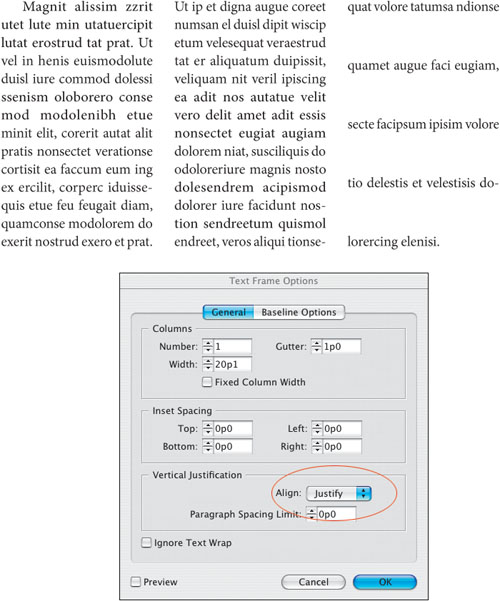
Also, don’t be tempted to go for the soft option of vertical alignment, which adjusts the leading to make multiple columns bottom out, i.e., end on the same baseline. (See Chapter 8: Align your Type.)
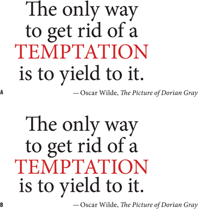
Working with display type, you may need to relax the consistency rule in favor of optical leading—tweaking the leading of individual lines to make the leading appear more consistent. Such a situation may arise in display type if one line doesn’t have descenders—another example of trusting your eye rather than the math.
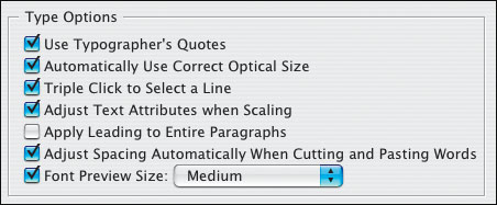
There’s an interesting and often overlooked text preference that determines how your leading will behave. When you choose Apply Leading to Entire Paragraphs, InDesign makes the leading of the whole paragraph the same, which is almost always a good idea, although it does not apply to paragraphs set to use Auto Leading.
Note that when your text is set to Align to Baseline Grid, changing the leading may result in unpredictable behavior, causing the lines of type to jump to the next baseline grid increment.
For a discussion of the Skip by Leading Text Wrap preference, see Chapter 18, “Text Wraps: The Good, the Bad, and the Ugly.”
For a discussion of the Text Frame First Baseline Position options as well as Align to Baseline Grid, see Chapter 16, “Everything in Its Right Place: Using Grids for a Clean, Structured Look.”
Tip
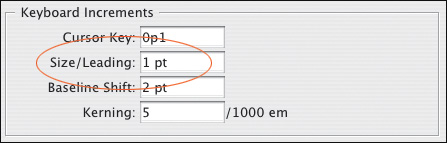
A handy shortcut for increasing or decreasing the leading of a selected range of text is pressing Option+Up Arrow (Alt+Up Arrow) to tighten the leading or Option+Down Arrow (Alt+Down Arrow) to loosen the leading. The amount is determined by the value in the Size/Leading field in the Units & Increments Preferences. To increase/decrease the leading value by five times this amount press Cmd+Option+Up Arrow/Down Arrow (Ctrl+Alt+Up Arrow/Down Arrow).
We switch from the vertical to the horizontal. Having tackled the space between the lines, we look next at controling the space between the words and characters. Kerning and tracking are to type what seasoning is to cooking. Carefully applied they can make the difference between the bland and sublime; but like seasoning it’s easy to use a heavy hand, so gently does it.