TYPOGRAPHY, LIKE ALL COMMUNICATIONS MEDIA, relies on established conventions that are understood, often unconsciously, by its audience. One such convention is the use of indents or spacing to distinguish one paragraph from another. Paragraphs represent units of thought, and a new paragraph signals the reader that a new idea is coming. While there are several ways to indicate a new paragraph, two methods are most prevalent: indenting the first line and adding spacing before the paragraph.
Figure 9.1. Two ways of differentiating paragraphs: First-line indents set to 1 pica for continuous reading text (example A) and Paragraph Spacing (example B) with a 6-point space above for more technical material.
The humble first-line indent plays a crucial role in the readability of documents, notifying the reader that one paragraph has ended and a new one is about to begin.
You wouldn’t think there would be too much to say about first-line indents. They’re indents on the first line of a paragraph. ’Nuff said. Not if you’re Jan Tschichold. The famous typographer wrote several articles about first-line indents and was unequivocal on the subject: “The beginnings of paragraphs must be indented. Paragraphs without indent…are a bad habit and should be eliminated.” And more: “Typesetting without indentation makes it difficult for the reader to comprehend what has been printed. And that is its most important disadvantage. While blunt beginnings seem to create a uniform and consistent impression when compared to normal typesetting, this impression is paid for with a serious loss of comprehension.”
There is no hard and fast rule, but 1 em is a good starting point. If you’re using 10-point type, a 10-point first-line indent is suitable. Anything less and the indent may be missed. Alternatively you can use your leading increment so that if your text is 10/12, then a 12-point first line indent is suitable. Some people prefer a slightly larger indent, especially if they’re working with wide columns. Just make sure your first-line indent is not bigger than the exit lines of your paragraphs, as this will create ugly areas of trapped space between paragraphs.
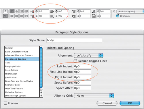
First-line indents can be applied through the Control palette, or better yet, incorporated into a style sheet definition. Don’t create your first-line indents with tabs, or worse, by pressing the spacebar multiple times.
While first-line indents are generally more suited to reading matter, be it magazine or newspaper articles or literature, paragraph spacing may be more appropriate for reference material. To some degree it’s a matter of preference, but here are some things to consider:
Don’t use first-line indents and paragraph spacing. It’s an either/or proposition.
Don’t use first line-indents on centered or right-aligned type.
Any paragraph spacing values will be overridden by the baseline grid if you align all the lines of your paragraph to the grid. Unless that is you ensure that your total paragraph spacing is a multiple of your baseline grid. (See Chapter 16: Everything in it Right Place: Using Grids.)
If a paragraph follows a heading or subhead, the first-line indent is unnecessary to differentiate that paragraph and should be dropped.
Dropping the first-line indent and adding a line of paragraph spacing before is a simple way to indicate a separation without implying a hierarchical difference between two paragraphs of type.
Not everyone loves a first-line indent. In Germany, as well as in some newspapers where space is especially tight, it’s popular to have the paragraphs flush left, without any indentation. This can be problematic if the last lines of the paragraphs run the full column measure, making it difficult for the reader to discern one paragraph from another.
Instead of indents, try separating paragraphs with an em or en space, or with a decorative paragraph mark. This can be effective for short passages of text where you want to maintain a flush look, but don’t want to compromise the meaning of the text.


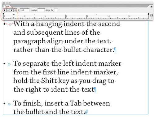
Hanging indents (also known as outdents), are where all the lines of the paragraph are indented except for the first line, which sticks out beyond the left margin edge. Hanging indents are achieved by applying a left indent, then applying a first-line indent of a negative value, typically the same amount as you entered for the left indent. For example, if you specify a left indent of 1 pica, your first-line left indent will be –1 pica.

Figure 9.5. When used sparingly, hanging indents or outdents can be an effective way of emphasizing the beginning of a paragraph.
To create a hanging indent, use the Control palette or the Paragraph palette. You can also use the Tabs palette: Specify a left-indent value greater than zero and drag the top marker to the left.
The most common example of a negative first-line indent is a bulleted or numbered list, where the second and subsequent lines of the paragraph align under the first character rather than under the bullet point or number. Bullets are great for lists that don’t require a sequence or hierarchy. In days of yore, you made bulleted lists by indenting the text, making the first-line indent the same as the left indent, but negative, then inserting a tab before the first character (after the bullet) to move it over to the left indent value. These days, a single-click using the Control palette or the PageMaker Toolbar will not only set the hanging indent but also add the bullet character.
Tip
To remove bullets from a bulleted list created with the Bulleted List button in the PageMaker Toolbar, either click the Bulleted List icon again or apply a paragraph style that does not incorporate bullets.
Here’s a bulleted list of things to consider when making a bulleted list:
Sometimes, especially if your bullet character is a different font from the body text, the bullet may not vertically align perfectly. If necessary, adjust the vertical spacing of the bullet with Baseline Shift.
If your items begin with a cap, center the bullet on the cap height.
If your items begin with lowercase characters, center the bullets on the x-height.
Don’t indent the text too far from the bullet—an em space is usually sufficient.
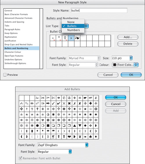
You are not limited to the standard bullet character. There are many picture or dingbat fonts available. Common picture fonts include Carta, Zapf Dingbats, Symbol, Wingdings, and Davy’s Dingbats, to name just a few.
New in CS2: Bullets (and Numbering) formatting can now be incorporated into the Paragraph Style definition. You can specify a specific font, size, and color for your bullet, and then apply this with a single click to multiple paragraphs. This is especially useful when you have specific paragraphs that always begin with a certain bullet. Defining a paragraph style with Bullets and Numbering saves you having to key in the bullet character every time. See Chapter 13: “Stylin’ with Style Sheets” for more on Paragraph Styles.
An attribute that cannot, as yet, be incorporated into the Bullets and Numbering formats of a Paragraph Style is baseline shift. This means that if your bullet character requires vertical adjustment to make it align, as mentioned above, with either the cap height or x-height of the type, your best option is the old-school method of defining your bullet as a Character Style. Once a Character Style is set up, you can easily apply the same formats to the subsequent bullets in the document, saving time and making sure that their formatting is consistent. You can go a step further and make a Nested Style, where the Character Style is incorporated into the Paragraph Style definition, and both are applied with a single mouse click. See Chapter 13: “Stylin’ with Style Sheets” for more on Character Styles and Chapter 14: “More Styles” for information on how to create Nested Styles.
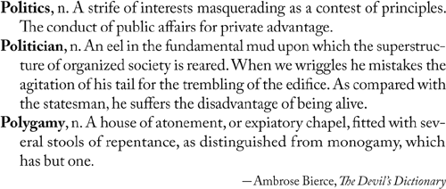
Hanging indents are also used for dictionaries and other reference sources, and sometimes on résumés.
Time for another sweeping pronouncement: Never, ever, under any circumstances should you have more than one consecutive carriage return in your document. Or to put it another way, Never create line spaces by pressing Return (Enter). No exceptions—at least none that I can think of. If text that you import into InDesign has extra carriage returns (very likely), then zap ’em with Find/Change.
Now, you might be thinking, what’s the big deal? Why not type a harmless extra carriage return between paragraphs—no one gets hurt. And it’s true; the sun will still rise if you insist on this bad habit. But there are good reasons why not:
Using carriage returns for paragraph spacing allows no flexibility in the size of the space between paragraphs. Every time you create a new paragraph by pressing Return, the new (blank line) paragraph has the same formats (including the leading) as the paragraph before it.
If your text flows into multiple columns and/or pages, a carriage return at the top of the column or page creates an unwanted space.
Instead of pressing Return (Enter) twice, or—heaven forbid—more than twice, use Space Before or Space After. I say or because using both, while occasionally necessary, is apt to get confusing. Most of the time, I use Space Before; only when working with a baseline grid do I use both. As well as giving you complete flexibility in the size of the space between paragraphs, paragraph spacing is smart enough to disappear when not needed, i.e., at the top or bottom of a column or page.

Figure 9.10. Don’t use extra carriage returns. The spacing between the paragraphs is too big, and you can get blank lines at the tops of columns.
Make sure any paragraph spacing accentuates rather than detracts from the connection between different pieces of text. Simply put, things that belong together get placed together. Organizing your type into clusters of information—subhead and paragraph, for example—will help establish the rhythm of your type. The reader will interpret the spaces between such clusters as representing a pause, the next cluster as being a new idea. To reinforce the relationship your subhead should always be closer to the text that follows it than to the text that precedes it. An obvious point, but this rule is frequently broken.
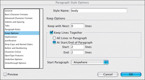
And to ensure that this relationship is never broken—by a column or page break, for example—set your Keep Options for the style definition of your subheads to Keep With Next 2 lines. (See Chapter 13: “Styling with Style Sheets.”)
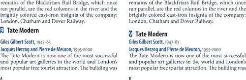
Figure 9.11. Creating a visual relationship. In example A, the subhead floats ambiguously between the text before and after it. In example B, the subhead is closer to the text that follows, establishing a visual connection between the two paragraphs. .
Indenting your text on the left and/or right is appropriate in the following situations:
To indicate a quoted passage of text or extract. Typically the type will be 1 point smaller than the body text with an even amount of paragraph space—usually a half-line space—added before and after.
To indicate hierarchy. Especially in tables of contents or technical documents, indenting signifies a lower level of the hierarchy.
Bibliography entries should be set with a hanging indent of 1 em space.
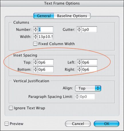
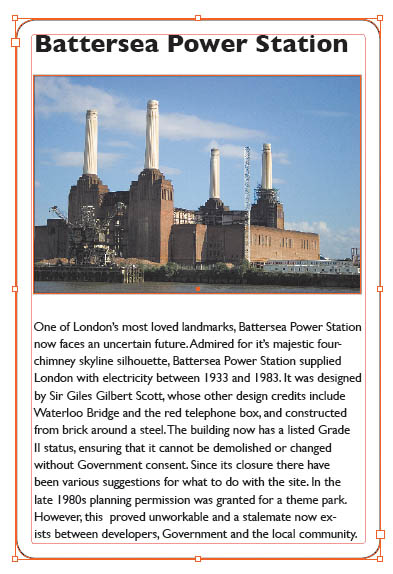
Text insets are an inner margin on your text frame. They give you the same result as applying left and/or right indents, but might be more convenient if you are working with type in a framed or colored rectangle.