
4. A First Look at Silverlight in SharePoint
SHAREPOINT HAS A NUMBER OF OUT-OF-THE-BOX FEATURES that take advantage of Silverlight if it is available. This greatly improves the usability of SharePoint in a few key areas. This chapter demonstrates how you use Silverlight in SharePoint without writing any SharePoint code in Visual Studio. The goal is to understand how the SharePoint team thinks about Silverlight in the product and demonstrate techniques that you can use to quickly leverage Silverlight on SharePoint.
When learning about building Silverlight applications for SharePoint, it is helpful to learn from those who have come before you. In this case looking at the work that the SharePoint team has done and how they overcame their issues helps you understand some of the issues you will face. The first control you see is the Create Content dialog. This dialog solves a number of interesting problems such as how to have a pluggable provider model to support new items in the dialog in the future at runtime. It solves the problem of having a down-level experience for users who do not have Silverlight installed. It demonstrates how to do diagnostic logging to the SharePoint Unified Logging Service (ULS) logs. And most importantly, it is a great user experience for completing a very common task in SharePoint, adding new content to your SharePoint sites.
Next you see how SharePoint leverages the media capabilities of Silverlight to deliver video and audio content to users. Looking at the media features that ship with SharePoint from a developer’s perspective demonstrates another interesting pattern. It demonstrates how to build a JavaScript accessible API into your Silverlight solutions. Having a JavaScript API makes your Silverlight applications programmable by other parts of the SharePoint page. In this case you can control the Media Web Part from other web parts on the page to do things like starting and stopping the videos. The Media Web Part also demonstrates how to integrate the Ribbon with your Silverlight Web Parts. Another interesting feature of the Media Web Part is the ability to provide different skins to completely change the look and feel of the web part. You also see more examples of Silverlight in SharePoint such as workflow visualizations and an Organizational Browser.
Finally the last part of the chapter demonstrates various techniques you can use to easily add your own Silverlight applications. SharePoint ships with a Silverlight Web Part that is designed to add Silverlight applications without your having to write any code. You also see some additional ways to use SharePoint to host your Silverlight applications using the Content Editor Web Part and IFrame.
Create Content
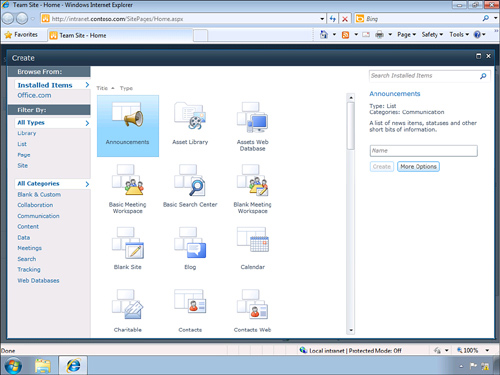
The Create Content dialog, also known as Add Gallery, is the most prominent use of Silverlight in SharePoint. This is used by every developer and content creator when they add new items to SharePoint. The Create Content dialog allows you to browse a gallery of various items that you want to add to your SharePoint site. The look and feel of the Create Content dialog is very similar to the Backstage feature in many of the Office client applications such as Word and Excel, making it familiar for Office users, as shown in Figure 4.1.
Figure 4.1. Create Content dialog
The Create Content dialog can create Libraries, Lists, Pages, and Sites and has two very important features that are not found in the down-level experience—filtering and searching. Filtering and searching enable you to quickly locate the item you are looking to create. This is more important as the number of templates or types of items you can create grows. In large organizations with many developers creating solutions, the number of templates can expand quickly.
Filtering
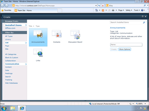
This dialog allows you to filter by four types: Libraries, Lists, Pages, and Sites. It also enables you to browse by 10categories—All Categories, Blank and Custom, Collaboration, Communication, Content, Data, Meetings, Search, Tracking, and Web Databases. Selecting a type and a category displays the intersection of these two filters to give you a focused result. For example in Figure 4.2, if you select List from the types section and select Communication from the categories section, you see a result set of four items: Announcements, Contacts, Discussion Board, and Links.
Figure 4.2. Filter by List and Communication
Search
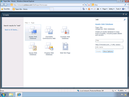
The Create Content dialog also has a search box in the top right that you can use to search the titles of all of the installed items by keyword. The search feature searches the Display Name, Type, and Categories fields of the content items, looking for keywords you enter. The search feature is not very sophisticated and does a simple text match for the search string you enter as shown in Figure 4.3. Wildcards are not used. Select an item to see the properties on the right side of the dialog in the details pane. You can see the three properties, Display Name, Type, and Categories, which are searched by the dialog. This should help you understand why a particular item was returned by the search string you entered.
Figure 4.3. Search by keyword web
More Options
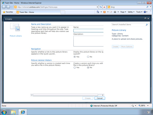
Selecting any item in the Create Content dialog enables you to create Libraries, Lists, and Pages using only a name. Sites require you to provide a title and a URL name to the new site. But many of the various item types have additional properties that you can set when you create the item. To access these additional properties, you need to click the More Options button. This displays the additional properties in the dialog, as shown in Figure 4.4. The additional properties for each item type look similar to the create page in the down-level experience. For example if you select the Picture Library and then press the More Options button, you can set additional properties such as enabling version support for the images. Keep in mind that this is a XAML representation of the down-level properties page as Silverlight 3, which the SharePoint controls are written in, does not support HTML displayed inside of the control. Any changes you make to the down-level property pages or custom types are not represented in the Silverlight Create Content dialog.
Down-level
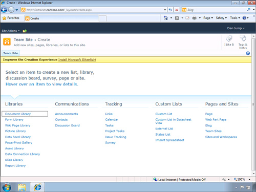
The use of Silverlight is optional in many features of SharePoint. This is true for the Create dialog as well. If you do not have Silverlight installed or have it disabled, you get the down-level experience, as shown in Figure 4.5. This is a similar experience to that of SharePoint 2007. The create page is located in the layouts directory at /_layouts/create.aspx. The down-level experience does have a little interactivity. Hovering over an item changes the header area to display the name and description of the item. But beyond that, this is it. There are no filtering or searching capabilities with the down-level page. The number of categories is also reduced to five (Libraries, Communications, Tracking, Custom Lists, and Pages and Sites).
Figure 4.5. A down-level creation experience
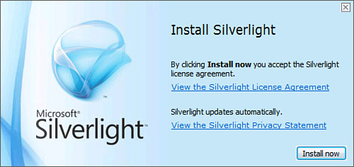
At the top of the page you see a yellow status bar informing you that you can improve the creation experience by installing Silverlight. A link called Install Microsoft Silverlight, which takes you to http://go.microsoft.com/fwlink/?LinkID=149156, is found there. This link redirects you to the current version of the Silverlight.exe installer, as shown in Figure 4.6. You have the option to save or open the executable.
Figure 4.6. Silverlight Installer dialog
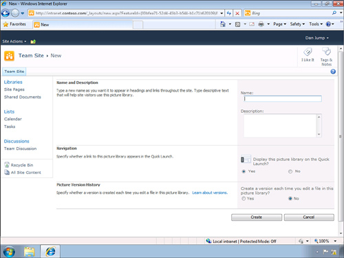
Clicking an item, for example, the Picture Library, opens the Create New Item page, shown in Figure 4.7, which has the properties that apply to the specific item type being created. Creating a Picture Library has one additional property, aside from the standard Name, Description, and Quick Launch properties, for setting the versioning of the images.
Figure 4.7. Create a new Picture Library
The Create Content dialog packs many features into a simple dialog that is easy for new users to use and for experienced users to have the power to access the advanced features.
Pluggable Providers
The Create Content dialog also supports a pluggable provider model. This means you can add additional items to the dialog at runtime by building a provider that returns items from your own custom store. SharePoint ships with one custom provider out-of-the-box for Office.com. You can see a list of all of the providers in the top left on the Create Content dialog under the Browse From section. The first and default provider is the built-in one for the local SharePoint instance. The second is for Office.com. Providers are loaded from the _LayoutsAddGalleryProviders folder. By default the Office.com provider, AddGallery.OfficeOnlineProvider.dll, is the only file in this folder. Although this feature of connecting to Office.com for templates never fully shipped with the server-side components of this provider, it is still a good example of a design pattern you should follow. You might see a warning message, or it might even be removed all together in future updates. The next most common Silverlight control in SharePoint is the Media Web Part for playing video and audio content, which you learn about in the next section.
Media Web Part
SharePoint ships with a Media Web Part that plays video and audio content. The Media Web Part is implemented as a Silverlight control that uses the media element to play the media. The type of content is restricted to media supported by Silverlight. The Media Web Part supports .wmv, .wma, .avi, .mpg, .mp3, and .mp4 audio and video content. The Media Web Part does not support true streaming content. SharePoint supports a progressive download model that has been optimized for a very responsive experience, but to have a true streaming solution, you would need to use Microsoft Media Services. But with that said, the Media Web Part is tightly integrated into SharePoint and makes it easy for site builders to quickly add rich media to their sites.
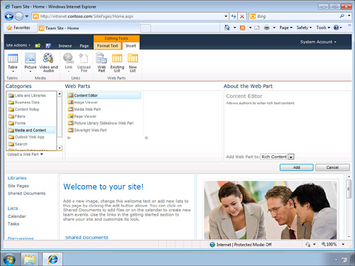
Let’s add a video to the home page of the site to understand what is involved and the various available options. Just like adding any web part, put the page in Edit mode. Click the page to set the cursor to the location where the web part will be inserted. When in Edit mode, click the Insert tab of the Editing Tools context Ribbon, as shown in Figure 4.8. On the Insert Ribbon you can add the Media Web Part by clicking the Web Part button, which opens the insert Web Part Gallery. Under the Categories section click the Media and Content item. Click the Media Web Part to insert it into the page. This is the same process you would use to insert any web part on the page, but there is a shortcut for the Media Web Part. It has its own Ribbon group called Media. The Media group has two items, Picture button and the Video and Audio button. The Video and Audio button inserts the Media Web Part.
Figure 4.8. Insert Media Web Part
After the Media Web Part has been added to the page, you need to set the content source. For most web parts you set the properties using the web part’s edit tool, but for the Media Web Part, you use the Ribbon. The Media Web Part has a context-sensitive Ribbon associated to the Edit mode of the Web Part. While the page is in Edit mode, click the Media Web Part to select it. When it is selected you see a new tab on the Ribbon called Media, which has an Options tab and has a single split button called Change Media. The Change Media button has four options. The first three allow you to pick media from your computer’s file system, from an existing SharePoint library, or from an Internet URL. The last option clears the source property for the Media Web Part. Picking a video from your computer prompts you to browse to the video and pick an existing SharePoint Library to upload the video to. The second option to select a video from SharePoint opens the Asset Picker Dialog, which allows you to browse your SharePoint site to select an existing video or audio file. The last option to select a video by address enables you to enter a URL of a video or audio file.
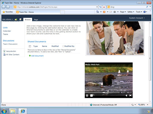
I have an existing video called Bear.wmv that I wish to run on the home page. To do so, I select the second option to load the video from my computer. The video is located in my Videos Library, and I upload it to the existing Site Assets Library. At this point the video source is set and ready to play. Save the page and click the Play button on the Media Web Part to play the video, as shown in Figure 4.9.
Figure 4.9. Media Player Web Part
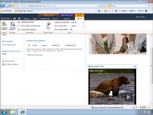
You might have noticed that the video does not show a preview image if the video is not playing. Instead it shows a default thumbnail image. SharePoint does not automatically extract and display a thumbnail preview image—you must do this manually. To set the preview image, put the page back in Edit mode and click the Media Web Part to set focus, which enables the context menu. The second group on the Media Web Part context menu is the Preview group. The Preview group has one split button called Change Image. The Change Image button has the same options as the Change Media button—From Computer, From SharePoint, From Address, and Remove. Select From Computer to browse to an image on your local computer; in this case I pick the Bear.png image and upload it to the Site Assets folder as well. When you have set the preview image, you see this image when the video is not playing.
The Properties group contains three properties. The first is the Title for the Media Web Part; this is the same as you can set in the Web Part Edit Tools pane. The second controls whether the video automatically starts when the page is loaded, and the third option sets the looping behavior of the video if it is playing.
The Player Styles group enables you to pick the Media Web Part’s skin. The Media Web Part ships with two skins called Light and Dark (Dark being the default). You can design and add your own skins as well. More details on skinning are discussed later in this chapter.
The last group of the Media Web Part’s context menu is the Size group. The Size group enables you to set the height and width of the video in pixels. You can also select if the video is stretched to fit or maintains its original aspect ratio.
JavaScript API
Many times you want to be able to programmatically control the Media Web Part from other parts of your page. The Media Web Part contains a JavaScript API that allows you to manipulate the media from JavaScript. The JavaScript API is implemented as a class in the Silverlight control itself, which is located in the _layouts/clientbin/mediaplayer.xap file. Silverlight contains a feature called the HTML Bridge, which allows you to access the HTML DOM from managed code and allows JavaScript to access managed code. You can also handle and throw events from either JavaScript or managed code. The Media Web Part exposes a subset of its API through the HTML Bridge. The Media Web Part JavaScript API has three methods: Pause(), Play(), and Stop(). The API also enables you to set the media source and other properties. These are generally the same ones you can set from the Ribbon, including setting the looping and startup behaviors.
Including a JavaScript API in your Silverlight applications, like the Media Web Part does, is a good best practice to follow. You want your Silverlight applications to fit seamlessly into the SharePoint user experience. Allowing developers to control your Silverlight controls as if they are native SharePoint controls provides the best end-user experiences.
Ribbon
Earlier you saw how the Ribbon was used to help you set the properties of the Media Web Part. There is not much more to add about how to use the Ribbon. But it is worth calling attention to the fact that, just like providing a JavaScript API is a best practice, providing a great Ribbon experience is also a best practice. The Ribbon is a new user interface component in SharePoint and provides the same experience as those of the Office client applications, such as Word, Excel, Outlook, and PowerPoint. Users expect that actions related to the object selected appear on the Ribbon. As you look at the Media Web Part, think about how you can provide a great Ribbon experience to your users similar to Figure 4.10.
Figure 4.10. Media Player Web Part context Ribbon
Skinning
The Media Web Part also supports creating custom skins. As described earlier, SharePoint ships with two skins, Dark and Light, with Dark being the default. The Light skin is located in the sitecollection/StyleLibrary/MediaPlayer/AlternateMediaPlayer.xaml file. The Media Player Web Part looks to the ~sitecollection/Style Library/Media Player folder when you are in Design mode and displays the files in the Player Styles group of the Ribbon. You can put additional custom skins in this folder as XAML files. The file names display in the drop-down, and users can select the skin at design time. You can also set the skin at runtime using the JavaScript API by setting the TemplateSource property.
Skinning is another way to make your Silverlight applications feel like they are part of the SharePoint site and allows users to customize the application to suit their needs and tastes.
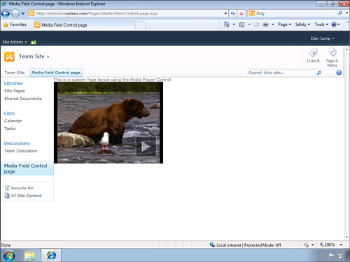
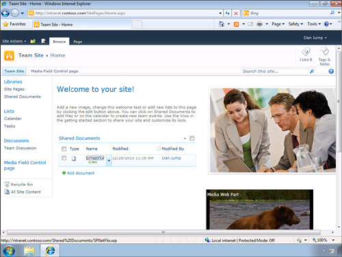
Media Field Control
SharePoint includes a custom field control called the Media Field Control, which behaves the same as the Media Web Part. It allows you to play audio and video media assets, except that it is implemented as a field control and not a web part. This gives you the ability to embed a video into a publishing page or on a list, as shown in Figure 4.11. Adding the Media Field Control to a page layout is no different than adding other non-Silverlight field controls to a page. At a high level, to add the Media Field Control to a publishing page, create a new site column of type Rich Media Data for Publishing. Add the new site column to a page layout using SharePoint Designer. You can now create an instance of your new page layout that contains the Media Field Control. Users can set the properties of the Media Field Control in the same way they did with the Media Web Part, by selecting the Media Field Control while in Edit mode and setting the properties on the Ribbon.
Figure 4.11. Media Field Control in a custom page layout
You can provide custom skins for the Media Field Control just as you can with the Media Web Part. The Media Field Control demonstrates an important concept to keep in mind as you develop Silverlight applications for SharePoint. It demonstrates that you can integrate your Silverlight applications wherever SharePoint allows you to put HTML code. Most tend to think about Silverlight in SharePoint in the context of web parts, but as you have seen with the Media Field Control, it can play a much larger role in your SharePoint solutions.
Organizational Chart
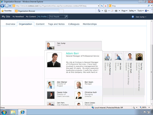
SharePoint has a concept similar to your Facebook page called a My Site. A My Site in SharePoint is your own personal space to display information about you and the activities you are working on. My Sites have both a public and private side so you can store documents just for yourself or share them with the rest of your team or your company. Another social aspect to My Sites is the ability to associate yourself with your corporate “friends,” which SharePoint calls colleagues. Many times your colleagues are already set up for you by your company and are based on employees in Active Directory. This is good because it allows you to use SharePoint to browse the organizational structure of your company out-of-the-box with no custom coding required.
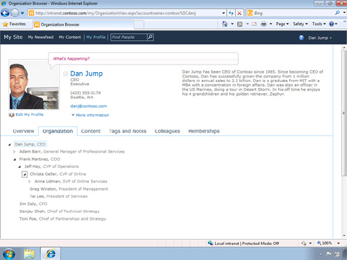
Organizational charts are hierarchical diagrams based on who works for whom. The hierarchy is determined from the Manager field in Active Directory. Silverlight is great at representing and visualizing data. SharePoint ships a Silverlight organizational chart out-of-the-box and is part of the My Site template. Simply browse to your My Site and click the Organization tab to view the Silverlight organizational chart. It displays the Name, Title, About Me, and Image of each user. You can browse horizontally and vertically through your colleagues, as shown in Figure 4.12. Although talking about it in a book doesn’t do it justice, the organizational chart is very intuitive, and the animations are smooth and responsive.
Figure 4.12. Silverlight-based Organization Browser
Down-level
The organizational chart provides a down-level experience just like the Create Content dialog did. As with the Create Content dialog, the Organization Browser’s down-level experience is very basic and is simply an HTML tree control. Clicking each node expands the branch, showing you hierarchy of colleagues. One thing to note that is different from the Create Content dialog is how you get to the down-level experience. The Create Content dialog doesn’t really provide any way to get to the down-level experience unless you turn off Silverlight or browse directly to the /_layouts/create.aspx page. The Organizational Browser has a small text link at the very bottom of the page called HTML View. Click the HTML View to go to the down-level organizational page, as shown in Figure 4.13.s
Figure 4.13. HTML-based Organizational Browser
Workflow Visualization
SharePoint uses Visio to visualize workflows. This is not only helpful for users to understand the overall process and steps within a workflow, but it also shows them what steps have been completed and the path that was taken. For example you can see in Figure 4.14 the visualization of an approval workflow attached to a document library. When a document is added to the library, a new approval workflow is started. In this particular example the workflow has a step called compare data source. If the compare data source is true, it sets a value in the document properties to approved and if it is false, it sets the value to denied. In the Visio workfslow diagram you can see the path that the workflow has taken. In Figure 4.14, the steps that have been completed have a green check mark over the step.
Figure 4.14. Visio Workflow Visualization
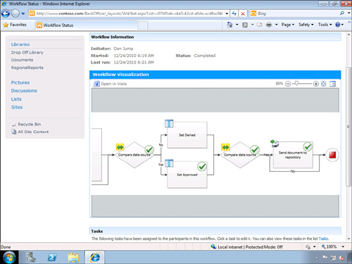
Although rendering workflows is a great use of Silverlight in Visio, it also demonstrates another technique you can use within your own SharePoint applications. The green check marks are implemented as XAML overlays onto the base Visio workflow diagram. Visio Web Applications contain a JavaScript API to program the Visio diagrams, including handling events and reading and writing shape data. One of the more interesting features of the Visio Web Application model is the ability to render overlays on top of your diagrams. In this case the green check marks are rendered as a canvas element with the check mark drawn as a vector image. Using the JavaScript API, the check marks are dynamically drawn on top of the diagram based on the status. What is important to understand is that this can be done for any Visio diagram and hosted as a web part in SharePoint. You then can overlay any XAML object onto the diagram at runtime using the Visio JavaScript API.
Down-level
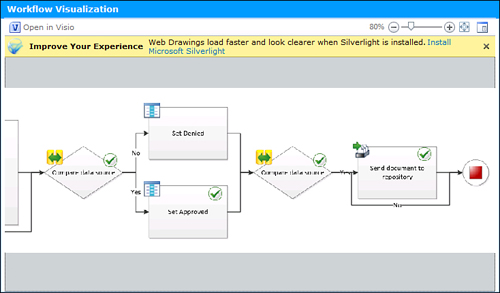
The Visio Web Applications also have a down-level experience. If Silverlight is not installed or not enabled, then the Visio diagram is rendered using a .png image file. This doesn’t result in the best user experience. For example, you can see in Figure 4.15 that the quality of the rendering is not clear at any zoom level other than 100%. In this case the zoom level is 80%, which is the same as the zoom level in Figure 4.14 and which is using Silverlight. The status indicators are also implemented as individual .png images that overlay the base diagram .png using a div element.
Figure 4.15. Down-level Workflow Visualization
The Visio Web Application also displays a yellow status bar informing the user that the diagram will load faster and look clearer when Silverlight is installed and a link to install Silverlight, as shown in Figure 4.14. This link, unlike the SharePoint down-level link, takes you to an Office landing page that has a link to download Silverlight but also has other general information about Silverlight. You can find the Silverlight landing page at the URL, http://www.microsoft.com/getsilverlight/office/?scenario=visio&loc=en-US.
Silverlight Web Part
Up to this point you have seen how SharePoint uses Silverlight out-of-the-box. One of the best new features of SharePoint 2010 is that it also ships a Silverlight Web Part. The Silverlight Web Part enables you to add Silverlight applications to SharePoint without writing any code. Users and Developers can easily leverage the web part to quickly add rich functionality to any site.
Let’s walk through an example of using the Silverlight Web Part to add functionality to the home page. In this example you add an existing Silverlight application to the right side bar of the home page. The application calls a service on NetFlix and displays a list of movies released on or after 2010. As you work through the book you see that there are two fundamental questions you need to answer in order to run Silverlight in SharePoint. The first is where the Silverlight application file is located, which is normally a single file with an .xap extension. The second question is how is the Silverlight application hosted? For this first walkthrough the answer to the first question is that the Silverlight application is located in the Shared Documents library. The answer to the second question is that you use the built-in Silverlight Web Part to host the Silverlight application.
Uploading the Silverlight Application
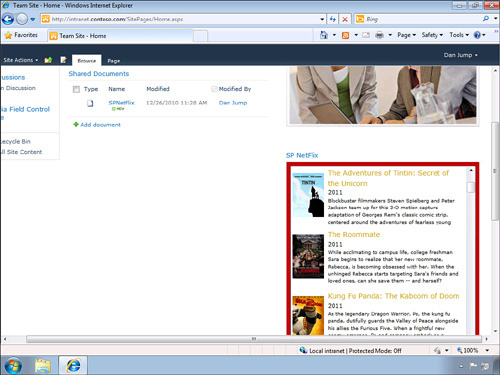
Start by uploading the Silverlight application to the Shared Documents library as you would any other document type. To SharePoint, the Silverlight application is just another document. It doesn’t know anything about the file type and treats it just like any other binary file. You can see in Figure 4.16 that that application is called SPNetFlix, and hovering over the file shows the path in the status bar of http://intranet.contoso.com/Shared%20Documents/SPNetFlix.xap. Copy this path to the clipboard because you will need it in the next step.
Figure 4.16. Upload Silverlight application package file (.xap) to SharePoint
Adding the Silverlight Web Part
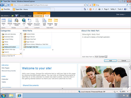
Now that you have uploaded the Silverlight application to the Shared Documents Library, you can add a Silverlight Web Part to host the application. Put the home page in Edit mode. There are a number of ways to do this including selecting Edit Page from the Site Actions menu. Set the focus of where you want to insert the web part by clicking the page—in this case click on the right-side bar below the image and above the Bear video. Use the Ribbon to insert the web part. On the Ribbon click the Insert tab under the Editing Tools context sensitive group. On the Insert tab, click the Web Part button under the Web Parts group. This opens the Web Parts Gallery, which enables you to browse and insert any web part, as shown in Figure 4.17. To insert the Silverlight Web Part select Media and Content from the Categories pane and then select Silverlight Web Part from the Web Parts pane and click the Add button.
Figure 4.17. Insert the Silverlight Web Part
When you click the Add button, SharePoint prompts you for the URL to the Silverlight application. You can paste in the path to the Silverlight .xap file that you copied earlier or just type in the URL, which is http://intranet.contoso.com/Shared%20Documents/SPNetFlix.xap. You now see the Silverlight NetFlix Web Part on the right.
Setting Web Part Properties
The Silverlight Web Part is added using the default properties. If you scroll down the page where you added the Silverlight Web Part you see that the application is cut off and the title of the Web Part is Silverlight Web Part. You can use the standard Web Part Tool pane to edit these properties. To open the Web Part Tool pane, select Edit Web Part from the Web Part context menu. In the Web Part Tool pane, change the title property to SP NetFlix and change the Height property to 400 pixels.
Passing Initialization Parameters
The Tool pane is also where you can set additional initialization parameters for the Silverlight application. To pass parameters, expand the Other Settings properties at the bottom of the Tool pane and set them in the Custom Initialization Parameters field. The Custom Initialization Parameters field is a comma delimited string of keys and values. If you wanted to pass the parameters for ReleaseYear and Rating you would do something like "ReleaseYear=2010,Rating=PG13". This, of course, assumes that your Silverlight application knows about these parameters and knows how to parse them, as shown in Figure 4.18.
Figure 4.18. Silverlight NetFlix Web Part movie browser
Another thing to be aware of is that the Silverlight Web Part URL encodes the value of this property. Your Silverlight application needs to decode the values back before it uses them. You can use the System.Windows.Browser.HttpUtility.UrlDecode method to convert it back to the unencoded string. For example if you had a key and value pair of K1:K2=V1:V2, then your Silverlight application would see the key and value as K1%3AK2=V1%3AV2. The encoding converts the colon to a %3A value. A more common scenario is passing URLs as parameters. Imagine you want to pass a parameter such as ServerName=http://www.MyServer.com. This would be encoded as ServerName=http%3A%2F%2Fwww%2EMyServer%2Ecom. CallingSystem.Windows.Browser.HttpUtility.UrlDecode("http%3A%2F%2 Fwww%2EMyServer%2Ecom") would convert it back to http://www.MyServer.com. You need to decode both the key and the value.
The Silverlight Web Part also supports two replacement token values in the custom initialization parameters property. The first is the {webpartid}, which expands to be the ID of the web part, also known as the storage key value. This is the same value returned by the Microsoft.SharePoint.WebPartPages.GetStorageKey(WebPart) method, which is a Guid value. For example if you set the custom initialization parameters property of the Silverlight Web Part to MyWebPartId={webpartid}, then at runtime this is actually expanded to something similar to MyWebPartId=%7B5CC5B6C6%2D546C%2D4484%2DB543%2D392B0743EA53%7D. Decoded in Silverlight, the final key and value pair would be MyWebPartId={5CC5B6C6-546C-4484-B543-392B0743EA53}. The second replacement token is {pageurl}, which returns the relative URL of the page that the Silverlight Web Part is on. For example setting the initialization parameters property to MyPageUrl={pageurl} is expanded at runtime to something similar to MyPageUrl=%2FSitePages%2FSLWP%2Easpx. Decoding this in Silverlight would result in the final key and value pair of MyPageUrl=/SitePages/SLWP.aspx.
Five Seconds to Load
The Silverlight Web Part makes it very easy to add your Silverlight applications to SharePoint without writing any code. The Silverlight Web Part was designed to make this easy and fast without interfering with the functionality of SharePoint. As part of this design, a built-in timeout mechanism throws an exception if the Silverlight application takes longer than five seconds to download and load. The reason for this is to reduce the load time for the entire page by limiting the time to load any individual web part. This works well for smaller widget-style Silverlight applications but can become an issue for larger applications. One way you hit this timeout is as developers add more functionality to their applications, the size of the Silverlight .xap file grows as resources such as images, videos, and fonts are embedded. Sometimes this is difficult to debug during development because you are calling the local SharePoint instance, so the download is very fast and you do not hit the timeout. The same application on a slower connection might hit the timeout limit, or maybe it occurs only during peak hours when the network is busy. Testing your Silverlight applications under various network conditions is one way to understand if you have this issue. Ultimately you need to use various Silverlight techniques to reduce the load time of your application, such as splitting the application into multiple .xap files or moving resources out of the .xap file. Visit the Silverlight.net site for more ways to reduce the load time of your application.
Other Hosting Options
There are a number of ways to host the Silverlight application without writing custom code. You saw earlier in this chapter how to host Silverlight in the built-in Silverlight Web Part. Next you see two more options for hosting Silverlight in SharePoint. The first way is using the Content Editor Web Part and the second is hosting Silverlight in an IFrame. These are just a couple of examples because hosting Silverlight is ultimately just a simple HTML object tag, so wherever or however you can put this HTML tag in SharePoint, you should be able to host the Silverlight application.
Content Editor Web Part
The Content Editor Web Part (CEWP) is a general purpose web part that allows users to add content directly into the web part without any coding required. The CEWP has three basic ways to enter content. The first is to use the rich text editor. This is a common option for content authors to add formatted text content to a site. The second way, to add content by editing the HTML source directly, is more powerful and used by developers and designers. Linking to an external file is the third way and is my preferred way to add content because it allows for better editing and tool support.
You can add the Content Editor Web Part just like any other web part. The CEWP is located in the Media and Content Categories folder in the Web Part Gallery. When you first add the CEWP it has default text telling you that you need to put the web part in Edit mode to add content. When the CEWP is in Edit mode you can click in the body area of the web part to add content. In this mode you can add content using the Editing Tools tab on the Ribbon. You are not able to add any script using the rich text editing tools. Any script code is automatically stripped out when you save the web part. The Rich Text Editor does not allow you to add a Silverlight application.
HTML Source Code Editor
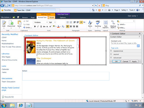
Editing in the HTML Source view of the CEWP allows you to add script, including the Silverlight object tag. Opening the CEWP for HTML Source editing is hidden under Format Text Ribbon tab in Markup group, where there is a split button called HTML. Expand the HTML split button and select Edit HTML Source. This opens a model dialog for you to enter the HTML source code that you wish to appear in the CEWP. Using this dialog is difficult because there are no tools or other help in editing the text. Let’s start by adding some basic tags. Enter the following code in the HTML Source dialog and click OK:
?<h1>My First CEWP</h1>
The text is then formatted with the h1 tag. This is the same as you could do with the rich text editor, but it is a good way to make sure you have the CEWP working before adding the Silverlight object tag.
Open the Edit HTML Source dialog again and add the code in Listing 4.1. This code comes directly from the TestPage.html file which is automatically generated by the Visual Studio Silverlight project in the bin directory.
Listing 4.1. Placing Silverlight in the Content Editor Web Part
<div id="silverlightControlHost">
<object data="data:application/x-silverlight-2,"
type="application/x-silverlight-2"
width="100%" height="100%">
<param name="source" value="/Shared%20Documents/SPNetFlix.xap" />
<param name="onError" value="onSilverlightError" />
<param name="background" value="white" />
<param name="minRuntimeVersion" value="4.0.50826.0" />
<param name="autoUpgrade" value="true" />
<a href="http://go.microsoft.com/fwlink/?LinkID=149156&v=4.0.50826.0"
style="text-decoration: none">
<img
src="http://go.microsoft.com/fwlink/?LinkId=161376"
alt="Get Microsoft Silverlight"
style="border-style: none" />
</a>
</object>
<iframe id="_sl_historyFrame"
style="visibility: hidden;
height: 0px; width: 0px;
border: 0px">
</iframe>
</div>
As soon as you click OK to accept the HTML Source dialog, you see the Silverlight application loaded in the CEWP, as shown in Figure 4.19.
Figure 4.19. Silverlight loaded in the Content Editor Web Part
One of the challenges with using the CEWP is that the Web Part modifies your source code. For example, the code that you just entered is changed to the code shown in Listing 4.2 after it is saved. You can see that the code has been modified with additional attributes, and the formatting is not as clean as when it was entered. This makes it difficult to debug and update your source code.
Listing 4.2. A Silverlight Tag after CEWP Reformatting
<div id="silverlightControlHost">
<object width="100%" height="100%" data="data:application/x-
oleobject;base64,QfXq3+HzJEysrJnDBxUISgAJAABtOwAA2BMAAAwAAAB3AGgAaQB0AGUAAAAAAA
AAAAAAAAAAAABEAAAALwBTAGgAYQByAGUAZAAlADIAMABEAG8AYwB1AG0AZQBuAHQAcwAvAF-
MAUABOAGUAdABGAGwAaQB4AC4AeABhAHAAAAA8AAAAAAAAACYAAABvAG4AUwBpAGwAdgBlAHIAbAB-
pAGcAaAB0AEUAcgByAG8AcgAAAAAAAAAAAAAAAAAAAAAAAAAAAAAAAAAAAAAAAAABAAAAAQAAAAAAAA
AAAAAAAAAAABgAAAA0AC4AMAAuADUAMAA4ADIANgAuADAAAAAKAAAAd-
AByAHUAZQAAAAAAAAAAAAAAAAAAAA=="
type="application/x-silverlight-2" althtml="
<a
href="http://go.microsoft.com/fwlink/?LinkID=149156&v=4.0.50826.0"
style="text-decoration: none">
<img
src="http://go.microsoft.com/fwlink/?LinkId=161376"
alt="Get Microsoft Silverlight"
style="border-style: none" />
</a>
" althtml="
<a
href="http://go.microsoft.com/fwlink/?LinkID=149156&v=4.0.50826.0"
style="text-decoration: none">
<img
src="http://go.microsoft.com/fwlink/?LinkId=161376"
alt="Get Microsoft Silverlight"
style="border-style: none" />
</a>
">
<param name="source" value="/Shared%20Documents/SPNetFlix.xap" />
<param name="onError" value="onSilverlightError" />
<param name="background" value="white" />
<param name="minRuntimeVersion" value="4.0.50826.0" />
<param name="autoUpgrade" value="true" />
<a
href="http://go.microsoft.com/fwlink/?LinkID=149156&v=4.0.50826.0"
style="text-decoration: none">
<img src="http://go.microsoft.com/fwlink/?LinkId=161376"
alt="Get Microsoft Silverlight"
style="border-style: none" />
</a>
</object>
<iframe id="_sl_historyFrame" style="border-bottom: 0px; border-left:
0px; width: 0px;
height: 0px; visibility: hidden; border-top: 0px; border-right:
0px"></iframe>
 </div>
You can also add script code to the CEWP. The script block is added directly to the HTML Source Editor above or below your div tag. For example the Silverlight test page creates a script block in the head tag to handle exceptions. Copy the script block from the head tag of the test page and paste it into the top of the HTML Source Editor dialog of the CEWP. This script is shown in Listing 4.3.
Listing 4.3. Silverlight Error Handling Script
<script type="text/javascript">
function onSilverlightError(sender, args) {
var appSource = "";
if (sender != null && sender != 0) {
appSource = sender.getHost().Source;
}
var errorType = args.ErrorType;
var iErrorCode = args.ErrorCode;
if (errorType == "ImageError" || errorType == "MediaError") {
return;
}
var errMsg = "Unhandled Error in Silverlight Application " +
appSource + "
";
errMsg += "Code: " + iErrorCode + "
";
errMsg += "Category: " + errorType + "
";
errMsg += "Message: " + args.ErrorMessage + "
";
if (errorType == "ParserError") {
errMsg += "File: " + args.xamlFile + "
";
errMsg += "Line: " + args.lineNumber + "
";
errMsg += "Position: " + args.charPosition + "
";
}
else if (errorType == "RuntimeError") {
if (args.lineNumber != 0) {
errMsg += "Line: " + args.lineNumber + "
";
errMsg += "Position: " + args.charPosition + "
";
}
errMsg += "MethodName: " + args.methodName + "
";
}
throw new Error(errMsg);
}
</script>
<div id="silverlightControlHost">
... Omitted for brevity
</div>
Linked File
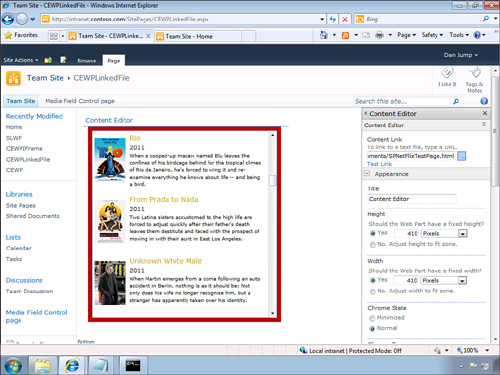
The Content Editor Web Part also allows you to add content by linking to a file that will be displayed in the CEWP, as shown in Figure 4.20. This is the best approach for using the CEWP with Silverlight, as it allows you to create the file separately using tools such as Visual Studio and Expression Web and Expression Blend. Linking to the file makes it easy to create, update, and debug your source code because the file is not changed by the CEWP, unlike using the HTML Source Code Editor dialog.
Figure 4.20. Content Editor Web Part with a linked content file
To see how this works, create a new page and add a CEWP to the page. In this example you use the test HTML page that is generated by Visual Studio in the bin directory when you create a Silverlight application. First you need to modify this file to point to the Silverlight .xap file in SharePoint by changing the following line:
<param name="source"value="/Shared%20Documents/SPNetFlix.xap"/>
The CEWP also doesn’t allow Form tags in the link files, so you need to delete the Form tag from the test page as well.
There is one other small change you can make to the test page. You can change the height and width properties to the actual size of the Silverlight application. These values by default are set to 100%, which causes scroll bars to appear in the CEWP. When these changes have been made, copy this file to the Shared Documents Library and copy the shortcut after it has been uploaded. Next put the CEWP in Edit mode using the Web Part menu and selecting Edit Web Part. On the Web Part Tool pane enter the path to the test page that you uploaded to the Shared Documents Library in the Content Link property. In this example the path is /Shared%20Documents/SPNetFlixTestPage.html. Click the Test Link hyperlink to verify the link is valid.
IFrame
SharePoint supports loading content as an IFrame. This is also supported in the Content Editor Web Parts. Everything that you learned about the CEWP earlier in this chapter applies to loading content from an IFrame as well. Instead of loading the Silverlight object tag directly, you can load a page that is running the Silverlight application remotely. Using an IFrame is a good technique for leveraging resources on another server or in the cloud such as running on Windows Azure.
Using SharePoint Designer you can add a simple aspx page to the Site Pages Library that does not have any page layout associated to it. In other words, it appears to be a blank page with no SharePoint page layout or master page. Add the Silverlight test page code to this page, as shown in Figure 4.21.
Figure 4.21. Building a simple aspx page in SharePoint Designer
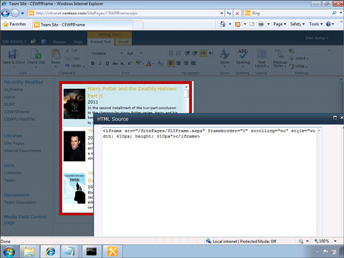
You could have used an existing page from Windows Azure or some other location for this example, but when you have a page you want to use you can reference it in the CEWP. To add a Silverlight application running in an IFrame, add a CEWP to a page in SharePoint. Edit the HTML Source of the CEWP, adding the following code. The src property of the IFrame is the URL to the page where the Silverlight application is running. Add the following code to the CEWP:
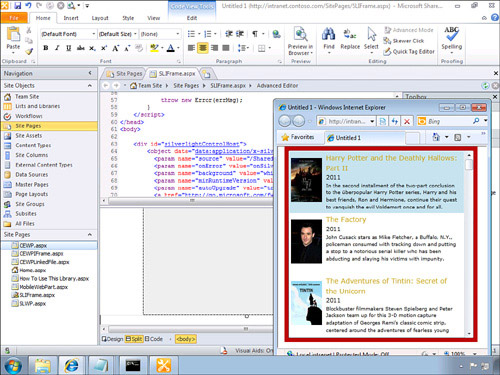
<iframe src="http://intranet.contoso.com/SitePages/SLIFrame.aspx "
scrolling="no" frameborder="0" style="width:410px; height:410px">
</iframe>
After you close the HTML Editor Source dialog you see the IFrame loaded with the Silverlight application, as shown in Figure 4.22. In all of these examples you can see that they look the same to the end user, but they all have different implementations.
Figure 4.22. Using the Content Editor Web Part to load Silverlight in an IFrame
Summary
You have seen that SharePoint offers a number of features that leverage the power of Silverlight to provide a rich user experience. Silverlight enables integration of audio and video to your pages and lists using the Media Player Web Part or the Media Field Control. Silverlight enables you to navigate a large number of items in the Create Content dialog and the Organization Browser. Silverlight also enables you to visualize information in the form of your workflows. But I think the most valuable point of this chapter is to understand how all of these various Silverlight applications that ship with SharePoint work and what design problems they solve. Ultimately you can use this knowledge in the design of your own applications. Let’s recap some of the lessons learned:
• Down-level Support—You can never guarantee that end users have Silverlight installed, so you should provide a down-level experience that still allows them to accomplish the tasks at hand. Depending on your target audience, this might be more or less of a concern. For example, if you are developing Enterprise solutions, then you have a great deal of control over the desktop environment and can require that Silverlight is installed. If you are targeting Internet or extranet scenarios, then you have much less control over the software installed on the desktop.
• Install experience—Building off the down-level experience pattern just described, you should also provide an easy and informative upgrade experience for users who do not have Silverlight installed. You can see this in some of the examples that ship with SharePoint. You should provide a link or warning message that informs the user that a better experience is available. Also users are more likely to install Silverlight if they perceive a benefit, so provide information and Help screens that explain and demonstrate added value.
• Ribbon Support—The biggest user interface change in SharePoint 2010 is the inclusion of the Fluent User Interface, which includes the Ribbon. You should integrate the Ribbon into your Silverlight applications.
• JavaScript API—Silverlight applications can communicate with JavaScript through the HTML Bridge feature. There is a rich JavaScript client-side object model in SharePoint including the Ribbon. It is important that your Silverlight applications are tightly integrated in the composite application model where web parts are added at runtime to work together. Having a JavaScript API allows other web parts and other SharePoint controls to automate your Silverlight applications.
• More than Just Web Parts—SharePoint is more than just web parts. You can leverage all of the user interface elements of SharePoint to host Silverlight in more places. For example, hosting Silverlight directly on the page layout pages or the master pages becomes a powerful way to leverage Silverlight across the entire site in a consist manner. Hosting Silverlight in individual field controls enables you to add rich data entry with mini Silverlight applications providing a small UI surface to enter or view rich field data.
• Skinning and localization—Your Silverlight applications should fit naturally into the SharePoint site they are hosted in. This includes skinning the control to match the look and feel of the host site. You can provide minimal functionality such as matching the site’s theme, or you can provide a full skinning model that developers can extend at runtime. SharePoint and Silverlight both have deep localization and globalization capabilities that you should take advantage of. These features sync the locales between your Silverlight applications and SharePoint. If the site is in German, your Silverlight application should be as well for the best user experience.
• Pluggable providers—Architecting your Silverlight applications to be extensible is a good pattern to follow. This allows you or other developers to add functionality to your application in the future at runtime. A pluggable model also makes it easier for large teams to work together building a large size Silverlight application. Decomposing your application into smaller parts also makes the application easier and faster to download, which greatly enhances the user experience and perception of the application.
• Diagnostics—It is important to consider the debugging and operational aspects of building your Silverlight applications. Adding deep diagnostic capabilities into your applications makes it easier for developers and administrators to monitor and troubleshoot your application. SharePoint provides a rich logging environment; you should integrate into this same logging structure with your Silverlight applications as well. If possible avoid creating your own nonstandard logging mechanism.
• Visio JavaScript API—Visio provides a JavaScript client object model for automating Visio diagrams hosted in SharePoint. Think about how you can leverage the richness of Visio to provide a drawing surface for overlaying your Silverlight applications. Visio gives you a jump start by providing a drawing and shapes data model to build on.
You also saw that using the Silverlight Web Part was not the only way to host Silverlight applications without writing any code. You saw that you could host Silverlight applications using the Content Editor Web Part either directly in the Web Part or linked to an external file. And finally you learned that it is possible to host Silverlight applications that are running remotely on another server or in the cloud such as on Windows Azure using an IFrame. All of these approaches provide you a number of ways to accomplish the same result of hosting Silverlight in SharePoint but give you the flexibility to choose the method that best fits your scenario.