
6. Expression Blend, Data Binding, and Sample Data
EXPRESSION BLEND IS AN INTEGRATED development environment for designers who want to create Windows Presentation Foundation (WPF), Silverlight, and Windows Phone applications. In this case think of IDE as Interactive Design Environment. Blend’s power comes from the rich declarative designers that allow developers to build entire applications without writing any code. Using just XAML and other components, designers can build visually stunning applications. Then designers can wire up functionality declaratively using Behaviors. Later in this chapter you learn how to use Behaviors and how to create your own custom Behaviors. As amazing as Blend is for designers, the real power of Blend comes from the integration with Visual Studio and developers. Expression Blend and Visual Studio work hand-in-hand to seamlessly integrate designing and developing. You see later in this chapter how designers and developers can work together to create SharePoint applications. You also see that designers can create a great design without any knowledge of SharePoint, and the developers can create great looking SharePoint applications without knowing anything about design or graphic arts. This lets each discipline focus on its core strengths.
SketchFlow is a feature of Blend that you use to rapidly create interactive prototypes. In this chapter you walk through the process of creating a prototype from beginning to end using SketchFlow. You also learn how to publish your prototypes to SharePoint and leverage SharePoint data using the Client Object Model and data binding. Let’s get started by understanding Behaviors in Expression Blend, which are the glue that designers use to add interactivity.
Behaviors
Behaviors in Silverlight provide a way to componentize a unit of functionality that can be attached to various user interface objects at design time and runtime. Behaviors also provide for a design-time tool experience in Expression Blend. This further allows the separation of design and code to occur. Developers can create new Behaviors that can be consumed by designers without writing any code. In Blend Behaviors appear in the Asset Gallery just as any other control that you can drag onto the design surface or the Objects and Timeline panel.
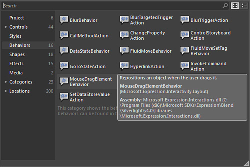
Let’s get started with a simple example of Behaviors in action. Open a new Silverlight application in Blend and add a button to the design surface. Open the Assets panel and click the Behaviors item on the left to filter by showing only the Behaviors. On the left in Figure 6.1, you can see a count of the number of Behaviors that Blend sees, and in the right pane you see a list of the Behaviors. Hovering over an item displays a Tooltip with the description, class name, namespace, and assembly.
Figure 6.1. Behaviors in Asset Gallery
Click and drag the PlaySoundAction onto the button on the design surface, or you can drop the Behavior onto the visual tree in the objects and timeline panel. When you have the Behavior attached to the button control, you can set the properties. In this case the only important one is the source property under the common properties group. Set this to the path of a Silverlight audio file (*.mp3, *.mp4, *.asf, *.asx, *.wma, *.wmv). You can find some sample audio files in the Expression Blend Samples directory at C:Program Files (x86)Microsoft ExpressionBlend 4Samplesen. Copy the start.mp3 file from the BeeHive.zip sample. Press F5 to run the project. Click the button to hear the start.mp3 sound play. Close the application and return to Blend. You can also specify the trigger that causes the Behavior to start. By default, for a button it is the click event, but you can see a list of all of the events in the Event Name drop-down property under the Triggers group. There are many events aside from the common ones such as Mouse Enter and Mouse Leave or the Left and Right Button down, you have other ones such as drag events and binding events.
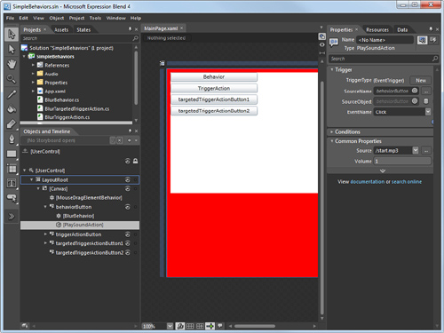
Let’s take a look at one simple example. This time you add a Behavior to drag the canvas around the screen. A Canvas element is a container that can contain other XAML elements. Start by grouping your button into a new canvas. Right-click your button, choose Group Into from the context menu, and then select Canvas. This creates a new canvas and adds all of the selected objects onto the canvas, in this case your button. By default the canvas is sized to fit the selected objects; resize the canvas a little to make it easier to grab and drag. Next you need to attach a Behavior to the new canvas. Open the Assets Gallery again and from the Behaviors filter drag the MouseDragElementBehavior onto the new canvas that you just created. Select the MouseDragElementBehavior object in the Objects and Timeline panel. Notice how there is no trigger to set. This is because this Behavior is based on the Behavior<T> class, which does not let you change the trigger or target. To make the drag operation stand out a little more, change the background color of the LayoutRoot canvas to Red, as shown in Figure 6.2. Press F5 to build and run your application. You hear that the sound still plays when you click the button, and now you can click and drag the surface of the application.
Figure 6.2. Expression Blend Behaviors
As a designer you can see how easy it is to add interactivity to your designs without needing to write any code. And as a developer you can create Behaviors for your designers, and you can use existing Behaviors yourself. This reduces your testing and debugging because you can reuse already tested and working code, thus reducing the amount of code you must write.
Building Your Own Behaviors
There are three types of Behaviors—Behavior<T>, TriggerAction<T>, and TargetedTriggerAction. Behaviors are attached to objects in Blend and provide a declarative way to add functionality. If you are familiar with Triggers and Actions in WPF or previous versions of Silverlight, you can think of Behaviors as encapsulating these two concepts.
Behavior<T>
The first type of Behavior is the Behavior<T> class. This type of Behavior acts on the object it is attached to. This Behavior does not have a trigger or target associated with it. The Behavior is responsible for attaching to the events that it is concerned about. As you saw earlier, the MouseDragBehavior is a good example. The MouseDragBehavior has no triggers; it just attaches to the drag and drop events to work seamlessly in the background as expected.
Let’s look at a simple Behavior to blur the attached object when you mouse over the object. To create a blur Behavior, add a new class to your project called BlurBehavior using Visual Studio. Your BlurBehavior must derive from System.Windows.Interactivity.Bahavior. Next you must override the OnAttached and OnDetaching methods. These methods are where you hook and unhook any events you want to handle in your Behavior. In the case of the BlurBehavior example, you want to handle the MouseEnter and MouseLeave events. When the mouse events fire, you can set the Effects property of the AssociatedObject. The AssociatedObject is a property on the base class that is set to a reference to the object that the Behavior was attached to.
Replace the code from Listing 6.1 in your BlurBehavior class to see it in action.
Listing 6.1. Code for a Custom Blur Behavior
using System;
using System.Net;
using System.Windows;
using System.Windows.Controls;
using System.Windows.Documents;
using System.Windows.Ink;
using System.Windows.Input;
using System.Windows.Media;
using System.Windows.Media.Animation;
using System.Windows.Shapes;
using System.Windows.Interactivity;
using System.Windows.Media.Effects;
using System.ComponentModel;
namespace SimpleBehaviors
{
[Description("This is my Blur Behavior")]
public class BlurBehavior : Behavior<FrameworkElement>
{
BlurEffect blur = new BlurEffect();
public BlurBehavior()
: base()
{
//set the default blur
BlurRadius = blur.Radius;
}
protected override void OnAttached()
{
base.OnAttached();
AssociatedObject.MouseEnter += AssociatedObject_MouseEnter;
AssociatedObject.MouseLeave += AssociatedObject_MouseLeave;
}
protected override void OnDetaching()
{
base.OnDetaching();
AssociatedObject.MouseEnter -= AssociatedObject_MouseEnter;
AssociatedObject.MouseLeave -= AssociatedObject_MouseLeave;
}
void AssociatedObject_MouseEnter(object sender, MouseEventArgs e)
{
blur.Radius = BlurRadius;
AssociatedObject.Effect = AssociatedObject.Effect = blur;
}
void AssociatedObject_MouseLeave(object sender, MouseEventArgs e)
{
AssociatedObject.Effect = null;
}
// Property Panel code here
}
}
When you have created your Behavior you should set the Description attribute on the class. The Description attribute is used by Expression Blend in the tool tip of the Behavior in the Asset Gallery. Compile the project and then open the project in Blend. You see you BlurBehavior in the Asset Gallery. To test the Behavior, add a button to the design surface. From the Asset Gallery drag the BlurBehavior onto the button you just created. You can press F5 to run the project; however, you will need the code in the next section as well for this to compile. You can see that hovering over the button causes it to blur with a radius of five pixels.
But what if you want to configure the Blur Radius? You can add properties to your Behaviors by using a DependencyProperty. Also be sure to add the Description attribute and the Category attribute. These are used by Blend in the properties panel on the right. If you do not specify a Category attribute for your properties, they appear in the category called Common Properties. Add the code from Listing 6.2 to the bottom of the BlurBehavior class.
Listing 6.2. Dependency Property to Control the Blur Radius
// Property Panel
public static readonly DependencyProperty BlurRadiusProperty =
DependencyProperty.Register("BlurRadius", typeof(double), typeof(BlurBehavior),
null);
[Category("Blur Properties")]
[Description("Sets the Blur Radius of the Effect")]
public double BlurRadius
{
get
{
return (double)base.GetValue(BlurRadiusProperty);
}
set
{
base.SetValue(BlurRadiusProperty, value);
}
}
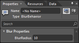
Now in Expression Blend when you select the BlurBehavior object that is attached to the button in the Objects and Timeline panel, you see a new property category and property on the right in the Property panel. Set the BlurRadius to 10 and run the application, as shown in Figure 6.3. You now see that the object is more blurry now that you increased the radius.
Figure 6.3. Custom Behavior properties
TriggerAction<T>
The TriggerAction Behavior is very similar to the Behavior<T> Behavior except that now it has a trigger associated to it. This means that the designer can declaratively set the trigger that fires this Behavior.
Let’s create a TriggerAction Behavior that blurs the attached object when the trigger is hit. In Visual Studio add a class to your project called BlurTriggerAction. Your BlurTriggerAction must derive from System.Windows.Interactivity.TriggerAction. Next you must override the OnAttached and OnDetaching methods. Although you could attach to events here just as you did in the BlurBehavior, it is generally not a best practice to do so. The key to the TriggerAction Behavior is that when the trigger is hit, it calls the Invoke method. So you must override the Invoke method and put your implementation to blur the attached object here. Replace the code from Listing 6.3 in the BlurTriggerAction class.
Listing 6.3. Custom Trigger Action
using System;
using System.Net;
using System.Windows;
using System.Windows.Controls;
using System.Windows.Documents;
using System.Windows.Ink;
using System.Windows.Input;
using System.Windows.Media;
using System.Windows.Media.Animation;
using System.Windows.Shapes;
using System.Windows.Interactivity;
using System.Windows.Media.Effects;
using System.ComponentModel;
namespace SimpleBehaviors
{
[Description("This is my Blur TriggerAction
Behavior"),Category("MyBehaviors")]
public class BlurTriggerAction : TriggerAction<FrameworkElement>
{
BlurEffect blur = new BlurEffect();
public BlurTriggerAction()
: base()
{
//set the default blur
BlurRadius = blur.Radius;
}
protected override void Invoke(object parameter)
{
AssociatedObject.Effect =
AssociatedObject.Effect == null ?
this.AssociatedObject.Effect = blur :
this.AssociatedObject.Effect = null;
}
protected override void OnAttached()
{
base.OnAttached();
}
protected override void OnDetaching()
{
base.OnDetaching();
}
// Property Panel
public static readonly DependencyProperty BlurRadiusProperty = Depen-
dencyProperty.Register("BlurRadius", typeof(double), typeof(BlurTriggerAction),
null);
[Category("Blur Properties")]
[Description("Sets the Blur Radius of the Effect")]
public double BlurRadius
{
get
{
return (double)base.GetValue(BlurRadiusProperty);
}
set
{
base.SetValue(BlurRadiusProperty, value);
}
}
}
}
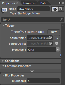
To test this Behavior, add a button to the design surface. From the Asset Gallery drag the BlurTriggerAction to the button. In the Properties pane, you can now set the Trigger event for the Behavior, as shown in Figure 6.4. In this example the Trigger is set to the click event of the button. When you run the application, clicking the button causes it to blur.
Figure 6.4. TriggerAction Behavior
TargetedTriggerAction
The TargetedTriggerAction is the same as the TriggerAction Behavior except that it adds the ability to specify a target. This target is the object the action occurs on; in this example it is the object that is blurred when the trigger is fired. A common scenario for this type of Behavior is to attach to a button to control an image or video so that when the button is clicked, the video plays.
Let’s create a new TargetedTriggerAction Behavior to demonstrate this. In Visual Studio create a new class called BlurTargetedTriggerAction. This class must derive from the System.Windows.Interactivity.TargetedTriggerAction. The code in Listing 6.4 is nearly identical to the BlurTriggerAction Behavior that you created in the previous section. The major difference is that you now use the Target property to reference the object that you perform the action on.
In the other two Behavior types, you used AssociatedObject as the object to perform the action upon, but now the target is declaratively set and dynamic. You can also override the OnTargetChanged event that runs when the object being targeted changes.
Listing 6.4. Targeted Trigger Action
using System;
using System.Net;
using System.Windows;
using System.Windows.Controls;
using System.Windows.Documents;
using System.Windows.Ink;
using System.Windows.Input;
using System.Windows.Media;
using System.Windows.Media.Animation;
using System.Windows.Shapes;
using System.Windows.Interactivity;
using System.Windows.Media.Effects;
using System.ComponentModel;
namespace SimpleBehaviors
{
[Description("This is my Blur TriggerAction Behavior")]
public class BlurTargetedTriggerAction : TargetedTriggerAction<FrameworkElement>
{
BlurEffect blur = new BlurEffect();
public BlurTargetedTriggerAction()
: base()
{
//set the default blur
BlurRadius = blur.Radius;
}
protected override void Invoke(object parameter)
{
Target.Effect =
Target.Effect == null ?
Target.Effect = blur :
Target.Effect = null;
}
protected override void OnTargetChanged(FrameworkElement oldTarget,
FrameworkElement newTarget)
{
base.OnTargetChanged(oldTarget, newTarget);
}
protected override void OnAttached()
{
base.OnAttached();
}
protected override void OnDetaching()
{
base.OnDetaching();
}
// Property Panel
public static readonly DependencyProperty BlurRadiusProperty =
DependencyProperty.Register(
"BlurRadius", typeof(double),
typeof(BlurTargetedTriggerAction),
new PropertyMetadata(OnBlurChanged));
[Category("Blur Properties")]
[Description("Sets the Blur Radius of the Effect")]
public double BlurRadius
{
get
{
return (double)base.GetValue(BlurRadiusProperty);
}
set
{
base.SetValue(BlurRadiusProperty, value);
}
}
static private void OnBlurChanged(DependencyObject obj,
DependencyPropertyChangedEventArgs e)
{
System.Diagnostics.Debug.WriteLine(
"BlurRadius property changed from {0} to {1}",
e.OldValue, e.NewValue);
}
}
}
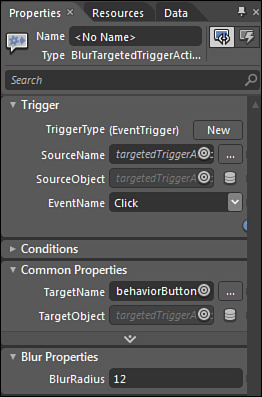
To test this Behavior, add a button to the design surface. From the Asset Gallery drag the BlurTargetedTriggerAction to the button. In the Properties pane you can now set the TargetObject and TargetName properties for the Behavior, as shown in Figure 6.5. In this example the target is set to another button. When you run the application, clicking the button causes the targeted button to blur.
Figure 6.5. TargetedTriggerAction Behavior properties
One more interesting note about this example is setting the typeMetaData parameter of the DependencyProperty. This is the last parameter and can be null. But you can also provide a callback method here that is called when the property changes. You can see in the preceding example that an OnBlurChanged handler writes the old and new values to the debug window.
Another question that comes up next is how do you debug this? This event fires in design mode as the designer updates the property in Expression Blend. In the next section you see how you debug your Behaviors at both design time and run time.
Debugging Behaviors
Debugging Behaviors in Visual Studio is just like debugging other Silverlight code. Simply set a breakpoint on the line of code you wish to break on and press F5 in Visual Studio to build and attach the debugger. Visual Studio stops at the breakpoint when your Behavior runs.
A more useful tip is how to debug the Behavior as it is running in Expression Blend. When your project is open in Blend, it is actually running your code behind the scenes as you develop it. Sometimes you might wish to debug how the designer interacts with your Behavior during design time. To debug your Behavior in the designer, open the project in Visual Studio as well as Expression Blend. From Visual Studio open the Attach to Process dialog from the Debug menu. In the Attach to Process dialog, select the Blend process that is running your Behavior; normally there will be only one. When you are attached to the Blend process, you can switch back to Blend and exercise the Behavior, and Visual Studio stops on breakpoints just as it did when the project was running in the browser.
Behaviors are a very powerful feature of Silverlight and Expression Blend. They allow developers to create packages of functionality that designers can attach to objects in the designer. In this chapter you have only seen a small slice of what Behaviors can do. You can find more information and sample Behaviors on the Expression Gallery located here: http://gallery.expression.microsoft.com.
SketchFlow
SketchFlow is a part of Expression Blend that uses sketching to let you quickly go from an idea and rough sketches to a fully working prototype. It allows you to explore many different design ideas rapidly.
SketchFlow solves three basic issues that designers face with creating prototypes. The first problem is how to create rapid, dynamic, and interactive prototypes that are cheap to build and iterate. The second problem is how to communicate your design to key stakeholders. The third issue is how to gather feedback from users about the design.
Building a Prototype
Building a prototype allows all of the participants in a project to understand the design and intent of an application. So it is important to be able to create these prototypes as rapidly as possible. In the past you might have prototyped on whiteboards or the back of a napkin at a coffee shop. For many the next level is to capture the whiteboard with a camera and throw the images into a PowerPoint slide deck. This is a fast and easy way to get your design out to people, but with PowerPoint you can’t navigate or interact with the design.
SketchFlow enables you to take a design to the next level by making it interactive. At its most basic level, creating a prototype in SketchFlow is as fast as doing it in PowerPoint with all of the benefits of Blend and SketchFlow, such as navigation, interaction, documentation, and user feedback.
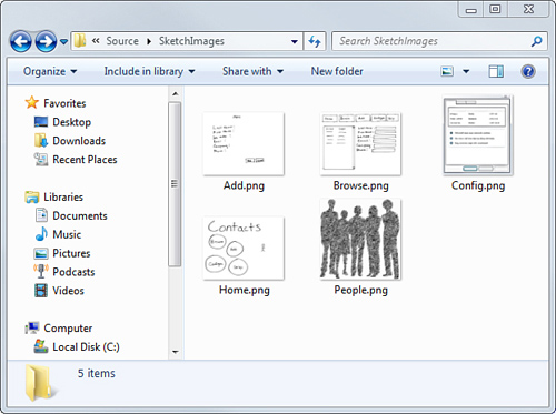
The best way to understand the process is to start at the beginning and walk through to the completion of a prototype. SketchFlow allows you to pay as you go, so your prototype can evolve in the areas that you need to in order to communicate the design of the application. In this scenario you have an idea for a SharePoint application that allows you to browse and update a list of contacts. You get together with your design team in a conference room and design the application on the whiteboard. At the end of the meeting someone takes photos of screens on the whiteboard. You can find the sample whiteboard images used here in the download code for this chapter. It is also very common to start your prototyping directly in Blend with no prior screenshots or images like the ones in Figure 6.6.
Figure 6.6. Whiteboard screens captured during design session
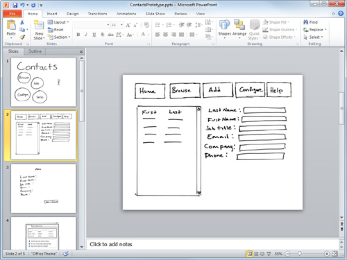
The next step that many do is throw these images into a PowerPoint slide deck and send them out to the team, as shown in Figure 6.7. As the applications grow in size and complexity, PowerPoint becomes less useful for communicating the design. It is also difficult in PowerPoint to understand the navigation of the application and get a feel for the animations and flow.
Figure 6.7. PowerPoint prototype
You are ready to create your SketchFlow prototype. In Blend create a new Silverlight SketchFlow Application project called ContactsPrototype. Blend creates two projects, ContactsPrototype and ContactsPrototypeScreens. The ContactsPrototypeScreens project is the one you will design the screens for that make up the application. The ContactsProtype project is just the wrapper that wraps the screens with the SketchFlow player. The SketchFlow player is used to gather feedback from the users. You learn more about this in the next section. The screens project starts with one default screen called Screen 1. Every screen created in SketchFlow is backed by an .xaml file in the project; Screen 1 is backed by the file Screen_1.xaml. The screens project also contains a file called Sketch.Flow. The Sketch.Flow file is an .xml definition file for the SketchFlow designer. You don’t need to worry about this file in any way as Blend takes care of updating it. The last file created in the default project is the SketchStyles.xaml file. This is a Resource Dictionary containing all of the sketch styles that give your prototype the look of a hand-drawn sketch. This is actually a very important aspect to SketchFlow. Nothing is worse than going to a review meeting with a customer and spending the time explaining why the control is in that color or size. People see the sketched styles and can focus on the overall design of the application or its functionality and not on minor fit and finish design elements.
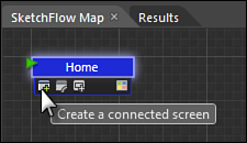
You must now transfer the design from the whiteboard session to SketchFlow. The first step is to lay out the screens and connect them together. Start by renaming Screen 1 to Home by double-clicking the blue square in the SketchFlow Map panel. Each node in the SketchFlow Map Panel represents a screen in your application. Think about these screens as whiteboards where you can sketch your designs. Connecting these nodes together allows you to model the flow and navigation of your application. Next create the Browse screen by dragging the Create a Connected Screen icon to a new location on the map, as shown in Figure 6.8. The screen menu appears when you hover over one of the screens on the map. The other options are to connect to an existing screen or create a component screen. You learn more about component screens in the next section. The last icon on the screen context menu is to change the visual tag. The visual tag simply means the background color of the screen in the map. The visual tags of screens by default are blue, and component screens are green. The other colors you can choose are yellow, orange, red, violet, gray, and white. The visual tags are helpful to group like screens together by color.
Figure 6.8. Create a connected screen
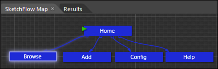
Continue creating the Browse, Add, Config, and Help screens using the same process. All of the screens should be connected to the Home screen. One good tip to keep in mind is that after you drag a new screen, you have the chance to name it. If you name the screen before clicking off it, then the backing .xaml file will have the same name. If you click off the screen or rename it later, the label and screen will be file out of sync. This is not really a big problem, but it makes it easier to understand if they match when you look at the project in the Projects panel or in Visual Studio. Your initial screen design should look something like what’s shown in Figure 6.9.
Figure 6.9. Initial screen design
Now you have the initial screens created, but at this point they are just blank space for you to add the design to. As mentioned before, SketchFlow allows you to pay as you go so you can simply drag the images that you captured from the whiteboard design session onto the corresponding screens. Double-click each screen in the SketchFlow Map panel to open it on the art board. Drag the image file from Windows Explorer onto the screen and resize it to fit. This is easiest if you have a multi-monitor development setup, but if not, simply resize both the Blend and Explorer windows so you can drag and drop between them. The default screen resolution is 640×480, and the images are quite large. It might be faster to set the Width and Height properties in the Property panel to 640×480 and all of the Margin Properties to 0. When you have done this for all of the screens, your prototype is at the same stage as your PowerPoint Prototype. Unlike PowerPoint, the prototype is interactive, and the user can navigate between screens, as shown in Figure 6.10.
Figure 6.10. Completed Sketchflow navigation
SketchFlow Player
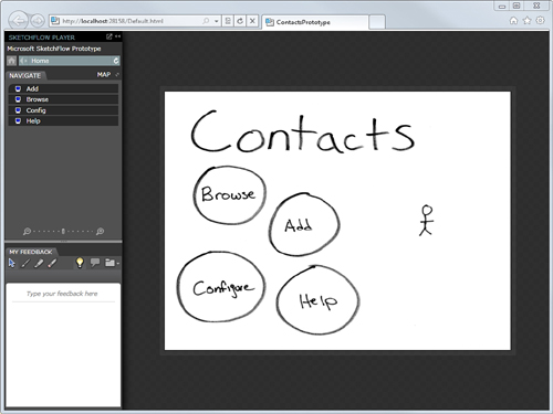
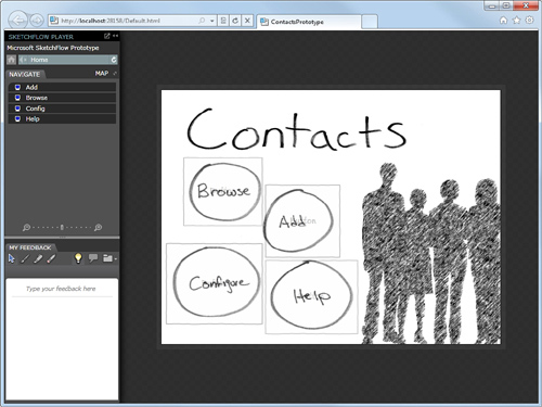
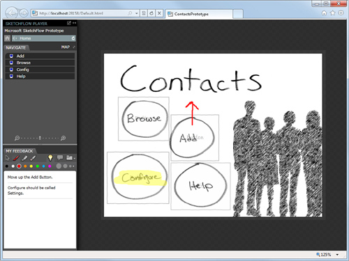
At this point you have only created the screens and connected them together. Your screen designs are just images of the whiteboard mock-ups. This might be the ending point for many of your prototypes; remember, the goal is to do just enough to convey the design and Behavior to stakeholders. Let’s run the project to see the SketchFlow Player in action. Press F5 to launch your prototype. You can see the SketchFlow Player in Figure 6.11.
Figure 6.11. This the prototype running in the SketchFlow Player
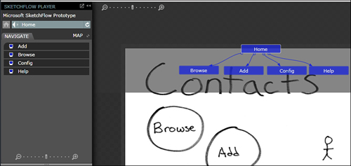
Although you haven’t added any interactivity yet, the SketchFlow Player allows you to jump to any screen from the Navigate panel. Above the Navigate panel is a Home button you can click to jump back to the Home screen where there is a navigation control that lets you navigate up and down the screen based on the connections you made on the SketchFlow map. The Map button toggles a SketchFlow map overlay view of the screens indicating which screen you are currently on, as shown in Figure 6.12. The Map view also allows you to navigate by clicking a screen in the map.
Figure 6.12. SketchFlow Player Map view
You learn about gathering feedback from the player in the next section. Let’s continue on with the prototyping process to add additional functionality. Close the browser window and return to the Contacts Prototype in Blend.
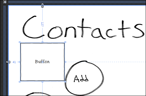
There are many techniques you can use when building your prototypes in Blend. Though it is not possible to cover all aspects of prototyping in SketchFlow in the space allowed in this book, a few examples are discussed. The first thing you want to do is enable the buttons on the home page so that when you click a button, it navigates to another screen. This is a prototype, so you want to trade fast and good enough for complete. In this case you could create a round button that you would place on the screen, but this would take too long and deliver minimal value to understanding the design. Instead you can cheat a little and place a transparent button over the round button images on the home page. Open the Home screen and drag a button-Sketch control over the circle labeled Browse. You can use any control from Blend, but you want to try and use the sketch controls if possible. They are located in the Assets Gallery under the Styles-Sketch Styles category. Resize the button to cover the circle. It should look something like Figure 6.13.
Figure 6.13. Create a Browse button
Set the Opacity property to 0% to hide the button. Next, you want to wire up the button’s click event to navigate to the Browse screen. Right-click the button you just created and select Browse under the Navigate To context menu. Under the Navigate To context menu you have the option for Forward and Back and a list of the screens in the current map. Continue this process adding buttons to all of the circle buttons on the Home screen.
One last thing to do on the Home screen is to update the people image on the right. The stick man doesn’t convey enough about the design intent here, so you want to update the image; not with a final image, but a little more detailed sketch. Drag an image into this space. You can use the People.png from the SketchImages folder in the Source for this chapter. When you are done, your Home screen should look something like what’s shown in Figure 6.14. The buttons are at 30% opacity so that you would be able to see them in this screen shot, but you can make them totally invisible if you choose to.
Figure 6.14. Completed Contacts Prototype Home screen
The user can now click the round buttons on the Home screen and navigate to the correct screen. This is starting to feel more like a real application already. Let’s continue with some of the other screens.
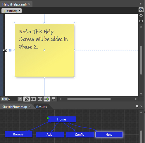
If you still have the SketchFlow Player running, close it and return to Blend. Open the Help screen, which is blank. There were no whiteboard mock-ups made of this screen. This is a common occurrence when doing iterative designs. Maybe you thought of some new screens as you started to lay out the map, or maybe the screens are going to be designed in another phase of the project; whatever the reason, you should probably tell the user what is going on. To do this add a Note-Sketch control to the screen and enter some text in the note such as: “This Help Screen will be added in Phase 2,” as shown in Figure 6.15.
Figure 6.15. Note to give the user more details about the Help screen
At this point you are done with the prototype. You see in the last section how to hook up the Browse screen with sample data from SharePoint and how to then hand the prototype to a developer to bind live SharePoint data to the prototype. But before that there are two more important features of SketchFlow prototyping—documenting the design and gathering feedback from the users.
Documenting the Design
When designing applications it is important to communicate and document the design. This allows everyone involved with the project to know what the current status is with the design. You also need a way to archive the design process so that you can go back and learn from the decisions that were made or understand what has already been tried. SketchFlow includes a feature to generate a design document using Microsoft Word.
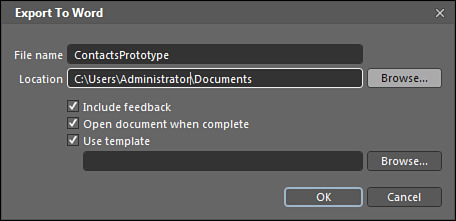
Generate a Word design document by choosing Export to Microsoft Word from the File menu of Blend. In the Export to Word dialog, set the file name and location to save the document to, as shown in Figure 6.16. You can also choose to include feedback. You learn more about feedback in the next section. You can also choose to have the document opened when it is completed. The last option is to use a Word template. This only allows you to set the styles in Word; other regions of placeholders are ignored other than the headers and footers. Click OK to generate the design document.
Figure 6.16. Create a design document in Word
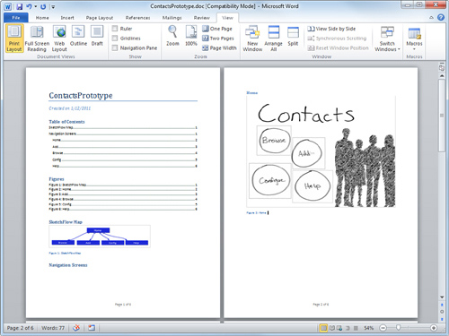
When the document is generated, you have a nicely formatted Word document that contains an image of the SketchFlow map and all of the screens from your design are captured in the document. You can see an example of the generated Word document in Figure 6.17.
Figure 6.17. Generated design document
Feedback
The main goal of prototyping is to gather feedback from users and stakeholders. The SketchFlow Player gives users the ability to comment on each screen. Users can add or remove short notes in the bottom left of the SketchFlow Player for each screen. Users can also add ink annotations directly on the surface of each screen, as shown in Figure 6.18. There are eight colors to choose from and four pen sizes. The player also includes a highlighter tool, which is similar to the ink tool. The main difference between the ink and the highlight tools is that the highlighter draws using a semi-transparent ink, which enables you to see what is under the highlighted region.
Figure 6.18. SketchFlow feedback
Exporting and Importing Feedback
After you have added all of your feedback to the prototype, you need to export it. Click the folder icon in the feedback panel of the Player and choose Export Feedback. You also have the option to clear your feedback if you need to start over or change your mind about the comments you added. If you click the Clear Feedback button, you are asked to confirm before it is actually cleared. Next in the Feedback Author Information dialog, enter your name and initials. This makes it easy to understand who made which comments when all of the feedback is aggregated together. In the Save As dialog, browse to the folder you wish to save the feedback file to and give it a name.
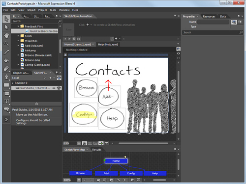
After you have exported your feedback, you can send this file to the designer. The designer can import all of feedback files they receive directly in Blend. To import the SketchFlow feedback you need to make the SketchFlow Feedback panel visible in Blend from the Window menu. In the SketchFlow Feedback panel, click on the plus icon to import a .feedback file. After the feedback file is imported, you can select the active feedback item in the panel, which shows you the comments and overlays any ink annotations directly on the art board. As you open other screens, the comments that appear are filtered to the active screen, as shown in Figure 6.19.
Figure 6.19. Feedback imported into Blend
Publishing to SharePoint
You have seen how easy it is to create and view a prototype and to gather feedback from users. But one of the new features of Expression Blend is the ability to publish prototypes directly to a SharePoint document library. Let’s take a look at how the process changes when publishing to SharePoint.
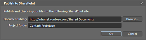
There are two ways you can prepare your prototype so that users can view it. The first is from the File menu—choose Package SketchFlow Project. This creates a folder with the Silverlight .xap file and a default.aspx and a default.html test page. You can then send this to the user or put it on a file share for them to access or on an ASP.NET web site. The second and preferred way is to publish the prototype directly to a SharePoint library. Choose Publish to SharePoint from the File menu. In the Publish to SharePoint dialog, enter the URL to the document library and a name for the folder, as shown in Figure 6.20.
Figure 6.20. Publish to SharePoint dialog
After publishing is complete, you can run the prototype from the following URL, http://intranet.contoso.com/Shared Documents/ContactsPrototype/ContactsPrototype_v2/Default.aspx.
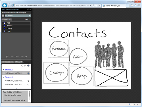
Notice that under the ContactsPrototype folder, there’s a sub folder with the same name appended with a version number. Each time you publish to SharePoint, a new versioned folder is created. This makes it very easy to keep all of your design iterations organized. In the versioned folder you see the same files that you would see if you just packaged the SketchFlow project. Also under the versioned folder in SharePoint is a feedback folder. What is really cool about publishing to SharePoint is that the SketchFlow player is aware that it is running in SharePoint and saves the users’ feedback directly on the SharePoint site in the feedback folder for each version. Users and designers don’t need to worry about how to export and import their feedback. In the SketchFlow Player there is a new feedback option to Upload to SharePoint. The user is asked for his name and initials just like before, but after that there are no other prompts. The feedback is saved automatically back in the SharePoint library. Another new feature that appears in the player when you publish to SharePoint is the Shared tab in the feedback section. The Shared tab displays all of the feedback files that have been submitted to SharePoint. This enables all of the users to collaborate on the feedback. In Figure 6.21 you can see that version 3 is published and there are comments from both version 2 and 3. Clicking the Revision 2 link takes you to that version of the prototype.
Figure 6.21. Published prototype in SharePoint
Design with Data
The prototype so far has progressed from static images to a more interactive model with navigation and controls. The next step of the prototype design is to add data to a few controls so that users can really get a good feel for how the application will behave. Blend includes a sample data feature that allows designers to design the application using a set of mocked up or random data as the data source without being connected to a live data source. This gives the designers the ability to design with data that closely represents what the real data will look like without needing to know anything about the final data source. For SharePoint applications this allows designers who might not know anything about SharePoint to create great interactive applications. And it allows SharePoint developers who might not know anything about cool designs to hook up those applications with very little effort. It allows large teams to divide the work and have the design and developer teams be loosely coupled.
Generating SharePoint Sample Data
Expression Blend has the ability to create its own random sample data. When developing applications for SharePoint, the data list already exists or is already defined. You want to generate a simple sample .xml file of that SharePoint list that you can give to your designers. In the source folder you will find a simple console application that uses the Client Object Model, which you learn more about in Chapter 8, “Accessing SharePoint Data with the Client Object Model,” to generate a sample data file. Listing 6.5 contains the code to generate the sample data file. When the contacts list is returned from SharePoint it loops through the row items, generating the .xml file with the XMlTextWriter class. This code is generic and can be used on any SharePoint list. The code generates the correct field nodes for a given list. You only need to change the list name parameter in the GetByTitle method. You can also adjust the number of rows returned or create a completely new CAML query to return a very specific set of items.
Listing 6.5. Code to Generate Sample Data
using System;
using System.Collections.Generic;
using System.Linq;
using System.Text;
using Microsoft.SharePoint.Client;
using System.Xml.Linq;
using System.Xml;
namespace GenerateSampleData
{
class Program
{
static void Main(string[] args)
{
ClientContext context = new ClientContext("http://intranet.contoso.com");
ListItemCollection sampleListItems = default(ListItemCollection);
List sampleList = context.Web.Lists.GetByTitle("Contacts");
//Filter the items returned
CamlQuery qry = new CamlQuery();
qry.ViewXml = "<View><RowLimit>5</RowLimit></View>";
sampleListItems = sampleList.GetItems(qry);
//Call the SharePoint Server
context.Load(sampleListItems);
context.ExecuteQuery();
XmlTextWriter writer =
new XmlTextWriter("C:\ContactsSampleData.xml", null);
writer.Formatting = Formatting.Indented;
//Write the root element
writer.WriteStartElement("SharePointListItems");
//Iterate through all of the rows
foreach (ListItem item in sampleListItems)
{
//Write the ListItem element
writer.WriteStartElement("ListItem");
//iterate through the fields
foreach (
KeyValuePair<string, object> fieldValue in item.FieldValues)
{
writer.WriteElementString(
fieldValue.Key,
(fieldValue.Value ?? string.Empty).ToString());
}
// end the ListItem element
writer.WriteEndElement();
}
// end the root element
writer.WriteEndElement();
//Write the XML to file and close the writer
writer.Close();
}
}
}
Using Sample Data
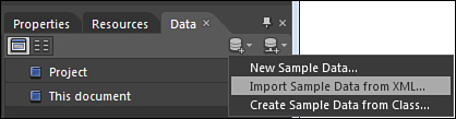
When you have generated a sample .xml data file from SharePoint, you can add this file to your SketchFlow prototype. Open the Contacts Prototype project again in Blend. The first thing you need to do is import the sample data. From the Data tab, choose Import Sample Data from XML... under the sample data drive icon, as shown in Figure 6.22. The other data icon on the far right has a little line under it, which is meant to represent a network and is used to create a data source.
Figure 6.22. Import SharePoint Sample Data
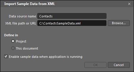
In the Import Sample Data from XML dialog, you must enter a name for the sample data and a path to the sample data .xml file. The path to the sample data file can be a fully qualified path or an http URL, or even a relative path if you have included the .xml file in your project. In this example, name your data source Contacts to match the name of the SharePoint list; although naming them the same is not required, it makes it easier to remember where the data is coming from. You can also define the scope of the sample data. The default is to define in the project, which makes the sample data available to all screens in the prototype. The last option enables you to see the sample data even when the application is running. This is the option you want to start with because you have not connected it to SharePoint list data yet. Click OK to create the sample data source. Figure 6.23 shows the completed Import Sample Data from XML dialog.
Figure 6.23. Import Sample Data from XML Dialog
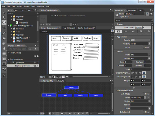
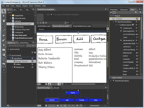
Now that the sample data has been imported into the prototype, you are ready to add it to the application. In the example you create a master detail view on the Browse screen. Open the Browse screen so that it is visible on the art board. According to the screen image that was mocked up, you want to create a list box with the first and last names of each contact. With the sample data feature you can create a list box by selecting and dragging the fields onto the art board. Rename the list box to ContactsListBox. In the data panel on the right, expand the sample data tree to view the list of fields under the ListItemCollection. Select the lastname and the title fields; title is actually the first name. At the top of the data panel there are two icons on the left, List Mode and Details Mode. List Mode is the default and creates a list box on the screen. Details Mode creates individual fields for each field selected when you drag it to the art board.
First you want to create the list box, so verify that List Mode is selected and drag the title and lastname fields onto the art board. A list box is created displaying sample data values; resize the list box to cover the list box image of the mock-up and set the background color to white to hide the image underneath.
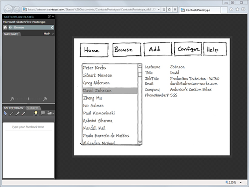
Next you want to add the details to the right of the list box you just created. Set the data panel to Details Mode and select the fields you want to see. In the mock-up, the designer wants to see firstname, lastname, jobTitle, email, company, and phone. Select all of those fields together and drag them onto the art board. Resize the detail fields to cover the details image of the mock-up and set the background of the grid they are grouped into to white. At this point reorder and play with the design of the fields so that they match the mock-up and look good to you. When you are done, you should have something that looks like what you see in Figure 6.24.
Figure 6.24. SharePoint sample data in the prototype
When you press F5 to run the prototype, you see that you have a fully functional master/detail form, and as you select items in the list box that the details change to match the selected item. You can also publish the new version to SharePoint as well. The sample data enables the designers to complete the prototype, knowing that the design will fit once it is connected to live data.
Databinding SketchFlow to SharePoint Data
The last part of developing the SketchFlow prototype is to actually hook it up to live SharePoint data. You can call SharePoint data in a number of different ways such as using web services, WCF Data services or the Client Object Model. All of these methods are discussed later in the book.
For this example you use the Client Object Model to retrieve a collection of Contact list items. Add the following code to the code behind for the Browse.xaml class. Skip to Chapter 8 to learn more about how to use the Client Object Model. You also need to add a reference to the Microsoft. SharePoint.Client.Silverlight.dll and the Microsoft. SharePoint.Client.Silverlight.Runtime.dll from the SharePoint root folder under 14TEMPLATELAYOUTSClientBin. The key to this code is to set the ItemsSource property of the list box to the contacts list item collection returned by the Client Object Model. The rest of the code in Listing 6.6 is just a standard Client Object Model call to return list items.
Listing 6.6. Databinding SketchFlow to SharePoint Data
using System;
using System.Windows;
using System.Windows.Controls;
using System.Windows.Documents;
using System.Windows.Ink;
using System.Windows.Input;
using System.Windows.Media;
using System.Windows.Media.Animation;
using System.Windows.Shapes;
using Microsoft.SharePoint.Client;
namespace ContactsPrototypeScreens
{
public partial class Browse : UserControl
{
ClientContext ctx;
ListItemCollection contactsListItems;
public Browse()
{
// Required to initialize variables
InitializeComponent();
//Get SharePoint List after page loads
this.Loaded += ThisPage_Loaded;
}
void ThisPage_Loaded(object sender, RoutedEventArgs e)
{
//Get Client Context
ctx = new ClientContext("http://intranet.contoso.com");
if (ctx != null) //null if we are not in SharePoint
{
//Get Contacts from SharePoint
List contactsList = ctx.Web.Lists.GetByTitle("Contacts");
contactsListItems =
contactsList.GetItems(CamlQuery.CreateAllItemsQuery());
ctx.Load(contactsListItems);
ctx.ExecuteQueryAsync(ContactsLoaded, ContactsLoadedFail);
}
}
//ContactsLoadedFail
void ContactsLoadedFail(object sender, ClientRequestFailedEventArgs args)
{
//TODO: Handle any Error;
}
//ContactsLoaded
void ContactsLoaded(object sender, ClientRequestSucceededEventArgs args)
{
//call back on the UI thread
Deployment.Current.Dispatcher.BeginInvoke(
delegate
{
ContactsListBox.ItemsSource = contactsListItems;
});
}
}
}
Databinding to Indexers
In the code behind you returned a list item collection and set the data source of the list box to the contactsListItems. But if you ran this, it would actually not work because the Client Object Model returns list item collections back as a collection of dictionary values. This means you need to change the data binding syntax of the XAML code to bind correctly to the dictionary objects. For example, when you drag the sample data onto the art board, Blend sets the Binding to just the name of the field to bind to:
<TextBlock Text="{Binding Title}">
A Dictionary collection is a known as an Indexer. This is because you can reference a specific item using an index value or key. Lists in SharePoint are very dynamic; designers can change the fields in a list very easily either in the browser or using SharePoint Designer. For the Client Object Model to handle the dynamic nature it returns the list results as a collection of field values. You need to change the binding syntax to handle this by setting the Path attribute. Change all of the bindings in the Browse.xaml file to use the indexer binding syntax like the following example.
<TextBlock Text="{Binding Path=FieldValues[Title]}">
When you have all of the bindings changed and have the code behind in place to load the Contacts list, you can publish the SketchFlow prototype to SharePoint. Figure 6.25 shows the sketch running in SharePoint with databinding.
Figure 6.25. SketchFlow prototype with live SharePoint data
In SharePoint, you can see all of the Contacts list items in the list box. Everything still works as before; as you select an item in the list box the details are displayed on the right.
Summary
Expression Blend is a powerful tool for designers and developers to create rich Silverlight applications. Behaviors are key to allowing designers to create interactivity and animations declaratively without writing any code. Developers can easily create Behaviors in Visual Studio that are integrated into the Blend UI for designers to use. Another key to Blend is SketchFlow prototypes. Building prototypes that can be created rapidly adds interactivity and navigation as needed to communicate the intent of the design. SketchFlow also enables you to publish your prototypes to SharePoint, giving you a central location for versioning, documentation, and feedback. And because the prototypes are running in SharePoint, you can actually leverage the SharePoint object model to add live SharePoint data directly into the prototype. Expression Blend is such an amazing product, and you have only seen one small slice of what it can do.