
Black and White
Black and white - for images where ‘luminance’ is more important than color
When color film arrived over half a century ago the pundits who presumed that black and white images would die a quick death were surprisingly mistaken. Color is all very nice but sometimes the rich tonal qualities that we can see in the work of the photographic artists are something certainly to be savoured. Can you imagine an Ansel Adams masterpiece in color? If you can - read no further.
The conversion from color to black and white
Creating fabulous black and white photographs from your color images is a little more complicated than hitting the ‘Convert to Grayscale mode’ or ‘Desaturate’ buttons in your image-editing software (or worse still, your camera). Ask any professional photographer who has been raised on the medium and you will discover that crafting tonally rich images requires both a carefully chosen color filter during the capture stage and some dodging and burning in the darkroom.
Color filters for black and white? Now there is an interesting concept! Well as strange as it may seem screwing on a color filter for capturing images on black and white film has traditionally been an essential ingredient to the recipe for success. The most popular color filter in the black and white photographer’s kit bag, that is used for the most dramatic effect, is the red filter. The effect of the red filter is to lighten all things that are red and darken all things that are not red in the original scene. The result is a print with considerable tonal differences compared to an image shot without a filter. Is this a big deal? Well, yes it is - blue skies are darkened and skin blemishes are lightened. That’s a winning combination for most landscape and portrait photographers wanting to create black and white masterpieces.
Note > The more conservative photographers of old (those not big on drama) would typically invest in a yellow or orange filter rather than the ‘full-on’ effects that the red filter offers.
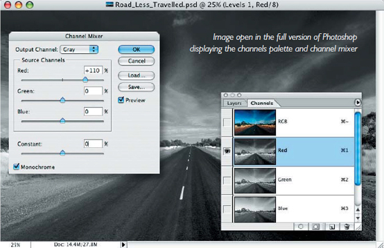
Now just before you run out to purchase your red filter and Grayscale image sensor you should be reminded that neither is required by the digital shooter with access to image editing software. Shooting digitally in RGB (red, green, blue) means that you have already shot the same image using the three different filters. If you were to selectively favor the goodies in the red channel, above those to be found in the mundane green and the notoriously noisy blue channels, when you convert your RGB image to Grayscale, you would, in effect, be creating a Grayscale image that would appear as if it had been shot using the red filter from the ‘good old days’. Owners of the full version of Photoshop can see the different information in the individual channels by using the Channels palette, and can then selectively combine the information using the Channel Mixer. For owners of Adobe Elements you are two cans short of a six-pack for this procedure - but take heart. Yes, there is no Channels palette, and no, you don’t have a Channel Mixer (but then your bank account probably looks healthier for it). As luck would have it the famous digital guru Russell Preston Brown has come up with a workaround that is both easier to use than the Channel Mixer and is also available to the software impoverished.
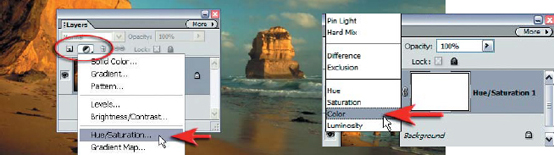
1. Drag the Layers palette from the palette bin (this will be your command center for this technique). Click on the ‘Adjustment Layer’ icon in the Layers palette and scroll down the list to select and create a Hue/Saturation adjustment layer. You will make no adjustments for the time being but simply select OK to close the dialog box. Set the blend mode of this adjustment layer to ‘Color’.
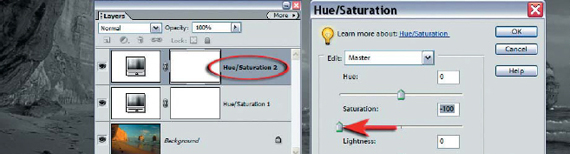
2. Create a second Hue/Saturation adjustment layer. Slide the Saturation slider all the way to the left (minus 100) to desaturate the image. Select OK. The image will now appear as if you had performed a simple Convert to Grayscale or desaturate (remove color) command.
Note > This second adjustment layer should be sitting on top of the layers stack.
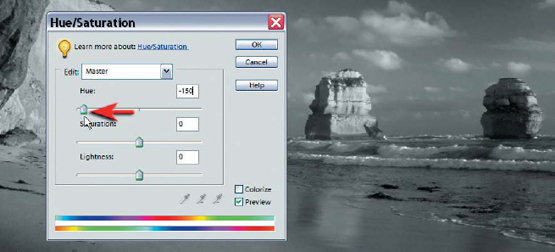
3. Select the first Hue Saturation layer that you created and double-click the layer thumbnail to reopen the Hue/Saturation dialog box. Move the ‘Hue’ slider in this dialog box to the left. Observe the changes to the tonality of the image as you move the slider. Blues will be darkest when the slider is moved to a position around –150. Select OK. The drama of the image will probably have been improved quite dramatically already but we can take this further with some dodging and burning.
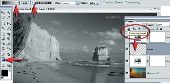
4. Click on the ‘New Layer’ icon in the Layers palette. Set the blend mode of the layer to ‘Overlay’. Set the default ‘Foreground and Background’ colors in the Tools palette and then select the ‘Gradient Tool’. In the Options bar select the ‘Foreground (black) to Transparent’ and ‘Linear’ gradient options and then lower the opacity to 50%.
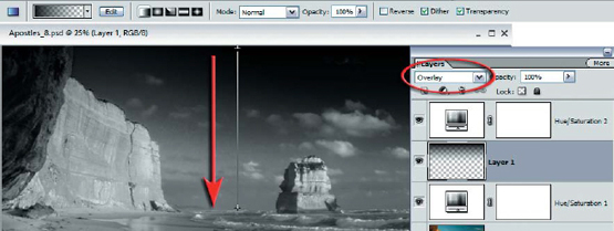
5. Drag one gradient from the base of the image to the horizon line, and a second from the top of the image window to the horizon line. This will have the effect of drawing the viewer into the image and create an increased sense of drama. Lowering the opacity of the layer if the effect is too strong.
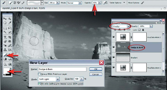
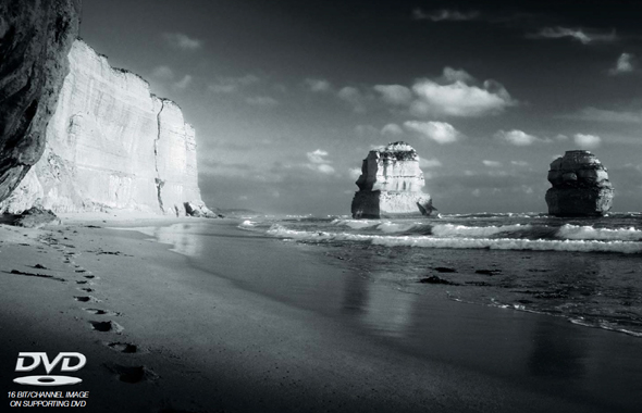
6. Press the Alt key and click on the ‘New Layer’ icon. In the New Layer dialog box set the blend mode to ‘Overlay’ and select the ‘Fill with Overlay-neutral color’ option. Select the ‘Paintbrush Tool’ and select a soft edged brush from the Options bar and lower the opacity to 10%. A layer that is 50% Gray in ‘Overlay’ mode is invisible. This gray layer will be used to dodge and burn your image nondestructively, i.e. you are not working on the actual pixels of your image. If any mistakes are made they can either be corrected or the layer can be discarded. Paint onto the gray layer with black selected as the foreground color to burn (darken) the image in localized areas or switch to white to dodge (lighten) localized areas. In the project image the cliffs and the surf were dodged to highlight them.
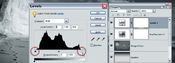
7. Select the top layer and then create a Levels adjustment layer (one adjustment layer to rule them all) to sit above all of the other layers. Make sure the histogram extends all the way between the black and white sliders. Move the sliders in to meet the histogram if this is not the case.
PERFORMANCE TIP
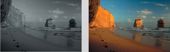
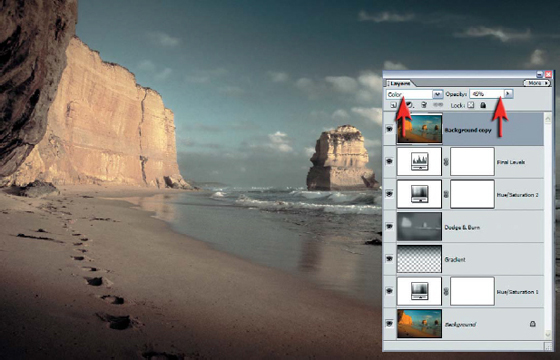
Try experimenting with the introduction of some of the original color. Duplicate the background layer by dragging it to the New Layer icon. Then drag the background copy further up the layers stack to a position just below the levels adjustment layer. Reduce the opacity of this layer and set the blend mode to ‘Color’ to let the black and white version introduce the drama once more.
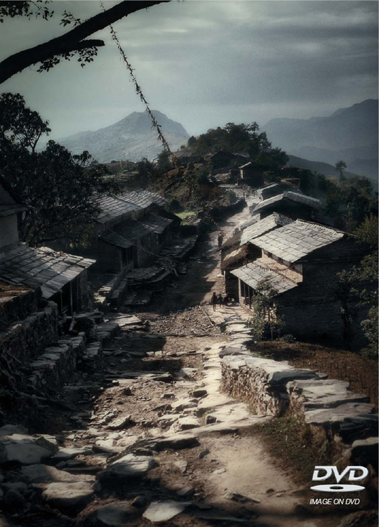
The techniques used to create this image have been taken from Projects 3 and 5 in this section of the book