
Printing
Adopt a color management workflow that delivers you predictable prints every time
Creating high-quality prints using desktop inkjet printers can be a mystifying and costly experience. Matching the colors of the print to those that appear on your monitor can be an infuriating experience. This example of a printing workflow may help you overcome some of the obstacles you may be encountering and enable you to attain perfect prints.
Most professionals use the Adobe RGB workspace when images are destined for print rather than web viewing. Set your own workspace by going to Edit > Color Settings prior to editing your own folio images. Use the Adobe Gamma utility that can be found in the ‘Control Panels’ of your operating system to guide you through the calibration process for your monitor, or better still, invest in a monitor calibration device that ensures maximum performance. Now follow these six simple steps to turn your edited images into folio masterpieces.
1. Preflight checklist
In an attempt to make the first time not too memorable, for all the wrong reasons, check that your ink cartridges are not about to run out of ink and that you have a plentiful supply of good quality paper (same surface and same make). It is also worth starting to print when there are several hours of daylight left, as window light (without direct sun) is the best light to judge the color accuracy of the prints. If you are restricted to printing in the evening it may be worthwhile checking out ‘daylight’ globes that offer a more ‘neutral’ light source than tungsten globes or fluorescent tubes. It is also important to position the computer’s monitor so that it is not reflecting any light source in the room (including the direct illumination from windows and skylights). If your monitor is reflecting a brightly colored wall or window then consider shifting your furniture.
Note > Refilling your ink cartridges and using cheap paper are not recommended for absolute quality and consistency.
Keeping a record
The settings of the translation process (all the buttons and options that will be outlined next), the choice of paper, the choice of ink and the lighting conditions used to view the print will all have enormous implications for the color that you see on the printed page. The objective when you have achieved a color match is to maintain consistency over the process and materials so that it can be repeated with each successive print. It is therefore important to keep a track of the settings and materials used.
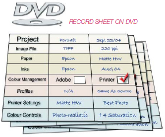
There is only one thing more infuriating than not being able to achieve accuracy, and that is achieving it once and not being sure of how you did it. Some words of advice … WRITE IT DOWN!
Note > A template for the print record sheet is available on the supporting DVD.
Use the test file to help you target the perfect color balance quickly and efficiently
2. Preparing a test print
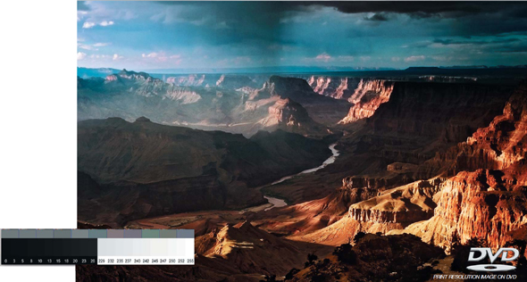
Start the printing process by selecting ‘Print with Preview’ from the File menu. As discussed previously there are several methods of printing. There is no one road. In order to discover a workflow that suits your own setup it is recommended that you use a test file that has a broad range of colors of varying saturations. Use a test file that incorporates a range of saturated colors, neutral grays and skin tones. If this file prints perfectly you can be confident that subsequent prints using the same media and settings will follow true to form. The test print file in the illustration above is available on the supporting DVD. It will help you target your optimum shadow and highlight points and stop you from chasing what initially appears to be a color cast and in the end turns out to be a blocked ink jet.
Note > There is an old saying, ‘quality in - quality out’. Each image you print must be checked that it has been optimized for printing. The file’s histogram should be optimized and any obvious color cast removed.
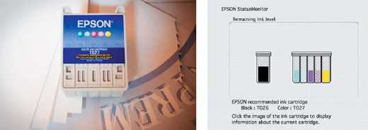
Select ‘Print’ from the File menu. Although Adobe has the industry standard color management engine it is only effective if you have a custom-made profile for your printer and paper combination. The latest photo printers are however more than up to the task of handling the color management.
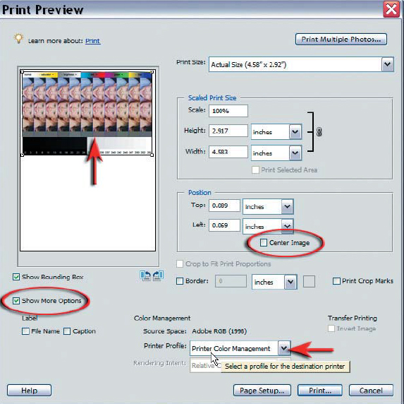
1. Click ‘Page Setup’ at the bottom of the dialog box to select paper size and orientation
2. Deselect the ‘Center Image’ checkbox
3. Drag the image preview to one side of the page to save printing paper
4. Click on the ‘Show More Options’ box to expand the dialog box
5. Select the ‘Printer Color Management’ option in the Color Management section
6. Select ‘Print’.
Note > If you have calibrated your printer and have a unique profile for your printer/paper combination then you should select this as the printer profile and turn off the color management in the printer.
Printer drivers are specific to your make and model of printer. The options outlined below will act as a guide for the settings in your own printer driver. Look for the same or similar options in your printer driver dialog box:
1. You may need to select ‘Properties’ in the first dialog box to access the printer settings
2. Select the ‘Advanced’ option if there is one to access ALL of the settings
3. Select the paper you are using from the Media Type or Paper Options menu
4. Select the maximum dpi from the Print Quality menu or any option that indicates the ‘Best Photo’ quality option has been selected.
5. Select Color Controls from the Color Management menu (you should see the Magenta, Cyan and Yellow color sliders)
6. Select ‘Print’.
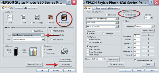
The options for ‘Printer Color Management’ in an Epson printer driver for a PC
The printer is now handling the color management. Once the test file has been printed you can make an assessment of what changes need to be made before printing a modified or ‘tweaked’ version. Be sure to let the test print dry for at least 10 to 15 minutes before making an assessment of the color and tonal values as these may change quite dramatically. Subtle changes can continue to occur for several hours during the drying process. See ‘Analyzing the test print’ when assessing whether any changes need to be made to the first test print. To speed up and simplify the procedure for subsequent prints a ‘custom setting’ or ‘preset’ can be resaved in the printer driver once you have achieved accuracy by fine-tuning the color sliders. Name the custom setting incorporating the paper surface, e.g. Matte HW-PCM (printer color management).
Note > The precise wording of the options in the printer drivers may vary between different manufacturers and models of printer.
View the print using soft window light (not direct sunlight) when the print is dry, and try to ascertain any differences between the print and the screen image in terms of hue (color), saturation and brightness. Any differences may be attributed to inaccuracies in your initial monitor calibration.
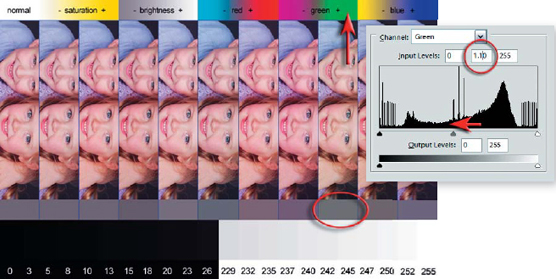
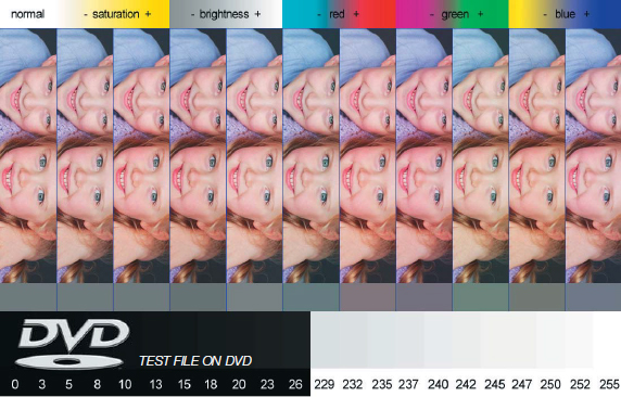
1. Check that the color swatches at the top of the image are saturated and printing without tracking marks or banding (there should be a gradual transition of color). If there is a problem with missing colors, tracking lines or saturation clean the printer heads using the printer guidelines.
2. View the skin tones to assess the appropriate level of saturation. The lower and higher saturation swatches have a –10 and +10 adjustment applied using Photoshop’s Hue/Saturation adjustment.
3. View the gray tones directly beneath the images of the children to determine if there is a color cast present in the image. The five tones on the extreme left are desaturated in the image file. If these print as gray then no color correction is required. If however one of the gray tones to the right (which have color adjustments applied) appears to be gray then a color cast is present.
4. Find the tone that appears to be desaturated (the color cast corresponds with the color swatches at the top of the test file). Apply this color correction to the next print. For example, if the plus green strip appears to print with no color cast (the gray swatches on the far left will therefore be printing with a magenta cast) then a 1.1 gamma adjustment in the green channel is required for the next test print. Alternatively a minus value can be entered in the Magenta slider in the ‘Color Controls’ in the printer dialog box.
Note > Each of the color strips in the test image has the same gamma adjustment applied using the RGB channels. The correction necessary can be made using the Levels dialog box by sliding the Gamma slider to 0.9 or 1.1 in the corresponding color channel.
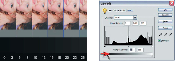
6. Maximizing shadow and highlight detail
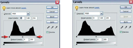
Examine the base of the test strip to establish the optimum highlight and shadow levels that can be printed with the media you have chosen to use. If the shadow tones between level 10 and level 20 are printing as black then you should establish a levels adjustment layer to resolve the problem in your Adobe software. The bottom left-hand slider should be moved to the right to reduce the level of black ink being printed. This should allow dark shadow detail to be visible in the second print. A less common problem is highlight values around 245 not registering on the media. If this however is a problem, the highlight slider can be moved to the left to encourage the printer to apply more ink.
Note > It is important to apply these output level adjustments to an adjustment layer only as these specific adjustments apply to only the output device you are currently testing.
PERFORMANCE TIP
Materials
Start by using the printer manufacturer’s recommended ink and paper.
Use premium grade ‘Photo Paper’ for maximum quality.
Monitor
Position your monitor so that it is clear of reflections.
Let your monitor warm up for a while (up to 30 minutes) before judging image quality.
Select a target white point or color temperature of 6500.
Set contrast, brightness and ‘Gamma’ using ‘Adobe Gamma’ or ‘Monitor Calibrator’.
Adobe
Set the Color Settings of the Adobe software.
Select ‘Let printer determine colors’.
Use a 6-ink inkjet printer or better for maximum quality.
Select the ‘Media Type’ in the printer software dialog box.
Select a high dpi setting (1440dpi or greater) or ‘Best Photo’ quality setting.
Proofing
Allow print to dry and use daylight to assess color accuracy of print.