
Creative Type

Master the techniques for working creatively with text layers and images to create stunning graphics
Elements may be a couple of tools short of a six-pack when it comes to working with vector shapes and paths, the principal tools of the trade for graphic designers, but creative typography is one area where Elements users do not have to bow down their heads in shame. We can be subtle and sophisticated, using conservative and delicate fonts with carefully color-matched hues, or, for those of you who believe typography does not always have to whisper, here are a couple of major techniques we can employ to get our message across loud and clear.


1. Open the Fire image from the supporting DVD. Select the ‘Type Tool’ in the Tools palette and then specify the font, style and size of the text.
Note > Color is normally selected by clicking the color swatch. Color is not important for this exercise as the type will be filled with another image. Ensure that anti-aliased option is selected (highlighted) to ensure smooth edged type and then click OK.
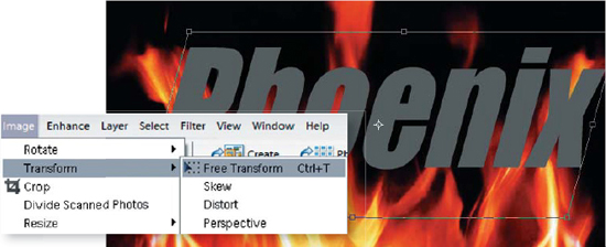
2. Stretch or distort the type layer by applying the ‘Free Transform’ command (Ctrl+T). The type in the example is stretched vertically by dragging the top-center handle upwards. Press the Enter key to apply the transformation.
PERFORMANCE TIP
Transform alters the shape and/or size of the subject matter on a single selected layer. Holding the Shift key down whilst dragging a corner handle will constrain the proportions. Holding down the Ctrl key whilst dragging a handle will allow you to skew the text.
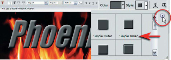
3. Apply an effect or ‘Layer Style’ to this text layer. Choose ‘Bevels >Simple Inner’ from the Style flyout menu in the Options bar.
PERFORMANCE TIP
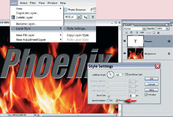
The appearance of the bevel can be fine-tuned by going to Layer > Layer Style > Style Settings. The Style Settings dialog box can also be accessed by double-clicking on the layer style (‘f’) icon on the layer in the Layers palette.
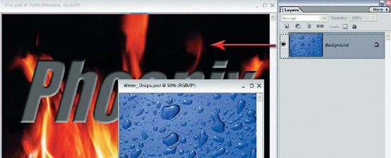
4. Open the image containing the texture you wish to paste into the text. For maximum quality check that the pixel dimensions of the texture image are the same, or greater than the image containing the text. The size can be modified later using the ‘Free Transform’ command but the digital photographer must be careful not to increase the size of any image excessively (‘interpolation’ has a tendency to lower the overall quality). Drag the thumbnail of the drops in the Layers palette into the image window containing the fire and text. The texture will be placed on a layer above the other layers completely concealing both the text and the background.
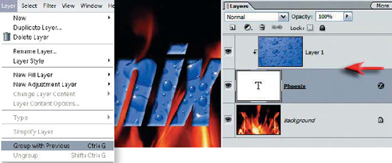
5. A clipping group is required in order to fill the text with the image of the raindrops. Go to Layer > Group with Previous or move the mouse cursor to the line that divides the two layers in the Layers palette. By holding down the Alt key the clipping icon should appear (two overlapping circles). Clicking whilst holding down the Alt key will group the layers together. The layer thumbnail is indented, the name of the base layer in the group is underlined and the text acts as a mask.
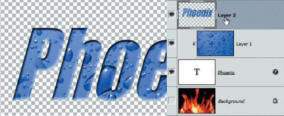
6. Switch off the visibility of the Background layer by clicking on the eye in the Layers palette. Stamp the visible elements to a new layer (hold down the Ctrl, Alt and Shift keys whilst typing the letter E on the keyboard. The text will appear on its own layer filled with raindrops. You can now switch on the visibility of the Background layer. The visibility of the text layer directly above the background layer can now be switched off as it has served its purpose.
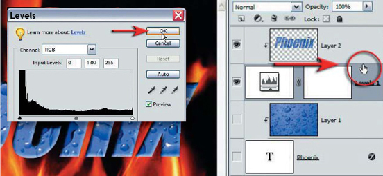
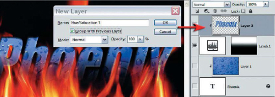
7. Select ‘Layer 1’ in the Layers palette (the raindrops layer) and then create a levels adjustment layer. As we only require the adjustment layer mask we can simply click OK without making any adjustments. Group ‘Layer 2’ with this levels adjustment layer.
Note > When the Phoenix layer is grouped with the adjustment layer no visible change occurs at this stage as the adjustment layer mask is empty.
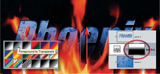
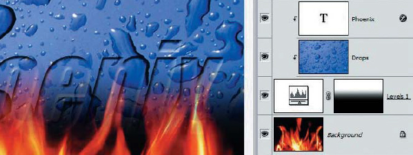
8. Set the default foreground and background colors in the Tools palette and then type the letter X on the keyboard to switch the colors to black in the foreground and white in the background. Select the ‘Gradient Tool’ in the Tools palette. Select the ‘Linear gradient’, ‘Foreground to Background’ or ‘Black, White’ options and 100% opacity. Move the cursor to the bottom of the typography in the main image window. Click and drag the gradient cursor from the base of the letters to the top of the letters. A linear gradient will appear in the layer mask and the typography should be half hidden behind this layer mask. Experiment with dragging shorter and longer gradients.

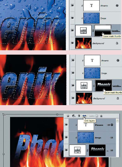
9. The layer mask can be moved by selecting the ‘Move Tool’ and dragging inside the main image window. To move the text instead of the mask you must first click on the layer above the adjustment layer. To move the layer mask and the typography at the same time you must first link the layers. Hold down the Shift key and click on both of the layers in the group to select them, then click on the ‘Link Layers’ icon in the Layers palette. The mask and the text can now be moved together.
PERFORMANCE TIP
To adjust the color of the text (now that it is not controlled by the font color) you can add an adjustment layer to the existing group. Hold down the Alt key as you select an adjustment layer to open the New Layer options dialog box. Select the ‘Group With Previous Layer’ box to ensure the adjustment effects only the text and not the background layer.
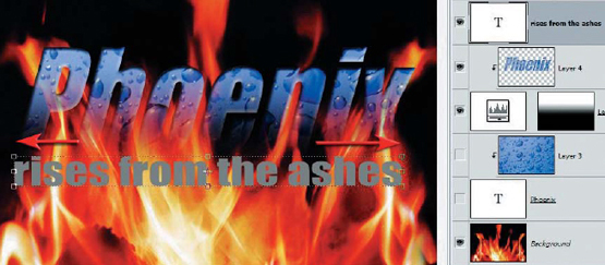
10. Select the ‘Horizontal Type Tool’ again and click beneath the word you have just created. Select a smaller point size and type the words ‘rises from the ashes’. Adjust the size and position of the text so that it is exactly the same width as the word ‘Phoenix’ (see step 2).
Note > Holding down the Shift key as you click with the text cursor ensures you always create a new text layer rather than editing the existing text layer. This is not a problem in this step as the visibility of the original text layer is off.

11. Apply a Simple Glow from the Outer Glow layer styles to this text layer. Return to the Style menu and select ‘Hide’ from the Visibility menu. This action hides the text color but leaves the layer style at 100% opacity. Adjust the Outer Glow size using the Style Settings palette (see the performance tip in step 3).
PERFORMANCE TIP - AN ALTERNATIVE APPROACH
An alternative approach to masking the text and texture is possible. The advantage of this approach is that the text remains editable as the text is not rasterized (converted from a text layer into a pixel layer). The disadvantage of this approach is that a more sophisticated mask is required to mask both the texture and the text, and this can take a little longer to perfect.
The text and texture are grouped with the adjustment layer mask containing the linear gradient.
Ctrl+Click the text layer to load the outline of the text as a selection. Invert the selection (Shift+Ctrl+I) and then select the layer mask thumbnail and fill the selection with black (Alt+ Backspace if black is the foreground color). Use the Maximum or Minimum filters, if required, to perfect the mask.