
Character Portrait
It is often possible to unleash the hidden potential of an image without going to the hassle of making fiddly selections. This project demonstrates how the tonality of an image can be enriched using duplicated layers, blend modes and a couple of filters to shape and sharpen. Dust off your trophy shelf - I feel an award coming on!
The beauty of these techniques is that we can let Photoshop Elements do all of the hard work and extract an image that has all of the hallmarks of a professionally lit studio-quality portrait from an image illuminated with nothing more than ambient light. The secret to success, if you plan to reuse this recipe on one of your own images, is to start with a razor sharp image illuminated by soft directional light (diffused window light is ideal).
Cooking up some character - a recipe for success
Before we start our culinary masterpiece we should prepare the main ingredient - the image. This should include optimizing the histogram via a manual or auto levels adjustment (if you have the luxury of accessing a 16 Bit/Channel file via a RAW capture or a 48-bit scan your histogram will appreciate the levels adjustment prior to hitting the ‘8 Bits/Channel’ option in the Image >Mode submenu). Start the project by removing any distractions in the image so that the viewer’s focus will not wander from the pièce de résistance - the face containing the character and majesty of our sitter. Keeping it simple is a key to clean and effective design.
1. You can either paint directly on to the background layer or duplicate the layer if you want to preserve the background layer unadjusted. Remember you have the option to undo any brush stroke that is not absolutely effective. In fact Elements allows you to undo 50 steps by default. Check the preferences and adjust the number to suit your own workflow if required. I think 50 is overly generous and this can consume excessive portions of the computer’s available RAM that would be best served being made available for the more memory intensive editing tasks we are about to engage in. There is no need to restart the computer if you decide to lower the number of ‘History States’ to 20 or even 10.
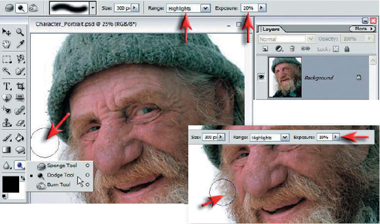
Dodge Tool > Use a soft edged brush and paint with the Dodge Tool set to ‘Highlights’. Reduce the opacity to around 20 to 30% to ensure that you lighten the background in the top left-hand corner without unduly affecting the sitter’s hat. Lower the opacity to 10% to lighten the rest of the background on this side (around the beard). The following steps will ensure that this backdrop will look like something from a studio (rather than the bus shelter where this image was captured).
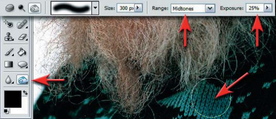
Burn Tool > Use a similar soft edged brush and paint with the Burn Tool set to ‘Midtones’ to reduce the distracting pattern of the clothing. You are not aiming to remove the texture - just subdue it.
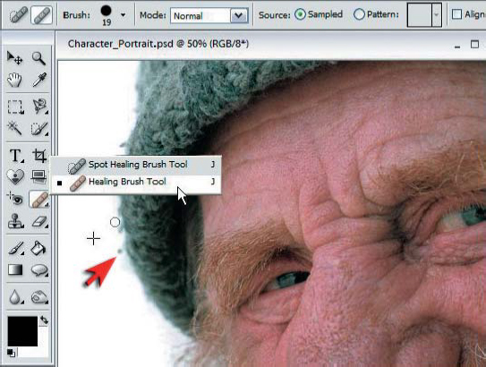
Spot Healing Brush >The Healing Brush Tool is the best tool for removing distracting details or dust marks. Use a hard edged Healing Brush when working in areas of large tonal difference, e.g. removing the dark woollen bobbles that are surrounded by the white background. This will ensure the healing area is not contaminated with the adjacent tones of the nearby hat.

2. To start working on the tonality we need to separate the ‘luminance’ or brightness values from the color component of the image. Start the process by dragging the ‘Background’ layer to the New Layer icon in the Tools palette to duplicate it (alternatively use the keyboard shortcut Ctrl+J on a PC). From the Enhance menu choose the command ‘Remove Color’ from the Adjust Color submenu. This will create a desaturated layer sitting above the colored background layer.
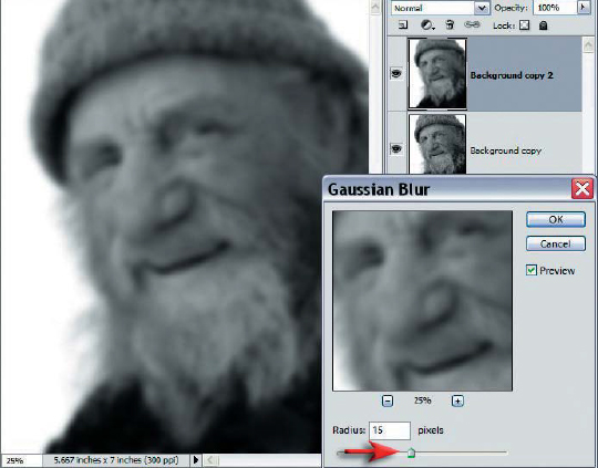
3. The fine detail of this portrait is going to be more pronounced if we create some smooth underlying tones. These smooth tones will also help to increase the three-dimensional quality of the portrait. Duplicate the desaturated layer using the same technique used in the previous step and then go to the Filter menu and choose ‘Gaussian Blur’ from the Blur submenu. Choose a generous Radius value - one where the skin tones are very smooth but the facial features can still be made out. When the blur radius is selected choose OK.
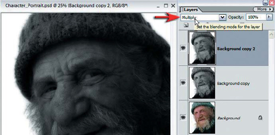
4. Switch the blend mode of the blurred layer to ‘Multiply’. The multiply mode blends the blurred tones back into the sharp detail underneath but renders the image temporarily dark. The shadow information, although very dark, is not lost or ‘clipped’ by this blending technique. The overall brightness of this image will be restored in the next step so that we can appreciate how effective this technique has been.
Multiply Mode > The ‘Multiply’ blend mode is one of the most useful blend modes for creative editing of digital images. The ‘Multiply’ blend mode belongs to the ‘Darken’ family grouping. The brightness values of the pixels on the blend layer and underlying layer are multiplied to create darker tones. Only values that are multiplied with white (level 255) stay the same.
PERFORMANCE TIP
One of the really essential techniques for multilayered image editing is the ability to take all of the combined elements from the visible layers and stamp them to a single new layer. It is so important that Adobe have decided to keep the shortcut a secret. The long way to achieve this stamping process involves choosing ‘Select All’ from the Select menu, choosing ‘Copy Merged’ from the Edit menu and then choosing ‘Paste’, again from the Edit menu.
Stamp Visible – the mother of all keyboard shortcuts
The shortcut is long, very long, but will save you considerable time as this technique is used over and over again in this style of editing. It will also impress the socks off image editors who are self-taught and who are most unlikely to have come across this permutation as it involves holding down nearly all of the left side of the keyboard! Hold down the Ctrl, Alt and Shift modifier keys and then (whilst still holding down the modifier keys) press the letters N followed by the letter E. If your new layer is not on top of the layers stack click and drag it to the top of the Layers palette.
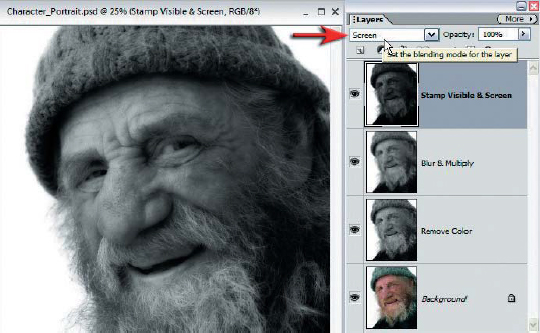
5. To restore the majority of the brightness values to this image simply switch the blending mode of this layer to ‘Screen’. The ‘Screen’ blend mode belongs to the ‘Lighten’ family grouping and has the opposite effect to the ‘Multiply’ blend mode. The action of first multiplying and then dividing (screening) has however incorporated the blur layer into the pixel stew and the visual outcome is altogether different from the start image.
PERFORMANCE TIP
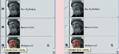
When working on a long project it is often necessary, or reassuring, to perform a quick taste test, i.e. gain a quick reminder of how life started out for this image and whether the techniques you are using are creating positive or negative visual outcomes. Rather than clicking on each eye icon, on each individual layer, to switch the visibility off (one by one), you can simplify the process by simply holding down the Alt key and clicking only the eye icon on the background layer. This action switches all of the other layers off in a single click, enabling you to see how life for this image started out. Alt+Click a second time to switch all of the layers back on. Looking good? Then let’s proceed.
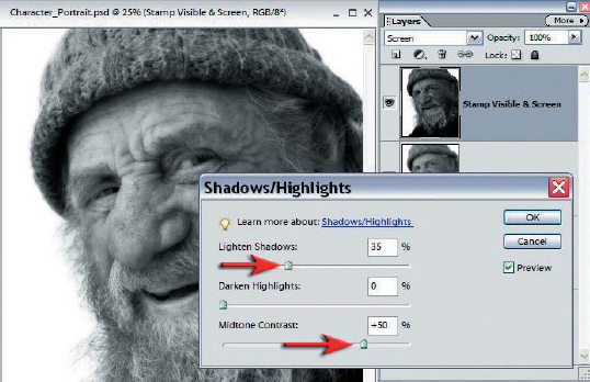
6. Sometimes tones need to be rescued if they are getting too close to 0 or 255. As the shadows are starting to make friends with ‘Level 0’ and getting a little too close for comfort we must instigate a rescue attempt. We will need to merge all of the visible elements again (as in step 4) to a new layer (stamp visible) if we are to utilize our good friend and ally - Shadows/Highlights.
The Shadows/Highlights adjustment feature is an excellent tool for targeting shadow or highlight tones that need to be massaged in isolation and brought back into the range of tones that can be comfortably printed using an inkjet printer. Although the ‘Screen’ blend mode did an excellent job of moving the midtones and highlight tones back to their former glory, the shadows of this image are still struggling to emerge above a level where they are likely to print with detail (between level 10 and level 20 depending on the type of paper, ink and printer being used). The adjustment feature can be accessed via the Enhance >Lighting menu. Before accessing the adjustment feature it is probably worth having either the Histogram palette or the Info palette open so that you can gauge when the shadows have been restored to a value that will print on your trusty inkjet printer. Raising the Midtone Contrast slider can also inject some life and drama into the tonality of the image. You may need to do a balancing act between the two sliders whilst observing the numerical or visual effects to your tonal range if you intend to make use of the Midtone Contrast slider.
PERFORMANCE TIP
Shadows/Highlights >The Shadows/Highlights adjustment feature is the most sophisticated tool for lowering excessive contrast in Adobe Elements. The tool made a very welcome appearance in Elements 3 and forms part of the sophisticated armory of adjustment features that can enable users to edit the tonal qualities of an image with control and confidence in a non-destructive way (this armory of course does NOT include the Brightness/Contrast adjustment feature which serves no useful purpose and should be assigned to the wastelands of oblivion).
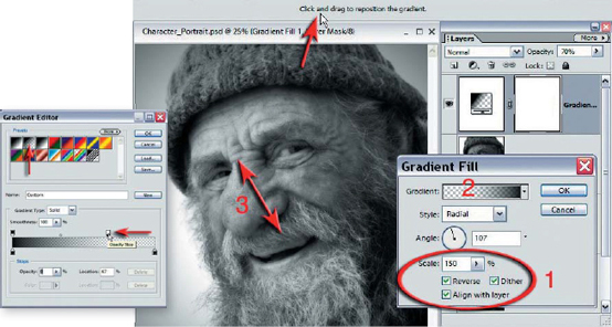
7. The next step involves getting rid of the distracting white background, replacing it with something a little more dramatic. Before creating a gradient make sure that black is the foreground color in the Tools palette (type D on the keyboard to return the color swatches to their default setting). From the Create adjustment layer menu in the Layers palette choose ‘Gradient’. The creation of a radial gradient or ‘vignette’ involves fours steps. First choose the ‘Radial’, ‘Reverse’ and ‘Dither’ options in the Gradient Fill dialog box and enter a value of 150% in the ‘Scale’ field and then choose an appropriate angle (I have followed the angle of the face). The second step involves clicking on the gradient to open the Gradient Editor. Choose the ‘Foreground to Transparent’ preset and move the opacity stop on the far right of the gradient ramp to the left to clear the face of any tone, thereby pushing the starting point of the gradient to the edge of the face. For the third step select OK to close the Gradient Editor and then drag inside the image window to move the center of the gradient to the perfect position. Finally (step 4) select OK and adjust the opacity of the layer to balance the background tone with the portrait.
PERFORMANCE TIP
Gradient layers >One feature short of a full load
Although gradient layers represent an important and powerful editing tool, the good people at Adobe overlooked a very important aspect in this adjustment layer feature. Gradients have a nasty habit of ‘banding’, either in the screen view and/or in the printed image, giving the tonal transition a posterized appearance that is not at all in keeping with the rich tonal qualities of advanced image-editing techniques. The banding can only partly reduced by selecting the ‘Dither’ option (not a default option for the gradients). To ensure this banding does not raise its ugly head the user must add noise to any areas of smooth tone after any gradients have been applied. Gradient layers unfortunately do not contain pixels to which noise can be added so this can become especially problematic and requires an additional noise layer to resolve the problem.
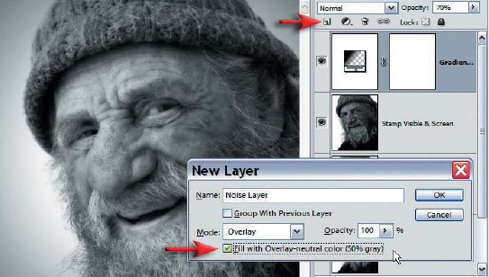
8. Adding noise rather than reducing noise may sound strange. One has to remember however that the gradient is completely artificial and completely noiseless - something that cannot be matched even with a low-noise image captured on a digital camera using a low ISO setting. By adding noise we are merely trying to match the noise present in the rest of the image and at the same time eliminate or reduce the problem of banding. To create a noise layer hold down the Alt key and click on the New Layer icon in the Layers palette. In the New Layer dialog box choose ‘Overlay’ as the mode and click on the ‘Fill with Overlay-neutral color (50% gray)’ checkbox.
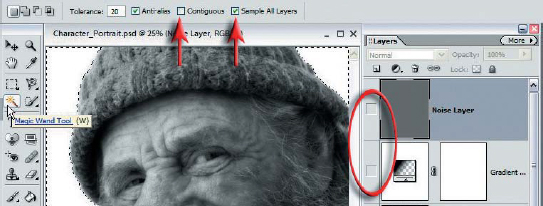
Select OK and then switch off the visibility of the gradient layer so that we can see the original white background. The only selection of the project will isolate the background for the noise treatment. Select the ‘Magic Wand’ from the Tools palette and select the ‘Sample all layers’ option in the Options bar. Deselect the ‘Contiguous’ box and lower the tolerance to 20 to ensure that the selection is painless - a single click should do the trick. You will need to add a generous amount of feather (100 pixels or more) to this mask to create a gradual transition between noise and no noise (Select >Feather). After feathering the selection switch the visibility of the gray overlay layer back on. Zoom in to 100 or 200% (avoid magnifications that do not give an accurate screen view, e.g. 133% etc.).
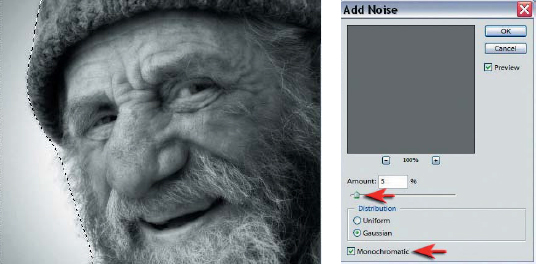
9. With the selection still active select the ‘Add Noise’ filter from the Filter >Noise submenu. Select the ‘Monochromatic’ option and choose an amount that will create a noise level that is consistent with the rest of the image file. To check the noise level is OK hold down the spacebar to enable you to drag the image between the gradient (with added noise) and the face (with no added noise). When the texture is consistent select OK.
Note > Adding noise is an essential component of using gradients. Think gradient - think noise.
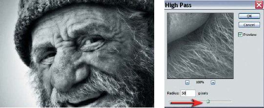
10. The localized contrast is already vastly improved from the original file but if you want to see how far you can take this tonal manipulation you may like to try the following technique that can add depth and volume to a seemingly lifeless and flat image. Stamp the visible elements yet again to another new layer (Ctrl+Alt+Shift and then type E) and then switch the blend mode to Overlay. From the Filter menu go to the Other submenu and choose the ‘High Pass’ filter. When this filter is used as an alternative to the Unsharp Mask filter a small radius of between 1 and 5 is usually selected, depending on the resolution of the image file and the output medium, but in this case the radius slider can be moved to a much higher radius whilst observing the effects to the image file. At the moment the effects may appear a little excessive but lowering the opacity of the layer and/or switching the blend mode of the layer to ‘Soft Light’ can refine the overall effect.
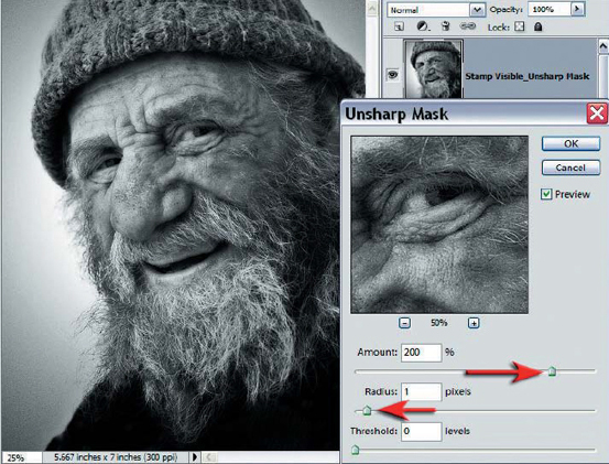
11. The rich tonality will now serve as an excellent canvas for the fine detail that we are about to sharpen. Sharpening should always appear late in the editing process to avoid exaggerating any image artifacts or non-image data. If you are to have maximum control over the sharpening process and the flexibility to adjust the level of sharpening after making a test print (images tend to look a little softer when compared to their screen counterpart - especially when using TFT displays) you need to apply the Unsharp Mask to a copy merged layer. You know the drill by now - stamp visible to a new layer. When this has been done you should set the blend mode to ‘Luminosity’. Switching the layer to the Luminosity blend mode will have zero effect to the visual outcome of the image at this stage. The advantage of this mode change is when the color is switched back on in the next and final step of the project. If you are used to applying conservative values in the Unsharp Mask filter this is not the time to exercise constraint. Be generous – very generous with the amount slider (200 in this project) but keep the Radius slider to the usual amount (no more than 1.5). The Threshold slider, which is usually raised to avoid sharpening minor details, can either be left at 0 so that all of the image information comes under the global sharpening umbrella or raised to around 5 so that the image noise levels are not excessively sharpened. You will need to print a test strip to your favorite paper surface before you can assess whether the amount of sharpening for this image is correct. If the sharpening seems a little excessive simply lower the opacity of the sharpening layer until you find the perfect setting for your paper.
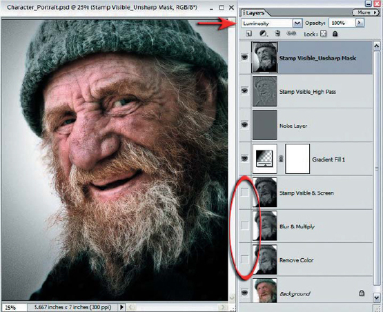
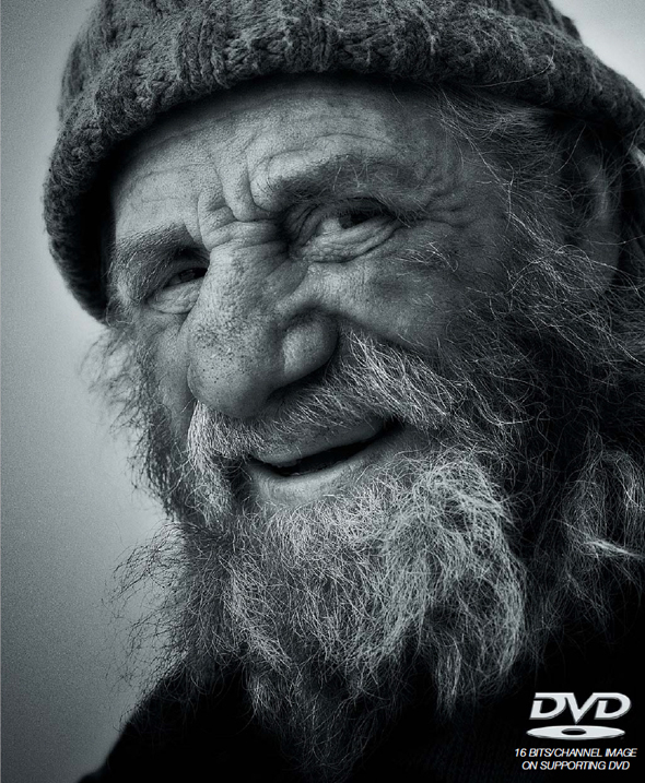
12. You might be so impressed with the tonal qualities of your monochrome masterpiece that the thought of switching the color back on gives you the shivers. It is important however to the learning curve of this project to discover how the luminance values of an image file can be edited independently of the color before being reunited. Color can be a major distraction when editing tonality. Switching off the visibility of the three monochrome or desaturated layers sitting directly above the background layer will allow the top layer in luminosity mode to merge with the color of the background layer. The blend modes are one of the most underutilized of the editing features to be found in Photoshop Elements. Perhaps it is because of their slightly abstract names and their mathematical approach to multilayered pixel editing but their creative power and usefulness should not be underestimated. With the digitally remastered dish ready to serve up to your printer you may need to savor both monochrome and color versions over a period of time before your own personal preference helps you make the final decision. Enjoy!
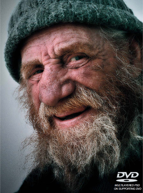
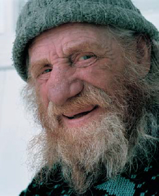
Color is fed back into the character portrait image to create the above effect